Designer Profile: Kit Kemp
WHY DO YOU LOVE COLOUR?
I’m always playing with a collage of colour, pattern and texture, especially handcrafted details such as appliqué and needlepoint. My style is best described as carefree and colourful – colour always makesme smile.
Working every day within a busy, uncompromising city landscape, I like to return to a room filled with light and colour. When I turn the key in the lock, I want my heart to lift and sing and colour is the easiest way of achieving this.
WHAT INSPIRES YOUR COLOUR COMBINATIONS?
I often look to nature for ideas of colour palettes that work – such as the natural hues of ochre, terracotta, sienna or indigo. From these organic base tones, I can create different moods with various colour and pattern combinations.
HOW DO YOU DECIDE WHICH COLOURS WILL WORK TOGETHER?
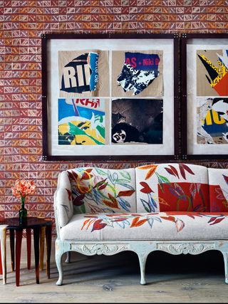
I look at colour in terms of shades. For example, if I cracked open a watermelon, I’d see red and green, but looking more closely, I’d see shades from watery white and shell pink to yellow grey. It’s the way these colours tone through from one to the other that gives me ideas of creating harmonious colour palettes and textures in a room. But then, I’d always add a jolt of contrast colour just to make it feel alive.
Be The First To Know
The Livingetc newsletter is your shortcut to the now and the next in home design. Subscribe today to receive a stunning free 200-page book of the best homes from around the world.
OTHER THAN USING PAINT AND WALLPAPER, HOW ELSE DO YOU INTRODUCE COLOUR INTO YOUR SCHEMES?
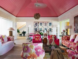
One of my greatest loves is finding handcrafted textiles. They can be woven or hand-blocked, silk screened or digitally printed – all can inspire a palette and when hung, they become the centre of attention. Using Perspex boxes to frame a material, whether a new fabric or an antique shawl, makes each one feel modern and of the moment.
ANY OTHER FAVOURITE WAYS OF USING COLOUR?
I like to use a bold abstract painting or a statement chair.
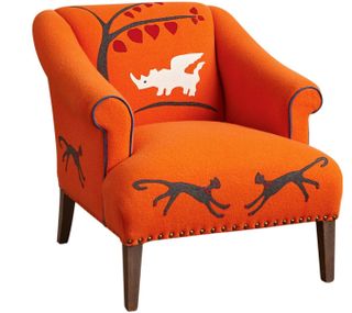
I designed the Rhino Chair for Anthropologie in bright orange felt with royal blue piping and a flying rhino motif on the back for this exact reason – it looked so at homein the beigest of settings and cheered up even the gloomiest of rooms. A brightly hued rug is another way of adding colour to a space, especially on a natural wood, stone or tiled floor, which may be clean, but can feel cold.
HOW DO YOU FLOW COLOUR THROUGH A SPACE?
Not everything in a room should zing with colour – balance and scale are part of the equation. I always look at the plans of a room as a whole and then create a sequence of spaces – a calm area leading into a vivid colourscape leading into a moodier area leading into a living zone. I like spaces to tell a story and lift the imagination as I travel through them.
HOW DO YOU CHOOSE A SPECIFIC PALETTE?
I look at the aspect of a room and decide how I want it to feel. If it’s facing north, a dark navy-blue wall will seem uninviting and heavy; a more reflective, lighter tone of blue with warmth will work better. I can then add touches of dark navy to the piping of a chair or a trim on the leadingedge of a curtain to still get the feel of the shade without overwhelming a space that lacks light. Conversely, with a south-facing room with good light, I can use denim on the walls with a contrasting colour for the curtains, such as a patterned fabric in a bright yellow, which will please the eye.
WHAT ABOUT PATTERN?
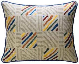
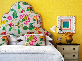
I often use a plain colour on walls and curtains and then add contrast colour and pattern in different scales through furniture, headboards, chairs and footstools. I never use more than one large patterned fabric in a room – instead, I like to mix it with a small repeat fabric and even mix in a geometric of a smaller scale altogether. It stops worrying the eye with too much going on at once. I designed my fabric and wallpaper collections for Christopher Farr with this flexibility, so different patterns and colourways work together. And I always think about texture too – I like a mix of fine and soft with rough and knobbly. I’d never use a fabric I wouldn’t like to sit on in the nude!
IN WHAT OTHER WAYS DO YOU USE COLOUR?
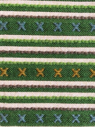
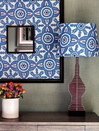
It’s a great way of bringing a jaded piece of furniture back to life – a Fifties sideboard painted in an orange lacquer looks fabulous. Interesting lamp bases with patterned shades, such as the ones I designed for Fine Cell Work, also create interest, while contrast piping, trims and handles lend a sense of the unexpected.
FINALLY, DO YOU HAVE ANY FIRM COLOUR RULES?
I love all colours, but there always needs to be a neutral thrown in to give the room some breathing space.
For more info about Kit Kemp, visit firmdalehotels.com
The homes media brand for early adopters, Livingetc shines a spotlight on the now and the next in design, obsessively covering interior trends, color advice, stylish homeware and modern homes. Celebrating the intersection between fashion and interiors. it's the brand that makes and breaks trends and it draws on its network on leading international luminaries to bring you the very best insight and ideas.
-
 I'm a Style Editor and This is My Best-Kept Styling Secret — It's Luxurious, Layerable, and Just $49 on Amazon
When in doubt, swap in a sheepskin rug. This is the exact one I swear by for winter (or anytime, really)
By Julia Demer Published
-
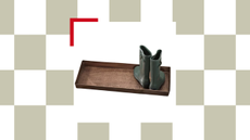 Goodbye Muddy Entryway Footprints: The Tangier Boot Tray Has Arrived On My Doorstep — And It's a Step Up in Style
This boot tray will ensure your dirty or wet shoes can dry off, your entryway flooring can stay shiny, and your entry closet can stay clean too
By Faiza Saqib Published