5 Living Room Color Trends for 2025 — New and Exciting Shades Designers Are Choosing for Walls
The new looks for living rooms sit in a few key color families, but there are a couple of outliers in these designer recommendations, too
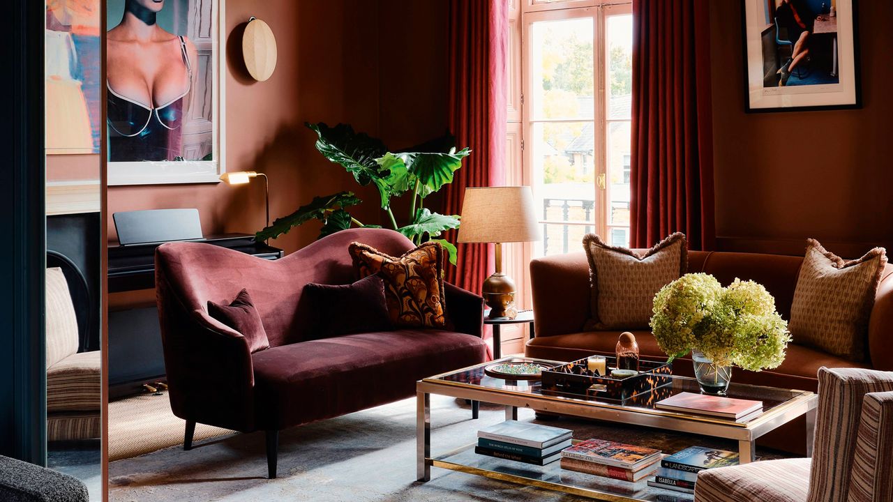

Changing up the color of my living room once a year is an idea I can get behind more than almost any room. It's a lived-in space that might just need repainting regularly anyway, and if you've got the sort of furniture that can adapt well enough, why not try something different occasionally?
Whether you're a serial redecorator, or your old scheme is starting to feel dated, it pays to be up to date on what's hot, and what's not so, in color before picking a paint. So, what are the living room color trends for 2025? Well, they track with the general color trends we're seeing for the home, though with a real focus on those warming, grounding hues. Think earth tones and sunset colors — comforting and on the cozier end of the spectrum.
However, that being said, there are also a couple of unexpected colors cropping up as emerging trends, too, that will give you pause for thought when browsing for paint colors. Let's dig in.
1. Rich Red
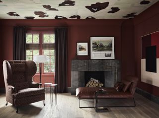
This living room marries rich red and brown tones for a sophisticated take on the trend.
Red doesn't sound like a calming living room color idea, necessarily, but the right tone of this powerful, emotional color can set just the right tone for a space that's cozy and relaxing, especially in the evening.
"The current trend of burgundy and jewel tones has definitely influenced my design choices," interior designer Filippo Calvagno, founder of Studio Calvagno, tells me. "I’ve always been drawn to a warm color palette, often using browns and greens, but the more red-toned hues are certainly becoming more prominent in my projects. It also seems that my clients are drawn to these colors as well."
So what shade of red, exactly, is the big living room color trend of the moment? Our pick for the year is 'oxblood' — a brown-red with huge depth and warmth that reads a lot more neutral than even the likes of burgundy.

Price: £0.50 per sample
Described as burgundy with black, this shade hits the trend perfectly.
2. Terracotta
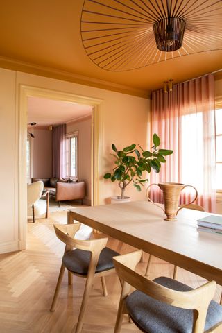
Designer Dagny Thurmann-Moe uses a mix of terracotta, pale orange, and pink across this living and dining room.
I'm not just telling you that muted shades of orange are being picked up for living rooms more and more anecdotally, according to Google, searches for 'terracotta' have gone up by 5,000% since 2024. Whether deep and rich, or a paler 'soft orange', it plays into this same color palette of warming, cocooning shades.
And there's a reason they're great for a living room. "Everyone looks good surrounded by these colors, they make your skin glow and your spirits rise," says Dagny Thurmann-Moe, a Norwegian color expert and founder of Koi Fargestudio. "In both Scandinavia and the UK we tend to have quite a cool daylight, full of blue tones, which these colors combat well. They flatter you. And if you feel you look good then you’ll feel good, too."
This living and dining room designed by Dagny shows how to style the trend, pairing with other sunset shades as colors that go with terracotta.
3. Light Blue
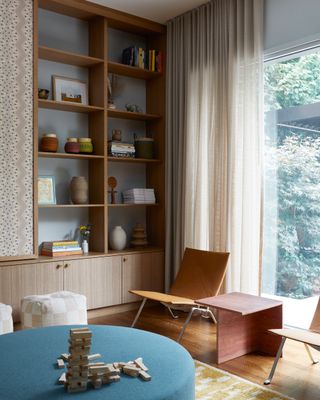
This living room uses contrasts of terracotta, yellow, and green against the light blue walls.
Light blue is an enduring color from last year, but one that hasn't been overdone, especially within the living room. Flying in the face of the 'warmer' living room color trends on this list, light blue is cool and refreshing, and has a near-neutral quality that makes it a bolder choice than white, gray, or beige, but enough of a background character, still.
"The light blue is a favorite of ours as it is architectural in feel, meaning it blends into the space rather than taking over from other elements such as millwork and furnishings," explains Lisa Lev, the interior designer behind the light blue living room above, which uses light blue as a base.
It also opens you up to some fun and playful color combinations, as lots of colors go with light blue. "Within the light blue envelope is a combination of green, mustard yellow, and terracotta, which are all muted enough to create a colorful yet calm setting for family life."

Price: £5.50 per sample
Not Farrow & Ball's most imaginatively named paint color, but a classic muted take on the hue.
4. Caramel
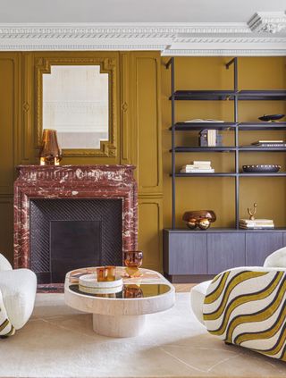
The walls in this living room match a colorway of Casamance's Moretta Fabric called 'Olive Noir'.
If you're wondering about whether beige living rooms are still on trend — well, yes, but with a slight difference. "This year, I'm definitely seeing neutrals punched up," says Livingetc editor Hugh Metcalf. "The so-called sad beige trend is definitely waning, but for those who love their earth tones, more saturated colors are coming through. Think richer, deeper browns, with more interesting tints."
Caramel, for example, is a color that feels perfect for right now. It's more intense than beige and has a retro richness that harkens back to the 1970s — another big interior design trend right now.
5. Purple
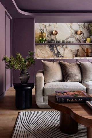
I'll say it now, purple wasn't a color I was expecting to see on any trends list anytime soon — however, it's undeniable that this color is making a comeback for living rooms, maybe for its dramatic boldness, maybe just as something a little bit different.
"I've been experimenting with purple in projects in a few ways," says Alexandra Barker, of Barker Architecture Office. "From a 'lavender gray' that's almost like a neutral with a tinted hue, to this deep aubergine that just feels so rich, but unexpected."
It's a color we're seeing surge in a big way for sofa color trends, too, even used in schemes where everything else is neutral. Think a more muted hue in this case, and materials like linen or weaves, rather than velvets.
Of course, alongside these bolder color choices, there are living room color trends that are a little more timeless, but I'm calling it — 2025 is the year to take a chance. Take stock of these colors, and other trending ideas like the sofa trends for 2025, and make a statement with your design, while keeping ahead of the bandwagon.
Be The First To Know
The Livingetc newsletter is your shortcut to the now and the next in home design. Subscribe today to receive a stunning free 200-page book of the best homes from around the world.

Luke Arthur Wells is a freelance design writer, award-winning interiors blogger and stylist, known for neutral, textural spaces with a luxury twist. He's worked with some of the UK's top design brands, counting the likes of Tom Dixon Studio as regular collaborators and his work has been featured in print and online in publications ranging from Domino Magazine to The Sunday Times. He's a hands-on type of interiors expert too, contributing practical renovation advice and DIY tutorials to a number of magazines, as well as to his own readers and followers via his blog and social media. He might currently be renovating a small Victorian house in England, but he dreams of light, spacious, neutral homes on the West Coast.
-
 Florals *Can* be Groundbreaking, and This Unlikely Collaboration Proves How
Italian fashion house, Moschino, tapped Sanderson’s iconic floral archive for its latest show in Milan
By Julia Demer Published
-
 The "One Amazing Thing" Theory Could Just Be the Secret to Making Your Decorating Budget Go Further (While Making More Impact)
What if we told you designers had found a way to control a project's spend even while elevating the final result? This new trend does just that
By Pip Rich Published
-
 The "One Amazing Thing" Theory Could Just Be the Secret to Making Your Decorating Budget Go Further (While Making More Impact)
What if we told you designers had found a way to control a project's spend even while elevating the final result? This new trend does just that
By Pip Rich Published
-
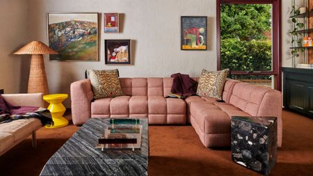 Carpets Used to Give Me the Ick, but This Bold New Style Makes Me Think They're the Next 70s Design Detail Due for a Revival
I've always had visions of ripping up wall-to-wall carpets, but now I'm thinking about actually installing them — what gives?
By Emma Breislin Published
-
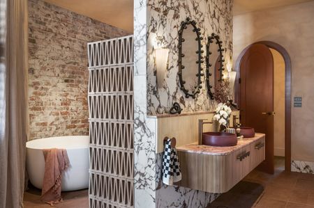 This 'Modern Breeze Block' Trend Is Everywhere Right Now — From Kitchen Islands to Room Dividers
I've spotted this V-shaped breeze block popping up as the cool finish in kitchens, living rooms, and even bathrooms right now. Here's what you need to know
By Luke Arthur Wells Published
-
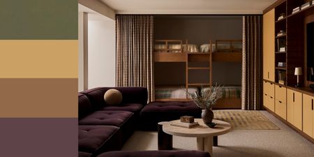 70s Color Palettes That Work for 2025 — 4 Designer-Approved Color 'Recipes' That Feel Modern Enough for Homes Today
It's time to bring out your paisley print and disco shoes — the golden yellows, olive greens, and deep purples of 70s color palettes are making a comeback
By Olivia Wolfe Published
-
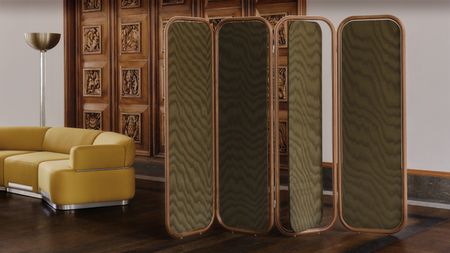 This 400-Year-Old Pattern Is the Emerging Trend That Designers Are Using to Bring 'Rhythm' to Their Projects
Whether you'd describe yourself as a maximalist or someone who loves a traditional interior, this centuries-old fabric is making an undeniable style revival
By Olivia Wolfe Published
-
 "It's Akin to a Shot of Caffeine" — 4 Ways You Should Be Decorating With Cobalt Blue to Wake Your Home Up
Experts reveal everything you need to know to decorate with this powerful shade in the home
By Amy Moorea Wong Published
-
 5 Bedroom Colors That Have Gone Out of Style in 2025 — Plus the Shades Designers Are Using Instead
Looking to redecorate your bedroom this year? Steer clear of these outdated hues if you want a fresh, contemporary-looking space
By Lilith Hudson Published
-
 Why Everyone's Going 'Long and Low' With Their Furniture — The Trend Creates a "Beautiful, Calm Dialogue of Shared Planes"
Whether through cabinetry, bench seats, or sectionals, long and low furniture marries form and function
By Olivia Wolfe Published

