5 Colors You Should Never Paint Your Bathroom — The Boring, Overstimulating, and Dating Shades These Designers Avoid
We're here to save you from the trap of a bad-taste bathroom. Listen to the experts, and stay away from these shades.

The Livingetc newsletters are your inside source for what’s shaping interiors now - and what’s next. Discover trend forecasts, smart style ideas, and curated shopping inspiration that brings design to life. Subscribe today and stay ahead of the curve.
You are now subscribed
Your newsletter sign-up was successful
The bathroom is arguably one of the most exciting spaces to design in your home. There's a certain sense of freedom and space for experimentation that you may not feel as able to explore in other, larger rooms. The bathroom is a place to have some fun with your design, to do something slightly outside the box. However, there are certain boundaries that just should not be crossed.
That's right. As much as we encourage you to explore your design options, it can't be denied that some colors will just never look good, especially in a bathroom. Whether that's because they're unflattering, outdated, or just simply not very nice, our experts are brimming with opinions about the bathroom color ideas that should be avoided.
"The key with bathroom colour is creating a space you want to spend time in relaxing, unwinding, and starting your day in the right headspace," explains Neil Curtis, senior designer at Ripples, "A little restraint goes a long way, and with the right tones, even a small space can feel beautifully designed."
Article continues belowIt's always helpful to have a trustworthy voice to defer to, someone to steer you in the right direction when your mind begins to wobble, and that's exactly what our experts are here to do. They've shared with us their biggest bathroom color, no-nos, and the shades we should all avoid no matter what.
1. Salmon Pink
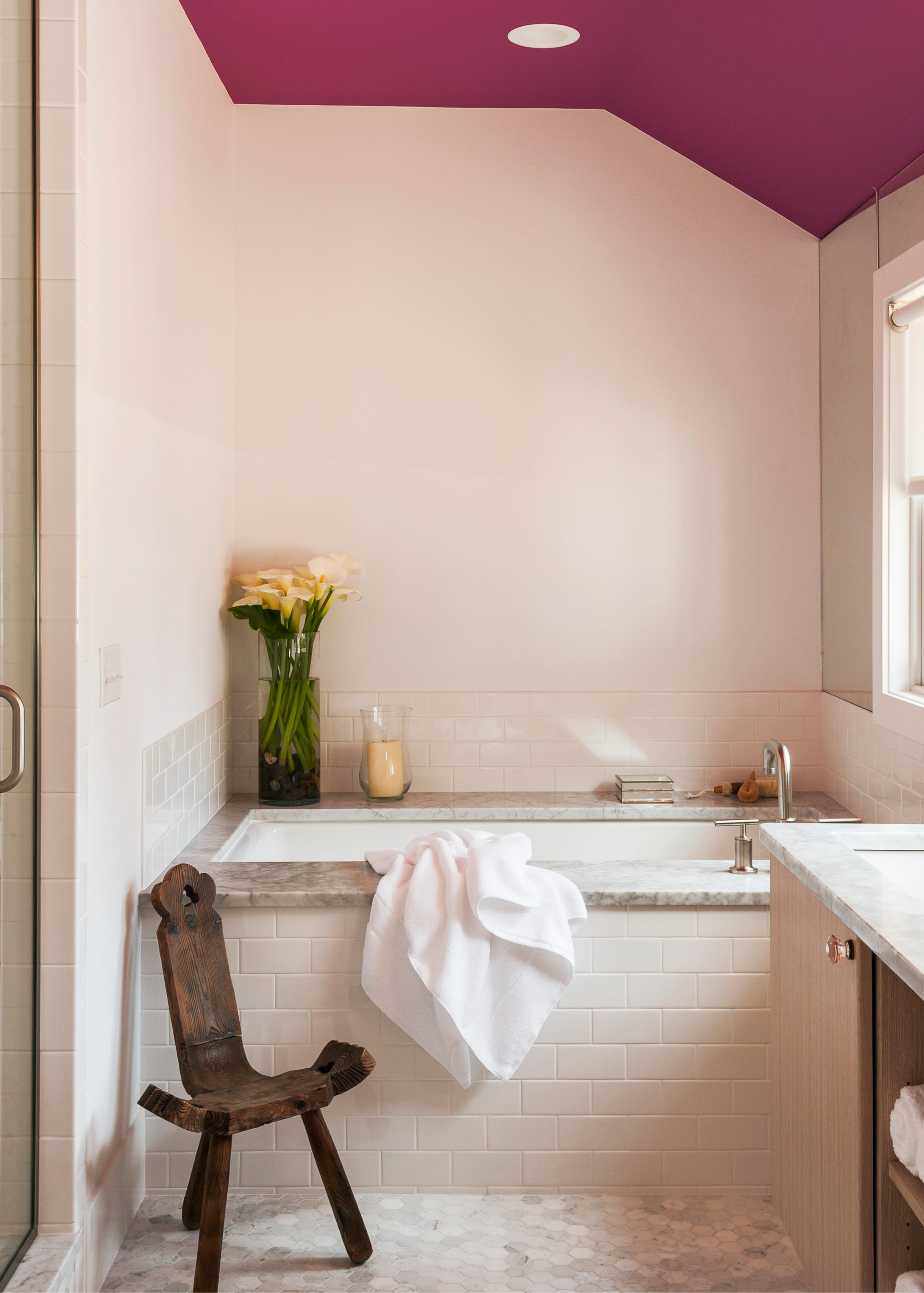
DO INSTEAD: "Instead, try blush pinks or dusty rose hues if you want something warm and feminine. These still feel soft but are far more contemporary and pair beautifully with matt black or chrome fixtures," says Neil.
It can take you by surprise to see a retro shade come back in to style, and sometimes it's a pleasant surprise (avocado bathrooms, we're looking at you), and other times... not so much. "I am all for retro," claims interior designer Pamela Lastiri, "but salmon is a color that dates rooms automatically and has an interesting way of contrasting a toilet in a visually unpleasant way."
The lingering reminder of salmon's heyday is enough to put anyone off who endured it the first time around, but as Pamela mentions, the sickly undertone of the shade can be particularly unflattering.
Similarly, Neil says, "We see peachy shades now and again in older bathrooms, and they often come hand in hand with matching tiles from the '80s! The trouble with peach is it’s neither modern nor particularly flattering under artificial lighting (which is usually what you’ve got in a bathroom)."
The Livingetc newsletters are your inside source for what’s shaping interiors now - and what’s next. Discover trend forecasts, smart style ideas, and curated shopping inspiration that brings design to life. Subscribe today and stay ahead of the curve.
However, in recent years, we've seen a shift towards variations of the shade, most notably Farrow and Ball's ever-popular Dead Salmon shade.
Pamela is an established interior designer who has led high-end residential and commercial design projects across the Bay Area and Napa Valley. Her work is grounded in her graduate studies in architecture, but elevated through her love of art and desire to create beautiful spaces that are made for longevity.
2. Bright, Fluro Shades
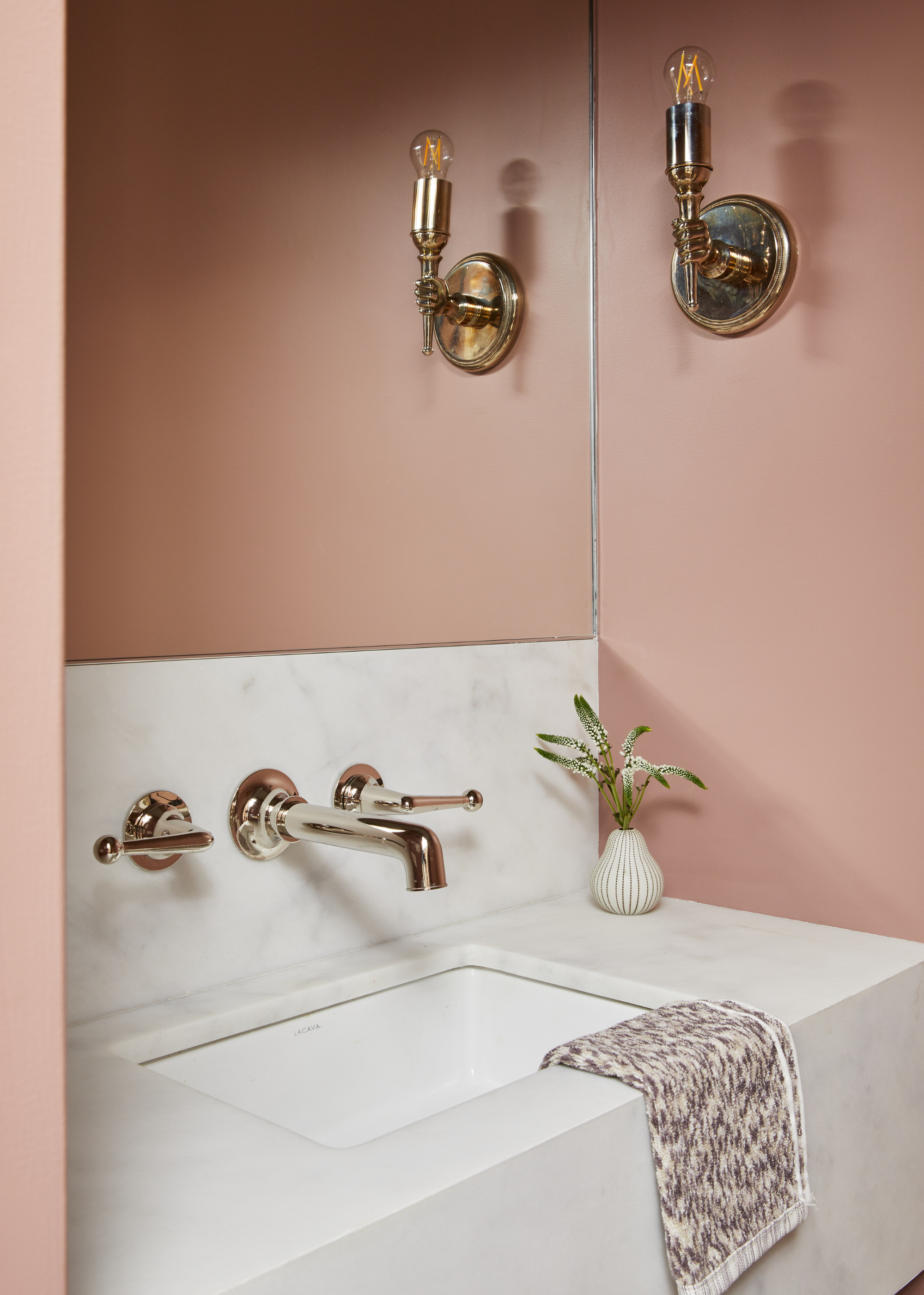
DO INSTEAD: Going for a toned-down version of the shade you were drawn to is interior designer Rachel Sherman's key for a relaxing bathroom design.
There is a time and place for neon colors, but the experts think that place is not in your bathroom. "I would never paint a powder room an extra-bright version of a color, like a bright yellow or a hot pink," explains Rachel Sherman, principal designer at Rachel Sloane Interiors. Instead, I like to select a moodier, toned-down version of that color."
The primary goal in bathrooms is most often to create a relaxing, spa bathroom-feel, and neon colors are the antithesis to this atmosphere of serenity. Opting for more muted versions of the color, as Rachel suggests, can help achieve this goal.
Neil agrees with Rachel's view, saying, "Bright citrus tones can be overpowering in a bathroom. They tend to bounce light in strange ways and rarely complement bathroom fixtures or tiles."
There is a certain appeal to bringing a color that feels so full of life into your space, but it can often have the opposite effect.
As Neil explains, "Rather than energizing the space, they often make it feel chaotic. If you’re after a fresh, zesty look, a muted sage green or soft buttermilk yellow gives you that lift without overwhelming the space."
Rachel Sloane Interiors is a boutique design studio based in New York City. Founded in 2019 by Rachel Sloane Sherman, RSI is a full-service design firm that specializes in residential design.
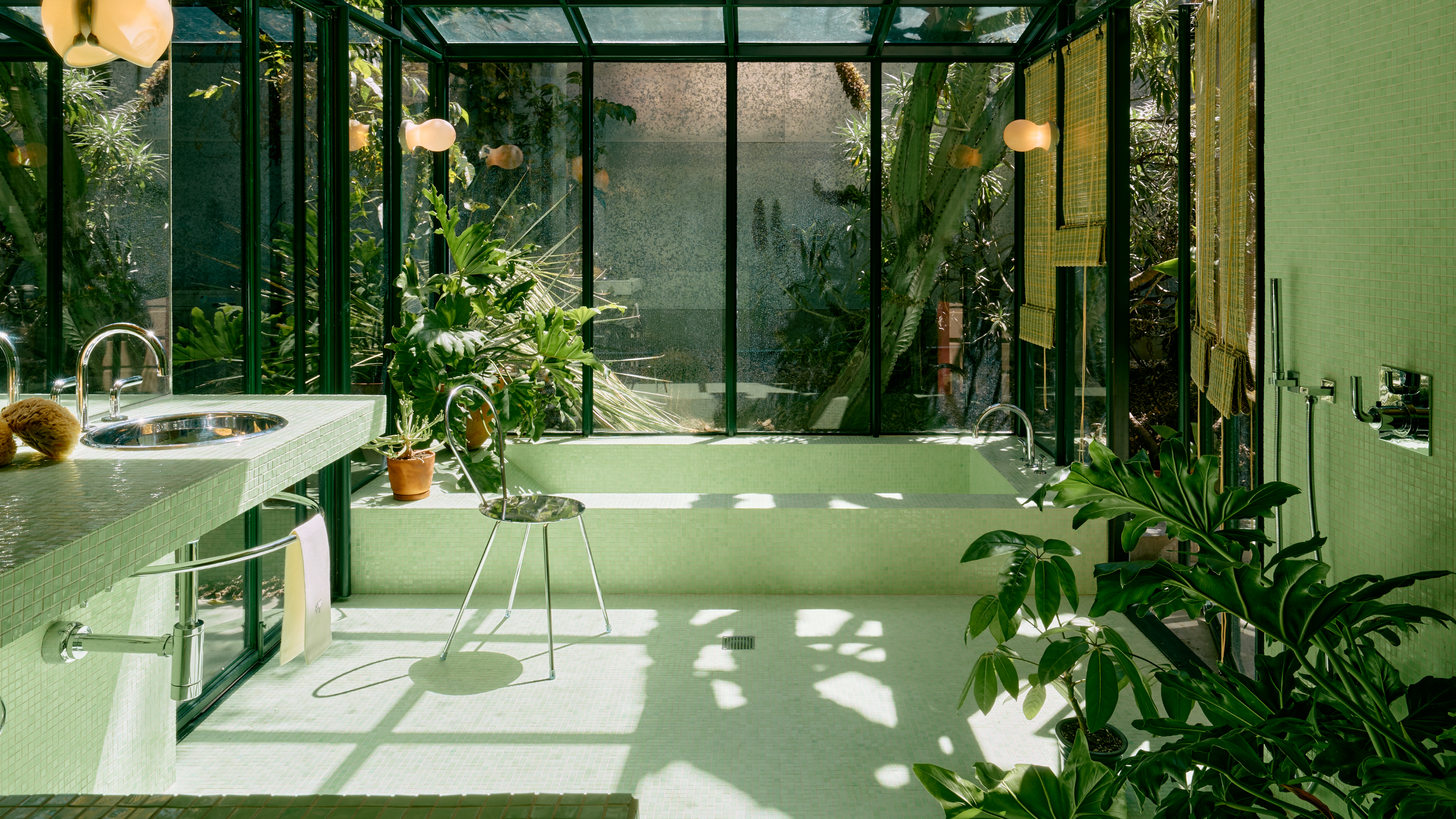
3. Sage Green
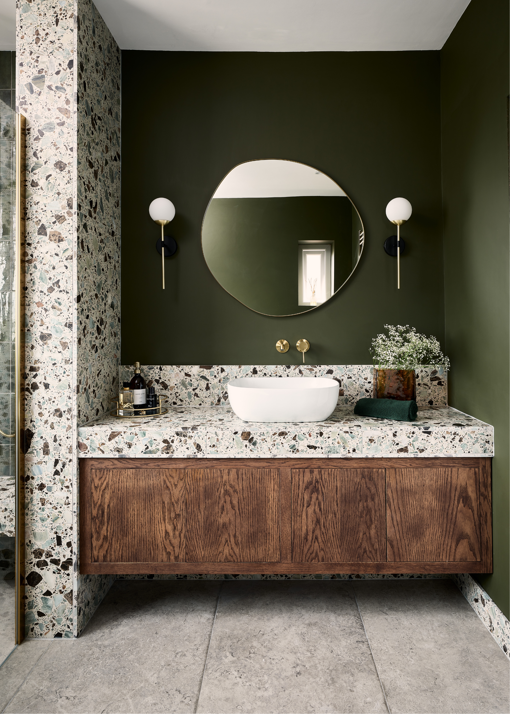
DO INSTEAD: "If you love green, there’s a whole world beyond sage. Think rich forest tones for mood and depth, fresh eucalyptus for a spa-like feel, or pistachio, which we’re tipping to be one of the standout shades of the year. It’s joyful, uplifting, and brings a subtle hit of personality that still feels timeless," says Grazzie.
We know this is going to upset some people, but we may be witnessing the end of the sage green room supremacy. It's put in a great shift, but now it's time for a new shade to step in and take its place.
"Sage green has had a good run, but in good 2025 it’s starting to feel massively overdone — like the default setting for anyone unsure where to go with color," says Grazzie Wilson, head of creative at Ca'Pietra, "It’s been used to the point where it’s lost its spark, and bathrooms deserve more than just a safe bet."
There is nothing surprising or exciting about sage green anymore, and your bathroom deserves something that hasn't been done a million times before.
4. Lifeless Neutrals
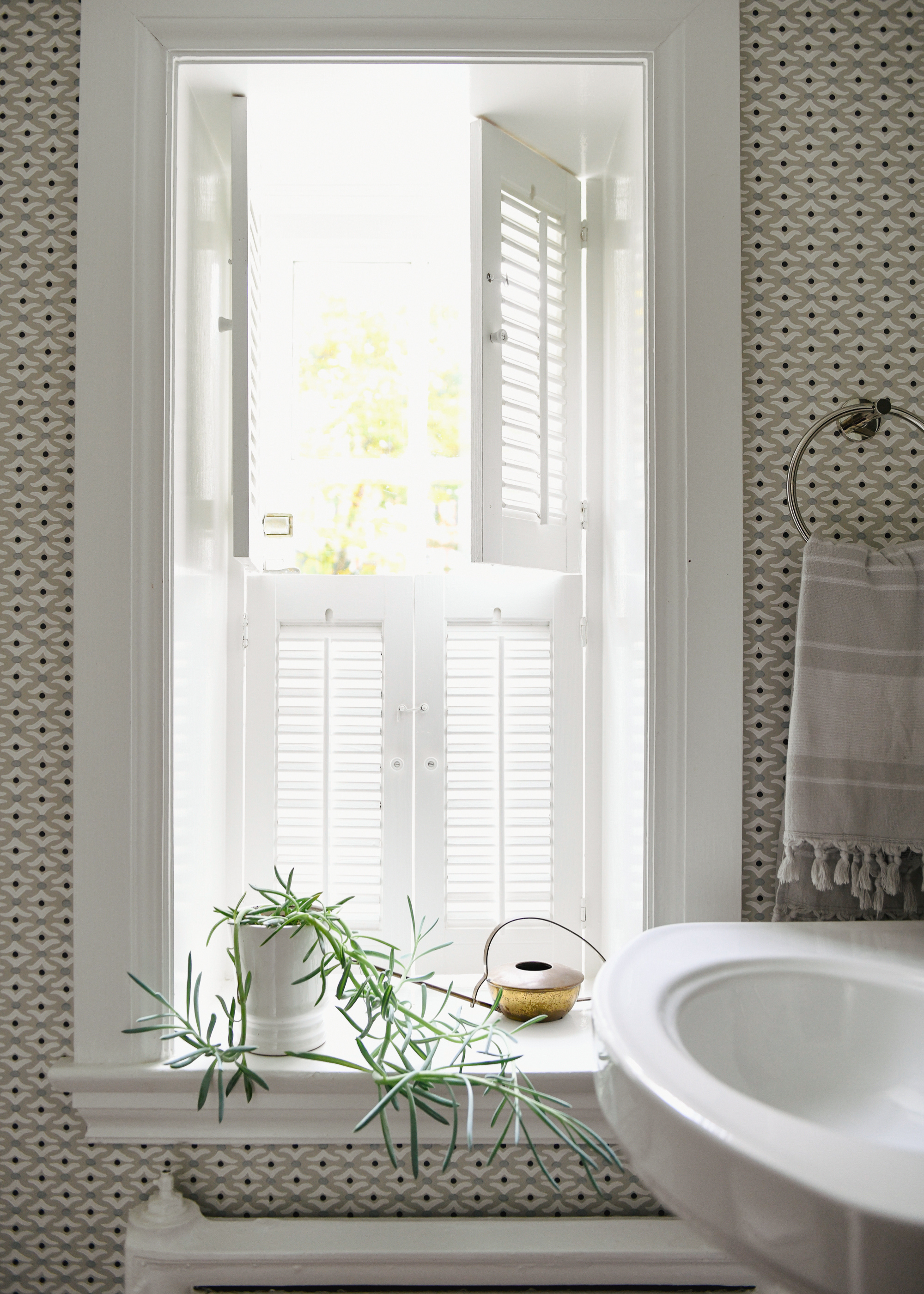
"Whites and really light and subtle neutrals can still be the dominant palette, but I'd achieve it with a pattern or print that brings in a little color, life and warmth," says Mindy.
A modern, white bathroom can feel classic and simple, like a breath of fresh air, but it can also feel quite sterile and cold. It became an increasingly popular style in the early 2000s, a symptom of the backlash to the maximalist designs of the 1980s, but nowadays, designers are moving away from this color palette.
"It might seem like the obvious choice for a clean, fresh look, but a bright, clinical white can leave your bathroom feeling cold and lifeless," says Neil, "Especially in spaces with little natural light, it can cast grey shadows and highlight every little mark or imperfection."
This is particularly true in small bathrooms with less exposure to natural light, where the monochromatic starkness can make you feel boxed in and uncomfortable. "I would avoid white, off-white, or light gray paint covering a whole powder room," adds Mindy Kelson O'Connor of Melinda Kelson O’Connor Architecture and Interiors.
BC Designs Keeley Sutcliffe echoes this point, saying, "Gray had its moment, but it is definitely a color that now feels cold, clinical, and a little too safe, especially in bathrooms, where warmth and comfort should be front and centre. That steely, blue-tinged grey can make a space feel sterile, which is the last thing you want in what should be a retreat."
Covering an entire bathroom, or powder room, in these cool-toned neutral shades can make a space feel extremely unwelcoming, and stifling at times. "These normally tiny spaces are the perfect opportunity to go big with either color or pattern," Mindy suggests.
There are plenty of ways to create the clean simplicity white offers without succumbing to this cold, off-putting sterility.
5. Navy Blue
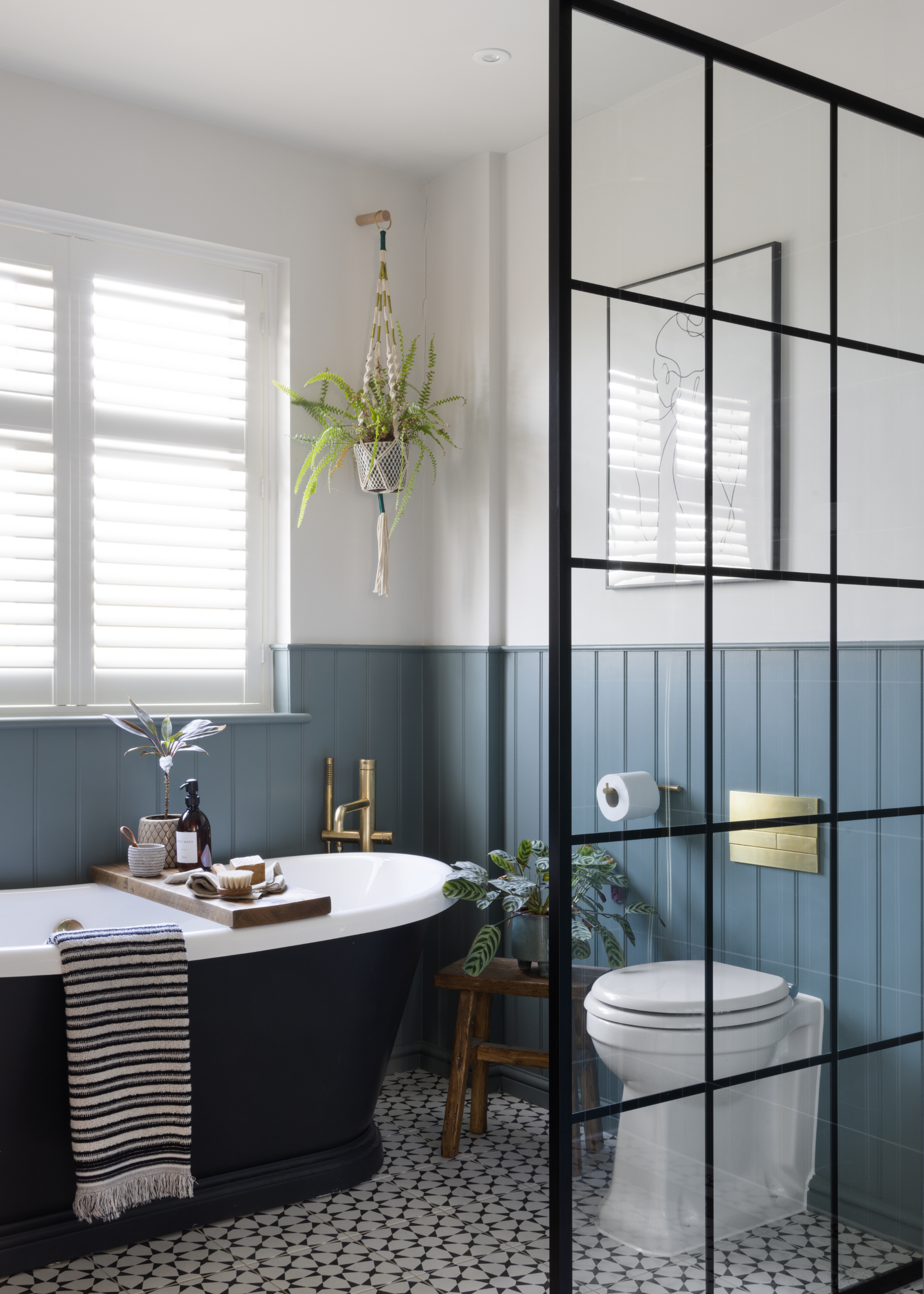
DO INSTEAD: "Denim blue feels effortless, it has that lived-in, easy elegance that works beautifully in a bathroom setting, It pairs seamlessly with natural textures like oak and travertine, and plays well with both warm and cool metals, from brushed brass to aged bronze. It also reflects light in a way navy doesn’t, bringing a softness that makes bathrooms feel calm, yet utterly current," says Louise.
"While navy blue has long been a go-to for creating contrast in bathrooms, it's starting to feel a little flat and overused in 2025," claims Louise Ashdown, from West One Bathrooms.
This classic shade has long been popular due to it's satisfyingly neutral tonality, easily adapting to many spaces. However, this can also translate into a slight dullness.
"It can overpower smaller UK spaces and lacks the softness and versatility today’s homeowners are craving," Louise explains, "Instead, we’re seeing a real shift towards denim tones which are a fresher, more relaxed take on blue that brings depth without heaviness."
Bringing in an element of freshness, and levity, allows a space to feel more relaxing.
Now that you know all the colors you shouldn't be using in your bathrooms, why not explore the trends we think you should think about bringing into your designs. We're still not over the tile drenching trend, but if that's not your thing, there are plenty of other modern bathroom trends about.

Maya Glantz is a Design Writer at Livingetc, covering all things bathrooms and kitchens. Her background in Art History informed her love of the aesthetic world, and she believes in the importance of finding beauty in the everyday. She recently graduated from City University with a Masters Degree in Magazine Journalism, during which she gained experience writing for various publications, including the Evening Standard. A lover of mid-century style, she can be found endlessly adding to her dream home Pinterest board.


