What is 70-20-10? The Color Rule Designers Love to Use — And How to Bring it Into Your Home
Designers use this decorating trick to create well-balanced, sophisticated and surprising schemes — here's what you need to know
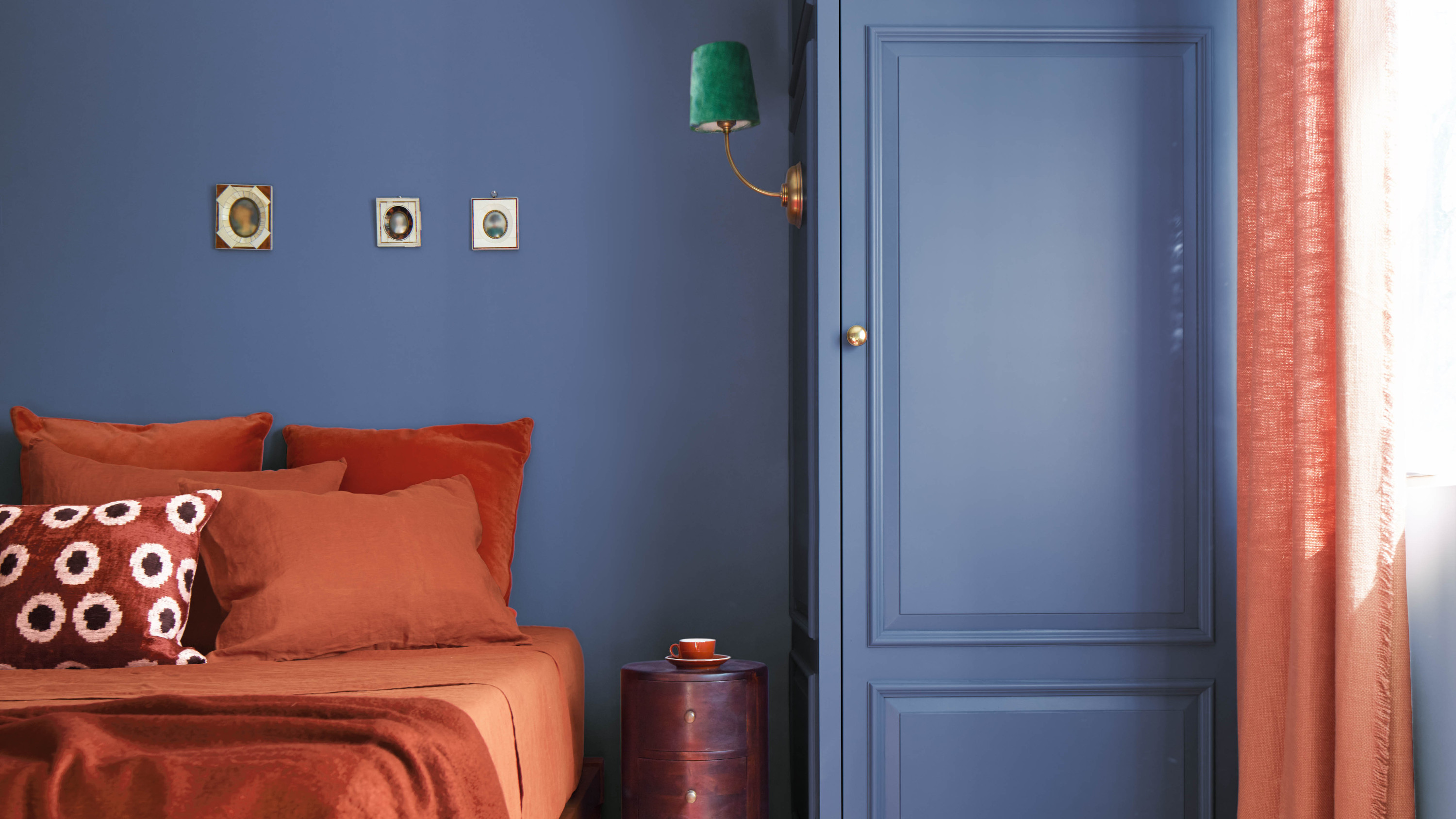

When it comes to design rules, two things can be true at once: it’s never necessary to follow them to the letter, but they can nevertheless be helpful for anyone who wants a little guidance.
So it goes for the 70-20-10 rule — an interior design concept very similar to the perhaps more well-used 60-30-10 ratio. It’s a helpful way of visualizing the balance of color in a room scheme, and can prompt you to be more confident and even daring in your choices — as interior designers told us when we quizzed them on it.
Read on to find out what the designers had to say about this color theory and get their tips on how to utilize this handy ratio in your own decorating — and when it’s okay to tweak it and make it your own.
What is the 70-20-10 rule in design?
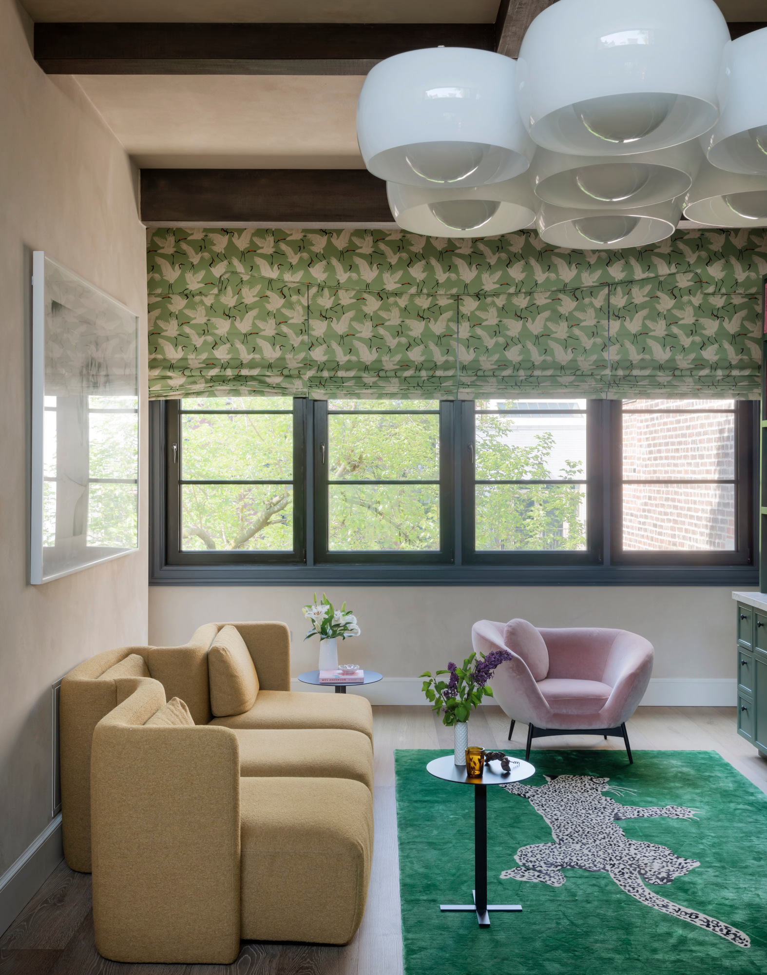
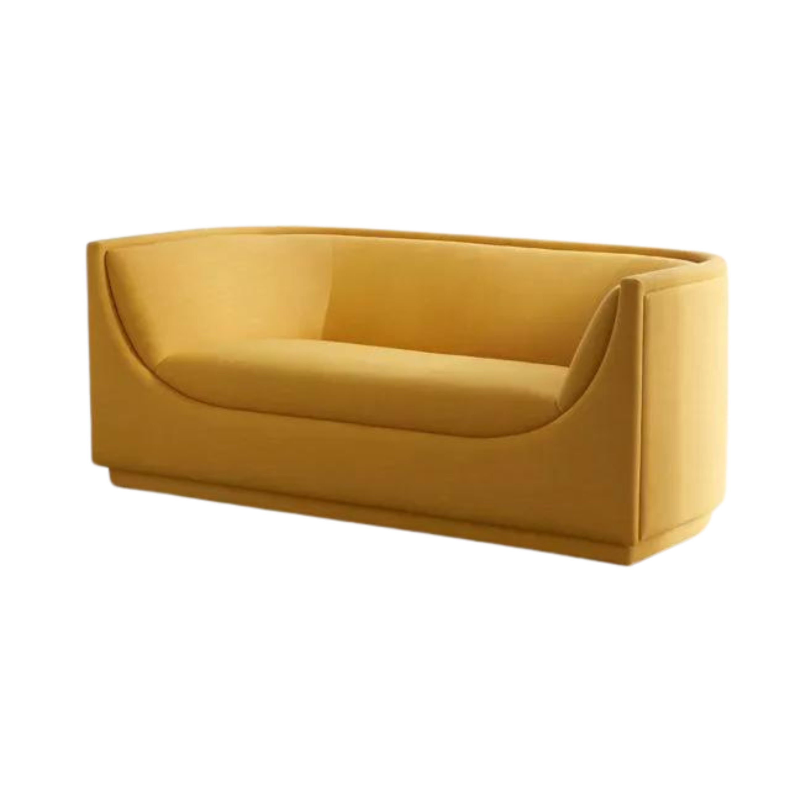
Price: Was $1299, Now $899.99
Material: Upholstered in performance fabrics
Size: 75.2" L x 35.4" W x 30.7" H
As we’ve mentioned, the premise for the 70-20-10 rule is similar to that of its popular sister theory, the 60-30-10 rule — both suggest that a room’s palette should feature a dominant color paired with two other shades used in varying quantities.
The difference is that the 70-20-10 rule can be a little more bold. ‘For those who prefer a more cohesive and clean look, I recommend opting for the 70-20-10 rule, utilizing 70% of the same color or material,’ says Sharon Blaustein, founder and principal designer of New York firm B Interior. ‘I’ve found that, especially in small spaces, using mostly one color or material makes the space appear bigger and more open.’
‘By increasing the dominant color to 70%, you create a space that's even more immersive and impactful,’ says Sacramento-based e-designer Amanda Foster. ‘It's like turning up the volume on your design, allowing that primary hue to really take center stage and set the tone for the entire space.’
Why should you use the 70-20-10 rule?
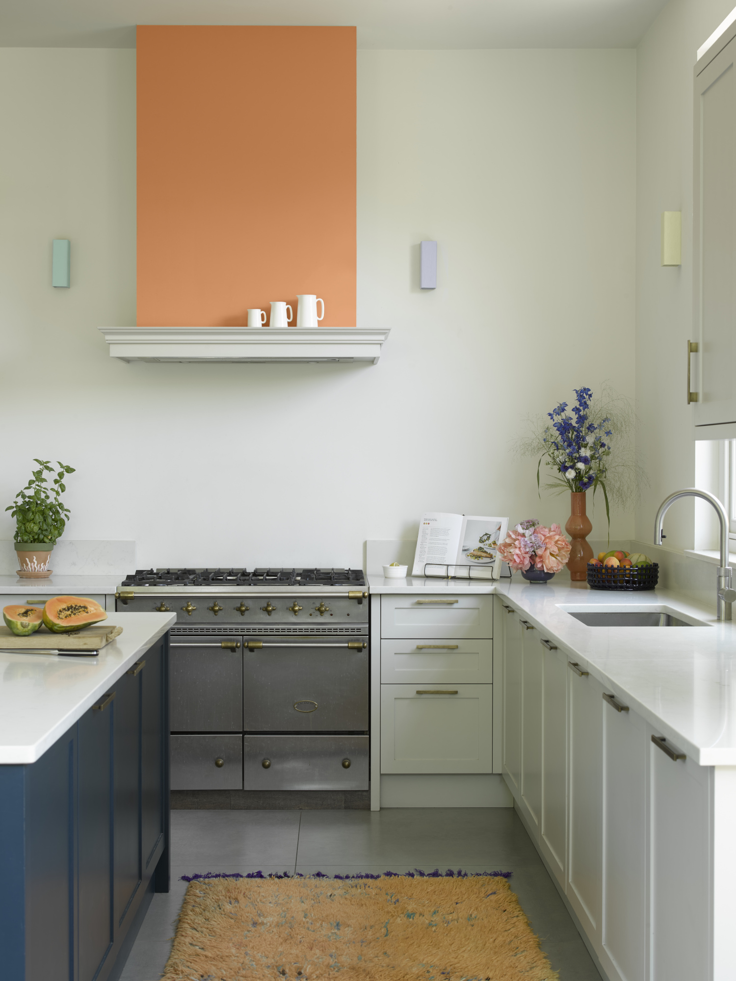
For Hanin Smith, principal and owner of Californian design practice HIDE Studio Interiors, there’s an instinctual element to using this rule — especially that 10% that acts as an unexpected accent. ‘When you've been designing spaces for a living, you stop referencing formulas like you might when you're starting out because it becomes second nature,’ she says. ‘We just know when something feels right and when it feels boring or predictable. Even though the 70-20-10 isn't a huge pivot, it's still a fun tweak on the standard formula.'
‘I love monochromatic schemes because they force the designer to rely on other elements to create visual interest, not just color,’ she continues. ‘For example, when a client wants a serene bedroom and opts for a neutral palette of earth tones, we give them what they ask for but then throw in a contrasting hue to take the design to the next level.’
She draws on the unexpected red theory as an example of a similar approach. ‘With all the social media design content, our eyes have become accustomed to the same ratios, so an unexpected jolt of color is a reminder that we're living a human experience and we crave a dose of reality, not just AI generated dreamscapes that lack soul,’ she explains.
How should you get started with the 70-20-10 approach to designing a room?
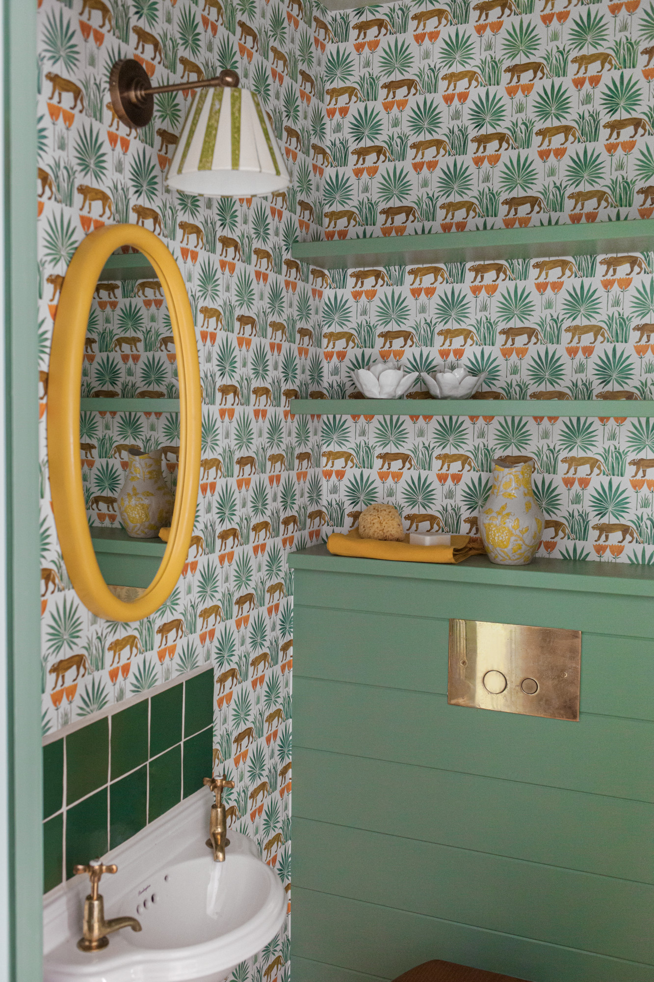
Naturally, it makes sense to take the largest surfaces of the room and employ the 70% in those areas. ‘The ceilings and walls should have similar color schemes with a bit of variation in hue, intensity and paint finishes,’ explains Sharon. ‘Next, I select rugs and drapery for the 20%, and I finalize my projects with accessories and art for 10%. If you don’t already have a palette in mind, I’d suggest collecting images that speak to you for inspiration. This can be done digitally or with the old-school approach of tearing out magazine images.’
Can the 70-20-10 rule be applied to elements other than color?
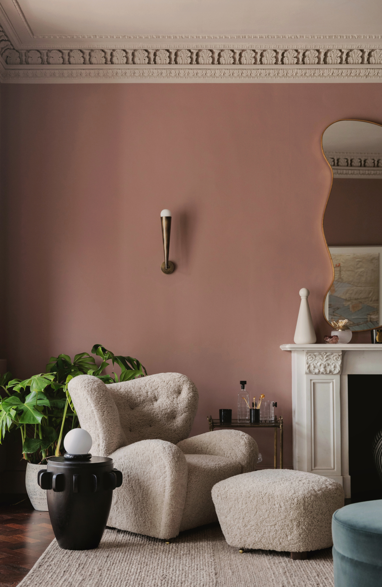
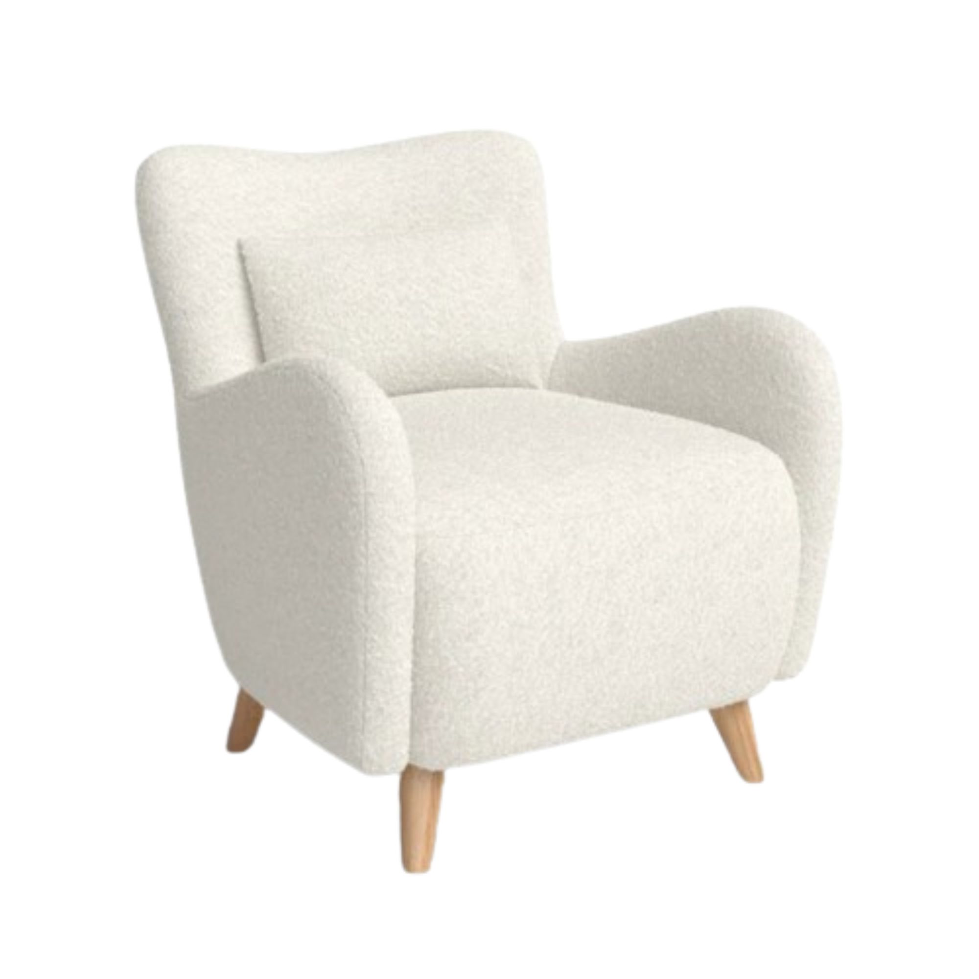
Price: Was $500, Now $450
Material: Solid wood and durable fabric
Size: 31.5'' H x 30'' W x 32.5'' D
‘Absolutely!’ says Sharon. ‘Texture design can be as important in telling the story of a space as color and it really reinforces the mood you’d like for a room. I’ve used fabrics and other materials for texture, but don’t overlook less traditional textural elements like tactile artworks, basket wall hangings or lighting fixtures.’
And don’t forget about flooring — that 70% can be wood floors, carpets and rugs or panels, for example — and consider introducing your 10% of texture through a statement furniture piece: ‘Recently boucle fabric has had a resurgence for good reason,' adds Sharon. 'Often it's used to fill that 10% via an accent chair or accessories.’
How can you use the 70-20-10 rule with neutrals colors?
A neutral color scheme can benefit from the 70-20-10 rule as much as a more vibrant one — in fact, we’d recommend using it as a guideline to make sure your palette doesn’t feel too safe or monotonous. ‘Don't think for a second that the 70-20-10 rule is just for bold, saturated hues,’ says Amanda. ‘Neutrals can be just as impactful when used strategically. Imagine a space with 70% warm, earthy tones, 20% crisp whites, and 10% rich, moody accents. It's a recipe for sophisticated drama.’
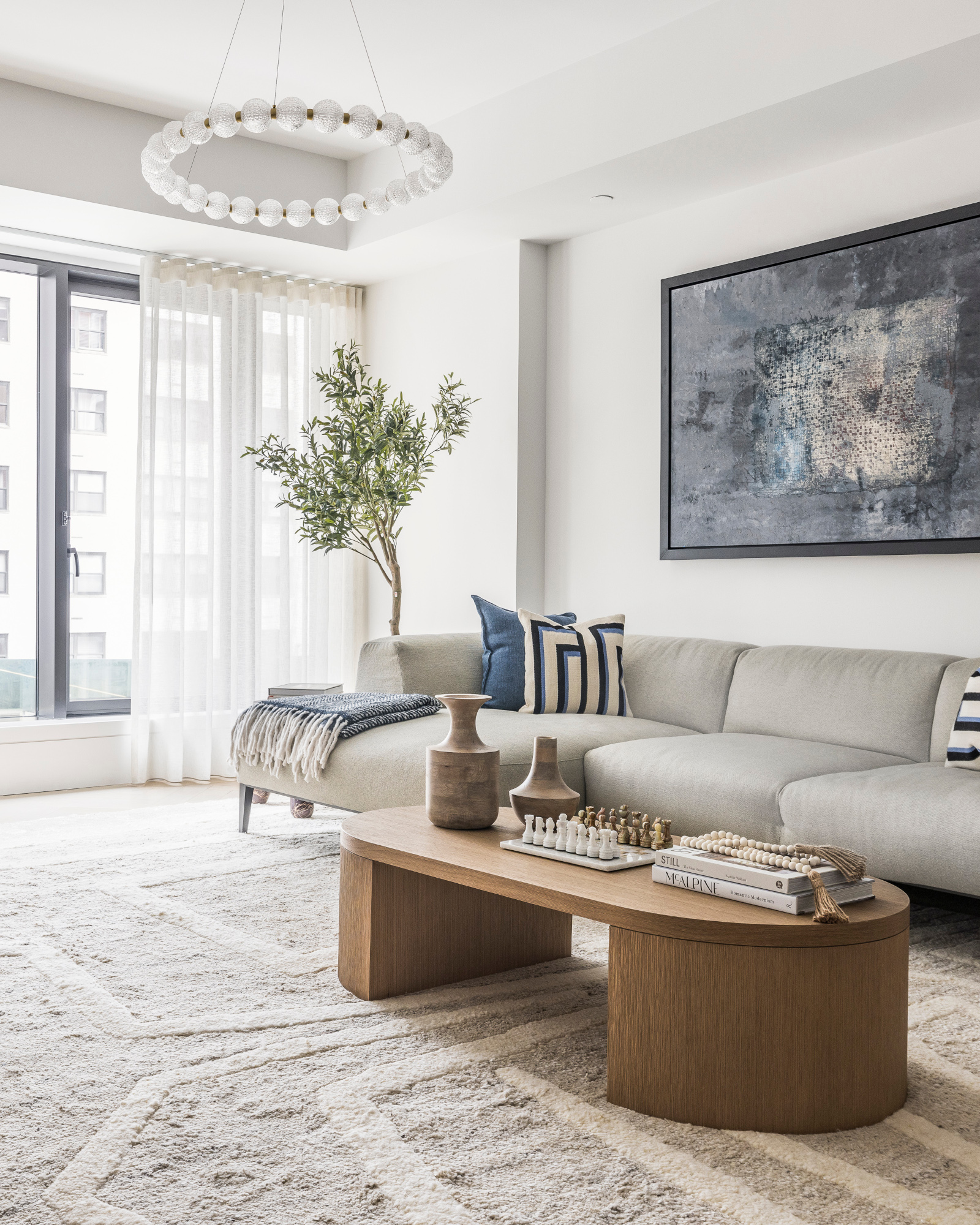
‘This rule creates depth and interest in monochromatic or neutral spaces by layering different textures from the same color family,’ adds Sharon. ‘In The Harper apartment (pictured below), I layered an off-white wool rug with a white boucle swivel and a light gray upholstered sofa. The sheer curtain adds a warm vibe to the room. The art and throw pillows bring a bit of color into the space.’
You can also use that 10% as a way to introduce something other than a neutral. ‘Right now we're designing a space for a client who really likes the organic modern aesthetic and there's a lot of travertine, sandstones, and mixed woods in the space — but as we were getting ready to style it for the photo shoot we noticed we were missing an element that says: we have a point of view,’ explains Hanin Smith of HIDE Studio Interiors. ‘After some brainstorming, we decided it needed a pop of lavender to break up the monotony of the neutral palette, while still achieving the vibe the client asked us to create. That little 10% of color or contrast is the difference between our design looking like it came from a catalog and one that actually has a soul.’
Be The First To Know
The Livingetc newsletters are your inside source for what’s shaping interiors now - and what’s next. Discover trend forecasts, smart style ideas, and curated shopping inspiration that brings design to life. Subscribe today and stay ahead of the curve.

Ellen is deputy editor of Livingetc magazine. She works with our fabulous art and production teams to publish the monthly print title, which features the most inspiring homes around the globe, interviews with leading designers, reporting on the hottest trends, and shopping edits of the best new pieces to refresh your space. Before Livingetc she was deputy editor at Real Homes, and has also written for titles including Homes & Gardens and Gardeningetc. Being surrounded by so much inspiration makes it tricky to decide what to do first in her own flat – a pretty nice problem to have, really. In her spare time, Ellen can be found pottering around in her balcony garden, reading her way through her overstacked bookshelf or planning her next holiday.
-
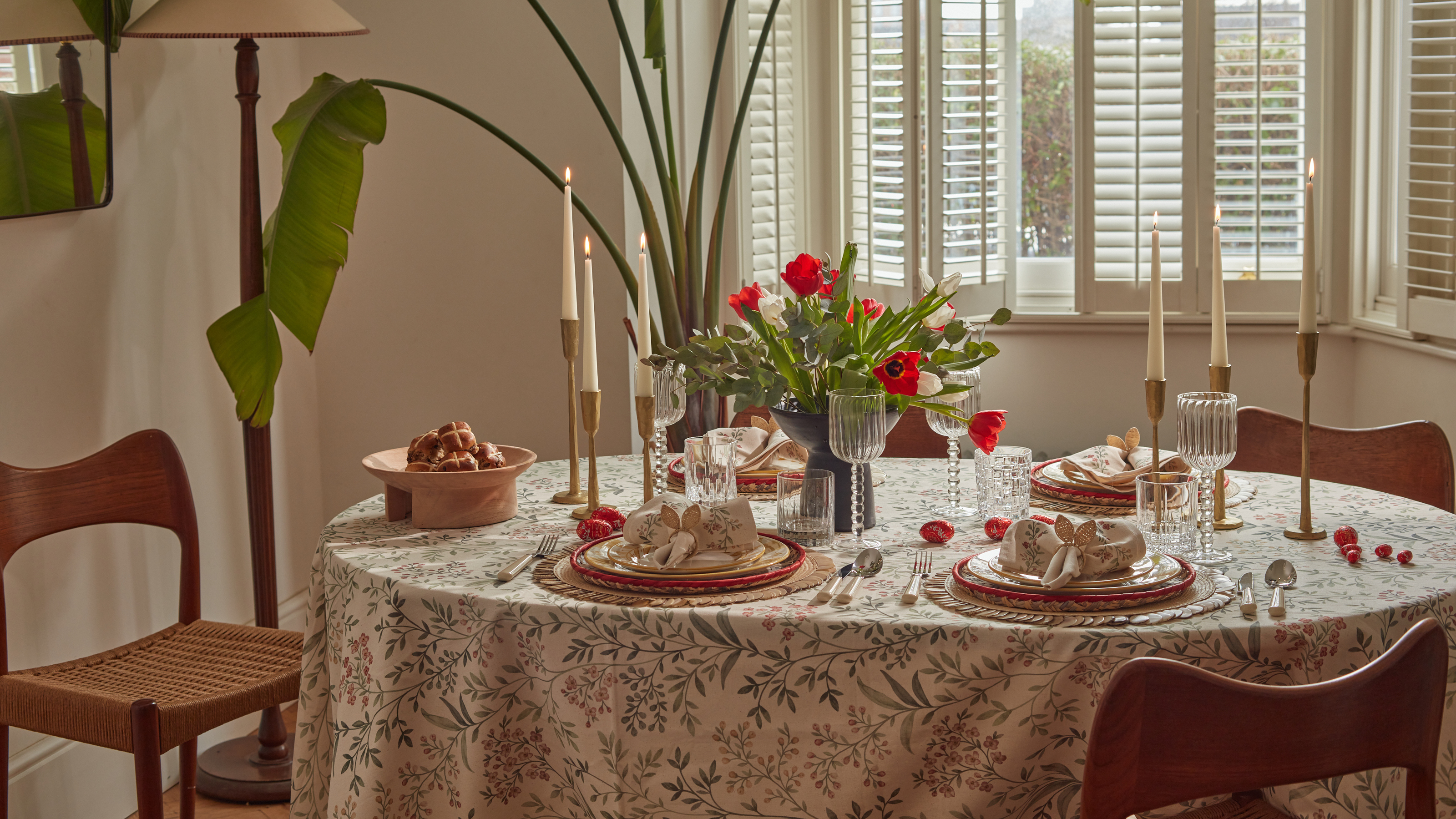 Bunny Ears, Be Gone — 7 Easter Table Styling Mistakes That Will Take Your Setting from Tawdry to Tasteful
From fussy floral displays that disrupt conversation to over-relying on tacky tropes, don't fall victim to these errors when decorating your Easter table
By Lilith Hudson
-
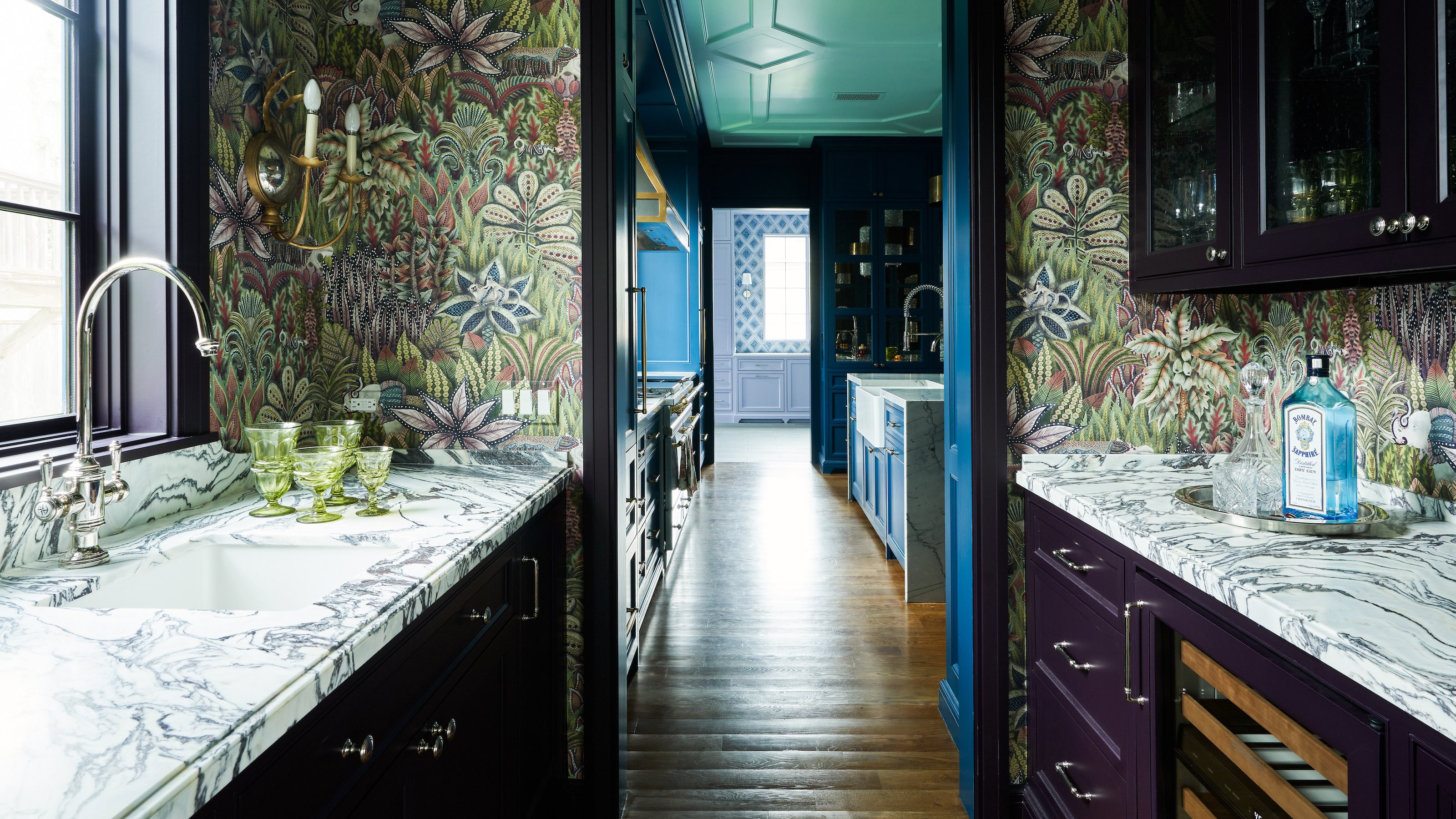 10 Hidden Kitchen Socket Ideas That Disguise Eyesores and Make Backsplashes Look More Minimalist
Discover innovative ways to hide those ugly outlets and claim a sleek, clutter-free space
By Linda Clayton
