

Color is one of the fastest ways to add character to your interiors. An unexpected dash of red here, a wall drenched in a moody green there. It can instantly elevate a space from simple to sophisticated. But part of why color is so intimidating is because of this drastic effect it has on a space — while some shades can expand a room , others engulf it.
Which brings us to advancing and receding colors. What are they? What do they do to our homes? Well, as their names suggest, when it comes to decorating with color, advancing colors are warm tones (think yellows and reds) that reach forward or pop in a room, while receding colors are typically cooler hues (like blues and greens) that tend to sit comfortably in the background. Strike the right balance? You get perfection.
To understand advancing and receding colors better, I spoke with Livingetc's color expert — and whiz on all things color theory — Amy Moorea Wong, to discover how best to incorporate them in a space. Here's what she told me.
What are Advancing Colors?

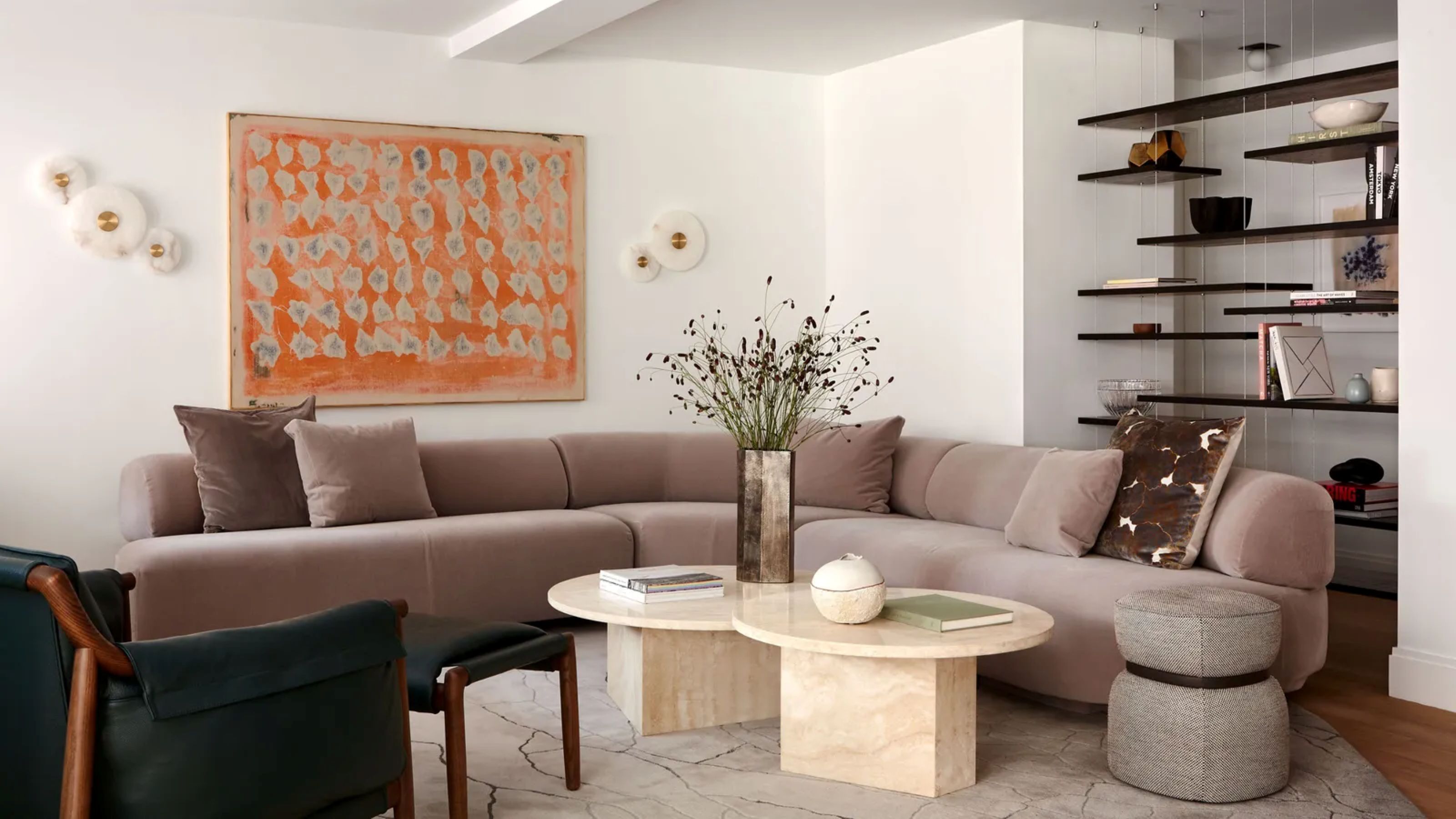
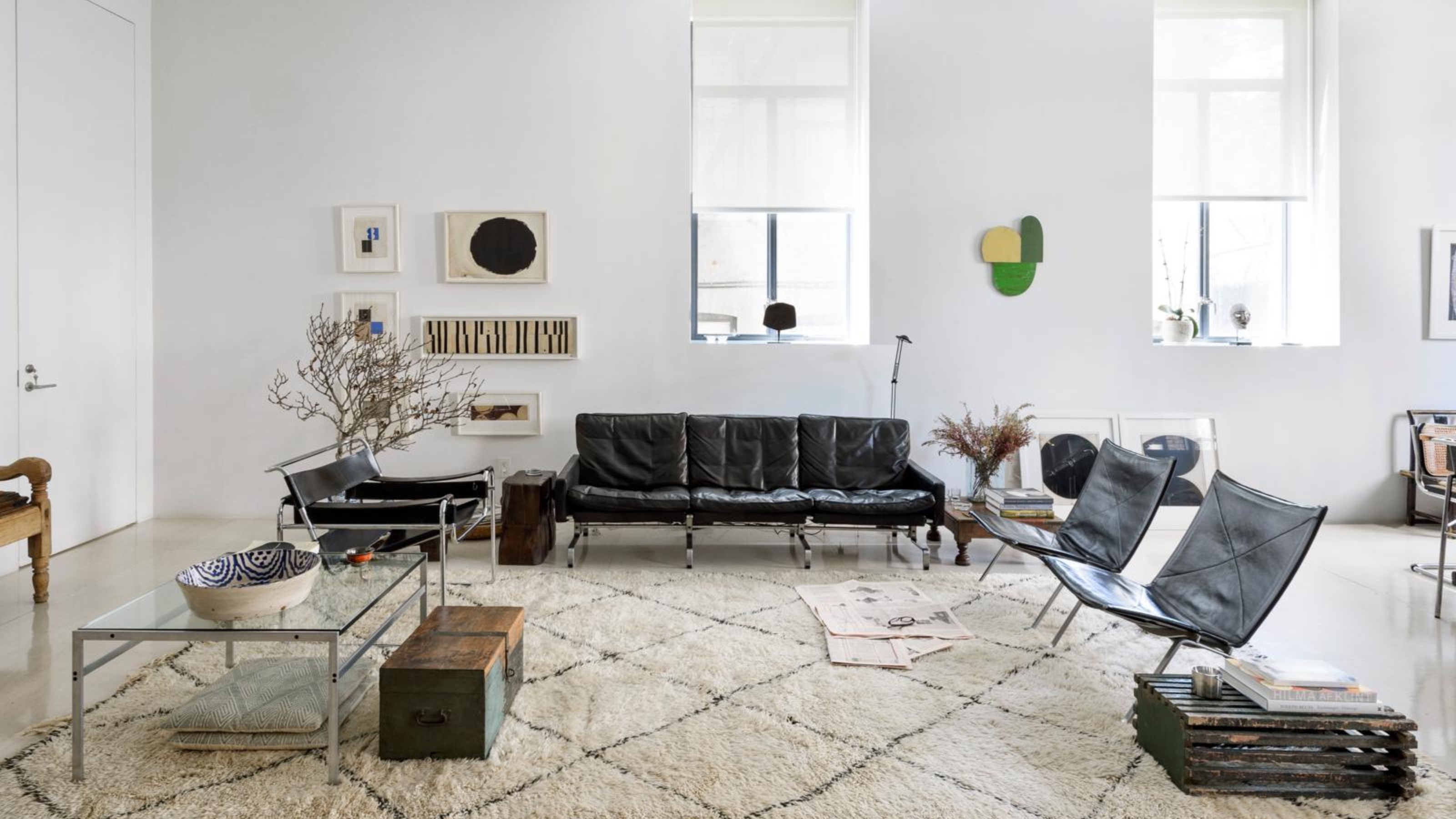
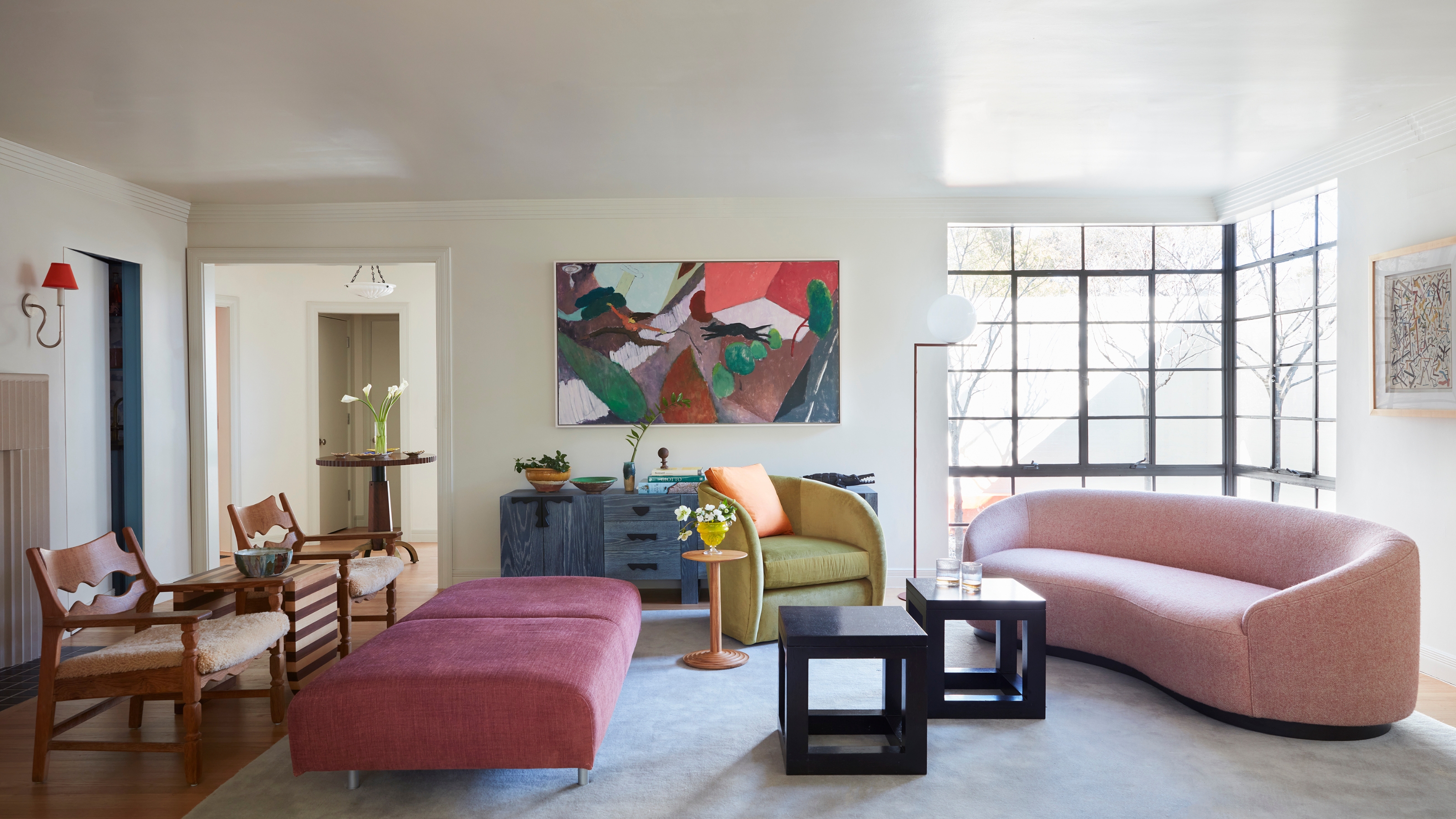
This living room is full of warm, vibrant, advancing colors, making the space feel energetic yet cozy.
"Advancing colors do what you’d expect from their assertive name — they appear to move towards you, lean in for attention, and sit at the front of what you can see," explains Amy Moorea Wong.
The shades that tick this box are the warm tones on the color wheel, such as red, orange, and yellow. "These colors have longer wavelengths which our eyes interpret as moving forwards," says Amy.
They create a sense of vibrancy and energy, making an object or area stand out, and feel louder and more prominent. However, as they come forward, they can also make a space feel closer, so you may want to avoid using a warm-dominate palette in an already small or restricted space.
On the other hand, advancing colors are perfect for making an open layout feel cozier or creating a warm, cocooning environment in a space such as a bedroom.

Amy Moorea Wong is a color authority and contemporary interior design writer who has specialized in all things decorating for over a decade. Alongside being Livingetc's color expert, Amy has also written a book, Kaleidoscope: Modern Homes in Every Colour, and works with several other notable interior publications. Her eye for color is nuanced, informed, and strikingly unique.

Price: £5/sample pot

Price: £5/sample pot

Price: £5.50/sample pot
What Are Receding Colors?

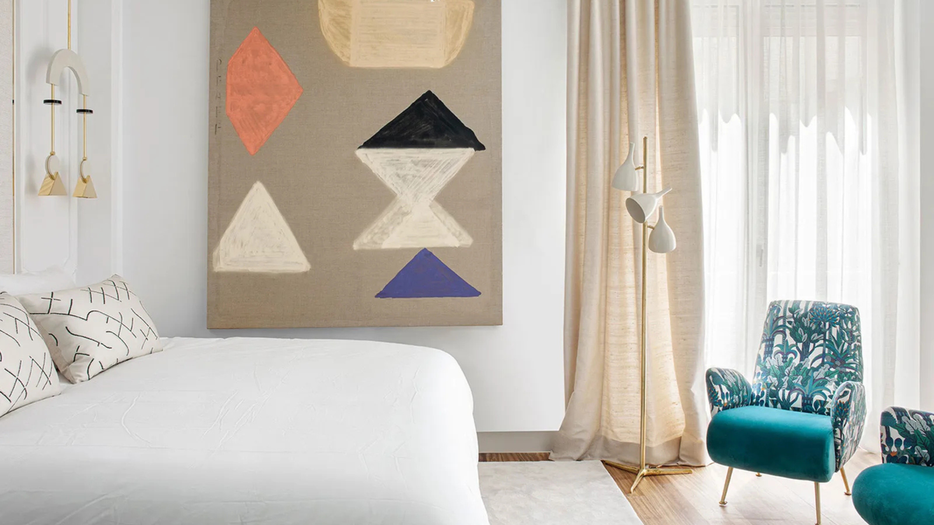
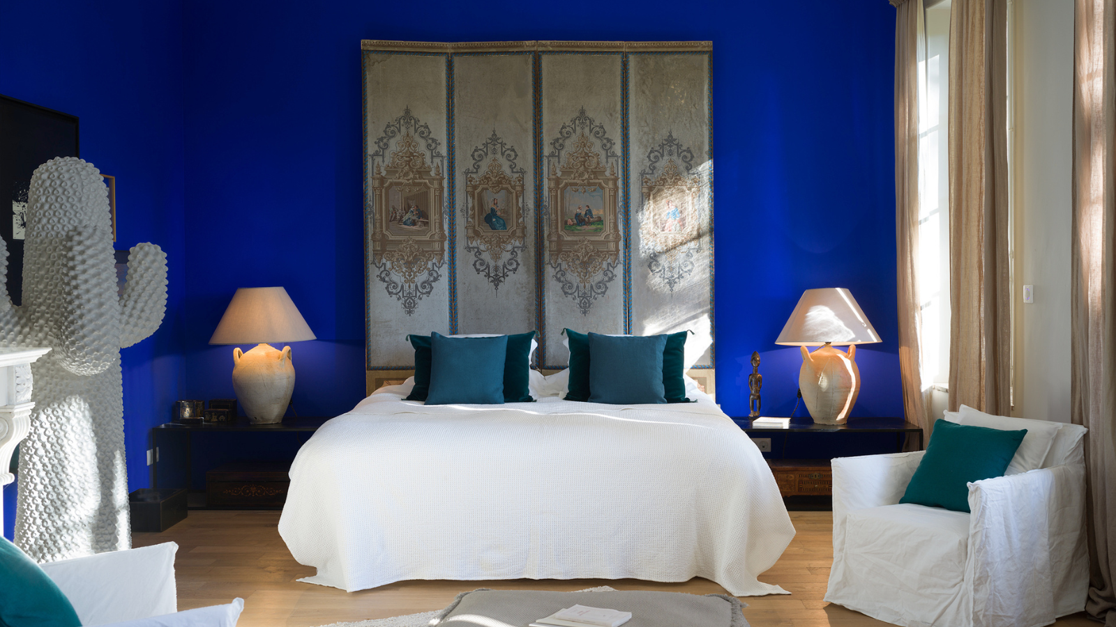
The receding colors in this bedroom make the space feel calm and airy — the perfect palette for turning your bedroom into a sleep sanctuary.
"Receding colors are those that don’t want any focus on them, that ease themselves quietly into the background," explains Amy. Classically this is the cold colors — blues, green and violets. "These colors have shorter wavelengths which the eye places at the back of what it’s looking at," says Amy.
Receding colors feel calm and unobtrusive, and they allow other shades to take center stage. "As they appear to move away from you, they create (the illusion of) depth, making objects or areas seem further away and fostering a sense of spaciousness," says Amy.
So a room full of receding colors will sit serenely with the eye, often feel more peaceful, and will even be a good base palette to work from.
Receding colors are a great paint trick for low ceilings, or if you have a small layout, they can make the space feel more expansive. Just be sure to balance the values (darkness or lightness) appropriately.

Price: £5.95/sample pot

Price: £5.50/sample pot

Price: £5.95/sample pot
Working with Advancing and Receding Colors in Interiors


Though it may seem like a lot to digest, when it comes to decorating your home, "placing an advancing and receding color together is actually quite fun," says Amy.
Sitting alongside each other, the duo forms an illusion; the warmer color seems to slowly loom forward while the cold tone shrinks back. "Adding accents of opposing colors creates visual balance in interior design, tempering the effects of the leading tone and making a space feel harmonious while also somehow dynamic," adds Amy.
For example, a room color-drenched in a cool-toned deep olive green or navy blue (a receding color) will create the illusion of an expansive space that you can then accentuate with contrasting orange or terracotta (advancing) accents.
Alternatively, if you choose to paint a room in a warm color scheme, brick red, Amy says, "I’d go for big pieces of (receding) deep greens and blues for depth, contrast, and richness such as a chunky chair or sofa."
Understanding the relationship between advancing and receding colors is all about context.
"Advancing and receding colors come down to how they’re placed and what they’re contrasted against," says Amy. "As you’d expect the advancing/receding contrast is heightened and more noticeable if the colors are placed directly alongside each other, whereas if they’re spread out or layered with neutrals, everything softens."
As you create a color palette, watch the colors come together and mingle with one another. Soon you will figure out what colors work naturally with your eye and design style.

-
 Sateen vs Percale Sheets — What's the Difference, and Which Are Better?
Who would have thought a simple weave pattern could make all the difference to your sleep
-
 I Asked Interior Designers to Share the Worst Design Trends They've Seen on Social Media — And What They Want to See Instead
Just because something is trending, doesn't mean it's tasteful — from dupe-culture to OTT lighting, here's what designers hate seeing in homes


-
 Amethyst, Heather, Pansy, Plum — Turns Out Decorating With Purple Opens You Up to a World of Possibilities
Purple certainly isn't a color for the faint hearted, it's a shade that can smell your fear. Here's how to conquer it through your interiors
-
 Here's Why Decorating With Mustard Yellow Helps Fill Your Interiors With a Sense of "Confident Calm"
There is so much more to decorating with this turmeric-tinted sauce-wiggled-on-a-hotdog not-quite-yellow shade than meets the eye
-
 5 Problems With Painting Your Walls White That No-One Ever Talks About (Until Now)
White is the easiest neutral to work with...right? Interior designers explain why this shade is actually more complex than it may seem
-
 5 Mistakes That Are Making the Blue Details in Your Room Feel Old-Fashioned — And How to Rectify Them
Blue is a timeless shade, no doubt, but use it in the wrong space or in the wrong way, and it can make a space feel, well... a bit blue
-
 5 of the Best Navy Blue Paint Colors That Designers Love — And How to Use Them
Navy blue has timeless appeal and can feel both modern yet classic, but what are the designers' favorite paints?
-
 Should Your Carpet Be A Darker Color Than Your Walls? How to Make This Bold Look Work
Not every room can get away with a carpet that is darker than the walls; Designers share when and where this combination works best
-
 What Actually Is Yves Klein Blue? A Short History of This Iconic Color, and How to Decorate With It
Explore “the most perfect expression of blue” and how to free this pigment in your home
-
 Do Pink and Green Go Together in Interiors? A Professional Color Consultant's Verdict
How to make pink and green color combinations work for more contemporary interior schemes


