
When it comes to our homes, we often praise certain interior styles for their calming and uplifting qualities. But what about the interior choices that have the opposite effect — that can make us feel agitated, or even angry? The short answer is color. "While some angry colors can stir up frustration or feel draining, others have the power to uplift, energize, and inspire us,” explains Karen Haller, color psychology expert and author of The Little Book of Colour.
In fact, according to color psychology in interior design, it's the one factor that can have the greatest influence over the mood in a space. “The beauty of color is that it’s not just about what we see,” continues Karen. “It’s how it influences how we think, feel, and most importantly, behave.”
To find out more about the psychological power of angry colors, we spoke to design experts about the shades that feel most frustrating — and which soothing hues to use instead. Here's what they shared.
1. Cherry Red

DO INSTEAD: Layer different shades of red, including darker-toned "juicy" shades.
Unsurprisingly perhaps, many of the shades on our list are reds. According to color psychology, red is the shade most synonymous with anger, evidenced in our everyday language. “It’s no coincidence we say, ‘seeing red’ or being ‘red with anger’,” says Karen Haller.
But which shades of red are most infuriating? “A shade of bright red can make a room feel angry and should be avoided if you're aiming for a calm or peaceful atmosphere,” says interior designer Róisín Lafferty. “Intense, bold reds, such as cherry red, can stimulate strong emotions and even raise energy levels.”
Importantly, not all reds are aggravating. “Different shades of red can indeed create the opposite effect and, when used correctly, can elevate a space,” continues Róisín. “Darker, richer reds such as burgundy, wine, or rust bring a sense of sophistication, warmth, and passion without the overwhelming intensity. These deeper tones can create a cozy, inviting atmosphere and even enhance creativity and focus when used in moderation.”
Another trick when decorating with red is to combine varying shades. “On a recent hotel project, our team designed a boldly patterned red carpet for the pre-function area of the event spaces,” explains Jessica McQueen, senior designer at ROAM. “Rather than using a bright red throughout the pattern, we used a variety of dark-toned juicy red shades, like deep burgundy, highlighted with lighter tones, such as pomegranate, to add depth to the shading.”
TRY INSTEAD

Price: £5.95/sample
2. Crimson

DO INSTEAD: You can still use 'angry' colors like bright crimson red, just in smaller amounts.
A pinker red than cherry red, but equally as bold, crimson is another potentially 'angry' shade of red to be wary of, according to Róisín Lafferty.
Color psychology explains that we can actually have a physical response to certain reds. “It’s hot, exciting and stimulating,” writes Professor Vijaya Lakshmi V in her paper, Psychological Effects of Colour in the Journal of Biotechnology & Bioinformatics Research. “The effect of red color is physical. Although not technically the most visible, it has the property of appearing to be nearer than it is and therefore it grabs our attention first. Hence, it is effective in traffic lights all over the world.”
The Professor Vijaya Lakshmi V recommends using bright reds like crimson only in a limited area of a space to “add life and cheer”. Take the 'unexpected red theory' as a guide. We can see this idea at play in the home office shown above, designed by Róisín Lafferty. Here, the lively red of the cabinetry is just one feature of the room, tempered by the white wall and statement artwork.
TRY INSTEAD

Price: £5.95/sample
3. Red Orange

DO INSTEAD: Balance more angry colors with soothing shades of green.
Red’s next-door-neighbour on the color wheel — orange — is another potentially angry color when used in the wrong hue. Sharing qualities with the reds above, red-orange in particular is a shade to approach with caution. However, one designer has proved that reddish-orange doesn’t have to be an angry color, if you can create balance with the right shade of green.
Maye Ruiz, founder of Maye Interiors, explains how. “Red, despite its reputation for being an ‘aggressive’ color, is one that I truly love,” she says. “During the height of the 2020 pandemic, I lived in an apartment painted in Bloody Mary Red, and far from feeling overwhelming, it was actually a warm and inviting space.”
She continues, “I believe the key isn’t the red itself, but how and with what you pair it. A great example is Carmín, our most recent bar project, where the ceiling is painted in a fiery red, an Aura Orange — a more orange-toned hue than the Bloody Mary (PANTONE 1807C) of my previous apartment. However, the surrounding walls and floors are in a deep, calming Spruce stone green, creating a balanced and harmonious atmosphere. This combination proves that red can be bold and immersive without feeling aggressive.”
Green is opposite red on the color wheel, and also has the contrasting effect on us psychologically. It is “neutral in its emotional effect, tending to be more passive than active,” writes Professor Lakshmi V. This makes decorating with green the perfect choice to use alongside angry colors.
TRY INSTEAD

Price: £5.95/sample
4. Violet

DO INSTEAD: Choose a deeper, more saturated chocolate-y shade of purple.
Reddish tones might be among the most furious angry colors to avoid, but they are not the only ones that can elicit feelings of rage. “If I had to choose it would be a violet color that makes me feel angry,” says interior designer Garrow Kedigian. “Instead of violet, I would prefer a deeper more saturated tone such as an eggplant color (Benjamin Moore's Caponata is a great one). It's really more chocolate brown, with a hint of eggplant purples.”
And Garrow is not alone in his feelings. “Some violets project tension and depression,” says Professor Lakshmi V. However, she also notes that violet can be “highly introvertive” and encourage “deep contemplation, or meditation” — quite the opposite of an angry outburst.
“With most colors it is less about the color and more about the tone,” explains Róisín Lafferty. “We are always looking for our interiors to capture a sense of depth, richness, and atmosphere, irrespective of color. This is especially true with red and blue. These can be too saturated, sharp, and strong or cold and icy if the tone is wrong.”
Garrow's use of Benjamin Moore's Caponata is a great example of getting the tone just right — the living room shown above feels cozy and quietly contemplative.
TRY INSTEAD

Price: £5.95/sample
5. True Black

DO INSTEAD: Opt for a dark charcoal gray rather than a true black.
True black is another potentially angry color with many negative connotations, and can be menacing when used in abundance. “Black can feel very stark, alienating, and angry in a space,” says interior designer Andrea Goldman. “The best way to handle the need for a dark palette without feeling too stark is to introduce just a touch of charcoal gray, like that found in Benjamin Moore's Raccoon Fur.”
In Andrea's design above, the charcoal gray walls soften the black framework to create a gentler look. Rather than menacing, the space feels alluringly moody. Indeed, black can also suggest “efficiency, substance, mystery, wisdom, or sophistication,” writes Professor Lakshmi V, so even black tones can have a positive psychological effect, it's just about where and how you chose to decorate with black accents.
TRY INSTEAD

Price: £5.95/sample
FAQs
What is the angriest color?
“In colour psychology, red is the colour linked to anger and frustration,” says Karen Haller. “Red is intense, stimulating, and can even feel aggressive in certain contexts. When it’s too harsh or overpowering, it can create a sense of tension, almost like an argument unfolding right in front of us.”
The biggest lesson to takeaway is that all of these angry colors can also evoke positive emptions when used in different hues. So if you're deeply attached to a somewhat aggressive shade, using it alongside softer, more joyful colors can result in a space that's visually and emotionally harmonious.
-
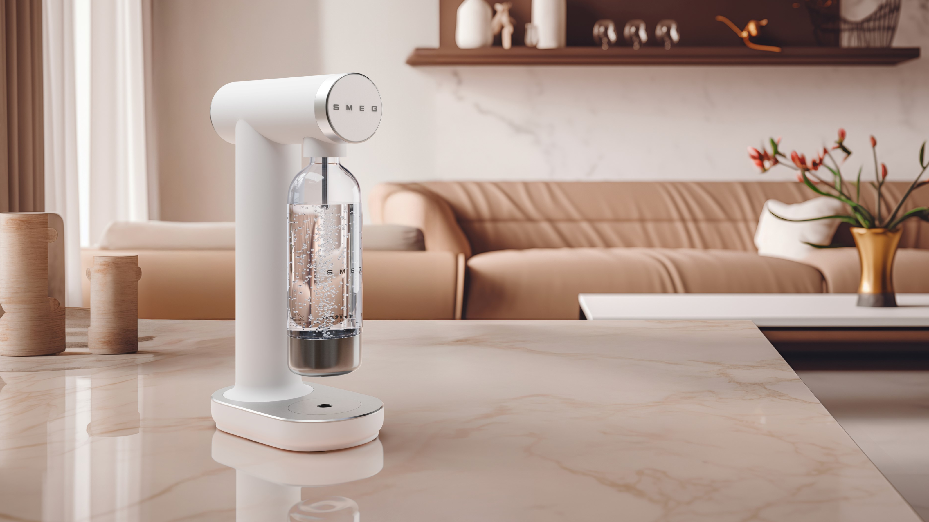 I Got to Test Out Smeg's New Soda Maker — And It's the Perfect Summertime Hosting Accessory
This sparkling launch from Smeg will make you the most popular host of the season, for cocktail parties or wellness mornings alike
-
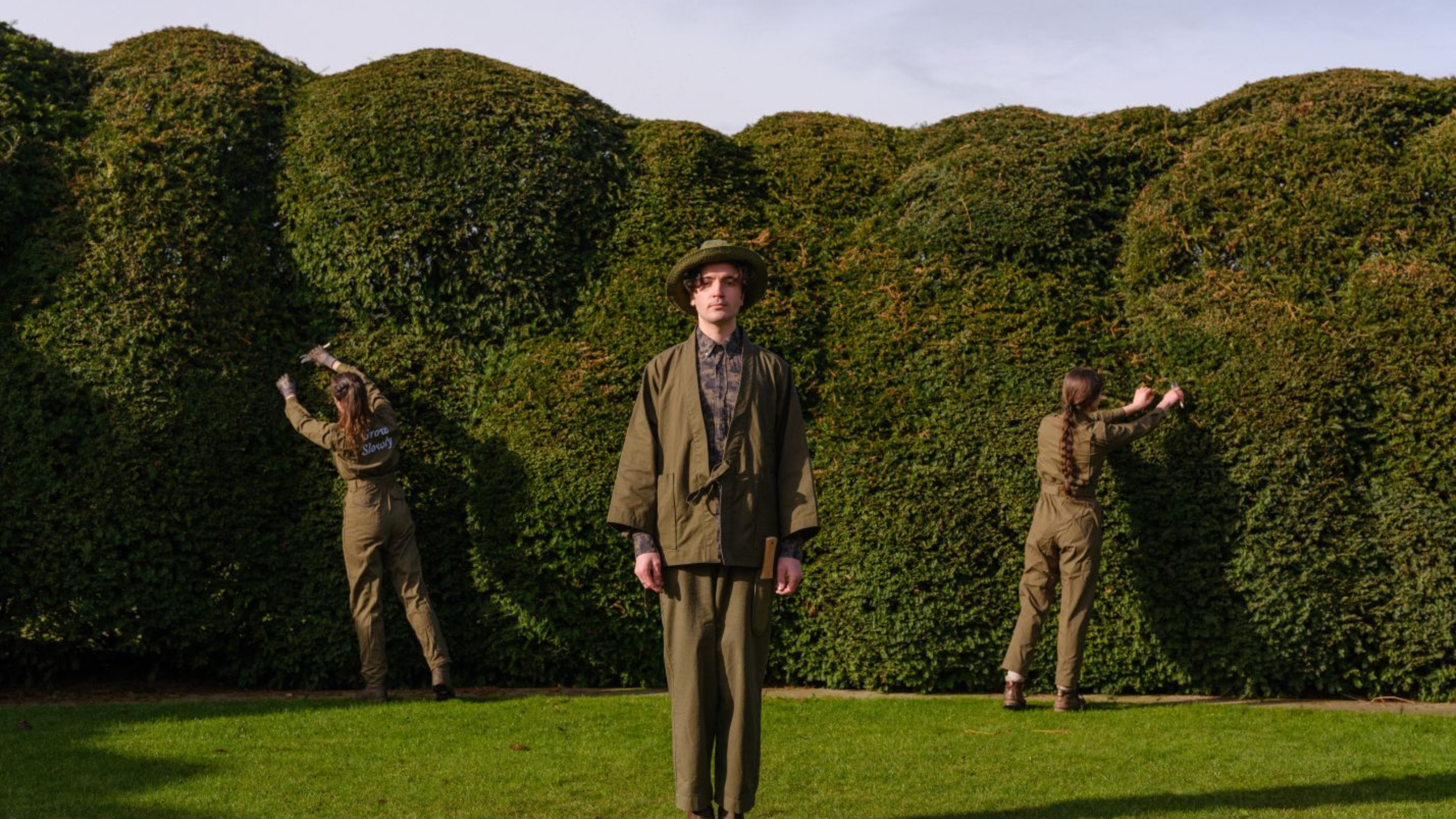 I Visited The Newt Hotel and Tested My Hand At Pruning With the Finest Japanese Tools Crafted By Niwaki
This gardening technique is the secret to the most eye-catching landscapes that last throughout the year


-
 Do Red and Yellow Go Together? Designers Share How to Make This Punchy Pairing Feel Soothing Rather Than Intense
These primary colors might seem like they'd clash, but get the levels right, and designers say this combination can look remarkably classic
-
 5 Butter Yellow Paints That Designers Swear By — So You Can Get This Trending Color on Your Walls With Confidence
Butter yellow is everywhere, but picking a paint shade can be a big commitment. To help, we asked designers to share their favorite shades
-
 What Does the Color Yellow Mean in Interior Design? A Color and Design Psychology Expert Explains
Whether you love or hate it, yellow always seems to elicit a strong reaction from people — here, we explain why
-
 Should a Living Room Be Painted Dark or Light? We Asked Design Experts to Settle The Age-Old Debate
The color of your living room can completely shift the mood of your entire home, so the question remains: should you go light or dark...?
-
 I'm Sorry, But You Need to Know About 'Advancing and Receding Colors' If You Want to Get Your Home's Decorating Scheme Right
While some colors tend to pop and reach forward in a room, others draw back. Here, a color expert helps define these palettes and how to use them
-
 Amethyst, Heather, Pansy, Plum — Turns Out Decorating With Purple Opens You Up to a World of Possibilities
Purple certainly isn't a color for the faint hearted, it's a shade that can smell your fear. Here's how to conquer it through your interiors
-
 Here's Why Decorating With Mustard Yellow Helps Fill Your Interiors With a Sense of "Confident Calm"
There is so much more to decorating with this turmeric-tinted sauce-wiggled-on-a-hotdog not-quite-yellow shade than meets the eye
-
 5 Problems With Painting Your Walls White That No-One Ever Talks About (Until Now)
White is the easiest neutral to work with...right? Interior designers explain why this shade is actually more complex than it may seem


