Should I Put Up a Ceiling Medallion? Our Experts Give a Verdict on Whether This "Elegant" Finish is in Style
Are ceiling medallions in style? We asked interior designers how they'd use them in their projects now for a modern look
The Livingetc newsletters are your inside source for what’s shaping interiors now - and what’s next. Discover trend forecasts, smart style ideas, and curated shopping inspiration that brings design to life. Subscribe today and stay ahead of the curve.
You are now subscribed
Your newsletter sign-up was successful
This storied decorative feature has interesting beginnings, they were originally designed to conceal the rings of soot that would form on ceilings as by-products of pre-electric lighting – think gas lamps and candle-lit chandeliers. While the first iterations of ceiling medallions emerged in the 17th century alongside Baroque interiors, their decadence and elaborate detailing were cemented in the Rococo, Regency, and Victorian styles that dominated much of the 18th and 19th centuries.
Characterized by their rings of molded plaster, sculptors would create bespoke medallions for clients directly onto the surface until mass-produced plaster molds made the feature more accessible. Today, the ceiling medallion still sings with the drama and detail of its beginnings, creating a wonderful contrast to more contemporary furnishings that it reigns over. To take a closer look into its enduring appeal, we’ve spoken to a range of interior designers to explore the versatility of this ceiling decorating idea and how it can work to elevate your interior.
1. ADD CHARACTER TO YOUR INTERIOR
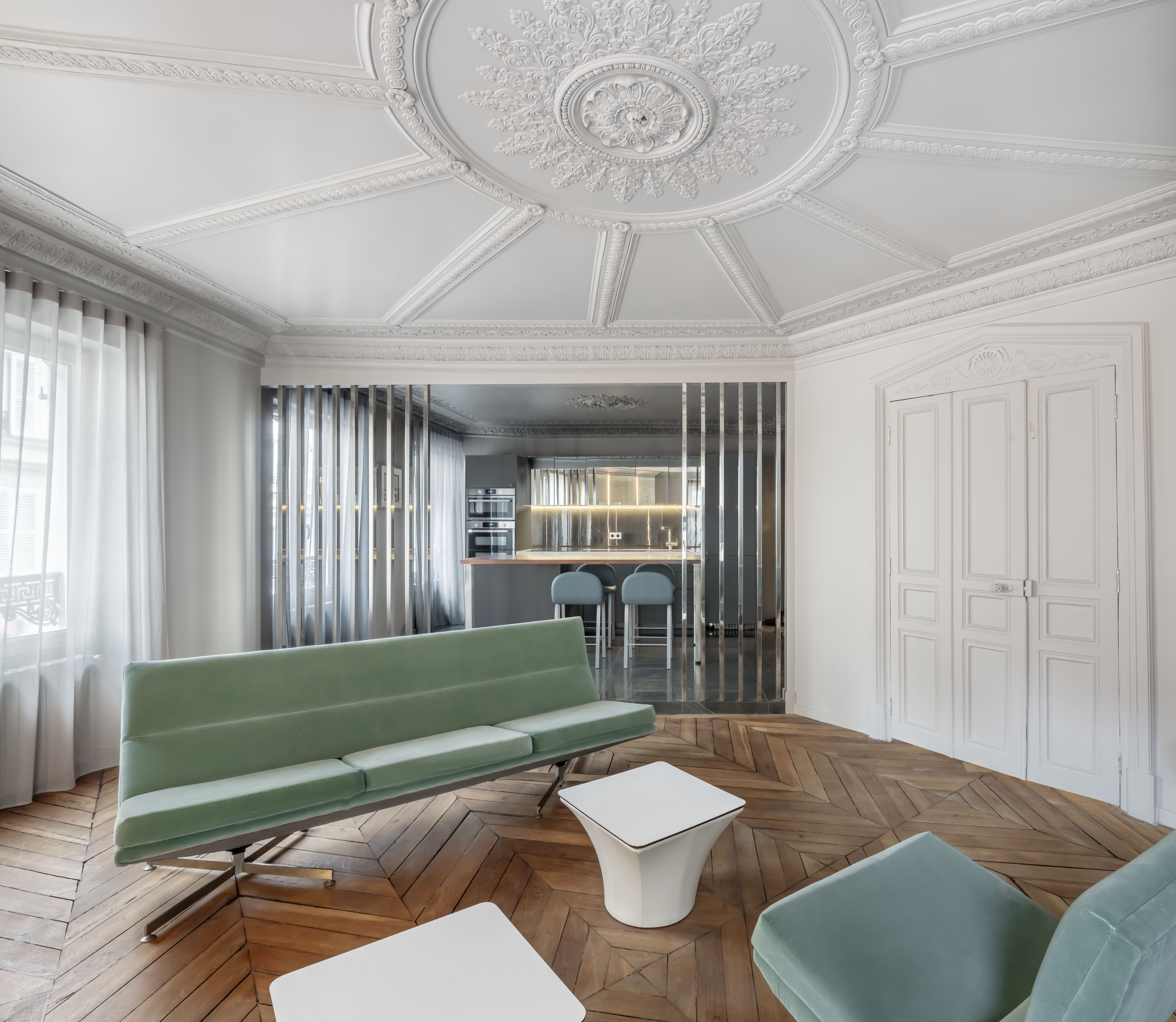
This Parisian apartment designed by Régis Botta showcases how a ceiling medallion is a perfect springboard to create a strong ceiling feature. The molded panels spread through the room and create the illusion of a larger space.
Article continues belowBy painting the ceiling and walls the same color in this crisp shade of white, the medallion doesn’t fight the contemporary kitchen, sofa, or tables but instead complements their clean lines and angular features. Visual balance is achieved by keeping the furnishings minimal and opting for a muted and cooling color palette. 'The lasting appeal of ceiling medallions stems from their ability to combine historical elegance with modern versatility, providing both aesthetic and functional advantages. Their ongoing presence in interior design highlights their timeless charm and adaptability to evolving trends and preferences,' says Régis Botta, Parisian architect and interior designer.
2. ELEVATE YOUR DESIGN WITH AN UNMATCHED ELEGANCE

For those concerned that a ceiling medallion may overpower their interior, Sydney-based interior designer Jillian Dinkel’s Tarella Terrace project showcases how medallions can blend femininity and calm with glamor. The softly muted pink living room with soothing caramel tones are given added depth and elegance with the detailed ceiling medallion that sits in the center of the room. The designer herself advocates for the transformative properties of ceiling medallions.
'A decorative ceiling medallion is an essential element in the decoration of formal rooms- the jewel in the crown that pulls the architectural detailing together,' reveals interior designer Jillian Dinkel.
3. CENTER YOUR SPACE WITH A CEILING MEDALLION
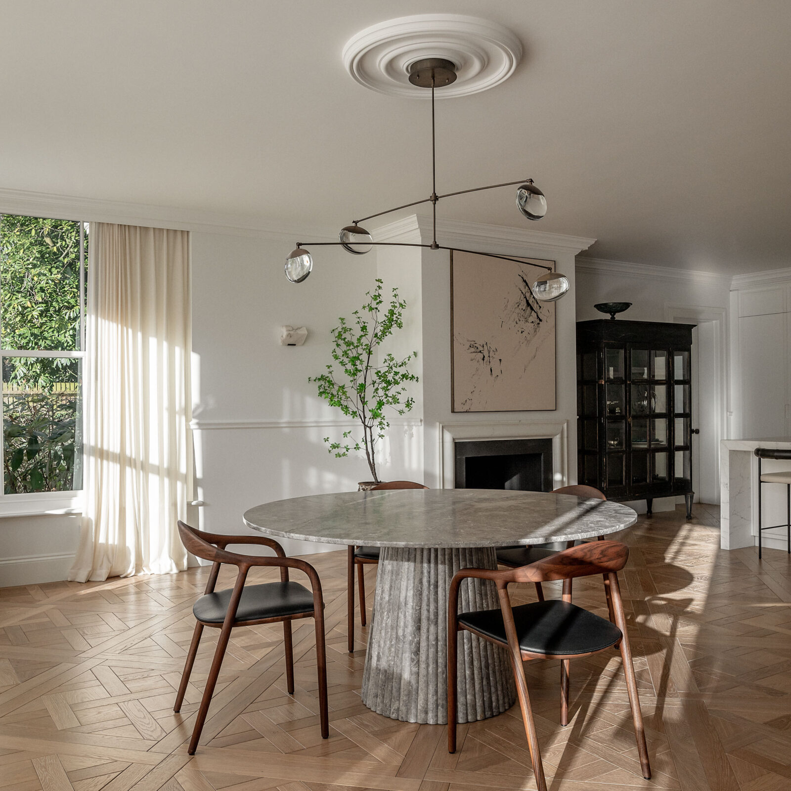
Whilst we no longer require ceiling medallions to hide soot, they can also prove to be incredibly effective tools when zoning a larger room or wanting to create a focal point within your interior.
The Livingetc newsletters are your inside source for what’s shaping interiors now - and what’s next. Discover trend forecasts, smart style ideas, and curated shopping inspiration that brings design to life. Subscribe today and stay ahead of the curve.
In their Surrey project, London-based design studio Covet Noir showcases how a minimal ceiling medallion can anchor a contemporary lighting fixture and create a designated space for dining within an open-plan living space. The medallion feels minimal thanks to its refined plaster crown molding. It also honors the other architectural features within the room, from the fireplace to the railing that runs across the walls. 'We love adding architectural detailing to our projects & ceiling roses are one of our favorite elements to incorporate. The kitchen and dining space of this project was vast, but with a fairly modest ceiling height, so we knew if we installed the gorgeous Ochre Gaia pendant directly to the ceiling it would draw attention to the expanse of ceiling. By adding a ceiling rose the space looks finished and balances out the proportions of the elegant pendant below,' share founders, Maria Lindgren & Adele Lonergan.
4. CELEBRATE CONTRAST THROUGH COLOR

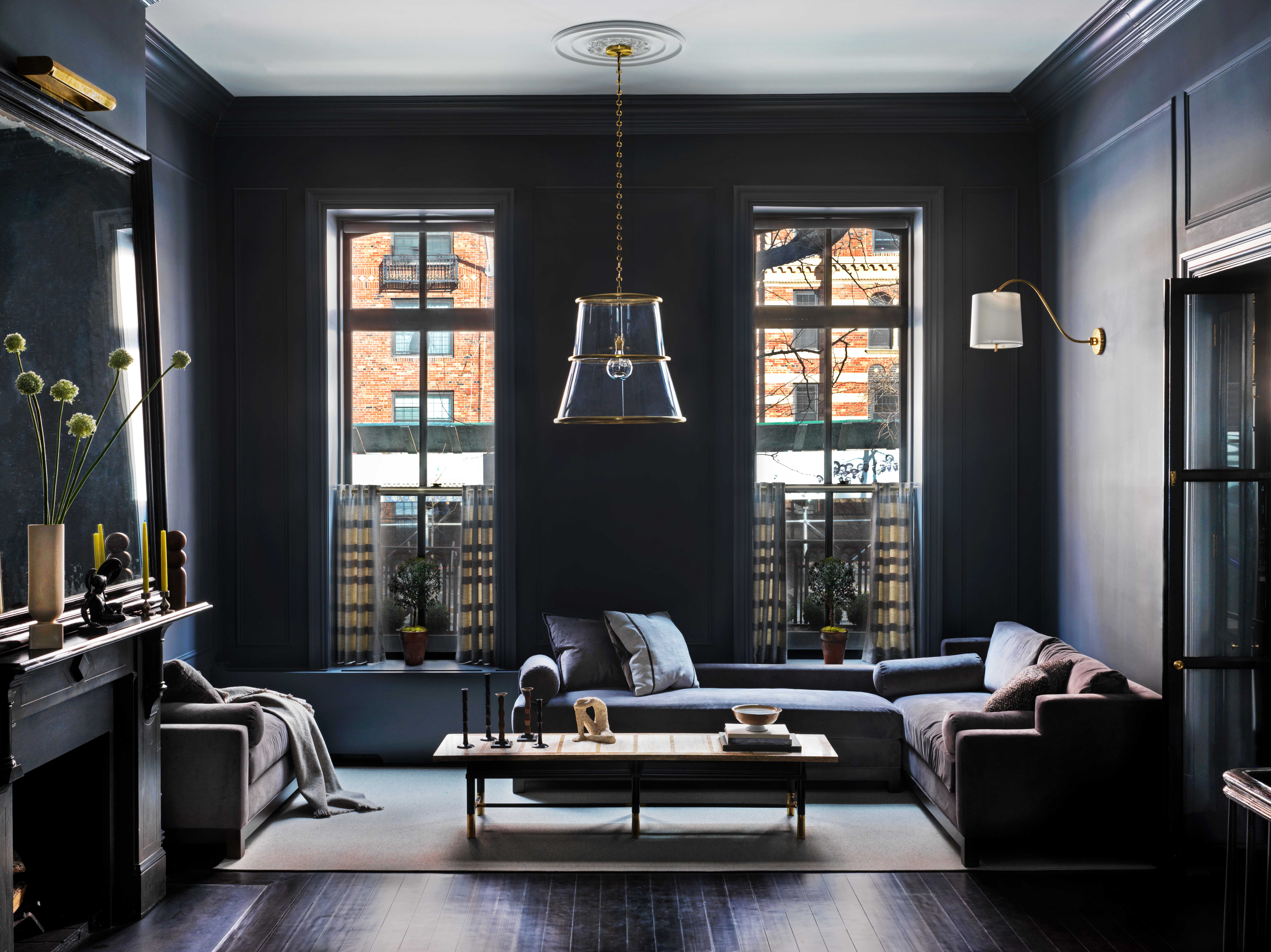
It’s important to remember that your ceiling medallion is just one part of the puzzle, it works in tandem with your choice of lighting, furniture, and color palette. Located in one of New-York’s most desirable districts, Manhattan, this Chelsea Maisonette was designed by local designer, Nannette Brown. It demonstrates expert use of contrasting colors, with an original medallion at the center point of a light-reflecting and calm-inducing ceiling.
'The mission for this maisonette was to maintain its original detail while making the larger reception darker, rich in tone, and handsome for our client (who’s a bachelor),' reveals American interior designer Nannette Brown. 'He’s a noted architectural photographer and really wanted a contrast as the backdrop for his art—this opposed to typical white gallery walls. He envisioned his photography in a more masculine space, standing proud on darker walls. The lightness of the ceiling was meant to lighten the room for contrast and increase its sense of volume.'
She highlights the treasure-like properties of original features but also explains how they can be modernized and celebrated today, whether that be through your choice of color or lighting. 'The medallion was original to the maisonette and the goal was/is always to salvage and honor the architectural integrity of a space—it also served as a terrific (and classic) contrast to the very modern Lucite pendant that was vintage 1970’s,' adds Brown.
So are ceiling medallions still in style?
Reflecting on the insight from these designers, it's clear that, for the right property, a ceiling medallion is still a good option — but here's what we think the secret is to getting it right.
Pick the right style for the right home — there are all kinds of ceiling medallions you can choose, from super ornate, historic-inspired designs, to some that feel modern and minimalist for a contemporary space. Pitching it right, with the right one for your space, is half the battle in making it feel like a natural fit.
Nailing the scale — an enormous expanse of ceiling with a tiny ceiling medallion will really draw attention to its inadequacy. When in doubt, go larger than you think you need.
Know when you don't need one — the ceiling light is less and less a 'must-have' for the modern home, and in contemporary spaces, ceiling lights when they are used are more minimalist and streamlined. Though a ceiling medallion can feel like a grounding element for a ceiling light, they're not an absolute necessity, so for sleeker, less visually cluttered spaces, feel confident that you don't have to have one to make your scheme work.
Writer and design expert Faaizah Shah is the founder of The Interiors Consultancy. She has worked with designers such as Staffan Tollgard and design houses such as Sanderson to help them understand and communicate their narratives. She is known for crafting engaging stories and imaginative content, and understanding great decor from her years alongside some of the best creatives in the industry. She is also a contributor to Livingetc.
