Are shutters outdated? Here’s what interior designers say, and how they're decorating for 2023 and beyond
Is it time to close the curtain on shutters? We asked interior designers to weigh in and offer their advice on how to create the most modern and on-trend decor
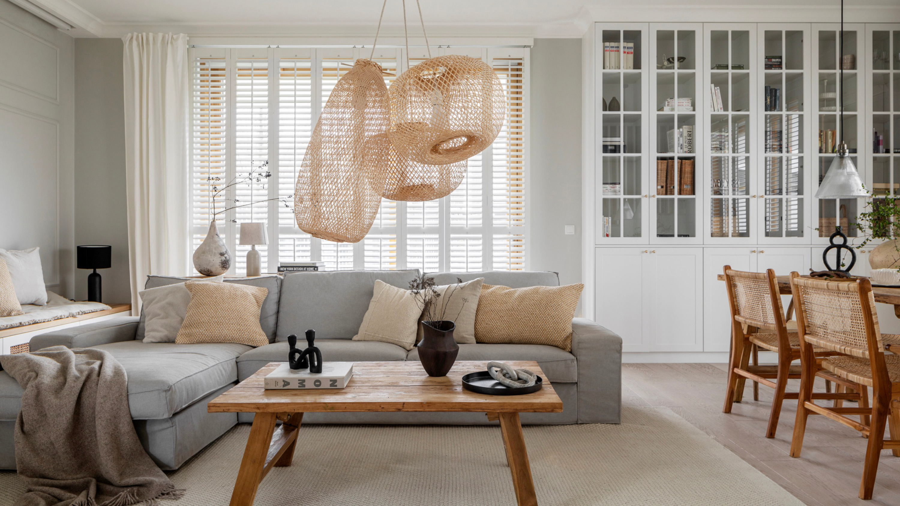

Often reserved for older homes with more traditional schemes, shutters might not be your first port of call when you’re deciding on a new window treatment. After all, with so many other options on offer – including some, like slubby linen curtains, that are dominating interior design trends at the moment – these classic finishes are getting less of a look-in than they used to.
So does that mean shutters are outdated? Well, no, not necessarily. They can still be an incredibly practical way to increase privacy and regulate light and even temperature – and although some styles of shutters are definitely on their way out, many of them actually look good, too. In fact, some interior designers think they offer a certain architectural charm that you can’t find in other modern window treatments.
Are shutters outdated?
To help us settle the debate, we’ve asked interior designers for their thoughts on shutters – as well as their favorite ways to use these window treatments for a chic contemporary finish. Read on to get their tips.
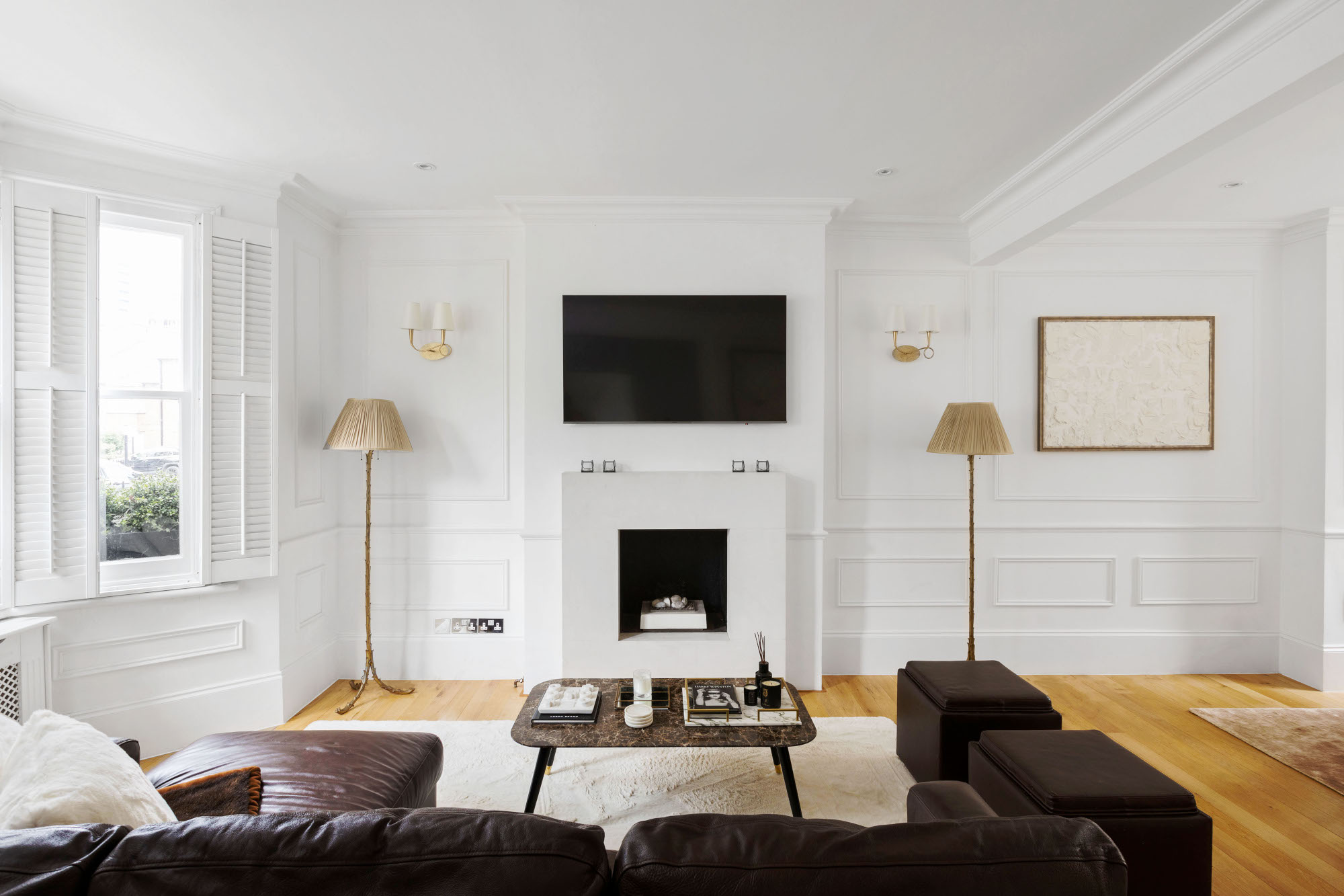
With few exceptions, the interior designers we spoke to all told us that there’s still a place for shutters in contemporary interiors – it just depends on the type of shutter you use. ‘I love shutters and wish they were available in a broader range of styles and easier to come by in the United States,’ says Louisville interior designer Bethany Adams. ‘Nothing is better at controlling light and in an old house, airflow, than shutters. In the US there was a vogue for the problematically named "Plantation" shutter – a 2-3" louvered shutter – in the nineties and early aughts so the concept may seem dated to some. But there are so many more options out there, from the more traditional 1" louvers to raised or recessed panels.’
‘Shutters, as traditional as they may seem, still hold a charm in modern interior design,’ agrees Artem Kropovinsky, founder of New York interior design studio Arsight. ‘Contrary to the belief that they're old-fashioned and bulky, shutters have evolved. Today, they're available in a variety of materials and designs to complement any contemporary interior, and their practicality is unquestionable. They can enhance your home's aesthetic appeal and even contribute to energy efficiency.’ He does warn that there are some exceptions, however: ‘They might not suit every space, particularly rooms where natural light and views are prioritized or where a softer ambiance is desired.’
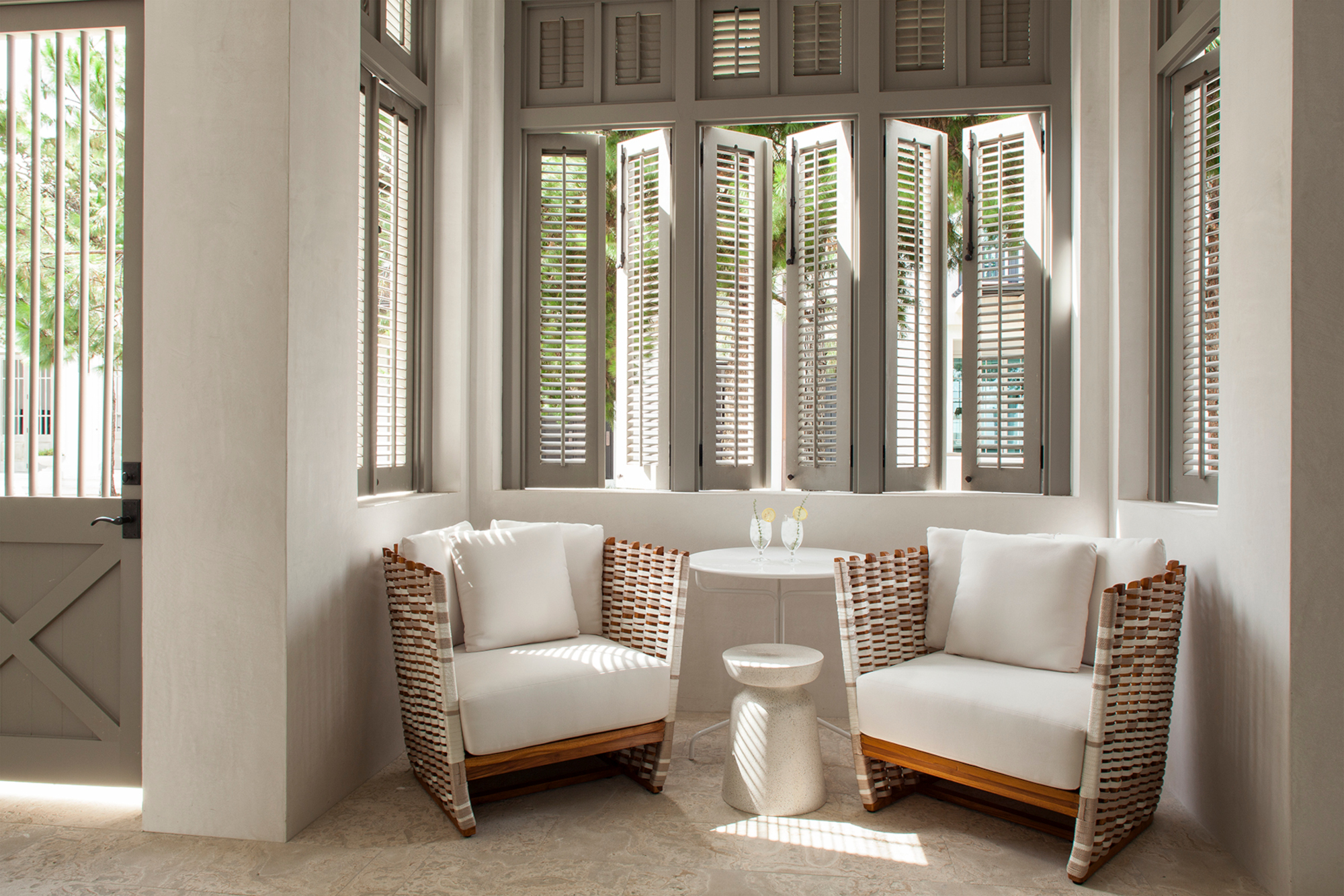
Shutters offer a practical solution to bathroom window treatments – and even kitchen window treatments – where fabric doesn’t work quite as well. They can also be an architectural feature in their own right. ‘We and our clients have always been keen on panelled shutters in period properties, and we’ve retained, restored or replaced many sets over the years,’ says London-based architect Brian O’Tuama. ‘They’re visually appropriate, fold neatly away when open, and provide extra security on ground-floor windows. They’re a classic architectural element, and as such will never fall out of favour (or style).’
There are, however, a handful of designers who weren’t quite so wedded to this window dressing. ‘90 percent of the time I say that shutters are outdated,’ says Sarah Storms, founder of Maplewood, NJ interior design studio Styled by Storms. ‘They block out too much light and make rooms too dark.’ Still, she accepts there are some situations in which they work: ‘When windows are huge and shutters are just on the bottom half, they don’t just provide privacy – they are an opportunity to bring in color. I treat them like trim.’
How should you use shutters in a contemporary scheme?
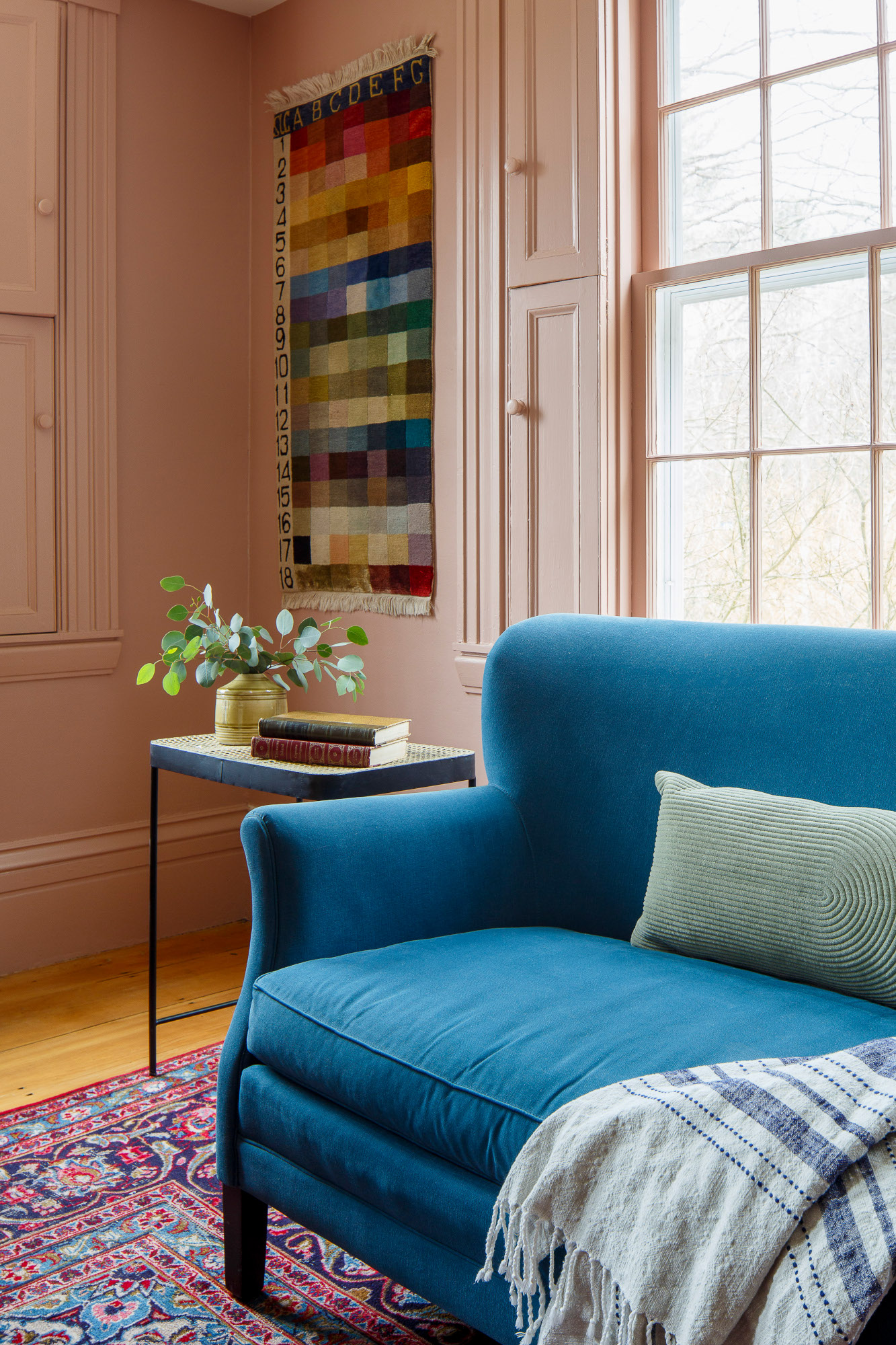
The general consensus is that if you’re opting for louvre shutters, you should choose those with wider blades over slimmer ones, which can feel more traditional in style. Other than that, it’s important to adopt a minimalist approach to the rest of your styling. ‘I would avoid other materials and excessive ornamentation,’ says California-based interior designer Jenny Kozena. ‘Embrace the shutters with minimal detailing instead and little to no visible hardware for a modern look.’
‘Shutters can be used in contemporary settings because sometimes they create a lighter feel than heavy drapery or window treatments with lots of layers,’ adds Rosanna Bassford of Silicon Valley studio Memmo Interiors. ‘The best approach is to keep them light and airy allowing them to blend into the walls and surroundings.’ The living room in the photograph at the top of this feature, by Shoko Design, is a great example of shutters used with a light touch.
Solid shutters, while often reserved for period homes, also work for a contemporary scheme. ‘In a modern home, flat panel shutters would be incredibly chic and minimalist as compared to drapery or other soft window treatments,’ says Bethany Adams. ‘The option to paint them in a beautiful color is also exciting!’
What are the best alternatives to shutters?
If you’re still not convinced that shutters are for you, we asked the designers to suggest alternatives for living room window treatments – and indeed ideas for any room. ‘Shutters may not be necessary in spaces where the design aesthetic leans towards a more open and airier atmosphere, such as modern and minimalist interiors or in locations where privacy and light control are not a significant concern,’ says Atlanta-based interior designer Jasmine Crockett of Joy Meets Home. ‘As an alternative, I would consider Roman shades for a soft and elegant appearance, or sheer curtains to create an airy and light-filled space. Each alternative can provide different levels of light control and privacy.’
‘Going with relaxed Roman shades takes the traditional-style window and makes it feel totally modern,’ agrees designer Julia Dempster. ‘The soft folds of linen in a natural window treatment are perfect for lending a contemporary feel to a room. Even if you don't have an oversized room, you can make your interior feel classy and elegant with a simple striking shade.’
Be The First To Know
The Livingetc newsletters are your inside source for what’s shaping interiors now - and what’s next. Discover trend forecasts, smart style ideas, and curated shopping inspiration that brings design to life. Subscribe today and stay ahead of the curve.

Ellen is deputy editor of Livingetc magazine. She works with our fabulous art and production teams to publish the monthly print title, which features the most inspiring homes around the globe, interviews with leading designers, reporting on the hottest trends, and shopping edits of the best new pieces to refresh your space. Before Livingetc she was deputy editor at Real Homes, and has also written for titles including Homes & Gardens and Gardeningetc. Being surrounded by so much inspiration makes it tricky to decide what to do first in her own flat – a pretty nice problem to have, really. In her spare time, Ellen can be found pottering around in her balcony garden, reading her way through her overstacked bookshelf or planning her next holiday.
-
 Pleated Lampshades Are the Silhouette of the Season — I've Found 9 For Well Under $100 (You'll Never Guess Where)
Leave it to Walmart to bless us with a collection of stunning pleated lampshades — proving this old-fashioned feature can look fresh and modern
By Devin Toolen
-
 I Found the "Healthiest” Bedding for Earth Month — Why Ettitude Is the Sustainable Sleep Label to Know
Softer than silk and smarter than cotton, Ettitude’s innovative take on bedding delivers luxury with a conscience
By Julia Demer