Ask Athena: how best to display objects in the home
Athena Calderone is back to answer your questions. This time, how best to place your collectables around your space


The Livingetc newsletters are your inside source for what’s shaping interiors now - and what’s next. Discover trend forecasts, smart style ideas, and curated shopping inspiration that brings design to life. Subscribe today and stay ahead of the curve.
You are now subscribed
Your newsletter sign-up was successful
Hi Athena,
I'm really interested in how you place your objets - they seem to be so beautifully curated, but there is a casualness to them, too. How do you display stuff without your room feeling cluttered?
Sally
Article continues below 
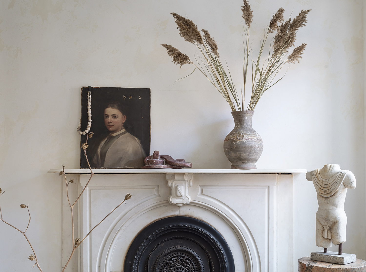
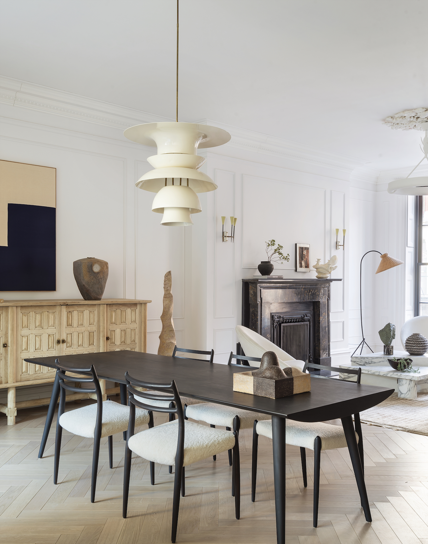
Athena's Brooklyn home is full of clever placement ideas
Hi Sally,
Thank you for your kind words about the objects within my home. There is nothing I love more than scavenging antique stores or diving down the rabbit hole of vintage resale sites for unique, one-of-a-kind sculptures, vessels, and primitive objects. These finer details are so critical to a space not just for the personal joy they bring you but for how they pull a space together—the smaller objects bind with the larger elements to bring cohesion and character.
When approaching the placement of these objects in a room, I always think about what will unify a space and what will contradict it, because you need both. Consider harder, slick materials juxtaposed against the soft or curvaceous. When I design a room or a vignette I am always thinking about the composition and alchemy of furniture and objects. I love how form, scale, and a slightly atypical composition can cause your eye to bounce around the room, gently landing on and discovering new things at varying heights. To me that is what defines a successful space—playful allure and curiosity—and always some sort of tension or contrast. The key is to allow design to unfold piece by piece, material by material. It’s so important to let go, to allow for the unexpected because it’s in those moments when the magic of design reveals itself. As a designer, I crave that level of discovery and surprise because more often than not, that is what yields the most intriguing spaces.
To achieve a curated arrangement in a space, start with a series of neutral palettes. The contrast of one the best white paints for interior walls against the harsher blacks will engage the eye. When decorating with color and contrast, I always ask myself where can I position things so that they almost disappear to create a sense of calm and reprieve on the eyes? How can I use objects to manipulate the eye? Can I play with minimalism and negative space to trick the eye and draw attention to the elements I deem most important? It’s in these often invisible steps where you can capture emotive and intimate portraits of who you are and what your home represents.
But this process is a delicate dance because when you have too much color or pattern, your eye doesn’t know where to land. That’s why a foundational palate is so important. When you control the palate, you have more control as a designer—you are guiding the experience! As always with design, the path there is full of twists and turns, but that’s what makes it so exhilarating—if you allow yourself to be led by your curiosity, of course. Ultimately, a room is never “done,” it is always moving and morphing, so play around, tinker with and explore, but above all, enjoy the process.
The Livingetc newsletters are your inside source for what’s shaping interiors now - and what’s next. Discover trend forecasts, smart style ideas, and curated shopping inspiration that brings design to life. Subscribe today and stay ahead of the curve.
Athena
To Ask Athena a question of your own, email our editor with as detailed a query as possible, on pip.mccormac@futurenet.com. Please note, not all questions can be answered, and no private correspondence can be entered into.
Sign up to Athena's newsletter here.

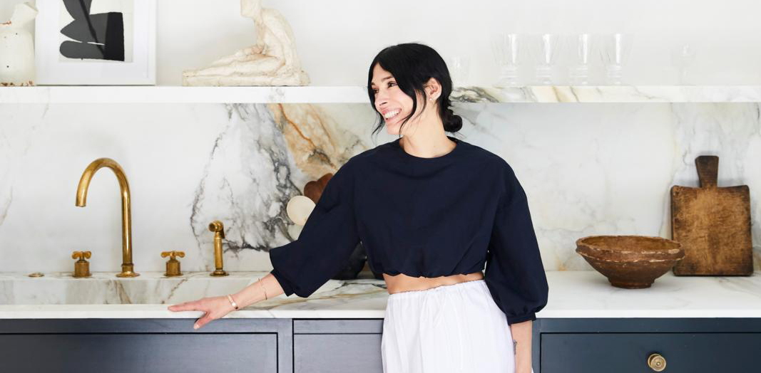
Athena Calderone is an award winning author, interiors writer, stylist, designer and curator. She has had her home featured on the cover of Livingetc twice.