5 Bathroom Remodel Mistakes Interior Designers Always See — And How to Avoid These Pitfalls
These common errors can turn your dream bathroom remodel into a nightmare, say designers
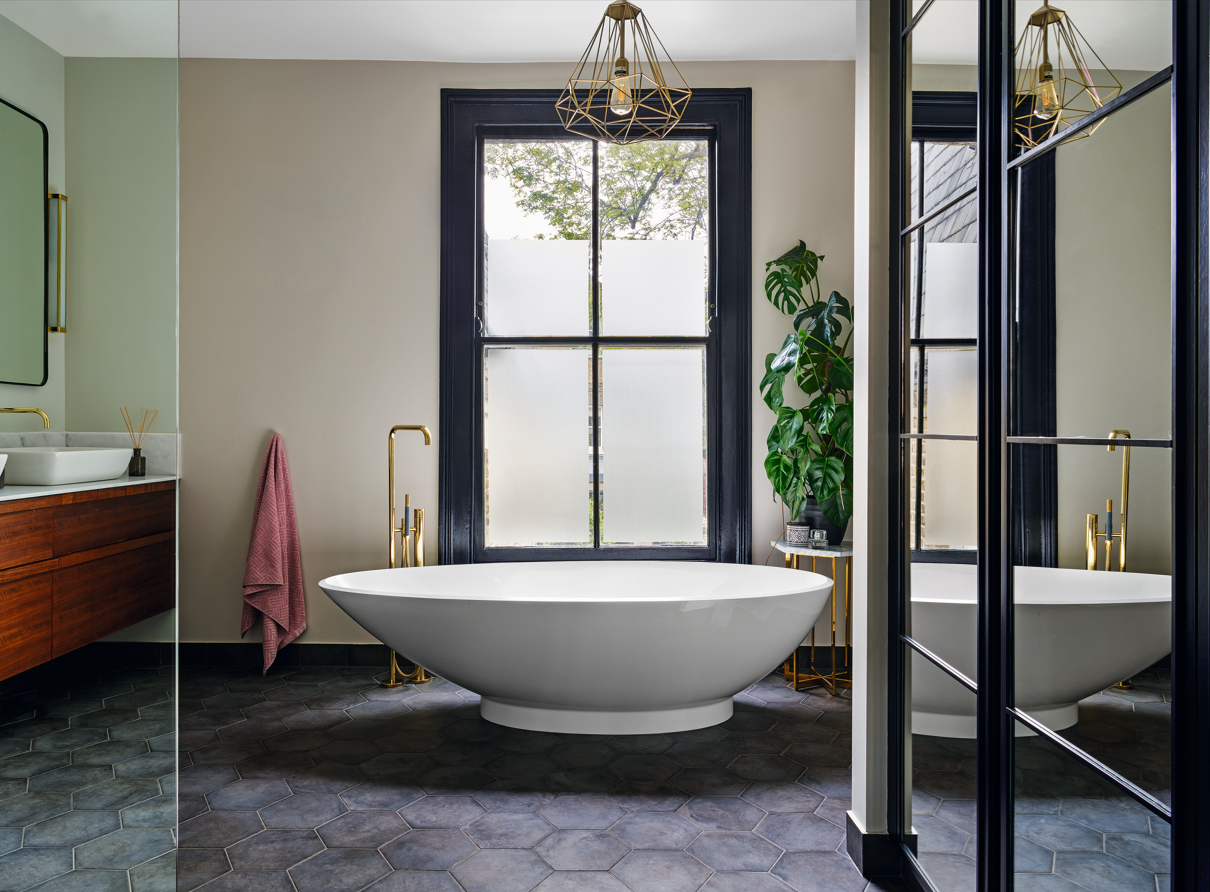

Everyone dreams of a relaxing, beautiful, and highly functional bathroom but sometimes designing or remodeling one can be a confusing task. You're always stuck between choosing elements that look stunning yet you've got a budget to contend with, too.
There are common bathroom mistakes that many people make when remodeling, some more serious than others. Sometimes the ambience doesn’t feel quite right, lighting fixtures burn a hole in the budget and the tiles don’t complement the fittings.
It's an interior designer's job to notice these mistakes, and they sure do spot them. To help you avoid these errors, we asked experts to tell us what design details irk them the most in poorly-executed modern bathrooms — here's what they pointed out.
1. Choosing mosaic tiles
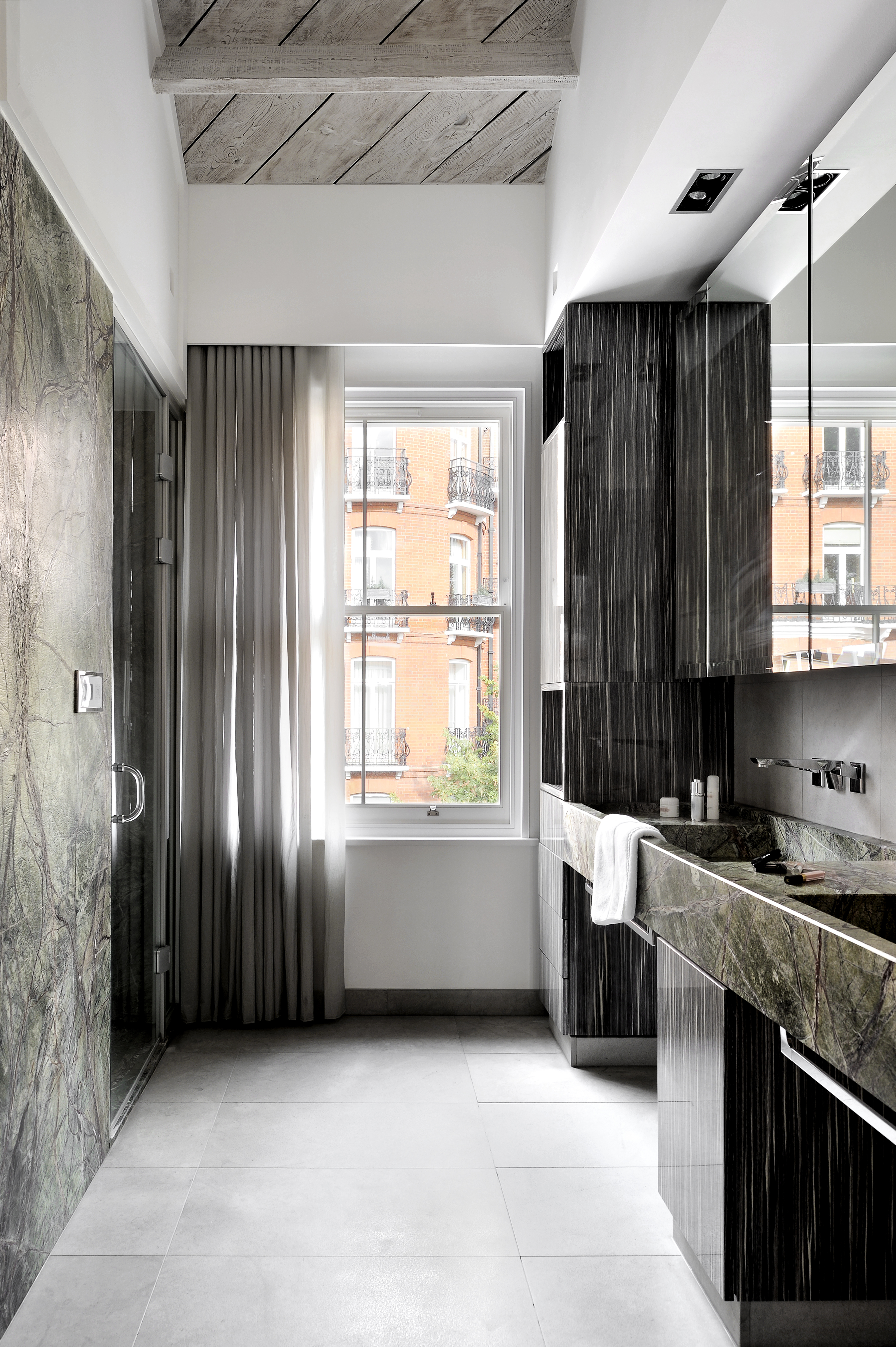
Picking the right bathroom tiles is of utmost importance because this element not only adds to the aesthetics but also the practicality of the space. The largest surface in the room, bathroom floor tiles need to be anti-skid, easy to clean, and timeless. Plus, you don't want to choose tiles that are too expensive and hard to maintain.
'Oftentimes it is the cost of the labor that significantly increases the price of the tile installation,' says Julia Mack, founder of Julia Mack Design. 'Consider large format porcelain wall and floor tiles with minimal grout joints. These are quicker and easier to install than small mosaic or handmade tiles, and the result is a clean and contemporary look for a newly remodeled bathroom.'
2. Using the wrong shower glass
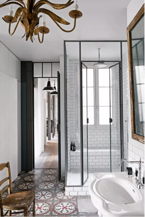
'Make sure you have a say in the shower glass type and work with your contractor and enclosure supplier so they ensure the thickness and structural stability is appropriate for the design,' says Sondra Ganz, founder of Studio Ganz. 'Decide whether Low E (i.e. Starphire/ Pure Clear) or Standard Clear (slightly greenish tint) is important to you. In all cases, you want an integral glass treatment on the surface that requires less cleaning/ low maintenance and is water-repellent to prevent mildew, soap scum, and water buildup. Talk through where there will be bumpers and seals in smaller walk in showers to prevent leakage so you won’t get charged for adding these things later.'
'One of the most frequent budget misunderstandings that always come up on projects is when contractors either budget the cheapest glass specification or they completely omit the shower enclosure,' avers Sondra. 'Then this becomes a +$5-10K discussion that the homeowner is never happy with. This is certainly a conversation that should be had from the beginning to avoid any surprises or miscommunication. A good contractor should supply drawings/ specifications for your shower that get into this level of detail.'
3. Spending more than you need to on vanity storage
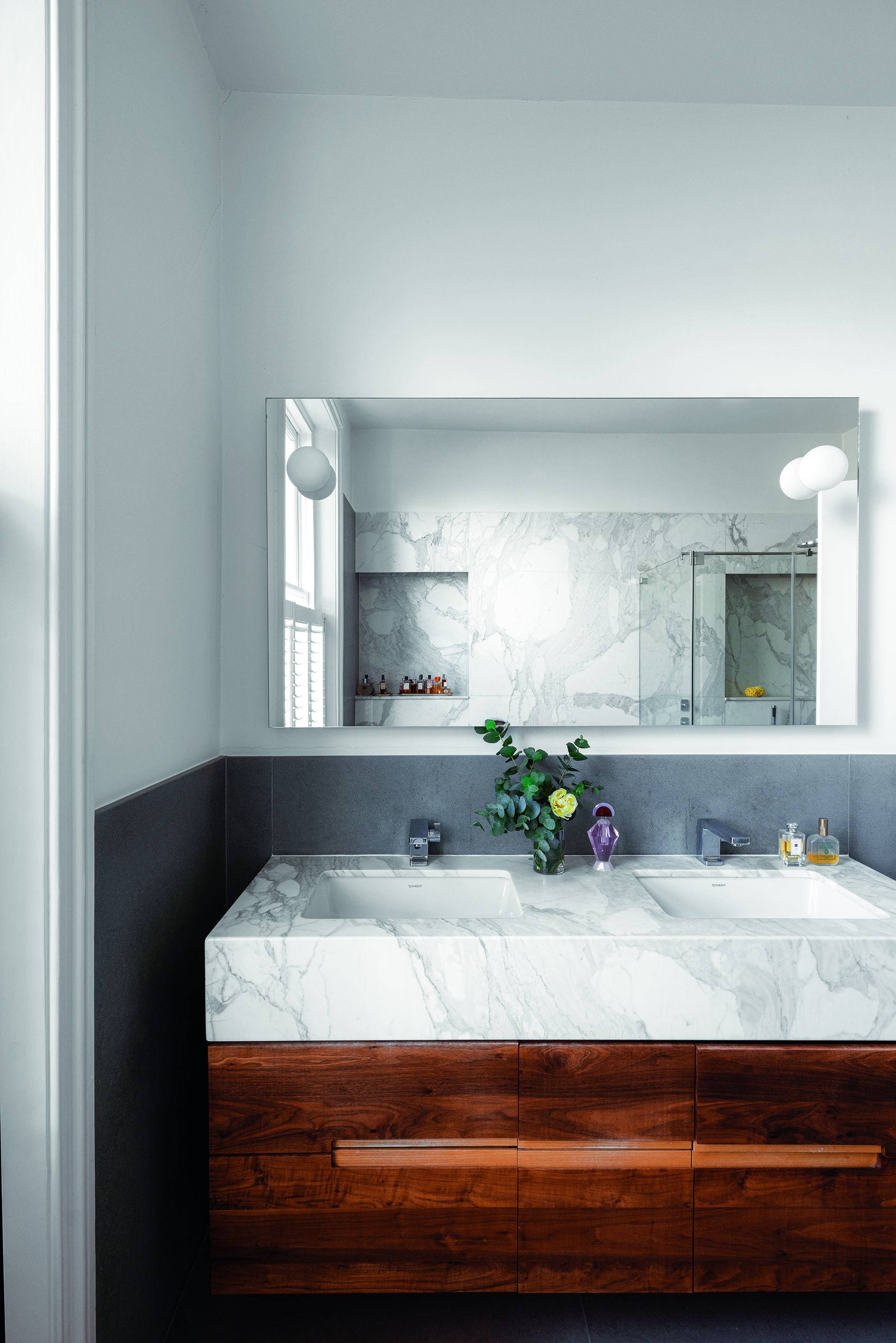
Ensure the bathroom storage is easy to install, use and easily accommodates all of the room's paraphernalia.
'Budget-friendly fiberboard choices are typically constructed of painted, pressed fiber board,' says Julia. 'Another issue that drives pricing is cabinet door vs drawer configurations. So keep in mind that open shelving and standard swing doors are less expensive than a series of rollout drawers that often require more costly hardware to function properly.'
4. Buying an expensive bathtub that doesn't fit the space
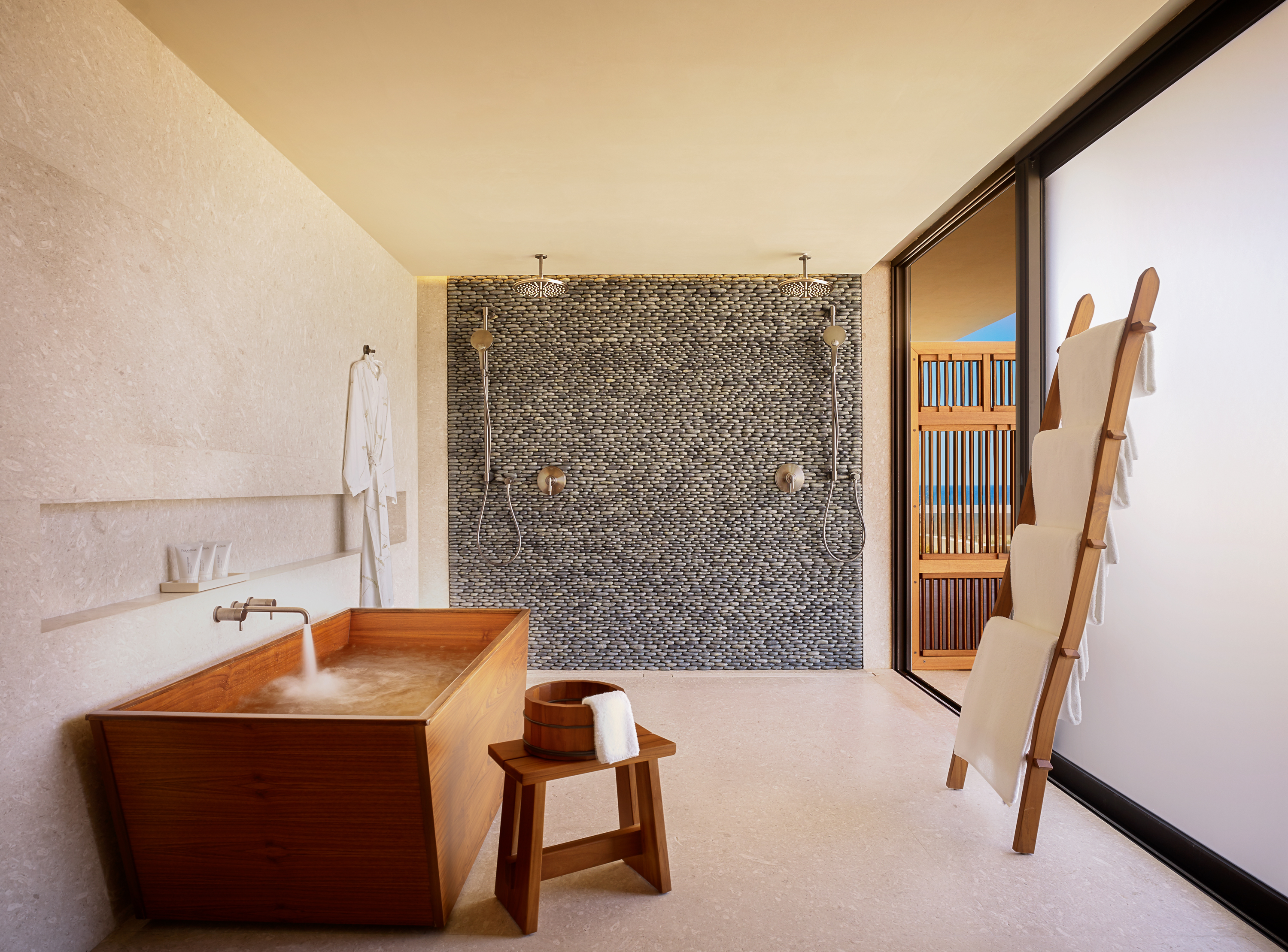
While remodeling a bathroom, it's easy to get carried away and choose elements that look stunning. But while aesthetics definitely matter, their costs should be proportional to their usability. It would be a mistake to go in for an extremely expensive freestanding bathtub, or even a seriously cheap one but a design that just doesn't fit into the room's space.
'One of my biggest design pet peeves is when a built-in bathtub doesn’t fit its alcove and a ledge needs to be furred out to cover the extra inches,' says Sondra. 'You can find a bathtub and/or design an alcove to make it look intentional like the bathtub fits just right; it just takes a little extra planning and effort to take your design from C-Level to A++.'
5. Not investing in quality countertops
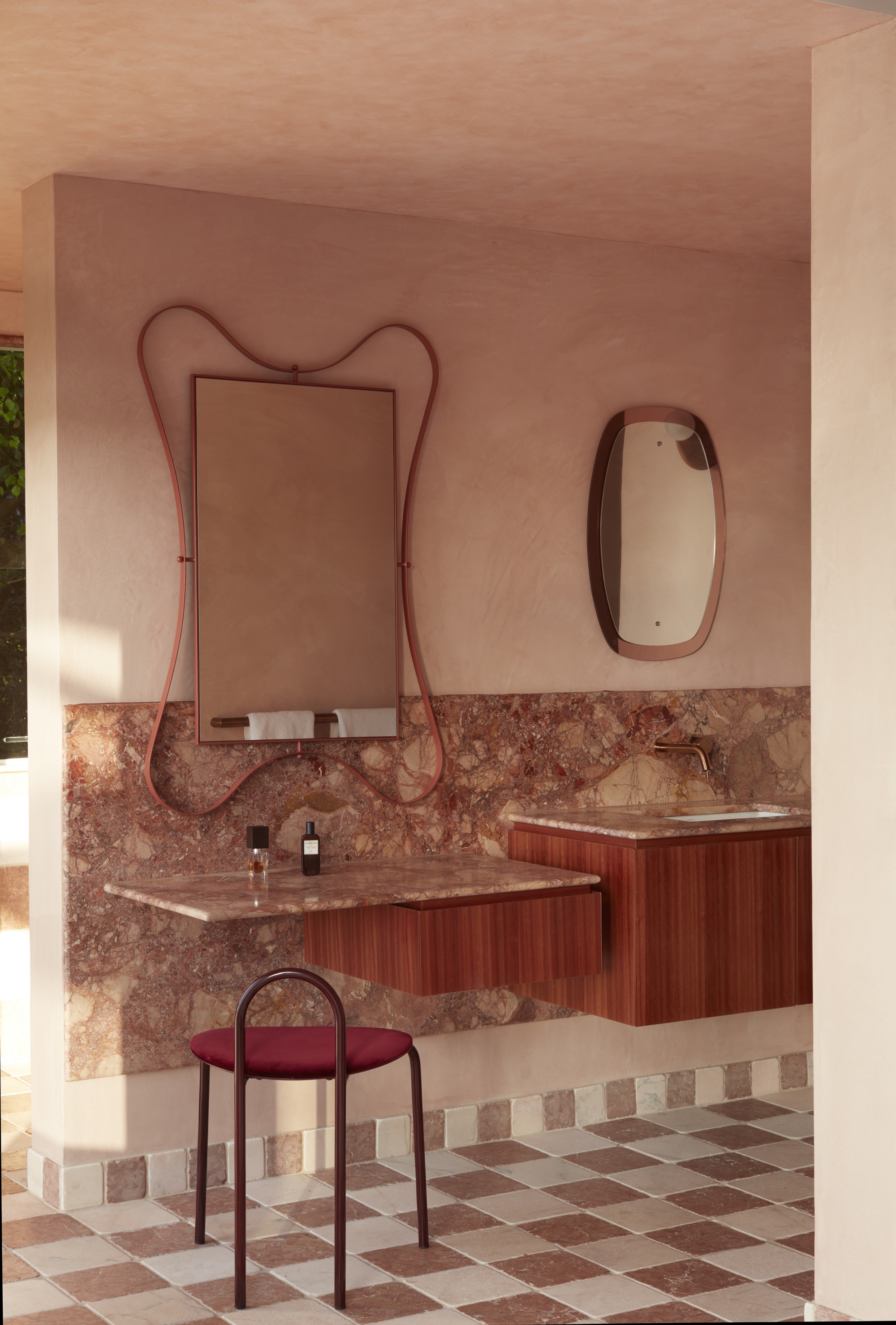
'At some bargain warehouses, you'll find vanity tops or counters that contain cheap glue particles to hold the quartz together — I’ve seen some serious chipping, staining, and breakage issues when the company is not known or reputable,' warns Sondra. 'Check with the manufacturer, and ask about the country of origin of the stone. Try to stick with trusted brands such as Caesarstone and Cambria, etc. There are some great trusted buy-out option tops with integrated sinks that come with vanities now…it makes cleaning and maintenance so much easier.'
A great luxury bathroom design can also sport colorful counters or veined marble varieties that look utterly sophisticated. Natural stone not only looks good but also lasts decades and only requires regular sealing.
Be The First To Know
The Livingetc newsletters are your inside source for what’s shaping interiors now - and what’s next. Discover trend forecasts, smart style ideas, and curated shopping inspiration that brings design to life. Subscribe today and stay ahead of the curve.

Aditi Sharma Maheshwari started her career at The Address (The Times of India), a tabloid on interiors and art. She wrote profiles of Indian artists, designers, and architects, and covered inspiring houses and commercial properties. After four years, she moved to ELLE DECOR as a senior features writer, where she contributed to the magazine and website, and also worked alongside the events team on India Design ID — the brand’s 10-day, annual design show. She wrote across topics: from designer interviews, and house tours, to new product launches, shopping pages, and reviews. After three years, she was hired as the senior editor at Houzz. The website content focused on practical advice on decorating the home and making design feel more approachable. She created fresh series on budget buys, design hacks, and DIYs, all backed with expert advice. Equipped with sizable knowledge of the industry and with a good network, she moved to Architectural Digest (Conde Nast) as the digital editor. The publication's focus was on high-end design, and her content highlighted A-listers, starchitects, and high-concept products, all customized for an audience that loves and invests in luxury. After a two-year stint, she moved to the UK and was hired at Livingetc as a design editor. She now freelances for a variety of interiors publications.
-
 The 'New British' Style? This Victorian London Home Embraces Its Owners' Global Background
Warm timber details, confident color pops, and an uninterrupted connection to the garden are the hallmarks of this relaxed yet design-forward family home
By Emma J Page
-
 Muji Living Room Ideas — 5 Ways to Harness The Calming Qualities of This Japanese Design Style
Inspired by Japanese "zen" principles, Muji living rooms are all about cultivating a calming, tranquil space that nourishes the soul
By Lilith Hudson
