7 of the worst bedroom layout mistakes and how to avoid them
Get the most important part of your bedroom design right by avoiding these bedroom layout mistakes
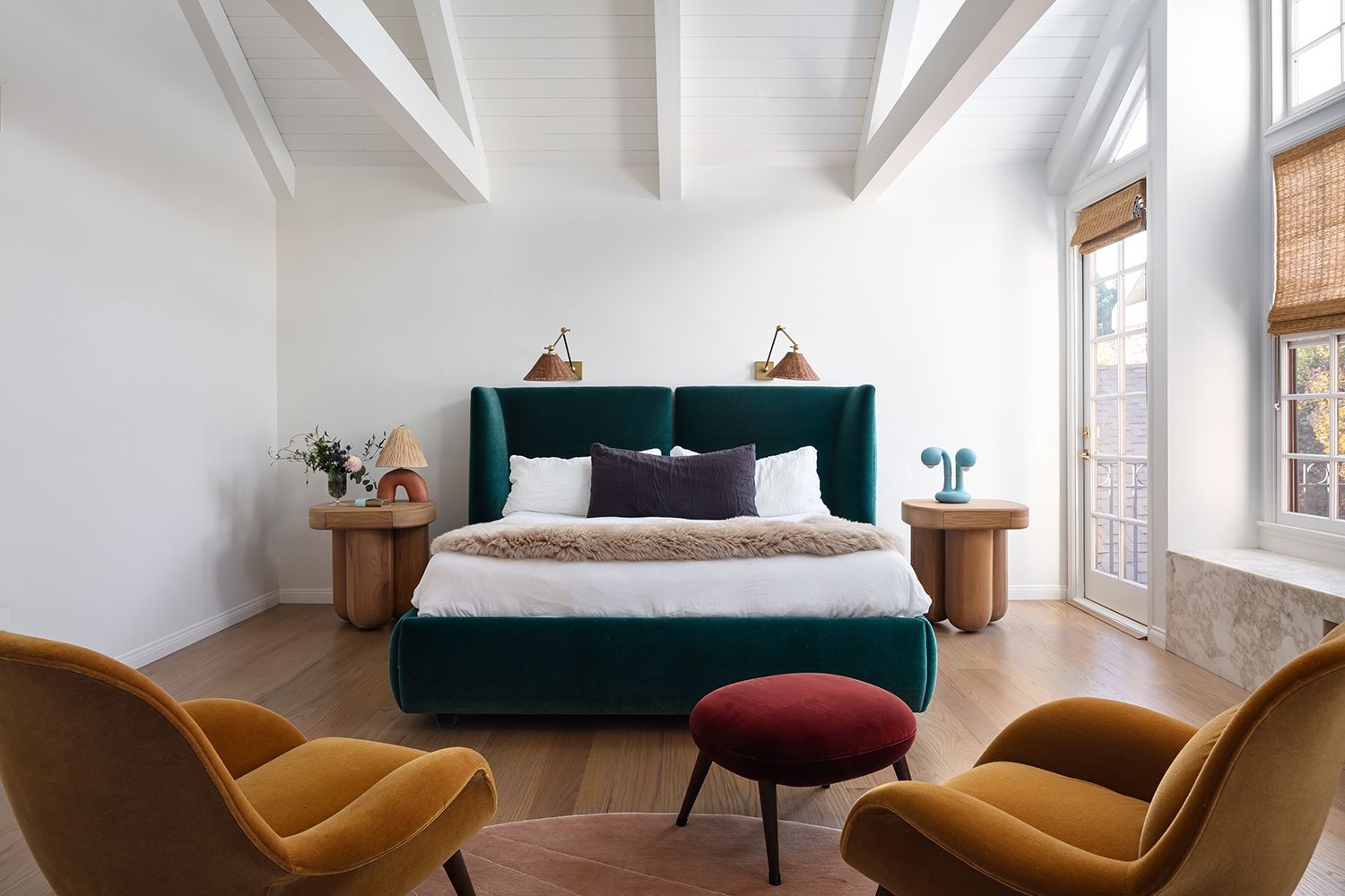

Bedroom layouts can be one of the trickiest aspects of designing a space, and there are plenty of bedroom layout mistakes to be made. Sure, deciding where the furniture goes may not be as thrilling as picking the wall colors, or deciding between carpet or hardwood, or sourcing the perfect lighting, but where your furniture sits in your space is just as important as all of these design choices.
There are plenty of obvious bedroom layouts that many of us stick with time and time again but we have spoken with designers who all seem in agreement that the biggest mistake you can make is to go with the obvious. What's become more evident is that the whole push everything up against a wall layout that's reined for decades is on the out. And there are other clear mistakes to avoid when it comes to bed placement and making a room feel bigger.
So in order for us all to be a bit more adventurous with our bedroom ideas and layouts, here are all the bedroom layout mistakes to avoid and what to try instead...
1. Overlooking the view when entering your bedroom
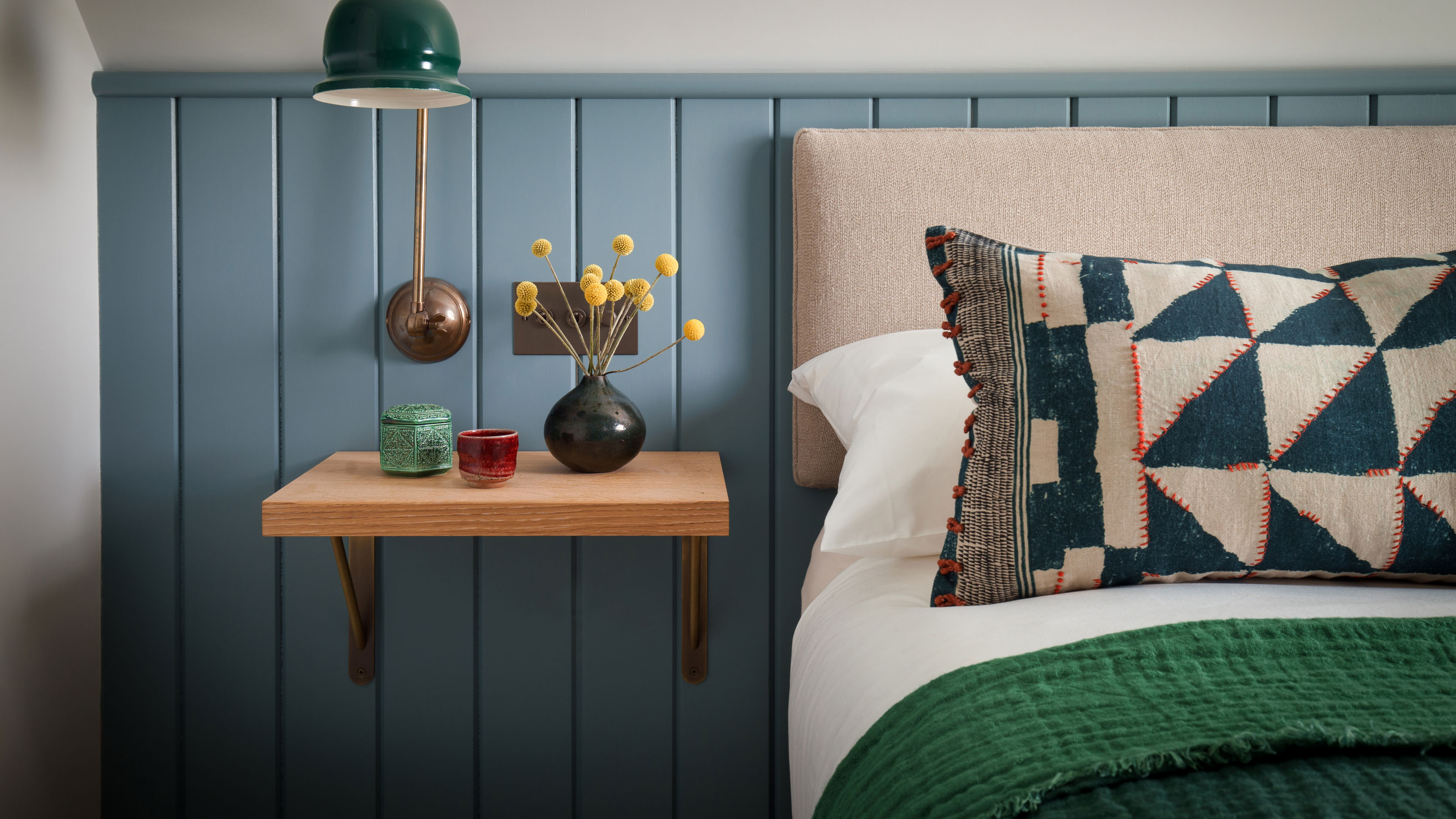
'It’s important to consider the size, proportions and orientation of a room when designing the layout.,' explains James Arkoulis, creative director of Howark Designs. 'One common mistake is to overlook the vista when you enter the room; walking in to the side of a chest of drawers or straight into the side of a bed should be avoided if possible - consider a stylish bedroom chair with scatter cushions, the front of a piece of furniture or the center of the bed as the first thing you see.'
'We are subconsciously drawn to symmetry, so a chaotic or unbalanced bedroom may not be the peaceful haven that it should be. Make sure the bed, nightstands, reading lights and bedroom rug are centered on the wall and that any ceiling lights are aligned accordingly.'
2. Having all your furniture hug the walls
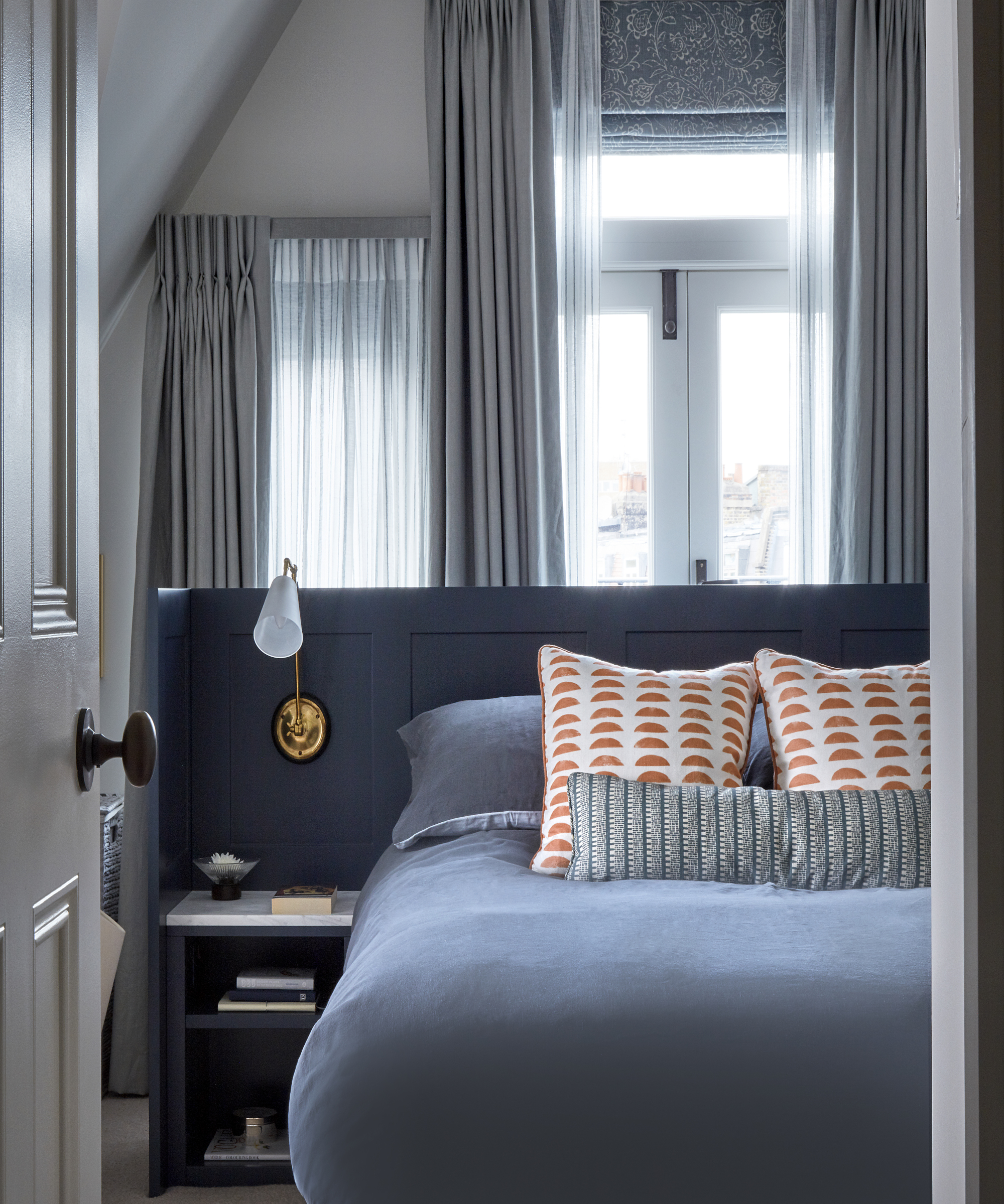
It's so tempting in any room layout to keep all your furniture up against the walls. It makes sense right? Keeping the floor as free as possible to make even a small bedroom feel bigger. But actually what this classic layout can do is crowd your walls and leave you with a sea of empty floor – 1. pretty boring and 2. can actually make the room feel smaller as you can clearly see the dimensions thanks to the walls of furniture.
So try something a bit different and float your furniture. We'd recommend starting with the bed. Pull it away from the wall so you have just enough space to walk behind and do the same with your bedside tables. Pick a headboard that's substantial enough to create almost a wall in the space, giving the bed a cocooning zone of its own.
3. Cluttering around the bed

This sounds like an obvious one but our main piece of advice is not to try and cram too much around the bed. If you have the room for lovely large bedside tables then great – just ensure they have a bit of breathing space either side so they don't totally flood the space available. However, if space is tight, acknowledge that and switch a side table for bedroom shelving or forgo the side table altogether to prevent the space from looking cluttered.
As interior designer and co-founder of Interior Fox, Jen explains, 'when planning out your bedroom layout, there are a few key things to consider. A bed is the dominant feature of any bedroom, it is the focal point and acts as a base to center the rest of your room around. If space allows, it’s always preferable to have space either side of the bed to be able to get in comfortably on both sides, as well as a space for bedside tables.'
4. Positioning the bed to close to the door
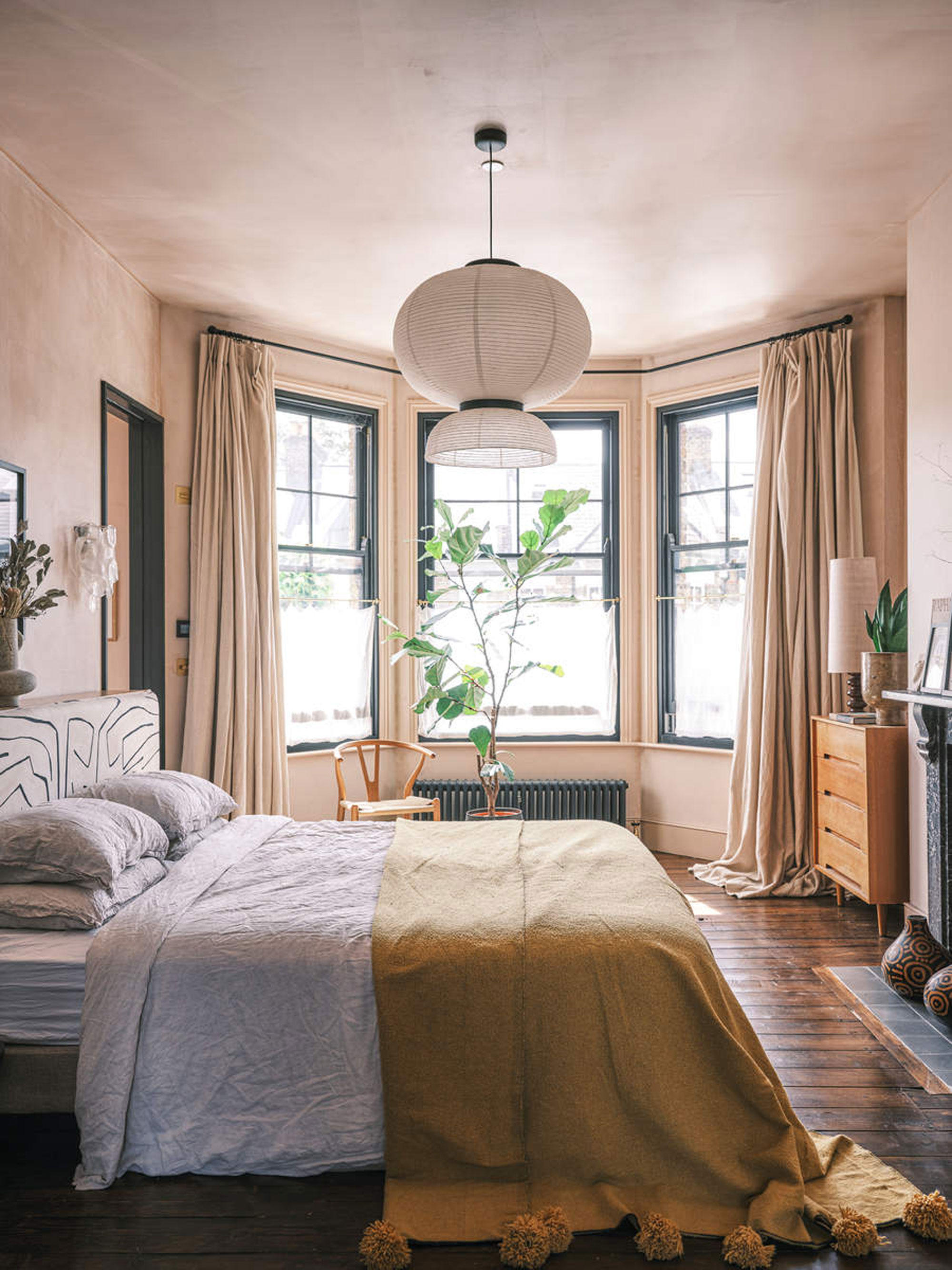
We couldn't not touch on bedroom feng shui and where your bed is positioned is key to designing a layout that creates a zen-like space. Now even if you aren't too concerned with Feng Shui, you still want your bed to be in a space that makes sense – it's calming and relaxing and away from the bustle of the main house. Placing the bed far enough away from the door (and ensure it's not facing it if you can) will help make your sleep space feel like a separate place to retreat to.
'A key consideration when it comes to bedroom layouts is the entrance to the room.' explains Andrew Griffiths founder of A New Day. 'To help a bedroom feel its most relaxing, you're better having some distance between the door and the bed so you feel safely cocooned and relaxed in the space rather than being a few steps away from the hallway. So think about that when planning the position of your bed.'
5. Omitting a rug
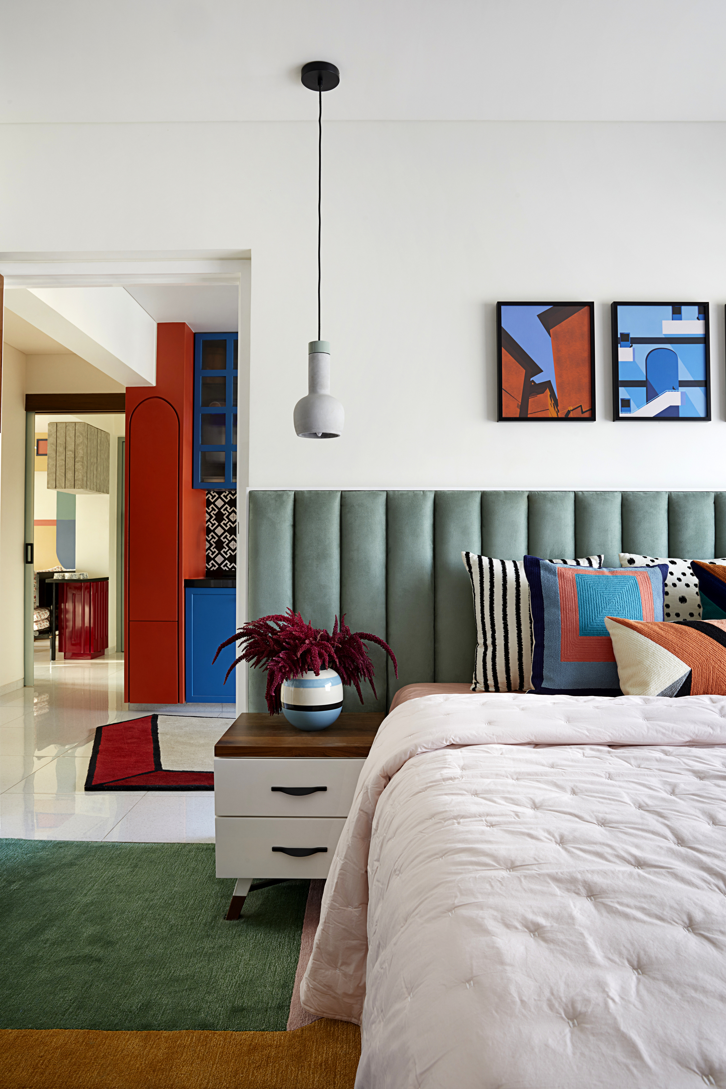
A rug is an essential in any room (even kitchen rugs are becoming a thing). Not only can they add color, pattern, and texture to a room, they help ground a layout too.
'An absolute bedroom layout no-no is omitting a rug in your space,' says interior designer Marie Flanigan. 'Whether you have hardwoods or carpet, I love the warmth that a rug gives to a room, even when layered over carpet. Rugs give beautiful symmetry and warmth to any space'
Rugs can be ideal for creating zones within your bedroom layout too. For example, if you have a dressing area or a seating space, throwing down a couple of rug around these different spaces makes them feel even more like rooms within rooms – a top tip for making a small bedroom feel bigger too.
6. Not making use of corners
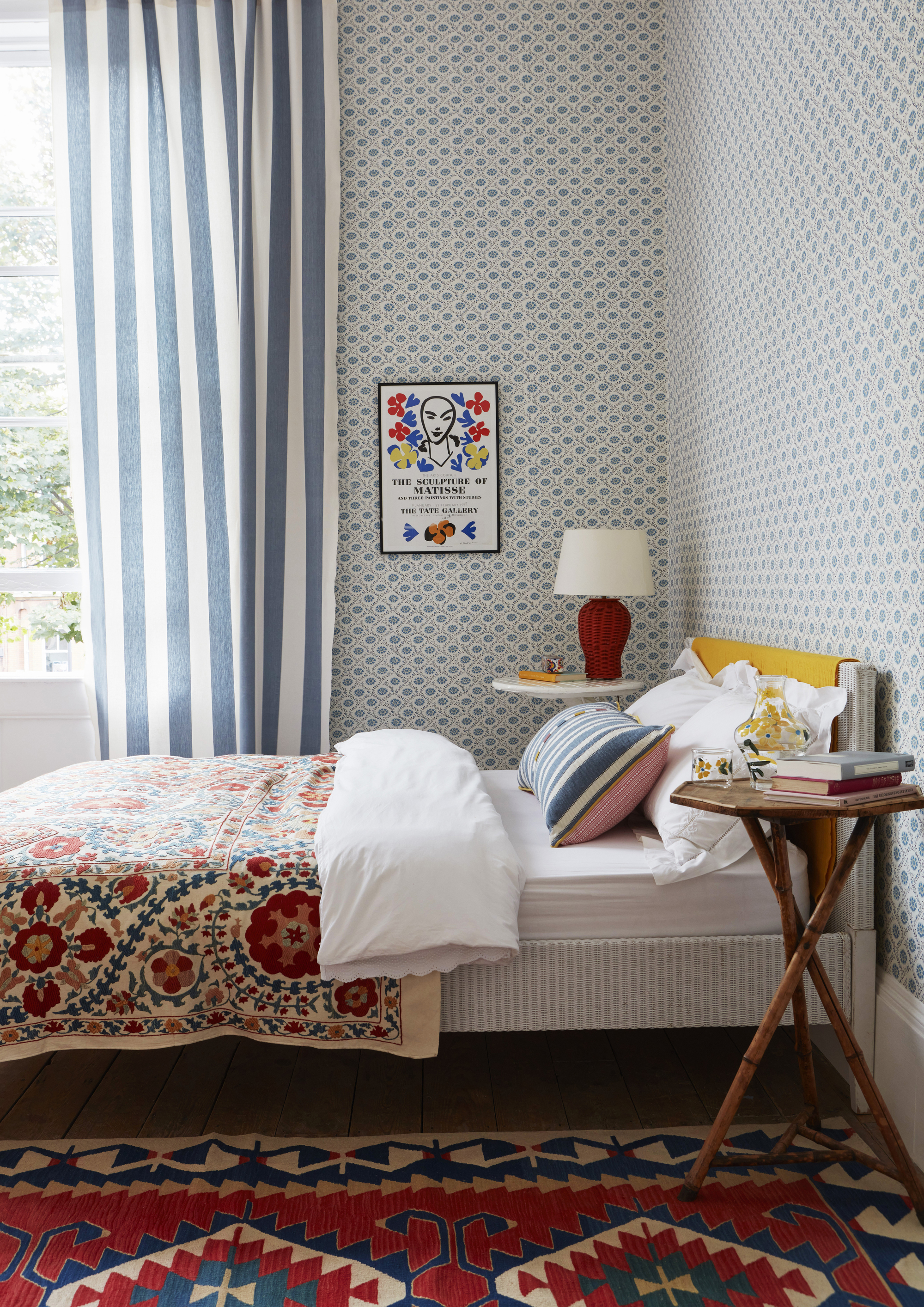
When space is tight in a small bedroom the option of floating furniture is limited, and while it might be tempting to follow the traditional layout of bed in the middle of the room, tables either side, this can make the room feel so much smaller.
'Don’t dismiss beds pushed into corners as a complete no no,' explains interior designer Benji Lewis. 'If your bedroom’s small, don’t position the bed in the middle of the room and let it eliminate the inclusion of any storage; by adopting the bed in a corner approach you might allow space beside it to fit a reasonable chest of drawers which could double up as a bedside table with lamp on it.'
Be inspired by this rustic bedroom and keep the bed close to the wall and then use a large area rug to make the space next to the bed feel larger and more open.
7. Choosing the biggest bed available
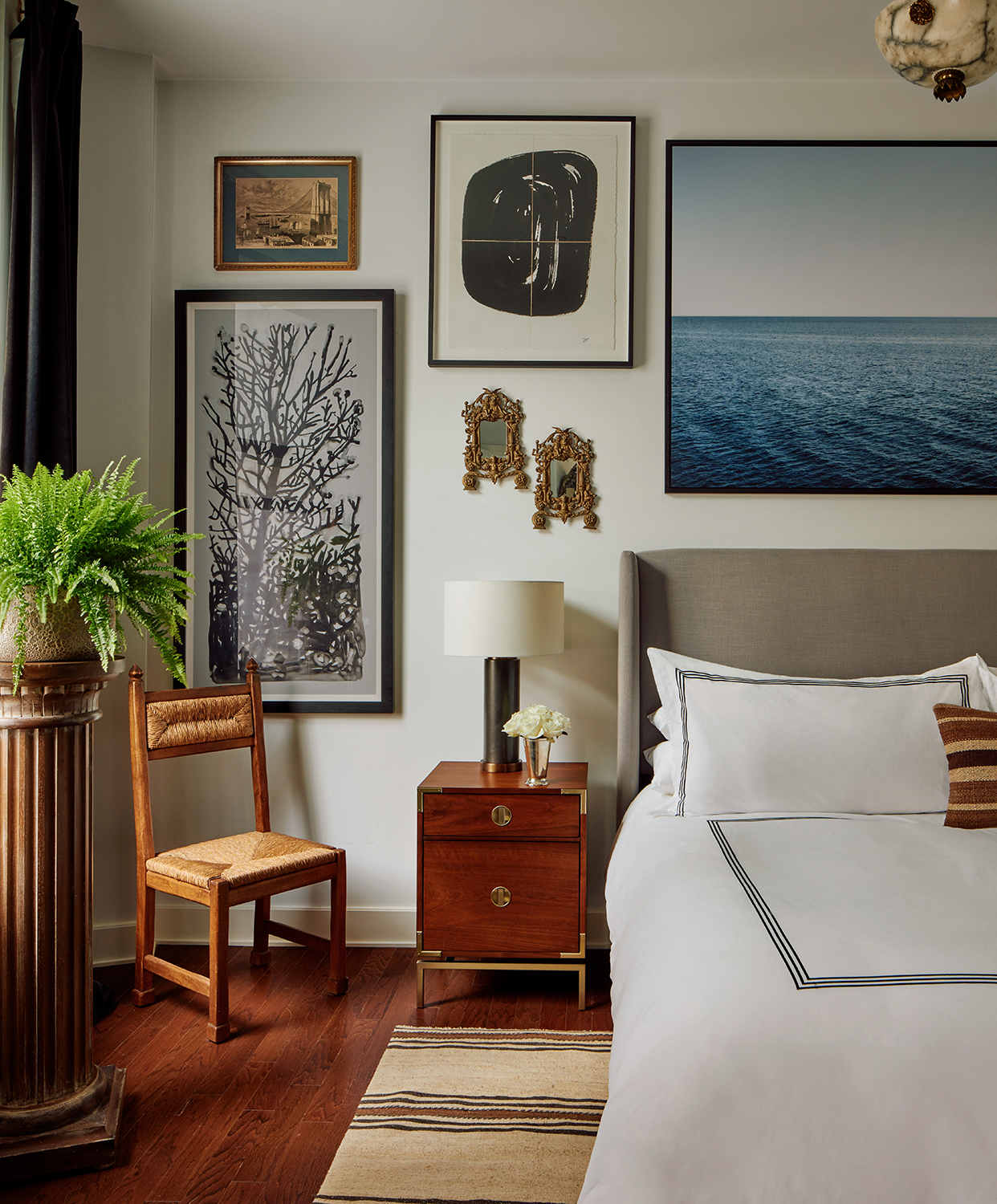
'One of the easiest mistakes people make when it comes to bedroom layouts, is not giving enough thought to bedside storage,' explains Andrew. 'Often people want the biggest bed possible, but that can then lead to a lack of space for a decent-sized bedside table.'
'While you might not need lots of storage or surface space, you still need somewhere for a glass of water and a source of decent lighting, both ambient and task light for reading. So make sure you're considering that before ordering a bed.'
How do you make the most of a bedroom layout?
As with any room layout, what works and what doesn't will come down to the shape and size of your space, but a rule that we believe applies to every bedroom layout is not to try and squeeze in too much.
'The bedroom is an area of rest, try to keep the space visually spacious and free of bulky furniture. Instead, consider bespoke built-in furniture to hide away everyday items. Finally, keep the palette simple by either sticking with bright-white walls balanced by interesting soft furnishings, or monochromatic look with a continued color theme,' recommends Jen.
So really think about what furniture you want to include? What's essential and what could perhaps go elsewhere in your home? Obviously, if you are blessed with space for a dressing room, keep bulky storage pieces out of the space. If you are struggling to fit in bedside tables just ditch them for a shelf or a headboard with built-in storage. The rule less is more definitely applies here.
Also, there are obvious things like make sure all doors (including closet doors) and drawers can be opened easily. There should be enough floor space between furniture for you to move around comfortably, and the layout should make sense for how you use the space.
How can you improve a bedroom layout?
Often improving a layout comes from thinking a bit outside the box. Follow the rules above for an instant improvement but also consider incorporating layouts and furniture pieces you'd find elsewhere in your house. It's a huge interior design trend right now to create that hotel vibe in a bedroom by incorporating a mini living room within your bedroom layout.
'I think one bedroom layout trend that I’ve seen over the last few years is including an area for respite within the room. A room is no longer just a place to go to sleep, so homeowners are rethinking how they envision the space functioning.' explains Marie Flanigan. 'I’ve included countless sitting areas in primary suites and love the idea that it gives the room added function. Whether you choose beautiful chairs, gliders or a chaise, give yourself more than one seating option.'
Should bedrooms always be symmetrical?
This depends on the look you are after. Symmetrical bedroom layouts are popular in minimalist bedrooms or if you like a classic hotel look with clean lines and a simple formula. However, for more rustic, country styles symmetry isn't essential and in fact, in some small or awkwardly shaped bedrooms, it's not even an option. So our advice is don't worry too much about symmetry in a bedroom, if it suits your style and space great, but often designs that don't follow the rules turn out the most intriguing.
Be The First To Know
The Livingetc newsletters are your inside source for what’s shaping interiors now - and what’s next. Discover trend forecasts, smart style ideas, and curated shopping inspiration that brings design to life. Subscribe today and stay ahead of the curve.

Formerly the Digital Editor of Livingetc, Hebe is currently the Head of Interiors at sister site Homes & Gardens; she has a background in lifestyle and interior journalism and a passion for renovating small spaces. You'll usually find her attempting DIY, whether it's spray painting her whole kitchen, don't try that at home, or ever-changing the wallpaper in her entryway. She loves being able to help others make decisions when decorating their own homes. A couple of years ago she moved from renting to owning her first teeny tiny Edwardian flat in London with her whippet Willow (who yes she chose to match her interiors...) and is already on the lookout for her next project.
-
 5 Things That Could Be Making Your Patio Look Cheap, and That Any Landscape Designer Worth Their Salt Would Notice
Now is the time to prime your patio for the spring-summer season, but steer clear of these common pitfalls that could be devaluing your space
By Lilith Hudson
-
 10 Small Bathroom Storage Ideas That Will Cull Clutter and Keep Even Tiny Spaces Feeling Calm
Unlock the storage potential hidden in your small bathroom and squeeze stashing space from every corner
By Linda Clayton