Designers Say Benjamin Moore Simply White Is a Perfect White Paint Color — Here's Why
The designers I spoke to sung the praises of Benjamin Moore Simply White as an ideal neutral they often recommend to clients


The Livingetc newsletters are your inside source for what’s shaping interiors now - and what’s next. Discover trend forecasts, smart style ideas, and curated shopping inspiration that brings design to life. Subscribe today and stay ahead of the curve.
You are now subscribed
Your newsletter sign-up was successful
Now I'm as big a fan of an obscurely-named paint color as the next person, but sometimes it's just helpful to know what you're getting by what's written on the can. And I think Benjamin Moore's Simply White might be one of the best, and simplest, examples of that.
As you might expect, it's one of Benjamin Moore's most popular paint colors, listed as a best-seller on the site — white paints often are — and by looking at it in real spaces, you can get a picture of why.
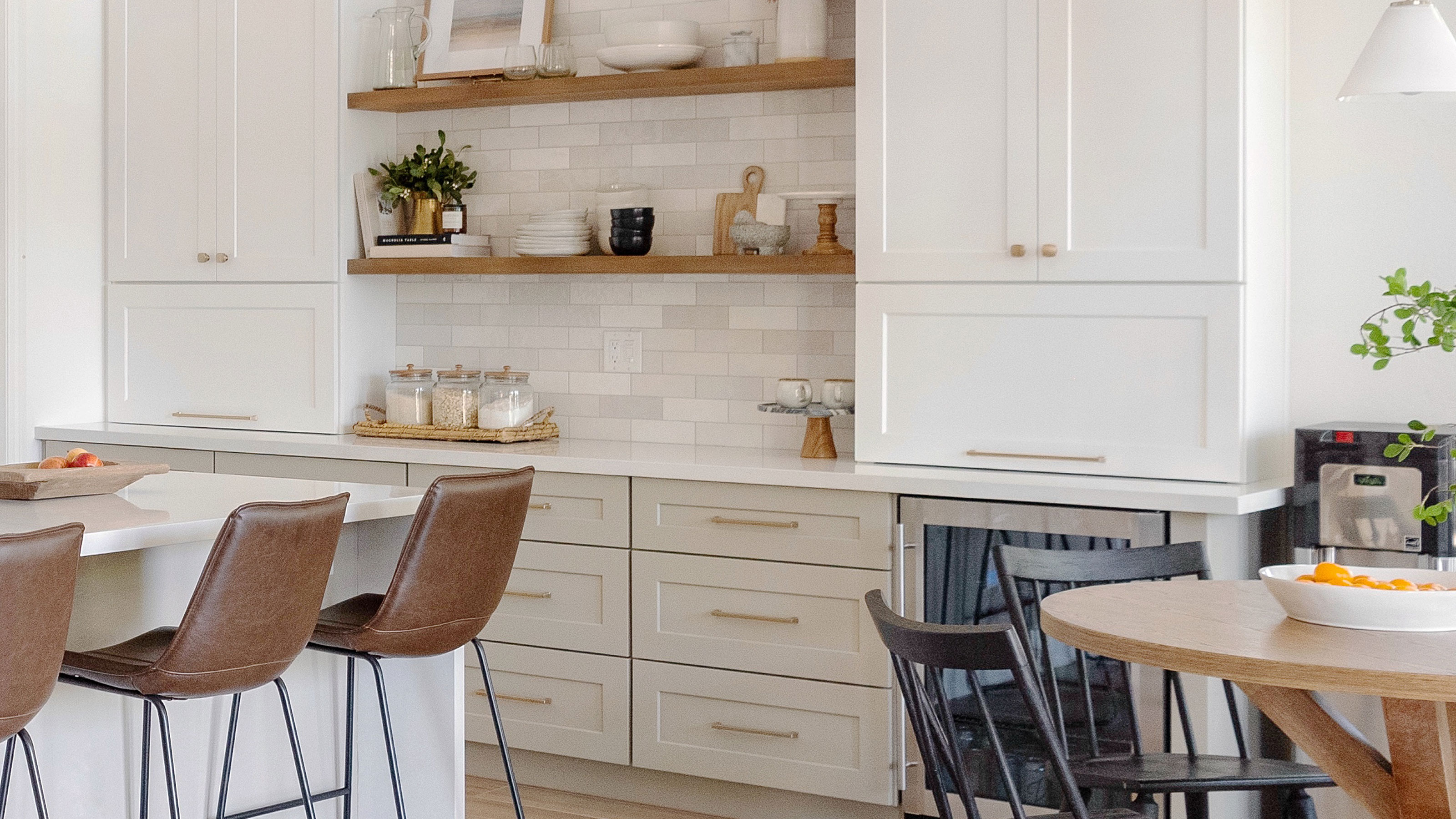
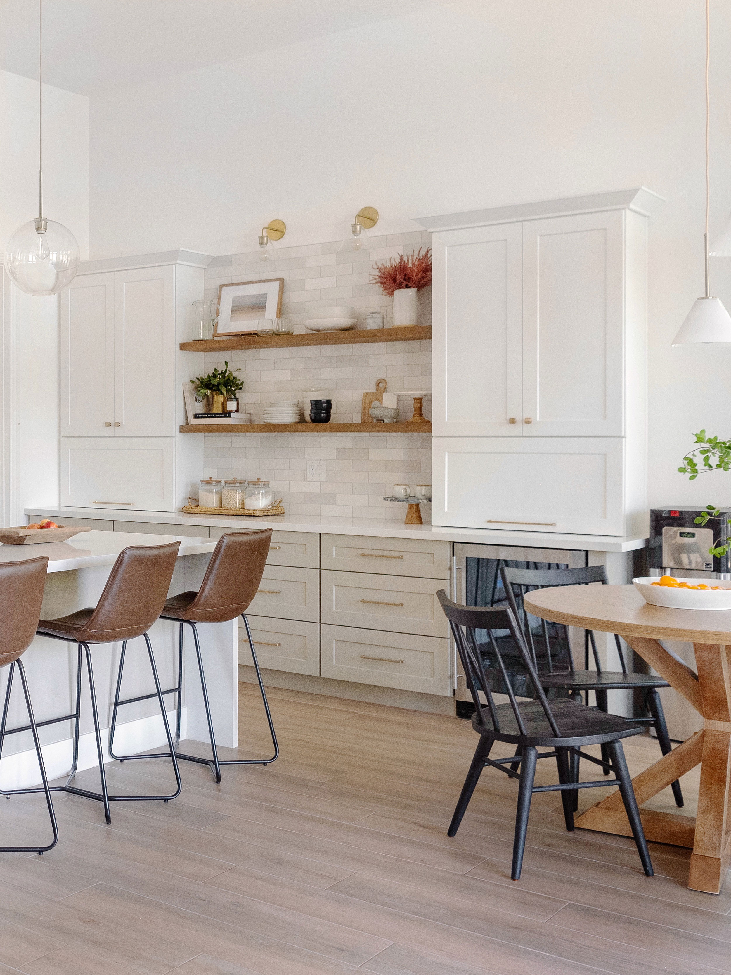
When I started to look for examples of Benjamin Moore Simply White in action, I came to a clear conclusion — this white paint color is loved in kitchens. "We use Simply White all the time, especially on cabinetry because it has universal appeal that clients love," agrees interior design Brittny Smith, founder of Homesmith Design.
Article continues belowOn my hunt, I also found a review of the color that described it as the perfect white paint color for a kitchen because it pairs so well with white quartz countertops, where the kitchen's owners said other warm whites looked 'yellow' against the pure whiteness of the counter.
Could this be the secret to why Simply White appears in a lot of kitchens?

The walls in this kitchen by Miranda & Co are painted in Benjamin Moore's Simply White.
Well, while it certainly seems to have a complementary undertone to pair well with other whites, it's not quite as simple as it seems.
"When we’re talking about quartz countertops, 'white' is not exactly 'white' if you know what I mean," says Brittny Smith. "It’s hard to fathom that white can have so many variations but believe it or not the selections are endless. That’s why it’s really important to start with your favorite slab and then choose your favorite white to coordinate with it."
The Livingetc newsletters are your inside source for what’s shaping interiors now - and what’s next. Discover trend forecasts, smart style ideas, and curated shopping inspiration that brings design to life. Subscribe today and stay ahead of the curve.
However, that doesn't mean that Simply White might not be the perfect starting point for consideration against your counter in a white kitchen. "After all, if the white isn’t quite perfect, you can modify the tint to varying degrees for just the right tone," Brittny says.

Price: $5.99 per half-pint sample
Part of Benjamin Moore's Off White collection, OC-117 (or Simply White) was the paint brand's Color of the Year in 2016.
What characteristics does is Benjamin Moore Simply White have?

Understanding the undertones of white paint colors is the secret to getting the ambience of your room perfect, so what's the secret to Simpy White which makes it one of the best white paint color?
Like many warm white paints, Simply White has yellow undertones, but they're just perfectly pitched in a way that makes it ideal for decorating all kinds of rooms.
"I love suggesting Simply White as at least one of the white options for when we start exploring neutral paint color options with clients," says Charlene Miranda, creative director of design studio Miranda & Co. "It is a beautiful warm white making it soft and inviting. It also has subtle undertones that go very well with natural materials such as wood."
"Simply White is a great color for interiors because it has just a hint of warm undertones which is really pleasing to the eye and keeps a space from feeling too institutional and cold," Brittny Smith agrees.
In large rooms with lots of natural light, those yellow undertones even out and you get a crisp, but still warm feeling, while it's well-pitched for north-facing rooms, and smaller darker rooms too, to make things feel cozy. The only places it might feel a little too warm is south-facing rooms with super directional light where those yellow tones will be enhanced.
What colors go with Benjamin Moore Simply White?

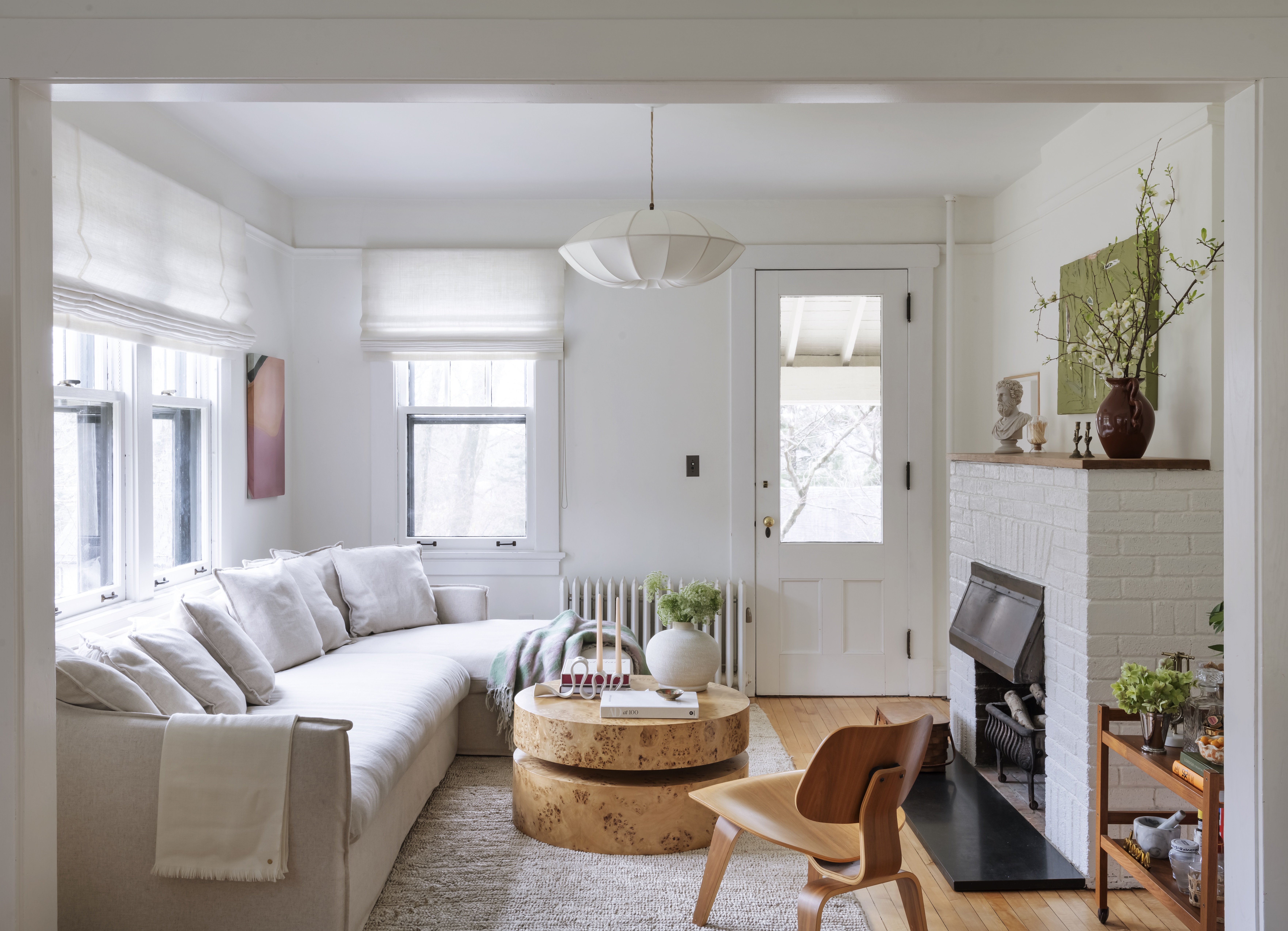
Some of the most effective uses for decorating a room with white walls is to use it alongside other whites in a way that brings a little more depth to the scheme. In the home pictured above, for example, Charlene used Simpy White on the walls throughout, with Benjamin Moore's Decorators White on the ceilings. "The warm white paired with cooler whites like Chantilly Lace or Decorators White contrasts beautifully adding depth and dimension without feeling stark," Charlene explains. "Also sometimes it is a nice way to subtle emphasize architectural features like trim, cabinetry etc without introducing jarring contrast."
When it comes to pairing it with more saturated colors, the secret lies in looking to shades with other warm undertones. "The beauty of Simply White is that it is such a versatile white and can be used in combination with any warm color palette," Charlene agrees. "I have used it in on the walls with blue millwork, I have also used it on millwork with multicolored wallpaper. I would look for warm undertones when scheming, some like beiges, taupes in terms of neutrals or even soft browns."
FAQs
Is Benjamin Moore Simply White warm or cool?
It's a warm-toned white paint with yellow undertones, though these are paler than some warm whites you'll find on the market.

Does Benjamin Moore's Simply White Look Yellow?
Simply White's yellow undertones are a little more nuanced, and designers say they don't read in bright, light rooms, avoiding it reading too beige, or magnolia, and keeping it firmly as a white paint. However, under artificial light, especially warmer light temperatures, some of those yellow tones can be amped up, so it's important to sample your choice under a range of lighting before you decide.

Hugh is Livingetc.com’s editor. With 8 years in the interiors industry under his belt, he has the nose for what people want to know about re-decorating their homes. He prides himself as an expert trend forecaster, visiting design fairs, showrooms and keeping an eye out for emerging designers to hone his eye. He joined Livingetc back in 2022 as a content editor, as a long-time reader of the print magazine, before becoming its online editor. Hugh has previously spent time as an editor for a kitchen and bathroom magazine, and has written for “hands-on” home brands such as Homebuilding & Renovating and Grand Designs magazine, so his knowledge of what it takes to create a home goes beyond the surface, too. Though not a trained interior designer, Hugh has cut his design teeth by managing several major interior design projects to date, each for private clients. He's also a keen DIYer — he's done everything from laying his own patio and building an integrated cooker hood from scratch, to undertaking plenty of creative IKEA hacks to help achieve the luxurious look he loves in design, when his budget doesn't always stretch that far.


