"Swiss Coffee" Is the Paint Color that People With Cozy but Expensive-Looking Homes Pick
This Benjamin Moore shade is a best-seller that people reach for to achieve the ideal warm white


The Livingetc newsletters are your inside source for what’s shaping interiors now - and what’s next. Discover trend forecasts, smart style ideas, and curated shopping inspiration that brings design to life. Subscribe today and stay ahead of the curve.
You are now subscribed
Your newsletter sign-up was successful
If I had to pick one thing that's changed for the better in interiors in the last 10 years, it's the demise of the 'Brilliant' white wall. This bluer-hued white made every space feel colder and more stark — fine for an art gallery, perhaps, but not for our homes.
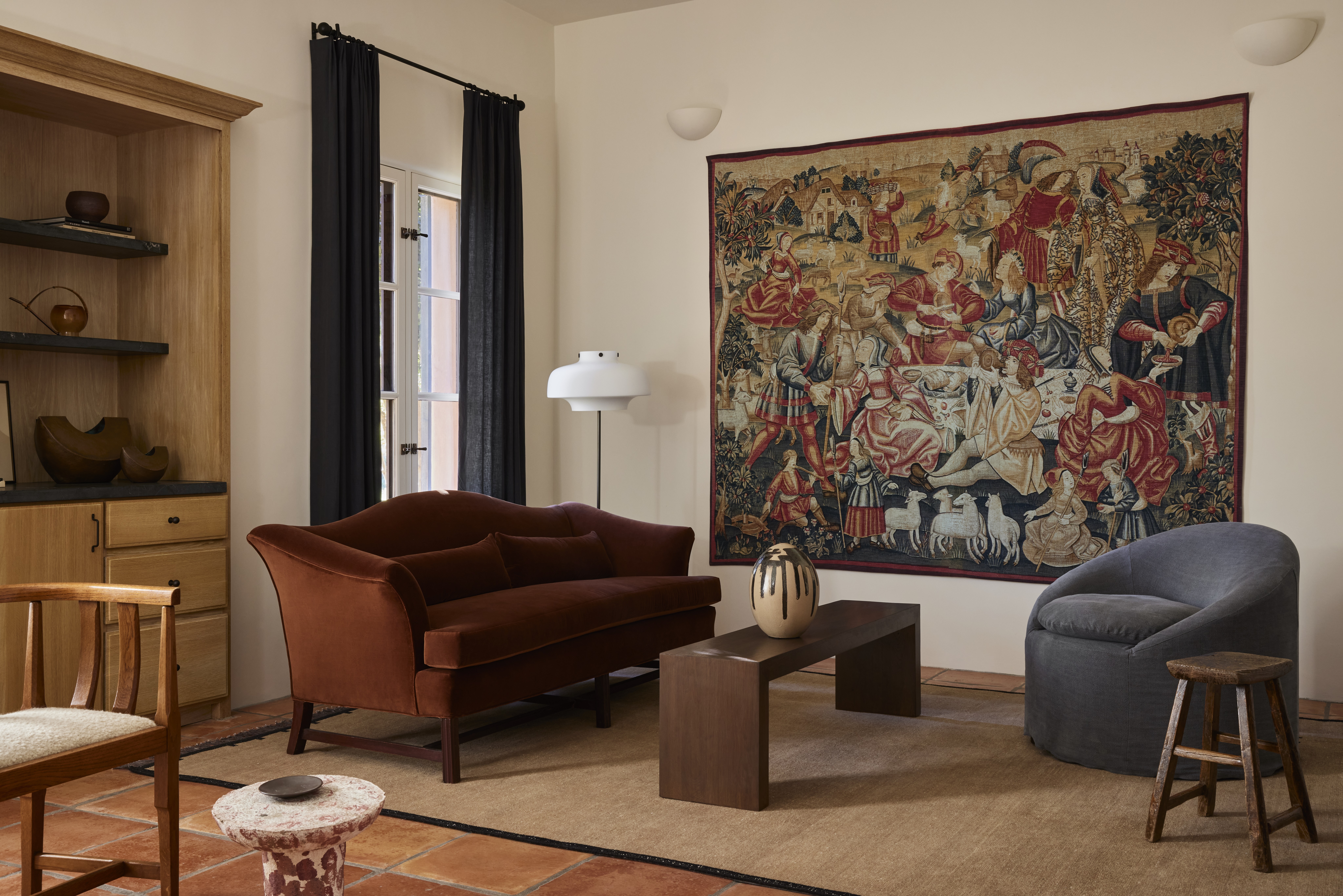
With that good news, warmer, yellow-hued whites have become more in vogue, especially when you're looking to create a cozy atmosphere, and among one of the very best is Benjamin Moore's Swiss Coffee paint color.
According to the paint brand, it's one of Benjamin Moore's most popular paint colors, and we can see why. While you might be dazzled by the brighter, more colorful shades, it's always the neutrals, and whites specifically, that are the best-sellers, and Swiss Coffee is one that captures the mood of the moment.
Article continues belowBut how do you use this paint color? And where is it best suited? To get all your answers, we've asked some interior designers who swear by this color for their best advice.
However, side note, just be warned that Benjamin Moore's Swiss Coffee isn't the only paint with this name. Dunn Edward's also has a Swiss Coffee in its range, so just make sure you've got the right paint color in mind before you dive in.
What makes Benjamin Moore's Swiss Coffee so popular?

Swiss Coffee is a popular shade with designers — even Nate Berkus named it as one of his favorite neutrals of all time. So what makes it one of the best cream wall paint colors for your home?
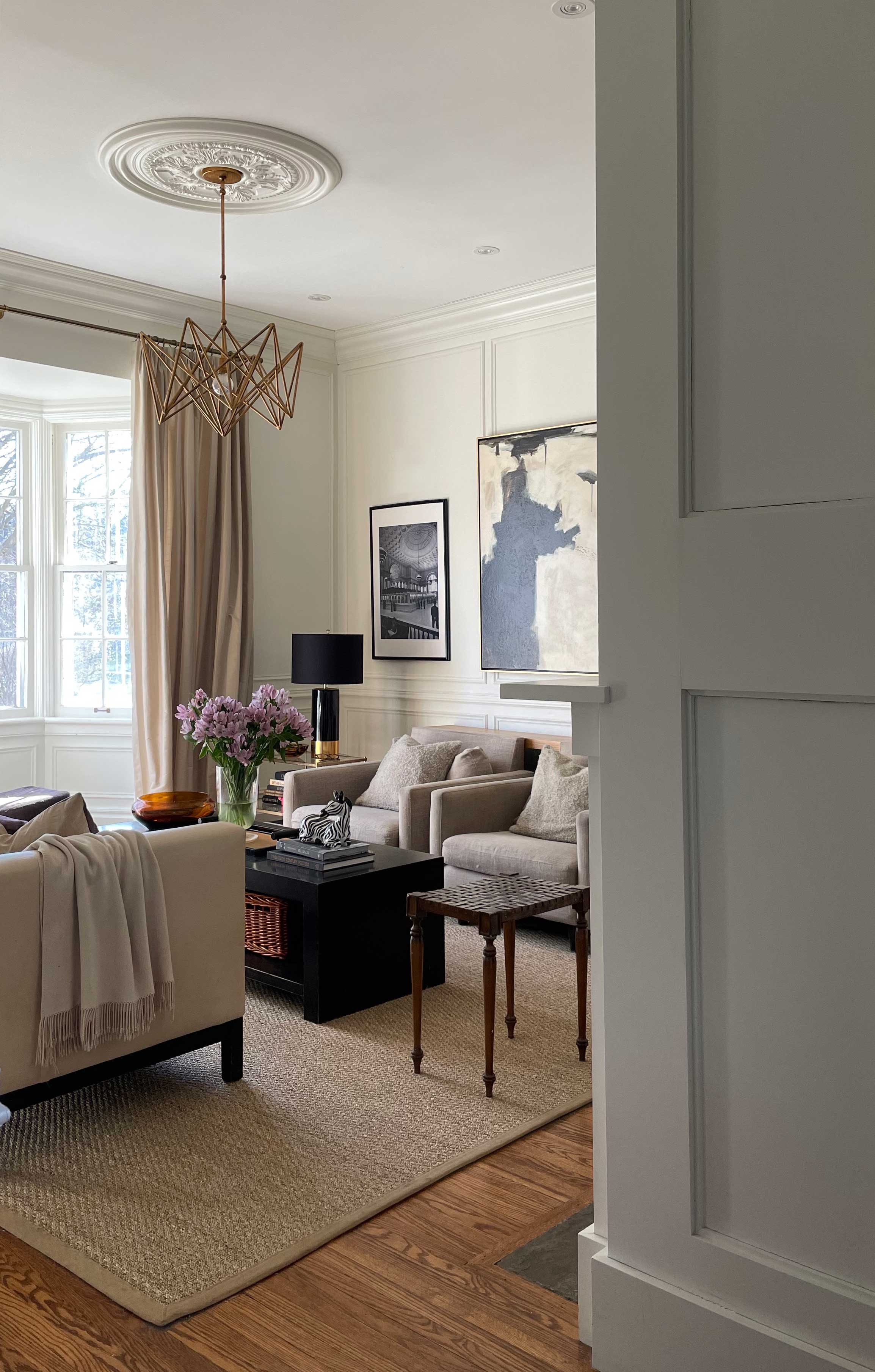
Well, for many designers, it measures the perfect level of warmth — cozy, without going too far that it feels too yellow, even magnolia. "It definitely has more "body" than a pure white and a sophisticated, almost historic feel to it," says interior designer Kelly Hopter.
The Livingetc newsletters are your inside source for what’s shaping interiors now - and what’s next. Discover trend forecasts, smart style ideas, and curated shopping inspiration that brings design to life. Subscribe today and stay ahead of the curve.
According to designer Kathy Kuo, this may be down to an almost imperceptible green undertone that helps to balance this paint color out. "It's bright and cheerful without being too stark, and it features just the slightest of green undertones," she explains.
While you might describe Swiss Coffee as an off-white, in truth it's a little darker than that, and you can see the difference against a truer off-white of the ceiling.
What type of room should you use Swiss Coffee in?

As it's a darker, warmer white, you can use Swiss Coffee in the likes of a north-facing room with ease, even one that's low on natural light. It will help to counteract the blue light color that is inherent in north-facing spaces, helping to balance out the cooler tones.
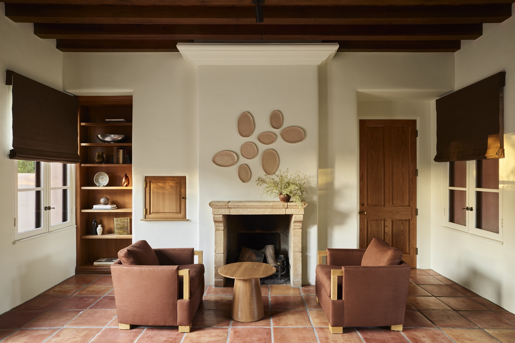
In terms of the types of room, it's a shade of white, so it's pretty universal, but we've seen lots of examples of Swiss Coffee used in the kitchen. In the home pictured above, designed by Corinne Matthern, Swiss Coffee was used in almost every single room — it's that versatile.
"The result is welcoming but also very upscale," says Kathy Kuo.
What colors go with Swiss Coffee?

Whether you're designing a cream living room, bathroom, kitchen or bedroom, understanding what colors go with a shade such as Swiss Coffee will help you make your space more cohesive.
"It works beautifully especially with warm color palettes — browns, beiges, taupes," designer Kathy explains. That's because, in general, matching undertones is an easy way to create a scheme that feels harmonious. Warm colors, and those with warm undertones of yellow and red, are ideal matches. That doesn't mean you can only use colors on the warmer side of the color wheel with Swiss Coffee, but more that if you look at the undertone when choosing a paint color, be they greens, blues or grays, those with warmer undertones will gel better with this white paint color.
However, it's a good idea to consider mixing warm and cool colors, too. Opting only for warm tones can sometimes make a room feel one-dimensional, and in a south-facing room, can read overly warm, without something refreshing, palette-wise, to rest your eye on. Even if it's just a small decorative accent, it can be a nice way to add some depth to your design by bringing a cooler tone in too.
How to decorate with Swiss Coffee
Beyond the colors that you pair Swiss Coffee with, you've got two options when using this as a neutral base for a room — either color drenching your whole room in it, or using it in combination with other whites for a slightly more nuanced approach.
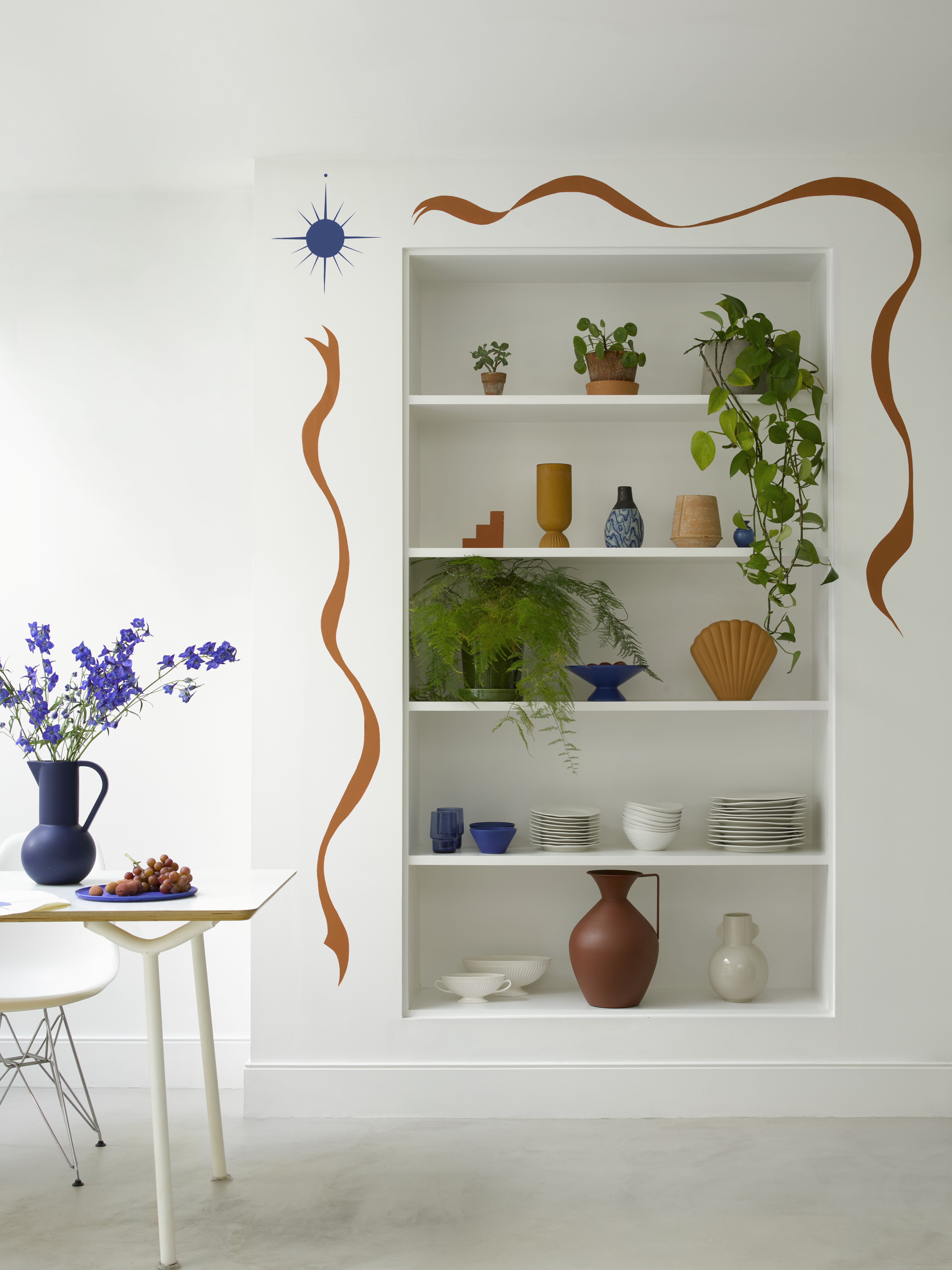
Color drenching, across the walls and ceilings, makes it easier to paint, and gives you a solid color which will undoubtedly make a room feel bigger. But because we're dealing with shades of white, the effect is far subtler than when using color if you do want to mix tones up. Using Swiss Coffee on the walls, with something such as Benjamin Moore's White Dove on the ceiling, will be an, in many instances, imperceptible difference, but using it on the likes of kitchen cabinets and the walls behind will give you a subtle shift in tone that can make a space feel a little more dimensional.

Hugh is Livingetc.com’s editor. With 8 years in the interiors industry under his belt, he has the nose for what people want to know about re-decorating their homes. He prides himself as an expert trend forecaster, visiting design fairs, showrooms and keeping an eye out for emerging designers to hone his eye. He joined Livingetc back in 2022 as a content editor, as a long-time reader of the print magazine, before becoming its online editor. Hugh has previously spent time as an editor for a kitchen and bathroom magazine, and has written for “hands-on” home brands such as Homebuilding & Renovating and Grand Designs magazine, so his knowledge of what it takes to create a home goes beyond the surface, too. Though not a trained interior designer, Hugh has cut his design teeth by managing several major interior design projects to date, each for private clients. He's also a keen DIYer — he's done everything from laying his own patio and building an integrated cooker hood from scratch, to undertaking plenty of creative IKEA hacks to help achieve the luxurious look he loves in design, when his budget doesn't always stretch that far.


