These are Benjamin Moore's 4 Best Paint Shades to Create a Relaxing and Restful Space
These color recommendations will inject tranquility into your space

The Livingetc newsletters are your inside source for what’s shaping interiors now - and what’s next. Discover trend forecasts, smart style ideas, and curated shopping inspiration that brings design to life. Subscribe today and stay ahead of the curve.
You are now subscribed
Your newsletter sign-up was successful
Benjamin Moore is a household name in the world of paint brands — and for good reason. With such a vast catalog of colors, we're spoiled for choice when it comes to deciding on the best shade to give our walls a refresh, but that can also be an overwhelming position to be in.
Choosing colors for your home can sometimes feel daunting when there are just so many to choose from, but we have you covered. If you need some color inspiration for your next decorating project and you know you want a relaxing, restful vibe, then look no further.
Here, we've asked the team at Benjamin Moore - as well as some seasoned designers - to offer up their top color picks for a relaxing room. Below are four shades to inspire your next paint idea, and we can already envision them in a sanctuary space such as a bedroom.
Article continues below1. 'Quiet Moments'
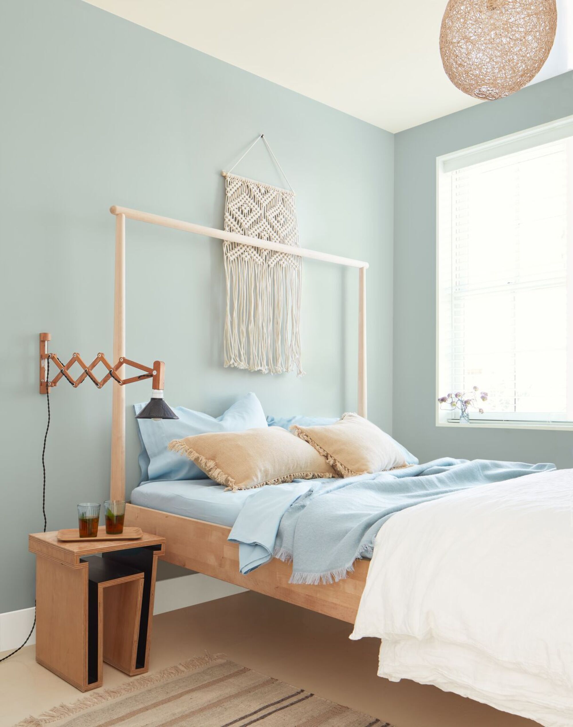
Walls painted in 'Quiet Moments'
The color green has been proven to relax our minds, especially in softer unsaturated tones, and makes the perfect bedroom color idea. 'Soft pastels such as our shade Quiet Moments (1563) will offer the perfect injection of color,' says Helen Shaw, Director of International Marketing at Benjamin Moore.
Its relaxing qualities needn't be reserved for a bedroom, though. 'Quiet Moments would be great in a meditation space or yoga room,' says Maria Vassiliou from Maria Zoe Designs. 'The green and blue hues create a perfect balance of calmness and serenity.' The shade is so versatile to work with, and it will create a serene ambience in any room around your home.
2. 'Hint of Violet'
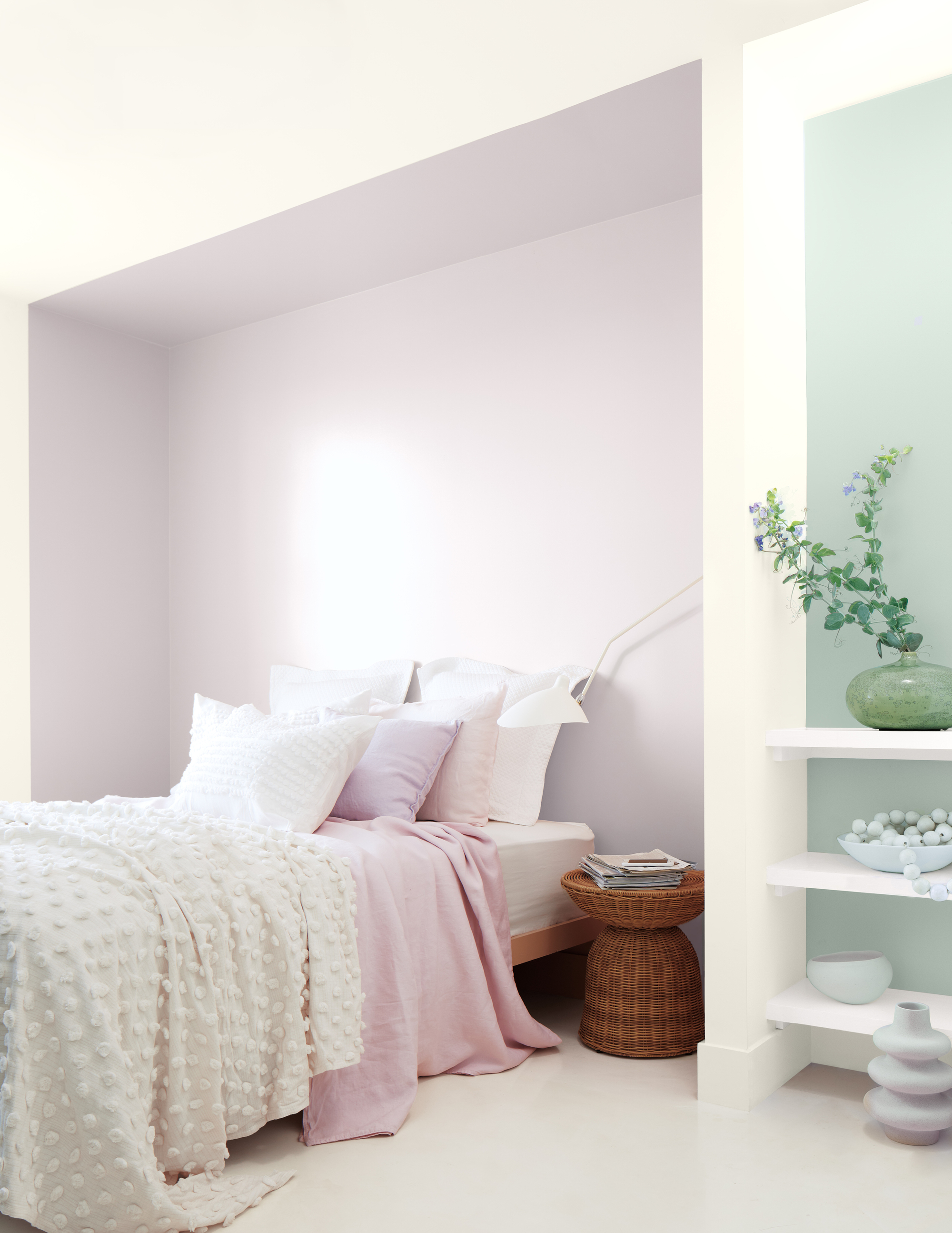
Alcoves painted in 'Hint of Violet' and 'Quiet Moments'
Helen also suggests soft pinks, such as Hint of Violet (2114-60), to create a restful feel in a space. This gentle lilac has a cool gray cast that gives it a refreshing feel as well as a relaxing one. 'The wonderful gray base kissed with lilac, allows for it to be used in many spaces such as a wall-paneled powder bathroom, or on a ship-lapped ceiling of a little girl's room,' notes Maria.
Helen even suggests pairing the two aforementioned tones together for the ultimate relaxing color pairing. 'Pinks and greens go hand in hand,' she says. Being complementary colors, they work to elevate each other yet are far less contrasting and harsh than green and red, for example. There are many ways in which to create interplay between the shades yet keep the overall color scheme sleek and ordered.' As paint colors that make you calmer, these two pastel tones will work wonders when used to create a relaxing yet colorful space.
The Livingetc newsletters are your inside source for what’s shaping interiors now - and what’s next. Discover trend forecasts, smart style ideas, and curated shopping inspiration that brings design to life. Subscribe today and stay ahead of the curve.
3. 'Hazy skies'
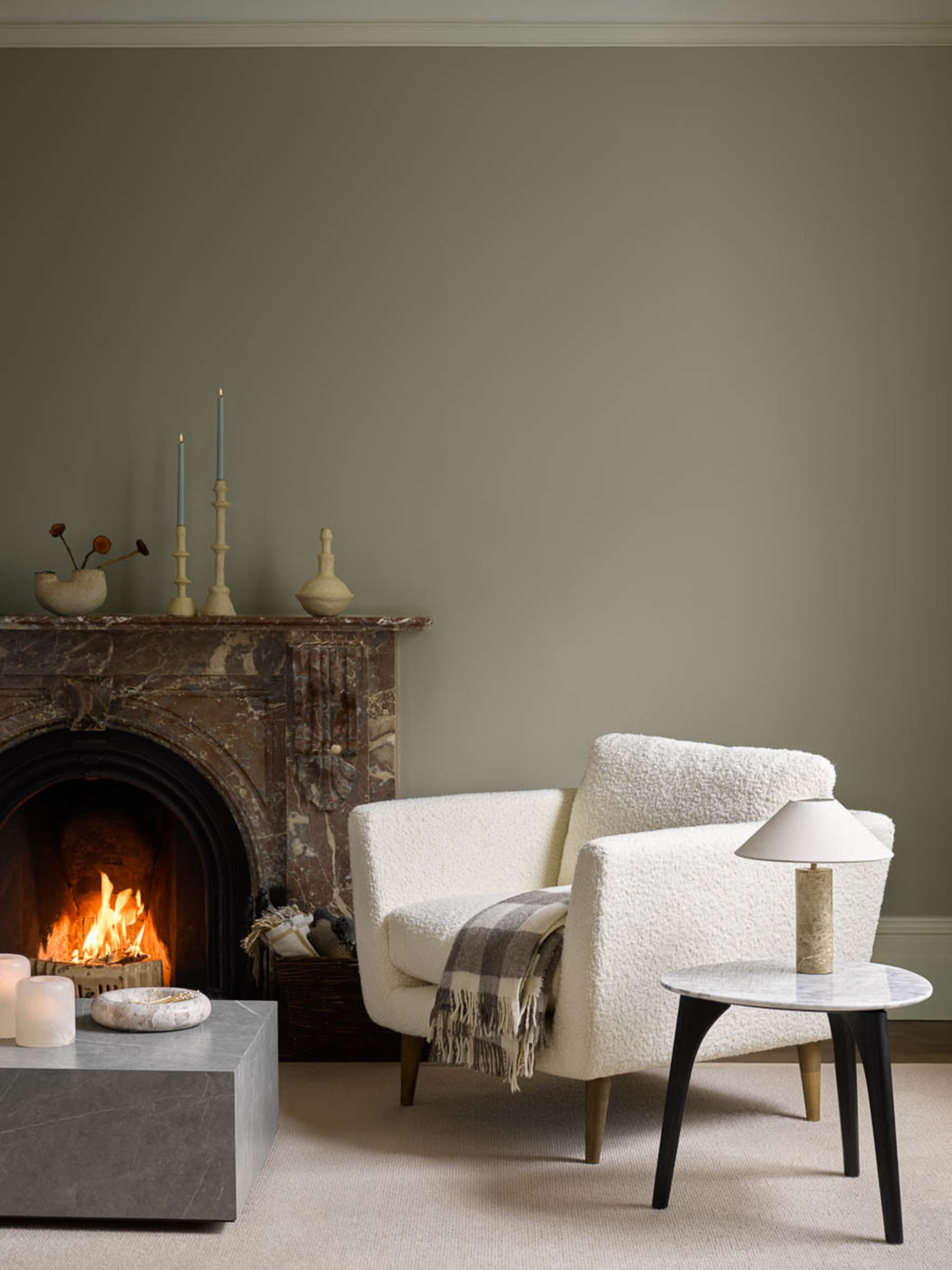
Walls painted in 'Hazy Skies'
Neutrals might seem like a boring choice for your walls, but they're well-loved for a reason. They go with everything, and always feel clean and contemporary. They're also great colors for a south-facing living room or bedroom, as the light throughout the day will make the space feel airy and bright.
Neutrals like Hazy Skies (OC-48), which has a gray-green undertone that adds moodiness to a space, are great for relaxing spaces. 'Combining lighter ice cream shades will feel soft and subtle whilst still creating a look that is fresh and optimistic,' says Helen. 'Pairing white warm neutrals such as Hazy Skies (OC-48) and Sebring White (OC-137) together will ooze comfort in a classy and effortless way.'
'Hazy Skies evokes a dewy sense of green, which could be perfect for a bright breakfast nook,' adds Maria. 'Paint the trims, and pair it with a coordinating wallpaper to make a classic statement.'
Paired with layers of texture, such as dark polished woods, tactile bouclé textiles, and sleek stone surfaces such as marble and quartz, will elevate the look, recommends Helen. The introduction of marble and quartz will also create a sleek, expensive feel that's effortlessly chic.
4. 'Garrison red'
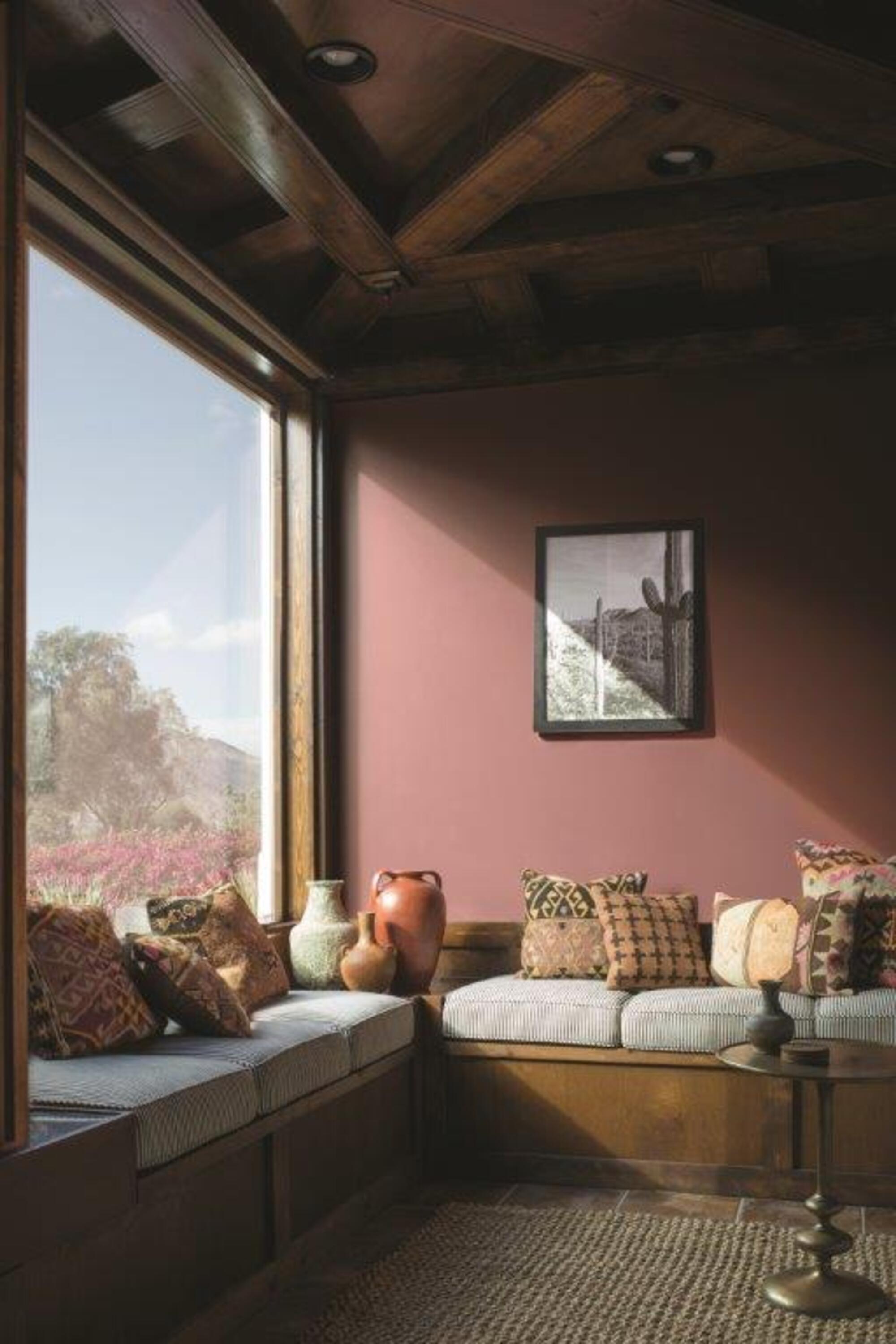
Walls painted in 'Garrison Red'
Deeper tones like Garrison Red (HC-66) might feel like a bold choice, but they're such an easy way to inject bold color into your space whilst creating a cozy, relaxing environment. 'Cozy up by the fire with a great book and paint your library or reading nook with this earthy, muted red,' says Maria. 'With a faint hint of brick and a dash of violet, this can help set the mood for any nail-biting novel.'
'Earthy colors such as browns reflect less light, making a room less active and therefore more restful,' says Helen. 'A rich burgundy, such as Garrison Red, paired with dark brown woods or accents will bring a rustic warmth to any room. This works particularly well in large, well-lit spaces, where there is plenty of natural light to avoid it becoming closeting and confined.'
These warmer earth tones go so well with rich, deep-toned furnishings. Think faux fur cushions, mahogany coffee tables and quirky vases for an elegant, luxe look. 'Layer the look with natural materials such as ceramic clay vases and textured fabrics and materials to soothe the senses and deliver softer surroundings,' notes Helen. It's the perfect background color for whiling away the weekend in style.
Shop Benjamin Moore paints

Ottilie Blackhall is a master’s Magazine Journalism student at City, University of London. After graduating from the University of Edinburgh, with a degree in English Literature and History of Art, she decided to pursue her love of writing and develop her passion for writing about literature and art. Having started a book review blog during lockdown, at City she is working on her portfolio.


