The 10 Benjamin Moore Neutrals Interior Designers Always Reach for — And How They Decorate With Them
Painting your walls? This list of designer-backed Benjamin Moore neutrals will make your life — and your choices — a whole lot easier

Unless you're a bonafide color expert, the process of selecting a single paint for the array of neutrals out there sounds as daunting as it gets. What makes one tan different from another? Why does this white work better in an entryway, while this white works best in a light-drenched living room? How many swatches do you have available? Enough to make my head spin? Great!
Well, in hopes of simplifying an over-complicated process saturated with choice, I asked designers and paint experts at Benjamin Moore for some of their favorite and best-selling neutral shades, then collated all of those suggestions into an easy-to-peruse list (see below). Each inclusion is accompanied by a short blurb as to what makes this particular shade great, which means you have (1) a shortlist from which to operate, and (2) insight into why you're choosing what. Some of these options you might have heard of, as a few are some of the most popular Benjamin Moore paint colors on the market. But others might be brand new; and I welcome you to run to your local Home Depot or Lowe's (that's another reason to lean on Benjamin Moore; you'll find its product everywhere) to get a swatch to test.
So, scroll down to find my expert-backed roster of the best Benjamin Moore neutrals, with the company's best-selling options listed at the top, and some additional designer-recommended picks below. For what it's worth, I attempted to round up as many opinions as possible for this piece, meaning I spoke with as many experts as I could. You didn't think we here at Livingetc would ever leave you hanging, did you?! Didn't think so.
Best-Selling Benjamin Moore Neutrals

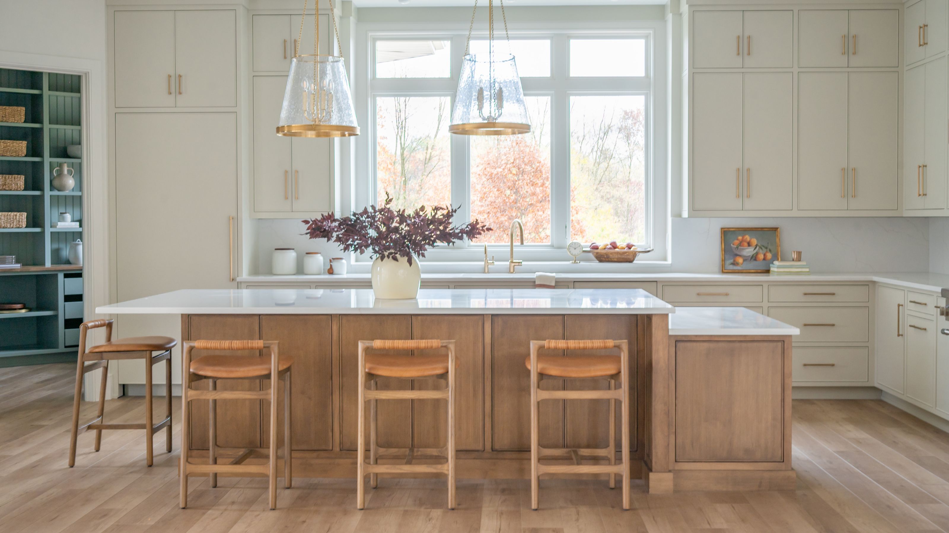
Benjamin Moore's Revere Pewter is shown on the walls.
If you're overwhelmed by choice, a great place to start with any shopping experience is a brand's best-sellers. It's not a foolproof method, of course, because you can't see the actual shopping data, but nine times out of 10, it should provide an excellent jumping off point. As such, I spoke with an expert at Benjamin Moore to gather data on the brand's three best-selling neutral paints, listed below:

Price: $5.99/half-pint sample
"White Dove OC-17 continues to top our best-selling colors list year after year," says Arianna Barone, color marketing manager at Benjamin Moore. "This soft off-white has the slightest wink of warmth making it the perfect option for any style and any room. White Dove OC-17 is truly a versatile white paint color and go-to for open concept floorplans. This is a great color to use on the trim, ceiling, and interior doors of an entire home because it works well with so many colors. It is an iconic Benjamin Moore color."
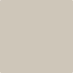
Price: $5.99/half-pint sample
"Revere Pewter HC-172 is the perfect mid-tone warm gray," says Arianna. "Not too warm, not too cool, this color emanates ease and adaptability. It feels warm and inviting while also being modern and fresh. This go-to hue is a color palette staple and always a first stop when looking for a neutral mid-tone."

Price: $5.99/half-pint sample
"Pale Oak OC-20 is a soft warm gray that is loved by designers and consumers alike," Arianna continues. "With just the right amount of depth, it balances between off-white and neutral. When paired with crisp white trim, it can look like more of a neutral shade. When used in rooms with a lot of natural light, it can take on the role [of] more of an off-white hue. This versatile color pairs well with warmer and cooler hues and works with a variety of styles."
Designers' Favorite Benjamin Moore Paints
Now that we know the customer favorites, let's take a look at designers' favorites, too. Below, find 10 different Benjamin Moore neutrals, from soft browns to creamy whites, that interiors experts positively love.
Chantilly Lace OC-65
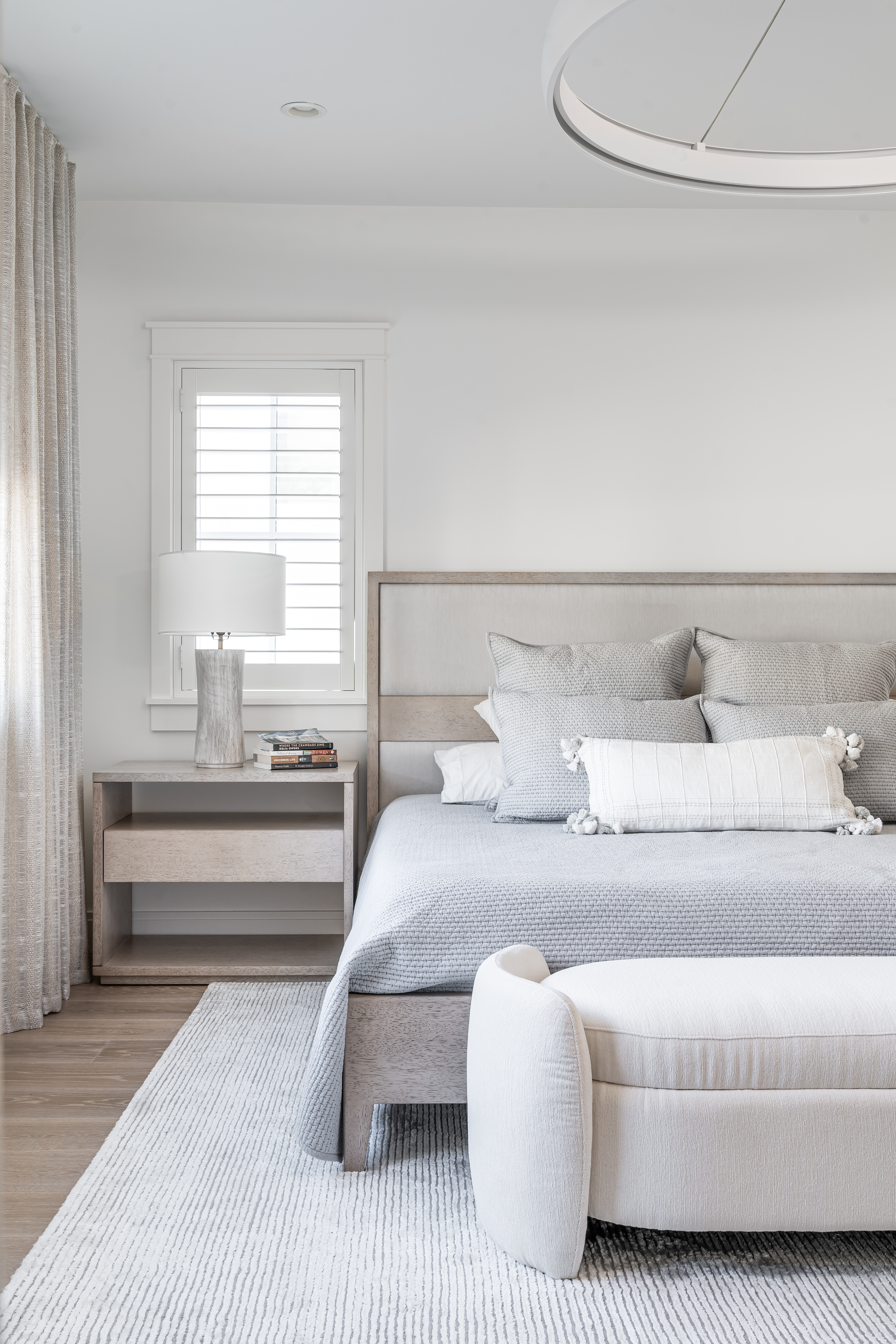
"Chantilly Lace (BM OC-65) is a soft, neutral white that works really beautifully on walls," says Laetitia Laurent, founder and principal at Laure Nell Interiors. "It has an understated undertone that creates a light, inviting atmosphere. This is where the versatility comes in, because it pairs seamlessly with all sorts of design styles. Chantilly Lace always seems to strike the perfect balance — bright and airy without feeling overly stark — making it ideal for spaces that exude calm and warmth."
Skipping Stone CSP-155
"Benjamin Moore’s Skipping Stone is a light beige with grey undertones that we use often on cabinetry," Becky Asleson, owner and principal at Maple & White Design, tells me. "It is a richer color that has some depth to it, but never feels too dark or heavy. Skipping Stone is neither too warm nor too cool and pairs nicely with a wide range of wood tones. It provides a relaxed and casual feeling to spaces."
River Reflections 1522
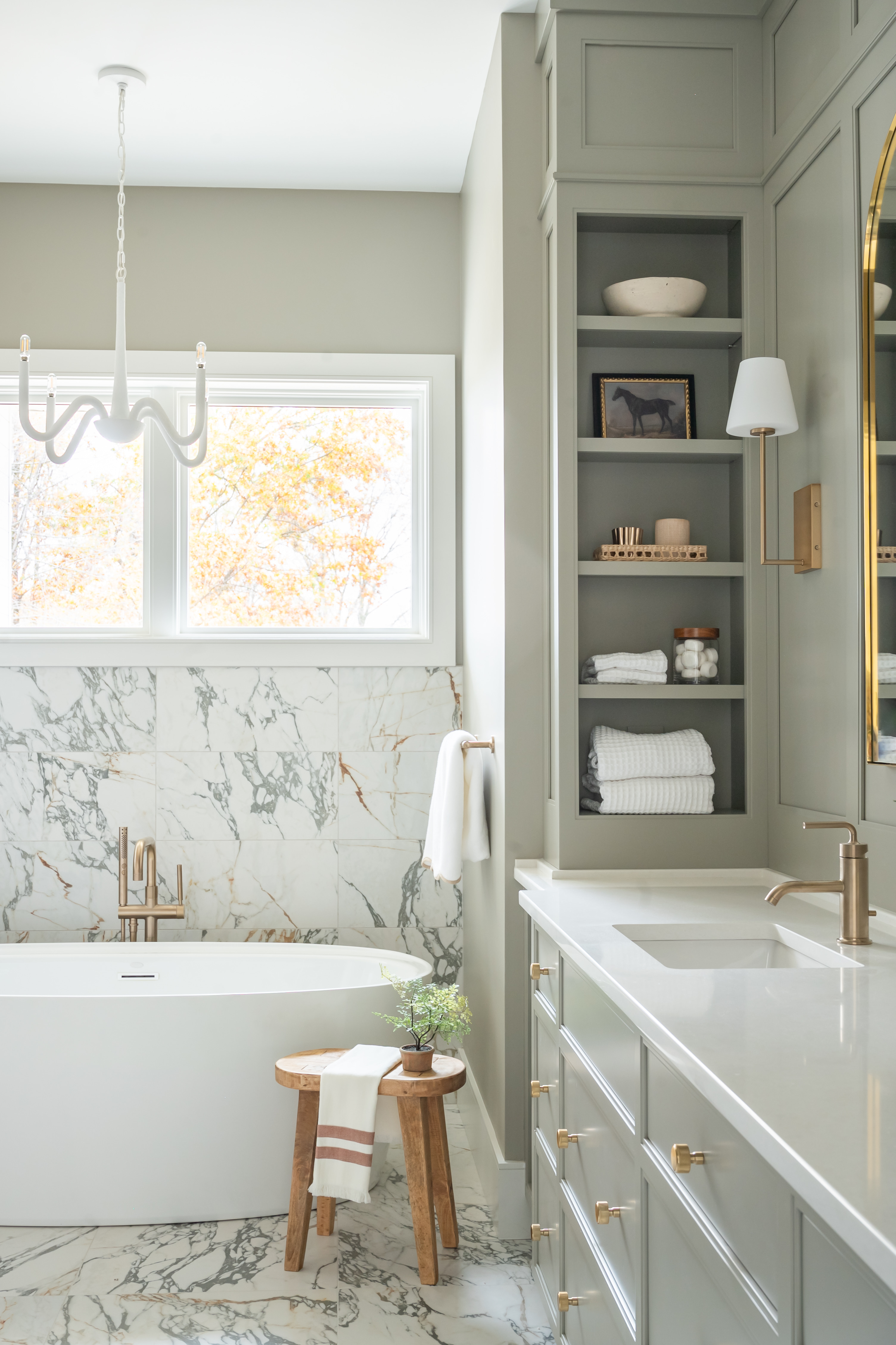
"Benjamin Moore’s River Reflections is a cool light brown with undertones of gray and the slightest hint of green," Becky continues. "It is a sophisticated color that pairs well with other neutrals. We especially like using it in spaces with mixed metals or rooms that have both cool and warm colors."
Gray Owl OC-52
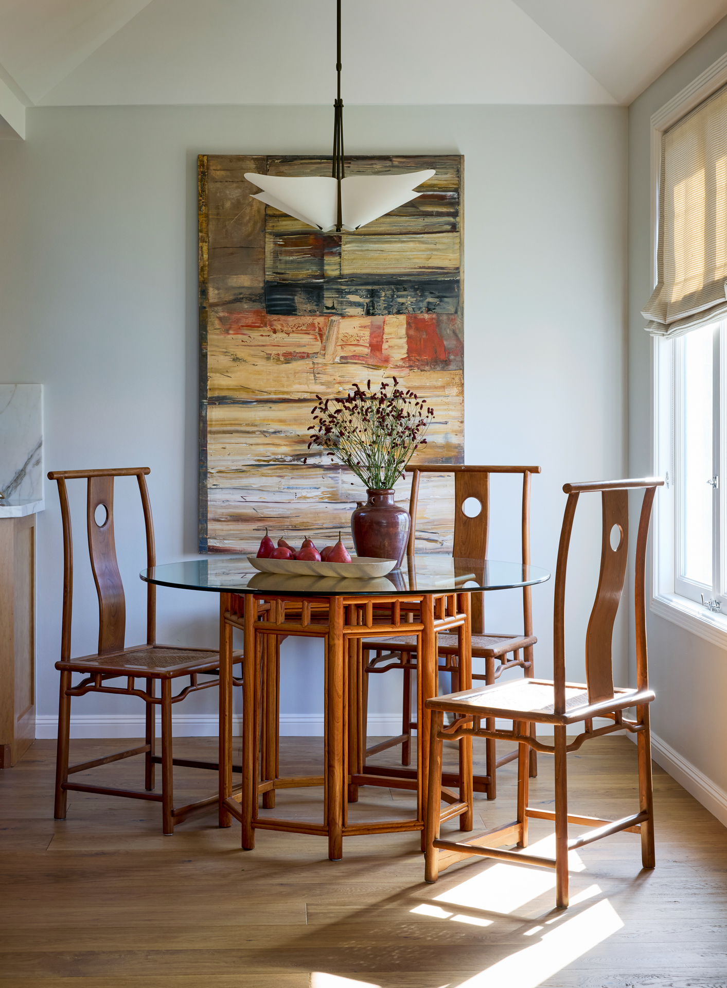
"My favorite Benjamin Moore neutral color hands down is Benjamin Moore's Gray Owl," says Alice Chiu, founder of Miss Alice Designs. "It's a serene and calm neutral that works with any style, from traditional to modern. Gray Owl is a versatile neutral that can exhibit a blue or green undertone depending on the natural light, the surrounding furniture, and the finishes in the space. The color works beautifully with black decorative accents and wood floors for a modern look, while creating a nice contrast with white molding and brass finishes for a classic feel. It's a refreshing spin on what people consider the typical neutral."
Balboa Mist OC-27
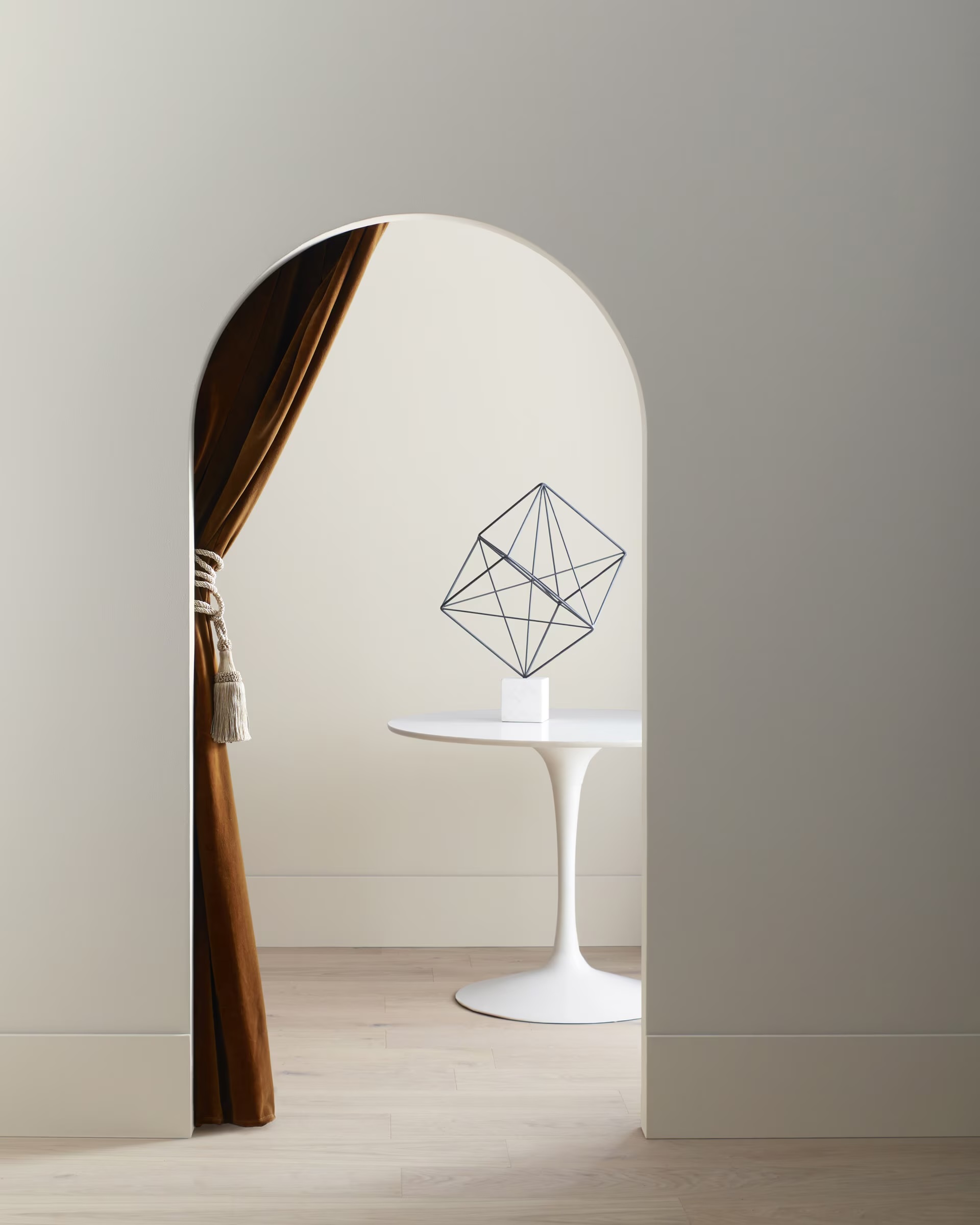
"This is a favorite of mine when used in the right lighting," says Jackie Johnson of Jackie Johnson Design. "It can lean a bit purple if placed in a room that doesn’t have great natural light, but in the right setting, it’s stunning. I love using it as a main color when a client doesn’t want a stark white. It’s perfect for bedrooms or dining rooms and adds a soft, inviting feel."
Calm OC-22
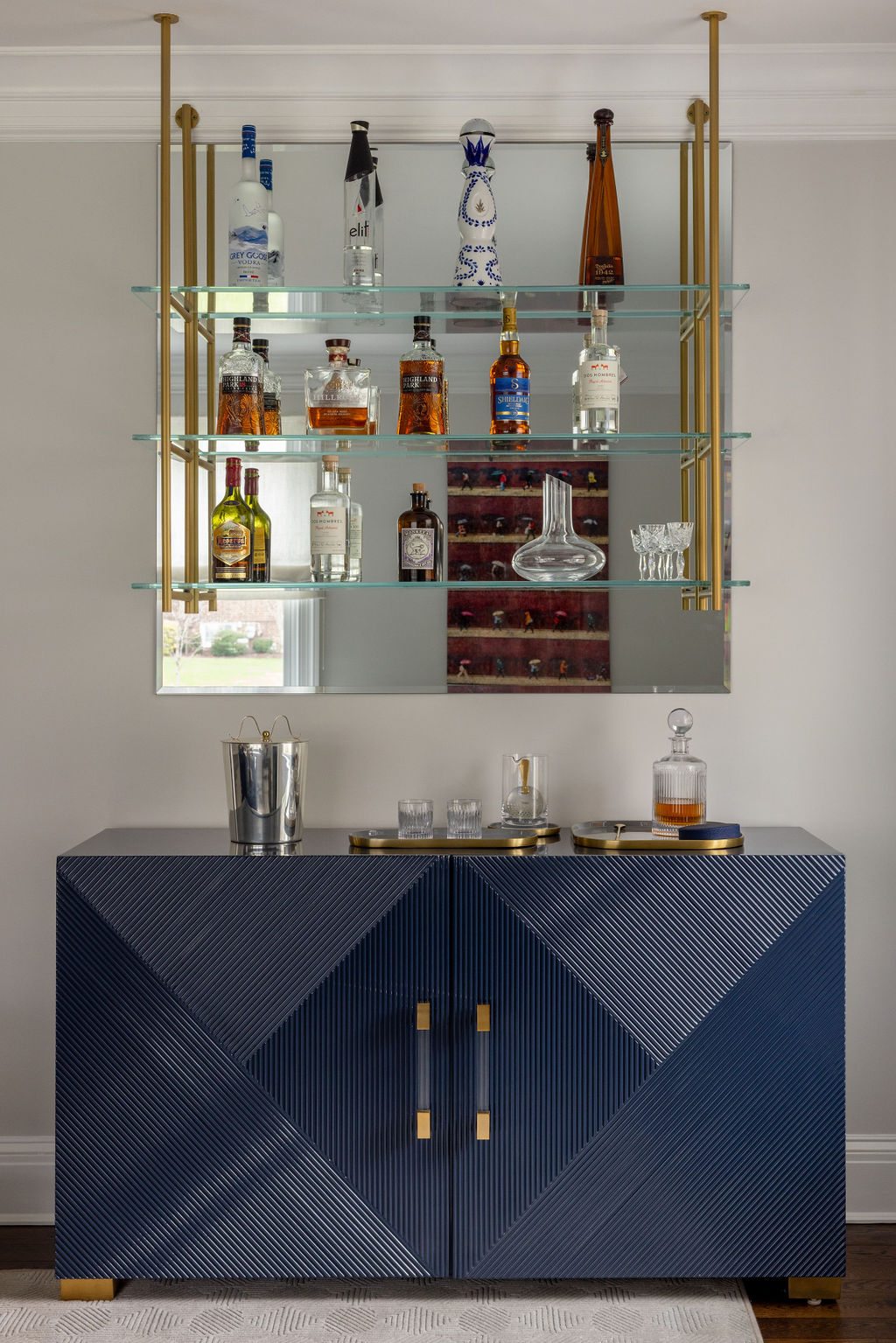
"Calm is a soft gray color that feels timeless and sophisticated," says Emily Shron of Shron Design, adding that it's perfect for "creating relaxing and serene spaces."
Creamy White OC-7
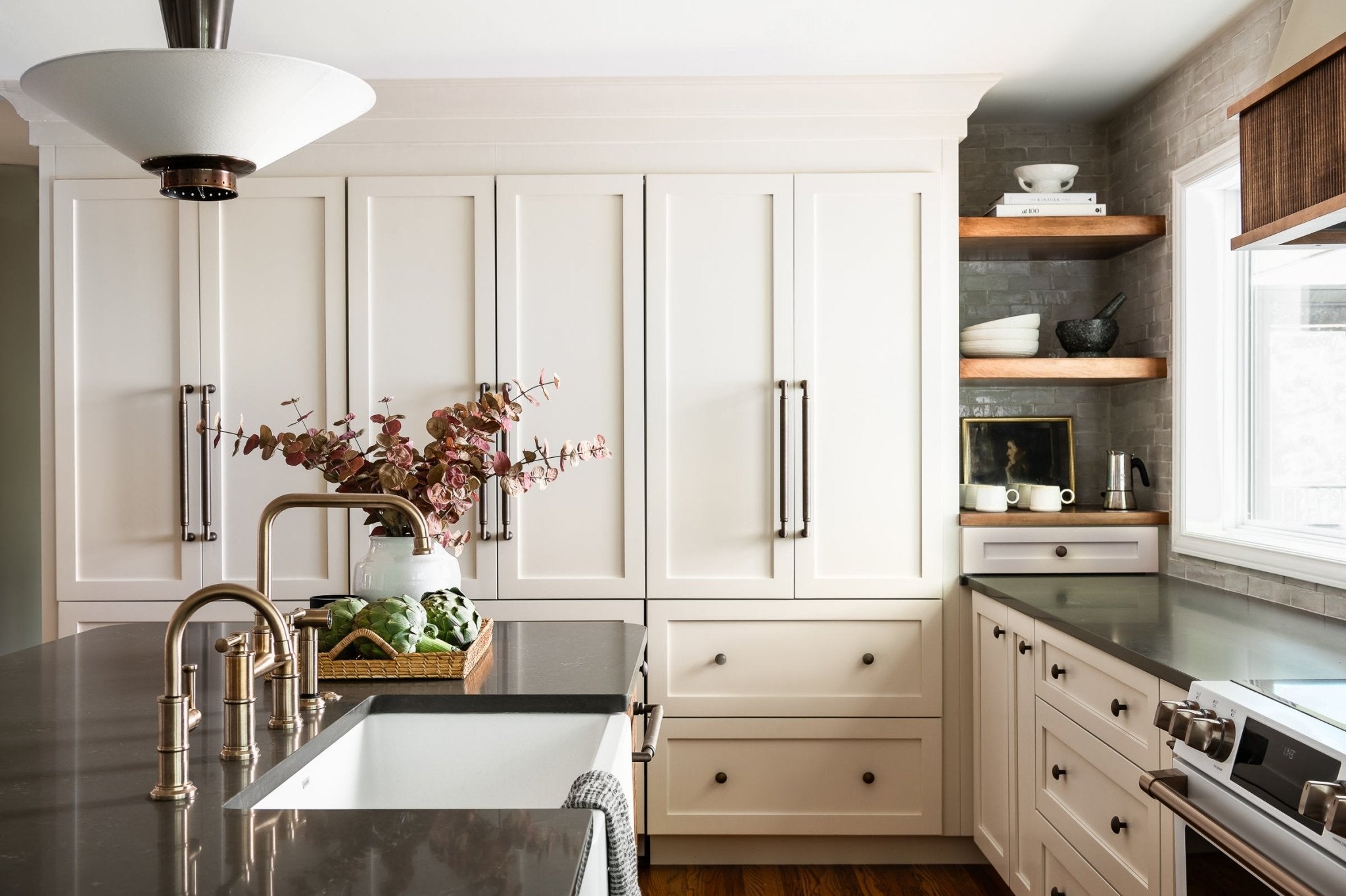
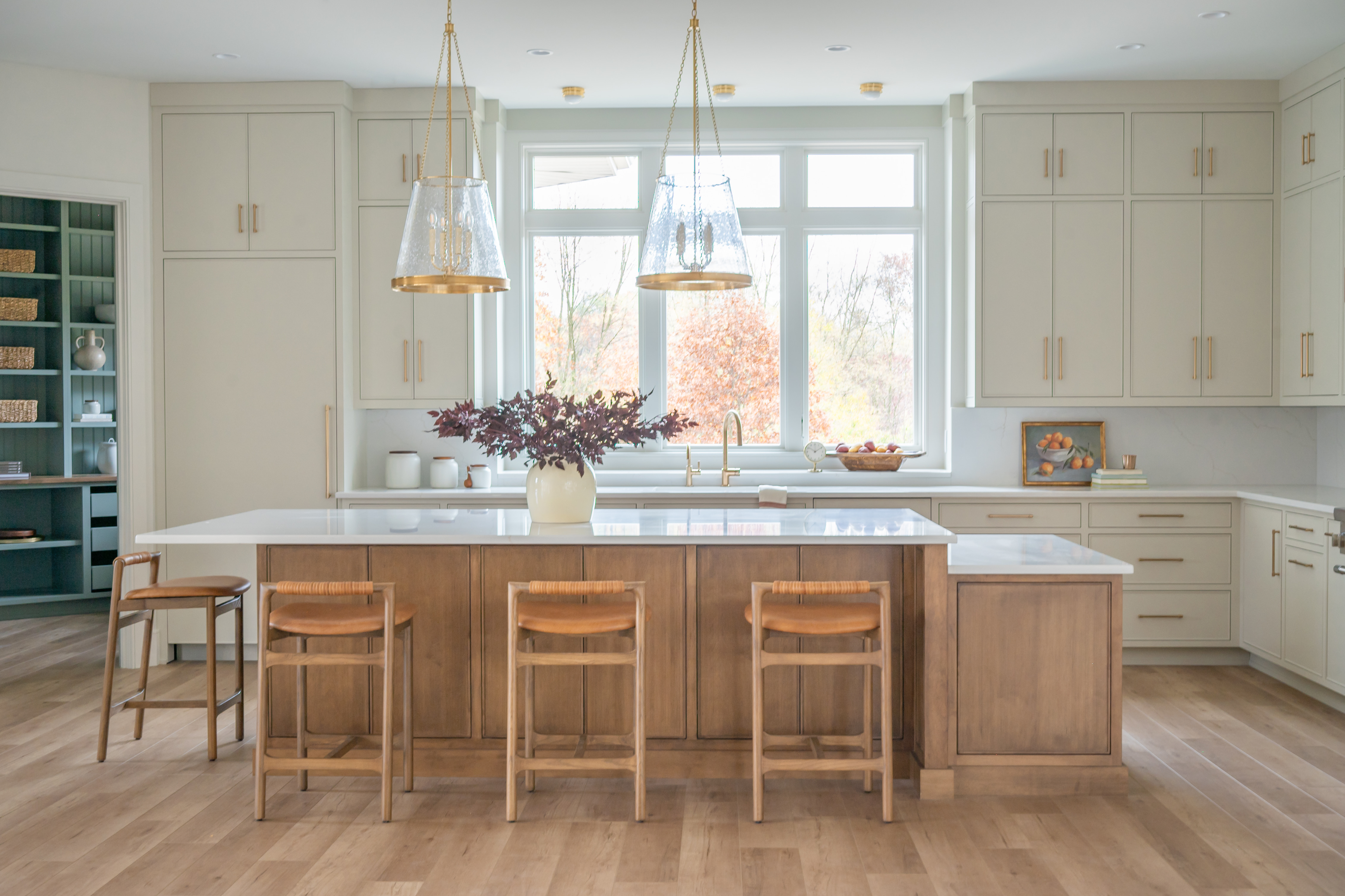
"I love Creamy White because it makes a space feel soft and warm without looking yellow, and it pairs really well with natural elements," explains Bailey Todd, owner and principal at White Cliff Studio. "We used it on the perimeter kitchen cabinets on a client project, paired with bold dark countertops and a medium-dark wood stain on the island cabinetry, which resulted in my favorite kitchen project to date." (Shown above).
New Hope Gray 2130-50
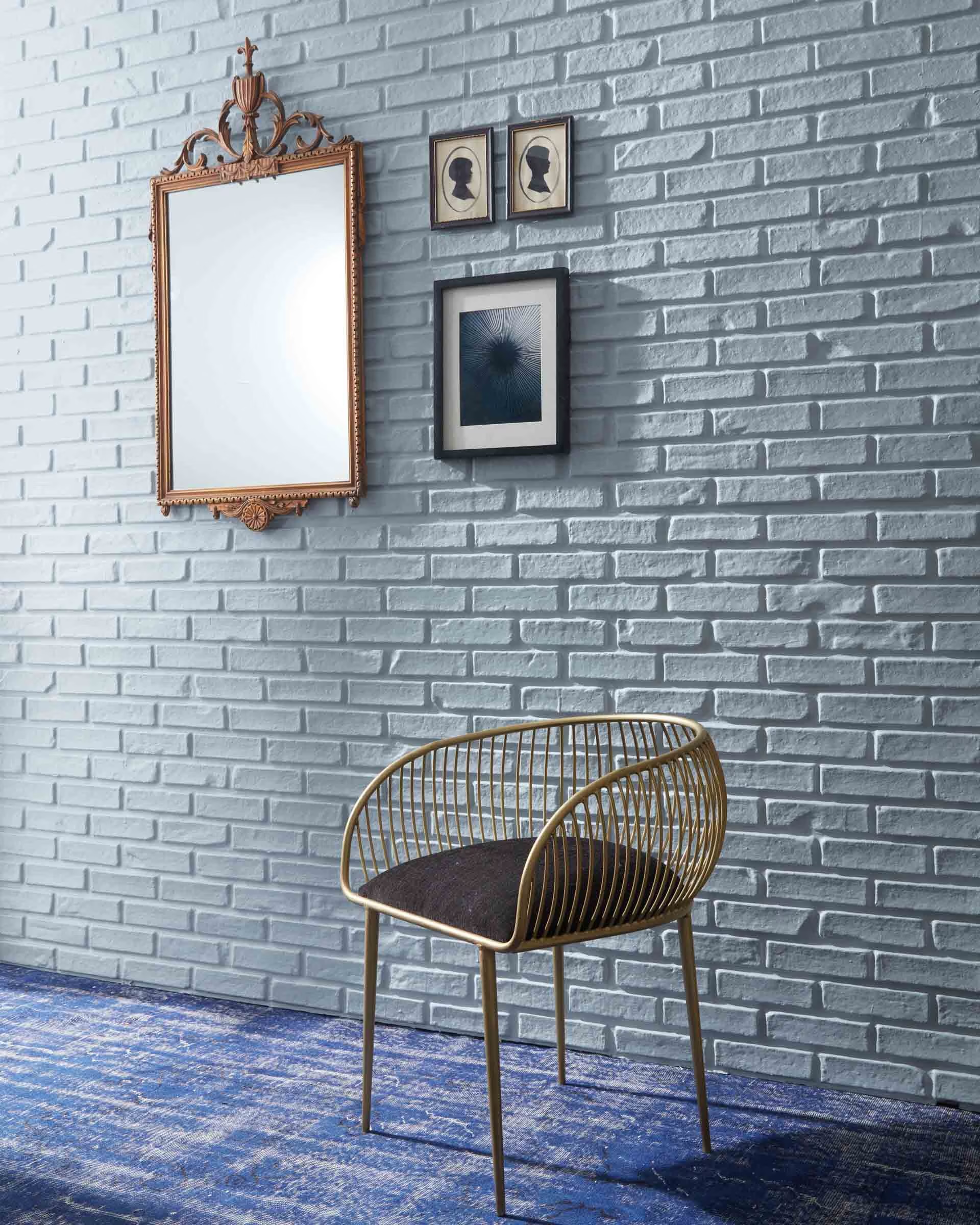
"I have forever found blue to be a neutral color and it is so versatile," Grey Joyner of Grey Joyner Interiors tells me. "Blue works exceptionally well in areas where you want a pop of color, like accent walls, built-in bars, or bookshelves and even cabinetry. For a softer approach, it can be incorporated through furnishings — think throw pillows, rugs, or decorative objects. Paired with earthy tones, blue creates a balanced and serene mood, while adding hints of gold or brass gives it a luxurious, sophisticated touch. Deep navy or pale blue grays are a great way to use blue as a traditional 'neutral' color."
As for the specific shade, "Benjamin Moore New Hope Gray (2130-50) is the ideal neutral blue and adds a fresh uniqueness to a home," Grey says. "It’s an energetic shade that brings both sophistication and warmth, blending seamlessly into modern and transitional styles."
Silver Satin 856
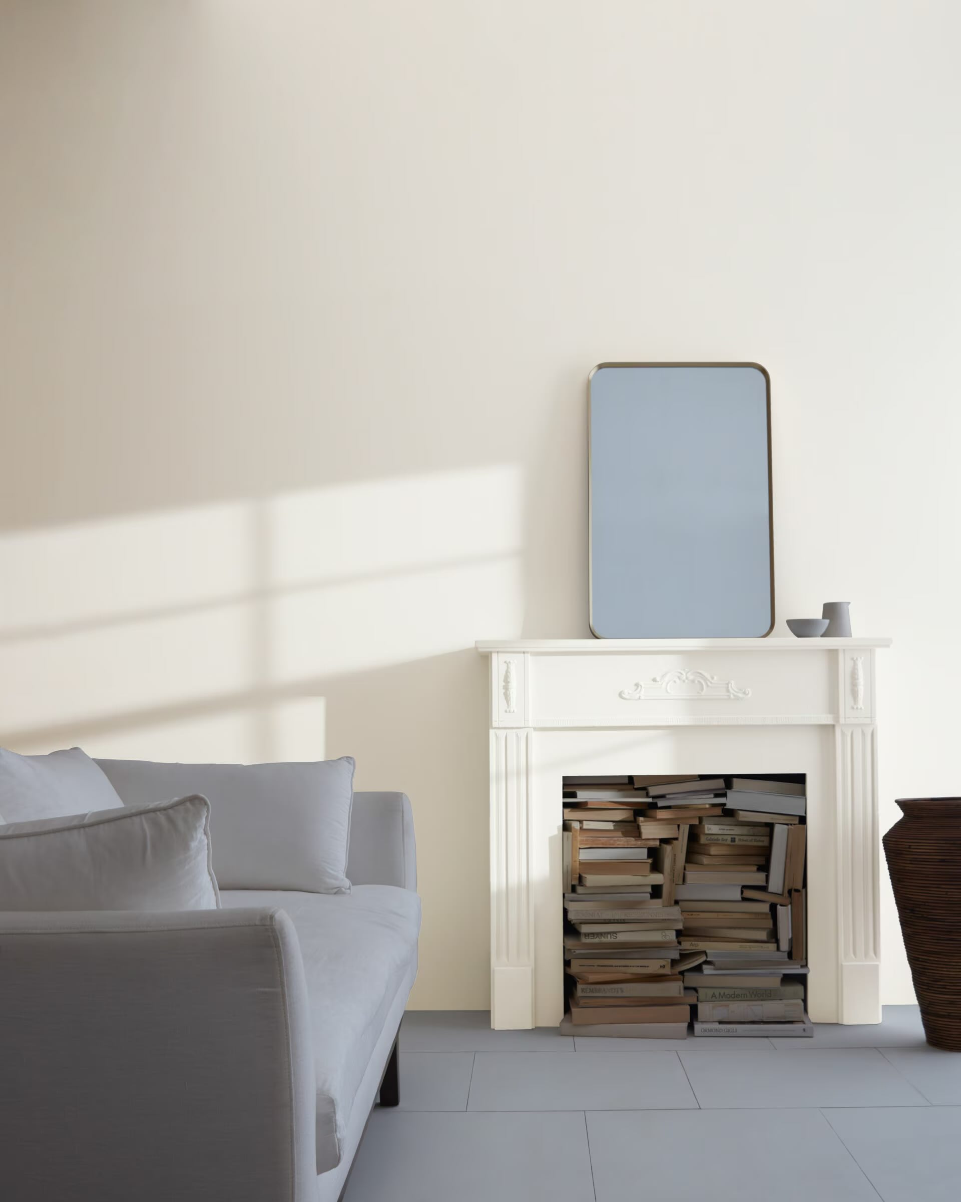
"This is my go-to cool-toned color when I want something other than a pure white," adds Jackie of Jackie Johnson Design. "It has a lovely hint of gray that looks beautiful contrasted against white trim and moldings. I would recommend using this in the main living areas of a home. It’s very neutral and versatile, working with most designs. I find it to be a timeless choice."
Simply White OC-117
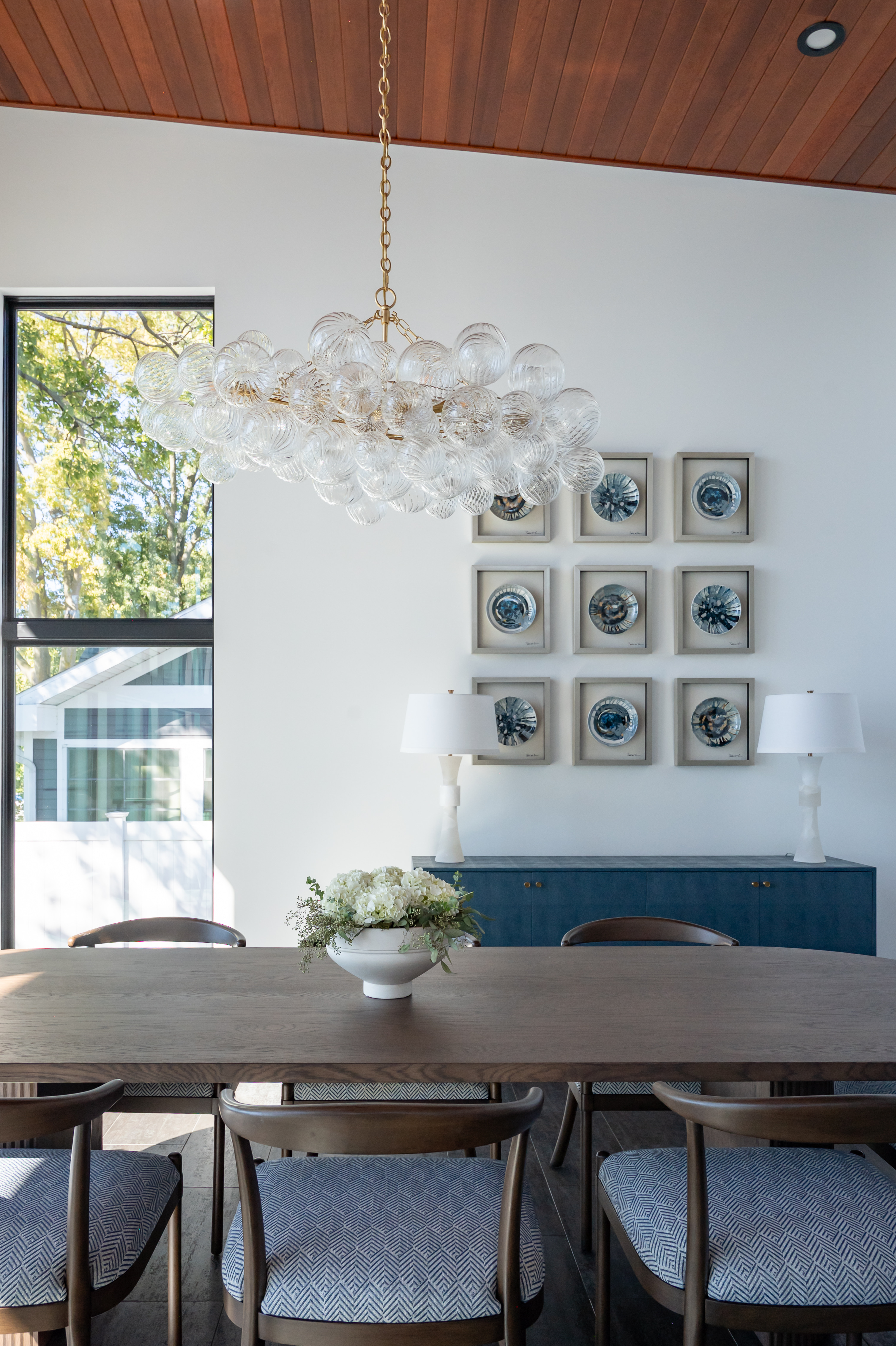
"Ask any interior designer or paint expert and they will confirm: choosing white paint can be tricky," Becky Asleson of Maple & White Design continues. "One of our favorite whites is Benjamin Moore’s Simply White. We like that it is a bright, yet slightly warmer white paint, which allows it to be used in many rooms and situations. It can handle south-facing windows as well as rooms with little or no natural light. It has the slightest bit of a yellow undertone, but still pairs nicely with cooler colors."
FAQs
What Is Benjamin Moore's Best Beige Color?
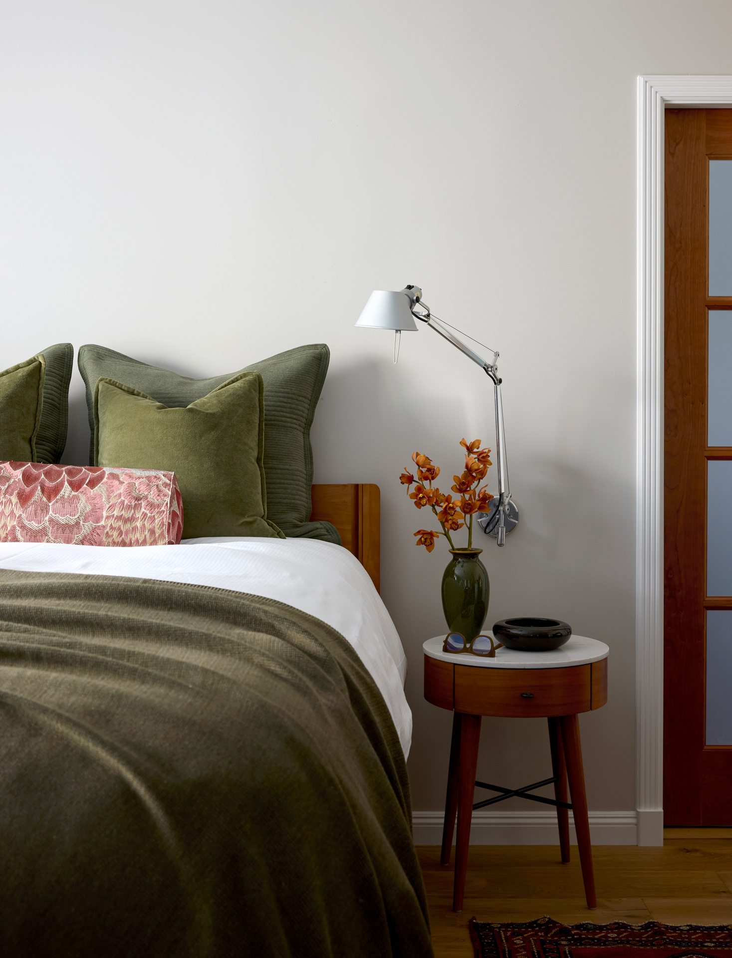
Pale oak (shown above) seems to be the winner here. It was mentioned by multiple designers as one of their favorite neutrals overall, plus it's one of Benjamin Moore's best-sellers.
Cyndy Cantley of cabinet design firm Cantley and Company likes to use this shade in kitchens, she tells me. "It is the most beautiful creamy white with the palest gray undertones," she explains. "So many whites have yellow or green undertones and never maintain that beautiful soft white that is always wanted for kitchens.”
Alice Chiu adds: "Pale Oak is a calm and soothing neutral that's perfect for the bedroom. It's a light greige (a blend of gray and beige) that has warm yellow undertones and can have subtle hints of pink and peach in different lighting conditions."
"It's a versatile neutral that works well with most colors and blends seamlessly with any design style," she continues. "I like to incorporate Pale Oak with wood (especially walnut), marble, and muted shades of green and blue, which adds an element of elegance and warmth to a space."
Now you've got a better idea of the best Benjamin Moore neutrals to try, make sure you know how to use paint samples properly so you can determine the best shade for your specific space.
Be The First To Know
The Livingetc newsletters are your inside source for what’s shaping interiors now - and what’s next. Discover trend forecasts, smart style ideas, and curated shopping inspiration that brings design to life. Subscribe today and stay ahead of the curve.

Brigid Kennedy is a freelance writer and former style editor for Livingetc.com, where she scoured the internet for the best and most stylish deals on home decor and more. She also served as the website's in-house sofa expert, completely revamping and reworking Livingetc's expansive sofa buying guide by interviewing a total of 17 interior designers and sofa experts at top brands like Article and Benchmade Modern; sitting on upwards of 50 sofas across both Pittsburgh and New York City; extensively polling her friends and family for their own sofa-buying anecdotes and product recommendations; and traveling to Dallas, Texas, to tour the floor of a couch factory. In total, she estimates she has spent 40+ hours (and counting!) reading, writing, and talking about couches with accredited sofa connoisseurs o then pass that knowledge on to you. She describes her personal design style as colorful and clean, and in her free time enjoys reading, watching movies, and curating impossibly niche playlists on Spotify. She recently relocated from Manhattan to Pittsburgh, Pennsylvania, where she's decorating and DIYing a new home downtown.
-
 The 'New British' Style? This Victorian London Home Embraces Its Owners' Global Background
Warm timber details, confident color pops, and an uninterrupted connection to the garden are the hallmarks of this relaxed yet design-forward family home
By Emma J Page
-
 Muji Living Room Ideas — 5 Ways to Harness The Calming Qualities of This Japanese Design Style
Inspired by Japanese "zen" principles, Muji living rooms are all about cultivating a calming, tranquil space that nourishes the soul
By Lilith Hudson
-
 10 Yellow Bathroom Ideas That Vitalize Your Mornings and Look Unexpectedly Sophisticated While Doing So
Yellow is a color that by its very nature is energetic and full of life, and these designers have proved it's ideal for a bathroom
By Oonagh Turner
-
 It's a Color Symbolic of Dreams, so These Purple Bedroom Ideas Almost Guarantee a Good Night's Sleep, Right?
Not always an obvious choice for the bedroom, these designs prove that purple has restful and calming qualities, making it perfect for the bedroom
By Oonagh Turner
-
 Amethyst, Heather, Pansy, Plum — Turns Out Decorating With Purple Opens You Up to a World of Possibilities
Purple certainly isn't a color for the faint hearted, it's a shade that can smell your fear. Here's how to conquer it through your interiors
By Amy Moorea Wong
-
 The Combination You Weren't Expecting to Love — 8 Blue And Orange Living Room Ideas That Feel Surprisingly Elevated
A blue and orange scheme for living rooms may sound jarring, but these spaces prove they're striking, vibrant, and certainly unforgettable
By Camille Dubuis-Welch
-
 Smeg Says Teal, and We’re Listening — The Kitchen Shade of the Year Is Here
Designers are already using the soft, sea-glass green everywhere from cabinetry to countertops
By Julia Demer
-
 Do Yellow and Purple Go Together? Designers Reveal How to Make This Unexpected Pairing Feel "Totally Intentional"
In an era where unexpected combinations have become cool, we've done a deep-dive to discover how to pair yellow and purple in a space
By Camille Dubuis-Welch
-
 5 Unexpected but Seriously Stylish Spring Color Palettes to Shake Up the Season — "It's Pastel, but Punchy"
Spring color palettes are notorious for their use of pretty pastels, but that doesn't mean they have to lack variation
By Olivia Wolfe
-
 The 'Red Table Trick' Is the Easiest and Most Expensive-Looking Trend to Hit 2025 So Far
A red dining table makes a seriously stylish statement; the beloved pop of red trend just got an bold and expensive-looking upgrade
By Olivia Wolfe


