Best Green Paints — 8 Wall Colors Recommended by Interior Designers As Their Favorites to Use
Looking for green paints with an expert stamp of approval? We asked some of our favorite designers for their most-loved picks for verdant, calming spaces

Amy Moorea Wong
When it comes to choosing green paint colors, there's a world of options available. Green is one of the most loved interior colors, and comes in a never-ending spectrum of shades, each bringing a different quality to the space.
‘Green is hugely versatile, which is why it’s probably the most useful color in a designer’s palette,’ say designers Campbell-Rey. In terms of colors that go with green, ‘it is a tone that pairs well with others too: olive green with pale blue, grass green with coral pink, eau de nil with a deep cherry red, and more,' the designers add.
If you're looking to go green, then these designer-approved paint recommendations for your walls (and more) are worth considering.
1. Lichen Green, Dunn Edwards Paints — A Refreshing Green
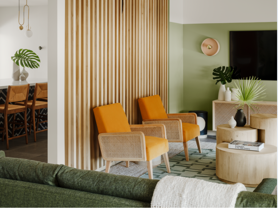
Tired of the conventional sage, teal and olive green? This shade is a particularly refreshing one, as designer Michelle Boudreau, founder of Michelle Boudreau Design advises. The tone sits comfortably between sage and mint green and looks nice with wood tones. Plus, many colors go with green, making this paint so easy to work with.
'The design intent was to capture the Spanish vibe while embracing a modern aesthetic to bring the place up to date,' says Michelle. 'The approach was to integrate unique details and character to encourage discovery and delight, considerate of the Palm Springs indoor-outdoor lifestyle. Encaustic concrete tiles with patterns and dimension are used throughout to give respect to the original materials used. A colorful inviting palette of terracotta, soft greens, and warm mustard is used to bring the environments together with holistic continuity. Black was used as a base to ground the design with a modern edge.'
2. Cap Ferret, Color Atelier — A Silvery green
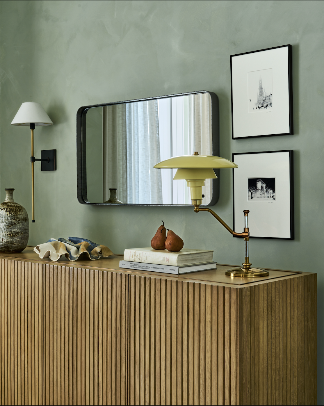
'This color has an irresistibly inviting feel to it due to its silvery green, and lightened sage undertones, perfect for a calming atmosphere,' says Burcu Garnier, co-founder of Color Atelier.
Many colors go with sage green, and this particular shade is especially useful if you wish to create an earth tone living room or bedroom. Here, the paint has a limewash effect, adding a tactile, natural quality to the room. Black accents look particularly nice with it.
3. Nob Hill Sage, Benjamin Moore — Green with a Drop of Gray

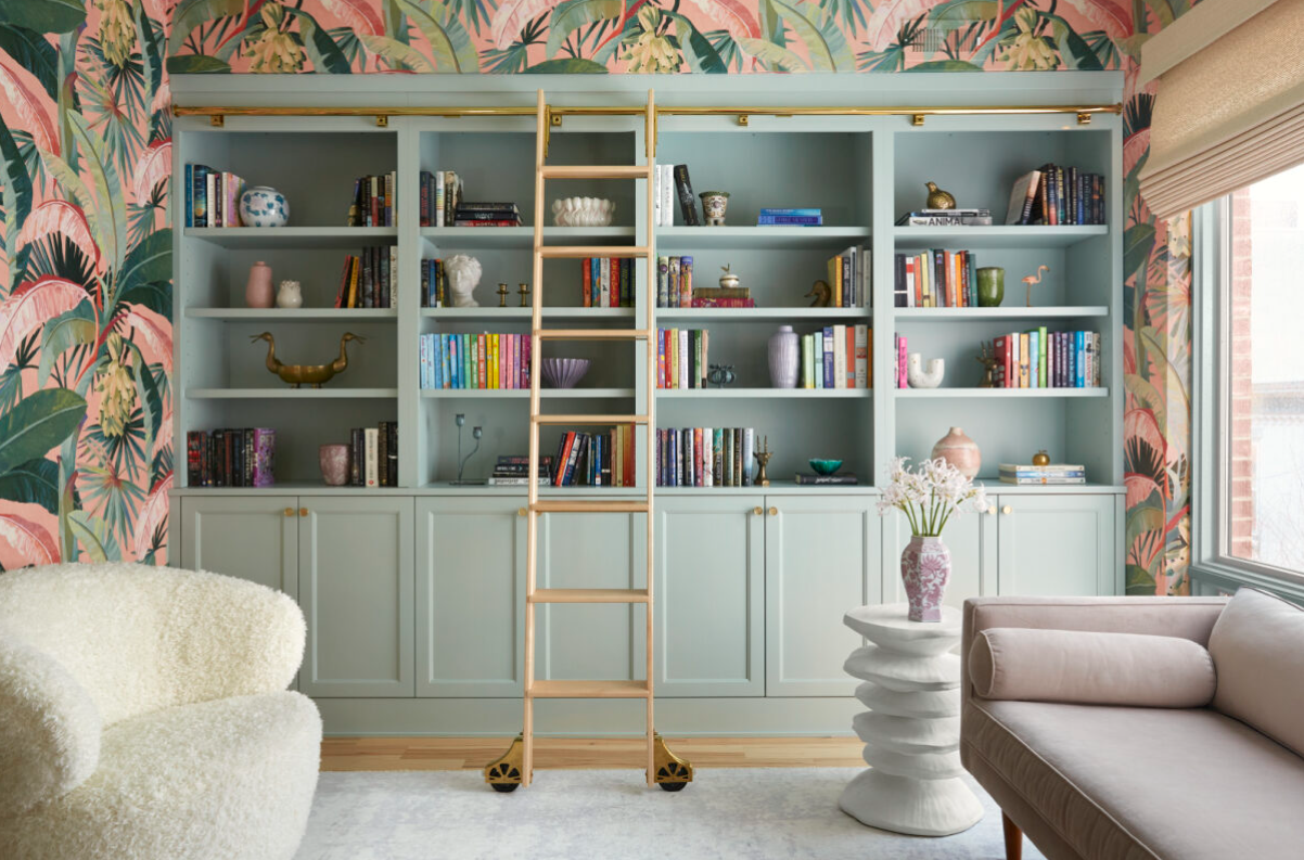
A little bit playful but with a grounded quality, this paint tone is ideal for a lounge-cum-work space. To see the full effect of the paint tone, it would be best to use it in a room that receives a lot of light, as seen in this pink and green home office.
'This paint was a special selection for this stunning office space,' says Michelle Gage, founder of Michelle Gage Interiors. 'The pink and green hues are nostalgic and create an inspiring workspace for our true millennial client without feeling too overly distracting.'
4. Balsam, C2 paints — a well-balanced, warm green
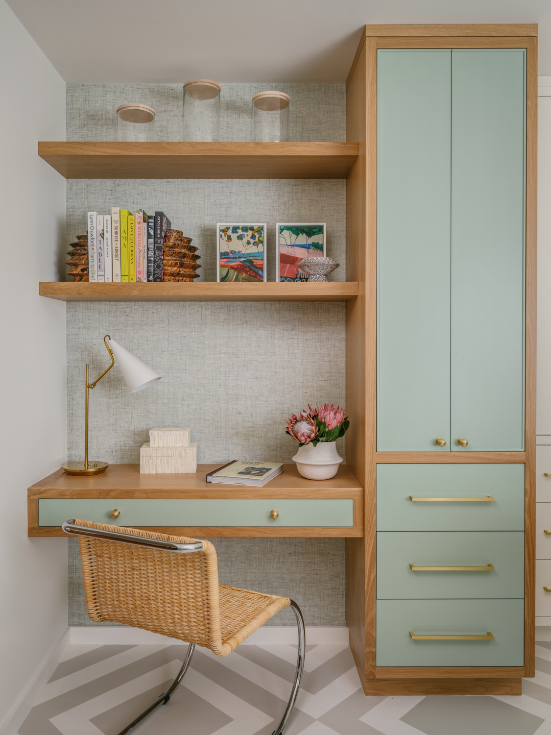
Going green doesn't have to mean a whole remodel. You can ditch the walls and instead paint furniture or storage units to give them a new lease of life. There's a growing trend for painting woodwork in the colors you would have once just kept for the walls. The effect can be dramatic! Remember, even in the most subtle sage shades, the color green easily stands out.
'This home office has natural light pouring in through lovely large windows allowing the surrounding verdant gardens to be visible from this area of the house,' says Stephanie Waskins, co-founder of LARK + PALM. 'Balsam by C2 Paints proved to be the perfect color to compliment the varying shades of green and allowed us to achieve a seamless visual experience from indoor to outdoor in this Northern California home.'
5. Lick, Green 09 — a pale sage green
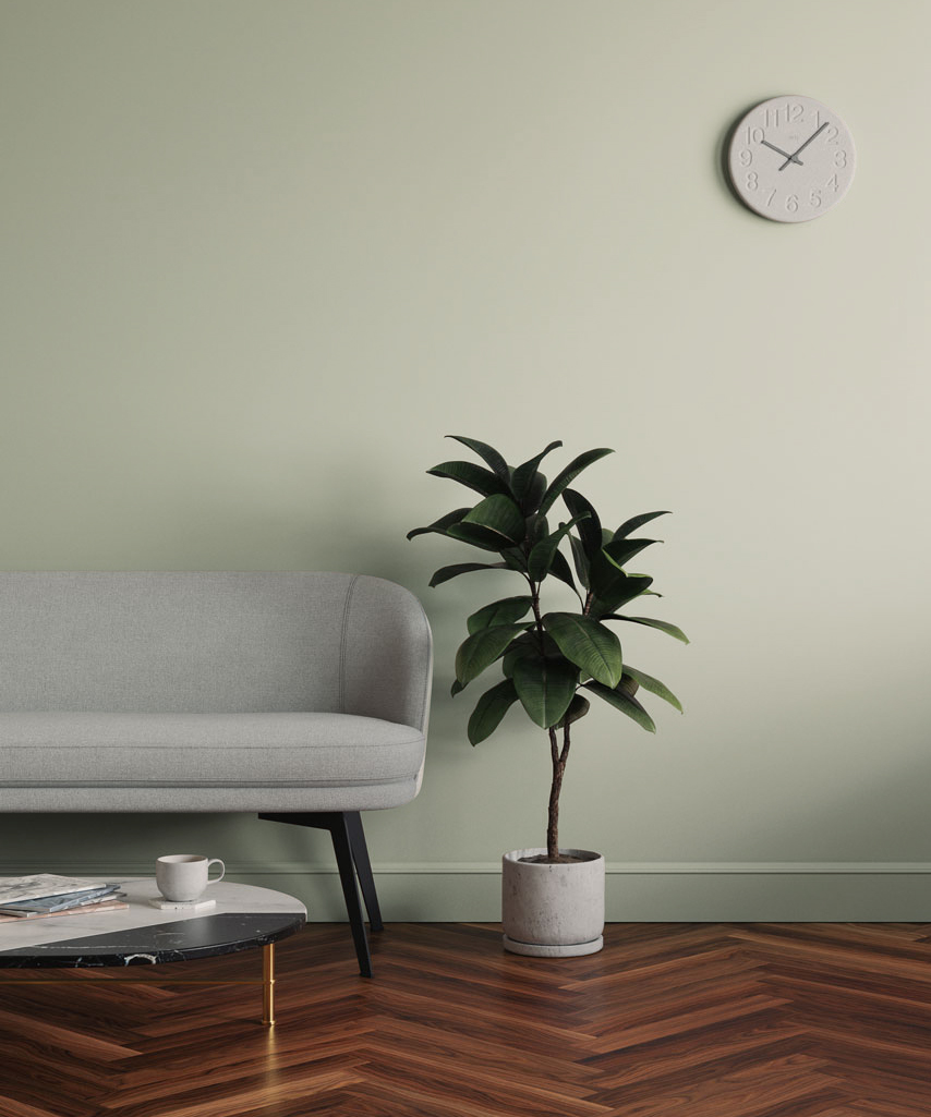
Green 09 by Lick
Nobody knows color quite like Eva Sonaike – the designer who has established herself through her daring color spectrum and signature rainbow hues. So, we couldn't wait to hear all that Eva had to suggest.
'I love Lick's Green 09,' she says. 'It is a pale green but light and refreshing at the same time. This shade feeds my senses and evokes a feeling of happiness and hope.'
6. Studio Green, Farrow & Ball — a deep, dark green
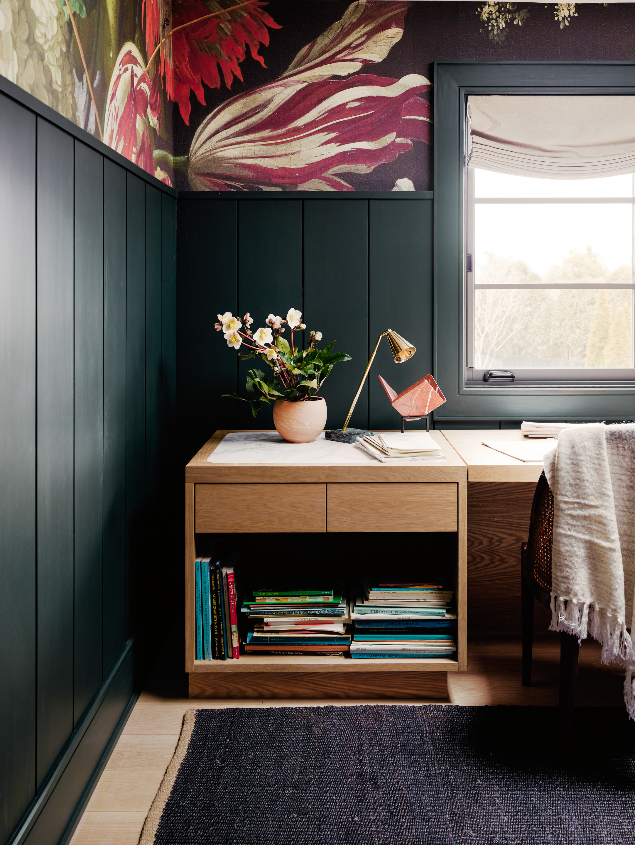
In some ways, green is one of those 'go big or go home' colors, and a dark hue like this is impactful in small doses, especially when used to highlight interesting architectural elements. In this space, Colin Stief, co-founder of General Assembly, decided to give a deep-toned, cocooning effect to this green bedroom with Studio Green by Farrow & Ball. To balance the daunting tone, a vibrant wallpaper was used, reducing the moody effect of the wall color.
The hue has slight hints of black when the light is low and can appear much darker than the original paint, so be sure with any dark paints to order samples and test out how dark the shade will be in your space.
7. Treron, Farrow & Ball — a grounded green
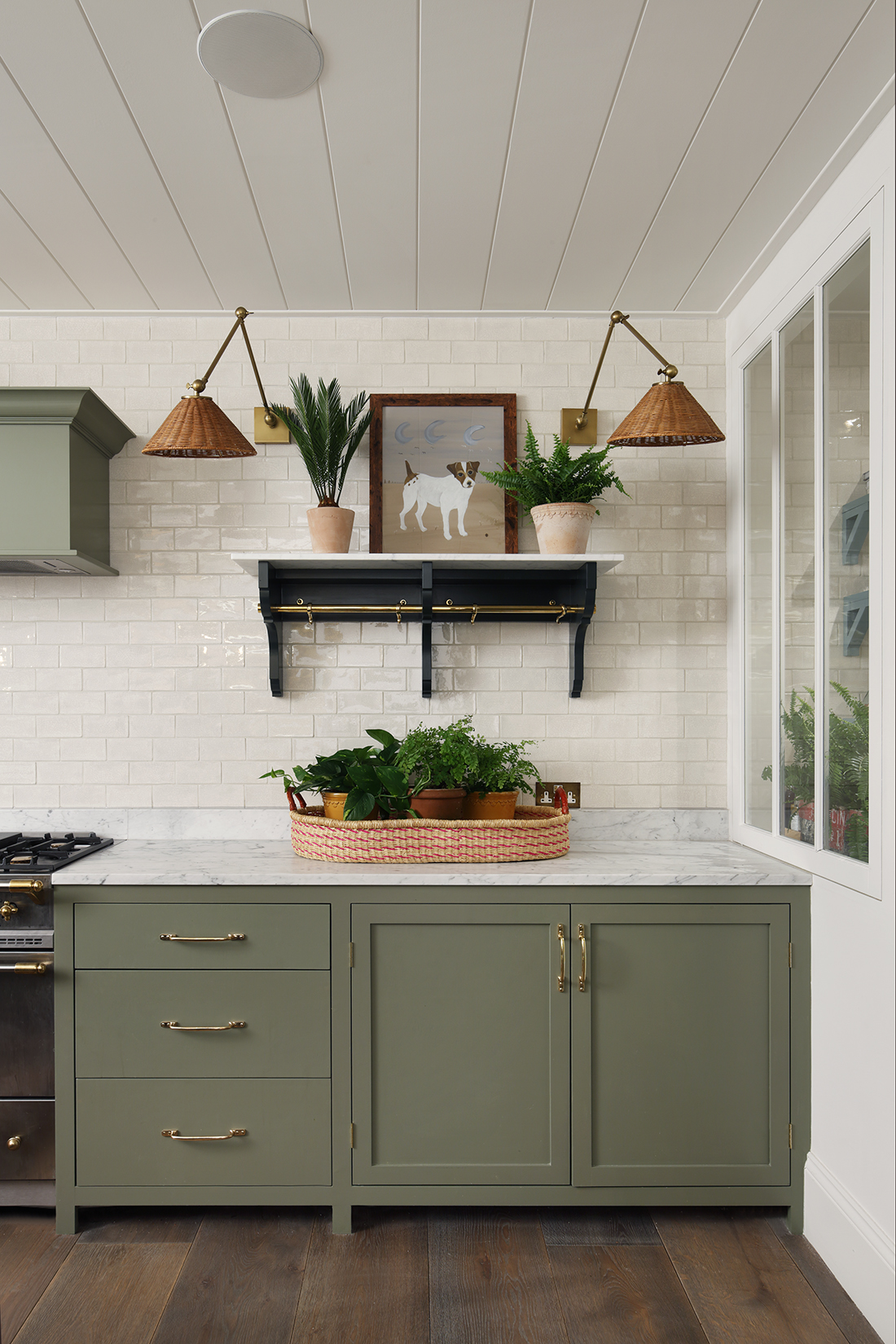
If you're looking for kitchen cabinet color ideas, Treron is an ideal shade. This is also the dark green version of the classic Farrow & Ball Pigeon. While the color may have more of an understated, traditional look, it works perfectly well in modern homes too, where natural materials abound. Paired with marble and white tiles, this slightly rustic kitchen has a luxurious but calming feel.
'When selecting paints we find it's important to get the mineral balance right, to give a tone that is natural and has a calm, muted quality,' says Tom Cox of HÁM interiors. 'In our Mews, Belgravia project the custom-made HÁM kitchen is painted in Farrow & Ball's deep green, Treron,'
8. Guacamole, Benjamin Moore — a bold, saturated green
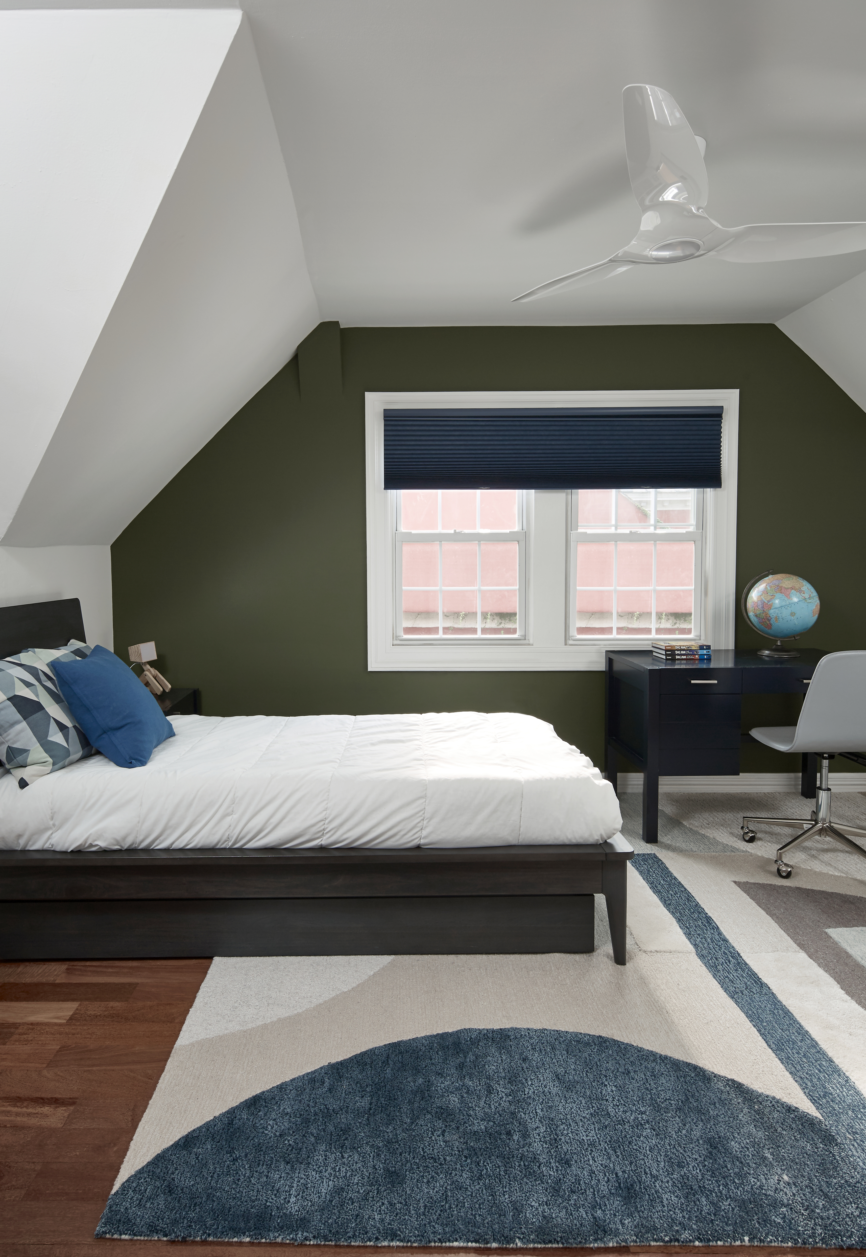
If you're looking for bedroom color ideas, this bold accent green is a great contender as it gives an elegant touch to the bedroom while the white walls and ceiling give the darker hue a lift. Guacamole being a saturated hue does not overpower and helps create an outdoorsy mood. The color painted on the window wall conjures an indoor-outdoor effect, bringing the hues of nature and the blue skies together.
'Green symbolizes growth, harmony, and freshness,' says Jennifer J. Morris, principal at JMorris Design. 'I am passionate about infusing biophilia as a way to have positive effects on well-being. Guacamole by Benjamin Moore has so many organic references and I believe it brings the healing powers of nature when you use it in your space.'
What are the best green exterior paints?
Using one of the best green paint colors outside blends man-made spaces and objects in the garden or on the exterior of the house with nature, buoying the natural and merging outside and in. ‘Play with tonality on the outside of buildings – a deep racing green can feel smart and formal for exterior woodwork, while turquoise on a bench brings a moment of whimsy to an orderly garden setting,’ advise designers Campbell-Rey. ‘Using green outside is a great way to introduce a sense of uniformity while the other elements of the garden – borders or a meadow for example – are encouraged to go wild.’
‘For a bold, impactful color which creates a strong outdoor presence, we love the amazing teal green Mid Azure Green by Little Greene,’ says Fiona Blanchot, co-director at Studio Ashby. ‘It’s a traditional tone, but feels contemporary when used externally.’
‘For cooler colors on your exterior walls like greens it always a good idea to make sure they have a touch of yellow in them like our Balmoral, to create a soft, calmer outside look,’ says Cathryn Helsby, Head of Creative at Earthborn Paints. ‘The olive tone creates a beautiful, natural-looking exterior, which blends the home serenely into its natural surroundings.’
Be The First To Know
The Livingetc newsletters are your inside source for what’s shaping interiors now - and what’s next. Discover trend forecasts, smart style ideas, and curated shopping inspiration that brings design to life. Subscribe today and stay ahead of the curve.

Aditi Sharma Maheshwari started her career at The Address (The Times of India), a tabloid on interiors and art. She wrote profiles of Indian artists, designers, and architects, and covered inspiring houses and commercial properties. After four years, she moved to ELLE DECOR as a senior features writer, where she contributed to the magazine and website, and also worked alongside the events team on India Design ID — the brand’s 10-day, annual design show. She wrote across topics: from designer interviews, and house tours, to new product launches, shopping pages, and reviews. After three years, she was hired as the senior editor at Houzz. The website content focused on practical advice on decorating the home and making design feel more approachable. She created fresh series on budget buys, design hacks, and DIYs, all backed with expert advice. Equipped with sizable knowledge of the industry and with a good network, she moved to Architectural Digest (Conde Nast) as the digital editor. The publication's focus was on high-end design, and her content highlighted A-listers, starchitects, and high-concept products, all customized for an audience that loves and invests in luxury. After a two-year stint, she moved to the UK and was hired at Livingetc as a design editor. She now freelances for a variety of interiors publications.
- Amy Moorea WongColor Expert
-
 Courteney Cox Just Launched Laundry Care Into Her Surprisingly Chic Home Fragrance Line — And Yes, You Can Buy It in the UK
If you loathe doing laundry, maybe you need something to motivate you through the chore. And Courteney Cox's new Homecourt laundry line could be just that.
By Amiya Baratan Published
-
 The Easiest Way to Turn Your Designer Scarf Into Wall Art — No Frame, No Fuss, No Regrets
Because silk this pretty should never stay in a drawer
By Julia Demer Published

