

Little Greene has long been revered by interior designers for its rich palette and exceptional paint quality. Whether you're after serene neutrals or bold statement shades, the brand has a hue to do it. Further to that, designers often turn to the best Little Greene paint colors, not only for its aesthetic appeal, but also for its commitment to sustainability.
Each shade in the Little Greene paint range tells a story, with many derived from archival sources such as National Trust properties or Georgian and Regency-era pigments. This thoughtful curation gives any paint color idea a sense of heritage and intention, making them especially appealing to those who want to create depth, character, and a sense of permanence in their interiors.
But with such an extensive range, it can be hard to narrow down a considered selection. So, we've done it for you. Below, discover the best Little Greene paint colors — 10 shades selected by interior designers for their transformative impact.
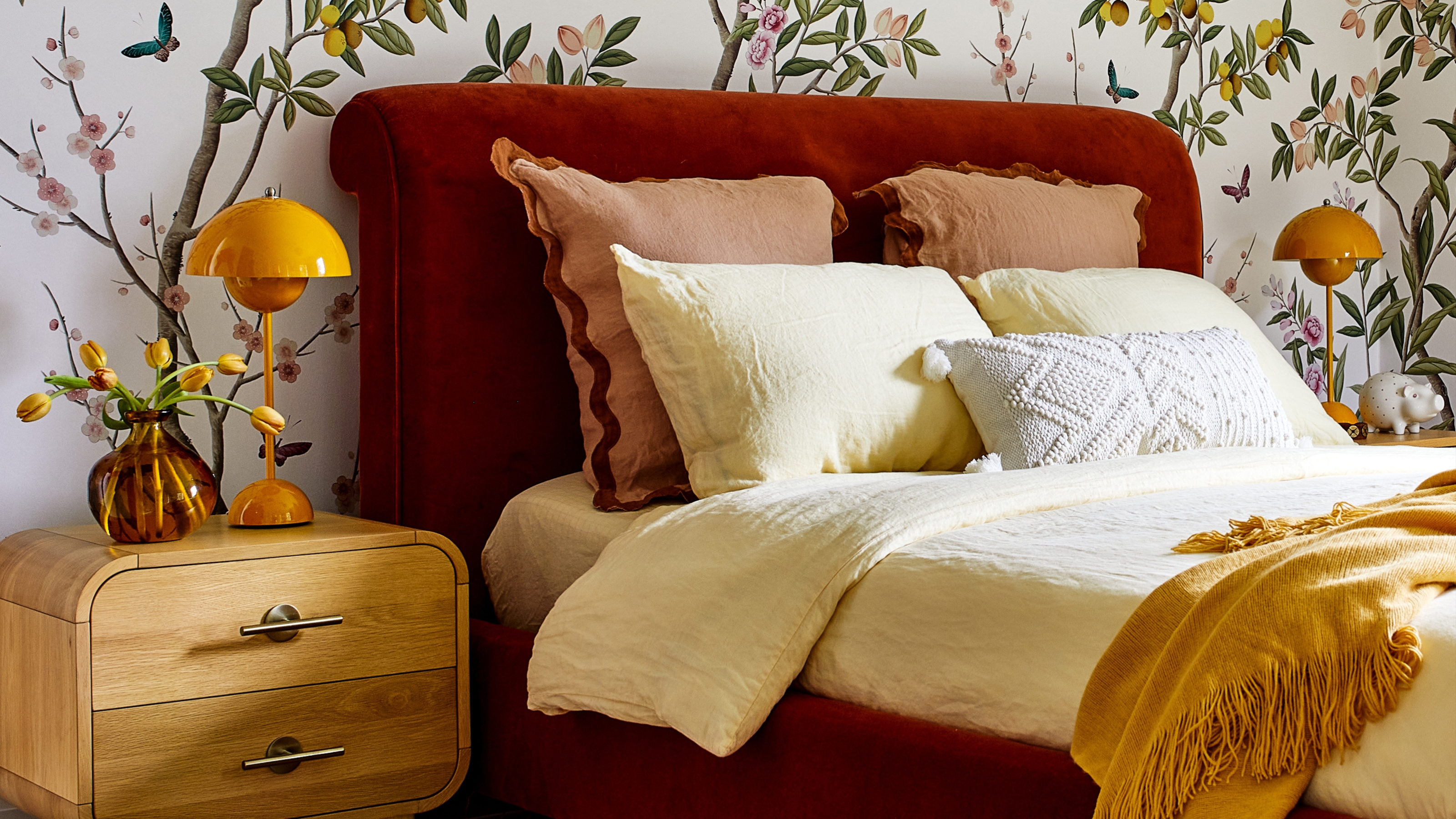
1. Slaked Lime

Slacked Lime is one of the best Little Greene paint colors if you're after a versatile, warm white.
Slaked Lime is one of Little Greene’s most versatile and beloved off-whites. This neutral tone has a subtle warmth and soft chalkiness that sets it apart from cooler, stark whites. Considered one of the best white paints among interior designers for its ability to work in both contemporary and traditional settings, it’s the kind of color that quietly elevates a room without competing with its furnishings.
Interior designer Gemma John from Alpine Rose Interiors recommends Slaked Lime Mid, using it throughout the main living areas of the home shown above. "We added interest and highlighted the rooms features in a shade a few tones darker with Slaked Lime Dark on the woodwork and fireplace," she adds. “The tones complement each other, creating a timeless, layered look that works especially well in calm, considered spaces."


Alpine Rose Interiors Ltd was established in February 2019 by Gemma John and is based in Enfield, North London. Working on projects in London, Essex Hertfordshire and further afield.
2. Araas

As color trends see people getting bolder and braver, shades like Little Greene's Arras are becoming more popular.
Arras is a deeply pigmented, muted red paint with brown undertones that evokes a sense of history and grandeur. Part of Little Greene’s National Trust collaboration, this color is named after a wall tapestry and was inspired by the red dyes used in traditional English textiles and interior finishes.
It brings a richness and sense of gravitas that only boldly decorating with red can offer, making it ideal for rooms where you want to foster intimacy and sophistication.
"Working with our clients to embody a brief of comfort, creativity, warmth, and welcome throughout the house, whilst placing a strong emphasis on sustainability, Arras played into our Victorian earthy palette but brought an aspect of drama," explains interior designer Samantha Watkins McRae of the space shown above.

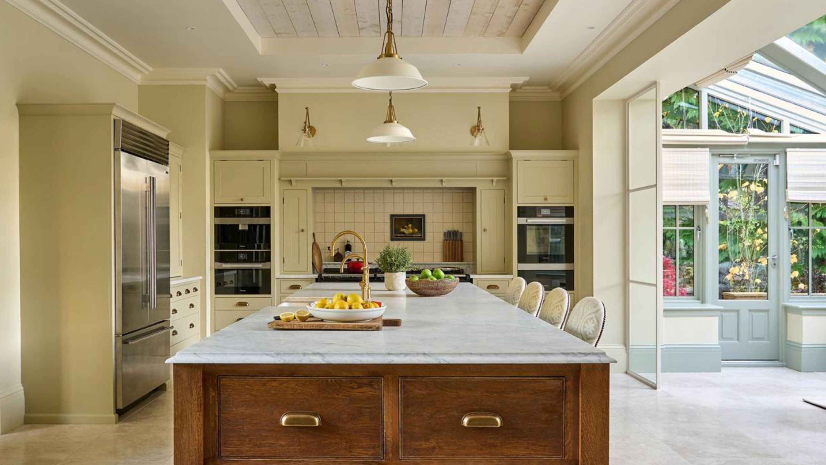
3. Travertine

Another one of the best Little Greene paint colors is Travertine, a warm off-white.
Another one of the best Little Greene paint colors is Travertine, a beautiful off-white with a faint warmth, that sits somewhere between ivory and putty. This subtle balance makes it highly adaptable and perfect for contemporary interiors that value minimalism, texture, and light.
Interior designer Gemma John used Travertine in this relaxed dining room at a coastal retreat. The goal was to create a palette that connected the interior to the sandy tones outside the windows.
"Travertine has a softness that echoes natural materials," she says. "It makes everything else — wood, metal, ceramics — pop without feeling too stark."

4. Middle Buff

Here, Middle Buff brings energy to the kitchen, while also ensuring it feels warm and cozy, too.
Middle Buff is a rich, warm and intense ‘Indian Yellow’ that brings warmth and sophistication to any space. Its deep, earthy hue makes it an excellent choice for creating cozy and inviting interiors.
In a South London living room designed by Kinder Design, Middle Buff was used to envelop the walls, creating a space that feels both intimate and vibrant, Leo Wood, founder of Kinder Design, explains.
"I wanted to choose a really deep, rich color for this living room, so that this space could work well both for our client to entertain in and to spend time alone with his partner," explains Leo. "Our client was open to going bold, and both he and I fell in love with this confident, caramel-like color."


Leo Wood is the founder of Kinder Design, an interior design studio based in south east London. Kinder Design take on residential and small commercial design projects, and regularly offer design consultancy services too.
5. Portland Stone

Portland Stone is one of the best Little Greene paint colors for transitional spaces.
Named after the famed limestone used in countless London landmarks, Portland Stone is one of the best Little Greene paint colors; one of the most versatile and historically grounded neutrals.
Designers love Portland Stone for its ability to bring cohesion to a home. Interior designer Cate St Hill notes its particular power in transitional spaces; "I often specify Portland Stone for hallways and landings because it creates an elegant sense of flow from room to room," she says. "It provides a calm backdrop that works whether you’re leading into a moody sitting room or a fresh, white kitchen."
With a chalky finish, it's a true bridge color — neither beige nor gray — making it a sophisticated choice for those looking to create warmth without overt color.

6. Tea with Florence

Set the tone of your home from the outset, using one of the most popular Little Greene paint colors, like 'Tea with Florence'.
If you’re after a green paint that delivers joy without overwhelming a space, Little Greene's Tea with Florence may be the perfect choice. This refreshing, citrus-tinged green was inspired by 20th-century design and is named after Florence Desmond, a celebrated British actress and interior design enthusiast of the 1930s.
Above, Tea with Florence was used as the entryway color, used on the lower cabinetry to create a lively, welcoming environment. Interior designer Gemma John chose the shade for its personality and light-reflective quality.
"We used Tea with Florence to instantly injected depth and vibrancy into the space," she explains. "By carrying the same color across all walls and woodwork, we avoided the visual interruption of white trim, allowing the narrow hallway to feel more continuous and generously proportioned."

7. Bronze Red

It's bold, it's daring, but a red paint is sure to make a space feel emotive and cozy.
Another one of the best Little Greene paint colors is Bronze Red, a rich, warm hue inspired by late 19th-century paint colors. Its deep, muted red undertone exudes sophistication, making it ideal for creating inviting, opulent spaces.
In a late-Georgian house in North London, interior designer Tom Morris used Bronze Red on the architraves to provide a striking contrast against greener wall tones. This application highlights the color's versatility in adding depth and character to architectural details.
It's perfect for spaces where you want to create a sense of comfort, such as living rooms, dining rooms, or bedrooms. For real 'wow' factor, combine reds in a ‘double drenching' scheme with other red oxide pigments, including deep plums, burgundy hues, or muted reds such as Little Greene's Arras.

8. Bone China Blue

Bone China Blue is soft and soothing, making it one of the best Little Greene paint colors for kids' rooms.
Bone China Blue is a delicate, refined blue that brings a subtle yet distinctive softness to interiors. Inspired by the pale blue glaze found in fine bone china porcelain, this color offers a muted, almost powdery blue tone with gentle gray undertones. It’s perfect for creating serene, calming spaces that feel both fresh and timeless.
For her own home library, interior designer Suzy Hoodless chose Bone China Blue for the custom-made shelves and cupboards, noting the color's versatility and ability to add depth without overwhelming the space.
Natalia Miyar Atelier has also used Bone China Blue in a nursery project (shown above). "We selected Bone China Blue by Little Greene to evoke a calm and uplifting atmosphere," she explains. "The soft blue-green tone works beautifully with warm textiles and playful details, making the space feel cozy yet fresh — ideal for a child’s room."

9. Silent White

Silent White is one of the brand's best-selling shades, because it's warm yet subtle.
As one of Little Greene’s quietest whites, Silent White is all about subtle clarity. With barely-there gray undertones, this color offers the clean look of white paint, but with added softness and restraint. It doesn’t glare or dominate; instead, it serves as an elegantly understated foundation for modern and classic interiors alike.
In a 17th-century cottage in the Cotswolds, Silent White was selected during a professional color consultation with Little Greene's expert, Pernille Howarth. The homeowner sought a calm and relaxed feel that complemented the natural surroundings, so Pernille recommended Silent White for the ceilings and trims to maintain a neutral look throughout the home.

10. Yellow-Pink

Want something bold? Yellow-Pink is a vibrant, earthy color that's popping with pigment.
In this thoughtfully designed child's bedroom by Natasha Lyon of Appreciation Project, Little Greene's Yellow-Pink was used to create a warm and cohesive atmosphere.
Situated at the top of the house with sloped ceilings, the room presented unique design challenges. To address this, Natasha chose to "completely bathe the space in one color," using Yellow-Pink across all surfaces.
This color-drenched approach not only simplified the room's geometry but also established a calming and cozy environment. Natasha describes Yellow-Pink as having "a wonderfully earthy tone to it with mustard hues," making it not too bright. The color's versatility and depth allowed it to adapt beautifully to the room's natural light, enhancing the space's overall ambiance.

FAQs
What are the most popular Little Greene paint colors?
From a best-selling perspective, "The three most popular Little Greene colors are Travertine, Silent White, and Middle Buff," says Ruth Mottershead, creative and marketing director of Little Greene. "A clear transition to warmer, natural neutrals is taking place with consumers opting for earthier tones that have an inherent warmth to them."
In terms of brighter colors, "There has been an increase in the sales of solid mid-strength yellows, and considering the details of orders, we can see these colors are being used for walls of size and not just as color highlights," adds Ruth.
And while certainly a bold choice, decorating with yellow provides a sense of positivity in a space, encouraging emotions that can help us feel uplifted, happy, and energized, so why not!
When it comes to the best Little Greene paint colors, the brand's palette offers a diverse range of cool color schemes that cater to various design preferences and spaces.
Whether you're seeking a bold statement or a subtle backdrop, these designer-approved shades provide inspiration for your next interior project.

-
 IKEA x Gustaf Westman Is Coming This Autumn — Here’s What You Need to Know About the Brand’s Coolest Collab in Years
IKEA just announced a collab with the creator TikTok's favorite "chunky" plates — and it might just be its buzziest drop since Virgil
-
 5 Patio Mistakes You're Probably Making and What to Do to Avoid Them for a Flawless Outdoor Space
What good is stylish outdoor furniture if your foundations aren't up to scratch? For a patio that lasts, these are the mistakes to avoid.


-
 So Long White; Goodbye Royal Blue — These Are The Sofa Colors Going Out of Style in 2025, and What To Replace Them With
Not all sofa colors are timeless — it's time we retire these five say interior design experts
-
 What Are the Best Lick Colors? 10 Designers Swear By From the Upstart Paint Brand
From colors inspired by cars spotted in Rome, to the most sought-after shade of red, these are the best Lick paint colors to style in your home
-
 I'm a 'Color Forecaster', Here's What That Actually Means, and How I Predict the Future of How You'll Decorate Your Home
Working with Pantone and WGSN, Jane Boddy has helped divine the trends in color that end up as the wall colors we paint with, the sofas we sit on, and more. Here's how
-
 5 Power Colors That Can Completely Shift the Way You See and Feel in Your Home
Power colors in interior design aren't just about being loud and dominating, they're about empowering you to express your true self
-
 10 Ways You Can Go Wrong When You're Decorating Your Home With Green — And What to Do to Get It Right
From failing to consider natural lighting to getting the balance or shade completely wrong, designers warn about working with green
-
 This Is When It's a Mistake to Use Color Theory to Decorate Your Home — "It Can Quickly Become a Distraction"
While it's a good idea to take inspiration from, is navigating the complex rules of theory around color more trouble than it's worth?
-
 Do Red and Yellow Go Together? Designers Share How to Make This Punchy Pairing Feel Soothing Rather Than Intense
These primary colors might seem like they'd clash, but get the levels right, and designers say this combination can look remarkably classic
-
 5 Butter Yellow Paints That Designers Swear By — So You Can Get This Trending Color on Your Walls With Confidence
Butter yellow is everywhere, but picking a paint shade can be a big commitment. To help, we asked designers to share their favorite shades


