5 of the Best Navy Blue Paint Colors That Designers Love — And How to Use Them
Navy blue has timeless appeal and can feel both modern yet classic, but what are the designers' favorite paints?


Navy is a timeless shade of blue that designers are drawn to for its classic aesthetic. It’s dark, moody, and atmospheric, offering both timeless luxury and modern relevance, while its versatility makes navy an excellent alternative to traditional neutral hues.
"Featuring a blend of both warm and cool undertones, navy blue hues create a balanced space that feels inviting and serene," says Hannah Yeo, a color expert from paint brand Benjamin Moore. "This makes it an ideal choice for creating a soothing, yet stylish atmosphere."
Alternatively, it’s a great option for a foundation, and many use navy in a monochromatic way, painting ceilings, trim, and walls. "I approach navy like it’s a neutral," says designer Corinne Mathern. "It pairs well with other colors and can provoke different moods."
As with any color, quality makes a real difference to the final finish, so we’ve spoken to the designers to find out the best blue paint colors in deep navy shades.
1. Hague Blue by Farrow & Ball

This music studio is painted in the popular Farrow & Ball navy blue which adds a sophisticated depth to the space.
Farrow and Ball's Hague Blue is a strong navy blue, loved by designers for its green undertones and dramatic finish — working happily on exterior walls as well as in small living rooms.
"I love Hague Blue from Farrow and Ball — it is a strong, very dark color with a bit of a green undertone," says Keren Richter of White Arrow. "We also used it in our bedroom, and I love how the color envelopes the room and creates a mysterious and cozy space perfect for falling asleep."
For interior designer Brad Krefman, Hague Blue is also his go-to navy paint. "It’s bold but still inviting — the perfect balance. I’ve always seen navy blue as a neutral, even though it’s technically a color. It just has this effortless versatility — whether in fashion or interiors, it flatters so many skin tones and pairs beautifully with both cool and warm shades."
2. Gentleman's Gray 2062-20 by Benjamin Moore
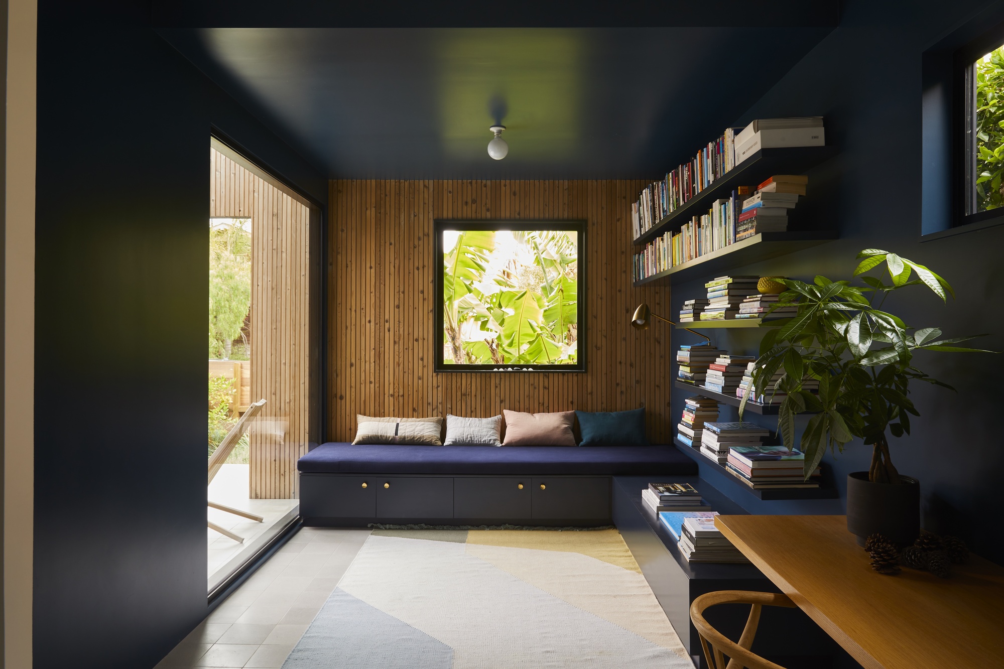
In this small reading knock, a glossy finish to this navy blue paint gives the space extra depth.
Gentleman's Gray is a deep and moody shade that has a tint of teal to it, perfect for a monochromatic color scheme.
"The blue pigment picks up light differently depending on the amount of light that hits the surface, sometimes the walls are a deep indigo while the ceiling leans closer to black," says Henry Cheung, senior designer of Bestor Architecture, who used this shade for his library space.
While most of the house is in tones of white, this is a more intimate, cozy, space intended to be used like a reading cave. It was crucial that the designers emphasized the natural backdrop and this choice of this Benjamin Moore blue paint on all walls does just that.
"Gentleman’s Gray 2062-20 is a handsome shade of blue-green tempered by a touch of grey, creating a beautiful navy hue," adds Hannah Yeo from Benjamin Moore. "It playfully blends the tranquil notes of blues and greens with the intriguing qualities of deeper hues to make a statement-making shade."
3. Symphony Blue 2060-10 by Benjamin Moore
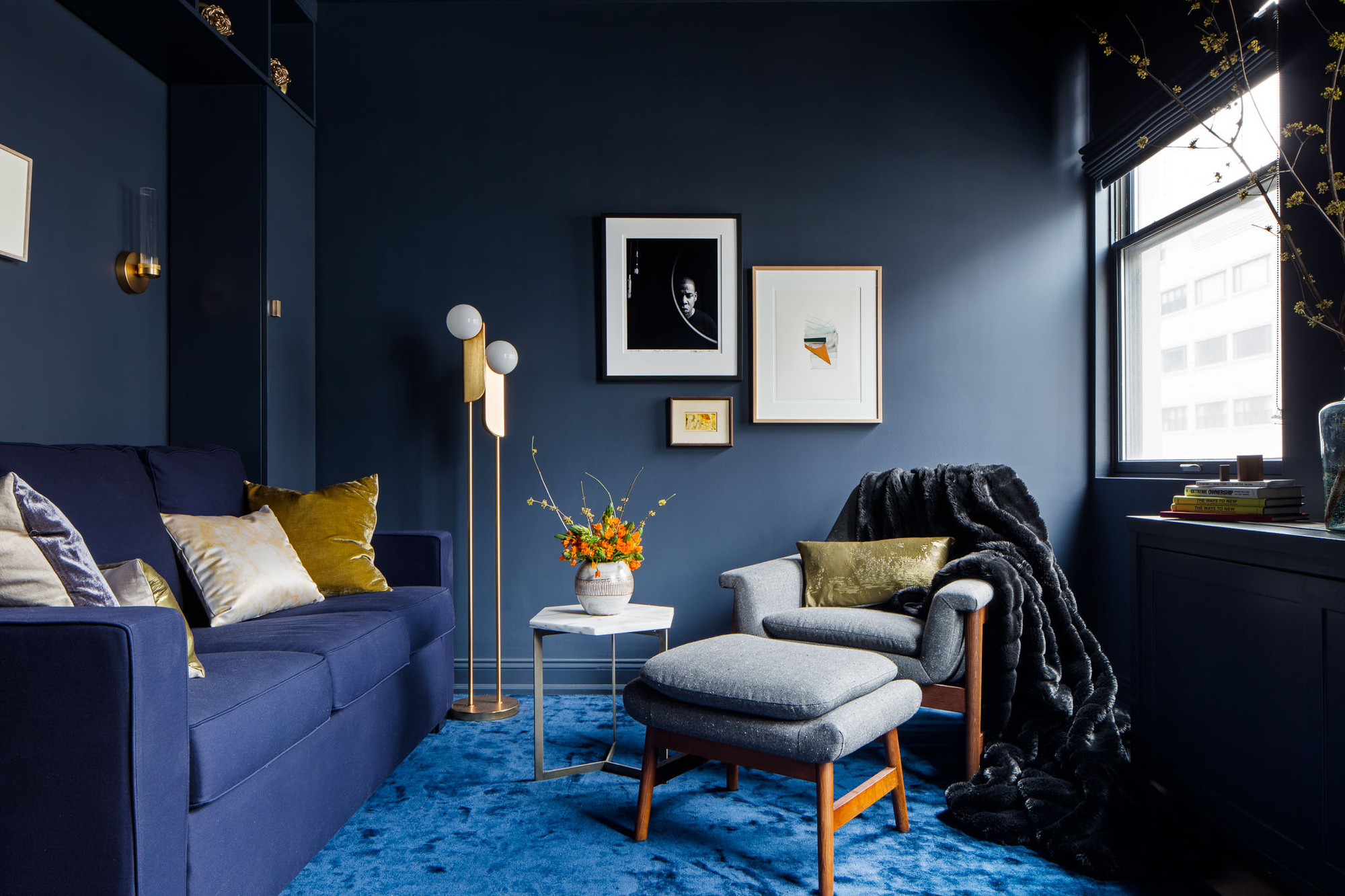
This navy blue paint has a richness that stops it feeling flat.
Symphony blue by Benjamin Moore is a classic dark hue that Jesse R. Turek, principal at Turek Interiors favors. "I use it because the tone is rich and deep but also bright enough so that the room doesn't feel too moody," she says. "It evokes a sense of romantic calm with a bit of drama."
In this living room, Jesse has reached for colors from the other side of the color wheel to help the navy pop, with yellow accents that bring brightness to the space. "Oranges, yellows and apple green or chartreuse are great to add if you want drama, contrast and a sense of playfulness," she says.
4. Midnight Navy Matt 950 by Crown Paints
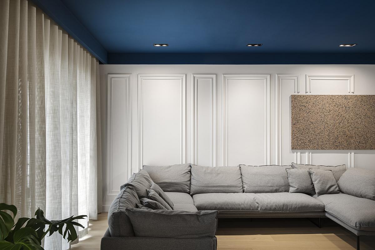
This Crown navy blue paint has a modern feel to it.
Studio NiCHE chose Midnight Navy Matt 950 for this flat. Given the standard ceiling height of 2.6 meters and the boxy nature of the rooms, the team introduced a sense of depth and height with painted ceilings and in other spaces, the main walls in a deep, dark blue.
"The goal was to maintain a light and airy feel throughout the apartment by keeping 80 percent of the space in a crisp white," says Martina Fenech Adami from Studio NiCHE. "To add contrast and depth, we introduced a deep, saturated blue, creating a striking pop of color while maintaining balance within the design." In the living room, the blue almost mimics a sky, and the space calls to nature for a calming and relaxing finish.
4. Deep Space Blue by Little Greene
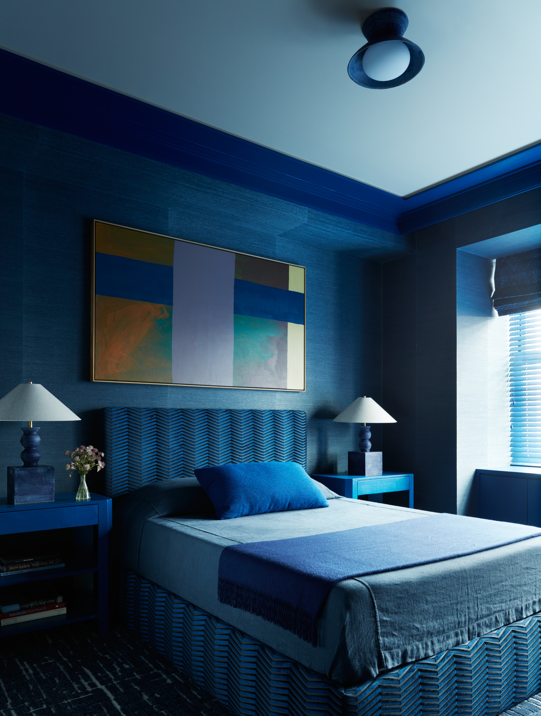
In this hotel bedroom, the paint was selected to complement the choice of textiles and wallpaper.
For one of the best navy blue paints that feels saturated, we love Little Greene's Deep Space Blue for a color that pops. Just take a look at this bedroom in the Astoria Waldorf in New York, which uses the energetic color along a monochromatic scheme.
"I wanted an impactful, enveloping, saturated blue for this room so I started with the soft materials — the fabrics, rug and wallcovering," explains interior designer Josh Greene. "When it came time for the paint, I needed something that lived up to the shocking cobalt and Deep Space Blue by Little Greene fit the bill."
While some navy blue paint colors lean towards gray, this one is packed full of vibrancy.
5. Hale Navy HC-154 by Benjamin Moore
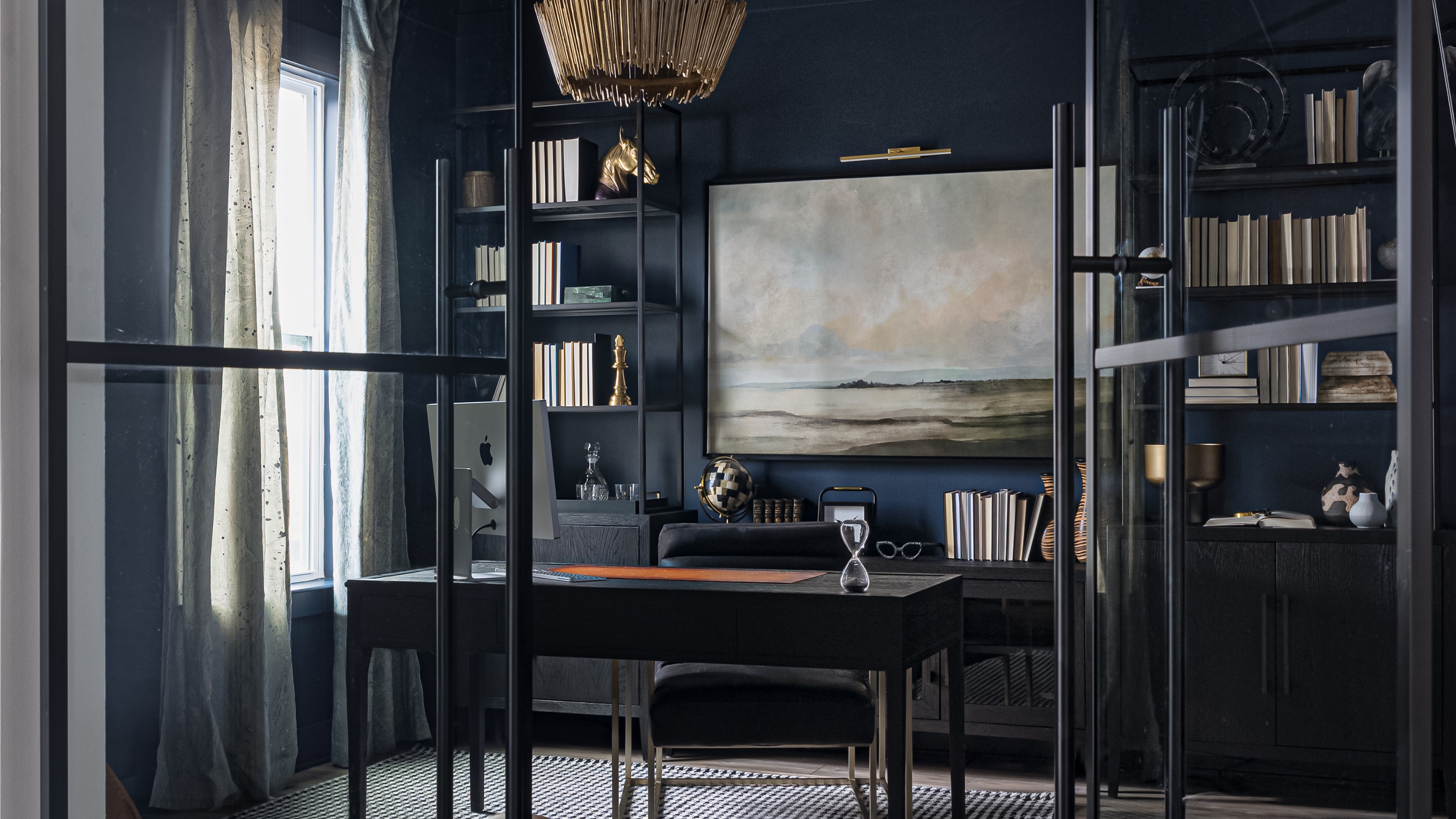
Hale Navy sits on the darker end of the navy blue paint spectrum.
As perhaps the most popular, multiple experts recommended Benjamin Moore's Hale Navy for its versatility. "We've used it both as an accent color on a kitchen island and as a full room color in an office, and it adds the perfect amount of depth and sophistication to both spaces," explains Barrett Oswald, principal designer at Barrett Oswald Designs.
The grey thing about Hale Navy is that it also has dark grey undertones to it, so it doesn't feels so bold and vibrant and makes it easier to use as a neutral throughout the home, and easy to pair with other colors.
FAQs
What Is the Most Popular Navy Blue from Benjamin Moore?
Benjamin Moore is a reliable paint brand that is loved across the world. With such a broad spectrum of blue paint colors, including navy shades, it can be hard to know where to begin. But the best Benjamin Moore blues in a navy shade is a great place to start.
"Hale Navy HC-154 is the most popular navy paint from Benjamin Moore," says Hannah Yeo of Benjamin Moore. "This color could work beautifully in a bedroom or home office as well as exterior walls and front doors," says Hannah.
"Whether applied to walls or cabinets, this versatile hue can serve as a neutral backdrop or beautifully highlight architectural details such as millwork, crown molding or shelving."
The Livingetc newsletters are your inside source for what’s shaping interiors now - and what’s next. Discover trend forecasts, smart style ideas, and curated shopping inspiration that brings design to life. Subscribe today and stay ahead of the curve.

Former content editor at Livingetc.com, Oonagh is an expert at spotting the interior trends that are making waves in the design world. She has written a mix of everything from home tours to news, long-form features to design idea pieces, as well as having frequently been featured in the monthly print magazine. She is the go-to for design advice in the home. Previously, she worked on a London property title, producing long-read interiors features, style pages and conducting interviews with a range of famous faces from the UK interiors scene, from Kit Kemp to Robert Kime. In doing so, she has developed a keen interest in London's historical architecture and the city's distinct tastemakers paving the way in the world of interiors.


