Blue and Yellow Color Palettes — Do These "Complementary" Hues Actually Go Together?
It's often seen in graphic design and logos, but does a blue and yellow color scheme look good in your home? A design writer makes a case for it
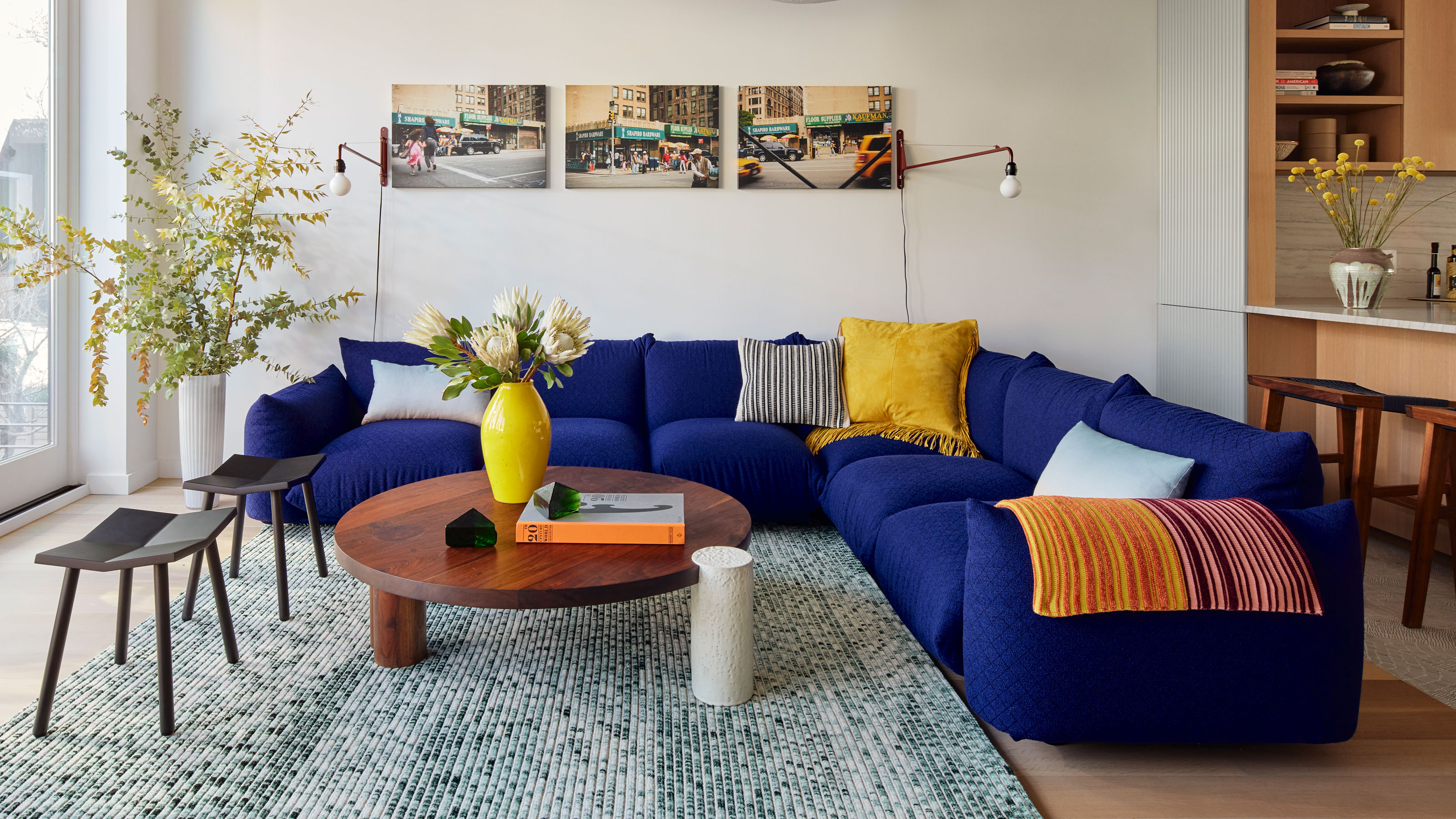

Blue and yellow are a funny color pairing when it comes to using them in your home. It's a scheme that's not unusual to see, for sure, but one that can easily go wrong. Given that these shades are considered 'complementary', why can a blue and yellow color palette be so disastrous in the wrong hands?
Well, in their purest, primary-color forms, yellow is definitely a color that goes with blue, but it's used more in 'design' than 'interior design', and you'll often see them used to creating striking logos. IKEA, Walmart, GoodYear — these colors are used because they stand out; because they're perfect contrasts to each other, but that doesn't always translate into a beautiful home.
Yet, I had a blue and yellow bedroom when I was a child, and the color pairing brought me joy for a number of years. It wasn’t until researching this article, that I realized just why this color combination works so well and how spaces with the theme of blue and yellow can look so different, depending on how the colors are applied.
So, do blue and yellow go together? Yes, but if you want to pair them, read on for some clever ways of using this palette.
How Are Blue and Yellow Related in Color Theory?

Blue and yellow are complementary colors — which means they're on opposite sides of the color wheel in color theory. In their various combinations, what being complementary actually means is that they're the most pure contrasts to each other, and if they were to be mixed together, they'd cancel each other out to create a greyscale, black or white.
How to Use Blue and Yellow Together in a Palette

As well as being opposites in theory, they bring very different qualities to a space. As much as blue exudes a feeling of tranquility and seriousness, yellow is joyful and energetic.
However, the key in making them work together often lies in their tones — after all, not many people are decorating with primary colors in a combination like this. "I think it’s important to consider the richness of each color to create the perfect complement," confirms Monica Breese, founder of The Designed Domicilio. "I like a dark hue and light hue of the opposite color. It’s bold and fun."
Take a look at some inspiring schemes below which show how it can be done deftly.
1. Try One Single Yellow Element
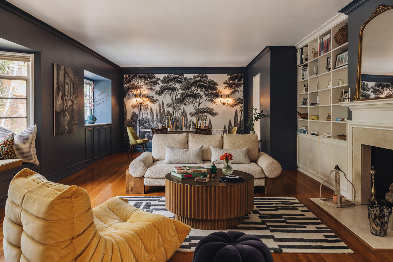
This midnight blue living room by Maison Vilucchi uses a solitary yellow accent in the Togo chair for some interesting contrast.
"Chosen as the dominant color, this rich blue helped us to tie up the different hues of honey, yellow and gold, the existing wood flooring and the black and white area rug, which added depth and interest to the space," explains Tancred Viluchi, founder of Maison Viluchi.
Using blue and yellow as a color palette can feel a little bit contrived if you match too many yellow accents throughout the space. Keeping it to a single object helps it feel a natural, casual pairing in the scheme.
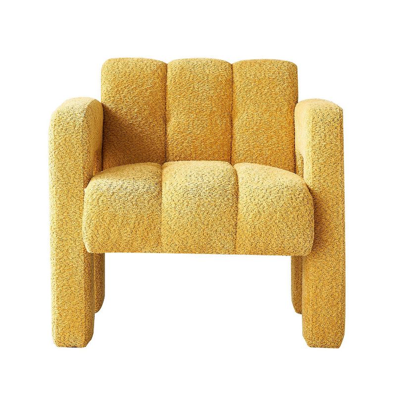
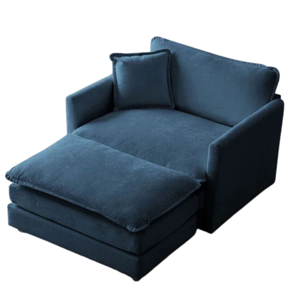
Price: $289.99
A fun color for a boucle accent chair, this design is a standout on all fronts.
2. Use the Palette Sparingly

This contemporary interior scheme by Truss Interiors is generally neutral in its palette, yet there is a scattering of deep blue and golden yellow tones throughout which contrast and ground the neutral palette.
The blue is used in slightly larger areas, such as the arm chairs, whereas flecks of golden yellow creep in in small details such as textiles, lighting fixtures and wall decor, reflecting a buttery glow onto the off white creamy walls and allowing the blue to take centre stage. The dark wood and lively red pulls the space together with common warmth.
3. Round Out the Palette

Your color scheme doesn't have to be based on just blue and yellow. There are lots of other colors that go with yellow and blue, separately and together.
Need inspiration? This bedroom by Rebecca Udall pairs blue and yellow with green and red. The striped blue and cream headboard offsets the warm mustard yellows used in the space, while the gentle greens and striking red to the side balance the colors even more so and offer a layer of added warmth.
4. Get the proportions right

"I like taking bright, strong yellows and pairing them with blue-greens," designer Robin Gannon, founder of Robin Gannon Interiors, tells us. "However, I think usually the blue will come first as that's the more prominent of the pair, with yellow as an accent."
This living room design is a great example of how to use the 70-20-10 rule. The majority of the scheme, the 70% is neutral tones, while 20% comes in through blue used in the rug and armchair. The final 10% comes in the yellow sofa.
So, Should You Decorate With Blue and Yellow?
You absolutely can commit to this color palette, but Livingetc.com's Editor Hugh Metcalf, has some thoughts on why it wouldn't be his go-to palette.
"There was a time when the yellow accent was ubiquitous in interior design," he says, "especially used as a strong contrast to colors like blue or gray. Today's color trends hang a little bit less on the power of contrast, and instead we're seeing more cohesive, harmonious palettes used — something to consider when thinking about pairing blue and yellow together."
So, if you want impact, blue and yellow go together perfectly — for something a little more peaceful, it might not be your go-to.
Be The First To Know
The Livingetc newsletters are your inside source for what’s shaping interiors now - and what’s next. Discover trend forecasts, smart style ideas, and curated shopping inspiration that brings design to life. Subscribe today and stay ahead of the curve.

Portia Carroll is an interior stylist, writer, and design consultant. With a background in interior architecture and design, she has a plethora of creative experience in the industry working with high end interior brands to capture beautiful spaces and products and enhance their qualities.
-
 Burl Wood Decor Is 2025’s Most Coveted Comeback — Here’s How to Get the Storied Swirls for Less
Irregularity is the ultimate luxury, but you don’t need an antiques dealer to find it
By Julia Demer Published
-
 5 Garden Features That Instantly Add Value to Your Home — While Making Your Outdoor Space More Practical, too
Get to know all the expert tips and tricks for making your backyard a standout selling point for your home.
By Maya Glantz Published

