

There’s something about certain blues that can make you feel, well… blue. The color’s many shades are perhaps the most commonly chosen for interior paint, especially for bedroom and bathroom walls. Don’t get us wrong: blue is still a color that’s timeless, versatile, and resonant. For the most part, choosing a blue paint color for an interior is a safe bet.
And yet, as trends shift and we see interiors make a return to more welcoming spaces, many blue hues that were once popular are inching dangerously close to the fate of the dreaded Millennial Gray. "Over the past few years, there’s been a notable shift in interior design toward spaces that feel warm, inviting, and emotionally grounding, rather than cool, sterile, or overly polished," says Cem Evirgen, Founder of Brooklyn, New York-based Monomid Design Studio.
So how can you be sure that if you are planning to paint or decorate with blue, you don’t choose a color that will soon feel dated? Alternatively, what should you do if the blues in your current space are feeling old-fashioned or cold, and in dire need of a refresh?
First, do not let your online color wheel spin out of control. It can be easy to get overwhelmed with choices, particularly when selecting paint colors (a process that should always be transferred from online to IRL). Second, don’t think paint is your only option. Color changes can come with the addition or subtraction of other decorative elements.
Whether you are struggling with how to pick a new blue, or deciding what to do about an old-fashioned-feeling space, we have rounded up some expert designer advice on the most common mistakes people make, and how to ensure your old-fashioned blues don’t get you down.
1. Picking a Blue With a Cool Undertone

DO INSTEAD: It's not to say you can't still use soft baby blues, but something as simple as pairing them with warmer shades helps balance the space.
Undertones are everything and the shades feeling the most dated these days are the cool tones. Bringing in bright blues with warner undertones can quickly and effortlessly modernize a room.
"There is this story about a factory painted light blue and staff were always complaining that they were cold," Marianne Tiegen of Marianne Teigen Interiors tells us. "We weren’t sure if the story she relayed was true or fictional, but we liked where it was going. They changed the wall colors to yellow and without changing the air temperature (or heater), [employees] never complained anymore about being cold."
We’ll take it! Whether true or hearsay, the moral of the story is sound: cool color schemes can have a real impact on how we feel. Designers we spoke to agreed that a lot of the powdery, pale blues popular in the 90s have started to feel dreary, especially because they don’t seem to “go” in more modern interiors that have made a turn toward either maximalism or minimalism, leaving little room for the in-between.
2. Styling Blue in the Wrong Space

DO INSTEAD: Before incorporating shades of blue in a space, ask yourself how you want to feel in the specific space, and whether the shade echoes that.
"When pale blue is used in a more modern space with no architectural detail, it reads cold and institutional," says Stephanie Sarkies, from Pembrooke & Ives. For Stephanie, it’s all about how the space and the colors interact, which is why context matters.
While some pale blues once common in bedrooms and bathrooms are now feeling a bit dated, they can still work in other spaces, if the application is carefully considered. Similarly, vibrant, deep blues can work wonders in small bathroom spaces to give depth, and can add warmth to a bedroom.
In other words, no blue is black and white. "A homeowner must think about the architecture of the home as well as the feeling the color evokes," says Stephanie. "Ask yourself, ‘Why that color?’ What is the function of the room, and how do you want to feel in the space?"
She advises to go with a less obvious shade of blue and make it a statement or feature. But painting is not the only option. Using accents in richer, deeper blues, can divert attention away from walls that might have a dated finish (we don’t all have the time or energy for a brand new paint job!)
Stephanie says to go with a less obvious blue shade for either new paint or accents, such as blue slate or opt to decorate with navy.

Stephanie Sarkies is the Managing Director of Decorating at Pembrooke & Ives. She heads up a team of designers at the firm, and as such, has a strong grasp on what goes into making a space sing, and what might leave one feeling less than ideal.
3. Blindly Following Trends

DO INSTEAD: A less permanent design decision, such as a blue sofa, could be a more non-committal way of embracing a trend.
Jumping headfirst into a major design decision that follows a recent interior design trend might not be best in the long-term. Nowhere is this an easier trap to fall into than with selecting colors, especially paint.
Try to avoid choosing a color based on what's trending. Instead, think about your long-term plans for how you will use the space and how you want to feel in the space. Then, build your mood boards from there.
"It’s typically not the color itself that makes a space feel dated; it’s the associations that might not work with it," says Marianne Tiegen of Marianne Teigen Interiors. "Every color is beautiful if arranged with things that work with it."
Be aware of how small finishing choices can amplify a certain effect. For instance, if you want to avoid a cooler-feeling blue and modernize your space, make sure that you aren’t adding insult to injury by pairing cold-undertone blues with sterile white accents. If you want to create a more modern, warm environment, a pale or lavender blue wall married with a bright white trim will create the opposite effect.
Marianne Tiegen is an interior designer based between Switzerland, France, and California. As such, she has an incredible way of knowing how to make any space feel like home, through the furnishings, finishes, and colors selected.
4. Picking the Wrong Application or Finish

DO INSTEAD: Experiment with where and how you use blue, such as going for a high gloss paint finish to make a statement in your space.
When considering blue paint application, don’t limit yourself to thinking it must cover an entire wall or room. In fact, blue can make an interesting choice for moldings, and not just baseboard or ceiling moldings. Experiment with a deep, rich blue on picture moldings, chair rails, or wainscotting.
Stephanie tells us: "Consider a high-gloss finish so that it can play with the light and morph over the course of the day."
Marianne also suggests changing trims and removing anything too stark white. While a bright, clinical white crown molding can feel dated, a creamier one can actually change the mood of the room entirely.
5. Accessorizing It Wrong

DO INSTEAD: Work out the colors that go with blue, and accessorize it with complementary shades and finishes.
Gold and brass finishes have come in and out of fashion in recent years, but their ability to bring warmth and depth to a space, particularly against cooler-feeling blue tones, is a failsafe way to switch up a room’s vibe and avoid making a mistake that will feel old-fashioned and quickly dated.
"Add gold colors, like a golden tone wood (blonde oak), a gold or brass pendant," says Marianne. "And add lots of fabrics to warm it up like satin curtains in a different shade of blue, cream, or linen color."
"To modernize a dated-feeling blue without committing to a full repaint, try layering in small, modern decorative accents that bring warmth, texture, and contrast," suggests Cem Evirgen. "Swapping in trendy throw pillows and textiles, sculptural objects, or curated print artwork can instantly refresh the space and balance the outdated tone."
Think velvet pillows with gold flourishes, brass hardware in bathrooms, or even small gold accessories like jewelry trays, desk organizers, or cotton swab holders.


So it's fair to say that blue is certainly not an old-fashioned color when it comes to decorating in our homes, it just depends on how and where you do it, as well as the shade you choose and how that makes you feel.
As with any color, the best way to avoid making a mistake that you'll live to despise each and every day, it's worth pausing before you pick up a paint brush, and really considering your design choice. Feeling extra committed? Why not try decorating with cobalt blue.

-
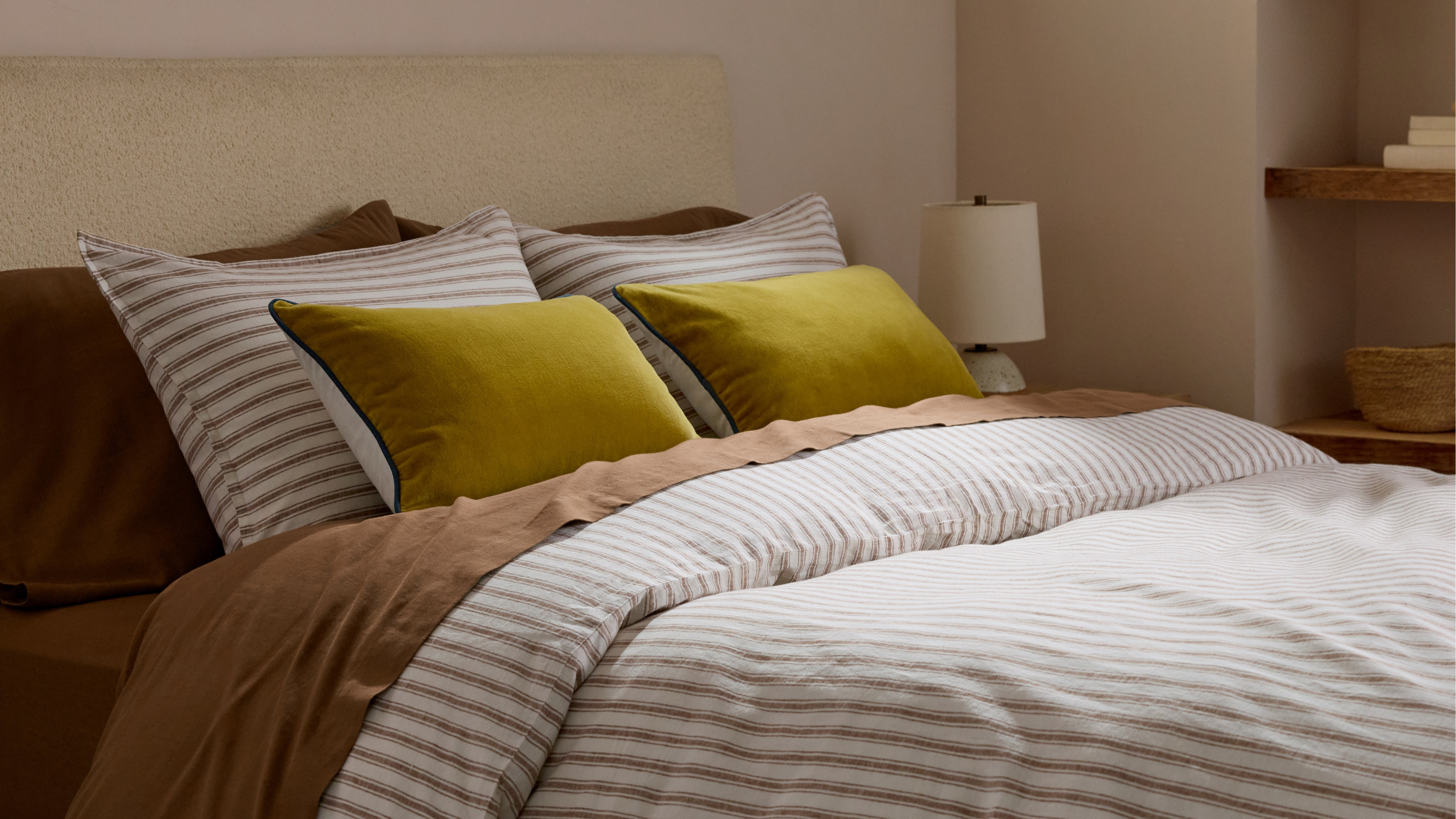 Parachute Just Dropped a Collection at Target and It's A Guaranteed Sell Out
High quality bedding and bath linens just got a lot more accessible. Parachute's signature effortlessly chic style is now available in over 200+ pieces at Target
-
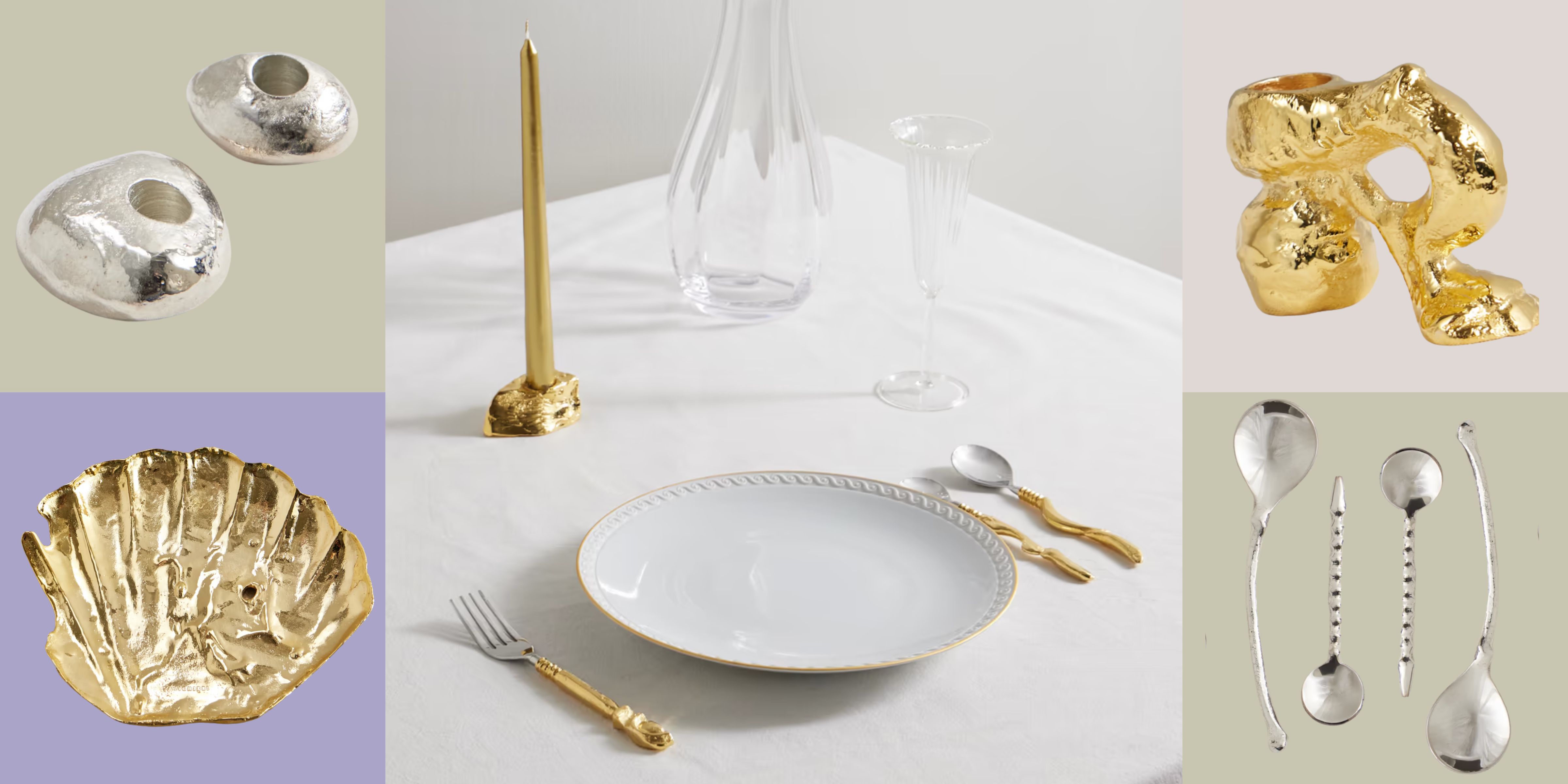 Now Serving: Jewelry for Dinner — Alighieri Brings Its Signature Raw Beauty to the Table
Alighieri CASA is what happens when a jewelry house designs your cutlery — and yes, it’s just as fabulous as it sounds


-
 What Does the Color Yellow Mean in Interior Design? A Color and Design Psychology Expert Explains
Whether you love or hate it, yellow always seems to elicit a strong reaction from people — here, we explain why
-
 Should a Living Room Be Painted Dark or Light? We Asked Design Experts to Settle The Age-Old Debate
The color of your living room can completely shift the mood of your entire home, so the question remains: should you go light or dark...?
-
 I'm Sorry, But You Need to Know About 'Advancing and Receding Colors' If You Want to Get Your Home's Decorating Scheme Right
While some colors tend to pop and reach forward in a room, others draw back. Here, a color expert helps define these palettes and how to use them
-
 Amethyst, Heather, Pansy, Plum — Turns Out Decorating With Purple Opens You Up to a World of Possibilities
Purple certainly isn't a color for the faint hearted, it's a shade that can smell your fear. Here's how to conquer it through your interiors
-
 Here's Why Decorating With Mustard Yellow Helps Fill Your Interiors With a Sense of "Confident Calm"
There is so much more to decorating with this turmeric-tinted sauce-wiggled-on-a-hotdog not-quite-yellow shade than meets the eye
-
 5 Problems With Painting Your Walls White That No-One Ever Talks About (Until Now)
White is the easiest neutral to work with...right? Interior designers explain why this shade is actually more complex than it may seem
-
 5 of the Best Navy Blue Paint Colors That Designers Love — And How to Use Them
Navy blue has timeless appeal and can feel both modern yet classic, but what are the designers' favorite paints?
-
 Should Your Carpet Be A Darker Color Than Your Walls? How to Make This Bold Look Work
Not every room can get away with a carpet that is darker than the walls; Designers share when and where this combination works best


