World-class designer Brigette Romanek on how to design a home that makes you feel good
Having designed homes for Beyonce and Gwyneth Paltrow, Brigette Romanek knows the secrets to creating perfect decor
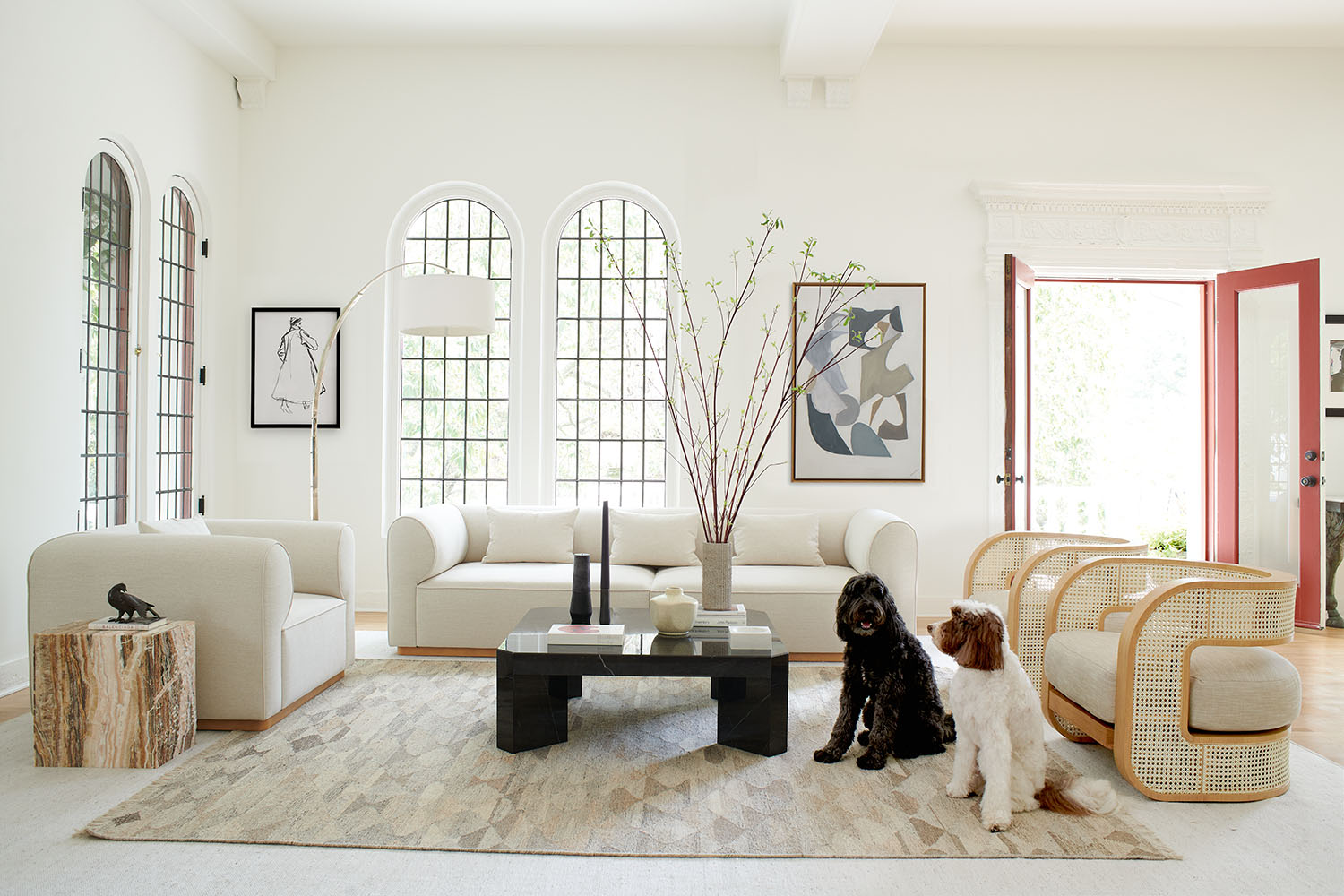
LA-based designer Brigette Romanek is known for her relaxed yet glamorous decor. Living in a wonderful home in Laurel Canyon, filled with indoor trees, curved furniture and a sense of inviting sophistication, her home embodies her take on design.
She was recently in the spotlight for having completed the interior design on her friend Gwyneth Paltrow's modern home. It is full of her signature touches - light, airiness, rounded shapes and more indoor trees.
She has also created schemes for Beyonce and has recently designed furniture for Mitchell Gold and Bob Williams.
I'll admit, she is one of my design heroes. This is the second time I've interviewed her, and both times I have out down the call feeling more rested and inspired. She talks in a gentle way but with passion about how decor can be done well to make you feel better, and she is so warm that I can't help but be swept along on the crest of her ideas. It helps that her taste is exactly right for now, and the pinnacle of current interior design trends - smart but welcoming, chic but not austere.
Good vibes only
Why should a coffee table be rectangular? Curved edges have more heart and soul
Brigette Romanek
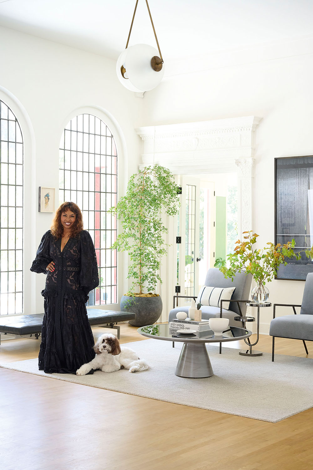
Pip Rich: Do you remember the last time we spoke? I was at home with builders literally coming in and out of the room, ears deep in the renovation, and we chatted about creating good energy in a space. It really did change the way I went on to decorate. Is positive energy still something you think about?
Brigette Romanek: Yes of course! I believe with all my heart that we’re enhanced by our surroundings, and if I can bring beauty into people’s lives then that creates good feelings. I now think about energy more than ever - I’ve seen it with clients and with myself. When people leave a room they don’t remember every piece of furniture or every object, but they do remember how they felt in that space - that energy lingers with them. I always want people to feel like when they walk into one of my rooms they’ve been invited to a party!
PR: How would you set about creating a scheme that fills the visitor with good vibes?
BR: It begins with a conversation about textures and colors, and finding the harmony between the two. The pieces you choose need to create no conflict with each other, to flow. You can do this by looking at the space between them and the shapes in the air around your furniture. By introducing gentle curves that compliment each other, and spacing them apart so their outlines have room to breathe, it will all come together.
The secrets to perfecting a layout
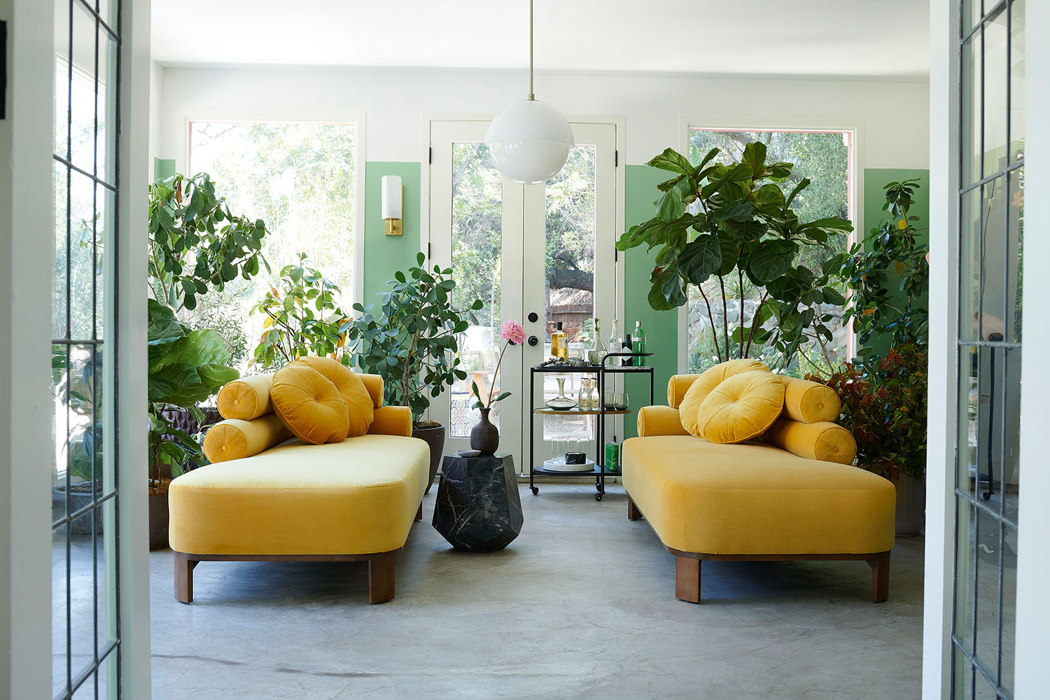
Part of the furniture collection Brigette designed for Mitchell Gold + Bob Williams
PR: Does that spacing come naturally to you, or is it meticulously planned? Your living rooms always seem to be placed so perfectly that I notice the air between the pieces as much as the pieces themselves.
BR: I always like to do plans, and I’d say this to anyone. Before you put any pieces together, get a floor plan, and lay your furniture out in terms of their dimensions. I know it feels like a pain in the butt but look at the room’s walkability. If you get the ability to travel seamlessly through a space right, the stars align and you’ll make as few mistakes as possible. Sometimes, it can be easier to break the room down into section - I like to create vignettes all in one room. That way, your eye travels to lots of different areas and each one feels like its own little world.
Enhancing the light
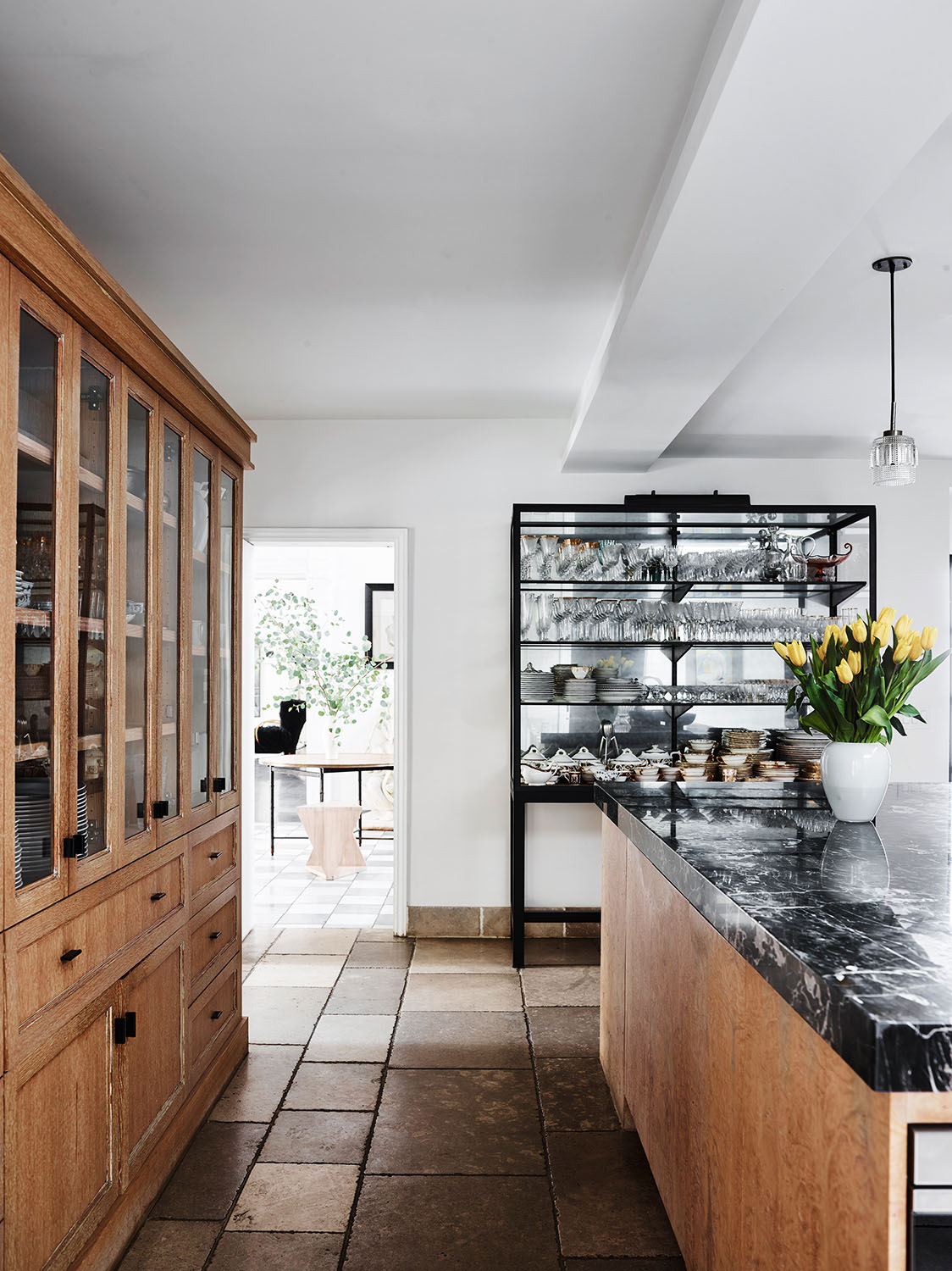
PR: The house you designed for Gwyneth Paltrow is full of those vignettes, and the height of a new trend we’re clumsily calling ‘Spanifornian’, which is a blend of Spanish palacio and airy Hollywood light. How can we bring that look to climes that don't have so much sun and dimensions that aren't as lofty?
BR: If your weather can lend itself to looking a bit heavy, find a white paint with a blue undertone. It brightens even in dull light. I also think it’s about using organic shapes, introducing an asymmetry that is unexpected and pleasing to the eye. I really like the curved sofas by Pierre Augustin Rose which just take the formality out of a room. Why should a coffee table be rectangular? Curved edges have more heart and soul.
PR: I agree! There is a conviviality to the way curves interact that you don’t get from lines. One of the other things I love about your decor is the light that shines though each room. What colors are you into at the moment that achieve this?
BR: I’m almost overwhelmed when it comes to colors right now! I love yellows and rusts and pale greens with muted blues. I like to take a lavender and mix with a little grey - there’s a softness here that is so easy to live with. I’m a big fan of Donald Kaufman’s paints - they are so beautiful and rich that they look like they have the sun in them. Somehow, they make a room feel kind.
PR: I love the idea that a room can be kind. Isn’t that what every scheme should strive to be?
BR: Yes! Which is why you should never design in a vacuum. It goes back to the plotting stage - pay particular attention to where the windows are and where the light comes from. I created a bathroom in Malibu that, because of its skylights, I was able to do in bottle green, which enhanced the sense of nature beyond. Consider a room’s surroundings first.
See how this interview with Brigette inspired the lavender bedroom trend other top designers are embracing too.
Be The First To Know
The Livingetc newsletters are your inside source for what’s shaping interiors now - and what’s next. Discover trend forecasts, smart style ideas, and curated shopping inspiration that brings design to life. Subscribe today and stay ahead of the curve.
The editor of Livingetc, Pip Rich (formerly Pip McCormac) is a lifestyle journalist of almost 20 years experience working for some of the UK's biggest titles. As well as holding staff positions at Sunday Times Style, Red and Grazia he has written for the Guardian, The Telegraph, The Times and ES Magazine. The host of Livingetc's podcast Home Truths, Pip has also published three books - his most recent, A New Leaf, was released in December 2021 and is about the homes of architects who have filled their spaces with houseplants. He has recently moved out of London - and a home that ELLE Decoration called one of the ten best small spaces in the world - to start a new renovation project in Somerset.
-
 My 10 Favorite Designs at Milan Design Week 2025 — Out of the Hundreds of Pieces I Saw
There is a new elegance, color, and shape being shown in Milan this week, and these are the pieces that caught my eye
By Pip Rich
-
 Iridescence Is Chrome’s More Playful, Hard-to-Define Cousin — And You're About to See It Everywhere
This kinetic finish signals a broader shift toward surfaces that move, shimmer, and surprise. Here's where to find it now
By Julia Demer