

Few colors come in and out of fashion more than yellow. One moment it's the it color and the next it’s passé. But lately, in the sea of sunshine and ochres, there's one shade of yellow that's standing out against the rest: butter yellow.
When it comes to choosing the best butter yellow paint colors, architectural color consultant Amy Krane says to look for "pale yellows that include the tiniest pinch of orange or red in their makeup." They're the shades that, simply put, remind us of the creamy butter we spread on toast.
"While highly chromatic yellows are always a challenge to use on walls, butter yellow, its gentle cousin, is another story," adds Amy. When working with a shade as soft, subtle, and sophisticated as butter, decorating with yellow becomes effortless.
Butter yellow paint colors are a more playful take on a neutral, adding interest without overwhelming a space. But how do you prevent it from looking too childish? We asked designers for their fool-proof butter yellow paint color suggestions, below.
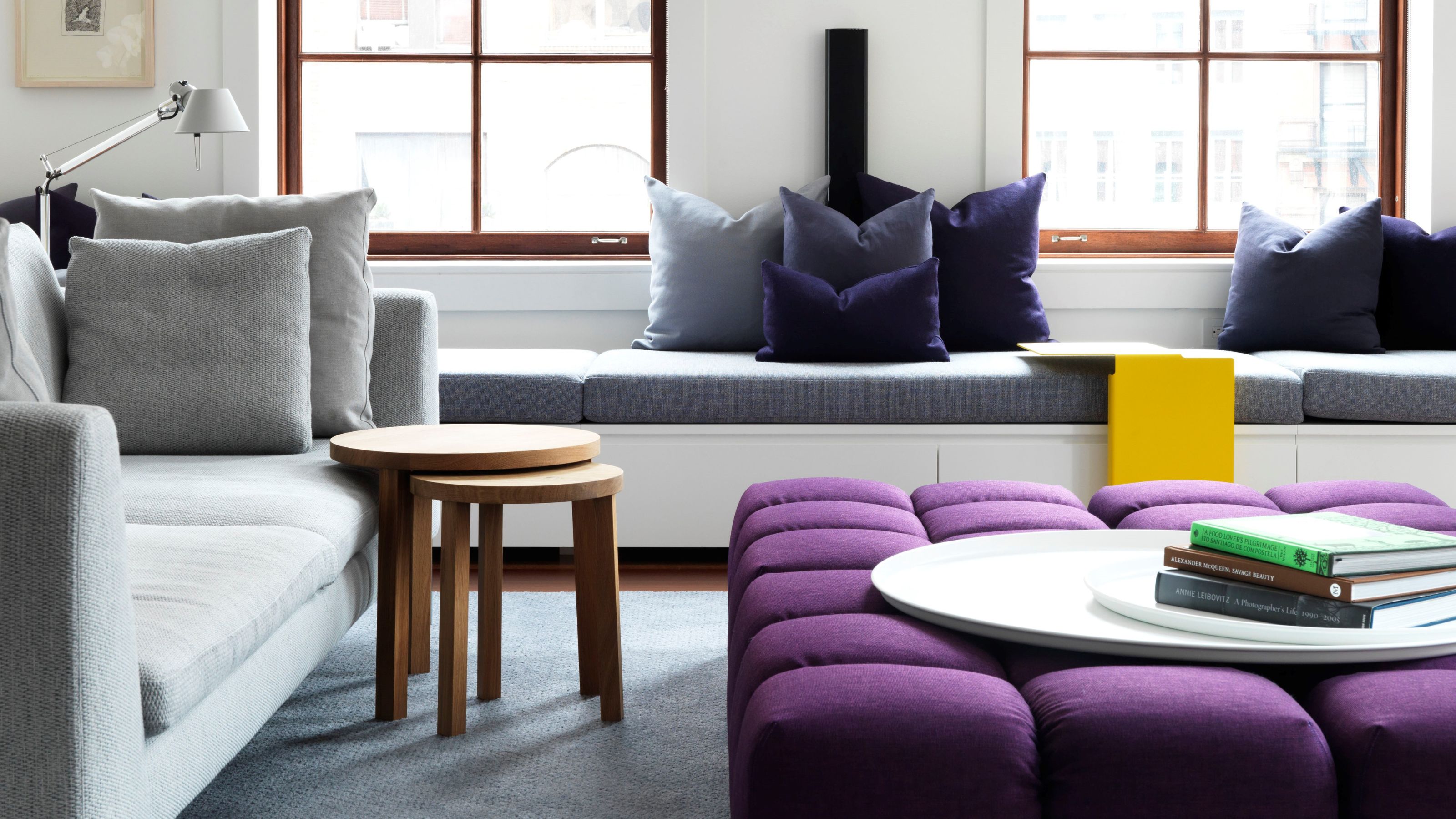
1. Benjamin Moore's Sweet Cream

Benjamin Moore's Sweet Cream is used on the walls of this bright living room configuration.
We wouldn't be surprised to learn that 'Sweet Cream' has become a top contender for one of the most popular Benjamin Moore paint colors this year. It's one of the first shade Amy Krane mentioned.
This color's soft, velvety hue is both warm and natural, while its subtle gray undertone gives it a rounded depth. "It's great for bedrooms and kitchens, to name a few places that come to mind, but it’s hard to conceive of a room I wouldn’t put it in," she admits. "I had it in the living room of my NYC apartment with a watermelon-colored sofa and a pink and orange rug." Yum.

Price: £5.95/sample pot

Amy Krane is an architectural color consultant at Amy Krane Color, and host of the popular design podcast, Let's Talk (Paint) Color. Amy was trained in color theory by the founder The International Association of Color Consultants/ Designers of North America, Frank Mahnke. Her training, experience, and skill set allow her to navigate all realms of color from classic to more trend-driven applications.
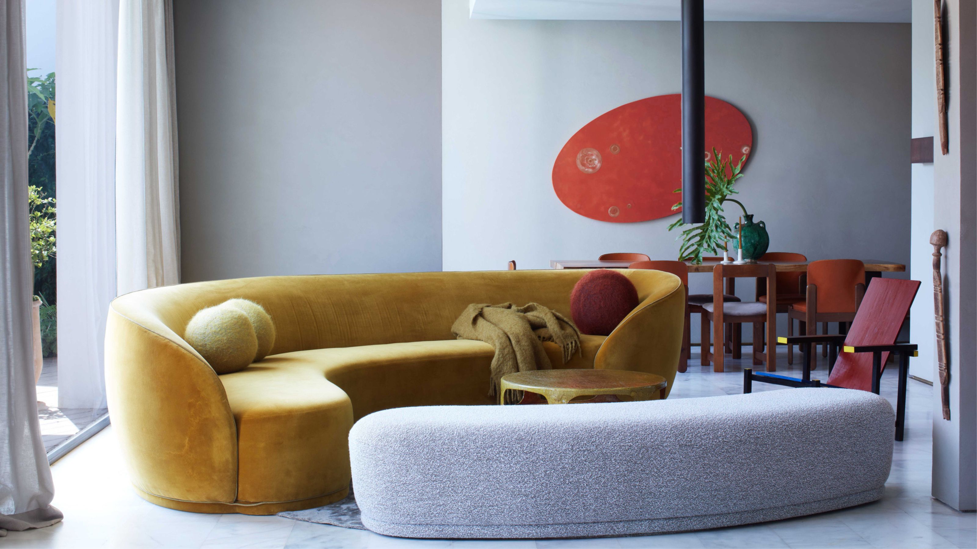
2. Benjamin Moore's Knitted Cape

The butter yellow paint color envelops this dining nook in a soft shades that plays with the shadows and light.
Next on the list is Knitted Cape, a neutral Benjamin Moore paint color that's perfect for a sophisticated, yet subtle palette. For a refined monochrome scheme, skip the classic beige and opt instead for a color-drenched butter moment in this shade.
"Butter yellow is a no-brainer for rooms you want to uplift," says Amy. "When you want a pale color that falls outside of the confines of a neutral but is still quiet enough to live in the background, it’s a great choice."
But beware, lighting will really impact how Knitted Cape sits in a room. "In rooms with a lot of warm southern exposure, the yellow undertone will appear stronger," says Arianna Barone, color marketing manager and color expert at Benjamin Moore. Conversely, it can help to brighten a dark room, or to warm up spaces with cool lighting.
Don't be afraid though — Arianna describes this shade as "a soothing butter yellow that is a great introduction to the yellow color family if you are hesitant to try it."

Price: £5.95/sample pot
3. Farrow & Ball's String

The shadows and light from the window showcases just how cozy String can be on a wall.
Is it beige? Is it yellow? String by Farrow & Ball can certainly be defined as a chic iteration of butter yellow, and an easy one to embrace if you're feeling apprehensive.
It's inspired by twine tied around packages and presents, but with a slightly more yellow twist. It has a darker undertone that gives the shade a beautiful amount of depth and allows it to morph when used in different lighting.
In darker rooms, it will have a cozy cocooning effect, while in a room with lots of natural light, it will become brighter and its yellow base notes will shine through.
"Butter yellows, like String, are excellent for north-facing rooms and rooms without windows," says Amy. While white may fall flat, "yellow will retain its character and give warmth to the room."

Price: £5.50/sample pot
4. COAT Paint's Arctic Roll

Artic Roll is used with a slightly lighter butter yellow paint in a color-blocking technique, creating just the right amount of visual interest on the wall.
Now for the more pigmented end of the spectrum. Melanie Liaw, co-founder and interior designer at Duelle Studio, says COAT Paint's Arctic Roll is one of her favorite butter yellow paint colors.
"The color palette for Café Petiole at Somerset House (shown above) — the soft yellow paired with a soft gray blue — was a palette that we loved from a local building in Milan near our studio there," she explains.
Inspired by the building, they selected COAT Paints in Arctic Roll, which Melanie describes as "quite a bubbly, vibrant, cool yellow." And yes, yellow by nature is an energetic color that brings vibrancy and joy to a space, but it can easily be subdued depending on what you pair it with.
"We added the ashy rose, another bespoke shade with COAT Paints, as a nod to the deep burgundy hues you often see in a traditional Parisian café," says Melanie. The oxblood and yellow pairing (one of my favorite unexpected spring color palettes) balances each other, resulting in a look that feels alive yet not overpowering.

Price: £7.50/sample pot
5. Tikkurila's Sorbet

In the entryway above, the trim and wall color combination varies between a darker shade on the walls (Tikkurila's TVT G393), with Sorbet framing the room as a lighter accent on the trim.
And who said butter yellow paint should be confined to your walls? This shade works particularly well as the perfect trim color.
Russian interior designer Elina Musakulov, co-founder of sdelaemremont.kz, often uses varying shades of soft butter yellow paint throughout all of her designs. She says Tikkurila's Sorbet and TVT as two shades she used in a recent project, and also two of her favorites.
"It's the ultimate cheery color," she says. In rooms with lots of light, Sorbet will glow. It’s whimsical on its own, but also makes an elegant pairing. Perfecting your butter yellow paint ideas means not being afraid to play around with the application.

Price: £5/sample pot
Knowing the best butter yellow paint colors should certainly help make you feel more confident to test out this current color trend in your own home, but if you're still feeling apprehensive, adding an accent of butter yellow decor could also be a good place to start.

-
 Which Spring Home Scent Matches Your Star Sign? This Is What Your Home Should Smell Like Right Now, According to the Zodiac
Choosing a home scent that matches your personality is the best way to create a space that feels perfectly your own. So find your zodiac and the scent to match.
-
 Parachute Just Dropped a Collection at Target and It's A Guaranteed Sell Out
High quality bedding and bath linens just got a lot more accessible. Parachute's signature effortlessly chic style is now available in over 200+ pieces at Target


-
 What Does the Color Yellow Mean in Interior Design? A Color and Design Psychology Expert Explains
Whether you love or hate it, yellow always seems to elicit a strong reaction from people — here, we explain why
-
 Should a Living Room Be Painted Dark or Light? We Asked Design Experts to Settle The Age-Old Debate
The color of your living room can completely shift the mood of your entire home, so the question remains: should you go light or dark...?
-
 I'm Sorry, But You Need to Know About 'Advancing and Receding Colors' If You Want to Get Your Home's Decorating Scheme Right
While some colors tend to pop and reach forward in a room, others draw back. Here, a color expert helps define these palettes and how to use them
-
 Amethyst, Heather, Pansy, Plum — Turns Out Decorating With Purple Opens You Up to a World of Possibilities
Purple certainly isn't a color for the faint hearted, it's a shade that can smell your fear. Here's how to conquer it through your interiors
-
 Here's Why Decorating With Mustard Yellow Helps Fill Your Interiors With a Sense of "Confident Calm"
There is so much more to decorating with this turmeric-tinted sauce-wiggled-on-a-hotdog not-quite-yellow shade than meets the eye
-
 5 Problems With Painting Your Walls White That No-One Ever Talks About (Until Now)
White is the easiest neutral to work with...right? Interior designers explain why this shade is actually more complex than it may seem
-
 5 Mistakes That Are Making the Blue Details in Your Room Feel Old-Fashioned — And How to Rectify Them
Blue is a timeless shade, no doubt, but use it in the wrong space or in the wrong way, and it can make a space feel, well... a bit blue
-
 5 of the Best Navy Blue Paint Colors That Designers Love — And How to Use Them
Navy blue has timeless appeal and can feel both modern yet classic, but what are the designers' favorite paints?


