Color commonality: the easy rule designers use for cosy decor, according to Livingetc's paint expert
Little Greene's creative director Ruth Mottershead on how to create paint palettes that perfectly blend together

So many of us have fallen in love with using green in our decor. Over the past few years we've seen bright, grassy shade, soft mints, sophisticated olives. It's a restful color which links so wonderfully to the outside world. It's a hue which is both relaxing to look at and gently energising.
Coming through for next year's interior design trends, we're starting to see a more warming take on using this color. Hunting green - the navy of the green world - is coming through strongly, providing a jolt of private members' club smartness. The way to make it more liveable, though is to pair it with earthier shades - taupes, beiges, terracottas.
It's exactly how to make a living room more cosy, and feels like a fresh new palette we've not really worked with in design before.
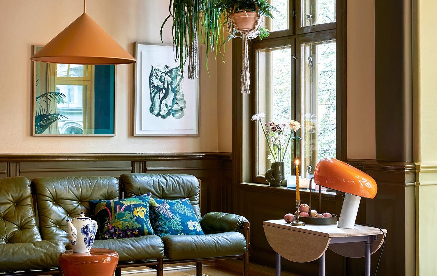
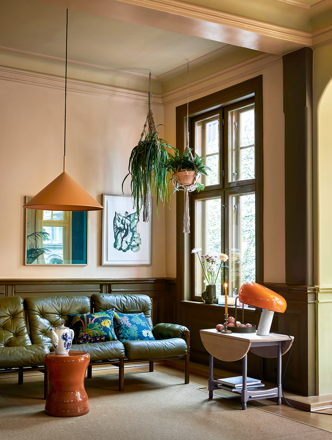
And so we asked color expert Ruth Mottershead, the Creative Director of Little Greene, to explain exactly why it works, using this to masterful living room by Koi Color Studio to provide plenty of guidance for getting fall decor ready.
The ratio of the colors is what makes a scheme work. Khaki represents just 30% of the overall scheme; the remaining 70% is terracotta – the power of khaki means the ratio is enough.
Ruth Mottershead
Find a common factor

Room styled by Koi Color Studio
Orange is always one of the colors that goes with green because they share the commonality of yellow in their make-up. In this room, the stability of the muted green allows the stronger oranges to stand out. The variation of these tones works in harmony due to their inherent warmth. Each hue contains ochre, umber or red oxide, which means the colors relate to each other, translating into a balanced and inviting scheme despite the clear difference in tonal strength.
Although orange and green could be thought of as a classic color scheme when by the rules of color theory, the use of terracotta and high gloss woodwork makes for a more contemporary finish here.
The blend of greens creates depth and dynamism, and is a good trick for how to make your home more Hygge. You know, that feeling of cosiness and warmth. The tonal variation of khaki, the olive tone of the sofa, the yellow-based green on the ceiling and the mid green of the plants achieves a balanced scheme. Similarly with the orange and terracotta, each element is a different hue yet the lamp, candle, table and lampshade are all from the same family, working to tie the scheme together.

Olive Color by Little Greene
Echo the natural world
Keeping the lower half of a room dark and the upper half light echoes the natural world. It feels like the contrast between earth and sky, so this way of using color is always well accepted and comfortable. This is particularly relevant with dark green – a reflection of nature.
The ratio of the colors is what makes a scheme work. In this case, khaki
strengthens the palette, acting as a solid ground for the lighter terracotta tones. Khaki represents just 30% of the overall scheme; the remaining 70% is terracotta – the power of khaki means the ratio is enough. Any more and it would become unbalanced and overbearing. The proportion of each tone allows the terracotta to remain delicate and unassuming against the bold statement of the khaki.
For more on how to balance shades like this, the 60-30-10 rule is a good place to start.

Middle Buff by Little Greene
Complement and contrast
Starting with accessories that have similar undertones to your paint colors helps create a cohesive and balanced result. It is important to have accessories in variations of similar tones rather than one single color – this creates depth and allows for subtle movement in a scheme.
Adding another contrasting, related color will bring dynamism and sophistication to a space; for example, the blue highlights on the cushions, artwork and teapot used here.
Stay warm
The warm green on the ceiling is perfectly in order. With a similar tonal strength to the terracotta wall shade, it does not compete. The ceiling color is also a diluted version of the khaki, making it a clever way of decorating without pure white; very diluted colors behave like white, satisfying the need for a lighter ceiling while maintaining a comprehensive scheme. To choose the correct diluted color for your ceiling, pick a key color from the scheme and find a white with a hint of a similar hue.
Dark colors can seem more profound in a gloss finish. Gloss paint has traditionally been used on front doors and woodwork, and there is a move away from matt and eggshell finishes towards gloss. The application of gloss requires significantly more preparation because every detail will be magnified by a gloss finish. If you ensure excellent preparation, the result can be stunning.

Apple by Little Greene
Be The First To Know
The Livingetc newsletters are your inside source for what’s shaping interiors now - and what’s next. Discover trend forecasts, smart style ideas, and curated shopping inspiration that brings design to life. Subscribe today and stay ahead of the curve.
Ruth Mottershead is the Creative Director of Little Greene, and one of the most renowned experts on exactly how to use color now. At Little Greene she has pioneered the way the brand thinks about color and pattern, creating new palettes, new pigments, and becoming the force behind sustainable paint offshoot Re:mix. She is also a regular contributor to Livingetc, as someone we turn to when we want to decode exactly how to put colors together.
-
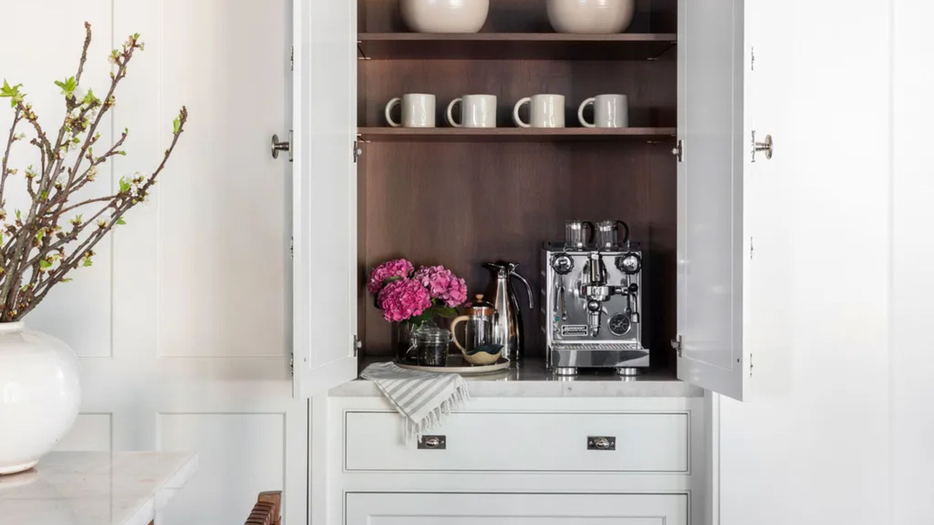
 Turns Out the Coolest New Café is Actually In Your Kitchen — Here's How to Steal the Style of TikTok's Latest Trend
Goodbye, over-priced lattes. Hello, home-brewed coffee with friends. TikTok's 'Home Cafe' trend brings stylish cafe culture into the comfort of your own home
By Devin Toolen Published
-
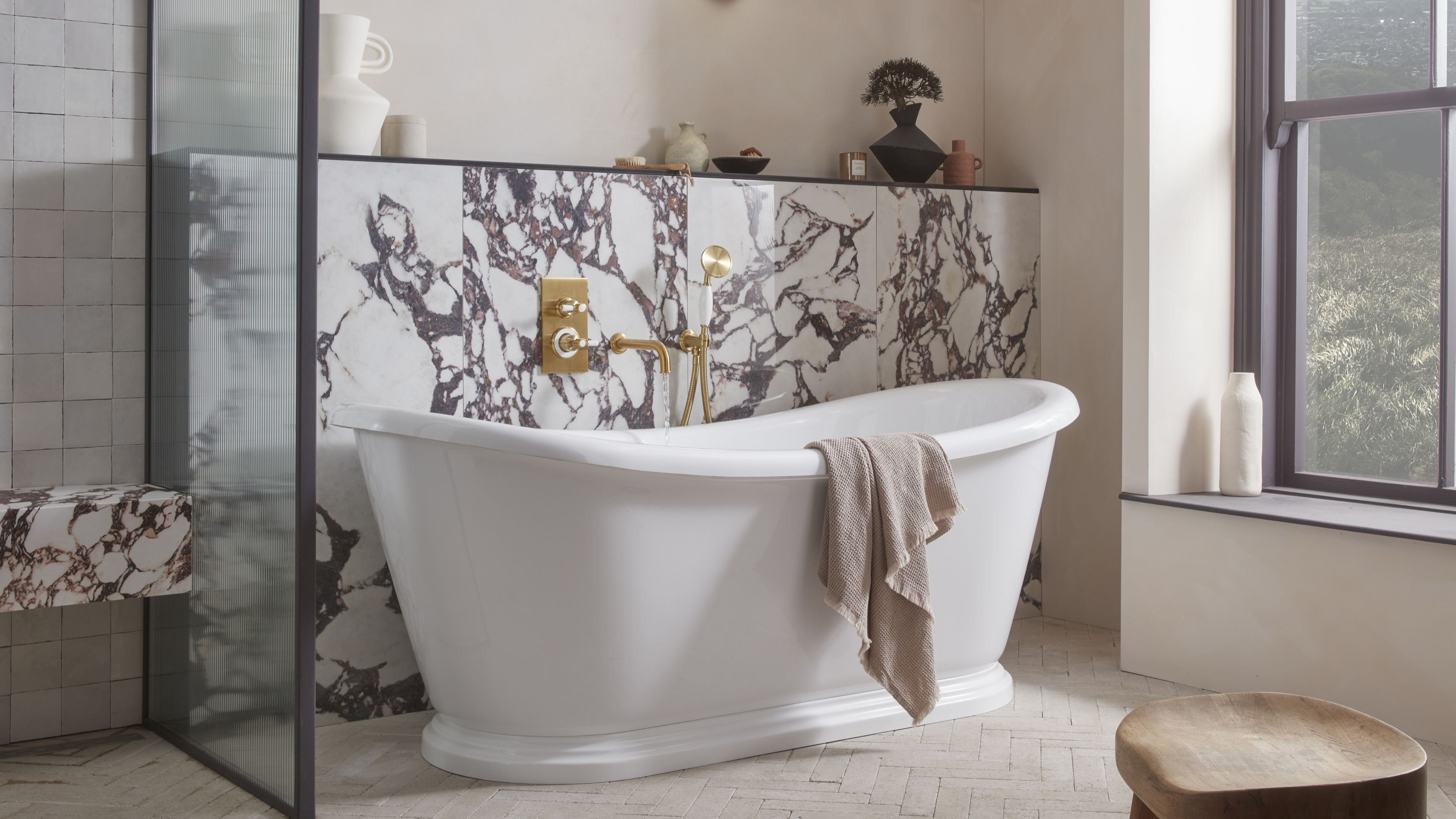
 5 Bathroom Layouts That Look Dated in 2025 — Plus the Alternatives Designers Use Instead for a More Contemporary Space
For a bathroom that feels in line with the times, avoid these layouts and be more intentional with the placement and positioning of your features and fixtures
By Lilith Hudson Published