Color layering is the super-clever trick designers use to create soothing kitchens. Our expert explains how
Ruth Mottershead explains how playing with tone and clever color layering can transform a kitchen into a dreamy space
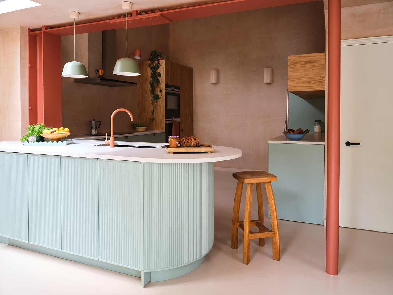
Getting a kitchen's color scheme right is a tricky balance. How do you blend in all the tech, the cookware, all the functionality and still make it a softly beautiful space?
Yet that was what design studio Borgo Otto Interiors have managed to do with this kitchen design by HOLTE. The hardness of the space - you know, the oven, the hood, the bits you need but don't necessarily love to look at - seem to fade into the background. Instead, all you notice is the gentle waftiness of this kitchen color scheme.
We asked our color expert columnist - and creative director of Little Greene - Ruth Mottershead to explain exactly how it was done.
How to do perfect color layering
Even a neutral kitchen can pack a punch with a contrasting highlight or a bold lowlight, so long as that contrasting tone is used in the correct proportion
Ruth Mottershead
Design by Borgo Otto Interiors
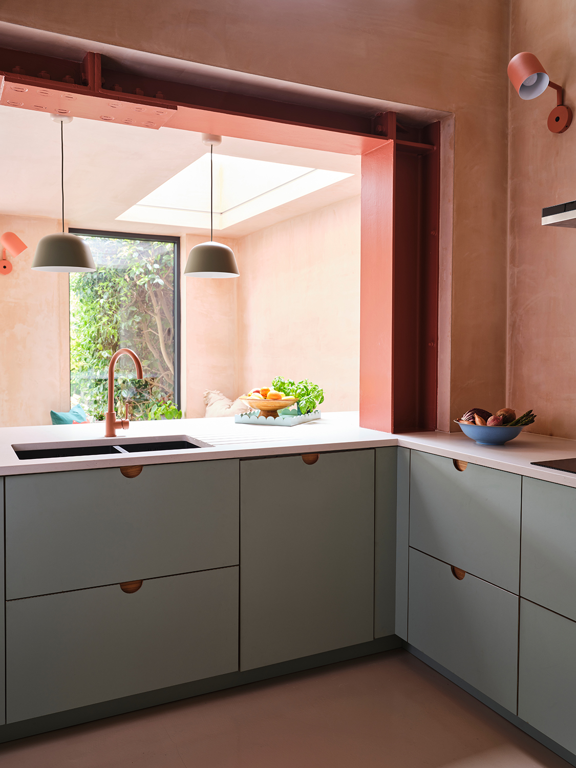
Choosing colors for any decorating project is always dependent on light, proportions and the architecture of the space. In a modern kitchen, however, as the hub of the home – a space where friends and family gather – bold, bright or fun colors can be used with ease, adding dynamism and energy to a space that deserves just that! Even a neutral kitchen can pack a punch with a contrasting highlight or a bold lowlight, so long as that contrasting tone is used in the correct proportion – a maximum of 30% of the entire scheme.
Design by Borgo Otto Interiors
The joy of plaster walls

Pink Slip Absolute Matt Emulsion, Little Greene
A plaster finish is wonderful because it feels soft and somewhat rustic – it creates the feeling of being ‘unfinished’ due to its textural quality and varying tonal depth. The key to this look is coordinating block color, as well as colors of the same tone as the plaster-effect walls – in this case, the wall light and skirting board, which act to provide stability and definition. The execution of the application needs to be tidy and smart to pull off an exquisite result.
Getting the texture just right
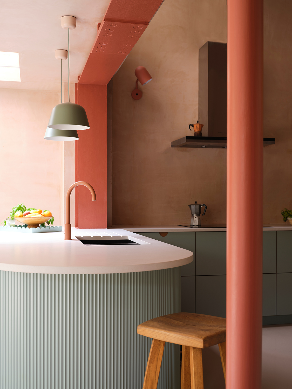
Texture in color choice can often be achieved through light. Light hits a textured surface to create a graduation of tones. Here, the scalloped edge of the kitchen unit provides a tactile experience as well as tonal variation thanks to the way the pastel aquamarine tone alternates between light and dark. Lighter colors provide a softer textural finish than darker colors, as do colors that are close to one another, like those in the plaster here. Layering colors also creates texture. Without the energetic stripe of strong pink across the ceiling, this scheme would be somewhat subdued and lack the charisma required for an entertaining space.
The pinks used within this scheme are differing strengths of similar tones. The plaster is the lighter tone, the tap is mid-strength and the beam is the most intense pink. The plaster contains more pink than orange, the tap contains more orange than pink, and the beam contains both red and orange. If the colors were a match, the pink kitchen scheme would feel less interesting and more neutral. As a rule, one light, one mid and one dark tone will provide immediate contrast. Pick your hero color first – the one that grounds your scheme (in this case, the plaster) – then choose two colors to use in combination, picking out the undertones of your hero colour as a starting point.
Why the blue works so well

Delicate Blue Absolute Matt Emulsion by Little Greene
The blue is delicate, but slightly fresher and brighter than the walls. Avoid colours of similar strength in a scheme; they often fight for attention. In this case, the proportion of colours helps create a cohesive scheme: the blue is 30% of the scheme and the plaster and pinks take up the remaining 70%, creating the perfect balance.
Turning to color theory, baby blue and pink are on opposing sides of the color wheel, so they naturally provide a contrast, and in turn combine well together. It does not matter so much that they are similar strengths because they are highly contrasting in their makeup. The olive-grey lampshades are an unexpected choice but they seem key to knocking this scheme out of being purely pastel. They also link the natural wood and the planting, providing tonal variation and a slightly new color direction.
The kitchen just has to layer in the white
The bright white helps to distinguish the plaster as a pink. It ensures the pink on the beam can be seen in all its intensity as well as making a feature of the blue on the unit. The white kitchen countertop also helps to visualise the subtle differences between the softer tones, highlighting the textural element within the plaster. I always recommend comparing softer colors and off whites to bright white to ensure the color can be seen for what it truly is.
Be The First To Know
The Livingetc newsletters are your inside source for what’s shaping interiors now - and what’s next. Discover trend forecasts, smart style ideas, and curated shopping inspiration that brings design to life. Subscribe today and stay ahead of the curve.
Ruth Mottershead is the Creative Director of Little Greene, and one of the most renowned experts on exactly how to use color now. At Little Greene she has pioneered the way the brand thinks about color and pattern, creating new palettes, new pigments, and becoming the force behind sustainable paint offshoot Re:mix. She is also a regular contributor to Livingetc, as someone we turn to when we want to decode exactly how to put colors together.
-
 Turns Out the Coolest New Café is Actually In Your Kitchen — Here's How to Steal the Style of TikTok's Latest Trend
Goodbye, over-priced lattes. Hello, home-brewed coffee with friends. TikTok's 'Home Cafe' trend brings stylish cafe culture into the comfort of your own home
By Devin Toolen Published
-
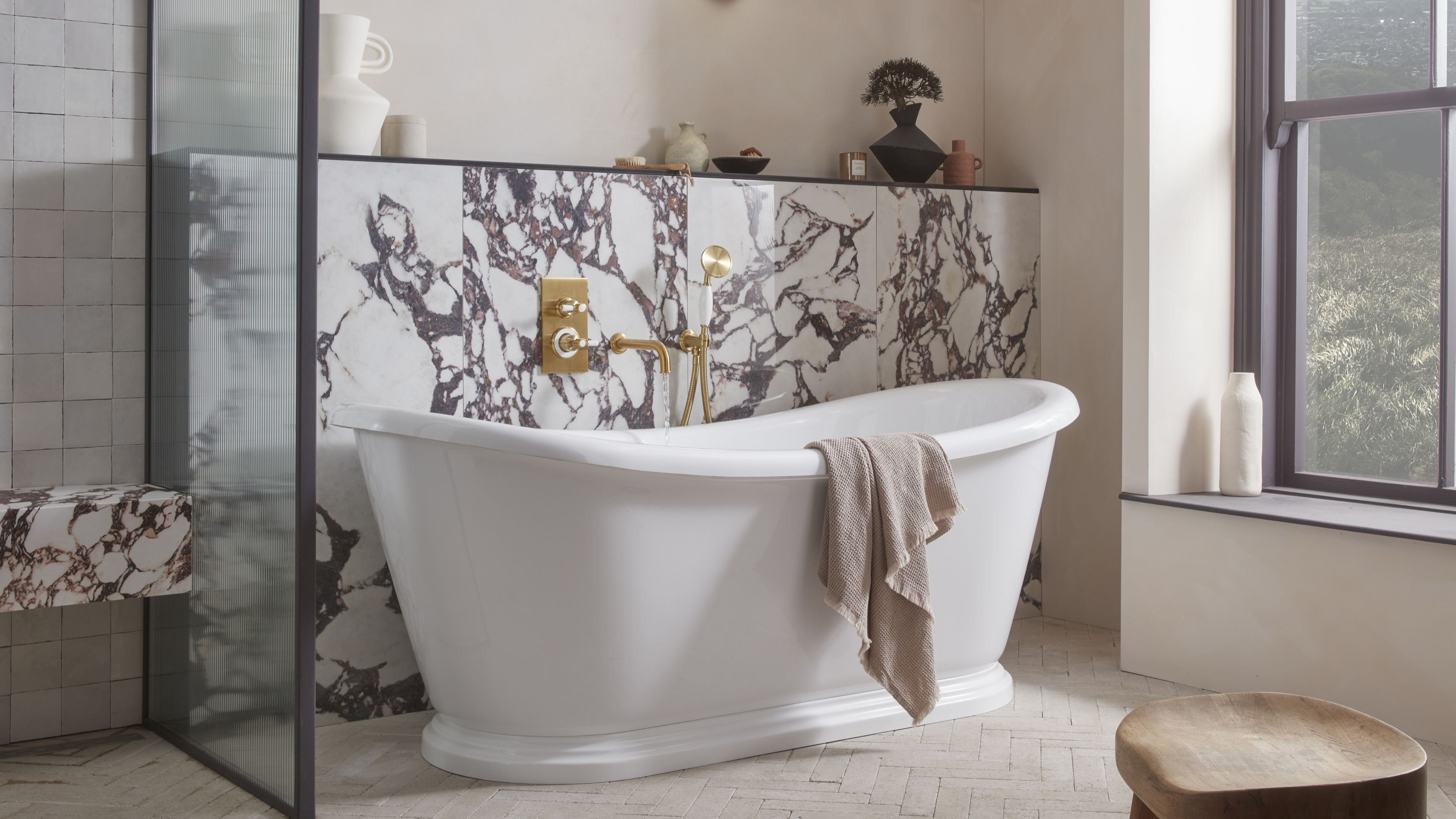 5 Bathroom Layouts That Look Dated in 2025 — Plus the Alternatives Designers Use Instead for a More Contemporary Space
For a bathroom that feels in line with the times, avoid these layouts and be more intentional with the placement and positioning of your features and fixtures
By Lilith Hudson Published