The Power of Color Psychology in Interior Design — How to Create a Home That Feels as Good as It Looks
Understanding the positive and adverse traits of certain colors can help you design a space you love, and that loves you back
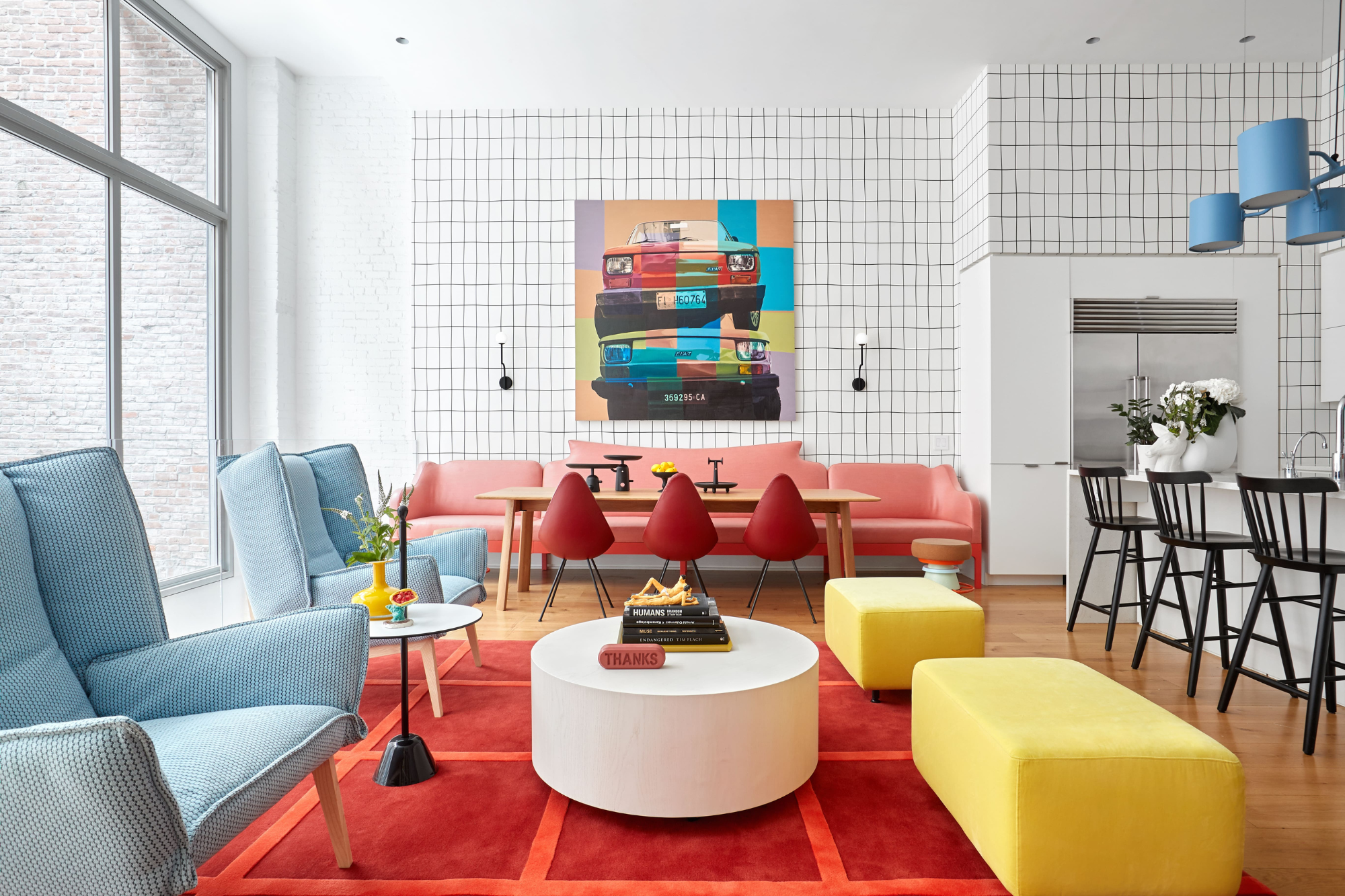

Color is far more than just decoration. Color is emotion. Constantly shaping how we feel and respond to the world around us and our everyday actions.
Color has the power to uplift, calm, energize, or even irritate and overwhelm — influencing our emotions and behaviours in ways we may not always be conscious of.
We see color with our eyes, but the real magic happens in the brain. Once color is processed, it triggers an emotional and physiological response, altering how we feel and behave. This is why understanding the role of color psychology in interior design is so powerful.
I’m a behavioural color and design consultant. I specialize in the way color influences how we feel and behave in the spaces we live and work in. In this feature, I’ll be sharing how you can use color psychology to design interiors that don’t just look good, they feel good too. It’s a powerful way to support how we live, how we behave, and how we connect with others.
We see color with our eyes, but the real magic happens in the brain. Once it’s processed, it triggers emotional and physiological responses that can shift our mood, our energy, and the way we interact. That’s why understanding the role of color in human behaviour is such a vital part of interior design.

Karen is a color psychology expert who wrote the book, quite literally, on how to use it when designing your home. She's the author of The Little Book of Colour which explains how to use color in interior design to improve you happiness, wellbeing, and confidence.
What Is Color Psychology in Interior Design?
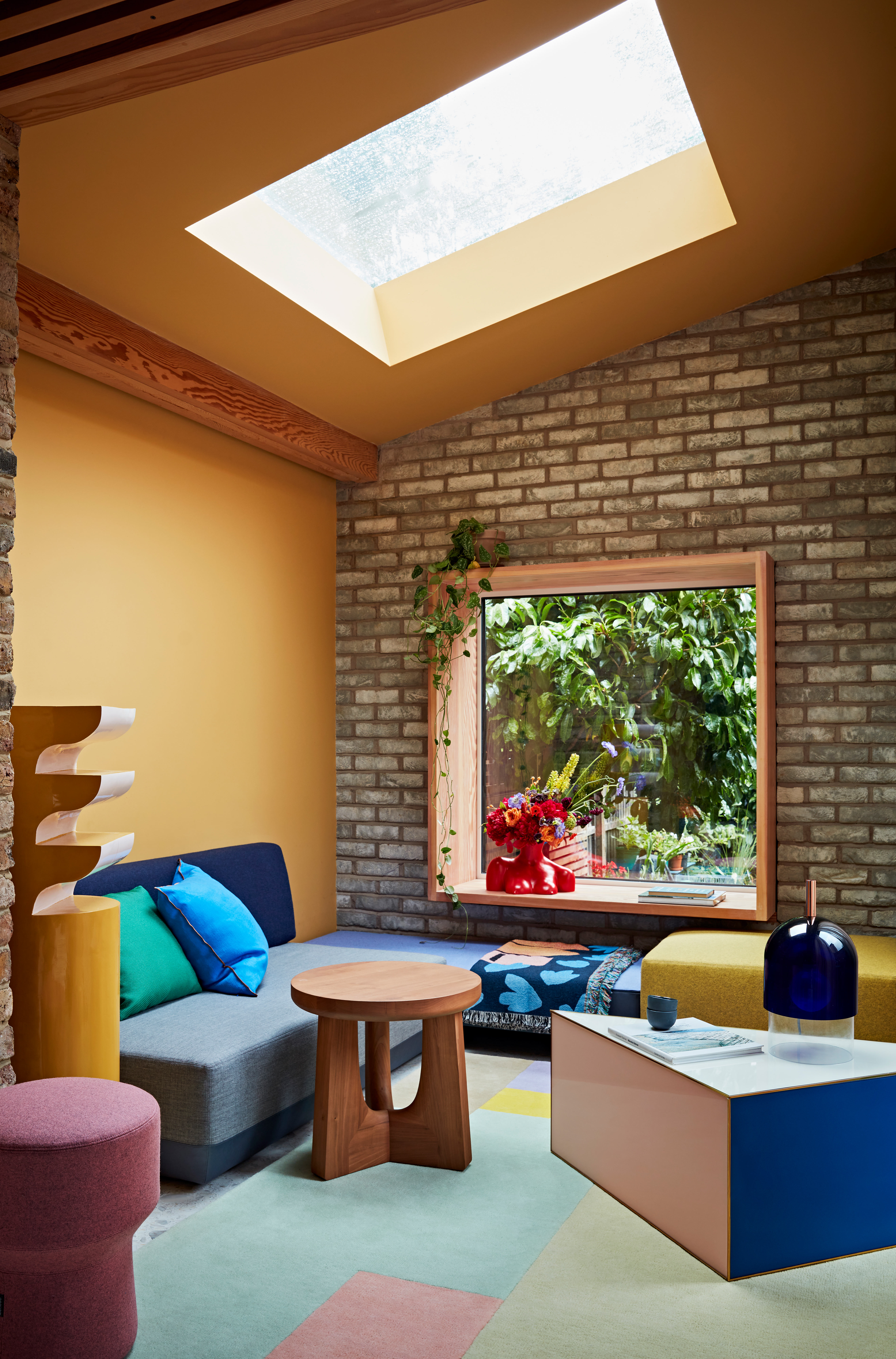
Understanding color psychology can help us to curate environments that not only look good, but feel good.
By applying color psychology in interior design, you can transform your home into a space that not only looks beautiful but also supports the way you want to feel, making it a true expression of you. Understanding how different colors influence human behaviour ensures your home reflects your needs and those you share it with.
Whether you seek a restful bedroom, an energizing workspace, or a welcoming living area, the right colors can shape both the function and emotional experience of a space. But how do you use this knowledge effectively in your home? Let’s explore the basic principles behind color psychology in interior design and how you can apply them.
Color psychology is the theory of how colors influence human emotions and behaviours. While every individual has unique associations with color based on their personal experiences or cultural beliefs, there are universal psychological responses that occur due to how our brains process color — these influence how we physically, psychologically, emotionally, and behaviorally react to it, whether they're positive colors, or stimulate a negative reaction.
In interior design, color psychology is a tool we can use to shape how a space feels, functions, and influences how we interact within it. In interior design, color psychology is a tool we use to shape how a space feels, functions, and supports how we interact within it. The right colors can enhance focus in a home office, create a restful retreat in a bedroom, or foster social connection in a dining area.
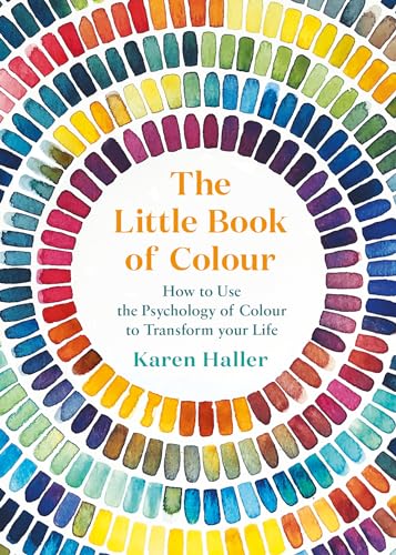
Intrigued? Karen's book The Little Book of Colour is your next port of call to better understand how to use color psychology to improve your the look and feel of your home.
How Do I Use Color Psychology to Design My Home?
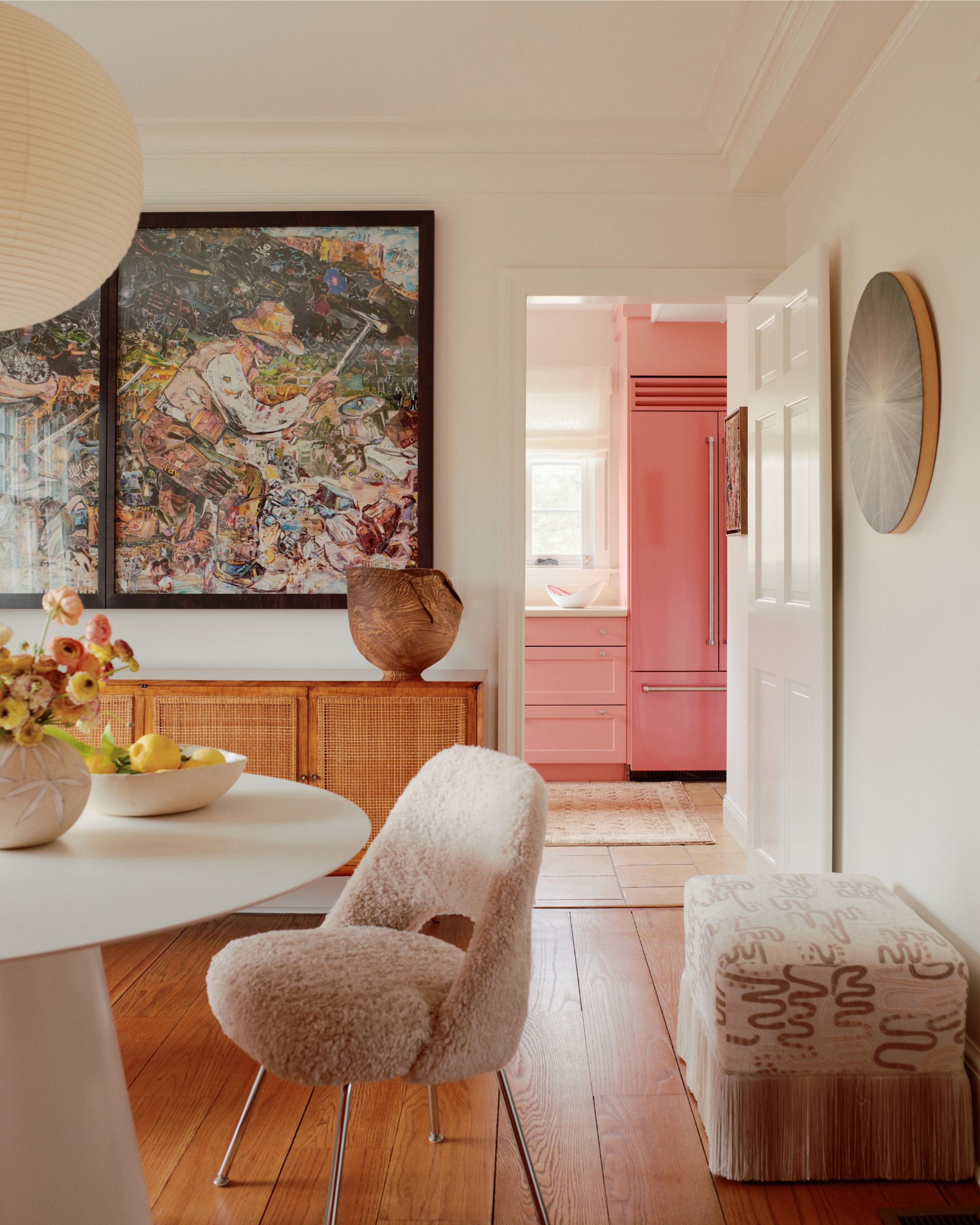
Depending on the function of the space, you want to include certain colors that promote the appropriate emotional response.
Using color psychology in interior design starts with identifying how you want each room to feel and how you want to interact within it.
Do you need a mentally calming retreat to unwind and give your mind a break from constant thinking and processing? A stimulating space that encourages focus and creativity? A warm, social environment that fosters connection and conversation for guests? Once you have clarity on the emotional experience and behaviours you want to encourage in any given space, you can choose the colors that together create those outcomes.
Here are a few key factors I consider when working with my clients to design spaces that are not only functional but also evoke the right emotions and behaviours to support their well-being and lifestyle:
Consider the context and purpose of each space — How do you use each space? What thoughts, emotions, and behaviours do you want to encourage? For example, a place of focus and productivity, a calming retreat, or a social hub for connection?
Experience and behaviours — What positive emotions and behaviours do you want to encourage? For example, you might want the morning shower room to invigorate and energize, helping you wake up and feel alert, while the evening bathroom helps you to relax and unwind before bed.
Choose the color family that expresses your personality — For example, you might resonate with the colors in autumn time: rust reds, teal blue, olive green, saffron yellow, calico white. All the colors that you choose will come from the same color family.
Pick the colors that shape positive emotions and actions — Every color has both positive and adverse effects. While colors can enhance well-being, if used in the wrong context or in excess, they can create discomfort, disrupt balance, or influence how you think, feel, and behave in unintended ways. Understanding this balance ensures your home truly supports your needs.
Balance intensity and depth — Strong, vibrant colors can be invigorating and energizing, while lighter, softer colors are calming and relaxing. However, if colors are overused, chosen from the wrong color family, or applied in an unsuitable context, their adverse traits may emerge leading to feelings of overwhelm, tiredness, or stress.
What Emotions Do Different Colors Evoke?
The theory of color psychology in interior design suggests that each color has distinct psychological effects, influencing how you experience and use your space. Below, we explore some of the key colors and their positive and adverse traits.
Blue

Blue can soothe, aid focus, energize, or, if done wrong, overstimulate us.
Soft blues like sky blue and duck egg blue are soothing and restful, making them ideal for spaces where relaxation is key, such as the bedroom, helping to create a tranquil atmosphere that promotes restful sleep.
Darker blues like navy and teal aid in focusing the mind, ideal for home offices or areas where you need concentration.
Bright blues like turquoise are great for energizing the body and mind, making them perfect for bathrooms where a morning boost is needed.
“There are adverse reactions when decorating with blue, which can come across as cold or uninviting, with turquoise in particular feeling overstimulating if overused."
Green
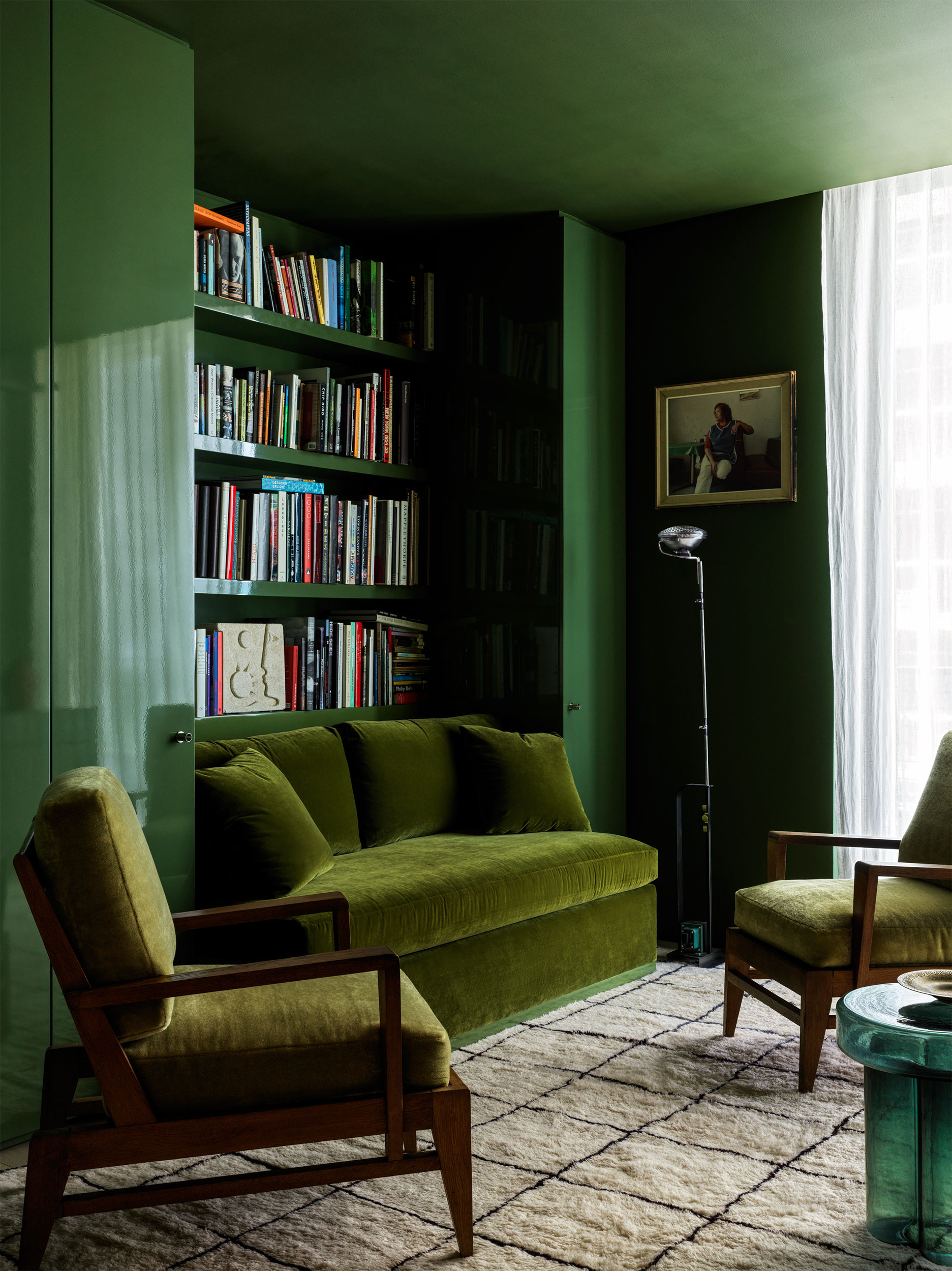
Green is typically a soothing shade, but depending on the specific hue used, it can also help us feel refreshed and rejuvenated.
Soft greens like sage, eucalyptus, seafoam, and moss are soothing for the mind, body, and spirit, making them ideal for rooms designed for relaxation and unwinding, such as the bedroom or living room.
Darker greens like bottle, emerald, and jade are restorative and rejuvenating, another great color for the living room.
Bright greens such as lime green and chartreuse are energetic and invigorating where a little goes a long way.
The adverse reaction for decorating with green? Lethargic, unmotivated, with bright green being irritating.
Red
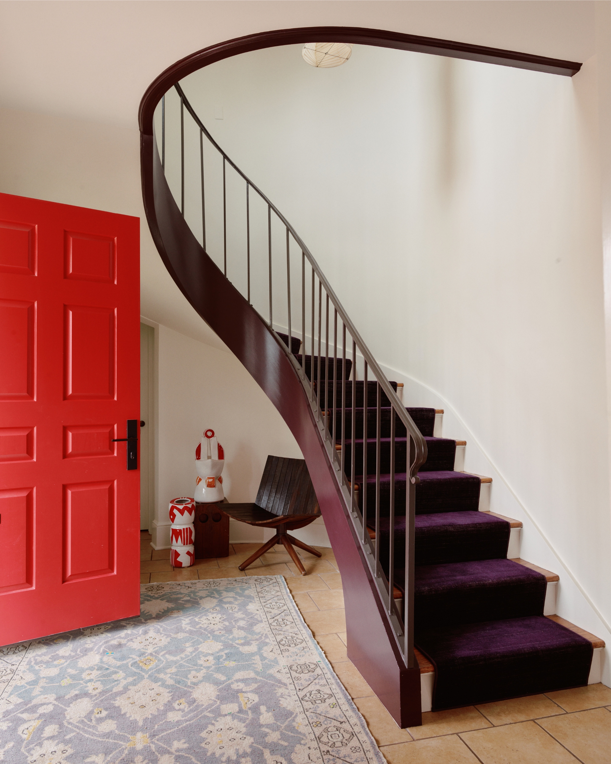
Red, best used in small accents, is an energetic color, and can be beneficial, depending on the room you use it in.
Red is pure high-octane energy — like a double espresso for your space. It can raise the pulse rate and create a dynamic, stimulating atmosphere, making it ideal for spaces where you want intensity, intimacy, or lively interaction.
Bold and commanding, red is best used as a statement feature or a striking accent.
The adverse reaction for red is that it can be overpowering, aggressive, and exhausting.
Pink
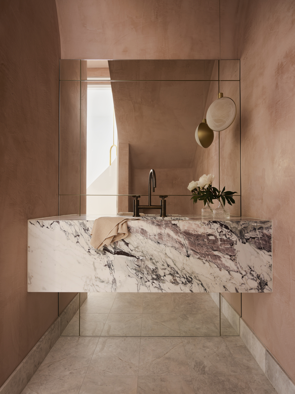
Soft pinks, like the plaster in this bathroom, help us feel nurtured and comforted — exactly what you need to start the day.
Soft pinks like baby, blush, rose, and dusty pink are like being wrapped in a cuddle. They are comforting and nurturing, making them ideal for spaces where you want to feel soothed, supported, and physically relaxed.
Vibrant pinks, like magenta, fuchsia, electric pink, and cerise, make a bold, unapologetic statement: feisty, independent, don’t-mess-with-me.
The adverse reaction for a soft pink is that it can feel weak, needy, and helpless. The adverse reaction for a vibrant pinks is that they can feel overwhelming, cold, and hard.
White
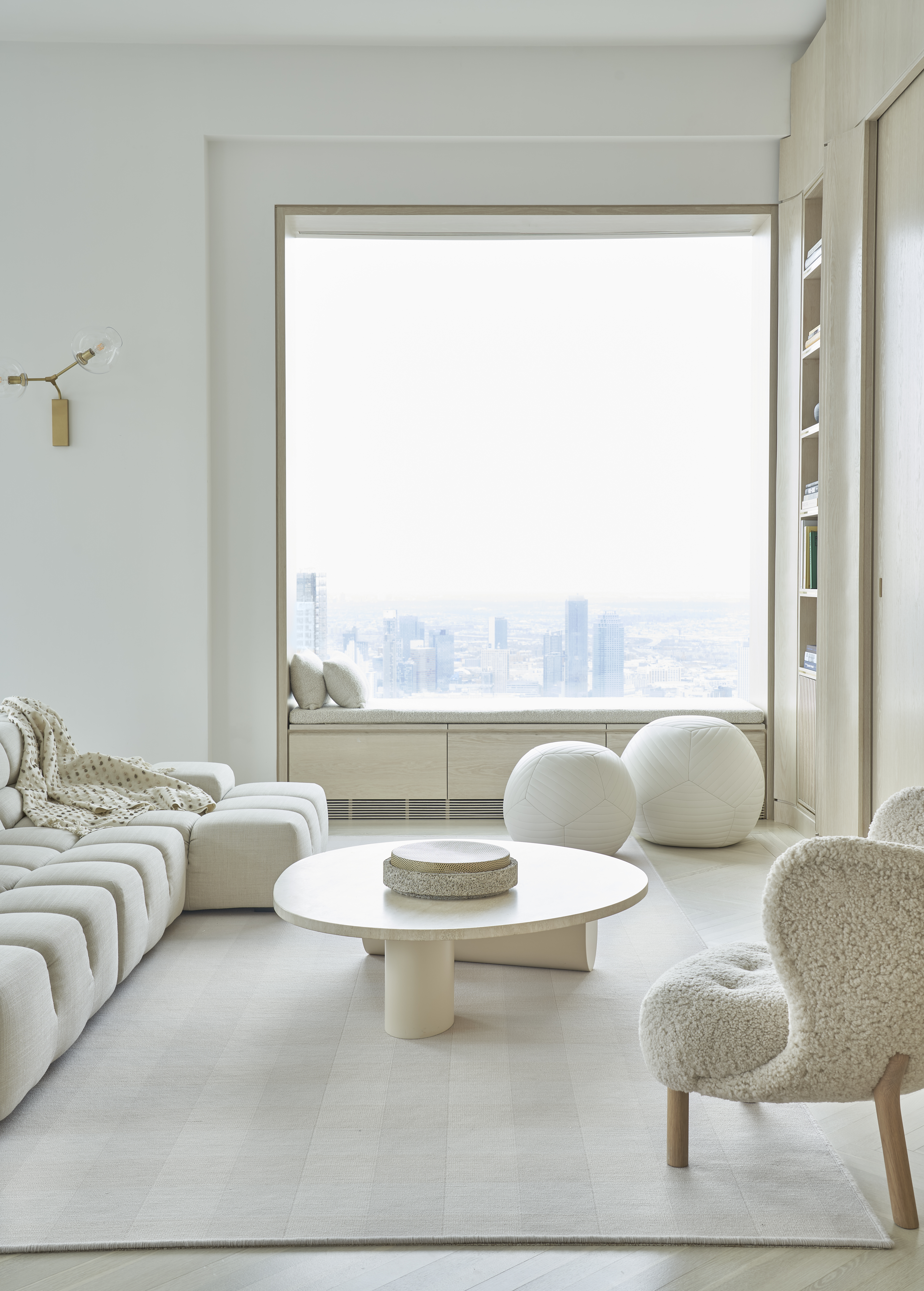
It comes as no surprise why white room ideas are so universally loved — color psychology tells us that the color provides calm, clarity, and spaciousness.
White can create a sense of calm and clarity, providing a retreat from emotional overwhelm and noise. It’s a way to cocoon yourself in stillness, bringing a feeling of order and spaciousness.
The adverse reaction for white rooms is that they can cold, sterile, emotion desensitising, and detached.
By applying color psychology to your interior design and palette choices, you can design a home that goes beyond aesthetics — one that actively supports your emotions, well-being, and daily life. Instead of following fleeting trends, you’ll be making intentional choices based on how you want to feel and respond in your space.
Whether refreshing a single room or designing an entire home, color psychology in interior design becomes a powerful tool for creating a home that truly works for you, one that you love and loves you back.
Be The First To Know
The Livingetc newsletters are your inside source for what’s shaping interiors now - and what’s next. Discover trend forecasts, smart style ideas, and curated shopping inspiration that brings design to life. Subscribe today and stay ahead of the curve.

Karen Haller is a leading international authority when it comes to behavioural color and design psychology. Specializing in human-centered design, Karen works with businesses, design professionals, and individual clients, to help them understand our relationships with color, and how it influences the way we interact with a space. She has authored a book on the topic, called The Little Book of Colour which explains how to use color in interior design to improve you happiness, wellbeing, and confidence.
-
 Turns Out the Coolest New Café is Actually In Your Kitchen — Here's How to Steal the Style of TikTok's Latest Trend
Goodbye, over-priced lattes. Hello, home-brewed coffee with friends. TikTok's 'Home Cafe' trend brings stylish cafe culture into the comfort of your own home
By Devin Toolen Published
-
 5 Bathroom Layouts That Look Dated in 2025 — Plus the Alternatives Designers Use Instead for a More Contemporary Space
For a bathroom that feels in line with the times, avoid these layouts and be more intentional with the placement and positioning of your features and fixtures
By Lilith Hudson Published
-
 Here's Why Decorating With Mustard Yellow Helps Fill Your Interiors With a Sense of "Confident Calm"
There is so much more to decorating with this turmeric-tinted sauce-wiggled-on-a-hotdog not-quite-yellow shade than meets the eye
By Amy Moorea Wong Published
-
 5 Problems With Painting Your Walls White That No-One Ever Talks About (Until Now)
White is the easiest neutral to work with...right? Interior designers explain why this shade is actually more complex than it may seem
By Olivia Wolfe Published
-
 5 Mistakes That Are Making the Blue Details in Your Room Feel Old-Fashioned — And How to Rectify Them
Blue is a timeless shade, no doubt, but use it in the wrong space or in the wrong way, and it can make a space feel, well... a bit blue
By Kelly Hushin Published
-
 5 of the Best Navy Blue Paint Colors That Designers Love — And How to Use Them
Navy blue has timeless appeal and can feel both modern yet classic, but what are the designers' favorite paints?
By Oonagh Turner Published
-
 Should Your Carpet Be A Darker Color Than Your Walls? How to Make This Bold Look Work
Not every room can get away with a carpet that is darker than the walls; Designers share when and where this combination works best
By Olivia Wolfe Published
-
 What Actually Is Yves Klein Blue? A Short History of This Iconic Color, and How to Decorate With It
Explore “the most perfect expression of blue” and how to free this pigment in your home
By Camille Dubuis-Welch Published
-
 Do Pink and Green Go Together in Interiors? A Professional Color Consultant's Verdict
How to make pink and green color combinations work for more contemporary interior schemes
By Olivia Wolfe Published
-
 The 'Grown-Up' Way to Decorate With Light Blue — This Shade Shouldn't Just "Be Resigned to the Baby's Room"
We explore how to bring the lighter intonations of blue into your home in a contemporary and thoughtful way
By Amy Moorea Wong Published