

A home that is bursting with joyful colors is one filled with a sense of cheer. From the hues themselves to where they live in your surroundings, color can completely change the mood of a room, and especially that of the people within it. That's why really understanding colors is so important when designing a home, rather than simply selecting shades you like (although, that's important, too).
But, is there one all-singing, all-dancing joyful color that we should all be splashing across our walls? When it comes to color psychology in interior design, it is generally accepted that warmer, brighter colors are linked to feelings of optimism; but it runs deeper than this, and ultimately comes down to our own perceptions of certain shades.
"As an art therapist, I’ve seen how personal color associations can be," explains Megan Collins, founder of NeuroArts Therapy. "For some clients, red symbolizes anger; for others, it represents love. Neuroaesthetics — the study of how the brain processes art — shows that our responses to color are shaped by culture, memory, and experience."
Looking to reap the rewards of a bit of dopamine decor in your home? Below, we (lightly) touch on the science behind joyful colors, and share some shades and palettes worth considering in your space.

As founder of NeuroArts Therapy, a registered art therapist, and psychotherapist with more than 14 years experience, Megan Collins knows better than anyone, the power of color and creative expression.
Much like a beautiful home, decorated just as you please, will give an endorphin boost, the specific effects that joyful colors have on our well-being is quite phenomenal. “There is nothing more powerful than color to boost your mood," says Paula Taylor, stylist and color expert at Graham & Brown. "It can change your heart rate and can affect how calm and relaxed or stimulated we feel. Serotonin for example is often associated with mood regulation can be stimulated by bright and vibrant colors leading to a boost in mood and happiness."
Here are joyful colors and combinations to consider for your home.
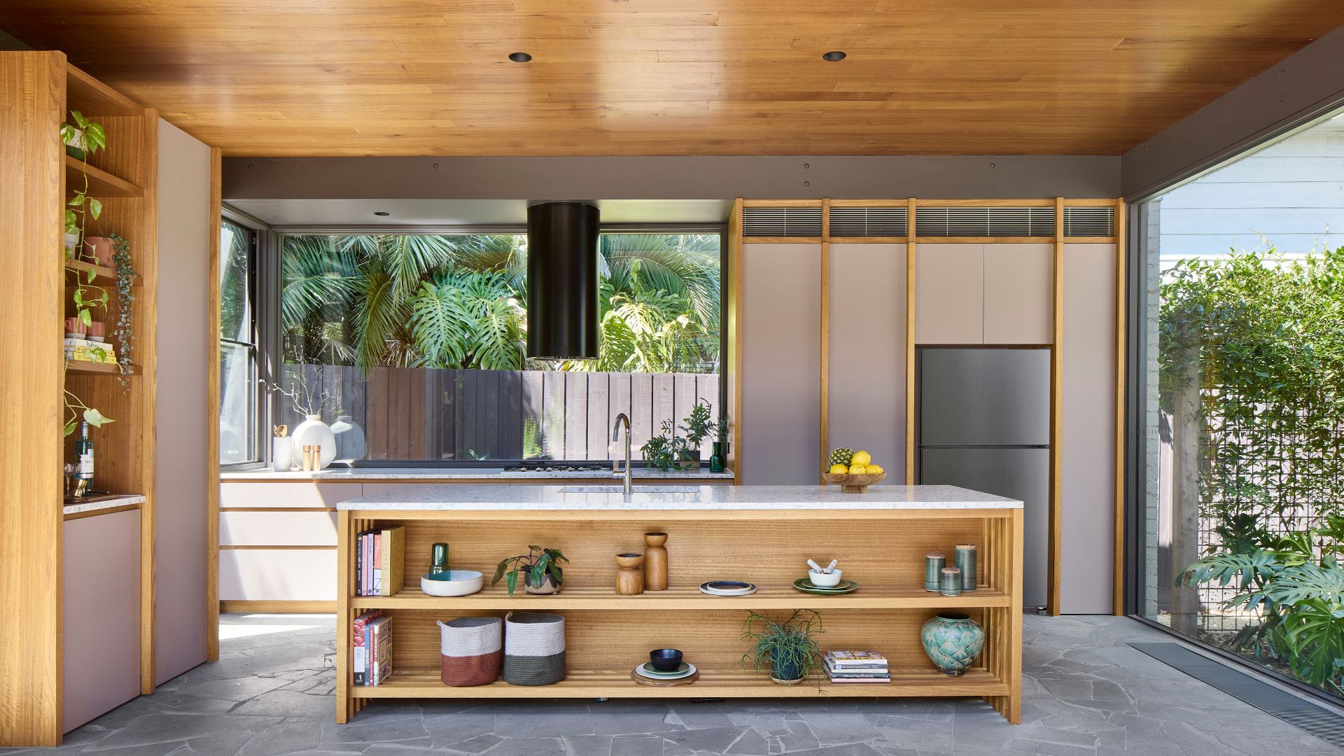
1. Butter Yellow

Townhouse project by OWN LONDON: The living room, with creamy butter yellow walls accentuating bright pops of teal and orange in joyful unison.
Reminiscent of bright, sunny days, and fond memories for most, yellow is positively associated with optimism and is a splendid addition to a joyful color palette at home, with science backing its mood-boosting powers, too. "A University of Manchester study found that decorating with yellow stimulates dopamine production, boosting happiness," shares Megan Collins. With so many beautiful colors to pair with yellow, it is the golden child of joyful color schemes, but there is one particular shade that is having a moment with designers right now: butter.
"This subtle yellow hue evolves from beige, introducing a more cheerful, charming and appealing tone that blends familiarity with a touch of much-needed joy," explains Iwona Budnik, senior interior designer at OWN LONDON. "It seamlessly integrates into various interior styles, from classic to contemporary minimalist, and everything in between."
If you're not ready to commit to strongly pigmented banana and citron tones, choosing a creamier but less saturated yellow opens up delightful and even unexpected design opportunities.
Much like a grounded yellow tone acts as the perfect accompaniment to vivacious orange trim and pink accents in Dorothée Meilichzon's Hotel Montesol project (shown at the top of the article), Iwona recommends playing with layers and contrasts for uplifting results.
"In a recent project within a family home, we employed various buttery yellow tones on the walls to subtly highlight other colors," she shares. "This choice created a softer, less stark contrast than white, effectively inviting the essence of summer indoors and capturing sunlight beautifully. It's a mild shade that pairs effortlessly with any other color."

Price: £5.95/sample

Price: £5.50/sample

Price: £5/sample
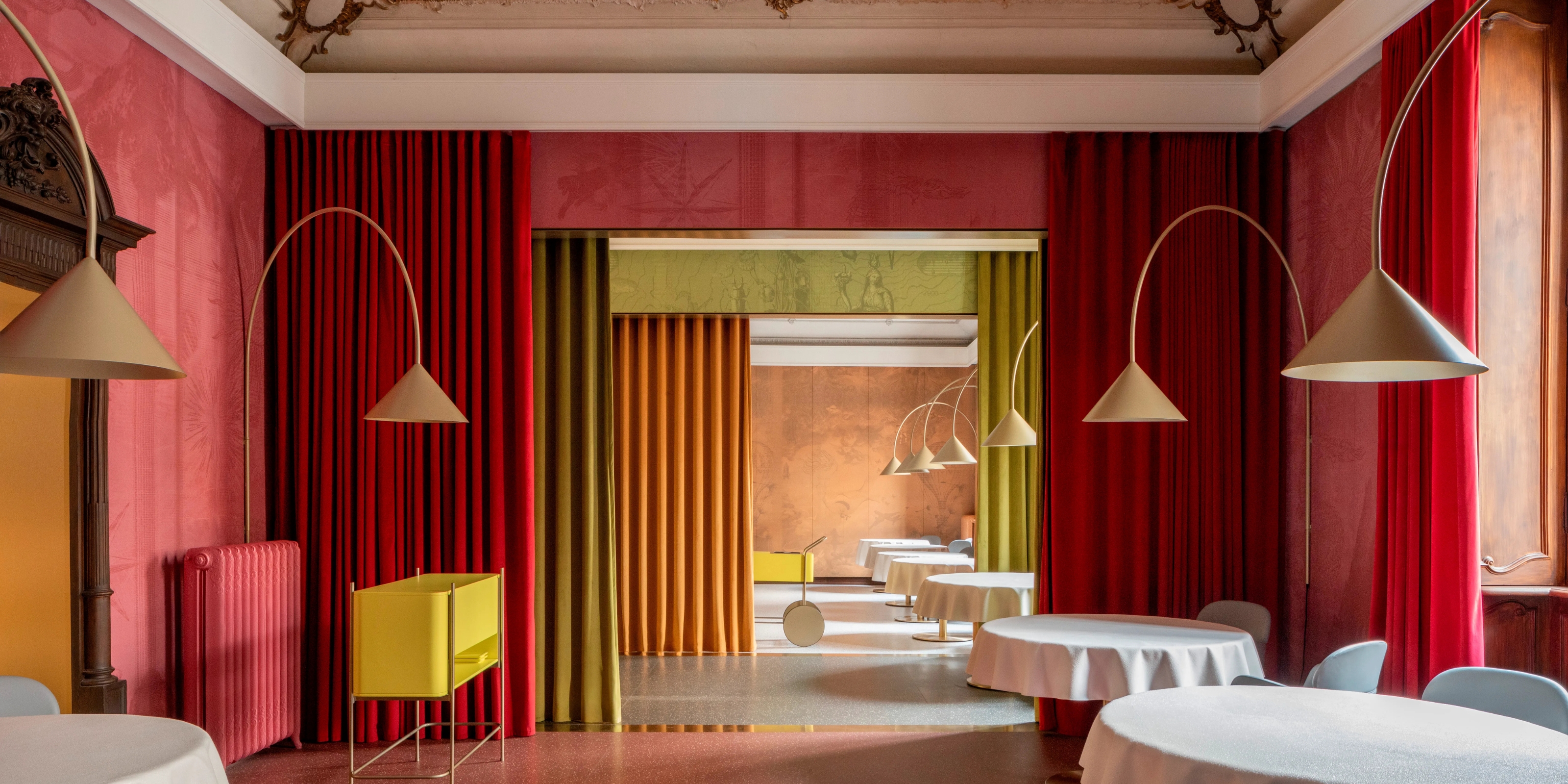
2. Pink and Orange

A vibrant dining area to spark conversation in Hotel MONTESOL, Ibiza.
Staying in the realm of summer shades, warming orange, pinks, and fuzzy peach tones are all highly joyful colors that can spark happiness in a home. "Colors influence mood by engaging the brain’s reward system. Yellow, orange, and pink often evoke joy because they remind us of warmth, sunlight, and playfulness," adds Megan, who highlights coral and peach as warm and joyful colors to consider, too.
It's all about memory association. "Colors that evoke happy feelings such as yellows and orange remind us of summer, happiness, and new beginnings, and make us feel uplifted and joyful," continues Paula. As we can see above, cheery orange can add a joyful gusto to a dining room a or kitchen.
Pink is another wonderfully positive color and that will be the epitome of joy for many. Designer Yinka Ilori sings its magical praises to Livingetc, when speaking about decorating the home for happiness, and it's the happy color of choice for psychologist Hannah Yang, Psy.D., too. "I associate pink with bubble gum, balloons, parties, and having fun," she says. "I think others may have this association, too."
Plus, pink color palettes ae favored by many designers — it can make a room look stylis and expensive, and there are many colors that go with pink. The hue doesn't need to be saccharine either, (though there is no harm in that), but a dusty powder pink such as Benjamin Moore's Rosy Tan goes a long way to accent colors like green and blue. For a true sweet pink, Nancy Blushes by Farrow & Ballis uplifting and jovial, and will give an elegant finish when paired with its complementary shade, All White.
Alongside yellow, pink is one of the many colors that goes with orange, so for a true dopamine hit, consider an analogous color palette, especially in places where you want to feel particularly upbeat and happy, like in a colorful living room.

Price: £5.50/sample

Price: £5.95/sample

Price: £5.95/sample
3. Landscape Greens

Being in nature tends to calm and soothe, so it makes sense that shades of green would constitute joyful colors.
Reclining gleefully into verdant landscape tones, mother nature never fails to bring joy into a home. For anyone fortunately living in the countryside, simply open your windows and invite all shades and colors that go with green in to create happy surroundings.
"Green gives us the feeling of being closer with nature and all the perks that come with it, such as boosting our mood and soothing our stress," explains Emma Sims-Hilditch, founder and creative director at Sims Hilditch. "Nature is always a good source of inspiration for a colour palette, looking at the garden or landscape there are so many different tones and hues of green that all work beautifully together so don't get too hung up about which greens work with others."
For more zest that is "refreshing and invigorating," Megan Collins recommends lime green. While you can always perk up and add interest to a muted tone with a crisp neutral or organic toned white, it depends on your preferences.
Some designers favor unsaturated colors. Interior designer Dorothée Meilichzon, founder of CHZON studio, is a fan of olive green paint, while Emma of Sims Hilditch currently admires a warm leaf color. "It is both light and fresh and can be mixed with a darker green for other elements of the kitchen, like a kitchen island, for contrast," says Emma.

Price: £5/sample

Price: £5.50/sample

Price: £5.50/sample
4. All Shades of Mustard

Emanating sunshine, shades of mustard yellow certainly fall into the joyful colors category.
Bringing the hero of joyful colors back into the spotlight, ignite happiness in the home with rich shades of yellow, choosing mustard intensity or jewel tones like gold in particular which can encourage confidence, according to Megan.
"Warm yellows and gold are great for entrance ways creating a warm and inviting space to visitors," adds Paula, who recommends warmer toned yellows like Graham & Brown’s Sunflower or Funkytown, especially in places with a cool light.
Color consultant and brand ambassador at Farrow & Ball, Patrick O'Donnell, also spotlights yellow as "the color of creativity," and recommends it as a joyful choice that serves an uplifting ambiance; whether on the walls or on kitchen cupboards and woodwork. "To counteract an intense finish, balance the space with a neutral such as Off White, or cut through the tones with a contrasting accent color like Tanner’s Brown with red undertones or Studio Green," he adds.
Go all out if you have the space, but if you have cozier rooms to style, consider splashes of this heady sunshine shade. "While yellow should be used judiciously — due to its potential mood-enhancing impact — it can deliver just the right vibrancy when used in small accents," adds Iwona.

Price: £5/sample

Price: £5/sample

Price: £5.50/sample
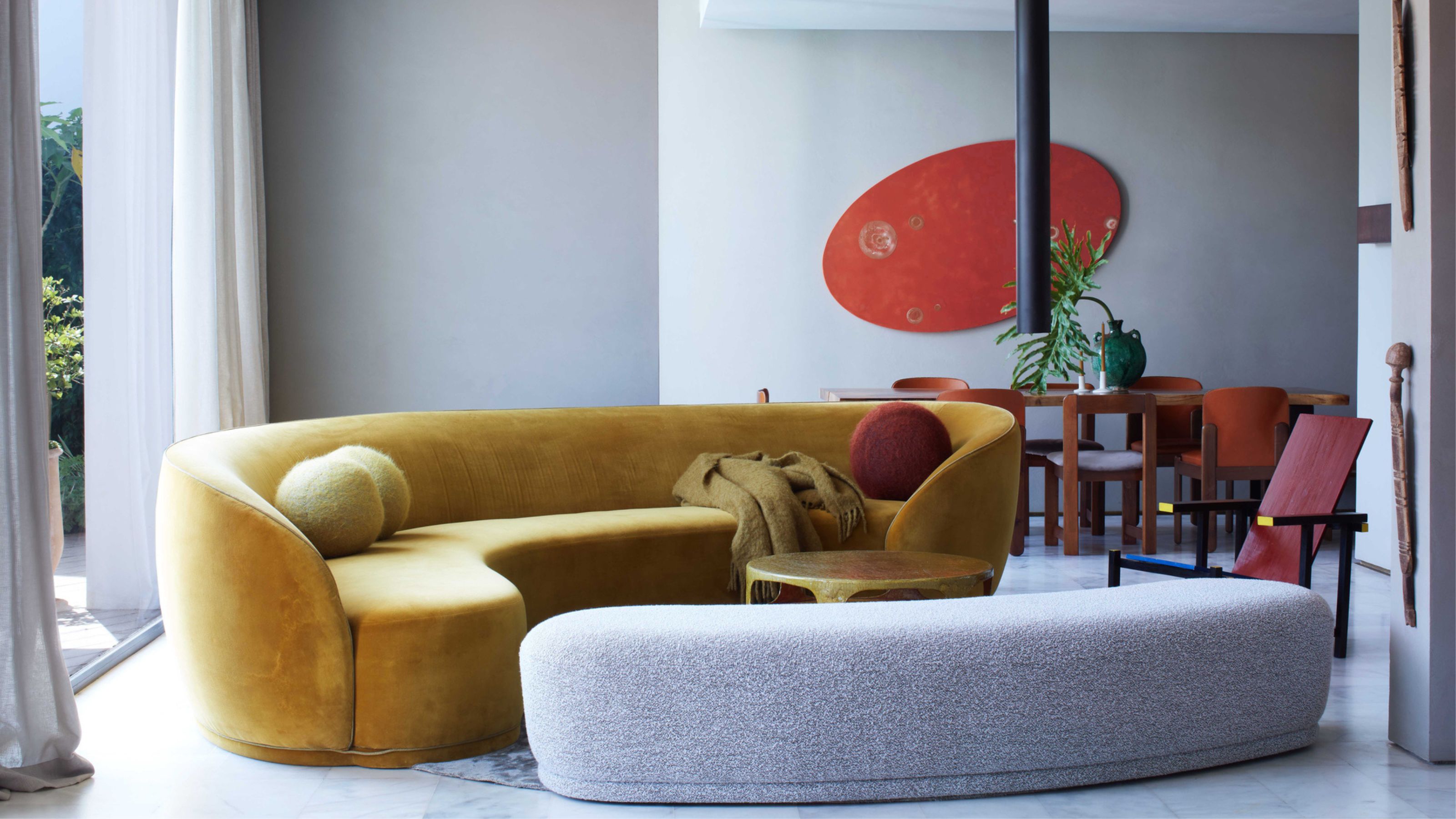
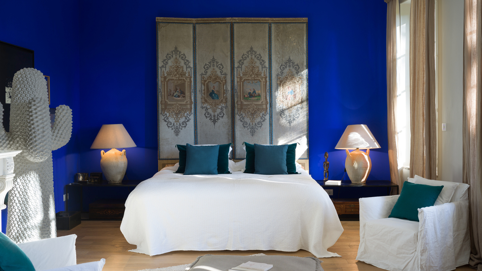
5. Blue and a Dash of Red

A modern, peppy bedroom brimming with joyful colors.
A characterful color pairing that is sure to turn heads; might blue and vivacious red be your joyful color match? If so, you will be following in the footsteps of Dorothée. When asked for the most joyful colors and why, the designer shared: "Red and blue, a warm one and a cold one to balance. Blue probably because I love the ocean very much and wish I could see it every day." The red, might be down to astrology, "I am a Taurus."
A sky blue sings to summer once again, and it makes a striking color to go with red. Don't be afraid of decorating with teal and stronger toned blues, too, they can make a vivid display. When it comes to choosing a red, Roger Red by Graham & Brown is a joyful choice, but use it sparingly.
Especially if you choose stronger joyful color palettes, it is important to balance out the tones, even when tapping into color trends of the moment. "I will always suggest to balance a warm color with a colder one, or play with complementary colors," says Dorothée.
A strong color contrast strikes a positive design chord with others too. “For a happy and joyful mood in the home, the recent revival of Memphis Design Style provides plenty of inspiration," says Benjamin Moore's Helen Shaw. "This style is all about bold color blocking with its most recent iteration moving into slightly more nuanced bold hues such as like Benjamin Moore's Stained Glass, Cinnamon Slate, and Orange Blossom, which are great for delivering a dose of dynamism into our lives."

£5.95/sample

£5.95/sample

£5.95/sample
FAQs
How Can I Pick the Most Joyful Colors for My Home?
For what is such a personal interior design choice, Hannah suggests we think of fun, playful childhood memories when selecting joyful colors for our homes. "What might come to mind are rainbows — so a combination of a lot of bright colors. Or your parents may have painted your bedroom blue and you have a positive association with the color blue because of this," Hannah (whose favorite joyful color is pink for exactly this reason) explains.
What Colors Should You Avoid for a Joyful Interiors Scheme?
Black and gray are universally associated with gloominess and simply not recommended when creating joyful surroundings. "Personally I would avoid beiges and gray colors," says Dorothée. "I better have metals as aluminium, bronze or stainless steel to cover the gray palette than paint."
Some consider blue to be off limits too, but this is a personal choice and as we can see it is popular with many for its fun and characterful finish, it all depends on the hue and on your feelings towards it.
Are Joyful Colors Always Bright?
Joyful colors don't have to be loud or overbearingly vivid, more muted variations might be the most positive addition to your color scheme, if those are the tones that speak to you.
"I am more into unsaturated colors: olive green, brick red, duck egg blue, cream white, dark faded blue," says Dorothée. Quieter tones like buttery yellow and even pastels all sit happily in the roster of joyous color combinations. "Think of an ice cream cone filled with mint or strawberry ice cream. It’s more muted, but will likely spark joy!" adds Hannah.
Megan Collins also recommends softer lavender or lilac, for their "calming yet cheerful" properties.

-
 Biophilic Decluttering — What to Take Out of Your Home (and What to Put in) for a More Natural Home
Try your hand at biophilic decluttering to ground your interiors, connect to the environment, and cure chronic clutter in one go. Here's how.
-
 10 Arrestingly Beautiful Milan Restaurants Locals *Actually* Dine at — Selected for Their Interiors
Brought to you by our community of culture insiders, this edit of the best restaurants in Milan sees authentic Italian food and immersive design unite


-
 Here's Why Decorating With Mustard Yellow Helps Fill Your Interiors With a Sense of "Confident Calm"
There is so much more to decorating with this turmeric-tinted sauce-wiggled-on-a-hotdog not-quite-yellow shade than meets the eye
-
 5 Problems With Painting Your Walls White That No-One Ever Talks About (Until Now)
White is the easiest neutral to work with...right? Interior designers explain why this shade is actually more complex than it may seem
-
 5 Mistakes That Are Making the Blue Details in Your Room Feel Old-Fashioned — And How to Rectify Them
Blue is a timeless shade, no doubt, but use it in the wrong space or in the wrong way, and it can make a space feel, well... a bit blue
-
 5 of the Best Navy Blue Paint Colors That Designers Love — And How to Use Them
Navy blue has timeless appeal and can feel both modern yet classic, but what are the designers' favorite paints?
-
 Should Your Carpet Be A Darker Color Than Your Walls? How to Make This Bold Look Work
Not every room can get away with a carpet that is darker than the walls; Designers share when and where this combination works best
-
 What Actually Is Yves Klein Blue? A Short History of This Iconic Color, and How to Decorate With It
Explore “the most perfect expression of blue” and how to free this pigment in your home
-
 Do Pink and Green Go Together in Interiors? A Professional Color Consultant's Verdict
How to make pink and green color combinations work for more contemporary interior schemes
-
 The 'Grown-Up' Way to Decorate With Light Blue — This Shade Shouldn't Just "Be Resigned to the Baby's Room"
We explore how to bring the lighter intonations of blue into your home in a contemporary and thoughtful way


