
The color wheel. We’ve all seen it, know the phrase, and are aware that’s it’s some kind of rainbow-toned round thing, but what does it actually do? When is it for? And can you actually use it to decorate?
Spinning spectrums of possibility, the color wheel in interior design is a handy technical tool to guide palettes for anyone on the quest for pigment, narrating the story of how colors interact, and offering opportunities for expression and creativity. Think of it as a helpful color compass.
The wheel is a reminder that contrast can be just as compelling as cohesion, that the right pairing can make hues feel entirely new, and that balance isn’t always what you’d expect. In the home, these ideas play out in fascinating ways — the way a deep emerald seems richer against warm ochre, how a soft blush takes on an unexpected edge next to charcoal, or how even the subtlest shifts in tone can change the entire atmosphere of a space.
Below, I've unveiled the mysteries of the color wheel in interior design — digging deep into its nuances and surprises, and discovering how it can elevate the way we live with color. Whether you're a bold-clash type of person, more into soothing harmonies, or something entirely unexpected, the color wheel is there to inspire ideas, not limit them. Let's dive in.
The Color Wheel Categories

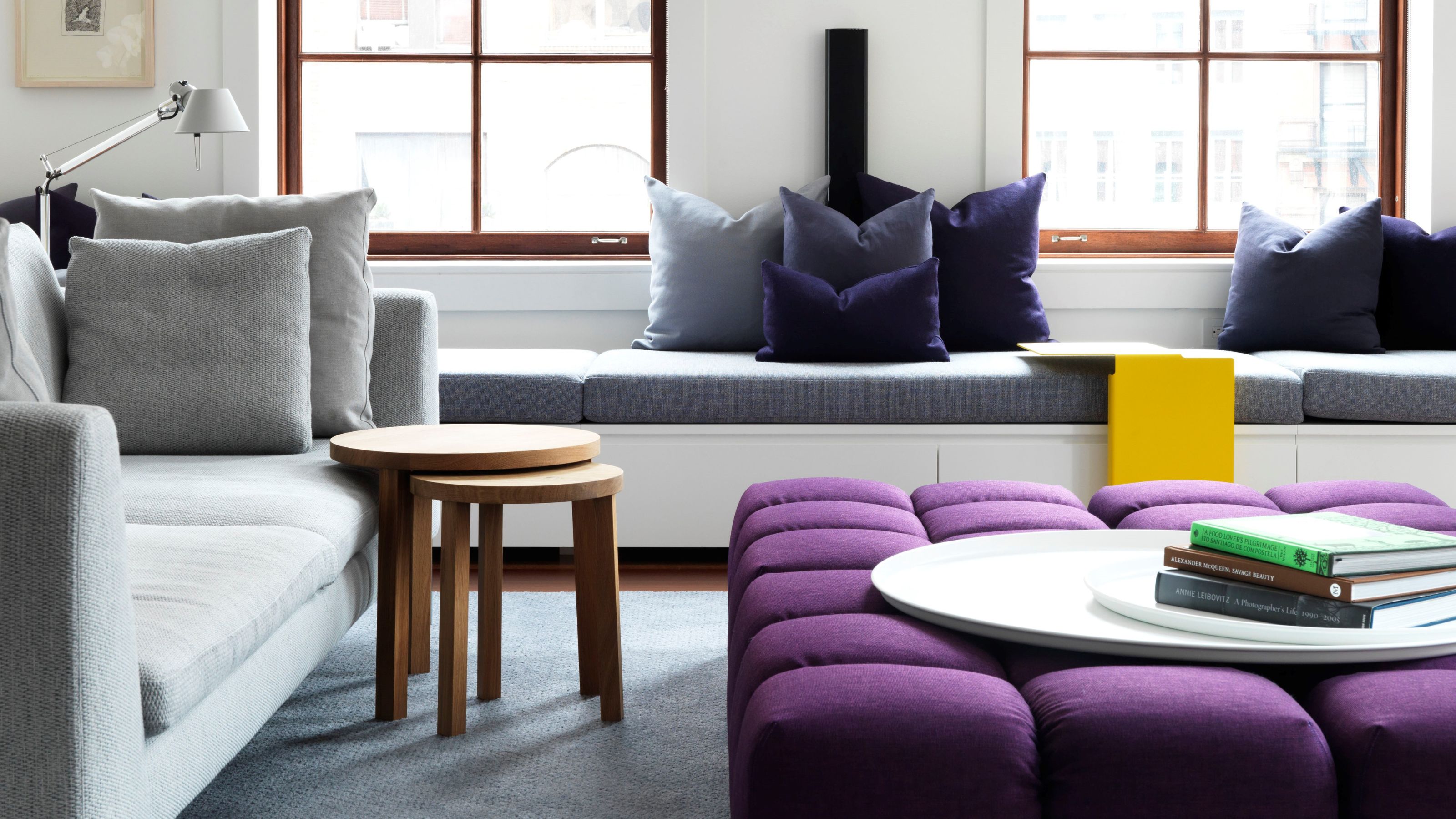
While at a glance this color palette might seem pared back and controlled, in reality, it’s quite experimental, which makes it exciting.
So, first thing’s first, what is a color wheel? Well, it’s is circular diagram showing the colors of the visible spectrum and their relationship to each other. Hues are arranged very, very specifically — in wheel-like a circle, or sometimes in blocks, and sometimes blending into each other.
There are twelve main colors, each falling under one of three categories: primary, secondary, and tertiary. We can likely all roll the trio of primary colors off our tongues, but then… it all becomes a bit hazy.
The primary colors accepted by most — technically any colors can be used as ‘primary’ to create a color system — are red, yellow, and blue (which is called the RYB model). These colors are so defined as they can’t be created by a combination of other hues, yet a pair of primaries can make secondary color — yellow-and-blue make green, yellow-and-red make orange, blue-and-red make violet — and mixing a primary with a hue physically adjacent to it on the wheel conjures a tertiary color, which are vermillion (red-plus-orange), magenta (red-plus-violet), teal (blue-plus-green), indigo (blue-plus-violet), amber (yellow-plus orange), and chartreuse (yellow-plus-green).
It sounds complicated, but the joy of a color wheel is that it sets out this detailed color theory so clearly.
How to Read a Color Wheel

The color wheel in interior design helps you work out complementary schemes.
The key to deciphering the mysteries of a color wheel? Again, it’s wonderfully simple (although the idea of reading colors can feel bizarre) — and we can thank Sir Isaac Newton for inventing such a clever tool that's weathered the 350+ years since its inception without losing a drop of relevance.
Okay, it's time for different lesson now. Take a look at the wheel — the first thing you’ll notice is that the warm tones and cool tones are nestled together, which is because color relationships are rooted in temperature. Warm hues like reds, oranges, and yellows radiate energy and vibrancy, while cool tones such as blues, greens, and purples evoke calm and depth, which naturally contradict each other. The division is a guide to locating tones that complement or contrast each other.

There are a multitude of ways to read the color wheel using strategic spacing to craft thoughtful, balanced, dynamic palettes — some of which we’ll dive into later — but for now there are two main principles to grasp. You’ll have noticed, that colors — of any classification — sitting directly across from each other pair up to make bold, impactful contrasts. This is because they are true opposites, what we call ‘complementary’ colors.
For the classic primary/secondary pairings, we’re talking combinations such as blue and orange, red and green, and yellow and violet. Then there are the secondary/tertiary complementary pairings including vermillion and teal, magenta and chartreuse, and amber and indigo. The powerful juxtaposition between the duos is what gives complementary pairings their dramatic appeal in interior design.
But it’s not just about opposites — proximity’s important too. Neighboring hues on the wheel, those that we call analogous colors, blend effortlessly without harsh contrast, naturally reinforcing each other’s undertones to create a sense of depth and cohesion. Primary/secondary analogous pairings include blue and teal, red and vermillion, and yellow and amber, while the secondary/tertiary analogous couples range from teal and indigo to vermillion and magenta, and chartreuse and green.
How Does the Color Wheel Help in Interior Design?

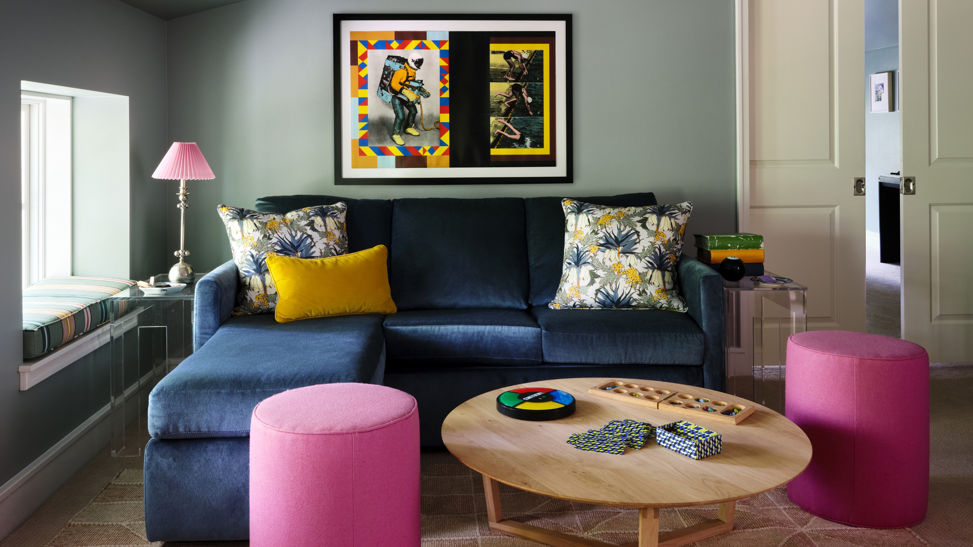
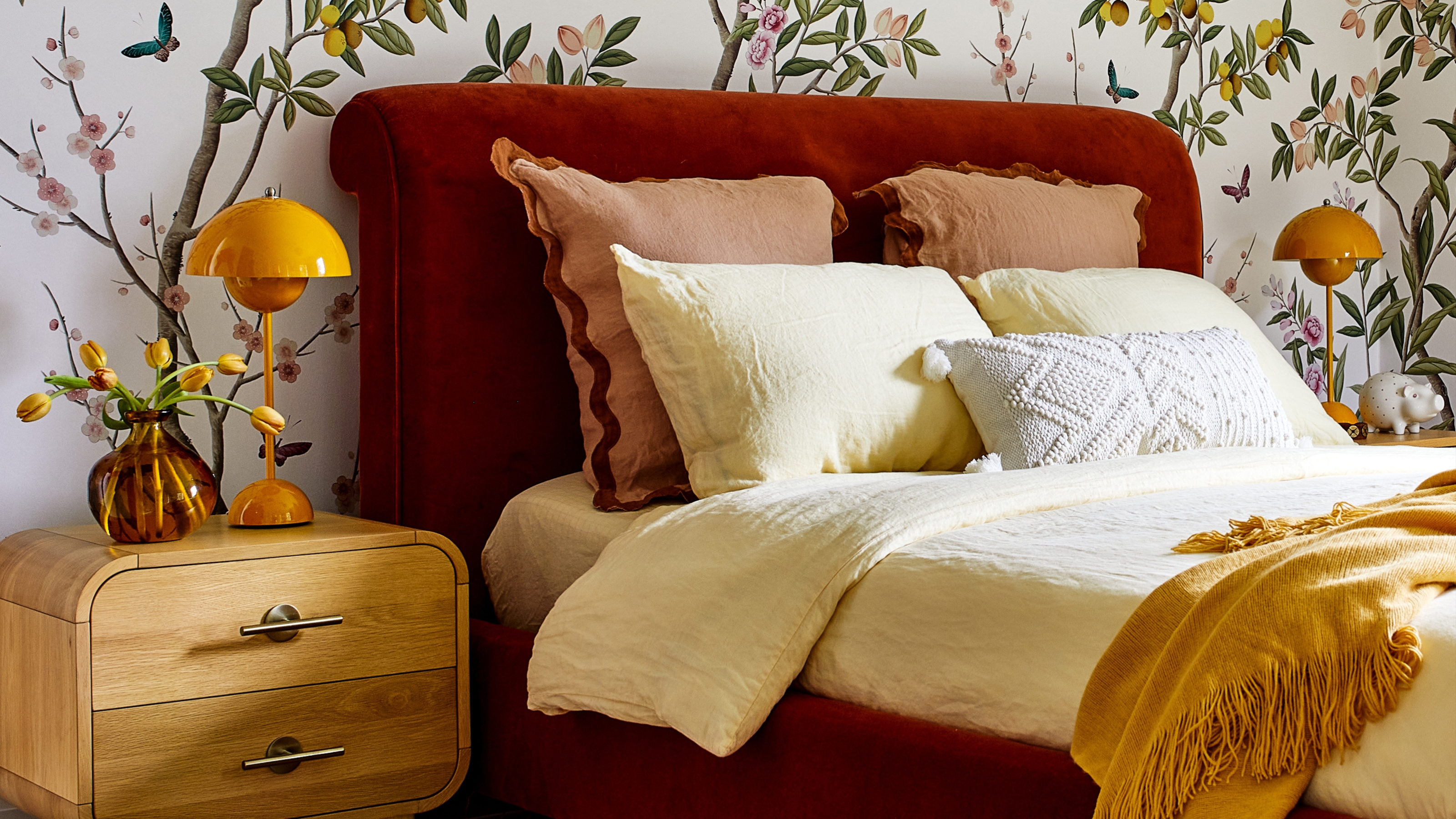
The color wheel in interior design can explain why this colorful bedroom feels cohesive rather than chaotic.
Simply put, the color wheel in interior design takes the guesswork out of decorating, providing a structured way to navigate hues with confidence, making planning mood boards and creating color combinations a breeze.
"The color wheel is fundamental to helping create visual harmony and guide the interior design experience," says Kristina Khersonsky, founder of Studio Keeta. "Leveraging the use of a color wheel ensures that designs are aesthetically and physically pleasing. While not all interior color schemes adhere to the traditional rules of color theory, knowledge of colors helps guide pairings that may be off the beaten path and impactful."
Kristina Khersonsky is the founder of Los Angeles-based STUDIO KEETA. In her practice, Kristina endeavours to curate the unexpected, breaking free from rules and trends, to create spaces that speal to her clients' personal taste. To do that, she works closely with the color wheel, to ensure that while her spaces make feel unique and surprising, they're also completely harmonious and liveable.
But how to get the ball rolling? You only need an idea for one color, and the magic, map-like wheel will lead you in the right direction. It might be a good idea to decide if you want to go bold and clashing or calm and harmonious — or then again, you could just see what the wheel suggests.
"When undertaking a paint project for your home, the color wheel is a valuable guide for selecting coordinating colors," says Hannah Yeo, Senior Manager of Color Marketing at Benjamin Moore. "Start with one color, typically a base color, and then build your palette by selecting additional colors from the wheel."
Bear in mind, that if you eye falls to, say, orange on the wheel, it doesn’t mean you have to dash out and buy a tin of bright tangerine paint. It’s all about the nuances, and the color variations. There are a world of orange hues tucked into the wheel, it comes down to what’s the right one for you, whether that means decorating with earth tones like terracotta, party-time tiger, soft apricot, or deep burnt sienna.
"Our reactions to colors are visceral and personal, but using established color schemes from the color wheel can help guide the selection process," says Emma Beryl Kemper founder and principal of Emma Beryl Interiors. "Mastering these schemes allows for the creation of professional and sophisticated palettes, ensuring a harmonious and visually appealing interior design."
Complementary Colors

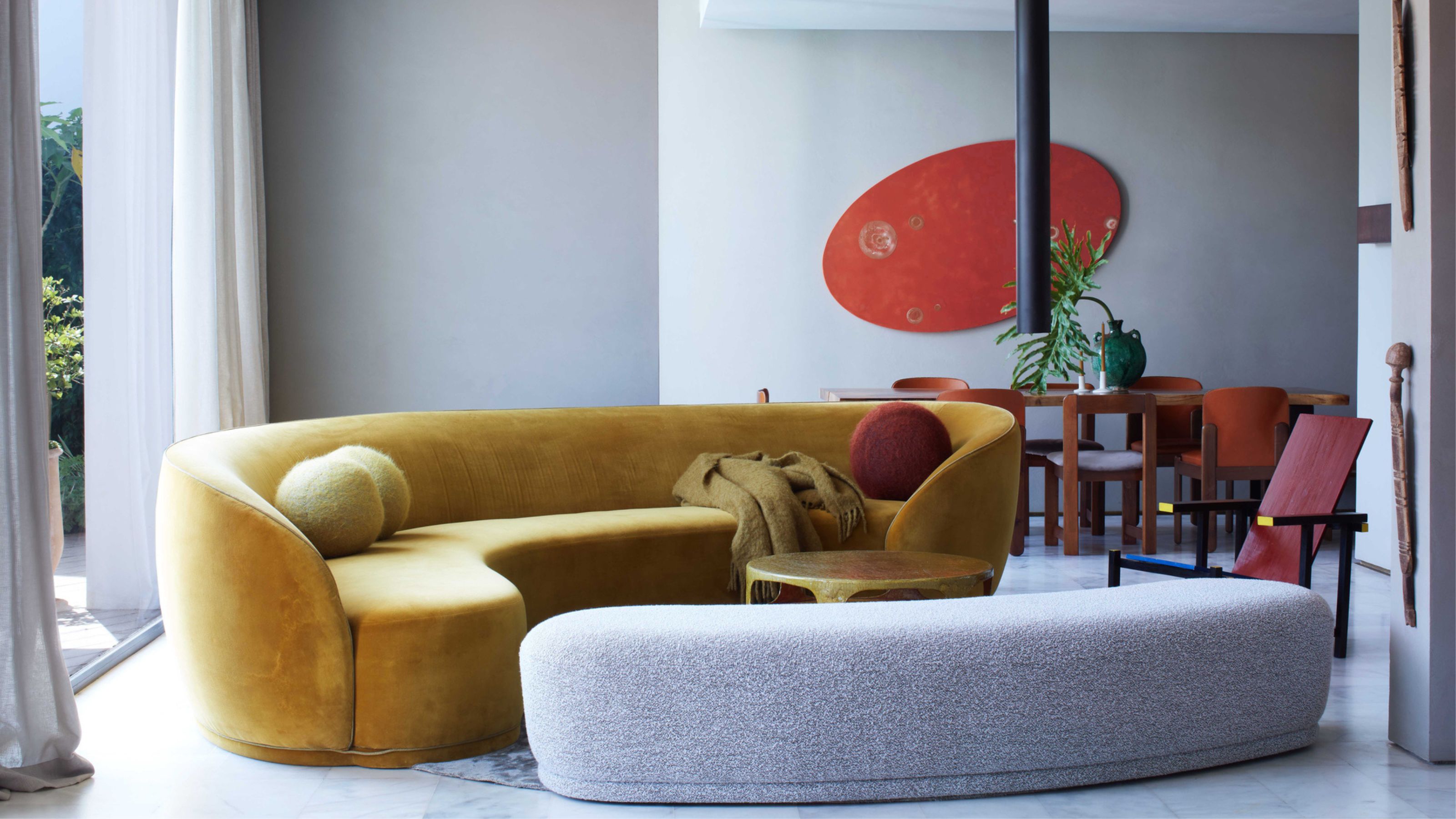
Choosing colors that complement is a quick way to create harmonious palettes.
The idea of complementary — aka opposing (slightly confusing, but hang in there) — colors in the home can be a little intimidating as they’re put together for impact, unforgettability and pizazz, but the ooo-factor lies in how they interact. When considered in conjunction with balance in interior design, these contrasting pairings can bring energy, depth, and unexpected smoothness to a space.
"As complementary colors do not have any common base hues, using them in a space creates tension and contrast," says Kristina Khersonsky. "Some of the most interesting spaces typically have some form of tension — something that is difficult to put your finger on — and complementary colors can create that juxtaposition, which makes a space especially striking."
Play with proportion, tone, and positioning to build complementary schemes that are dynamic rather than overpowering. Varying the saturation levels also helps; a deep indigo paired with a pale amber feels more sophisticated than two equally vivid cobalt and cherry tones vying for attention.
And rather than splitting a space 50/50 between two complementary hues, consider letting one color take the lead while the other plays a supporting role. A rich green room with small bursts of red for example — a burgundy vase here, a rose cushion over there — seems more intentional and less overwhelming.
"To create visual balance in a space with complementary colors, include a subtle neutral version of the hues," agrees Hannah Yeo. "For example, a mossy green with a delicate pink creates a soft, romantic color scheme."
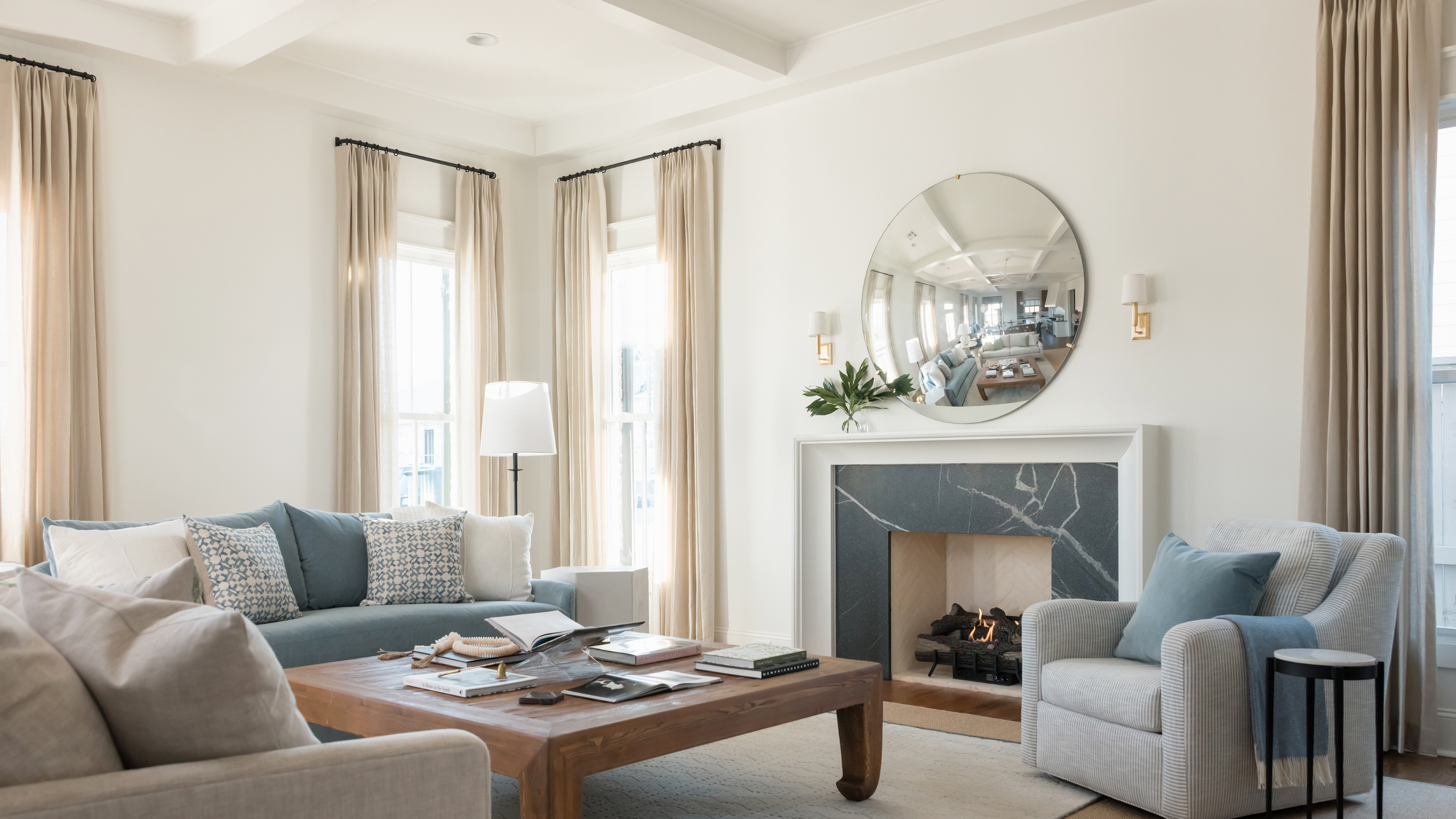
Analogous Schemes

When in doubt, pick colors that are next to each other on the color wheel.
Using analogous color schemes — neighboring hues from the color wheel — in interior design is a way to create flowing spaces, where an innate sense of smoothness and ease rules. These palettes feel effortless as they hues share base tones — think collaborations between powder blue, cobalt, and periwinkle or terracotta, blush, and coral, for example — and cast a serene mood over their surrounds.
"Analogous color combinations are considered among the most stable of all color schemes, in that they create visual harmony and bring in a simplicity," says Kristina Khersonsky. "They are easy on the eyes, with no tension or contrast." This approach works particularly beautifully in open-plan spaces, where it’s important to foster connection — by spreading analogous colors across different zones, say, a lilac in the kitchen flowing into a mauve in the dining area, you cultivate continuity while still allowing each area its own identity.
"These schemes create a calming effect due to their gentle variations," says Emma Beryl Kemper. "A simple way to do it is to use one dominant color while introducing the others as subtle accents." A single ruling color also creates more natural, less overly blended spaces, as well as adding interest without overwhelming.
Another way to experiment with the analogous includes blending warm and cool tones found close to each other on the color wheel — this approach doesn’t have to stay strictly warm or cool how about warm olive merged with cool sage for a subtly dynamic, nature-inspired look…
Emma Beryl Kemper is the founder and principal of Emma Beryl Interiors. She studied at the New York School of Interior Design, and has authored a book, House Rules: 100 Ways to Feel at Home where she explains the tenets of interior design, including how best to use color in your home.
Monochromatic Schemes

Sometimes, your best trick is just picking one shade and sticking with it.
Another decorating approach with color selection is to go for a monochromatic color scheme, a palette based on a single hue but is made memorable by a mixture of different tones, tints, and shades. It casts hues of different light levels against each other for contrast and variation with a considered edge.
In the home, these schemes create a clean, chic look, and the palette is naturally cohesive and easy to live with as the whole thing complements itself (which we should all do a little more of). Since the scheme stays within one section of the color wheel, it naturally forms a cohesive and visually restful environment, making it a great choice for interiors aiming for elegance and refinement.
A classically mono-toned palette would be taking one color from the wheel and adding white, black, or gray to it to produce different variations of that single, beloved, hue. We’re a little more relaxed these days, and a modern monochromatic interior is generally classed as one that uses just one color in general — say a general mixture of greens from seafoam to shamrock, or a combination of yellows spanning butterscotch to banana.
"Color schemes such as navy, royal blue, indigo, and powder blue are simple to implement and give a space a cohesive and polished appearance," says Emma Beryl Kemper. "If blue is your focal color for example, try going beyond what you see on the color wheel and think of neutrals with blue undertones — you might combine a light sky with a deep navy and a neutral gray blue," adds Hannah Yeo.
There are, naturally, a few tricks to keep such solo-colored spaces from feeling flat. Layering tones is important — a bit of lightness next to a dash of darkness is always compelling. "The all-immersive monochromatic color selection creates a cocooned, warming effect," says Kristina Khersonsky. "Incorporating textural elements or patterns within that select hero hue maintains impactful visual interest, which allows the eye to freely around travel around yet maintains resting points throughout."
The 60-30-10 Rule

Following this color rule ensures your space feels balanced.
The 60-30-10 rule is a respected design principle used to harness color in a balanced way. It goes like this — 60% of the room is taken up with the main color, which can be applied to large areas such as surfaces (don’t forget ceilings), rugs, or chunky pieces of furniture. 30% of the room is dedicated to the secondary color, on things such as upholstery, curtains, and bedding, while the 10% is for the playful pop of accent color, which can come in as things such as cushions and throws, side tables and stools, hardware, artwork, and general objets.
"Ratio and proportion play a key role in creating mood and maintaining balance in a 60-30-10 space," says Hannah Yeo. "For example, using a deep brown as your primary color will establish a moody atmosphere, but by introducing a lighter off-white on the trim, ceiling, and through accents, you can prevent the room from feeling too dark. Adding a pop of color will further enhance the space for visual interest."
Personally, I am not a huge fan of rules — and even less so with those involving percentages — but 60-30-10 is nice to have up your sleeve if you’re looking for a place to start, or to use as a (rough) roadmap on how-much-hue-to-put-where — it does make for a pleasing, calm-yet-cool division of color. Just don’t sweat about it too much, and personally I don’t think any kind of percentage measuring device is necessary.
Triadic Color Schemes

This is a good approach for finding vibrant palettes that still feel cohesive.
A triadic color palette is — you guessed it — based on a trio of colors, which are to be found spread evenly around the color wheel. Place an equilateral triangle-shape on the wheel and the corners will point to three hues, and there’s your new triadic scheme — twist it around until you find a decorative threesome you’re drawn to.
The triadic approach is good for even yet vibrant mixtures — from the likes of classic, bold red-yellow-blue, the soft yet statement coral-sage-indigo or the warm and earthy terracotta-olive-navy. "Using a triadic color scheme can bring vividity but can also strike a perfect harmony in the space," says Kristina Khersonsky. "A secondary color triadic combination — orange, green, and purple for example — is subtle and has been quite popular of late, as color palettes from the 70s have become infused into contemporary design."
How to decorate with triadic shades, you ask? There are several approaches that keep things manageable. "Triadic color schemes work best when one color is the 'hero' and the other two play supporting roles, for example, blue as the main color with yellow and red as accents," advises Emma Beryl Kemper. "Triadic color combinations naturally exudes vibrant energy and visual interest — however, be thoughtful on where and how much of each color you use — ratio and proportion are key here," says Hannah Yeo. "Try balancing the palette with off-white or neutrals to soften the contrast." You can also try adjusting the saturation levels of your chosen tones for a more nuanced, softer look, distributing the colors evenly throughout the room for a cohesive feel, or folding them into the 60-30-10 rule for extra decorative box ticking.

Price: £25.98, Was: £38.74

Price: £15.46
![Old Brand New: Colorful Homes for Maximal Living [an Interior Design Book]](https://cdn.mos.cms.futurecdn.net/hU4FCnGAy8RQgL5EBQATK8-1920-80.jpg.webp)
Price: £14.93, Was: £27.12
After more color wheel fun? Why not investigate split-complementary schemes, square schemes, high-key vs low-key schemes, tetradic/slip-complementary schemes (not the same as triadic) or warm-to-cool gradients?
There’s a whole color wheel world out there waiting to be explored when it comes to interior design, each studied approach offering new ways to play with colour composition contrast and cohesion.

-
 Don't Fall Into the Trap of These Tacky and Dated Patio Furniture Buys — Here, Designers Share the Styles to Shop Instead
It's time to retire those brightly-colored plastic chairs and ugly buttoned upholstery...
-
 10 Loft Stair Ideas That Turn Functional Steps Into a Stylish Statement
These clever staircase solutions from designers and architects promise to elevate your space in more ways than one


-
 This Is When It's a Mistake to Use Color Theory to Decorate Your Home — "It Can Quickly Become a Distraction"
While it's a good idea to take inspiration from, is navigating the complex rules of theory around color more trouble than it's worth?
-
 Do Red and Yellow Go Together? Designers Share How to Make This Punchy Pairing Feel Soothing Rather Than Intense
These primary colors might seem like they'd clash, but get the levels right, and designers say this combination can look remarkably classic
-
 5 Butter Yellow Paints That Designers Swear By — So You Can Get This Trending Color on Your Walls With Confidence
Butter yellow is everywhere, but picking a paint shade can be a big commitment. To help, we asked designers to share their favorite shades
-
 What Does the Color Yellow Mean in Interior Design? A Color and Design Psychology Expert Explains
Whether you love or hate it, yellow always seems to elicit a strong reaction from people — here, we explain why
-
 Should a Living Room Be Painted Dark or Light? We Asked Design Experts to Settle The Age-Old Debate
The color of your living room can completely shift the mood of your entire home, so the question remains: should you go light or dark...?
-
 I'm Sorry, But You Need to Know About 'Advancing and Receding Colors' If You Want to Get Your Home's Decorating Scheme Right
While some colors tend to pop and reach forward in a room, others draw back. Here, a color expert helps define these palettes and how to use them
-
 Amethyst, Heather, Pansy, Plum — Turns Out Decorating With Purple Opens You Up to a World of Possibilities
Purple certainly isn't a color for the faint hearted, it's a shade that can smell your fear. Here's how to conquer it through your interiors
-
 Here's Why Decorating With Mustard Yellow Helps Fill Your Interiors With a Sense of "Confident Calm"
There is so much more to decorating with this turmeric-tinted sauce-wiggled-on-a-hotdog not-quite-yellow shade than meets the eye


