What colors make a room feel bigger and brighter? Designers share their tips for space-enhancing schemes
These are the colors to choose for small and dark spaces – plus tips on how to use them for the best effect
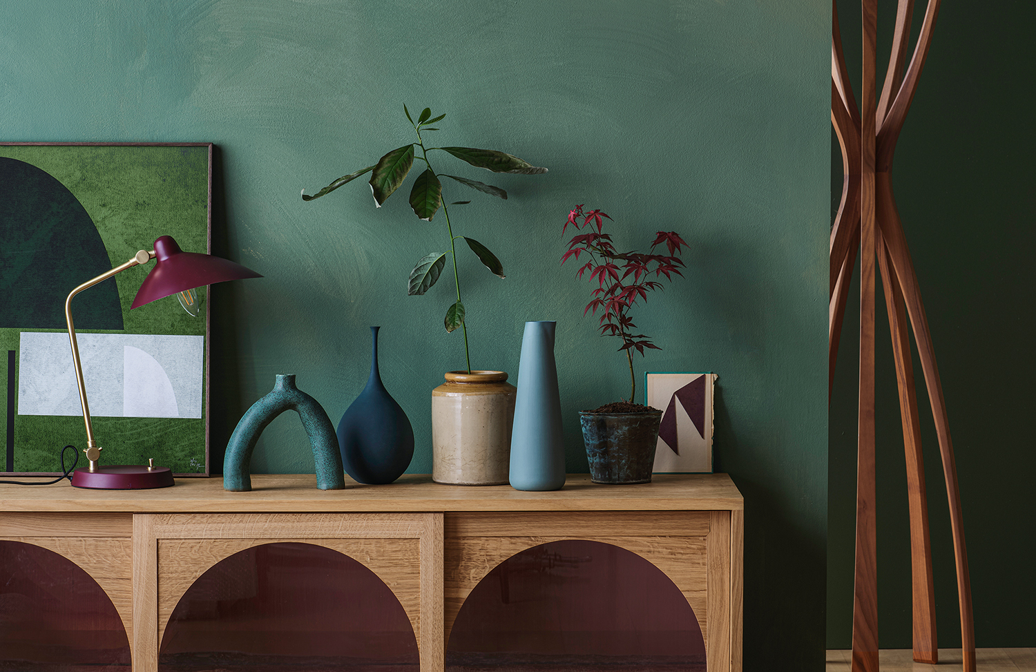

For anyone facing the challenge of decorating a small, dark room, the big question is: what colors make a room feel bigger and brighter? Color, after all, can have a huge impact on the look and feel of a space – whether that's deep hues in a moody, cocooning scheme or light neutrals in an airy room.
And while the latter is pretty much a given for making a room feel bigger and brighter, the good news is that neutrals aren't the only way to enhance a space. We spoke to interior designers and paint experts who revealed their favorite shades to use – as well as the interior design trends that will help you to create the effect of grand(er) proportions.
What colors make a room feel bigger and brighter?
The first thing to note is that there's no hard and fast rule when it comes to choosing colors for a small, dark room. In fact, it's more about playing with tones and shades. 'Personally, I don't buy into the idea of light colors making rooms look larger,’ says interior designer Lisa Mettis of Born & Bred Studio. ‘The emphasis needs to be on the tone and shade of the color and, most importantly, the proportion of color used.'
Having said that, the experts we spoke to did pick out four key paint color ideas that can work wonders in smaller spaces. And good news for color lovers – they're not all white and beige…
1. Earthy pinks
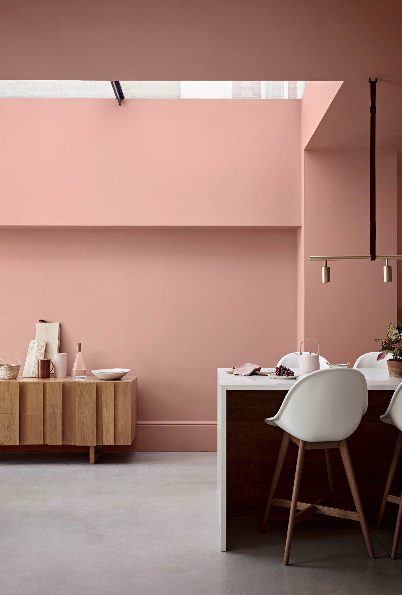
Thanks, perhaps, to its ability to act as a neutral, earthy pink can be a great way to enhance a space. It's calming but still bright, and there's no sign of it slowing down as a key color trend.
‘My favorite color and paint currently is Argile De Toscana,’ says designer Irenie Cossey of London-based Irenie Studio. ‘It is a very subtle light dusty and chalky pink. It’s amazing with deep gray or indeed super bright blues – a real solid backdrop that can take any tone or color. Apply it to walls of a small room and it gives the room a new life feeling bigger and calmer.’ Generally, she uses this or a chalky, warm gray. ‘Painting window frames and shutters in a similar tone but darker also extends the space,’ she adds.
2. Off-whites
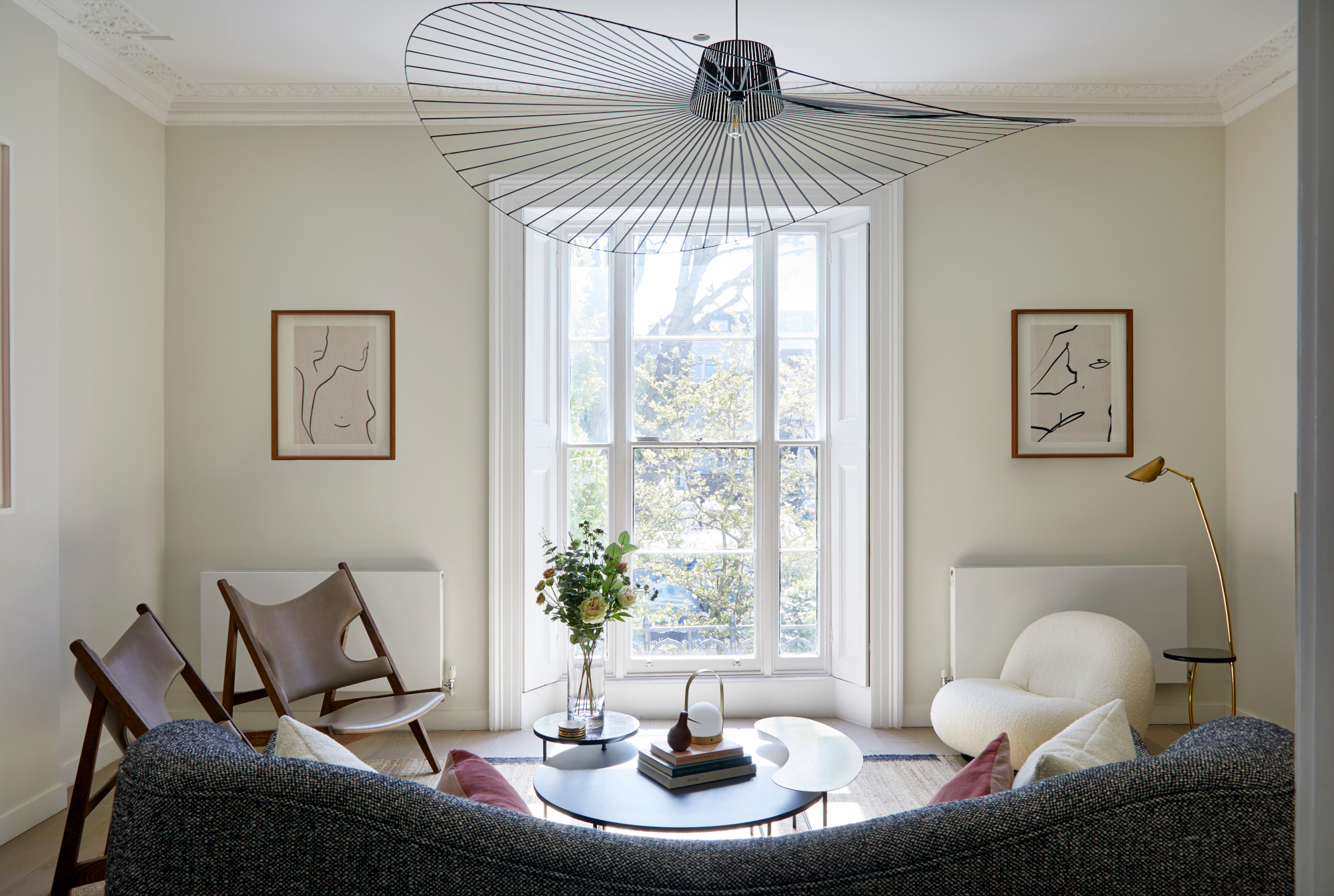
Okay, so no surprises here – but crucially, the type of white you use can make a huge difference to the feel of your space. ‘A light wall color will allow the natural light to move around the space, creating the illusion that the space is larger,’ says Tanya Peters and Renee Struthers of interior design studio Ola Hiraeth. ‘But it’s not always a one size fits all solution. Depending on the shape of the room, the presence or absence of natural light and the direction the windows are facing, the design strategy will differ.'
A bright white like Benjamin Moore's Chantilly Lace may work in a warmly-lit, south-facing room, they suggest – but could have the opposite effect in a cooler, north-facing space. 'In general, warm tones advance, compared to cool bright colors, which recede,' they add. 'Use warm tones to compress and cool tones to lengthen or contract. We prefer to use warmth in most cases, and there are wonderful warm whites that still give the opportunity for light reflection, while at the same time provide a feeling of comfort. A couple of our favorites are Benjamin Moore's Cloud White and White Dove.'
3. Mid neutrals
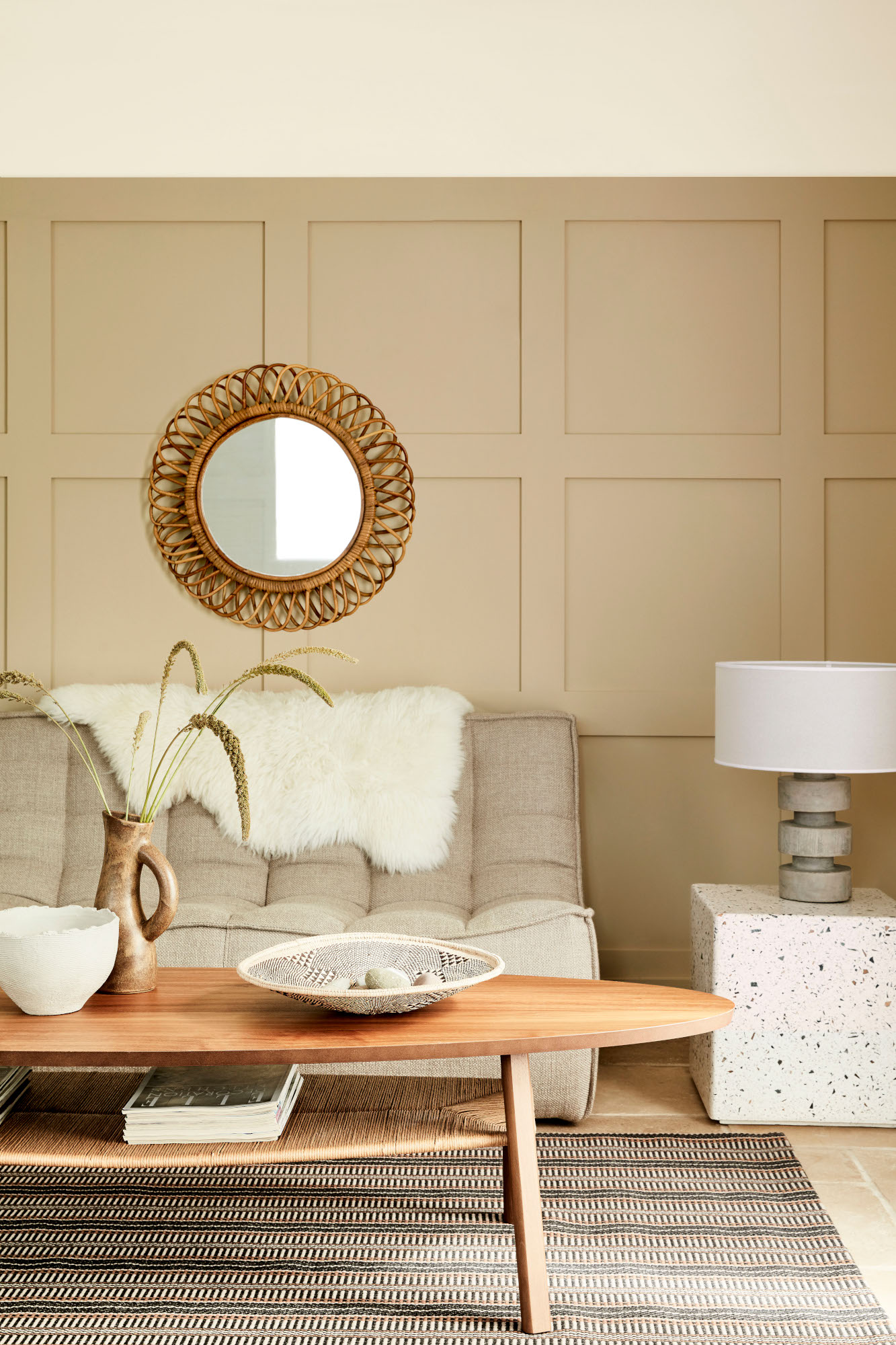
If an all-white room feels a little stark for your tastes, try stepping it up with mid-toned neutrals – which can pick up hints of your favorite accent colors, too. These shades work particularly well when they're used all over.
‘If you have low ceilings or small spaces, consider one color on every surface,’ says Patrick O’Donnell, color consultant and brand ambassador for Farrow & Ball. ‘Off whites or mid neutrals should be your go-to here, but do consider the aspect – think red based neutrals like Dimity for a north facing room, and in east-facing rooms, play to the early morning light and consider something like Pale Powder, the most gentle pale aqua.’
‘Warm, light neutrals used in a tonal scheme will make a room feel spacious,’ agrees Ruth Mottershead, creative director at Little Greene. The paint company's Colour Scales collection is a useful tool here, designed to help you create a harmonious space: as an example, Ruth adds, 'Masquerade works beautifully alongside Masquerade Mid and Masquerade Light to create an elegant and welcoming scheme.'
4. Rich hues
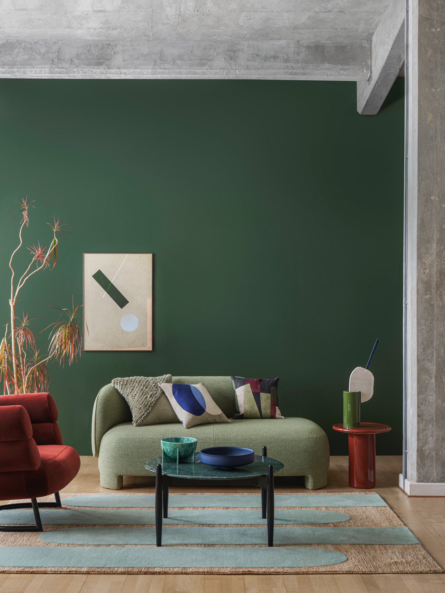
A neutral color scheme isn't for everyone, and for those who prefer a bolder look, you can still integrate color into a small, dark room – the key is to choose rich shades. ‘I would always suggest rich colors with the luminosity that comes from a full spectrum paint since they don't contain black, which can often dull or over-saturate color,’ says Philippa Radon, C2 Paint's color and design specialist. ‘Richer hues make more of an embracing statement that draws your eye to the color and feeling of the room rather than the size.
'To exaggerate brightness, I recommend colors with a higher chroma value (or color purity) to introduce more energy. These can be found throughout the color spectrum, allowing you to choose your favorite – or if you want to stay light and bright, stick with shades that have a warmer undertone.’
Tanya Peters and Renee Struthers agree. ‘Rooms that have very little or no natural light often appear more grand and spacious when painted with a richer color such as Farrow & Ball Green Smoke or Benjamin Moore's Salamander on walls and even the ceilings,' they add.
‘Dark plum tones such as Valspar’s Plumberry Juice and greyish greens such as Stormy Day are unexpectedly useful for lengthening a room,’ says Charlotte Radford, senior product manager at Valspar. ‘Using these darker shades on the sides of the walls and lighter shades on the end of the wall will help the room look longer than it actually is. Color drenching the walls and ceilings is also an effective way to create a feeling of more space in a room.’
What colors should you avoid?
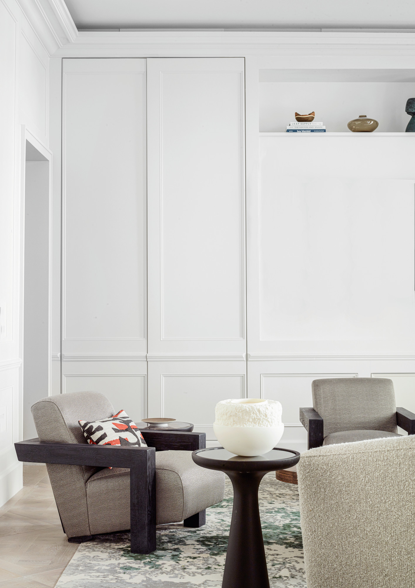
Happily, there are very few colors that won't work to make a room feel bigger and brighter, providing you use them correctly. ‘Don’t avoid any colors,’ says Irenie Cossey. ‘The challenge is where you use them and what other influences, materials and textures are in the room. It’s really fun to test colors in a new environment. If you want a small space to feel bigger, use lighter colors – but small spaces respond equally well to dark colors, which create intimacy.'
'People sometimes shy away from darker shades, for fear that the boldness could come across as overbearing,' adds Charlotte Radford. 'However, this isn’t always the case. Pairing lighter paint shades with darker furnishings and details can bring a striking edge to the room and actually make the space feel bigger than it is.'
The shades that don't work as well are those with colder tones. ‘I would avoid gray at all costs,’ says Lisa Mettis. 'It immediately dates a room and the undertones of blue are not helpful in smaller rooms. I feel my job is largely banishing gray in projects at the moment!’
'Many opt to use bright white with the aim of making a room appear larger,’ adds Ruth Mottershead. ‘However, a very bright white can make a room feel stark and cold. Light neutrals combined in a tonal scheme will make a room feel more spacious, creating the same effect whilst not appearing too stark.'
How can you use color to make a room feel bigger and brighter?
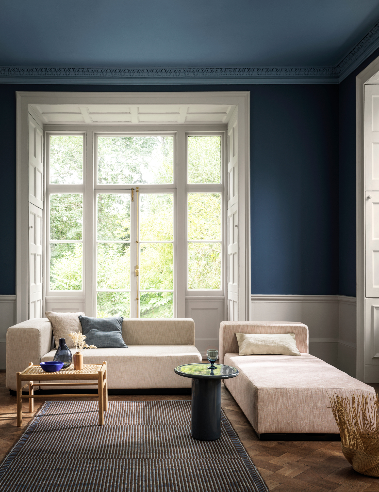
As well as working out what colors make a room feel bigger and brighter, you also need to consider how you use paint for the best results. ‘In a period property, look at the dado, picture rail and coving as areas to stop, start and highlight tones and shades,’ says Lisa Mettis. ‘It all helps draw the eye line to the detail and variation in shades. Using three shades of the same color, for example, can create a subtle change with big impact. In small rooms I would suggest the same color on both the walls, skirting and ceiling if you’re feeling brave. The blurring of visual lines helps the room look seamless.’
However, keeping the colors similar is key, according to Patrick O’Donnell. ‘If your room is blessed with lots of architectural detail such as chair rails and/or picture rails but on the small side, avoid picking out these details in a secondary color as a multitude of highlighted “horizontals” will break up the space too much,’ he says. ‘The best advice is to paint them in your chosen wall color in the appropriate finish.’
Tara Dennis of interior design firm Archie Bolden also advocates color drenching. 'Play tricks on the eye by painting or having one solid color,' she says. 'Even if it’s darker, it's harder for the eye to rest on those moments of contrast. The space can therefore look bigger as a whole because your eyes are reading the space as one, and it’s blurring the lines between corner junctions and starting and stopping transitions.'
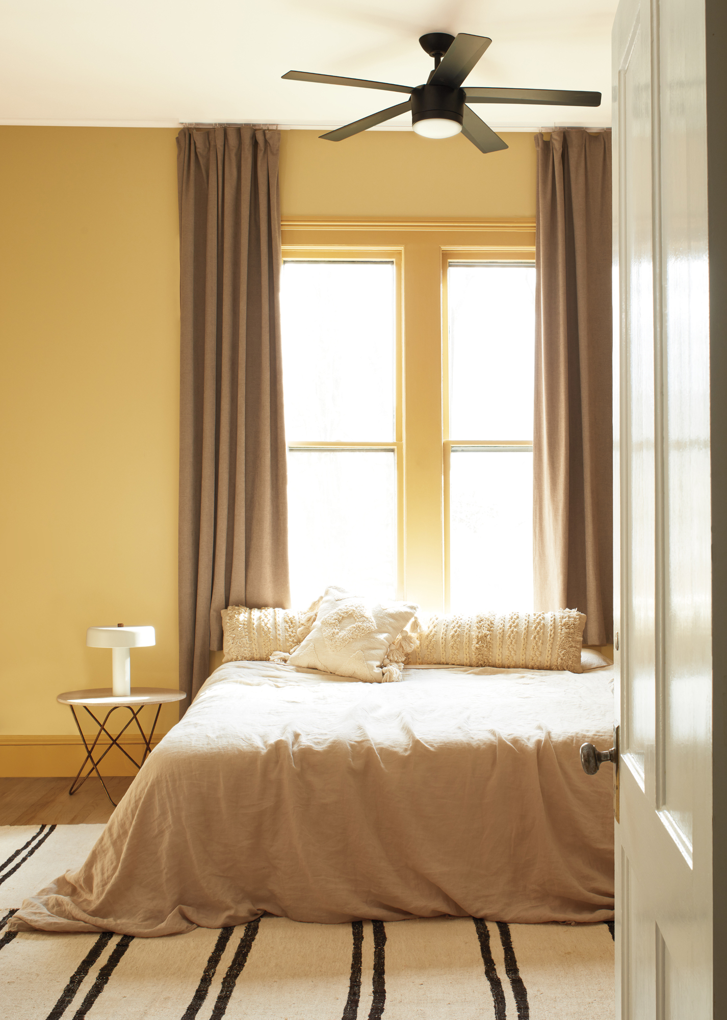
Also consider making the most of the ceiling, also known as the fifth wall, with one of the best ceiling colors. It's a great way to enhance a room's feeling of space, diversity, and interest, according to Philippa Radon. ‘It's a good policy to reflect on the features you want to be the hero of the room and draw those out with bolder, more robust colors,' she says. 'Add interest through color blocking; try an unexpected accent color, add shine with a gloss sheen or keep it simple by using a lighter percentage of the wall color to add height.’
'Paint a color halfway up a wall from the floor up – maybe 3ft – and bring the ceiling down,' advises Tara Dennis. 'It brings a trick of the eye by pretending the cut line is lower, and it effectively pushes the ceiling up visually. What you're trying to do when you're playing with colors is trick the eye into seeing things that actually exist, or messing with the scale and form of the space.'
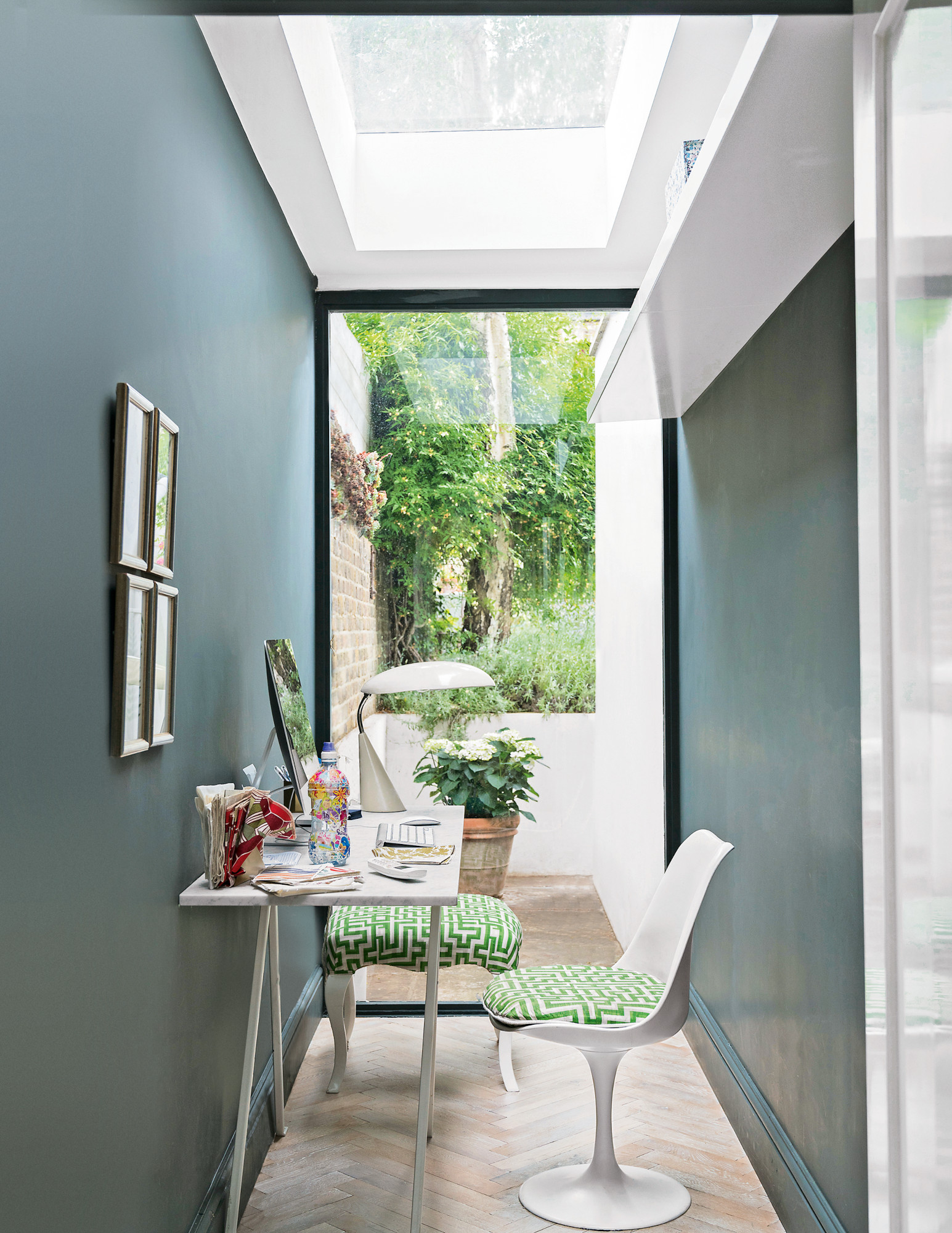
Adding texture to your walls also plays an important role in making a room feel larger or smaller. ‘Smoother textures such as eggshell or satin paint finishes will create more reflection and surface for light to bounce around, which can give an overall effect of a larger, brighter space,’ says Tanya Peters and Renee Struthers. ‘Really matte or textured wall finishes have an absorbing effect, but also add a layer of richness to the space, which might be appreciated.'
A high- or semi-gloss paint gives an even more dramatic effect. ‘This offers any chance of light, whether this be from natural or artificial sources, to be reflected within the room and add a feeling of extra space,’ says Helen Shaw, UK director of Benjamin Moore.
‘Another trick to try for creating the illusion of more space is incorporating metallic finishes and accents that will reflect both natural and artificial light around the room,’ says Marie Goodwin, head designer at UK luxury fabric specialist Prestigious Textiles. ‘Create a focal point through upholstered furnishings featuring hints of metallic, or a feature wall painted in shades of cool silver, pale gold or even bronze for a slightly warmer feel ahead of the new season.’
What colors should you use for small kitchens and bathrooms?
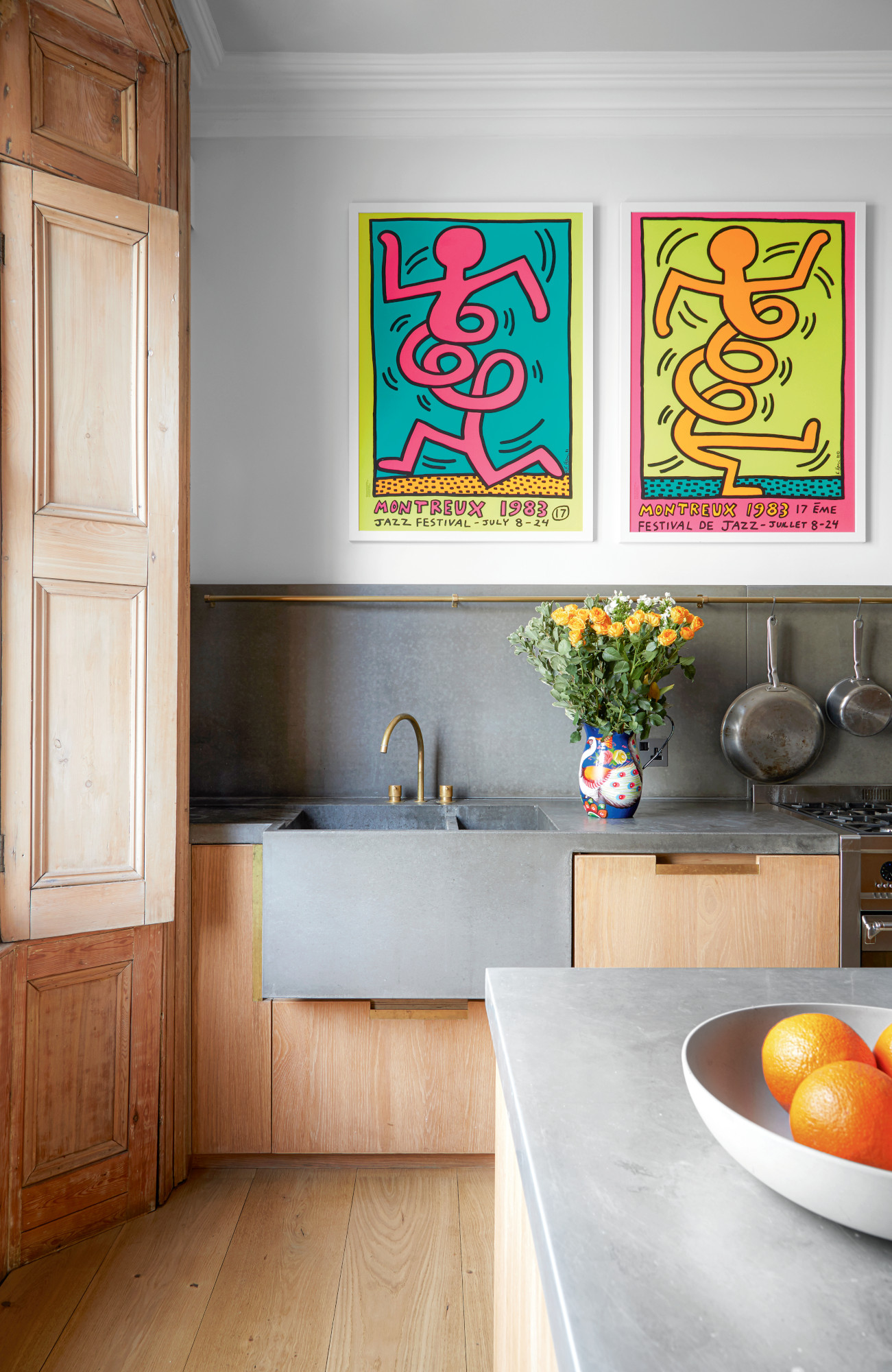
'With the cabinetry and different lines of a kitchen, there are a lot of things going on and a lot of decoration – therefore you should keep colors to a minimum, or to a light scale,' says Tara Bolden. 'All those little details throw shadows, and if you already got a dark tone, those shadows will also show even darker. It’ll just look super busy.'
‘I have a tendency in kitchens to use a warm pale shade on the walls – never brilliant white – and continue it on all woodwork and the ceiling,’ says Lisa Mettis. ‘Most kitchens now are “a color,” so it's a nice backdrop to make the unit colors pop. I do, however, introduce color and pattern around the dining area. This helps create a cozy nook and ambience for an evening of relaxing and conversing.’
While neutrals are a popular small kitchen idea, then, Ruth Mottershead warns against letting the space stand out from the rest of your scheme. 'Small kitchens are often painted white out of habit, causing them to feel very separate to the rest of a home,' she says. 'Consider the kitchen as an extension of your design scheme, carrying your color palette through into the space. Light neutrals are not the only option for a small space: embrace a small room and create a cocooning, intimate interior with darker, richer colors.'
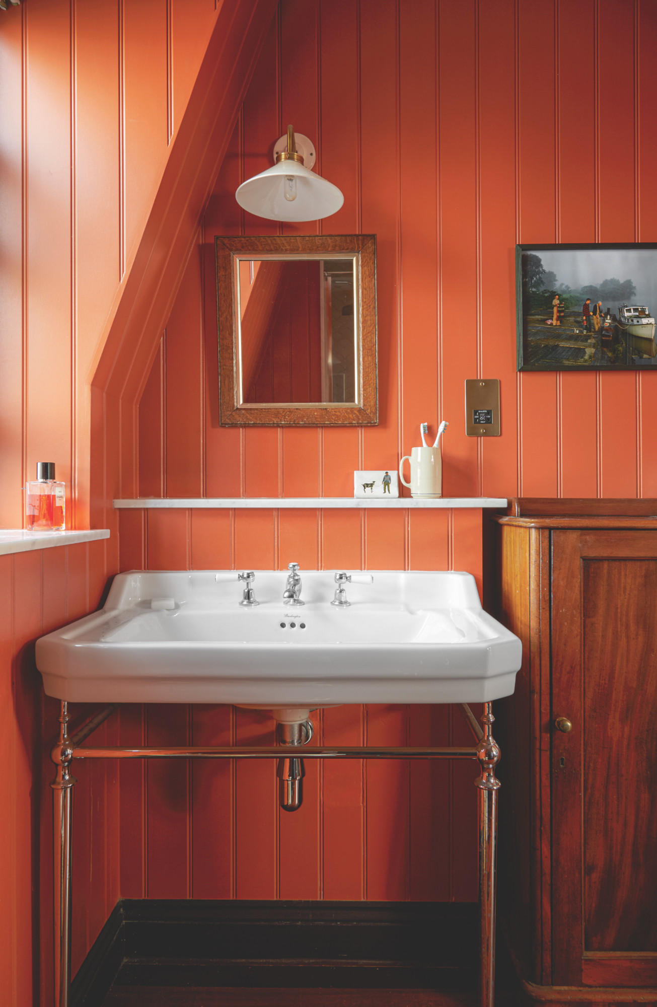
In a small or dark bathroom, however, the consensus is that bolder is better. ‘For small bathrooms, go bold,’ advises Irenie Cossey, ‘and paint the whole room and ceiling in the color. If you’re using tiles, choose from the same color palette but tonally darker or lighter. Then add a pop of color through the tap, mirror or light fitting.’
'It's best to use as minimal texture difference and materials as possible,' adds Tara Bolden. 'The space will feel bigger if you do the same tiles in a whole space, similar to doing the same paint color in a whole space. It just feels like the walls are endless, particularly with grout lines involved.'
Still, the small bathroom color idea you choose – be it bolder or more neutral – needs to be one that works for you and creates a calm atmosphere. 'Introducing a calming shade – anything from a soothing green to plaster neutrals or heavy saturated blues – creates a zen space for bathing and also makes the space less clinical,’ says Lisa Mettis.
What color should you paint a small entryway?
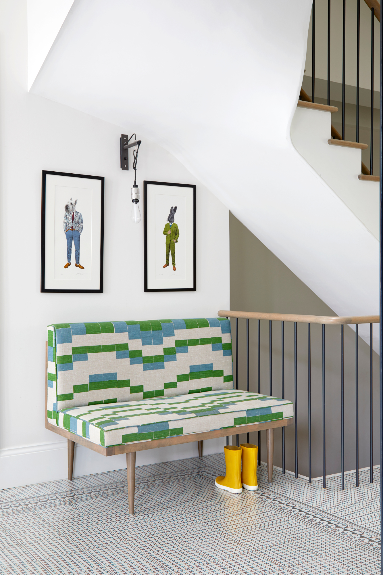
As one of the smallest and often darkest parts of the home – but with a heavy footfall – hallway paint ideas needs to be brightening, space-boosting and practical. ‘Tones of white will obviously be a suitable color for a bright hallway and can look super stylish – especially if you think about painting woodwork something like a pale gray to give definition,’ says Justyna Korczynska, senior designer at Crown. ‘Bring in areas of a pale color that will reflect the available light – this could be in stripes or a series of checks or squares. Try using a metallic paint as a paint effect over a matt emulsion to add shine and reflection and bring a space to life.’
Be The First To Know
The Livingetc newsletters are your inside source for what’s shaping interiors now - and what’s next. Discover trend forecasts, smart style ideas, and curated shopping inspiration that brings design to life. Subscribe today and stay ahead of the curve.

Ellen is deputy editor of Livingetc magazine. She works with our fabulous art and production teams to publish the monthly print title, which features the most inspiring homes around the globe, interviews with leading designers, reporting on the hottest trends, and shopping edits of the best new pieces to refresh your space. Before Livingetc she was deputy editor at Real Homes, and has also written for titles including Homes & Gardens and Gardeningetc. Being surrounded by so much inspiration makes it tricky to decide what to do first in her own flat – a pretty nice problem to have, really. In her spare time, Ellen can be found pottering around in her balcony garden, reading her way through her overstacked bookshelf or planning her next holiday.
-
 5 Houseplant Humidity Myths That Might Be Wasting Your Time and Not Actually Helping Your Plants
Contrary to popular belief, these houseplant humidifying 'facts' aren't quite what they seem
By Amiya Baratan
-
 Turns Out the Coolest New Café is Actually In Your Kitchen — Here's How to Steal the Style of TikTok's Latest Trend
Goodbye, over-priced lattes. Hello, home-brewed coffee with friends. TikTok's 'Home Cafe' trend brings stylish cafe culture into the comfort of your own home
By Devin Toolen
-
 How to declutter as-you-go on Christmas Day to stop your home spiralling into chaos
Christmas can be one of the messiest days for your home, but it doesn't have to be. Follow these simple steps to restore peace to your home this Christmas
By Alex Berry
-
 How do I make my living room look expensive? Ideas for achieving a luxe scheme without spending a fortune
If you want your living room to look expensive, these are the key elements that can transform your space, plus how to achieve them even if you're on a budget
By Oonagh Turner
-
 How to choose kitchen cabinet colors – tricks from the experts for picking the right shade
Discover how to choose a kitchen cabinet color with confidence with these expert-recommended ideas
By Aditi Sharma Maheshwari
-
 Best indoor trees – designer-approved picks to bring this trend into your home
These are the best indoor trees, according to designers, to bring the outdoors in and elevate your interiors
By Oonagh Turner