Colors That Interior Designers Avoid Pairing With Green — and Better Ways to Make These Combos Work
Looking to create the perfect indoor palette with green? Before you begin, experts warn against choosing these particular hues
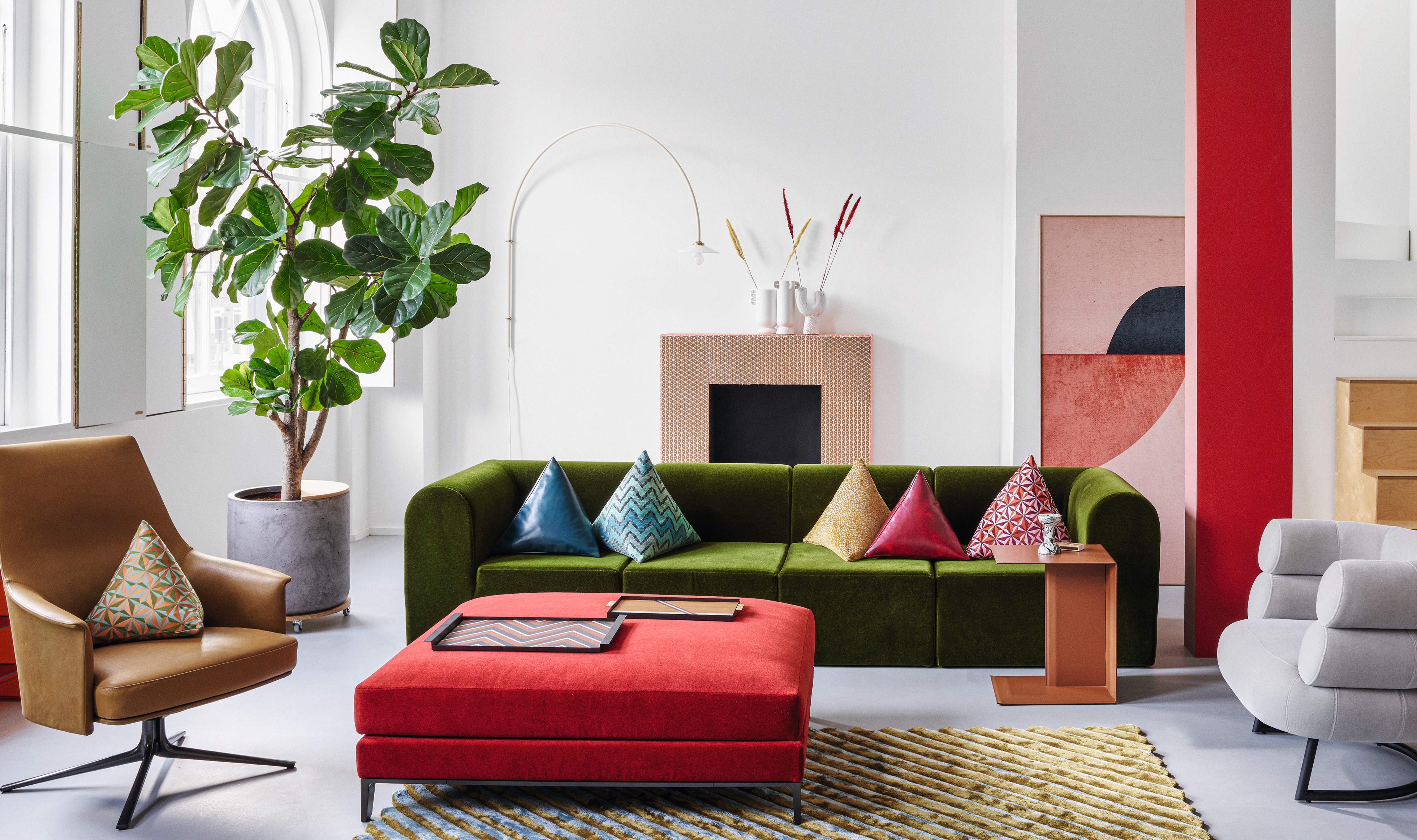

Sure, there are ways to make several different colors go together but certain combinations simply do not have staying power, according to experts. When it comes to green, especially, a few hues can make this wonderful, earthy, and fresh color feel dull or too stark.
We asked experts to elaborate on colors that go with green and the ones that don't, and this is what they had to say.
1. Avoid other greens, choose terracotta instead
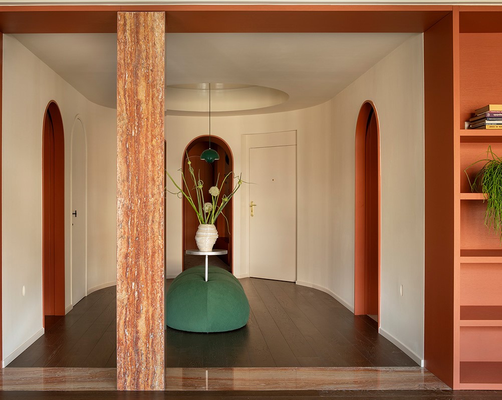
When it comes to two colors that should not be used together, experts point out different greens. Sage green, olive green, forest green, and more individually are packed with personality and beauty but when used together can create a confusing visual.
'What's funny is green doesn't look so great with itself,' says Linda Hayslett of LH.Designs. 'Green colors can have a lot of different undertones and hues, so green with another green can be jarring. For example, lime green with forest green – it just doesn't work so well. Avoid trying to get greens together.'
Instead, experts suggest using more earthy tones to make the green feel warm and welcoming.
'One color that looks modern, crisp, and welcoming when paired with green is terracotta,' says Linda. 'Terracotta always exudes warmth and when paired in the right way with green can look clean, modern, and fresh.'
2. Avoid red, choose wood tones instead
Many of us have wondered if red and green go together, and while this is a no-brainer when it comes to holiday decor, it doesn't cut it as a regular scheme for interiors.
'Red, being the opposite on the color wheel from green makes for a jarring home interior color combination,' says Julia Mack, founder of Julia Mack Design. 'If this does appeal to you, consider a more muted version of each. A dark burgundy paired with a dark bottle green creates a cozy, warm family room, den, or basement activity center.'
'This combination can create a stark contrast that may appear too intense or even visually overwhelming,' says Richard Misso from The Stylesmiths. 'Green and red are complementary colors, and have a strong visual impact that can sometimes be disruptive rather than harmonious. In interior design, pairing green with red may evoke holiday themes like Christmas and it can be challenging to balance these colors effectively without overwhelming the visual senses.'
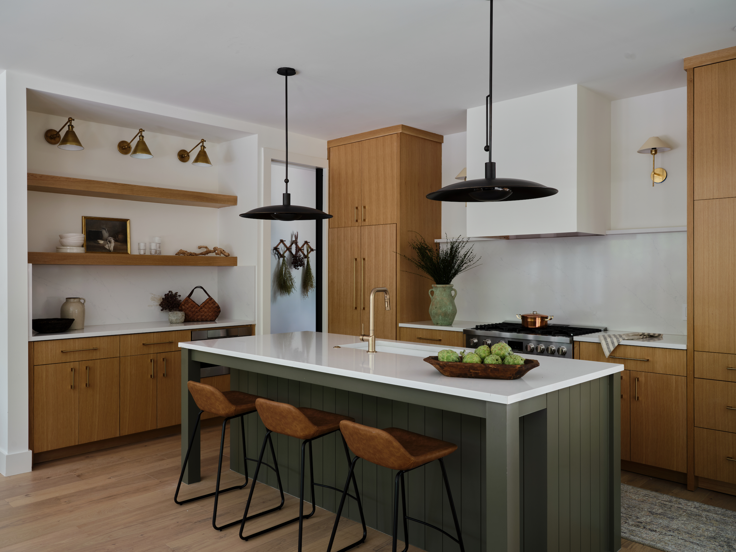
Instead, use green as a layering color in a wood-dominated setting, to create an indoor-outdoor appeal.
'Without a doubt, pairing bright green with warm wood tones in flooring, furniture, or artwork offers a balance of cool and warm colors that look modern, crisp, and welcoming,' says Julia. 'Dark green walls recede in a space allowing the warmth of wood furniture to add both tonal balance and interest to a space.'
If wood tones aren't a possibility and you are looking for wall colors, consider a coffee tone. It's a winning color that goes with brown. 'I'm drawn to the blend of olive green with rich chocolate brown; the rising popularity of brown tones is attributed to the cozy and welcoming ambiance they impart to a space,' says Kashi Shikunova, director at Yam Studios. 'When paired with green, it creates a natural and inviting atmosphere that feels simultaneously modern and sophisticated.'
3. Avoid saturated yellow, choose white instead
Many colors go with yellow but perhaps keep green away, especially if you're experimenting with the brighter version of yellow.
'In my view, most colors can either clash or harmonize well together, depending on the careful balance and harmony within a design,' says Kashi. 'It's crucial to consider factors like the amount of color used, its saturation, and brightness. For instance, yellow and green may clash if both are highly saturated or if not balanced properly within a color scheme.'
'It's like mixing two bold personalities that just don't see eye to eye,' says Saba Kapoor, co-founder of Nivasa. 'Yellow, despite being one of the most popular colors globally, when combined with green can be visually overwhelming. The intensity of these colors clashing can strain the eyes and create an unharmonious visual experience. The intense combination might overwhelm the senses, leaving your design or setting feeling a bit disjointed.'
Decorating with neutrals is the simplest way to create a timeless interior. Consider pairing green with a muted tone to ensure the combo never looks dated or odd.
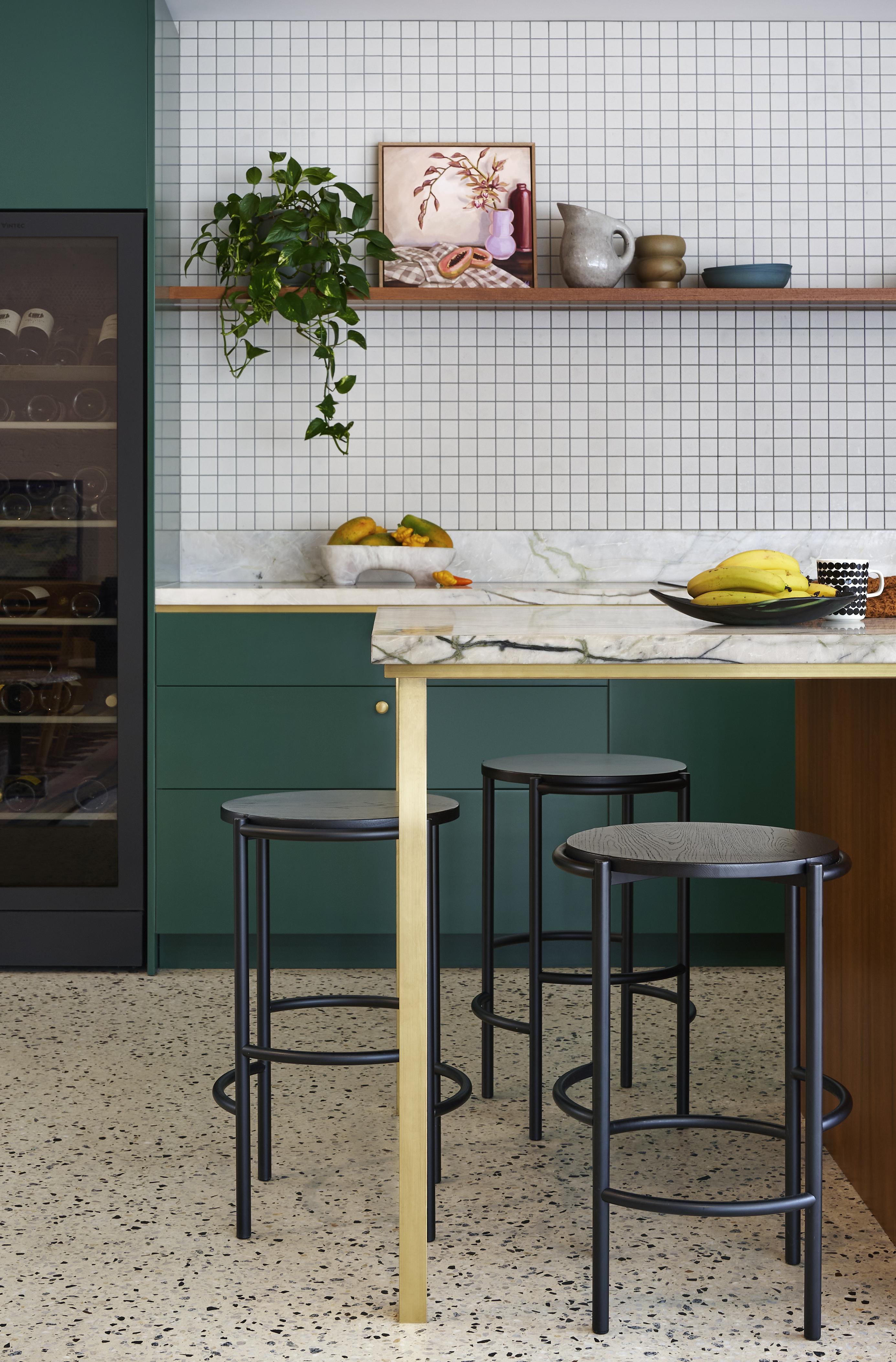
'One color that complements green beautifully while also instilling a modern, crisp, and welcoming feel is various tones of white,' says Richard. 'White acts as a neutral backdrop that allows green to stand out without competing for attention. When paired with green, white creates a fresh and airy atmosphere, evoking a sense of cleanliness and openness. This combination is particularly effective in interior design, where white walls or furnishings can accentuate the natural vibrancy of green elements such as plants or decor. For example, in this kitchen, green serves as the primary color, paired with white walls/tiles and accent features in black and gold, showcasing the elegant balance between green and white.'
4. Avoid purple, choose peach instead

'When greens and purples are overly vibrant and used excessively, they can feel overwhelming,' says Kashi. Usually finding colors that go with purple can be a tricky process, so it's best to use that tone with more neutral tones such as beige and cream.
Instead, consider green as a color that goes with blush pink or peach.
'The combination of peach and green creates a delightful contrast, blending warm and cool tones seamlessly,' says Saba. 'This pairing radiates a sense of fineness and style. Picture a room with a dark green accent wall adorned with artwork, paired with a peach-toned sofa set. The peach hue softens the intensity of the green while adding warmth and depth to the space. The polarity adds visual interest, creating a contemporary yet inviting ambiance.
'The colors peach and green, evoke a sense of harmony and peace, which can remind you of a lush garden bathed in soft sunlight,' says Saba. 'This color pairing is versatile and can be incorporated into various design styles, from modern minimalist to eclectic chic.'
3 paint colors that go with green
Be The First To Know
The Livingetc newsletters are your inside source for what’s shaping interiors now - and what’s next. Discover trend forecasts, smart style ideas, and curated shopping inspiration that brings design to life. Subscribe today and stay ahead of the curve.

Aditi Sharma Maheshwari started her career at The Address (The Times of India), a tabloid on interiors and art. She wrote profiles of Indian artists, designers, and architects, and covered inspiring houses and commercial properties. After four years, she moved to ELLE DECOR as a senior features writer, where she contributed to the magazine and website, and also worked alongside the events team on India Design ID — the brand’s 10-day, annual design show. She wrote across topics: from designer interviews, and house tours, to new product launches, shopping pages, and reviews. After three years, she was hired as the senior editor at Houzz. The website content focused on practical advice on decorating the home and making design feel more approachable. She created fresh series on budget buys, design hacks, and DIYs, all backed with expert advice. Equipped with sizable knowledge of the industry and with a good network, she moved to Architectural Digest (Conde Nast) as the digital editor. The publication's focus was on high-end design, and her content highlighted A-listers, starchitects, and high-concept products, all customized for an audience that loves and invests in luxury. After a two-year stint, she moved to the UK and was hired at Livingetc as a design editor. She now freelances for a variety of interiors publications.
-
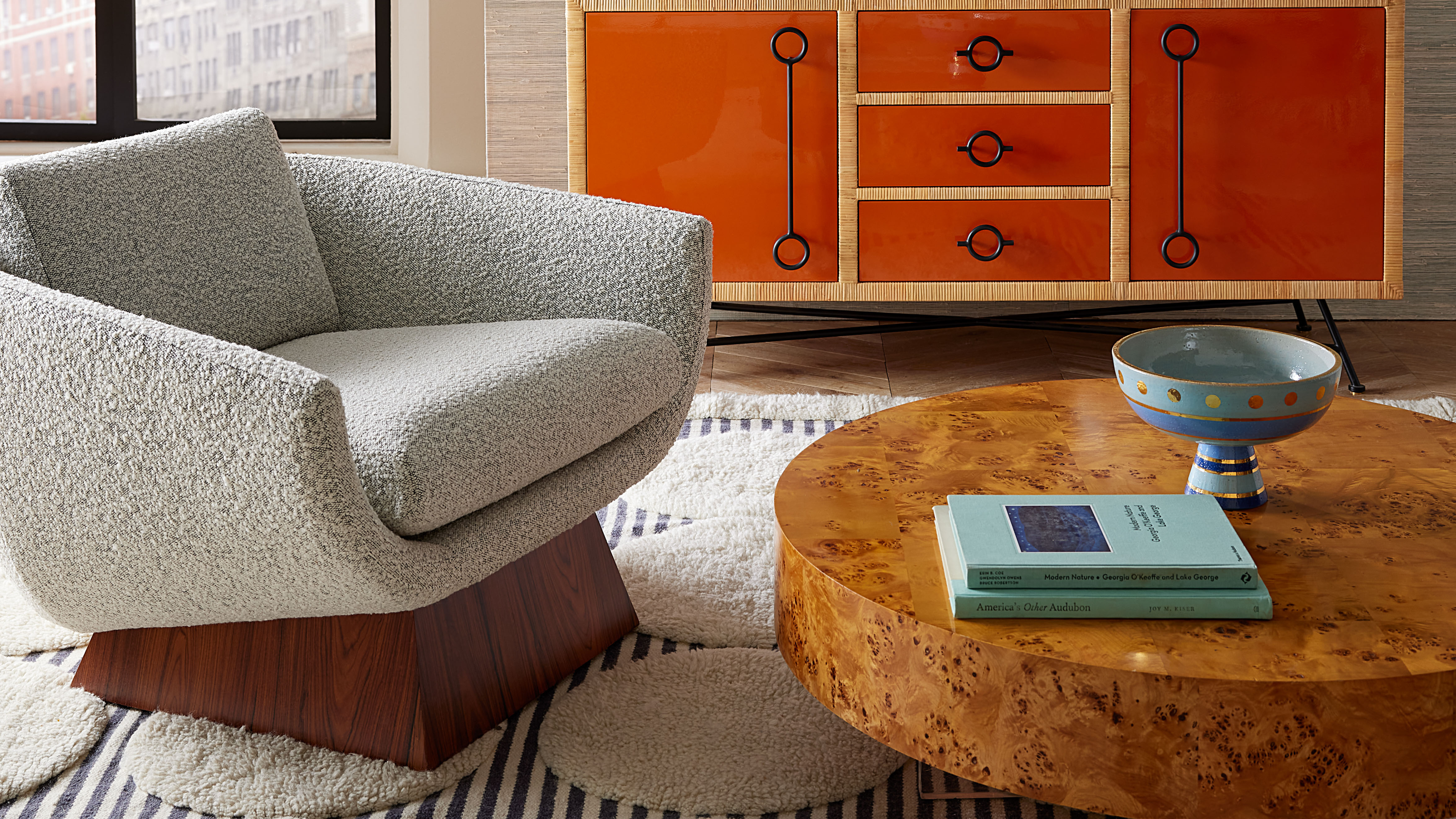 Burl Wood Decor Is 2025’s Most Coveted Comeback — Here’s How to Get the Storied Swirls for Less
Irregularity is the ultimate luxury, but you don’t need an antiques dealer to find it
By Julia Demer Published
-
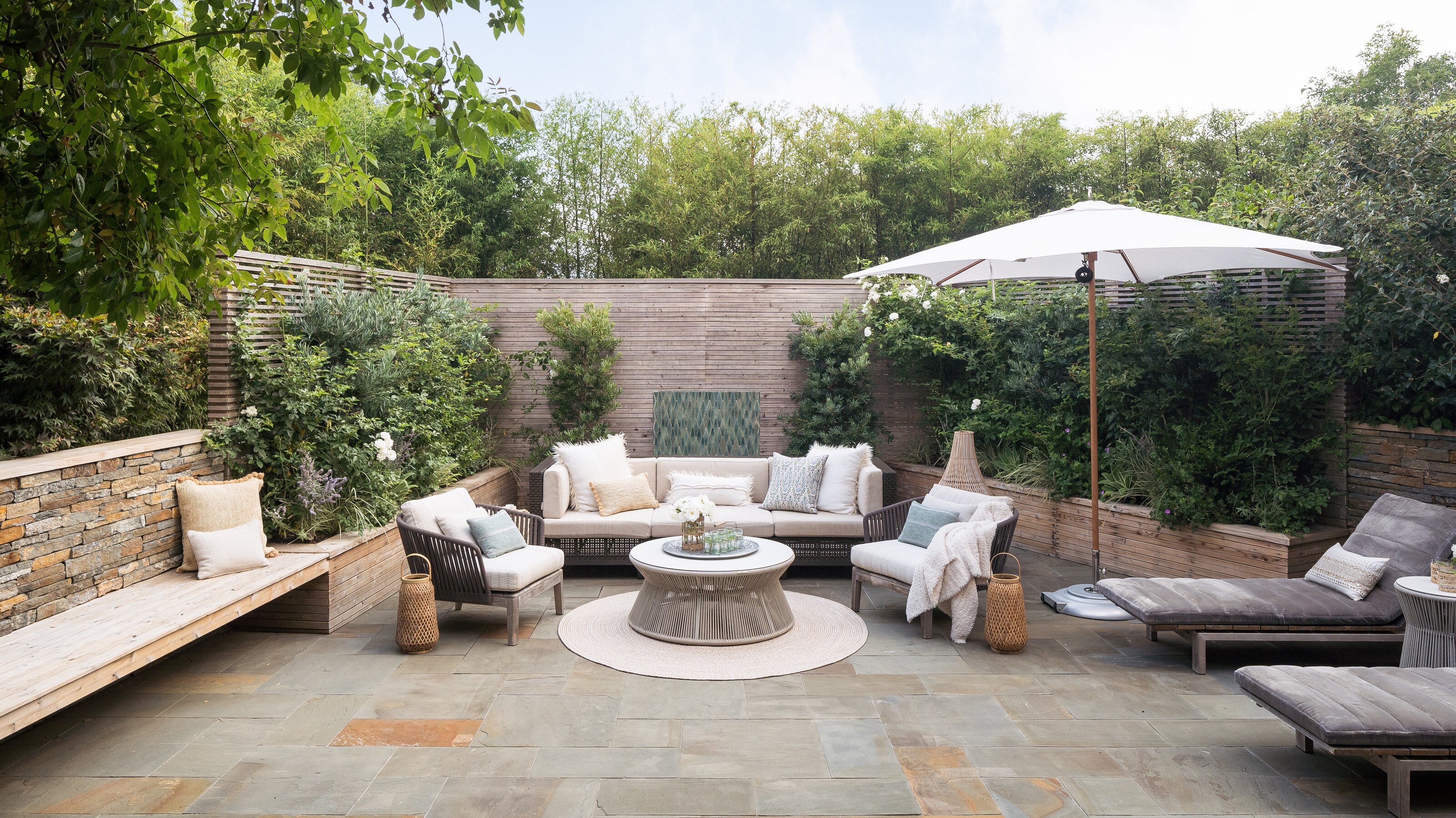 5 Garden Features That Instantly Add Value to Your Home — While Making Your Outdoor Space More Practical, too
Get to know all the expert tips and tricks for making your backyard a standout selling point for your home.
By Maya Glantz Published

