Colors That Go With Burgundy — 11 On-Trend Combinations for This Moody, Merlot Hue
Believe it or not, burgundy is a designer favourite. Here's how to bring it into your home — suggested paint shades, styling tips, and more

Oonagh Turner
Personally, I've always shied away from using burgundy in interior schemes because it was the color of my uniform in elementary school. But after Pantone announced 'Viva Magenta' as their color of the year back in 2023, I soon realized I had been missing out when it came to these sultry merlot-inspired shades.
Sitting somewhere between a red, brown and purple, it may surprise to you to discover which colors go with burgundy well, because there are actually plenty of them. It's just as capable of creating a cocooning and enveloping scheme as it is one that's dynamic, confident and trend-forward.
And just like colors that go with red, burgundy is actually a highly versatile shade. It complements earthy tones like taupe and beige just as well as it does pops of bright yellow and electric pink.
If you're feeling bold but don't know where to start when it comes to burgundy, you've come to the right place. I've found the answers to all the questions you may be asking, and plenty of interior inspiration pulled straight from designer's personal portfolios. I've found the paint colors to pair it with, and even sourced some styling advice from the professionals.
11 Burgundy Complementary Color Palette Ideas
It's safe to say, the burgundy color trend has been a designer favorite in 2024. Once I started looking, I found it everywhere: drenching dining room walls, bathroom cabinets, on furniture upholstery and as an accent color in all the most aesthetic schemes.
"With the shift towards warmer tones and more personalized color choices, burgundy and red-browns have seen a resurgence," says Benjamin Moore's senior manager for color marketing, Hannah Yeo. "While these moody hues might seem like a daring choice, they are surprisingly versatile, pairing effortlessly with a wide range of colors and materials."
1. BURGUNDY AND BLUE

While both bold and saturated tones, burgundy is a color that goes with blue, particularly in its most royal shade. The two tones can wonderfully offset each other and create a vibrant interior.
"Burgundy and blue work nicely if both colors are of the same value, so when pairing the two, consider a dark burgundy with a dark blue or navy, especially if the goal is to have the color scheme balance, with neither taking the spotlight away from the other," says interior designer Julia Mack.
2. BURGUNDY AND PINK
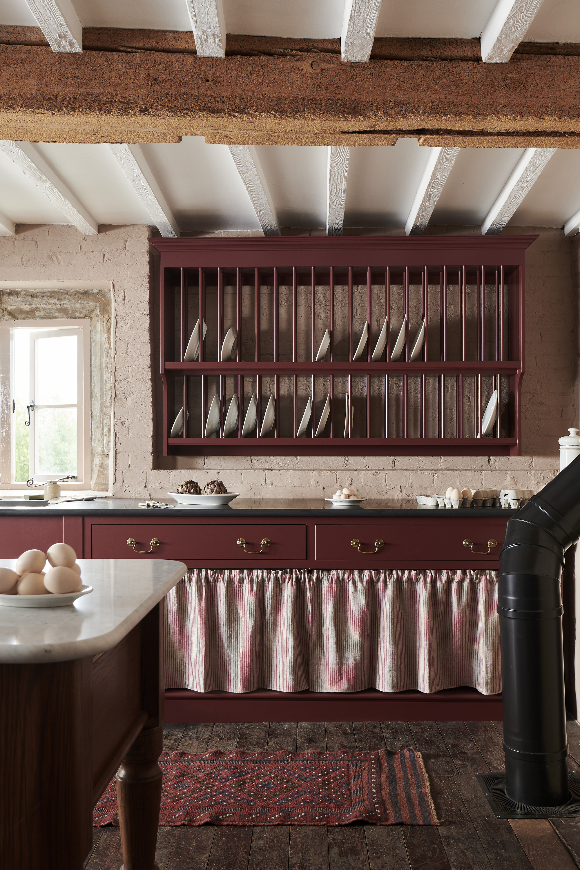
If you're decorating with pastels like soft, dusty pinks, a good way to ensure your scheme still feels grown-up is to bring in grounding colors to balance it. In this kitchen — part of deVOL's Heirloom Kitchen Collection — an earthy burgundy shade (the brand's own 'Refectory Red' paint color) picks up the same undertones of the subtle pink walls, while anchoring the room and giving it a level of sophistication and composure.
3. BURGUNDY AND BLACK
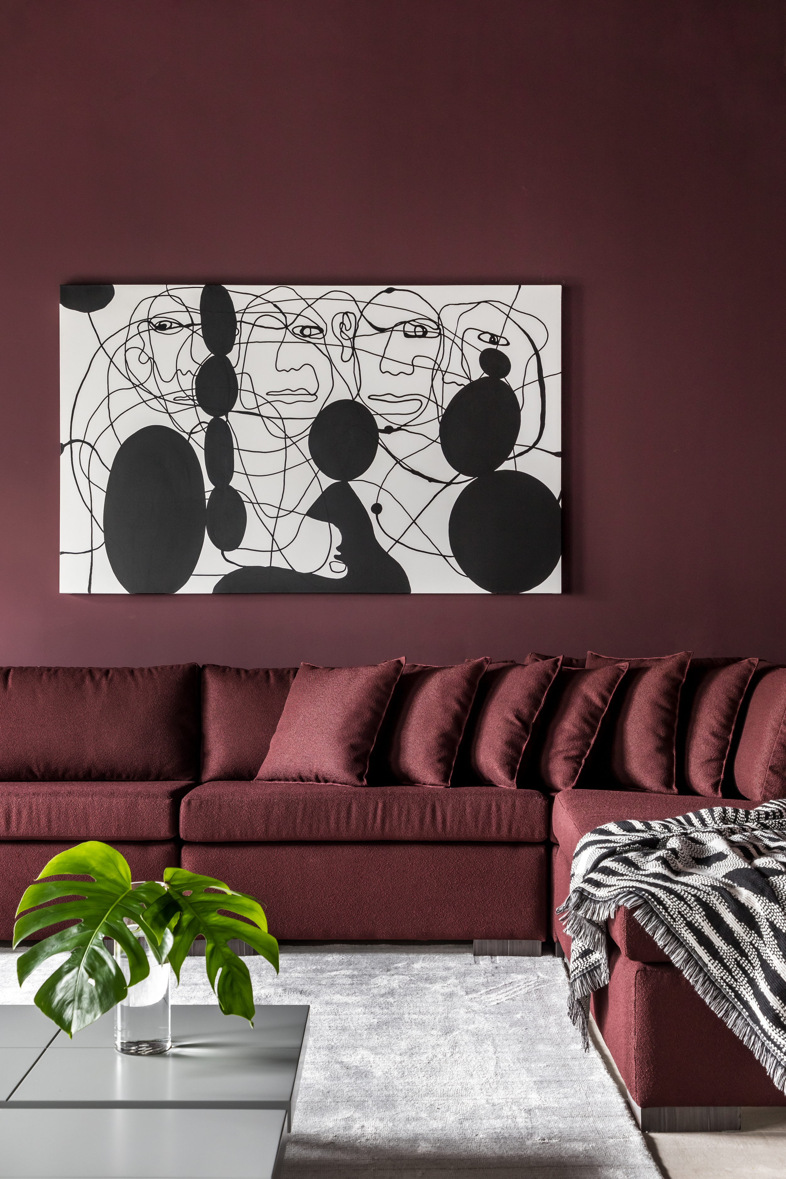
A black and burgundy palette is an easy way to up the drama in a space. Amongst the many colors that go with black, burgundy creates a moody and glamorous cave-like feel. Two dark tones create a layering like no other.
"The beauty of burgundy is it has a very interesting range of variations — from brown undertones to plums with more of a rosy purple feel to it," says Canadian-based interior designer Jane Lockhart, founder of Jane Lockhart Design. "There is also a 'blackened' burgundy where the color is super saturated with black, which can make an excellent alternative to blue-based blacks and gives a warmer, more luxurious feel. Burgundy is a color that almost always has a feel of luxury and history to it, given its naturally deep color value."
4. BURGUNDY AND TERRACOTTA
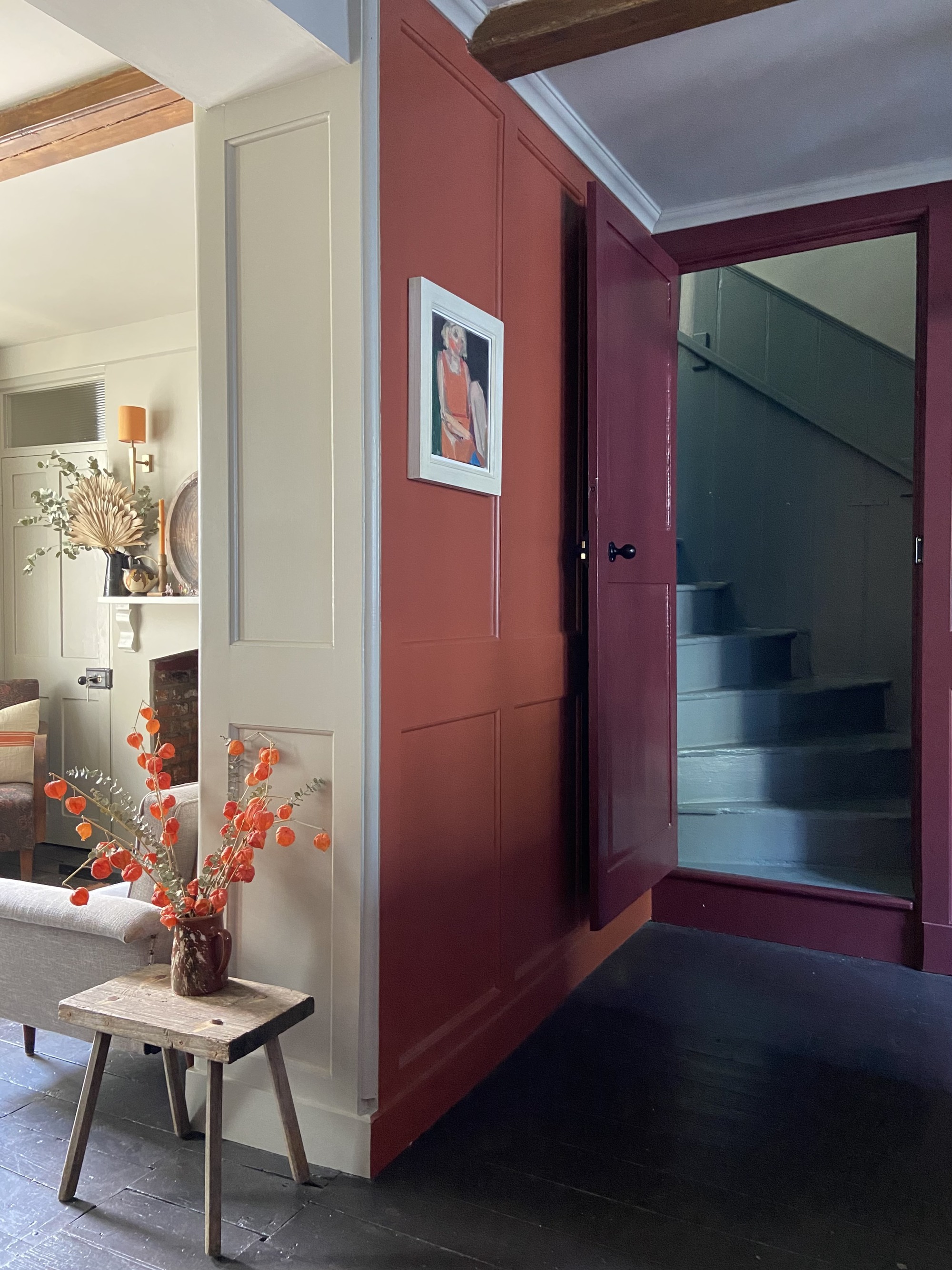
You can really highlight the red undertones of burgundy by pairing it with a subdued orange like terracotta, creating a real sense of warmth in a space. The reason burgundy works so well as a color that complements terracotta is because the two are so similar, and therefore create a monochromatic look.
"This is a dynamic color combo, and one that speaks of intensity and drama in a space," says Jane Lockhart. "A blue or pinkish-toned burgundy paired with a bright orange will help make the color hum when side by side. To lower the intensity of these colors together, select a burgundy with a deeper brown undertone so it blends more with the terracotta."
5. BURGUNDY AND BROWNS
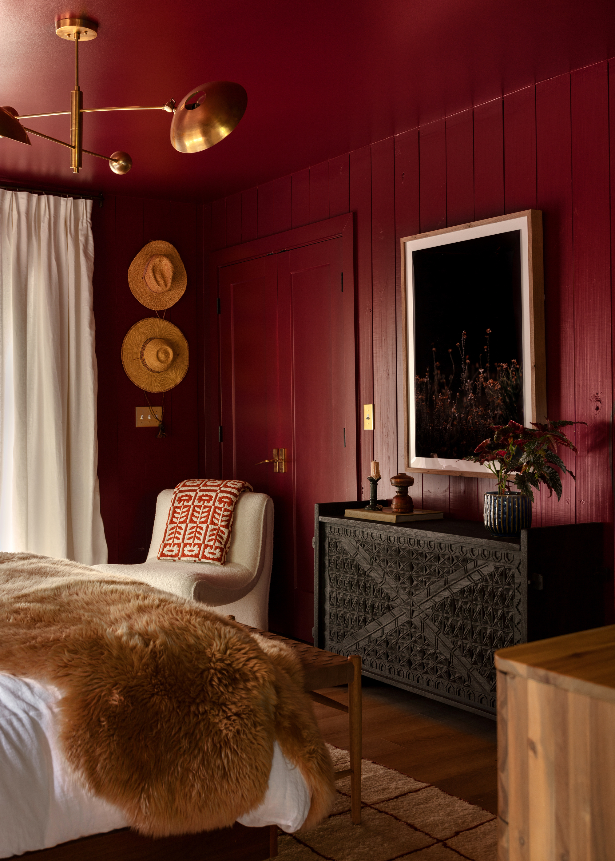
And that's all the browns, from caramels to tans, deep timber tones and even brassy bronzes. It forms the perfect backdrop in this bedroom by Northwest Arkansas-based design studio Meet West.
"Burgundy complements traditional architectural homes where it harmonizes beautifully with warm wood tones, like oak and walnut, creating a sense of warmth and coziness," adds Benjamin Moore's Hannah Yeo.
6. BURGUNDY AND BEIGE
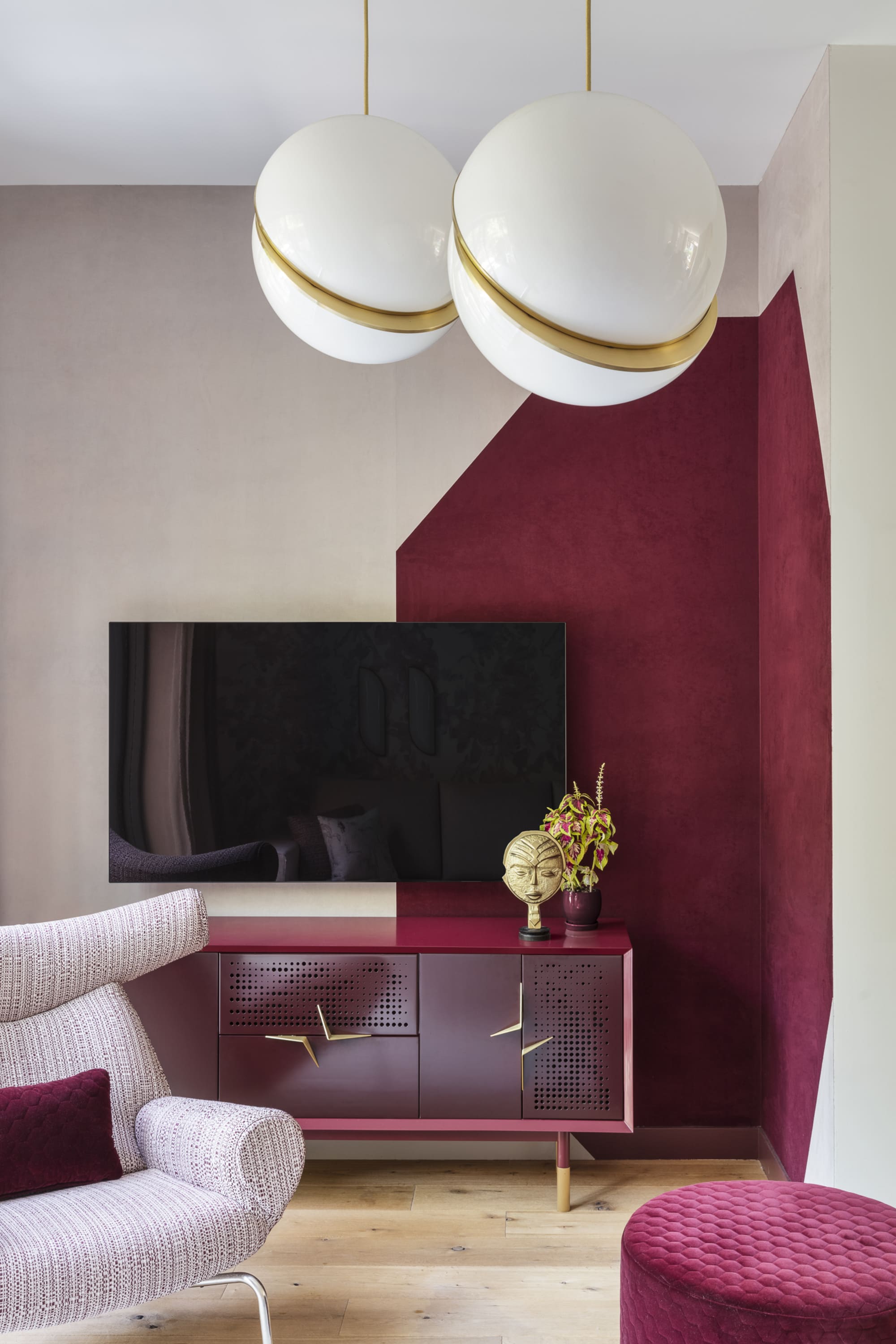
"Being a deep jewel tone, burgundy can be quite a moody color by itself," says Fanny Abbes, creative director and founder of NYC-based firm The New Design Project. And while white can be quite a start contrast, light, dusty tones like beige provide a nice balance.
"When paired with a lighter color or with brighter patterns, especially in a fairly bright room, it takes on another life whilst still keeping its intrinsic strong character, making it a focal point without being overpowering," adds Fanny.
7. BURGUNDY AND BRIGHT PINK
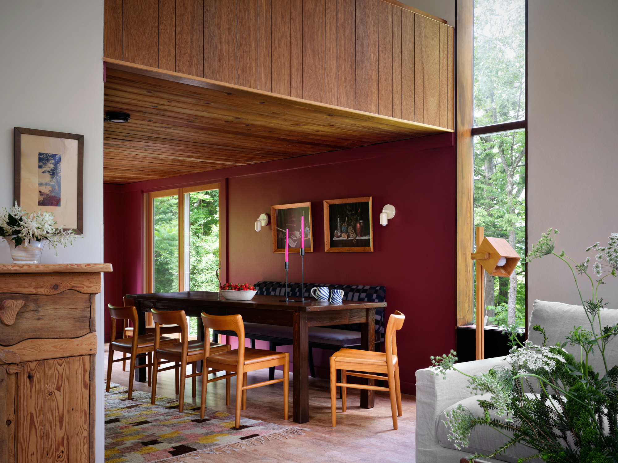
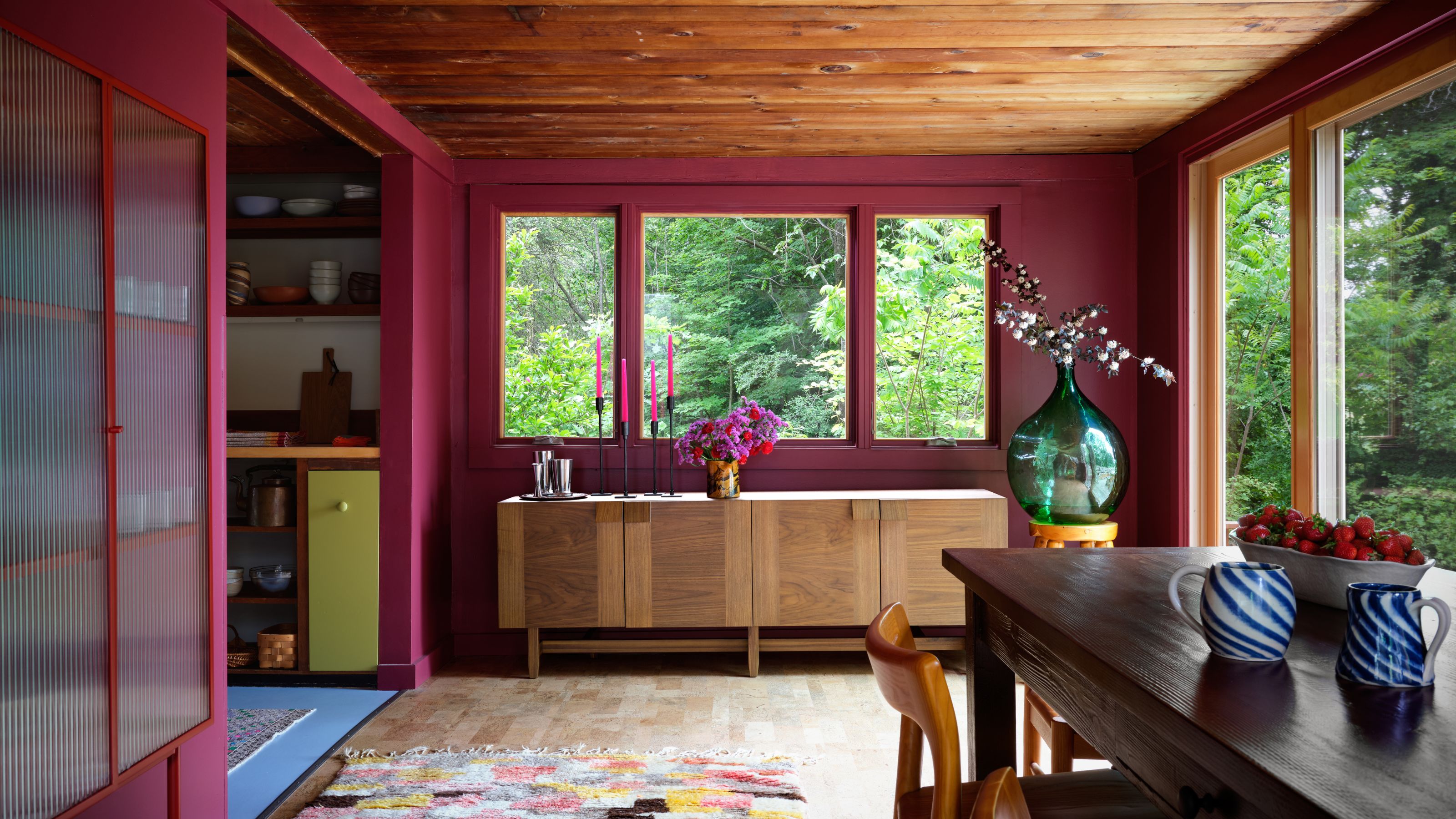
While we've already established that burgundy is a color that goes with soft pinks, it also has the intrinsic energy to balance more out-there shades, like hot pink. So, if you're looking for modern ways to decorate with pink, take this dining room scheme by Texas-based studio Avery Cox Design for example. The bright pink candles pop against the burgundy backdrop, complementing its red undertones and giving it a new sense of warmth and character.
8. BURGUNDY AND RED
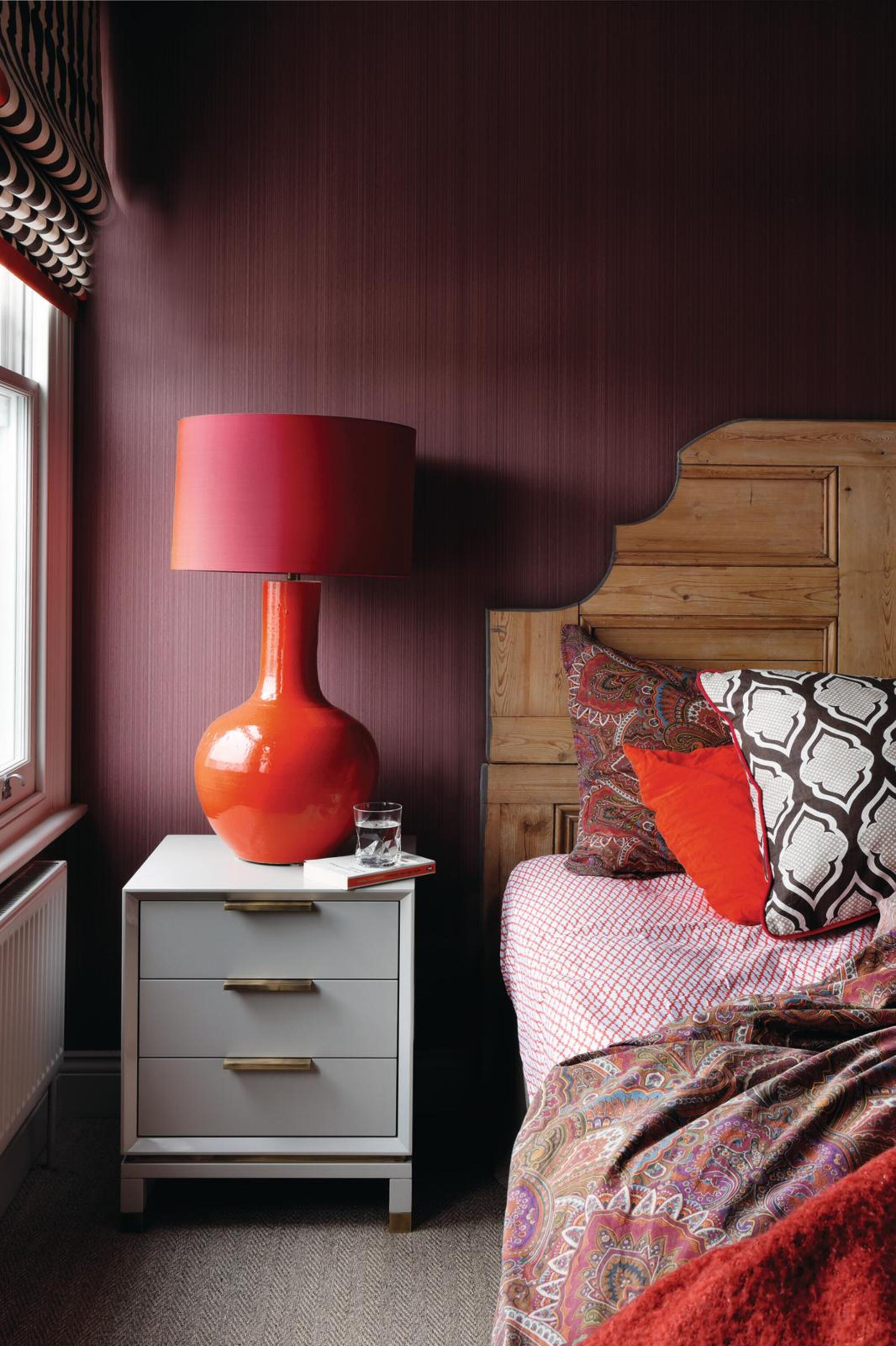
Sitting somewhere in the realm of a deep red on the color wheel, it should come as no surprise that it's one of the colors that go with red in all its shades. By pairing burgundy with other hues from the same color family, it can work to blend the color scheme, and keep your interiors feeling warm. In the bedroom above, a dark burgundy provides the perfect backdrop for the brighter red accents in the room.
"If you're looking for a big 'wow' factor for your room, consider a deep, dark burgundy for your walls, and pair it with red accents, keeping in mind that it's all in the balance, not the clash of warm colors," says interior designer Julia Mack. "The key is to add enough of a creamy white to the palette."
9. BURGUNDY AND GREEN
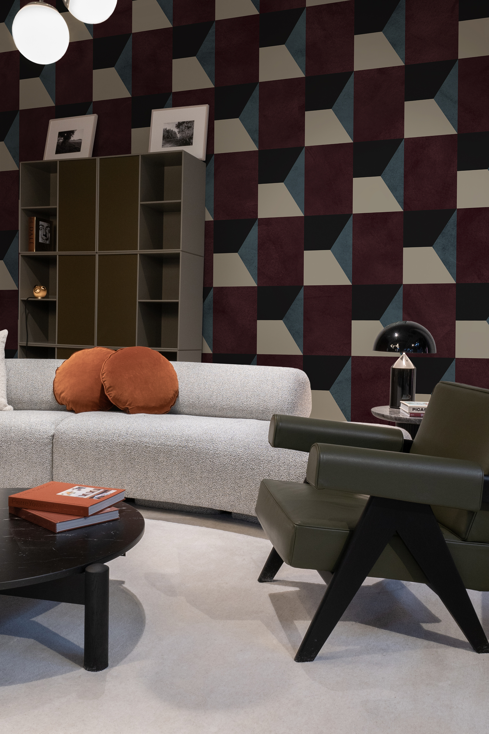
When thinking about what colors go with green, according to color theory and the color wheel, burgundy is one of the best. Opting for a dark tone of green — like a deep, muddy olive green — can work well as a combination, reminding us of nature and grounding the space.
"Burgundy with green is a timeless combination, seen in tartans, plaids, paisley, and floral prints from bygone eras," adds Jane Mack. "Burgundy and green naturally complement each other because they sit opposite one another on the color wheel. This means they intensify each other, which ultimately results in more visual energy within a room."
10. BURGUNDY AND GOLD
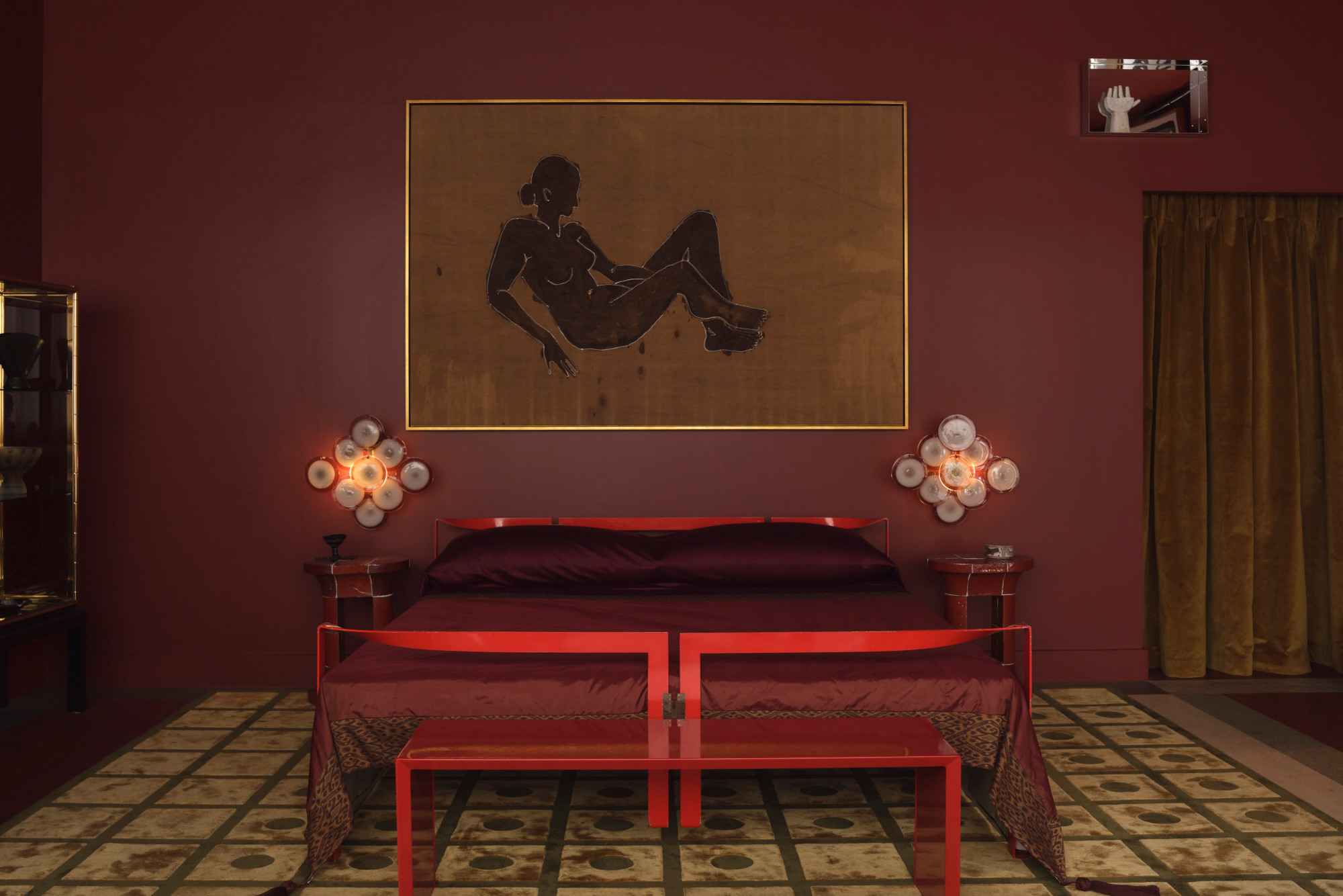
A deep-toned burgundy has an inherent royal, rich and sophisticated sensibility. An easy way to amp this up is to add to its charm by complementing the tone with metallic accents, like silver and gold. Tying in with its warm undertones, burgundy goes with gold beautifully, or glittering copper touches that add a little bit of omph. Just take a look at the bedroom above, by The House by M.A.H, that oozes luxury.
11. BURGUNDY AND YELLOW
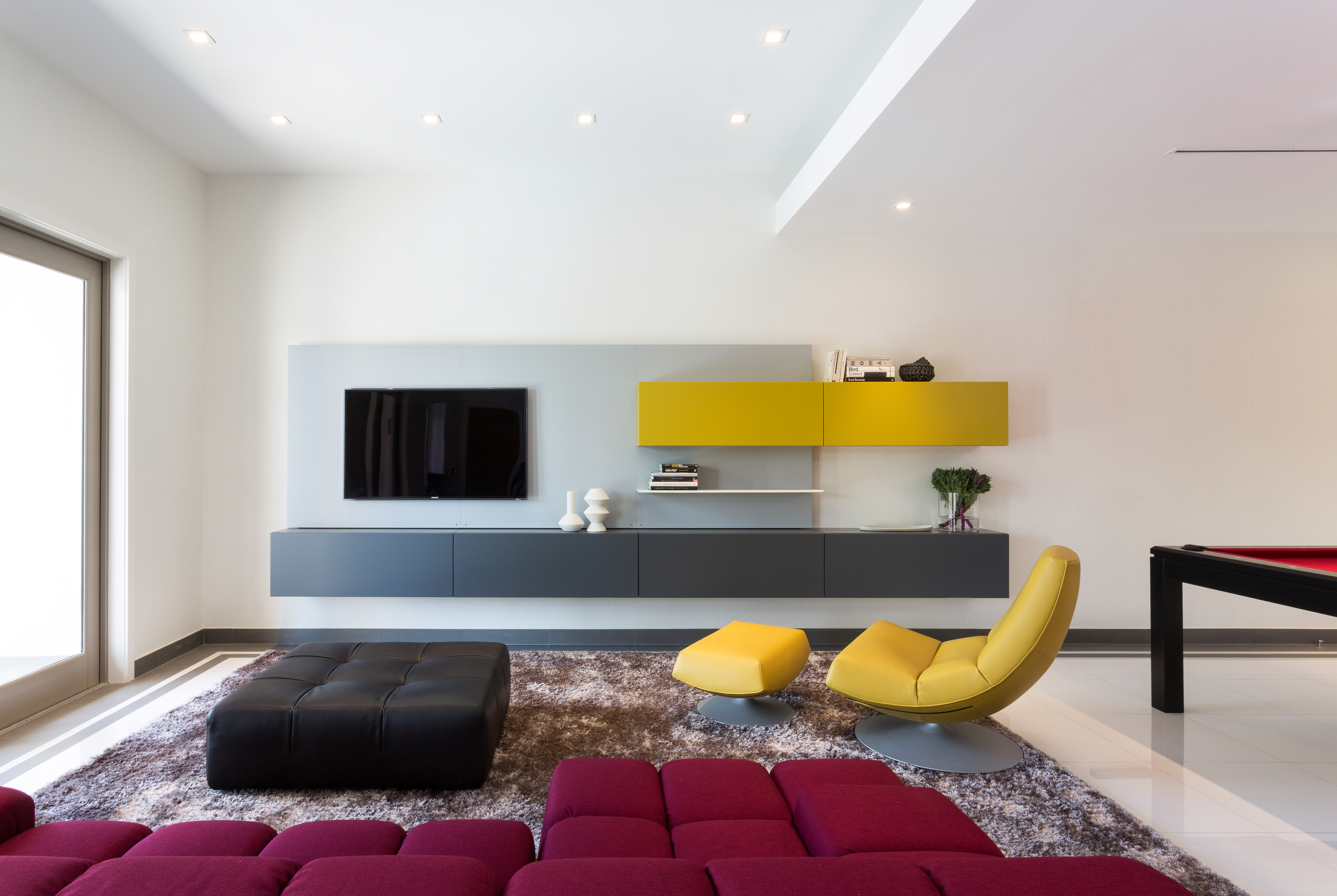
For an interior that is immediately striking and color-rich, consider a triadic scheme (or the 60-30-10 rule). This means combining three colors on the color wheel, for example: burgundy, navy blue and mustard yellow. Together, these tones can give life to a staid space and inject a fun energy.
"Our client wanted a bold and fun use of color in this living room," says Jacqueline Gonzalez Touzet, principal of Miami-based architectural firm Touzet Studio. "Her favorite colors were plum and burgundy, which are used throughout the house. For this particular assemble, we added chartreuse for another pop of color."
FAQs
How Do you Style Burgundy in a Room?
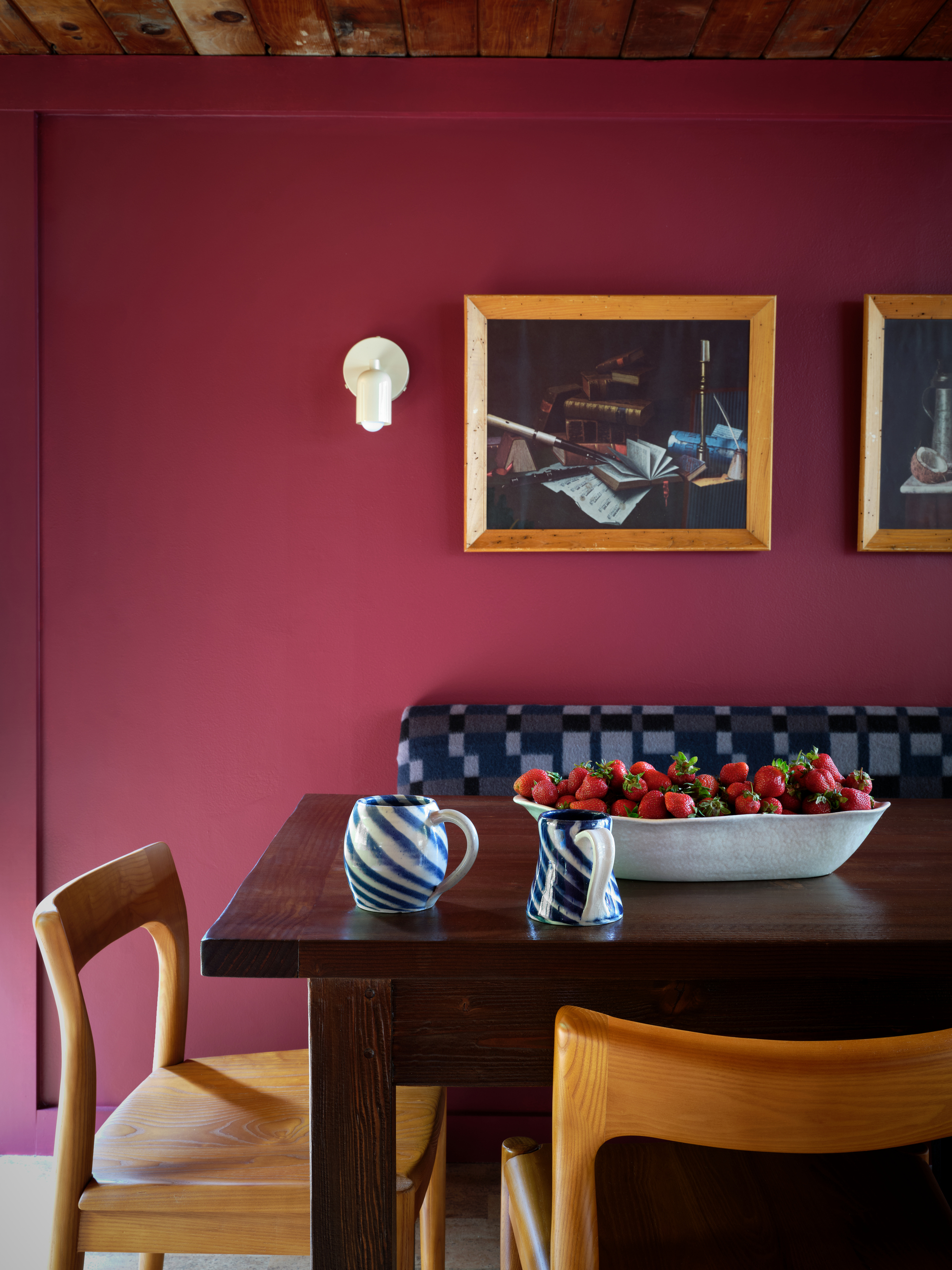
Here are a few quick tips and tricks for decorating with burgundy.
- Experiment with paint finishes — "High-gloss burgundy cabinets contrasted with crisp off-white trim not only elevates the space, but also exudes a sense of luxury," says Hannah.
- Use it as an accent on trims — "This deep hue also works wonderfully in highlighting millwork and built-ins giving them a more contemporary feel," adds Hannah.
- Pair it with an off-white — "It is imperative to select a white that is more of a tonal cream color to avoid a sterile, clinical look," says interior designer Julia Mack.
- Add glamour to the space — "When combined with an ornate marble fireplace, a jute rug and gold accents, the room gains rich texture and a touch of glamour," says Hannah.
- Layer it with lots of texture — "Think of burgundy on tweed, houndstooth, or a textural shag rug," says Julia.
What Are the Best Burgundy Paint Colors?
Here's how to bring one of the biggest color trends into your home.
What shade of blue goes best with burgundy?

For a more contemporary feel, you'll want to select a shade from the lighter end of the spectrum. "Pale blues, such as Benjamin Moore's 'Silver Mist' or 'Yarmouth Blue', introduce a light and airy contrast to deep burgundy tones, adding balance and sophistication," says the paint brand's senior manager of color marketing, Hannah Yeo.
"On the other hand, an inky blue like 'Midnight Blue' creates a dark, moody atmosphere that feels both formal and impactful, adding depth and drama to any room," she adds.
How do you make a burgundy color scheme feel cozy?
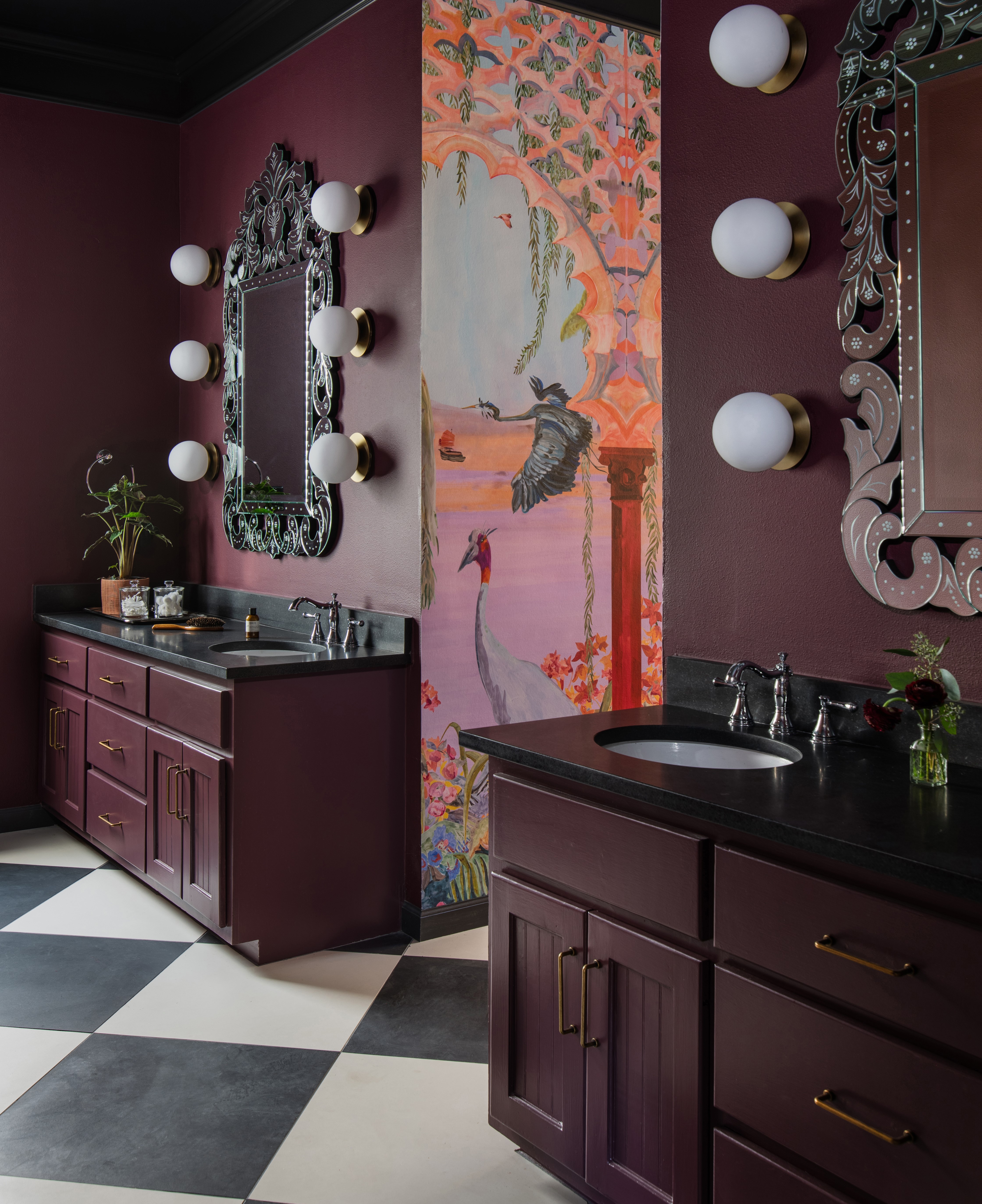
While the size of your space should be a consideration, the mood you are looking to create and the level of natural light are far more important to consider when creating cozy schemes. Dark hues like burgundy are ideal for introducing a real sense of opulence and warmth to a space.
To emphasize the coziness, consider adding a palette of richer colors to create a more cocooning feel. You could even try color-drenching the room, painting all the walls and ceiling in burgundy, or using a lighter shade on the woodwork and trims for some contrast.
What color flowers go with burgundy?
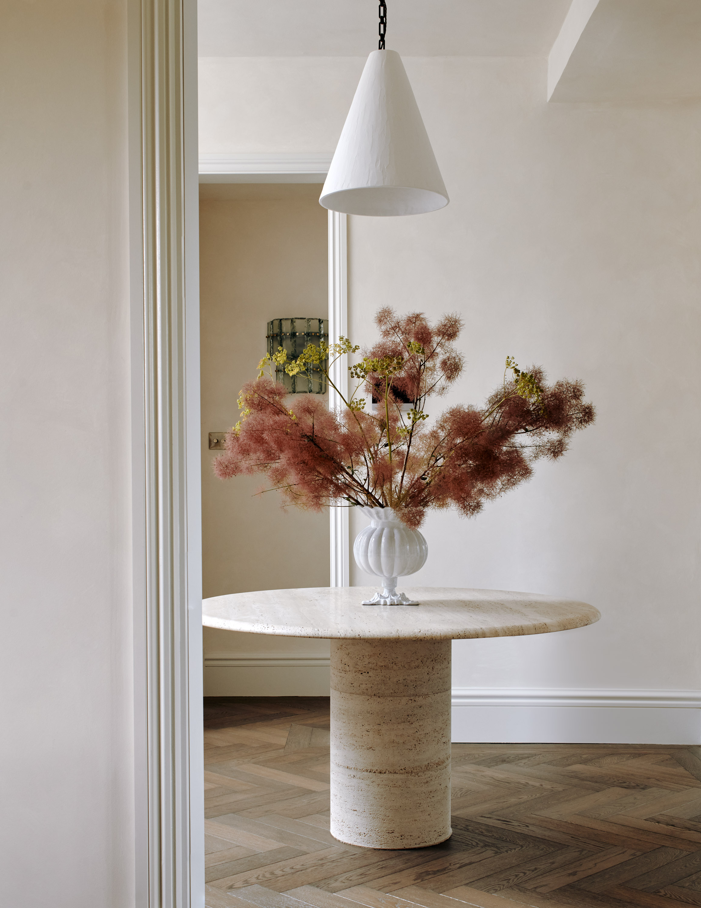
If you're thinking of styling flowers with either a burgundy-colored room, or burgundy furniture and décor, you can apply the same information shared above to determine what colors will work best.
If you're after specific varietals, consider roses, dahlias, ranunculus, and smokebush that often come in burgundy tones. Alternatively, peonies and hydrangeas often come in subtle shades that would complement burgundy tones, too.
Be The First To Know
The Livingetc newsletters are your inside source for what’s shaping interiors now - and what’s next. Discover trend forecasts, smart style ideas, and curated shopping inspiration that brings design to life. Subscribe today and stay ahead of the curve.

Emma is the Interiors Editor at Livingetc. She formerly worked on Homes To Love, one of Australia's leading interiors websites, where she wrote for some of the country's top publications including Australian House & Garden and Belle magazine. Before that she was the Content Producer for luxury linen brand, CULTIVER, where she nurtured a true appreciation for filling your home with high-quality and beautiful things. At Livingetc, she spends her days digging into the big design questions — from styling ideas to color palettes, interior trends and home tours. Outside of work hours, Emma can often be found elbow-deep at an antique store, moving her sofa for the 70th time or mentally renovating every room she walks into. Having just moved to London, she's currently starting from scratch when it comes to styling her home, which, while to many may sound daunting, to her, is just an excuse to switch up her style.
- Oonagh TurnerFormer Livingetc content editor and design expert
-
 The Easiest Way to Turn Your Designer Scarf Into Wall Art — No Frame, No Fuss, No Regrets
Because silk this pretty should never stay in a drawer
By Julia Demer Published
-
 Italian Kitchen Trends — 5 Emerging Ideas From the Chicest Italian Designers That I Predict Will Go Global in 2025
Fresh from Milan Design Week, these are the exciting finishes, styles, and innovative materials I can't wait to see in more kitchens this year
By Faiza Saqib Published


