
If purple wasn't previously on your interiors radar, we get it. But you'll be pleasantly surprised to learn about the colors that go with lavender and how this pretty hue can be given edge when used in the right way.
Just like the colors that go with purple, hues that pair well with lavender can be bold for dramatic contrast, or soft for a calming ambiance.
Often thought of as a go-to for kids' bedrooms, designers are now showing us how decorating with purple in its softest hue can be elevated to grown-up status and incorporated into a cool, trend-focused space.
"Lavender is all about tranquility and calm," says Linda Hayslett of L.H. Designs. "It has this magical ability to make a room feel serene yet sophisticated. It’s like a gentle hug for your space — soothing, but with enough personality to keep things interesting."
And the colors you pair it with can dictate the vibe you're going for. Molly Torres Portnof, of DATE Interiors, says: "Lavender is a pretty neutral, so pairing it with deep, rich hues can help elevate the palette."
Lavender is a trending color in 2025, and we're continuing to update this article with the matches that go with lavender that feel right for decorating now. And some of these combinations may surprise you.
1. Lavender and Grass Green

Lavender and green are matches found in nature, so they go together peacefully.
Lavender is a biophilic hue, so it pairs well with other colors from nature's palette.
"Like its botanical counterpart, lavender rooms evoke a sense of calm," explains Jeanne Barber of Camden Grace Interiors, adding: "Corals, grass greens, and cool-toned blues all complement lavender beautifully."
The stylish bathroom by Banner Day Interiors above shows how grass green in the Schumacher Thistle wallpaper makes a chic and cozy accompaniment, and proves that lavender is a color that goes with green.
Clara Jung, of Banner Day Interiors, says lavender can be "something small to serve as an accent or a highlight in a room," but adds: "However, it's even nicer to have it take a larger role such as tile, accent furniture or window treatments."
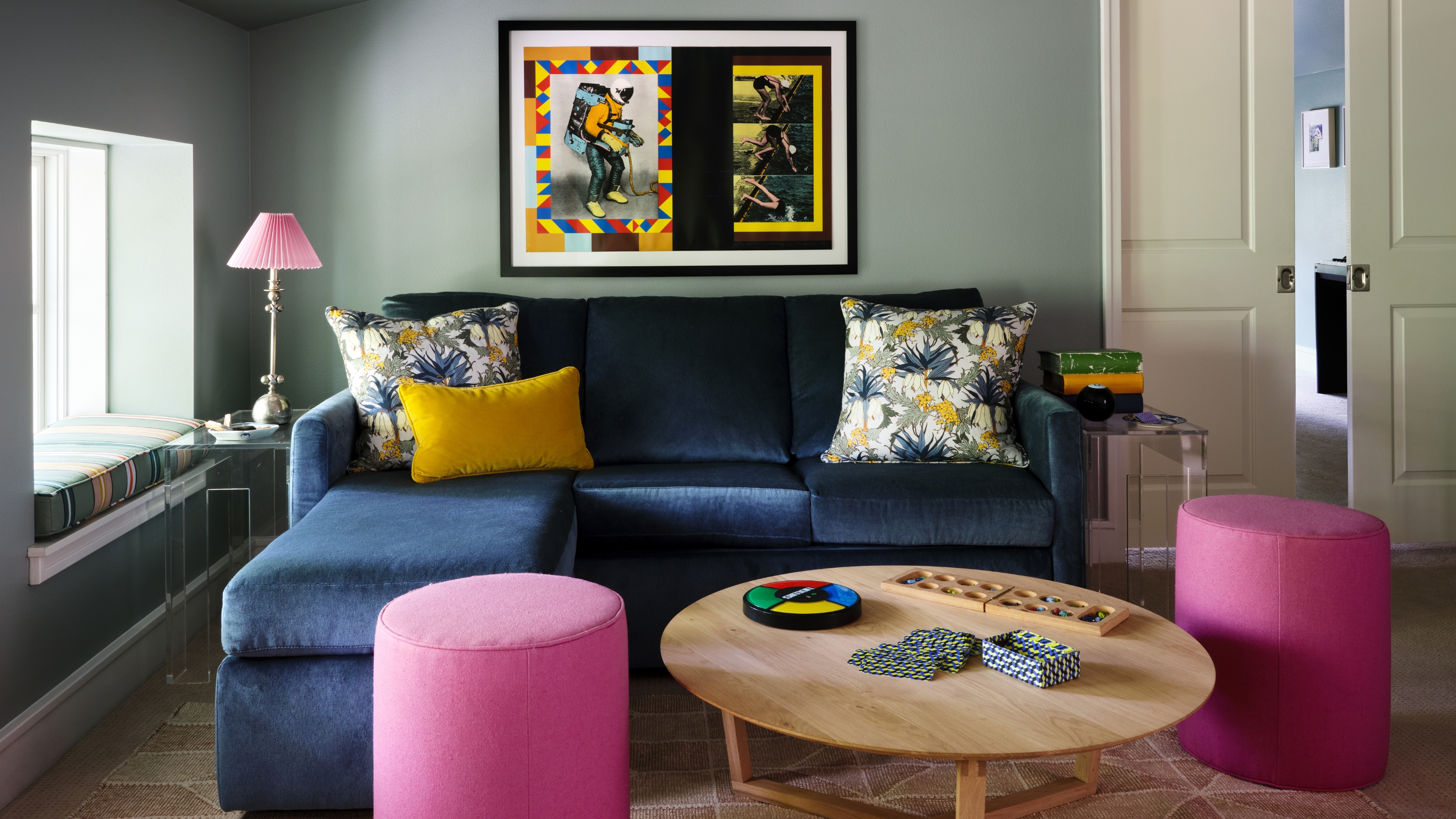
2. Lavender and Royal Blue

This combination with lavender can feel young and fresh.
Purple is a top choice for colors that go with blue, and a rich royal blue will add a visual pop while maintaining a relaxing atmosphere.
"Soft, cool lavender and deep royal blue hues are a calming color combination that feels very effortless," says DATE Interiors' Molly Portnof.
Throw in a blush pink for the perfect tertiary color, says Molly, as seen in the office above. "The soft lavender and pale pink tones act as a neutral base for the deeper, more saturated pops of blue," she says.
3. Lavender and Charcoal Gray

This textured limewash lavender wall helps tie in with the gray veining in the marble.
Proving that lavender can be moody and dramatic as opposed to saccharine and sweet, this modern bathroom by Wendy Labrum Interiors oozes upscale sophistication.
"We like lavender that isn't too sweet and feels a little moody and organic," says Wendy. Marble makes a fantastic partner for lavender, elevating any space with its timeless, chic aesthetic. The deep streaks of charcoal help add edge to the room above and echo the deeper lavender hue, and is picked out cleverly again in the vase.
"Natural linen tones, dark charcoal, and ivory accent lavender nicely."
And if you're looking for a darker lavender, what's a good paint to pick? "Go for a lavender with gray undertones to create some nuance and avoid your room feeling like an Easter Egg," says Jeanne Barber.
"For a light lavender, we love Peignoir by Farrow & Ball. For a darker lavender, try Hazy Lilac by Benjamin Moore."
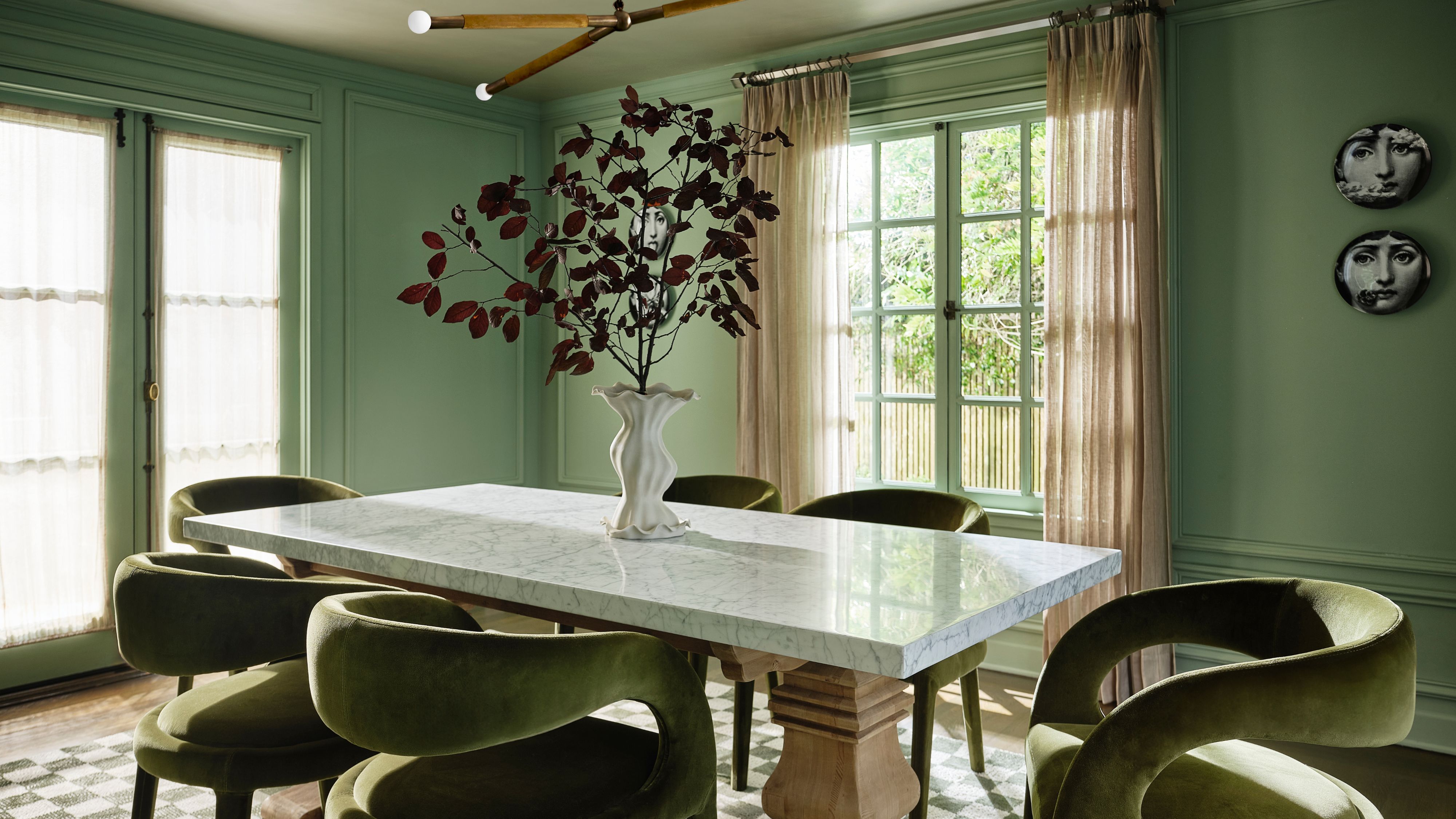
4. Lavender and Red

Red is a bold and unexpected combination with lavender.
TikTok's viral 'unexpected red' theory introduced us to the notion that actually all colors go with red, so why not lavender? Well, if this living room scheme by Danish paint brand File Under Pop is anything to go by, the colors certainly complement one another.
Sitting close to one another on the color wheel, red and lavender go together in theory, but in practice, it's probably best done with small pops of both shades. It's a bold pairing, but when done well, it can be a beautiful one.

This deep, rich red color creates a warm and luxurious feel. The full, darker tones of this shade will make any space feel welcoming.

This stunning golden yellow creates a warm pop of color. The dusty, mustard tones really elevate the traditional yellow shade.
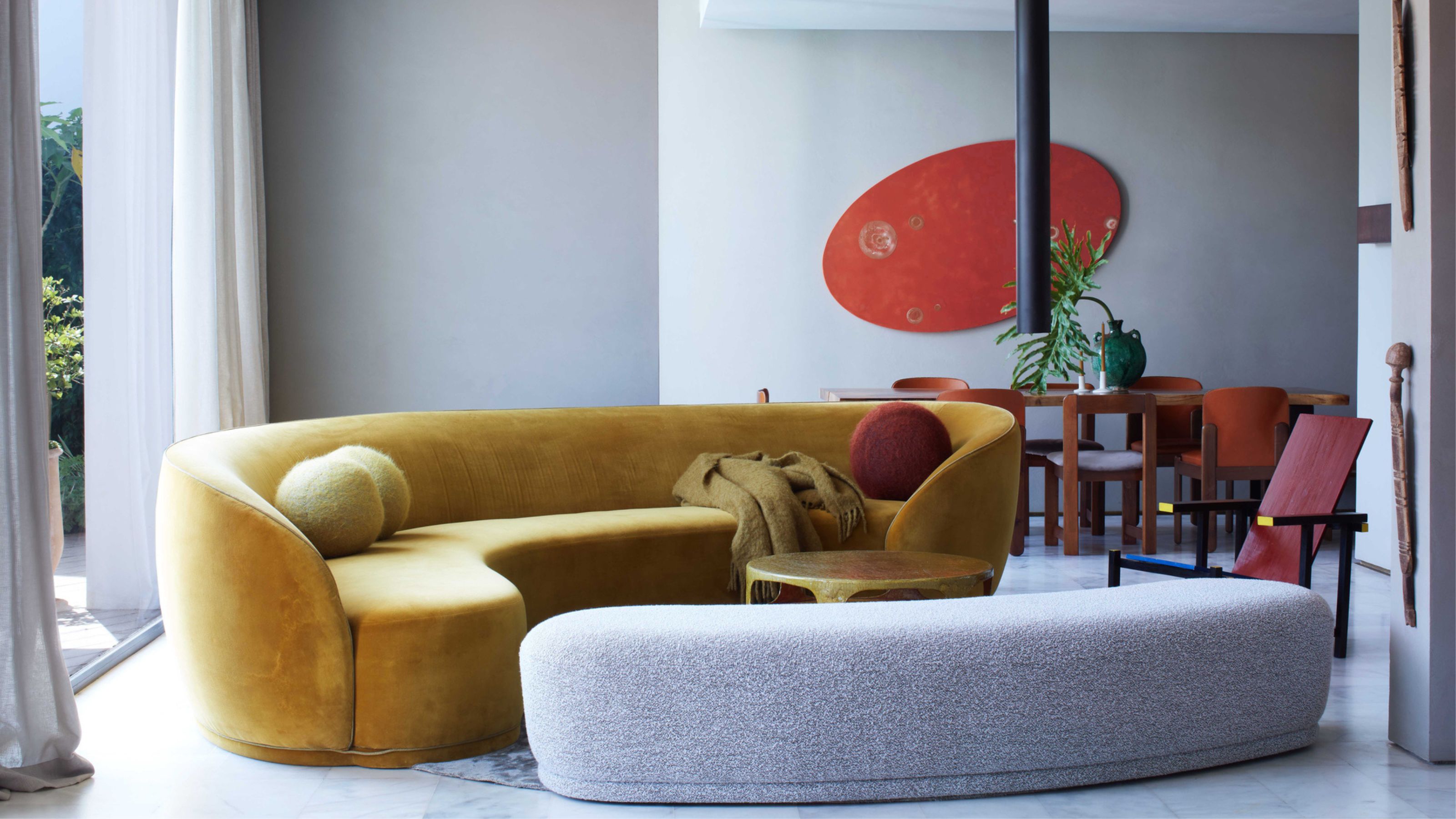
5. Lavender and Gold

Gold paired with lavender elevates it out of kids' room territory.
Whether it's a gilded frame or golden-toned timbers, this one makes for the most romantic of pairings. Reminiscent of classic regency-inspired interiors, it has a soft feminine touch that can also easily be modernized.
In the lavender bedroom idea shown above, interior designer Colleen Simonds has perfectly paired a barely-there lavender paint color with warm golden hues, through the timber frame, bamboo curtain, gilded gold mirror and brass floor lamp.
6. Lavender and Navy

This living room introduces the lavender and navy color pairing throughout the scheme.
Purple and blue are analogous colors, meaning they sit next to each other on the color wheel, helping this pairing lend itself to a calm, subtle scheme. Using lavender as a color that goes with navy blue creates a gentle but effective tonal contrast, and allows whichever is the accent color to pop.
"This is a wonderful way to bring in tonal play without being too literal," says Sarah Rosenhaus. "The richness of navy paired with lavender creates a sophisticated mood."
Because it's not too stimulating, lavender and blue is an ideal palette for a bedroom or living room, where you're looking to unwind. In the scheme shown above, Maryland interior designer Stephanie Bradshaw pairs the duo with gray, and because of their tonal similarities, lavender actually shares many of the same colors that go with gray, making these three colors a truly beautiful combination.

This beautiful, deep blue color has a rich feel to it. It is a classic shade with full ocean blue tones.

This earthy, terracotta shade will warm up any space. The burnt orange tones create a rich, full color.
7. Lavender and Orange

Orange might be the most unexpected color match for lavender on this list.
This pairing makes use of the idea of contrasting hues in color theory: the idea that a deep or bold color from one part of the wheel can be used with a lighter, more subtle shade from another part for an effective scheme. As shown in the above space by Australian architectural practice Hindley & Co, the effect can be striking. Lavender as a color that goes with orange? Who knew!
"When orange is mixed with warm lavender, it infuses a burst of cheerful optimism into an otherwise tranquil space," says New York-based interior designer Lisa Frantz. "It’s also great for dining rooms to create a welcoming environment and stimulate conversation."
8. Lavender and White

Lavender goes surprisingly well with monochromatic color schemes.
Thanks to its subtlety, lavender makes for a gentle but effective pairing with white — as the above scheme by Hindley & Co shows. "Lavender and white with bits of black is a favorite color combination of mine," says Lisa Frantz. "Depending on how it's used, it can evoke an Art Deco or Hollywood regency vibe yet still feel fresh and alive."
But need the right shade of white to make this duo work. "Depending on the strength of lavender, at the paler end, opt for cleaner whiter shades to partner with — nothing too drab as this could look dirty rather than empathetic!" says Patrick O'Donnell. "Something like our delicate 'Peignoir', a pale-ish lavender/gray colour with muted qualities, would look wonderfully simple teamed with 'Strong White' on your trim and ceiling."
For a cooler, more contemporary scheme, you'll need to choose your lavender wisely too. "Lavender is a perfect addition for clients who want a gentle 'pop' of color in a more neutral environment," says Ashley Macuga of San Carlos design studio Collected Interiors. "One of the challenges using lavender is making sure that it doesn’t present too 'nursery' in adult spaces. One of our favorite lavenders is Sherwin William’s Imagine, which has a very gray base, ensuring that it looks charming but still sophisticated."

With its cool, grey undertones, this white can be paired with any color effectively. The sophisticated nature of this colour makes is a staple in any home.

Safe Play is a perfect neutral beige with natural undertones. This shade will complement any color and is perfect for both modern and traditional interiors.
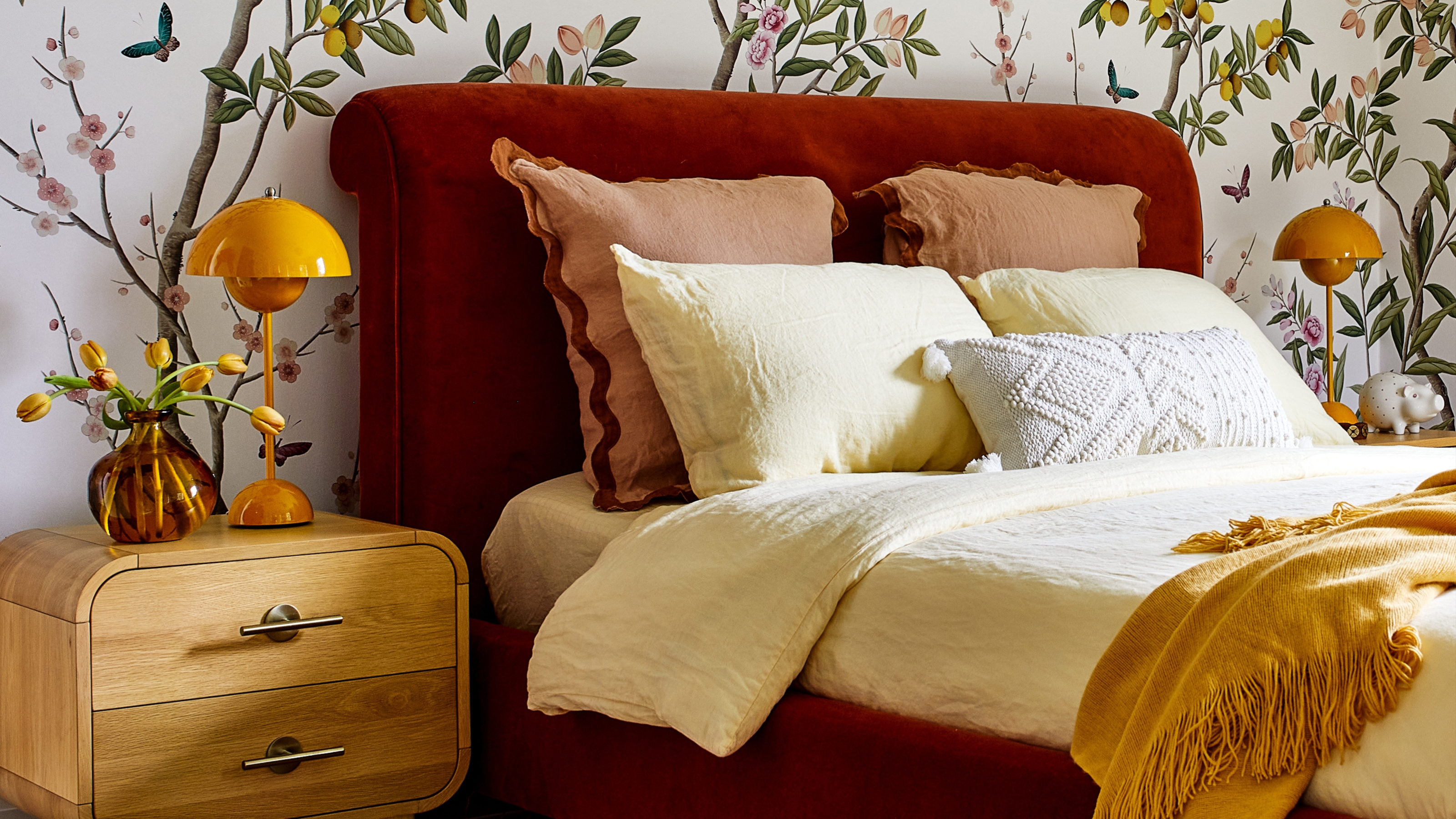
9. Lavender and Beige

Beige is a warming neutral pairing for cooler lavender.
Finding colors that go with beige isn't always as easy as it seems, but thanks to lavender's balance of warm and cold undertones, it's a natural duo that provides a twist on a classic neutral scheme.
"It’s a tick-up from a traditional neutral color combo, where the lavender becomes the star and creates a subtle play of warm vs. cool against the beige," says Sarah Rosenhaus.
In the bedroom shown above, designed by Luke Ferran of New York design studio Kevin O'Sullivan, layers of purple through the cushions and bed base allow the light lavender walls, along with the beige headboard and the wood panelling, to play a role as a neutral — a clever way to twist this color on its head.
10. Lavender and Yellow

For the more color-confident, lavender and yellow is a particularly interesting pairing. It's also, it seems, a controversial one — not all of the designers we spoke to agreed on it. "I find it challenging to pair lavender with vibrant warm colors like red and yellow," says Lisa Frantz. "I tend to avoid them — unless I'm using lavender for a children's space and just want a snappy explosion of colors!"
Still, there are ways to make this combination work if you enjoy the energetic vibe it brings. In the above scheme by the San Francisco-based interior designer Kevin Sawyers, a personal 'color theory' makes it work. "One of my go-to approaches for color combinations is a clean color with a dirty color," he explains. "One color should be clear and have no black or gray in it, whereas the other should be slightly muted or muddy. Here, the lavender is clean and the yellow is muted, leaning toward a mustard/gold/ochre."
"I love pairing lavender with just about any color, but it works particularly well with yellow as they're opposite each other on the color wheel," adds Kentucky-based interior designer Bethany Adams. "I always like to match the intensity of the hues, however." She points to a project where she paired deep lavender walls of a bedroom with a strong, monochromatic yellow canvas — a scheme that feels ultra contemporary and unexpected.

This rich, mustard yellow color brings a happy brightness and earthy richness to any space.

This stunning olive green color will add an earthy, yet modern wash of colour to any interior spaces.
11. Lavender and Olive Green

Olive greens get a boost against a lavender backdrop.
Purple is a great choice if you're looking for colors that go with green, so it follows that lavender can offer a softer twist on this duo. Whereas deep aubergines and plums look dramatic paired with earthy or gem-like green shades, lavender finds a comfortable match in a similarly lighter hue.
Of course, interior design is about bending the rules as much as following them, and we've also seen examples of pink-tinged lavender paired with more vibrant green shades — it's a particularly interesting combination in a kitchen.
12. Lavender and Mint Green

An all pastel scheme makes lavender take on a different character.
But, believe it or not, one of the best shades of green to style with lavender is one that comes in an equally soft form. Yes, lavender is one of the colors that goes with mint green.
"Lavender and green are on the same side of the color wheel," explains Lisa Frantz. ‘Lavender works best when used with soft pastel greens — it’s a great color combo for bedrooms to create calming respite.’ Take the bedroom shown above, for example.

This turquoise-blue color, with its yellow and green undertones, adds character and fun to the space.

Budapest pink is a gorgeous, dusty pink that adds a subtle glamour, without being too harsh or overpowering.
13. Lavender and Pink

Pink and lilac make a more romantic color match.
If lavender and pink feels too sickly-sweet, don't scroll away just yet — there are ways to make this scheme feel sophisticated rather than childish. "This is a very youthful color combination, perfect if you are looking to create a sophisticated space with levity," says Sarah Rosenhaus. "Alternatively, we love to keep things tonal and gravitate to a combo of lavender, mauve and aubergine."
In the bedroom scheme above by Pennsylvania-based designer Rasheeda Gray, lavender walls and pastel pinks are tempered by rust-colored curtains and a gray-blue ottoman that grounds the scheme.
"Selecting the right shade depends on the feeling you want to give the space," Rasheeda explains. "In this bedroom, the soft rosy-pink makes the space feel warm and cozy, but it doesn't overstimulate your senses despite its pastel appearance. It is a shade that can be mixed with other colors easily without drawing too much attention away from it — especially colors like lavender."
FAQs
Does Lavender Go With Every Color?
According to Linda Hayslett, of L.H. Designs, lavender is a "surprisingly versatile" hue and pairs well with most colors.
"There are a range of colors that pair great with lavender," she says. "Soft grays and creamy whites keep it elegant, while deeper charcoals add a bit of drama.
"For something more vibrant, try pairing it with muted greens or even a touch of gold for that perfect hint of luxury."
Wendy Labrum suggests lavender "pairs well with warm golds, mustard, creamy tones, and metallics", while Clara Jung says lavender "plays really well with reds and oranges", thanks to their warm, inviting tone that creates an interesting contrast.
Does Lavender Go With Silver or Gold Best?
So, you've found your perfect color pairing with lavender — but what about your finishes? Mixing in metals can prove one of the trickiest parts of a lavender-based scheme.
‘I would opt for metals that have patina and character and a bit of warmth,’ says Sarah Rosenhaus. ‘Think copper, unfinished brass, bronze and verdigris. Lavender is already quite cool, so I would shy away from any metals that lean toward silver, chrome, or stainless tones.’
If you do prefer metals on the cooler side, consider nickel as a compromise. ‘When pairing lavender with a metal, we love using polished nickel,’ says Ashley Macuga. ‘The warmer undertones offset lavender’s natural coolness, adding more of a layered depth to the design.’
What Colors Should You Avoid Pairing With Lavender?
The key when using lavender in your home is to style it with colors and textures that enhance its soothing qualities and draw out its subtle warmth, explains Californian-based designer Sarah Rosenhaus. "I wouldn’t avoid any particular color with lavender, but I would be cautious of using hues that are too bright or primary. Instead, opt for rich earth and jewel tones that enhance the quietness of lavender," she adds.
"The spectrum of lavender from the lightest blush to darker, bluer-toned purple is a broad family and used wisely can be an interesting alternative to pinks and blues," adds color expert and Farrow & Ball ambassador, Patrick O’Donnell. "But just err on the side of caution and get the tone right as it can be on the chilly side."
What is the best lavender paint color for your home?

Clockwise has a subtle lilac undertone that elevates this shade of purple. This colour would add character to any space.
-
 Color-Soaked, Culture-Rich, and Anything But Cold — This San Francisco Dining Room Has It All
In her own 100-year-old San Francisco home, designer Anu Jain brings together historic architecture, global references, and a shade of green you won’t forget
-
 This New Zealand Designer's Textural Creations Bring This East London Showroom to Life — "Every Piece is Unique"
In "all in each", artist Grace Atkinson's textile works appear alongside iconic 20th-century designs in a poetic exploration of "perception, intimacy, function, and form"


-
 This Is When It's a Mistake to Use Color Theory to Decorate Your Home — "It Can Quickly Become a Distraction"
While it's a good idea to take inspiration from, is navigating the complex rules of theory around color more trouble than it's worth?
-
 Do Red and Yellow Go Together? Designers Share How to Make This Punchy Pairing Feel Soothing Rather Than Intense
These primary colors might seem like they'd clash, but get the levels right, and designers say this combination can look remarkably classic
-
 5 Butter Yellow Paints That Designers Swear By — So You Can Get This Trending Color on Your Walls With Confidence
Butter yellow is everywhere, but picking a paint shade can be a big commitment. To help, we asked designers to share their favorite shades
-
 What Does the Color Yellow Mean in Interior Design? A Color and Design Psychology Expert Explains
Whether you love or hate it, yellow always seems to elicit a strong reaction from people — here, we explain why
-
 Should a Living Room Be Painted Dark or Light? We Asked Design Experts to Settle The Age-Old Debate
The color of your living room can completely shift the mood of your entire home, so the question remains: should you go light or dark...?
-
 I'm Sorry, But You Need to Know About 'Advancing and Receding Colors' If You Want to Get Your Home's Decorating Scheme Right
While some colors tend to pop and reach forward in a room, others draw back. Here, a color expert helps define these palettes and how to use them
-
 Amethyst, Heather, Pansy, Plum — Turns Out Decorating With Purple Opens You Up to a World of Possibilities
Purple certainly isn't a color for the faint hearted, it's a shade that can smell your fear. Here's how to conquer it through your interiors
-
 Here's Why Decorating With Mustard Yellow Helps Fill Your Interiors With a Sense of "Confident Calm"
There is so much more to decorating with this turmeric-tinted sauce-wiggled-on-a-hotdog not-quite-yellow shade than meets the eye


