14 Colors That Go With Sage Green — Serene Color Pairings Interior Designers Always Use
Designers have dubbed sage green the 'new neutral' for its versatility and calming effect – here's how to pair it

Lola Houlton
If you're drawn to serene, calming spaces, sage green – and the colors that complement it – deserve a place in your home. According to color experts and interior designers, this soothing shade has an inherent ability to create a relaxing atmosphere while still feeling uplifting — but only if you get its pairings right.
Decorating with sage green means using a versatile "new neutral" that pairs beautifully with a wide range of hues, offering so many possibilities for creating harmonious color schemes. So, whether you're designing a cozy living room, a tranquil bedroom, or a welcoming kitchen, the right color combinations can enhance the natural charm of sage.
Here, designers have suggested the colors that go with green when sage is your favorite shade.
1. Red
Sage green room ideas can be very safe, so let's start off with a bold pairing. "Sage green is a gentle color that is calming and soothing," says Khushboo Khandelwal of Studio Design Inc. "It can draw the feeling of living with nature within a space, lending the aura of overall well-being and relaxation. This color is very versatile and can be used and paired in a variety of ways. It can work as a calming neutral to create a monochrome green color palette simply through shades and textures of the same color, harnessing positive energy, light, and air within a space."
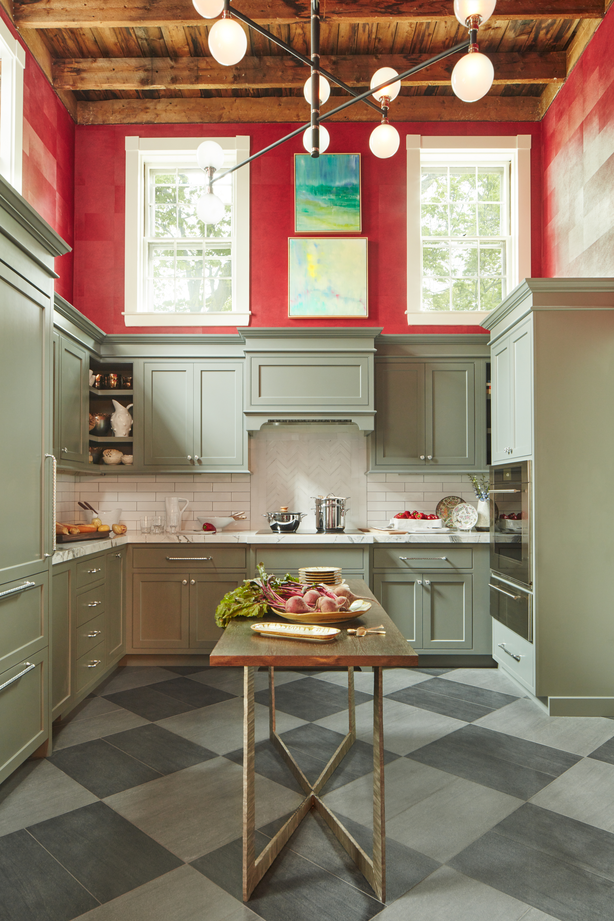
Dare to use red in your modern kitchen? Take a leaf out of this project, where red is used as a bold accent to energize the space. To balance its intensity, sage green is chosen as the perfect color that goes with red. The calming, cooler neutral tone of sage provides a beautiful backdrop, allowing the warm, vibrant red to truly stand out.
"Boasting of grand proportions and confidant hues, this Massachusetts kitchen is as stately as the house’s history," says Vani Sayeed, founder of Vani Sayeed Studios. "Built in 1848, this Greek Revival house was in disrepair and in need of an overhaul. As we assessed the space, the overall footprint of the kitchen was not very big, but because of the double-height ceilings, the space felt airy and spacious. By embracing a unique color combination on the cabinets and bold red wall covering with a simple white subway tile backsplash we were able to achieve the desired drama to balance the unique architecture. Because of the double height and the second set of upper windows, the light changes as the sun travels which affects the color of the cabinets. It can vary between gray to sage green."

Type: Acrylic paint
You'll be surprised how good red and sage green can look together. Red is a good color to embolden a space that's excessively decorated with sage green. Consider this color on joinery, along panels, wainscoting, or on furniture.
2. Pastels
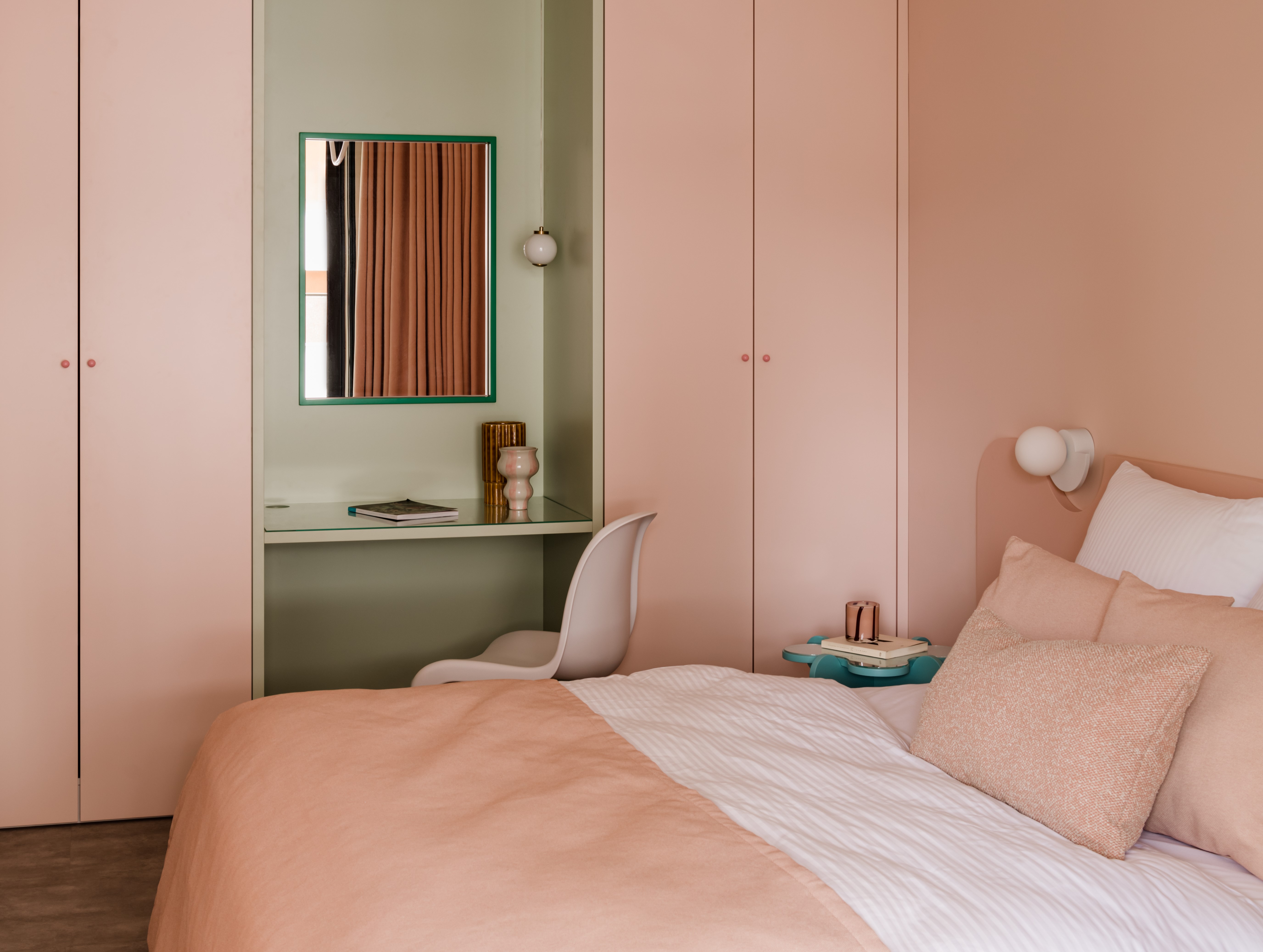
The combination of sage green paired with pastels creates a soft, harmonious palette, whether you opt for a delicate mix of light hues or striking contrasts. The cool, muted nature of sage creates an ideal foundation for delicate pastel colors like pinks, blues, and lilacs, adding subtle warmth. This combination is particularly effective for sage green bedrooms or in spaces where tranquility and balance are essential – think living rooms, or even a nursery.
Becca Stern, creative director and co-founder at Mustard Made recommends styling sage with pastel pinks, blues, and lilacs for a beautiful, well-rounded palette: "Soft and dreamy, these shades add a wash of subtle color that won't overpower small rooms.
"Keep the palette cool by pairing light blues and sage. Shades of light pink with sage create a cozy, warm vibe, while lilac and sage give a fun, modern take on pastel." This combination offers a contemporary twist on the classic pastel palette, with lilac’s vibrancy adding depth and energy to the otherwise subtle sage tones.
3. Brown
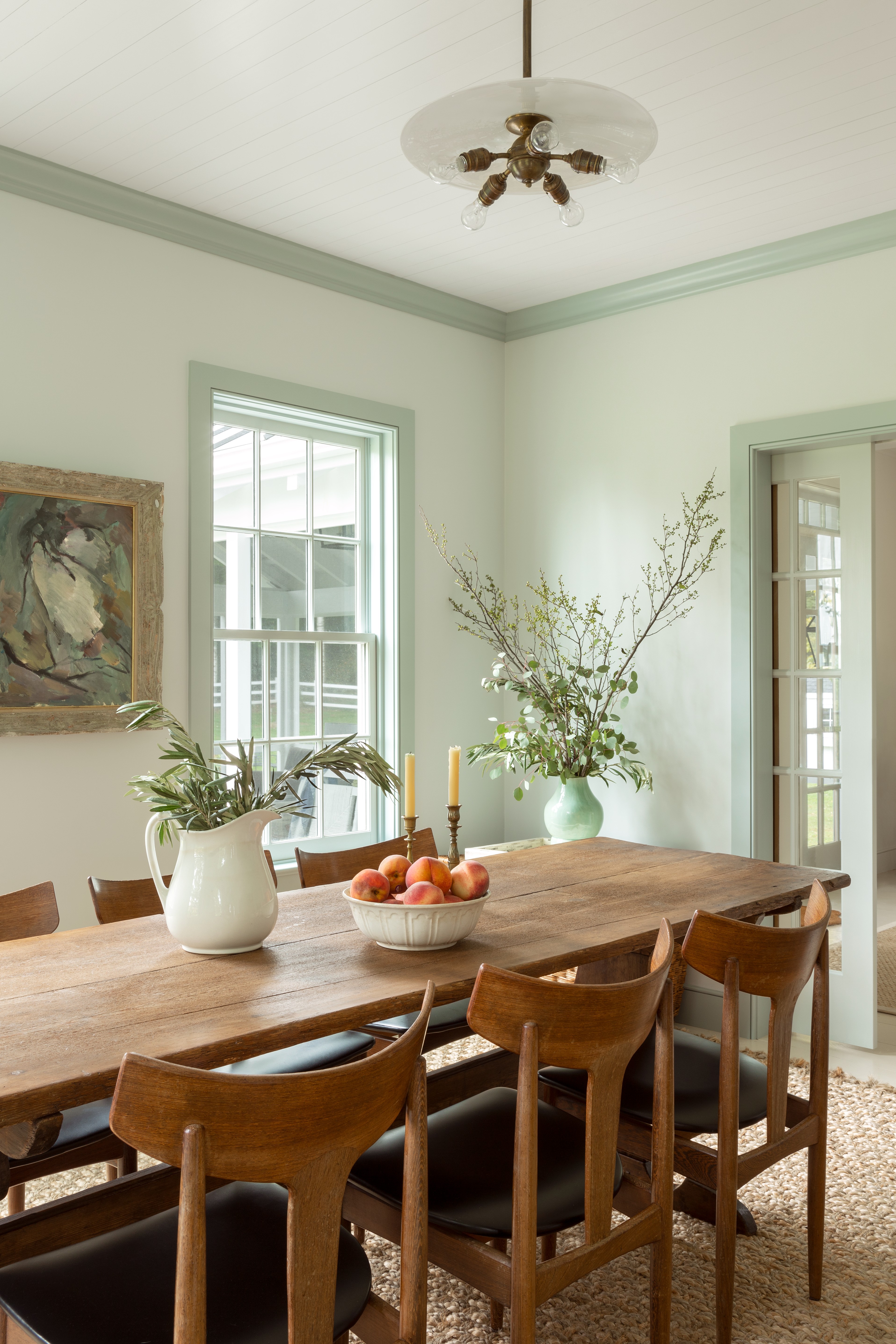
Sage green is one of the many colors that go with brown. "With its earthy tone, it's no surprise that sage is the perfect partner for shades of brown, rust, and naturals," says Becca Stern. "Mimicking the color combos seen in nature, styling sage with earthy colors creates a laid-back aesthetic perfect for homes that embrace indoor-outdoor living."
And this combination is used expertly in the dining room. The walls lend a soft touch to the space, while the wooden furniture adds an earthy charm. Both tones have a grounding connection to the natural surroundings, creating an organic landscape.
"Colors found in nature are always complementary of each other so sage and brown are very easy to pull together," say Kirsten Dahl-Feathers and Carlie Ng from the Stylesmiths. "We typically like to use a lighter brown material with some warmth to it like a tan rather than going too dark and heavy with chocolate browns, when paired with green."
4. Pink
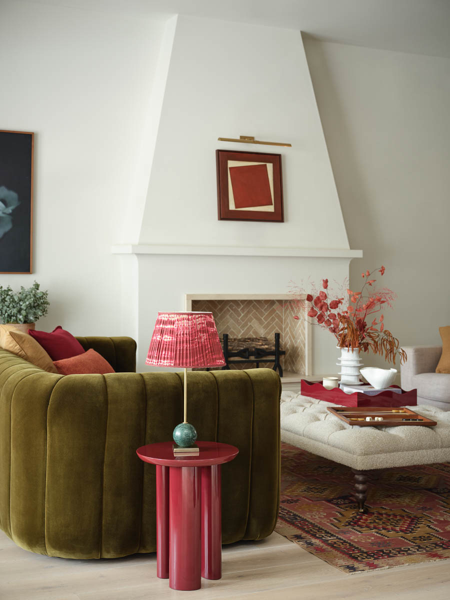
This color combination is a true standout. Sage green works beautifully as a color that goes with pink, with the two tones perfectly balancing each other to create a modern, cozy atmosphere. You can experiment with a range of pinks – from bold cherry hues to soft pastels – and pair them with sage green The pink softens any harshness, while the sage green brings warmth and depth to the pink.
"It doesn't take much skill to pair pink with green successfully as they exist together in nature in so many flowers," says Amy Krane, architectural color consultant and founder of Amy Krane Color. "Both warmer yellow pinks and cooler blue-pinks work with greens well. Pinks work well with olive, sage, mint, and hunter."
"There is a vast range of hues to pick from – from pinks with deep earthy undertones to lighter brighter rosy pinks," says Chloe Morrison, designer at Topology. "It works well as both an accent color in a space, seen within soft furnishings, and as a subtle backdrop instead of a classic neutral."
5. Yellow
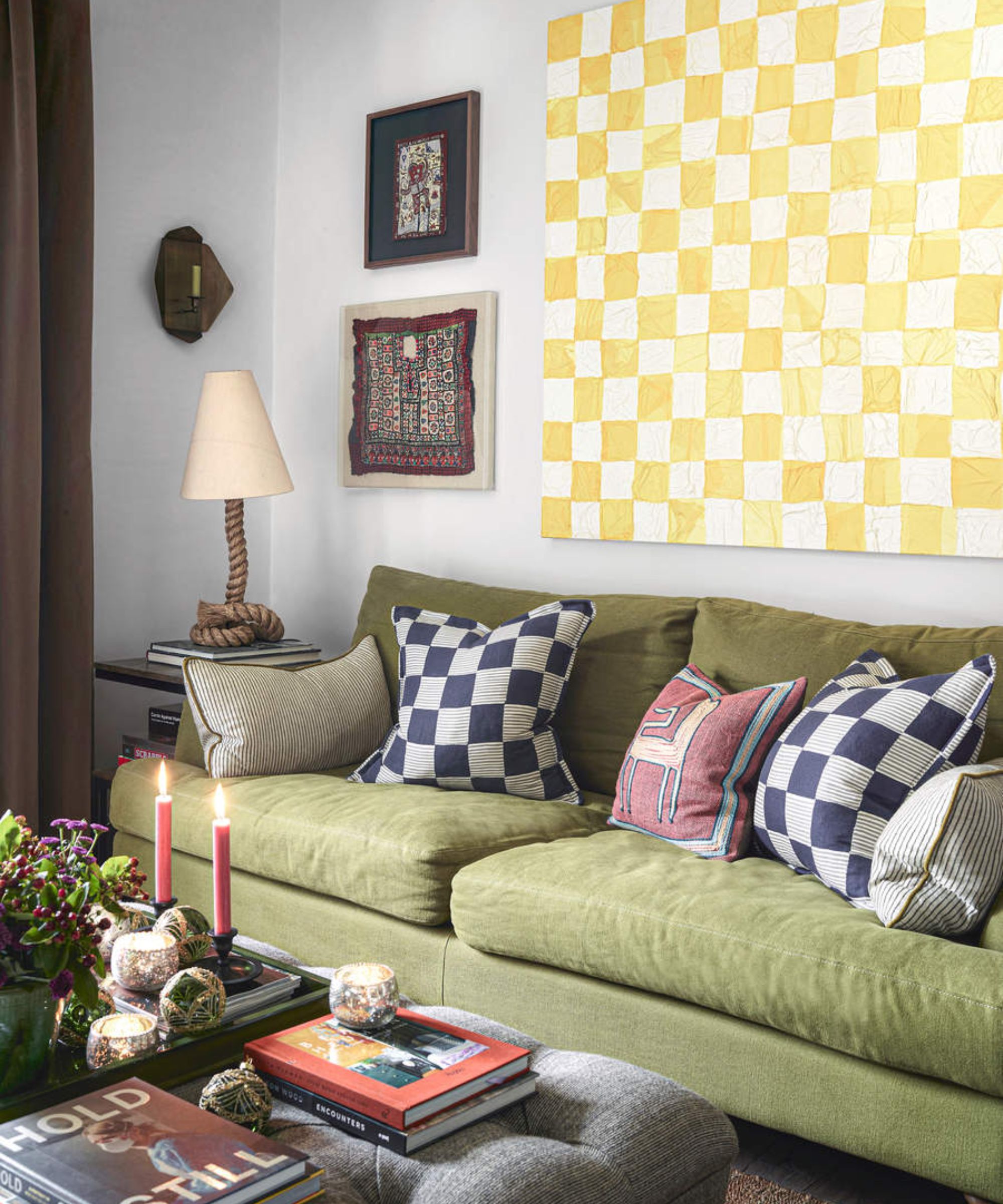
Yellow is a good choice to juxtapose with sage green. Plus several more colors go with yellow, allowing you to add a third shade to round out your palette, though ensure the tones match the green and yellow, such as the muted pink in the room above.
Choosing the right shade is important. "Several colors go with sage green such as a muted yellow like ochre, a tan yellow, or pastel yellow," says Amy Krane. "Bright, highly saturated yellow are less successful. They will overpower the softness of sage green."
It would also be prudent to stay away from neon tones of bright yellow or lime colors. Think mustard, buff or mango yellow for pairings.
6. Beige
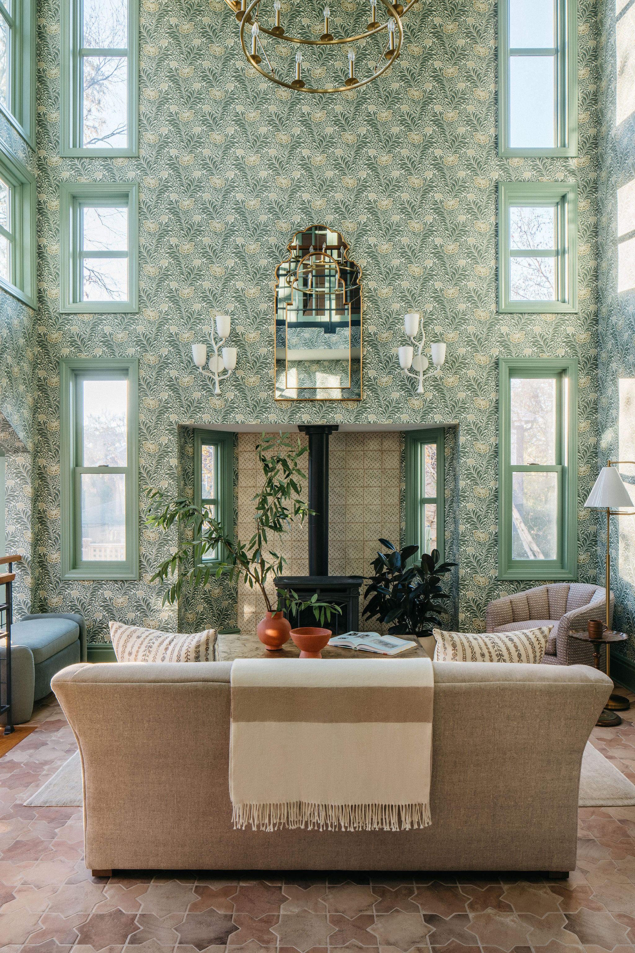
Beige is a timeless, versatile neutral that pairs beautifully with sage green, offering a softer and warmer alternative to whites and greys. The subtle tones of beige complement the earthy richness of sage green, creating a balanced and harmonious atmosphere in any room.
"Sage green and neutrals play so well together that it's hard to go wrong," says Jillian Gamboa. "Don't be afraid to be immersive with this earthy green – treat sage as your base color, and use whites, beiges, and greys as accents."
For example, Donny Mak of Design & Build Jacksonville, Florida recommends swapping out stark white for oatmeal or warm beige linen to soften the boldness of other elements in the room, adding a welcoming, cozy atmosphere. This pairing allows sage green to take center stage, while beige provides depth and warmth. Whether in flooring, bedding, or decor accents, beige works seamlessly with sage green, making it one of the best colors that go with beige for creating a relaxed yet stylish atmosphere.
7. Green
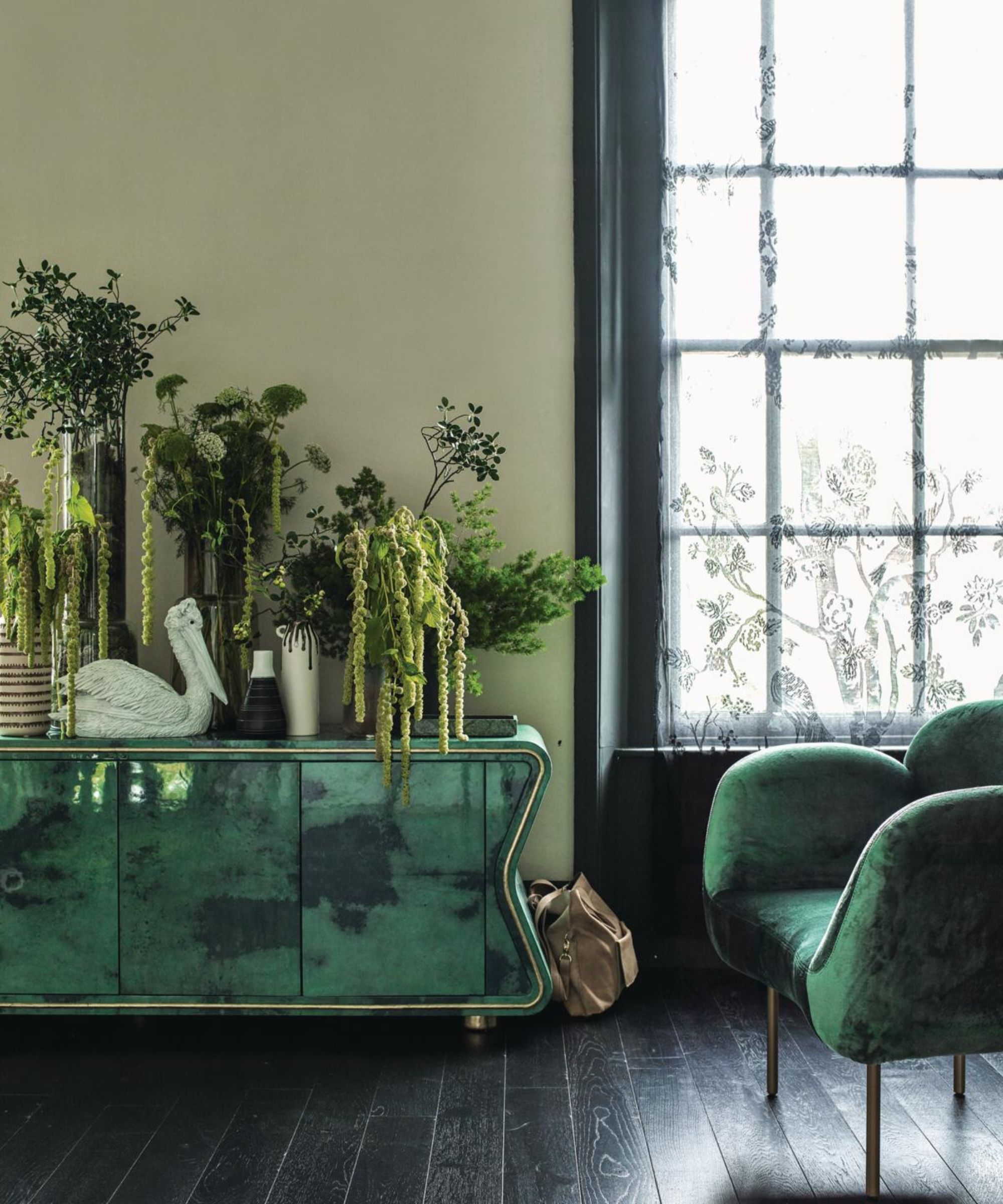
"You know what they say, greens are good for you! Bring the colors of nature inside with green-on-green goodness," recommends Becca Stern.
"Pairing sage with shades of olive creates a soothing, lush palette that looks extra rich when styled with fresh green foliage. Adding some vivid white to this combination brightens it right up, while an olive wall or accessories lends a moody touch of drama."
When working with this green-on-green palette, it’s important to balance the varying shades of green. Keep larger surface – like walls or furniture – neutral, and use deeper greens like olive or forest in accent pieces, textiles, or even a statement wall. This allows sage green to remain the focal point while the other tones add layers of richness and complexity.
8. Cream
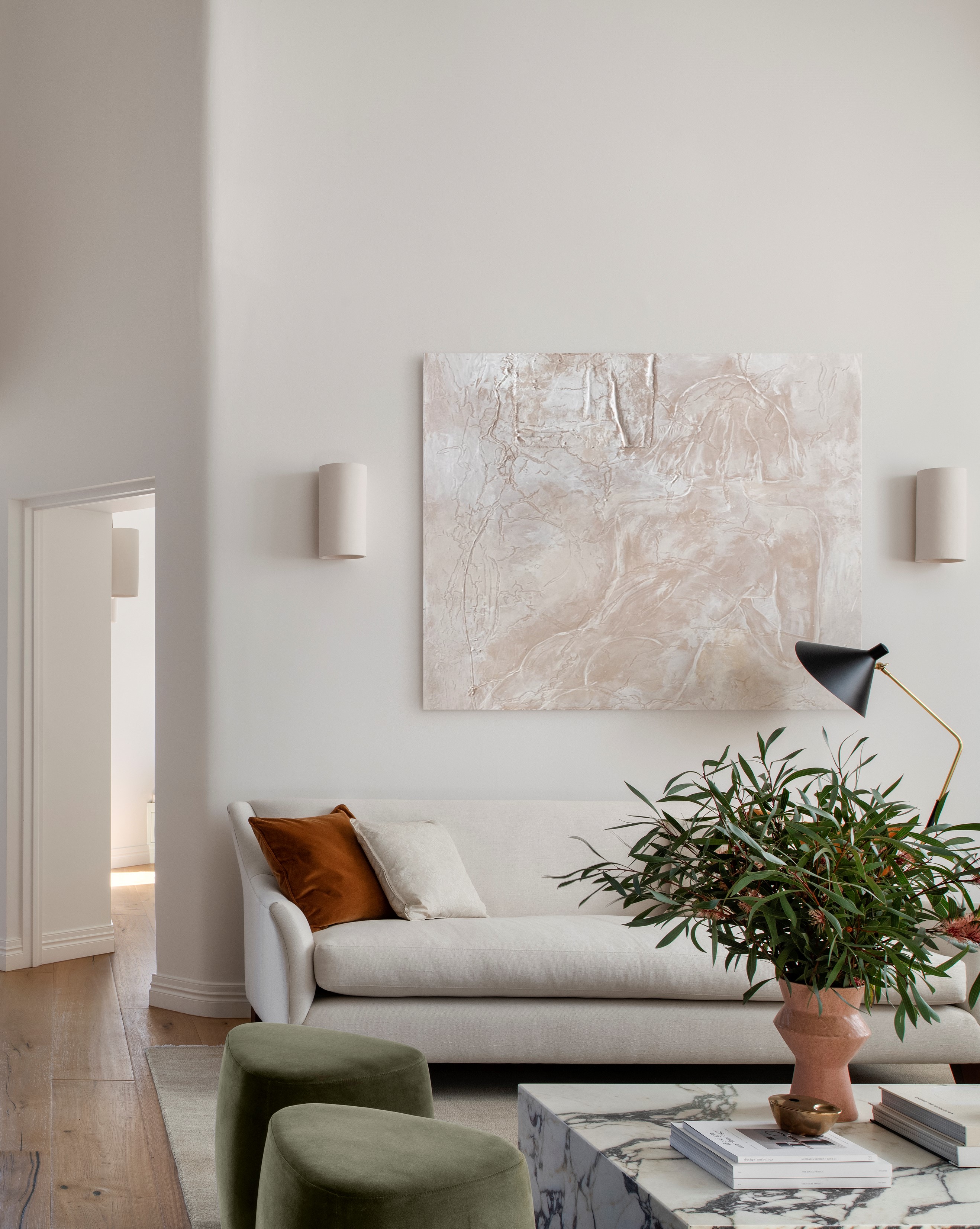
Combining cream and sage green is an easy way to add interest to your homes without having to drastically overhaul your interiors. This is a safe combo for a living room, as exemplified in this interior. Cream living rooms have the advantage of looking warmer than pure white spaces and can create a more welcoming atmosphere.
"As with most muted or earthy tones, sage green pairs best with a softer cream, or opt away from your bright whites and yellow undertones and go for something with a green or greige undertone," say designers Kristen and Carlie.

Recommended Primer & Undercoat: Mid Tones
A 'safe' combination with sage green. If you want to create a room that's relaxing, calming and bright, then a good way is to combine sage green with cream. The two are warm tones and can have a soothing effect, visually.
9. Black
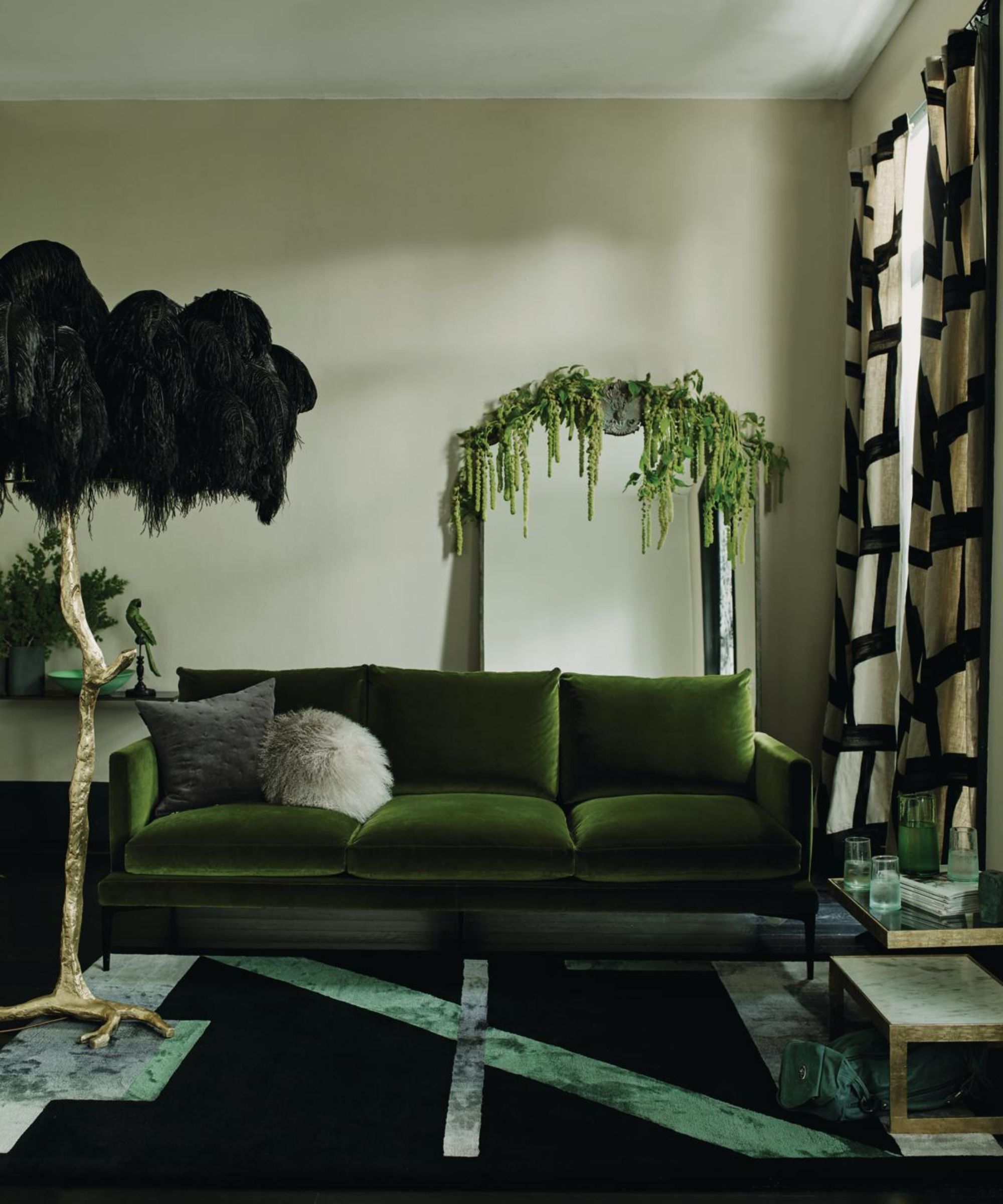
Not sure if black is the right choice for you or if there are enough colors that go with black? There's a great way to soften it – simply pair it with earthy tones like sage green.
"Pairing it with black accents, such as furniture, frames, or light fixtures, provides bold contrast and a modern edge, and prevents the space from feeling overly muted," explains Donny Mak. Take this interior for instance. The dark carpet and black accessories could have created a one-dimensional space but the sage green cabinets lift the interior and create a crisp, refreshing feeling.
"Green is known as one of the most warm as well as cool colors there is in the color wheel," says Nishita Kamdar, founder of Studio Nishita Kamdar. "Sage green often associated with tranquility makes for a great choice for a room especially when it comes to layering with actual plants/cane/jute elements. It looks moody as well as fresh."
10. Teal
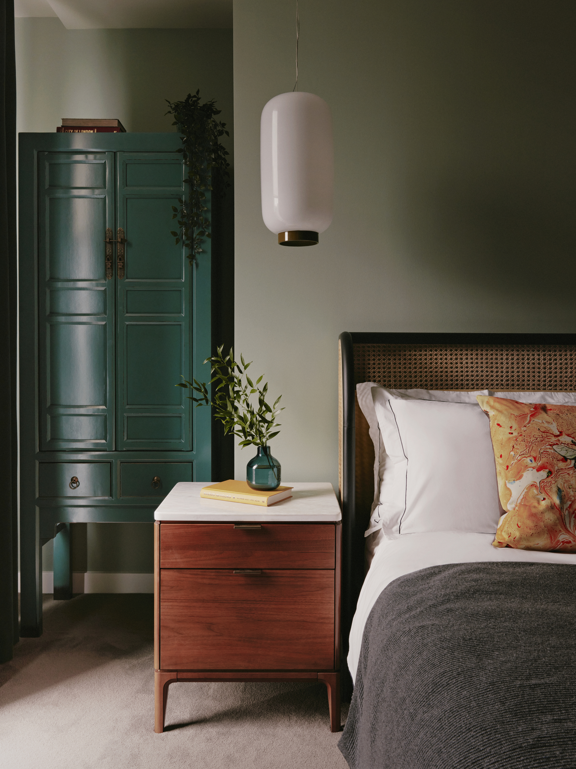
If you’re looking to go daring with your color scheme, sage green is one of the colors that go with teal. See how the cabinet green is brightened with a lick of aqua-blue paint. The two work together in harmony because of their similar base tones.
"Sage green is an earthy soothing tone that aids in the feeling of calm, promoting a relaxing environment that oozes a sense of tranquility and softness within a space," says Chole. "Perhaps more than ever, we desire to enhance our sense of well-being through biophilic design and sage green is undoubtedly a tone that works well to achieve this. Colors inspired by nature team up beautifully with sage green, for example, deep greens, browns, and blues."
11. Navy
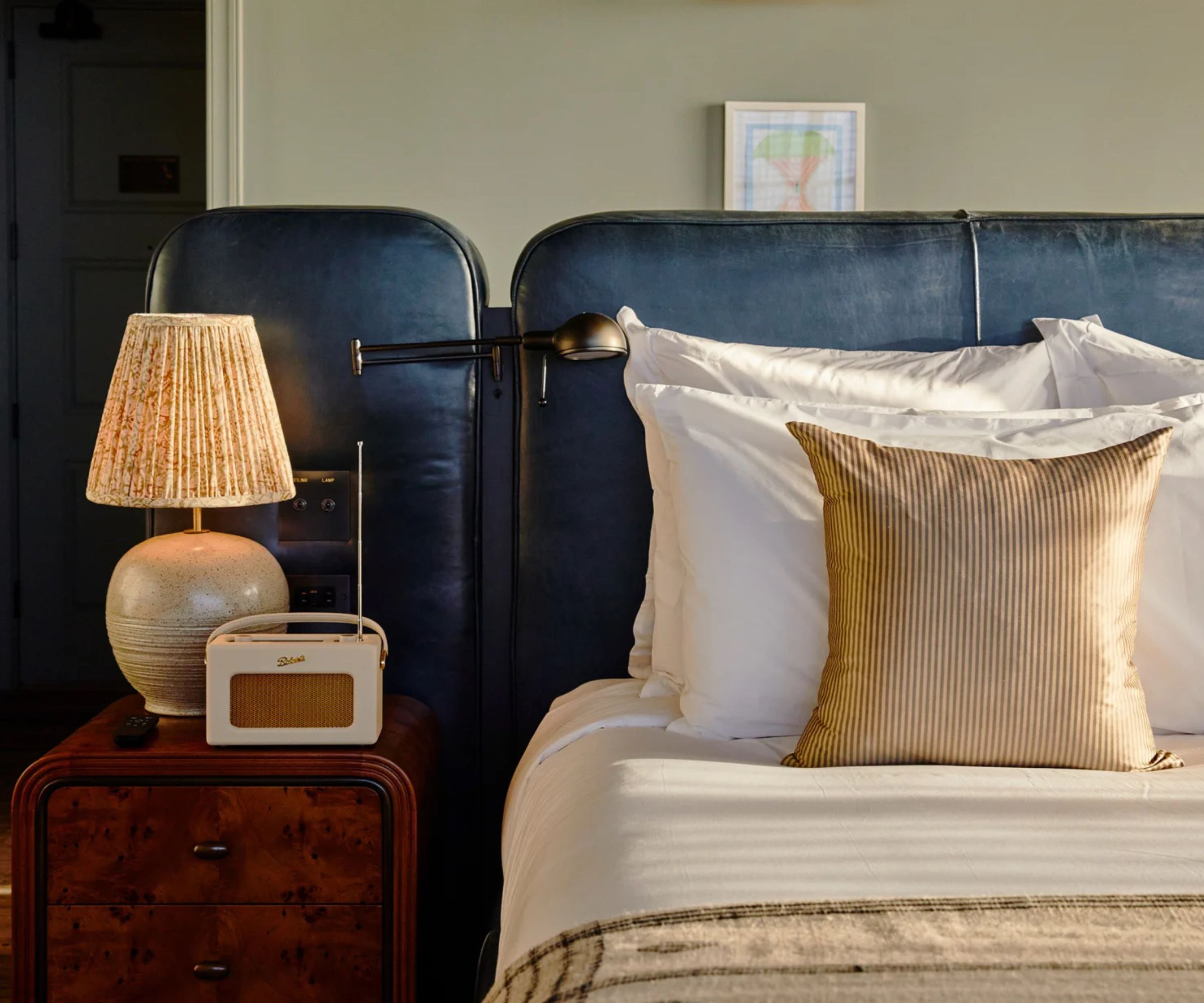
To add depth and sophistication to your space, pair sage green with deep navy. This combination creates a striking contrast that maintains a timeless, elegant look.
LA-based Interior Designer Alexandra Peck shares, "Sage green is one of my favorite colors to use in my projects as it is beautiful and calming. Sage can stand alone and be the star but it is also lovely as a supporting color. In one of my favorite projects, Soho House Nashville, I painted one of the rooms in sage which provided the best backdrop for this stunning navy leather upholstered bed which was accented by white, cream, and walnut."
12. Gray
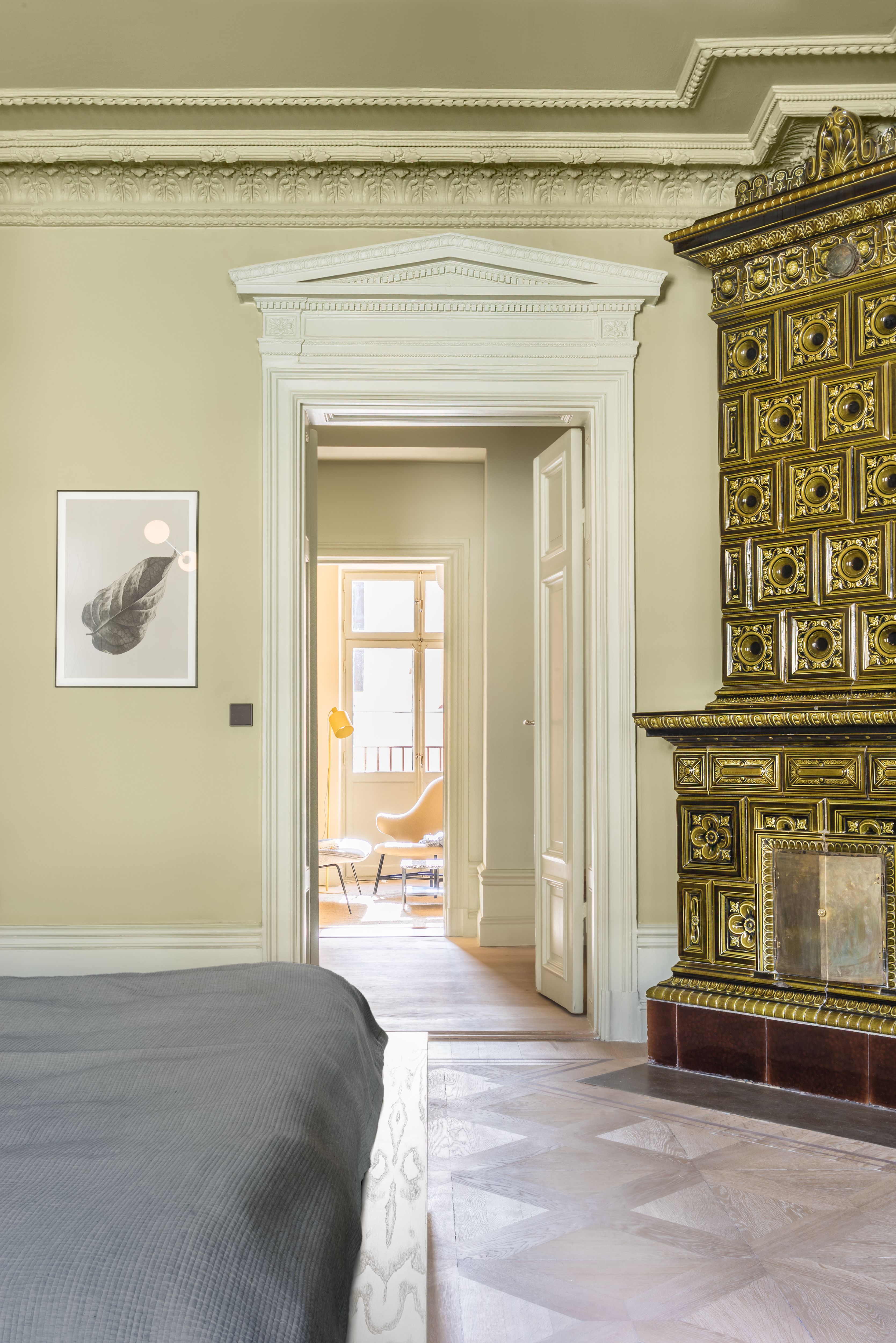
Several colors go with light gray or dark grey, and one among them is gentle, soothing sage green. In this bedroom color scheme, the two tones add the perfect layering and depth to the space, making it feel instantly relaxing.
"Think of pale green with charcoal gray to add sophisticated and current color combinations," says Amy. "You could also play with their pastel tones for a more energetic interior. The softness of pastels makes them versatile and livable. Combine them with darker colors and you have a well-balanced interior."
13. Orange
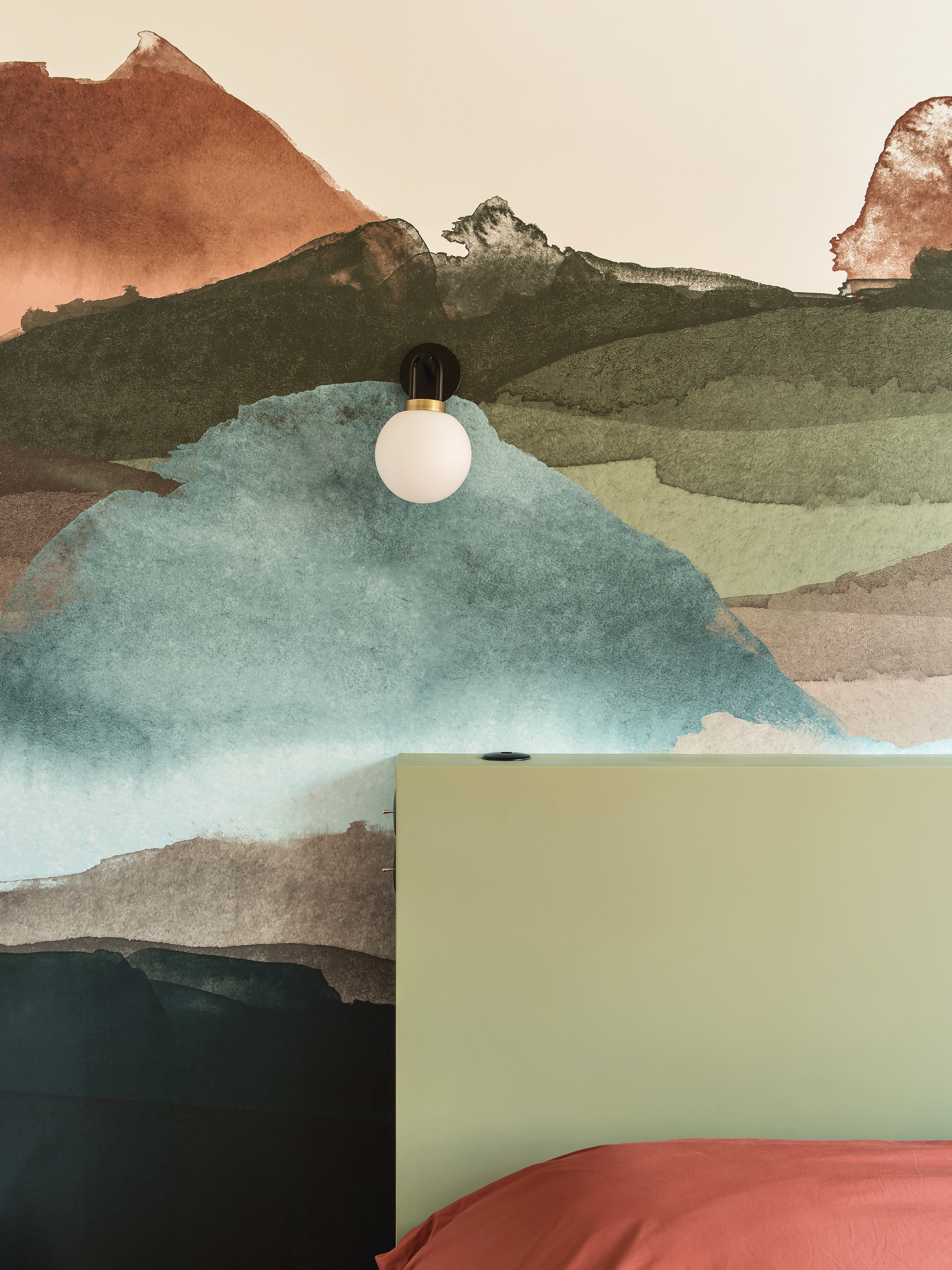
Who doesn't want a bedroom that feels serene and cozy? Amongst the colors that go with orange is sage green, and together the hues can create a moody and sultry vibe, as seen in this bedroom. ‘A bit of turmeric or burnt orange can go a long way to add some contrast and warmth’, says interior designer Daniel Hopwood.
Instead of going all in on green and orange-drenched spaces, consider dotting objects of orange around the room or purchase soft furnishings in this shade to bring added warmth to the space. Here, a simple orange bedroom offsets the sage green headboard, adding fun to an otherwise restful space.
14. Gold or brass
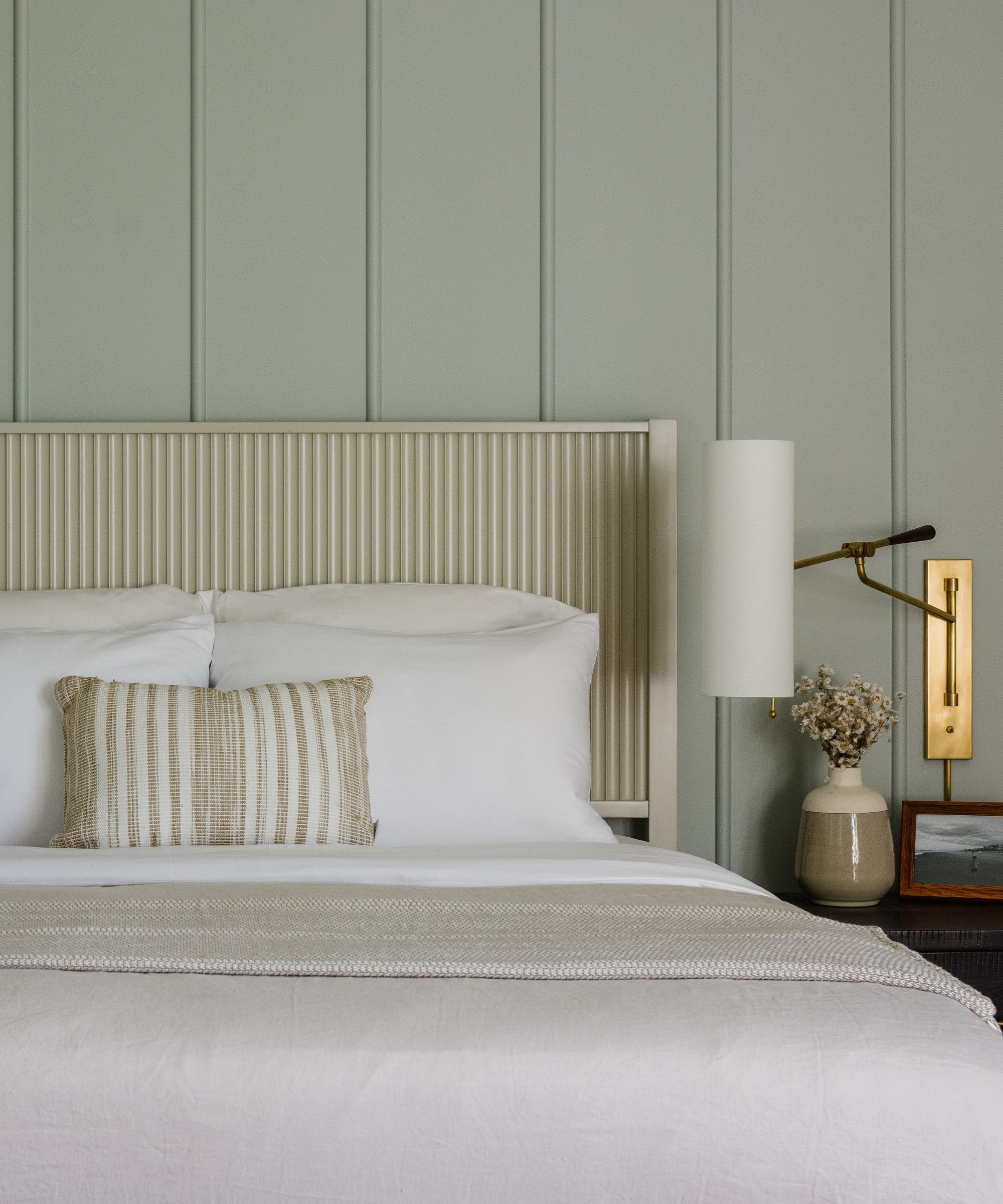
"One of the best qualities of sage green is its unique ability to complement other materials timelessly," says interior designer Jillian Gamboa of Austin, Texas-based studio Avery Cox Design. "The same sage tone can feel balanced with nearly any metal finish – brass, nickel, bronze, etc – which is why you see it used across a broad array of spaces, from historic homes to contemporary new-builds."
"Metallic accents in soft gold, brass, or antique bronze work well with sage green because they strike a perfect balance between warm and cool tones," elaborates Amy Granger, director of Marketing at Dania Furniture and Scandinavian Designs. "Sage green brings a calming, earthy vibe with its cool undertones, while metals like gold, brass, and bronze add warmth and shine."
FAQs
Why is sage green so popular?
With strong ties to nature, sage green mirrors the newfound enthusiasm people have for greenery in their homes. Greenery and houseplants are everywhere. Everything has a very natural and slightly seventies vibe at the moment and painting your kitchen green just seems to confirm that love for natural things, in particular living greenery.
Green is going to be a top color choice for people who love this look or even if they can’t face the care required to look after plants they can still feel the positive vibes of such a fresh and vibrant color which reminds us so much of nature and the outdoors.
Can you pair more than one color with sage green?
If you have a color pairing of say lavender, red or blue with sage green, and want to add a third hue, be sure to include a shade that doesn't overwhelm but blends in well with these calming colors. A good option would be with a cream or a beige – both tones are neutral and can give an excellent lift to lavender and sage green. Alternatively, a dusty blue could be a great companion if you want to add an impact to the space.
No matter your style or design goals, the beauty of sage green lies in its ability to adapt, allowing you to curate a space that feels both fresh and deeply rooted in nature. This remarkably versatile and soothing color pairs effortlessly with a wide range of hues – whether soft pastels, earthy neutrals, or striking contrasts like navy and olive – to create balanced, harmonious spaces. By thoughtfully selecting colors that complement sage, you can design rooms that evoke tranquility, warmth, and sophistication.
Be The First To Know
The Livingetc newsletters are your inside source for what’s shaping interiors now - and what’s next. Discover trend forecasts, smart style ideas, and curated shopping inspiration that brings design to life. Subscribe today and stay ahead of the curve.

Aditi Sharma Maheshwari started her career at The Address (The Times of India), a tabloid on interiors and art. She wrote profiles of Indian artists, designers, and architects, and covered inspiring houses and commercial properties. After four years, she moved to ELLE DECOR as a senior features writer, where she contributed to the magazine and website, and also worked alongside the events team on India Design ID — the brand’s 10-day, annual design show. She wrote across topics: from designer interviews, and house tours, to new product launches, shopping pages, and reviews. After three years, she was hired as the senior editor at Houzz. The website content focused on practical advice on decorating the home and making design feel more approachable. She created fresh series on budget buys, design hacks, and DIYs, all backed with expert advice. Equipped with sizable knowledge of the industry and with a good network, she moved to Architectural Digest (Conde Nast) as the digital editor. The publication's focus was on high-end design, and her content highlighted A-listers, starchitects, and high-concept products, all customized for an audience that loves and invests in luxury. After a two-year stint, she moved to the UK and was hired at Livingetc as a design editor. She now freelances for a variety of interiors publications.
- Lola HoultonNews writer
-
 The Easiest Way to Turn Your Designer Scarf Into Wall Art — No Frame, No Fuss, No Regrets
Because silk this pretty should never stay in a drawer
By Julia Demer Published
-
 Italian Kitchen Trends — 5 Emerging Ideas From the Chicest Italian Designers That I Predict Will Go Global in 2025
Fresh from Milan Design Week, these are the exciting finishes, styles, and innovative materials I can't wait to see in more kitchens this year
By Faiza Saqib Published