Colors to avoid in a small living room – the shades that don't work for tiny spaces, explained
Color and design experts tell us which colors to avoid in a small living room, as well as which to use instead


There are colors to avoid in a small living room if you want to ensure your space is welcoming and warm. Tiny areas can be tricky to decorate because you want them to have a distinct personality yet you don't want to overwhelm them. Finding the right balance is key and with that comes finding the right colors, an even bigger task.
Usually, living room colors are best selected by taking the size and lighting of the room into consideration. The shade you select is important, helping even a small living room seem bigger and brighter. They can also heavily influence the atmosphere you’re hoping to create. Whether you want a cheerful space, a high-energy room, a tranquil haven, or an intimate chill-out zone, the color you paint your walls in matter.
But are there any colors you should avoid? 'There are very few colors that are off-limits for a living room, but the most important factor you have to consider is how it’s going to make you feel when you want to relax,' says Marianne Shillingford, paint brand Dulux's creative director and color guru.
Some colors, it's fair to say, are anything but restful, so we asked top color experts and designers which colors you should stay far away from the living room. Take note.
1. Avoid Easter egg hues, choosing softer pastels instead
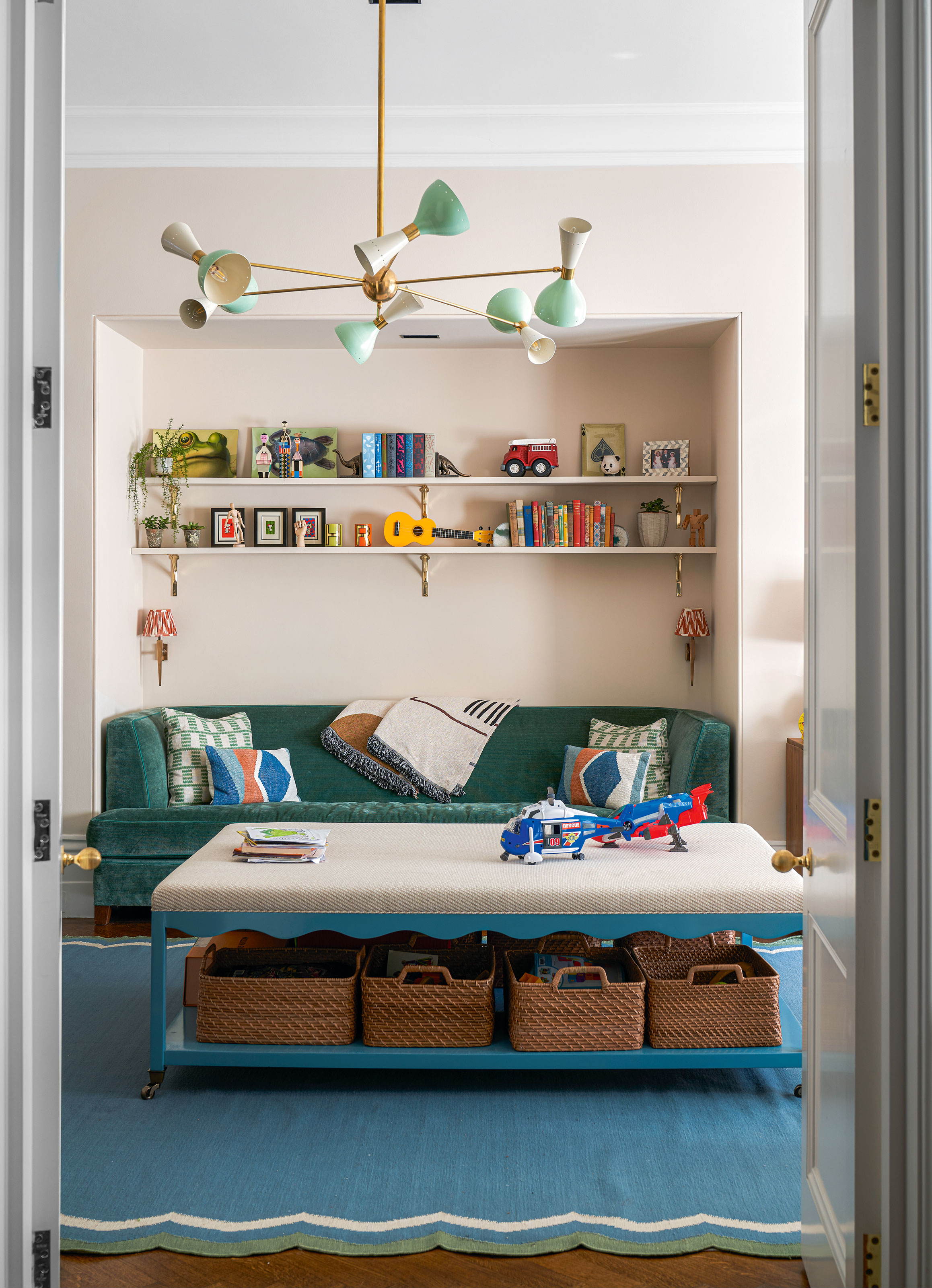
'If you have to use these colors, choose their warmer tones,' says interior designer Jennifer Morris
Sugary, pastel hues were popular in the 18th century and were used in decorative Rococo interiors. They enjoyed their time in the sun and several paint companies experimented with different tonalities for pastels.
Getting the right shade and mix of pastels isn't the easiest task, especially in a small living room where their combined effect can be overwhelming. 'I particularly advise against the Easter egg pastels as they make an interior look like a pre-school,' says Jennifer Morris, interior designer, JMorris Design. 'If you have to use these colors, choose their warmer tones.'
Another way to make these chalky colors work in your interior is to balance them with cool whites, moody blacks, greys, and neutral tones. Pastels can be quite useful in balancing sharp lines, exaggerated angles, and glossy surfaces, and can help create a modern, stylish interior.
If you feel your pastel interior feels too soft and informal, a way to toughen up the look is by throwing in some raw, edgy materials into the mix. Choose concrete, steel, exposed brick, or timber. For a more sophisticated interior, pair powder hues with sleek materials such as natural stone, glass, and metallic surfaces.
If you love the pastel trend yet aren't sure about painting a big-ticket item in the room this shade like the walls or the small living room furniture, introduce a single splash of this color in smaller, removable items or design features, such as lights, artworks, rugs, or a feature wall. These can be swapped or easily replaced once your love affair with your pastel of choice is over.
2. Don't use violet, unless in small patches
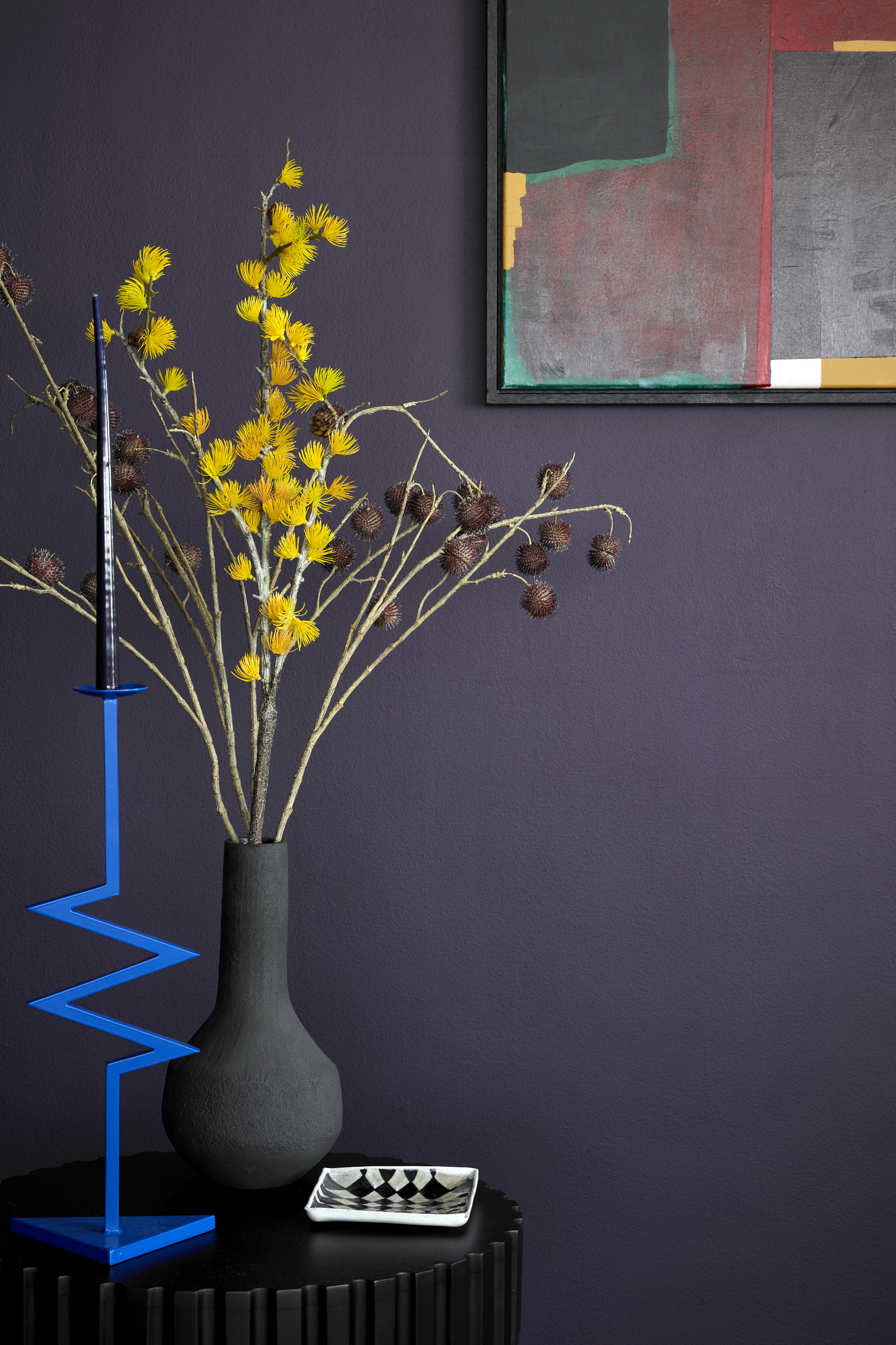
'Violets can read as dull used on a larger scale,' says Jennifer.
Have you heard of the term 'shrinking violet'? It means a timid person. Perhaps not the strongest connotation for a shade, and this is among the colors to avoid if you want to make a small living room look bigger. Violet, if painted across all walls can make a space seem closed in. It is made up of two contrasting hues – blue and red – and if used liberally, can create an interior that may seem garish.
'Violets can read as dull used on a larger scale, just like day-glow greens. These lack personality and are not the colors for a small living room where each tone and shade matters,' says Jennifer. 'If you love violet, use it sparingly, like inside cubbies, on doors, or even just as flowers.'
Consider adding this color in small accents like throws, pillows, a patch on the wall, artworks, or vases. Since it's a deep, lush color, it has a large impact even in small doses. This shade, which is seen in nature (in flowers and fruits) looks lovely when paired with other natural hues such as aqua and brown.
Usually, it's best to not combine violet with brighter or darker shades of green. The bickering combination can throw the room's balance, peace, and harmony. It's best to use the color with a selective range of shades like brown, muted silver or dusty sage.
3. Ditch fluorescent colors for warmer hues
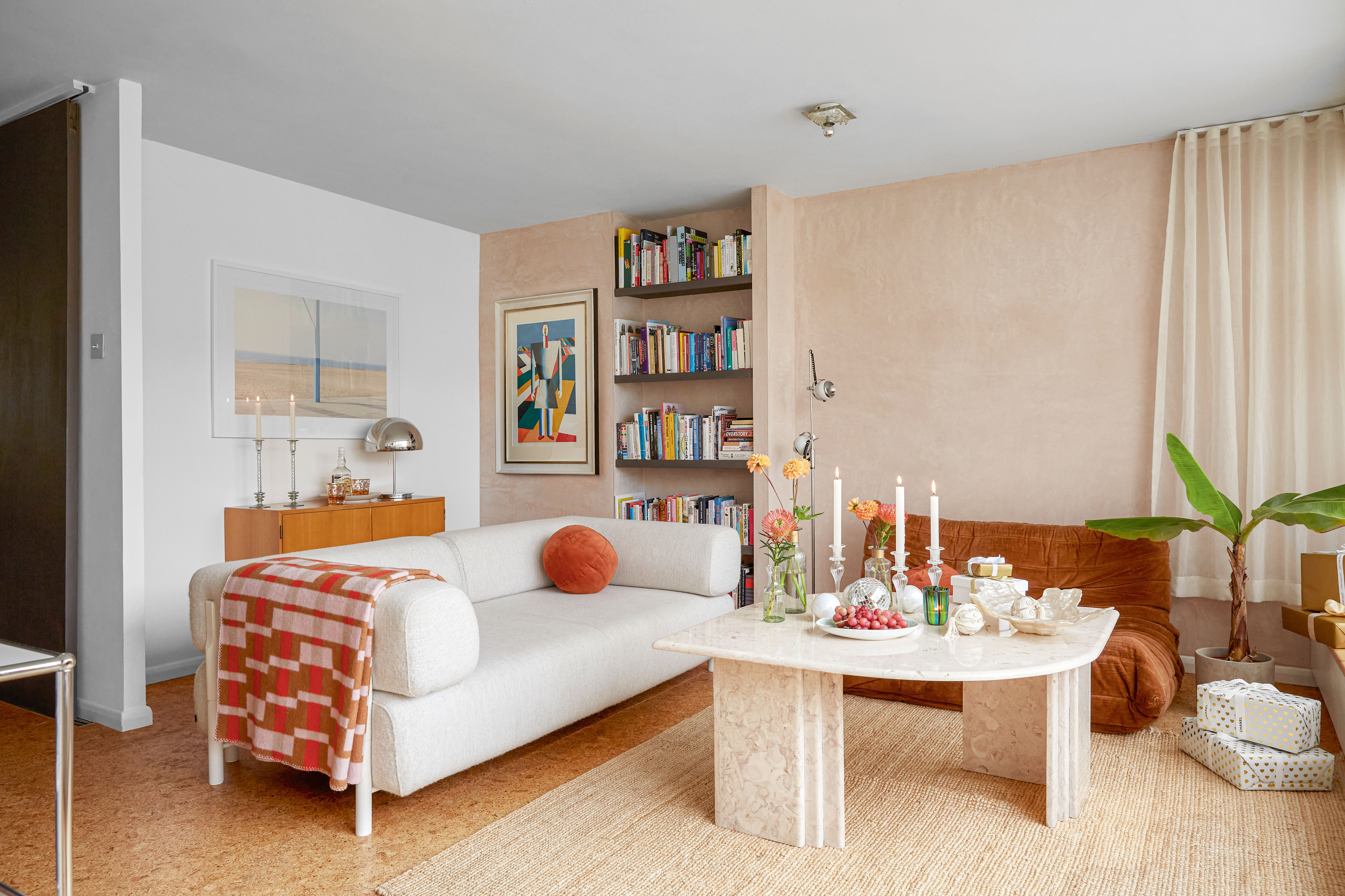
'Avoid acidic brights, unless your idea of chilling out is a bull racing festival in Spain or a carnival in Rio,' says Marianne Shillingford.
Fluorescent or neon colors are the extremely bright versions of primary and secondary colors, such as blue, red, green, yellow, and purple. These stand apart from other hues because they emit sharp light, making them luminescent.
These near-phosphorescent colors are ones to avoid in a small living room as they are bright, brash, and artificial. They're considered fun, frivolous, and excessive. Because these colors are so in-your-face, they're usually used in public signages like nightclubs, construction worker uniforms and road signs, so you can imagine they might overwhelm in a small living room.
'Bright acidic yellows and fizzy saturated pinks, blues, and greens may be ones to avoid unless your idea of chilling out is a bull racing festival in Spain or a carnival in Rio,' suggests Dulux's Marianne Shillingford.
Fluorescents are considered garish for homes as they throw cold light around the room, dominate the interior with their overbearing tones, and usually create stark contrasts with other hues.
'Fluorescent colors, and florescent green especially can be distracting and anxiety-producing,' says Jennifer. 'I strongly advise homeowners to stay away from them, especially if you have a small apartment living room. The colors do not match the modern architecture and design and, are not suitable for comfortable living.'
Pure fluorescents, of course, aren't everyone's cup of tea but those who do dare can perhaps try it in tiny doses. Or use them by combining them with neutrals, such as camel, biscuit, or grey. But be wary of neon saturation—a fluorescent cushion or vase is easier to live with than Day-Glo walls.
4. Avoid too many high contrast color combinations
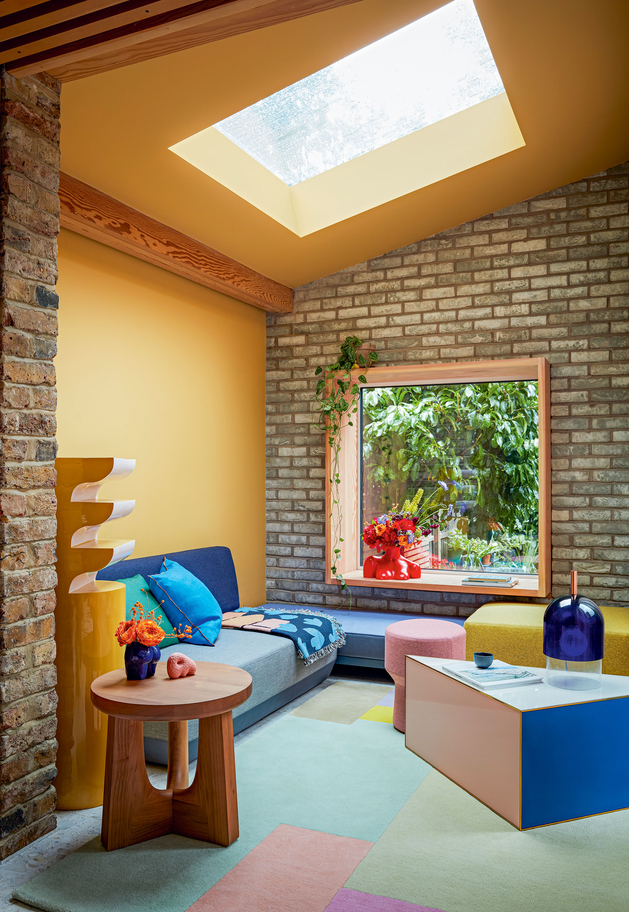
'Avoid too many contrasts of color within a small space,' says Patrick O’ Donnell, of Farrow & Ball. 'Keep your chosen palette simple and with some empathetic tonality – this will help blur the lines to the fundamental elements in a room, such as woodwork or fitted furniture.'
In a small living room layout, it's best to not use more than two or three shades on opposite sides of the color wheel to create a contrast, but keep it limited to one room or corner. Combos like blue and orange, or purple and yellow can look impactful but they're also harsh. Those who aren’t quite ready for their living rooms to have high contrast can add neutrals to soften and bridge. Doing so will give eyes some rest while surveying the room.
5. Say no to brilliant white, and yes warmer shades of white
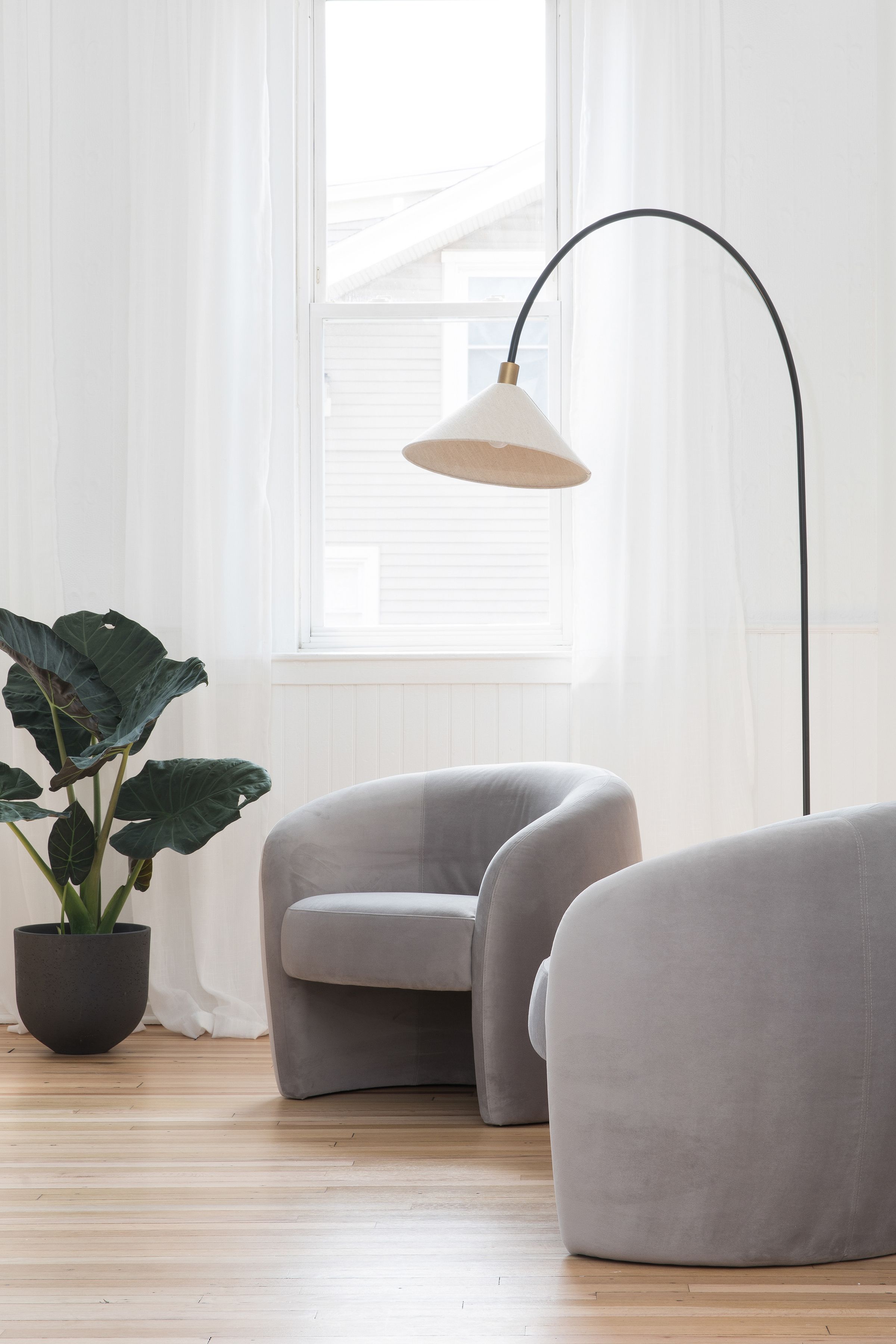
When it comes to small and narrow living rooms, white paint, in particular, can do wonders. It can give life to dark spaces and make small rooms feel generous and light-filled.
'If blessed with lots of natural light, play to the benefits of your room aspect and look to whites,' says Patrick. 'However, avoid brilliant white in favor of something with a gentle undertone like Pointing or School House White. Use the one color in the appropriate finish on everything, walls, ceiling, woodwork, even your floor if possible. This technique will create a clean, bright space without distraction.'
Pure brilliant white is devoid of all pigment; this means the color, the brightest white in the pack, reflects nearly all the light that hits it, making the room seem stark and characterless.
Also, north-facing rooms tend to get a lot less sun so are naturally darker and prone to shadows. These rooms also reflect a lot more blue and grey tones, so using brilliant white or cool-toned white paint can make the room look flat and dreary.
Another factor to consider is how the light plays and changes the white paint throughout the day. A good idea is to paint white paint swatches and place them in the room to understand their undertones. You will notice that the paints look different as the sun moves through the day. The colors will also change when you switch on the artificial light at night. It's best to live with the paint swatches for a day or two before finalizing which one you prefer.
6. Only avoid dark colors in the wrong living rooms
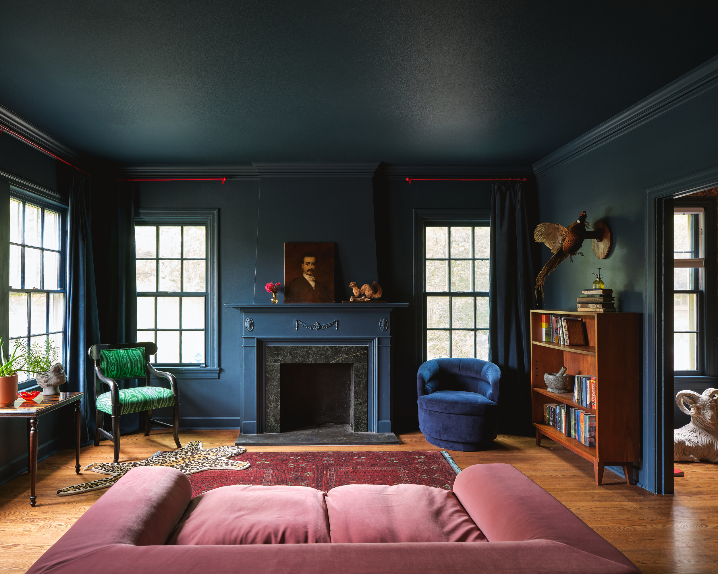
'When working with a small area, dark colors cleverly absorb the light of space,' says Helen Shaw.
'Some fear that adding a deep or bright color to a small room will make it appear claustrophobic, opting instead for light neutrals to keep the space open,' says Helen Shaw, Benjamin Moore UK Director. 'However, when working with a small area, dark colors cleverly absorb the light of space, and dividing walls appear blurred. This ‘blurred edges’ effect adds depth and dimension to a room, making it appear larger.'
'In addition, incorporating a rich or bright paint color into a small space is a fool-proof way to create an instant character, taking a room from sterile to stylish. Smaller areas are a great place to experiment with colors that are bolder than those you would normally use, as this will have a less dramatic effect than opting for a statement hue in a large room,' adds Helen.
When it comes to how to use color in a small living room, dark tones do make a strong case. Black especially creates the illusion of the endless night sky, giving a room a strong character and edge.
This interior design trick also helps create a relaxed and cozy feeling, keeping the ambiance calm, ideal for winding down. For shades, you can consider grey, purple, blue, brown, and green, and balance them by using a matte finish to diffuse light.
7. Don't pair cool color contrasts with teal
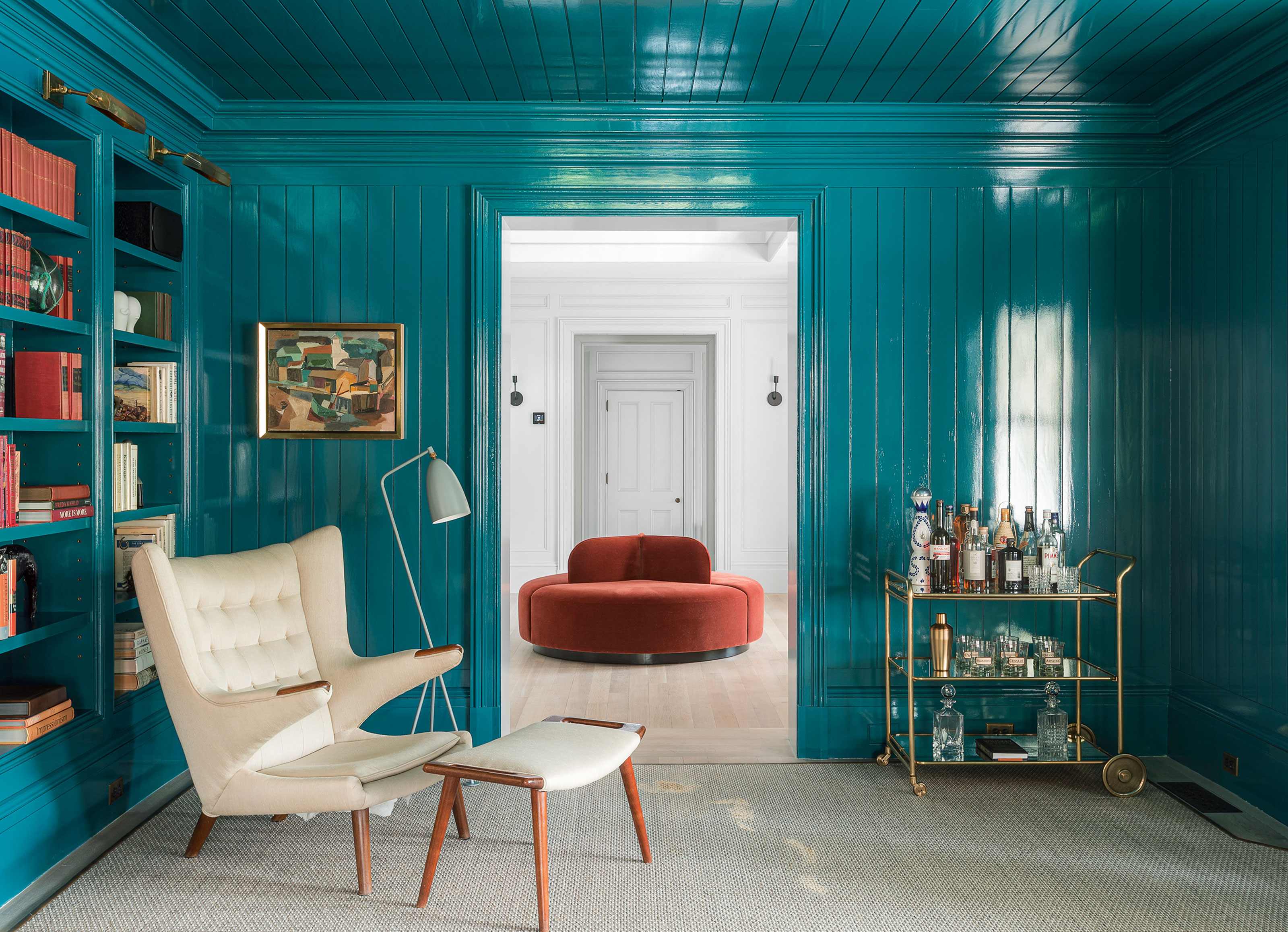
'Warm orange is a stunning contrast to teal,' says interior designer Natalie Tredgett.
Teal can transform any space into one with a strong personality. You can't go wrong with this versatile paint color as it has within it, a range of hues including soft, muted aquas and bold, bright blues. Especially in cottage homes featuring living rooms with a fireplace, a teal wall looks innately stylish. The color can be used to create a calm or energizing environment depending on the finish you choose. You can give your serene space extra style and pizzazz with high-gloss paint.
Since teal is a deep, moody tone, it can be tricky to pair it with other hues, especially as a small living room decorating idea, where the effect can be intense. One color it goes brilliantly with is pink, as the latter has a softening effect on the dominating teal. Orange when paired with teal makes for a brilliant partnership as the two colors have the highest contrast between their exposure values of any pair of complementary colors on the color wheel. While burnt orange induces warmth, dark teal sets a calming, gently invigorating, and effortlessly elegant scene.
'Blue is the most loved color in the world. It is the color of the sky and sea,' says interior designer Natalie Tredgett. 'Teal, albeit it a blue, has green in it. Warm orange is the opposite of teal on the color wheel and therefore a stunning contrast that is easy on the eye. Avoid other diverse colors as the effect can be disturbing.'
What colors make a small living room look bigger?

'As a rule of thumb, lighter colors tend to make a space feel bigger, while darker colors tend to advance and bring the wall towards you making a room feel smaller,' says Helen Shaw, Benjamin Moore UK Director. 'Paint is a clever way to change the perception of space in a room.'
With the power of optical illusion, several colors can do the job of making a small living room look bigger. Consider light paint colors that are more reflective, and make a space feel open and airy, which in turn makes it seem larger. Opt for soft tones like off-white, blues, and greens.
Another color that has a deep impact on a small living room is earthy ochre. This is a deep, warm color that conjures a snug environment. The light tan colors when mixed with sunlight help increase the dimensions of the room.
This may be surprising but when it comes to giving your room depth, nothing works better than charcoal grey. This color is a big paint trend this year. Although this tone reads like black, it has all the good qualities of both colors. It makes a room seem intimate, it pairs well with more modern, sophisticated light tones like blue, purple, white, and green. It makes a space seem endless and the color also radiates more heat than others, thereby creating a cozy interior.
Be The First To Know
The Livingetc newsletters are your inside source for what’s shaping interiors now - and what’s next. Discover trend forecasts, smart style ideas, and curated shopping inspiration that brings design to life. Subscribe today and stay ahead of the curve.

Aditi Sharma Maheshwari started her career at The Address (The Times of India), a tabloid on interiors and art. She wrote profiles of Indian artists, designers, and architects, and covered inspiring houses and commercial properties. After four years, she moved to ELLE DECOR as a senior features writer, where she contributed to the magazine and website, and also worked alongside the events team on India Design ID — the brand’s 10-day, annual design show. She wrote across topics: from designer interviews, and house tours, to new product launches, shopping pages, and reviews. After three years, she was hired as the senior editor at Houzz. The website content focused on practical advice on decorating the home and making design feel more approachable. She created fresh series on budget buys, design hacks, and DIYs, all backed with expert advice. Equipped with sizable knowledge of the industry and with a good network, she moved to Architectural Digest (Conde Nast) as the digital editor. The publication's focus was on high-end design, and her content highlighted A-listers, starchitects, and high-concept products, all customized for an audience that loves and invests in luxury. After a two-year stint, she moved to the UK and was hired at Livingetc as a design editor. She now freelances for a variety of interiors publications.
-
 Turns Out the Coolest New Café is Actually In Your Kitchen — Here's How to Steal the Style of TikTok's Latest Trend
Goodbye, over-priced lattes. Hello, home-brewed coffee with friends. TikTok's 'Home Cafe' trend brings stylish cafe culture into the comfort of your own home
By Devin Toolen Published
-
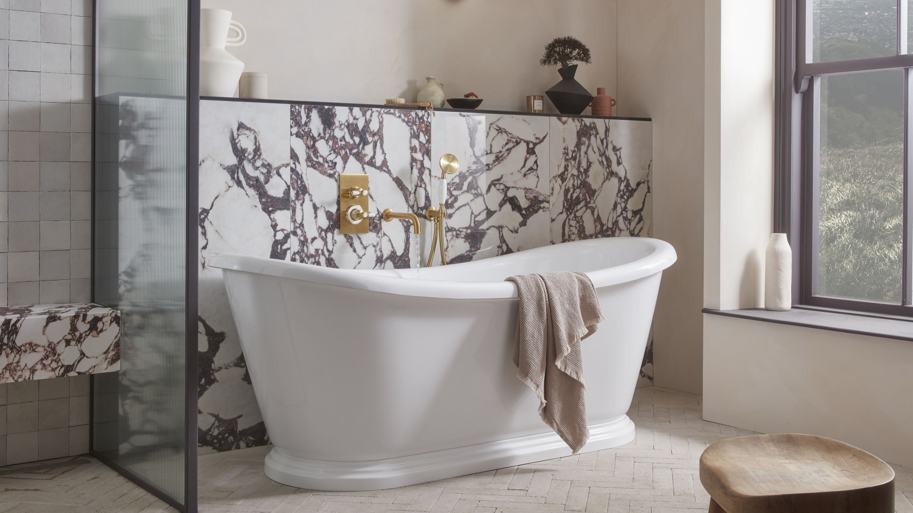 5 Bathroom Layouts That Look Dated in 2025 — Plus the Alternatives Designers Use Instead for a More Contemporary Space
For a bathroom that feels in line with the times, avoid these layouts and be more intentional with the placement and positioning of your features and fixtures
By Lilith Hudson Published