

You might be surprised to learn that beige — a warm, welcoming neutral — doesn't always layer so comfortably with all shades. While it’s generally more versatile than a stark white, and pairs well with most shades, its slightly warm and softly 'dusty' appearance can sometimes feel underwhelming or clash awkwardly with certain sharper tones. Plus, beige can look and feel vastly different in varied light settings, making it a precarious tone to work with.
Curious about what colors go with beige and which don’t? We consulted design experts to uncover the colors to avoid pairing with beige, as well as alternatives that will be more complementary. Here’s what shades they recommend steering clear of.
1. Lemon Yellow

DO INSTEAD: a warm mustard yellow or ochre
Generally speaking, it's hard to find a tone that doesn't match with beige; and most experts will agree with that. However, there are certain paint colors or specific hues that tend to not look quite right.
“At a push, I would say that lemon yellow would jar with beige, as these are the cooler yellows rather than the warmer mustard and ochres," says Paula Taylor, head stylist & trend specialist at Graham & Brown. "The contrast of this citric yellow can be too harsh.”
Instead of a lemon yellow, Paula suggests a more toned-down version of the color; perhaps an ochre or a mustard yellow, like in the room shown above. This will give beige a warm layered look, and make the scheme feel more well-curated.

Price: $5.98/sample

Price: $5.99/sample; $2.50/swatch

Price: $5.99/sample; $2.50/swatch
2. Red

DO INSTEAD: a terracotta or burnt orange
Whether you're thinking of a wall color combination or how you'll pair your furnishings and accessories together, Kerith Flynn, principal and founder of Margali & Flynn Designs, suggests against pairing red with beige.
“This combination can be a bit too much," she says. "Beige is soft and neutral, so when you throw in a bright red, it can feel like the two compete rather than complement each other. The contrast can be jarring, and the overall look might feel unbalanced or overly intense.”
Instead of a red, Paula suggests a more earthy tone such as terracotta or burnt orange, as seen in the above image by Estudio Recente. "These natural shades look fabulous with beige," she adds. "Ignoring the 70’s vibe that they could have, they bring warmth and joy to the room adding heaps of personality. Try Graham & Brown's Arizona Sky."

Price: $5.99/sample; $2.50/swatch

Price: $5.98/sample

Price: $5.99/sample; $2.50/swatch
3. Neon Green

DO INSTEAD: a sage or dark green
Let's be honest; we've all enjoyed the strategic neon trend that has been huge on Instagram and Pinterest, but while this vibrancy definitely has its place in modern interiors, it might not be the best when paired with beige.
"Beige is the calm, collected introvert, while neon is the loud, party-crashing extrovert — they just don’t vibe together," says interior designer Nishtha Vashist. “Neons, whether it’s neon green, pink, or blue, overwhelm beige’s understated elegance, making the room feel chaotic rather than harmonious. Beige thrives on subtlety and softness, while neon screams for attention, creating a clash that’s visually unsettling and out of sync with beige’s natural, cozy vibe.”
If you were thinking of introducing a neon green, designers suggest using a calm, relaxed sage or dark green instead. “Green has been heralded as the new neutral over the past few seasons," says Paula. "However, when teamed with beige it comes to life and brings in the biophilic properties of calming and restorative nature.”

Price: $5.99/sample; $2.50/swatch

Price: free color chip sample

Price: $5.99/sample; $2.50/swatch
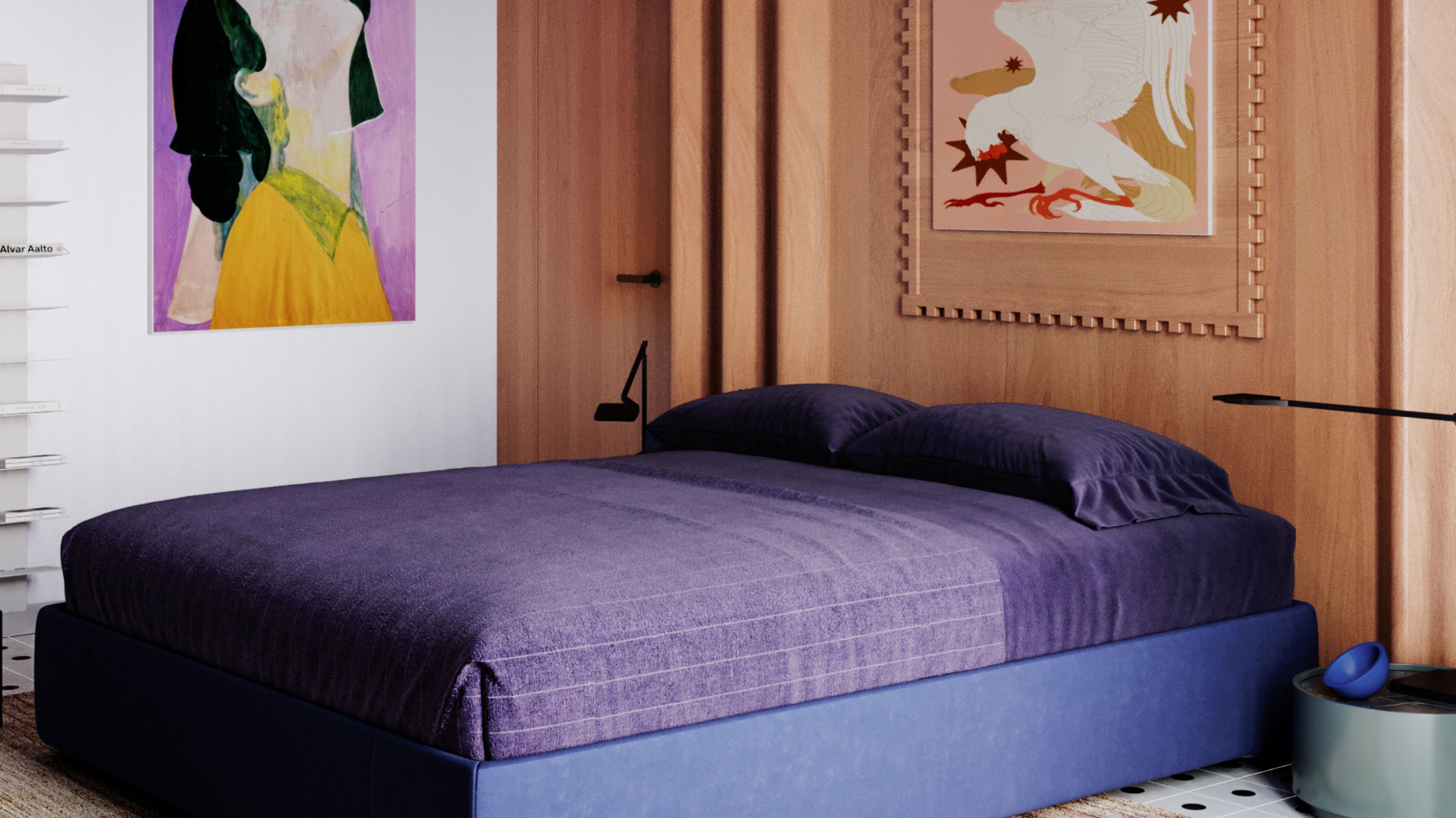
4. Light Gray

DO INSTEAD: a darker or mid-tone gray
There are several colors that go with gray but a dull, light, or lackluster gray isn’t one for beige. “Combining beige with dull gray often results in a flat, uninspiring palette, as both colors lack vibrancy and contrast, leaving the space feeling lifeless,” says Lauren Lerner, founder of Living with Lolo.
Choose instead, a darker or mid-tone gray so the neutrals don't wash each other out and can stand on their own. In this space show above, designed by Brad Ramsey Interiors, the two tones layer well together and give the bedroom a feeling of depth and dimension.

Price: $5/sample

Price: $5.98/sample

Price: $5.99/sample
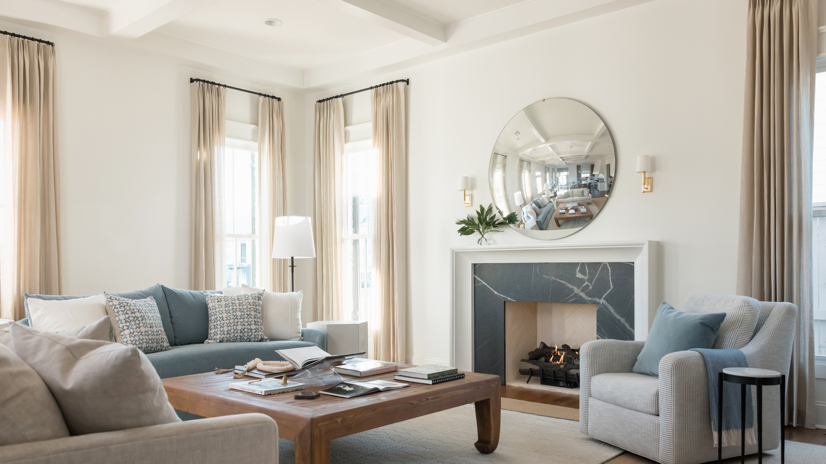
5. Taupe

DO INSTEAD: a warmer brown
The color taupe and other gray-browns are amongst the shades that designers say don't pair best with beige.
“Taupes and gray-browns when paired with beige can look dull and uninteresting, however the warmer rich browns such as Graham & Brown's COTY Elderton bring a beautiful natural warmth to a room,” says Paula.
Decorating with browns can be a good bet as brown and beige work wonderfully together and complement each other well, just like in this project by Studio Haddou Dufourcq, shown above. The beige walls and the deep brown sofa create the perfect earth tone living room.

Price: $5.98/sample

Price: $2/sample
Price: $5.99/sample; $2.50/swatch
6. Stark White

DO INSTEAD: a warm white or cream
You may be surprised to learn that a beige is not a color that goes with white. Well, it isn't all whites, but definitely a stark, true white. "Think of beige as a warm latte, and stark white as icy milk — pairing the two feels mismatched and a little awkward," says Nishtha. “Cool whites, especially those with blue undertones, make beige look washed-out and lifeless. Instead of complementing beige’s warmth, they create an uninviting and disjointed aesthetic, draining the room of its cozy charm.”
Instead, Nishtha suggests pairing beige with warm whites or creams like seen in the space shown above. “They keep the mood soft and inviting without any competition,” she says.

Price: $5.99/sample; $2.50/swatch

Price: $5.99/sample

Price: $5.98/sample
7. Hot Pink

DO INSTEAD: a dusty pink or salmon
There are many colors that go with pink as the shade is quite versatile and even fun to create combinations with. However, think of the loudest shade of pink — a hot pink — and you're best keeping it as far away from warm neutrals like beige. The two colors create a jarring contrast and can make an interior feel overwhelming.
Instead, pair beige with dusty or salmon pinks; the result will be a charming, inviting space, much like the one designed by Cookfox Architects, shown above. "Lighter beiges with darker pinks or pale, pastel pinks with deeper beige tones can keep the space from feeling overly neutral while maintaining a calming environment," shares Sarah Barnard, founder of Sarah Barnard Design.

Price: $8.50/sample

Price: $5.99/sample

Price: $2/sample
While most colors generally pair well with beige, experts generally advise against neon tones and overly saturated colors, as their strong contrast will clash with this warm neutral.
Additionally, you should be cautious when combining beige with other earthy tones like taupe or grays, as these combinations can make a space feel overly drab, dull, or dusty.

-
 7 Sustainable Product Designs That Are Setting the Agenda for Environmentally-Conscious Homes in 2025
From pillows made from textile waste to sanitaryware made in the world's first electric kiln, these brands are revolutionizing sustainable design — for the better
-
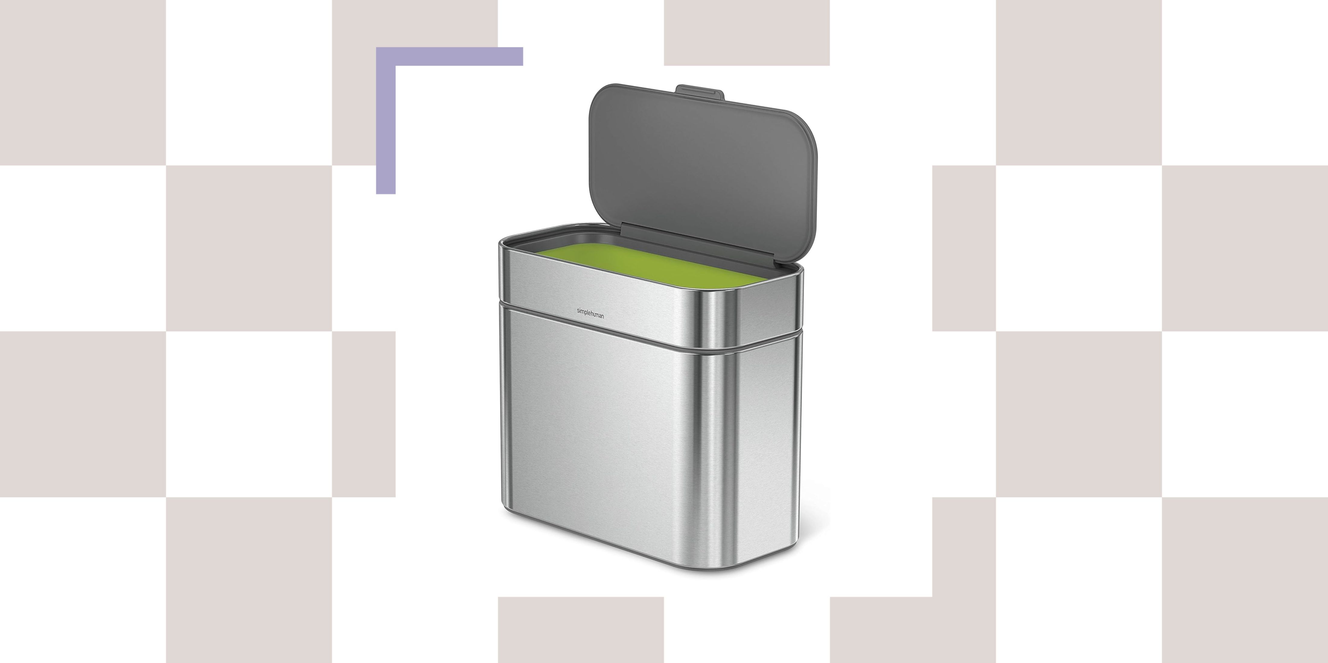 NYC's New Rules Forced Me to Find a Chic Compost Bin — Here's 7 Options Significantly Cheaper Than the $300 Fine
Composting is now mandatory in NYC. Here’s how to do it stylishly


-
 Should a Living Room Be Painted Dark or Light? We Asked Design Experts to Settle The Age-Old Debate
The color of your living room can completely shift the mood of your entire home, so the question remains: should you go light or dark...?
-
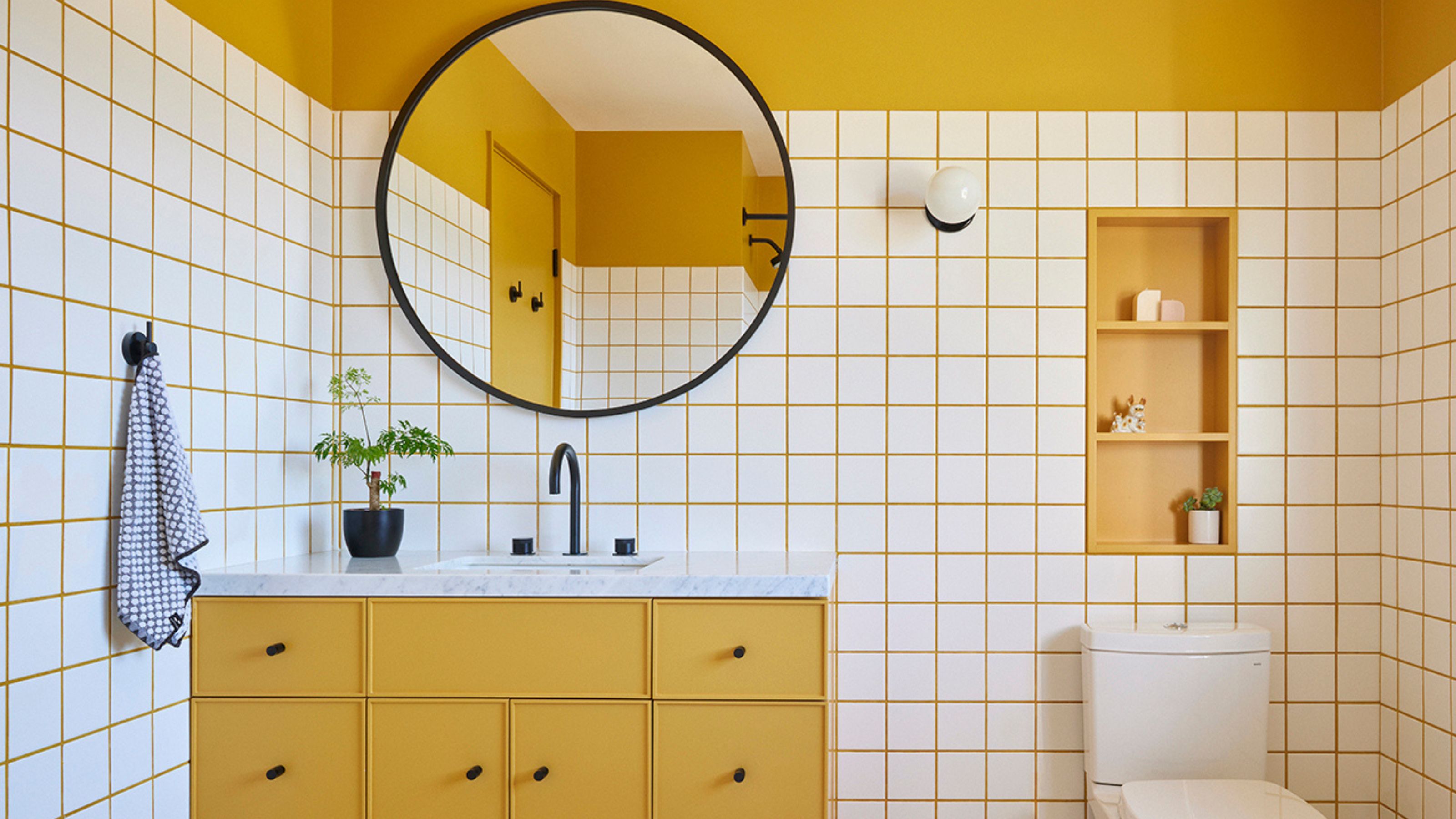 10 Yellow Bathroom Ideas That Vitalize Your Mornings and Look Unexpectedly Sophisticated While Doing So
Yellow is a color that by its very nature is energetic and full of life, and these designers have proved it's ideal for a bathroom
-
 It's a Color Symbolic of Dreams, so These Purple Bedroom Ideas Almost Guarantee a Good Night's Sleep, Right?
Not always an obvious choice for the bedroom, these designs prove that purple has restful and calming qualities, making it perfect for the bedroom
-
 I'm Sorry, But You Need to Know About 'Advancing and Receding Colors' If You Want to Get Your Home's Decorating Scheme Right
While some colors tend to pop and reach forward in a room, others draw back. Here, a color expert helps define these palettes and how to use them
-
 Amethyst, Heather, Pansy, Plum — Turns Out Decorating With Purple Opens You Up to a World of Possibilities
Purple certainly isn't a color for the faint hearted, it's a shade that can smell your fear. Here's how to conquer it through your interiors
-
 Here's Why Decorating With Mustard Yellow Helps Fill Your Interiors With a Sense of "Confident Calm"
There is so much more to decorating with this turmeric-tinted sauce-wiggled-on-a-hotdog not-quite-yellow shade than meets the eye
-
 The Combination You Weren't Expecting to Love — 8 Blue And Orange Living Room Ideas That Feel Surprisingly Elevated
A blue and orange scheme for living rooms may sound jarring, but these spaces prove they're striking, vibrant, and certainly unforgettable
-
 Smeg Says Teal, and We’re Listening — The Kitchen Shade of the Year Is Here
Designers are already using the soft, sea-glass green everywhere from cabinetry to countertops


