
Blue is everywhere, but have we forgotten the true power when decorating with blue in our homes? It's time to take fresh look at this beguiling color classic.
Blue is one of the hues on the color wheel that’s most second nature to us. It’s long been used as a crutch, a friendly non-descript shade to rely on. It’ll always be there, why it’s practically a neutral isn’t it? The color is so innately a part of our natural everyday lives — the sky, the sea (or any kind of water), in our eyes… — that sometimes, let’s admit it, we overlook it, and take it for granted.
Decorating with blue creates spaces that feel serene, calm, and cool; its spectrum shifting all the way from the palest duck egg and powdery shades to the deepest navy and indigo, and intense cobalt and azure — there really is a blue to suit every mood. You can’t deny that it’s got range, and there are so many colors that go with blue. On one end it’s stormy, edgy, and dramatic, the other it’s delicate, airy, and fresh.
In the home it’s easy to think we’ve seen it all before when it comes to decorating with blue. We all remember the days when navy feature walls were looming at us from every angle, and coastal-themed bathrooms paired watery tones with anchors and rope.
But let's not talk about those times and just be pleased that they’re over. We’re officially ready for a contemporary way to decorate with blue. To find exciting new colors that go with blue. To give this broad-reaching hue another chance in our homes, and lives. Here’s where to start.
1. Embrace the Blues

Blue has a surprising number of associations, many of which are calming and uplifting, which makes it a lovely color to decorate with.
Imagine the color blue. I bet you’re diving into an exhilarating azure ocean, or looking over a still cerulean lake, or gazing up into an endless horizon… Blue’s inherent link to nature means it has a certain meditative quality about it, and even the idea of it makes the shoulders drop and the mind quiet for a moment. It’s the essence of taking a slow breath without even knowing you needed one.
The sky itself demonstrates how expansive blue is, gloriously displaying the shade as it changes from the palest dawn whisper of blueness to dark and all-encompassing midnight, with everything in between popping in along the way, the color shifting in tone and disposition as light floods across its surface.
This is a hue that has resonance. It's able to convey sentiments that oscillate between tranquility and tenacity. Which for the home means decorating with blue is one of the most versatile choices you can make — and that even once you land on ‘blue’, they’ll be a lot of decisions still to make.
"Blue can be adapted to many different interior styles or moods — a bright Swedish blue feels very joyful and playful, whereas a subtle, more delicate blue can feel genteel," says Alice Bettington, co-director of UK-based studio, Golden Design. "Jewel-like tones of blue feel glamorous and lend a room opulence, and bright blue is a very welcoming color. There isn’t really anywhere we actively wouldn’t use blue."
Alice Bettington is the co-founder of London-based Golden Design. A quick flick through the studio's portfolio and it's clear that both Alice and her partner, Ellen Cumber, know how to use color throughout the home — whether it's boldly clashing or softly layered, so who better to ask about the ins and outs of decorating with blue.

Price: £5.50/sample

Price: £5.95/sample

Price: £5.50/sample
2. Unlock Blue's Power

Blue needn't be a color that blends in and feels soft and soothing — it works just as well in bright, zesty, and refreshing shades.
Somehow over time the color blue has become an alternative to black — from pens and ink and tableware and printing, to suits and uniforms — so it’s easy to forget that it’s due its place in the rainbow just as much as any other hue is. Unlike the colorless shades it’s often grouped with, blue carries a sense of depth, of richness, and of personality. Blue has spirit. Soul. And most importantly, especially if you’re a more logical person, pigment.
Despite the PR it’s been getting lately, do not believe that blue is a passive color — even in its most muted iterations, it does not need to fade into the background. The quietest of its tones remains permeated with presence, bringing with it freshness and a subtle sense that it's actually an energetic color, while more saturated blues are packed with impact and electricity.
And those in the middle? Well, they’re more low-key, sure, but no less potent. Mid-tone blues carry a quiet confidence, bringing nuance without dominance and intrigue without overwhelm.
"Blue has a lovely calming effect, yet at the same time is powerful enough to make a statement" agrees Venetia Rudebeck, the co-founder of Studio Vero. "We tend to use paler shades to create rooms which feel light and welcoming but also serve to make bold colors and pattern pop. There’s a lovely sense of tranquility and softness to be found in more muted tones, and they provide an interesting alternative to a neutral — we love using pale blue for bedroom walls and woodwork. If opting for a bold blue, really embrace it and don’t be afraid to experiment with more unusual and richer color combinations as it tends to work beautifully with most shades and styles."
For 10 years, Venetia Rudebeck has been working alongside Romanos Brihi as Studio Vero, developing a signature style of antique touches modernized with a unique use of color and texture. She's boldly splashed blue across the walls, floors, furnishings and decor, so knows a thing or two about how to make it feel balanced, walm, and welcoming.
3. Reflect on How Blue Makes You Feel

From jewel-toned teals to soft baby blues and rich navy shades — the spectrum of blue makes it an exciting color to decorate with.
To me, the shades you decorate with in the home are crucially linked to emotion and mood. Decorating with blue in the home is an act of self-care — this is a hue that’s innately soothing.
It makes the type of sounds that you’d want to drift off to sleep to, gently crashing or softly lapping waves, rumbling stormy nights, or the patter of soft rain drops. It smells like salt on a breeze or the wind before a downpour. It’s a color that slows the heartrate and allows time to pause for just a moment.
You likely already have big sections of blue in your home even if you don’t realize it — they’re called windows (and you may have noticed the pigment levels tend to change). As such, it’s almost impossible for blue not to fit into the home, and the connection to nature makes blue effortlessly slide into the home, seamlessly linking indoor spaces to the ever-changing light outside. "A room can often feel like something is missing if it doesn’t include blue," agrees Alice Bettington.
But how should you decorate with blue? A question that opens the decorative version of Pandora’s Box, as blue practically makes up an entire spectrum of its own. You could say there’s a blue for every mood, and a blue for every room.
"There are so many ways to use blue," enthuses Kate Guinness, director and founder of Kate Guinness Design. "A really strong blue will create a dramatic, vital effect, whereas a mid-blue with good depth of color will be both warm and calming. A cooler, lighter blue will give a sense of freshness. Layering blues all together also works well to give a calming backdrop with some nuance."

Price: £499
4. Understand the Undertones of Blue

Understanding the undertone of the shade of blue paint you pick is crucial to ensuring the space feels colorful but not cold.
So, you’ve set off along the I’m-going-to-decorate-with-blue path. Next, you’ll want to clarify the undertones of your chosen blue, or use the undertones to guide your choice of blue.
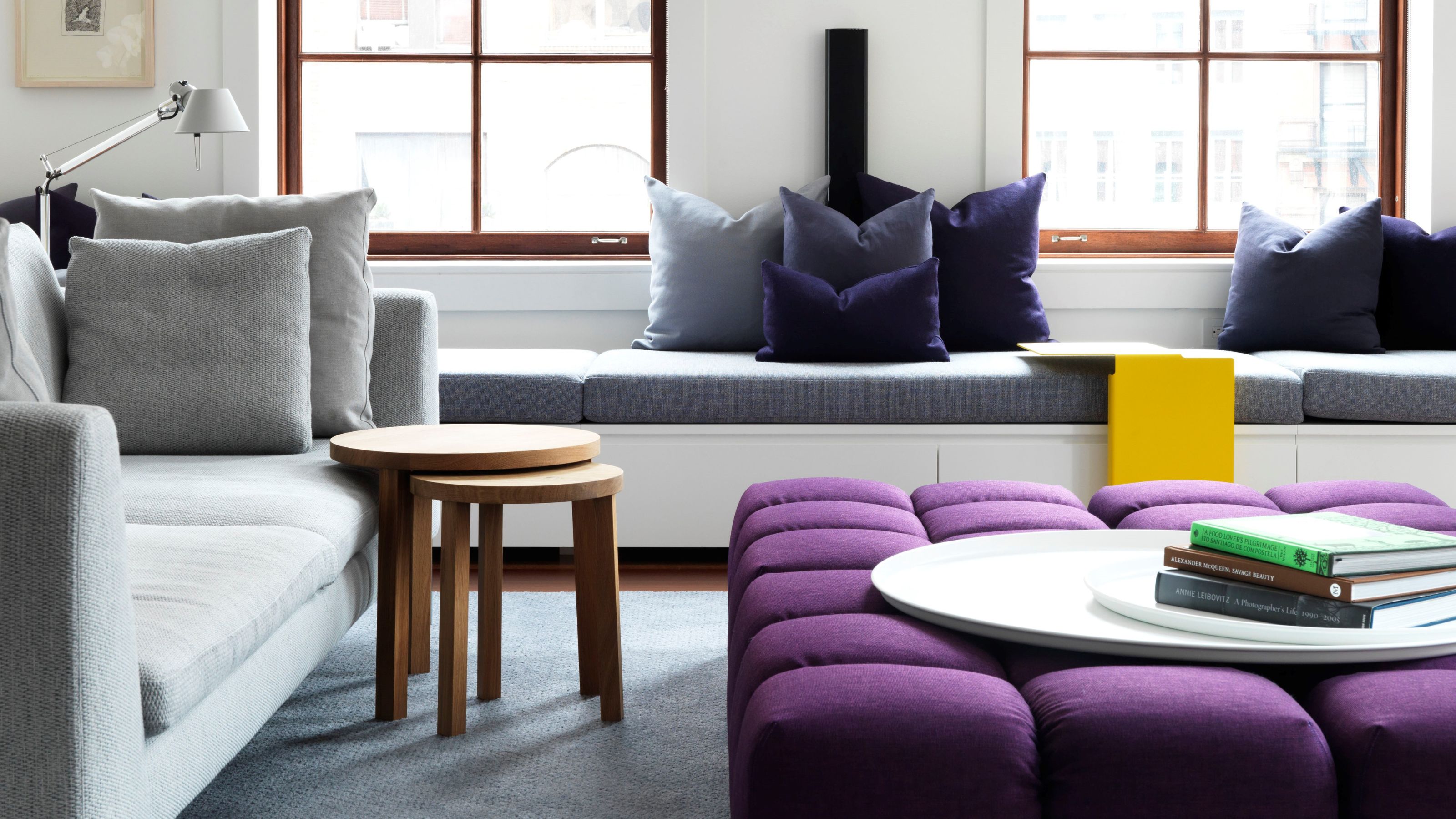
In the cool-and-crisp undertone department, blues with green undertones equal an organic, relaxing quality such as seafoam and turquoise, blues with purple undertones cast an evocative mood such as periwinkle and indigo, and blues with gray undertones are peaceful and muted, such as steel blue.
Then there are the blues with warmer undertones which are more about vibrant and full-bodied shades — red undertones make a blue feel intense, such as cobalt and aquamarine. Violet undertones in a blue lead to a soft type of depth, such as that found in sapphire or French blue, and blues tinted with muted yellow emit a gentle sun-kissed-style heat, such as cornflower.
The undertones are when lighting conditions become very important and you may find yourself studying them like you’re revising for your GCSEs. As we all know, this is much more important.
"It’s vital to know whether the room you are decorating is north or south-facing and to think about its natural light and the time of day you’ll use the space, as this will determine whether you go for a warmer or cooler shade," advises Kate Guinness. "If the room is north-facing it will generally get cooler, (literally) bluer light, so a warmer shade will balance this."
So, how to harness the power of undertones to help us when decorating with blue? Firstly, it’s important to layer different types of color within a room to keep it varied and natural. For example, if you’re a devotee of cool blues, add warmth with other materials such as wood and spicy colors to create a space that’s inviting rather than one that feels frosty.
Conversely, balance warm blues with shots of coolness such as clean white or silvery metals, and smoky colors to keep the palette refined and grounded.
5. Know the Complementary Colors of Blue

Being a color found often in nature, blue has many complementary pairings, which makes it relatively easy to work with in your home.
As I have mentioned, there are a lot of different shades of blue. And as such, there are plenty of pairings to go with it, too. You've got to consider what colors go with light blue, all the way to the colors that go with navy blue. In fact, it might be simpler to decide upon the other tones you’d like to use first and work backwards, deciding upon your blue shade last.
If in doubt, start with the color wheel and the centuries old (but still incredibly — and surprisingly — relevant) color structure it puts in place. "Most colors can pair well with blue, but those that are naturally opposing will always pack a punch," says Alice Bettington. "For example, a burnt orange lampshade will absolutely sing in a blue room. Blue also pairs beautifully with brown — it’s great as a backdrop for antique timber furniture."
Also try softer takes on orange such as peach, apricot, and coral, or go for something earthier such as terracotta or cinnamon. For complementary ‘analogous’ color pairings — made with hues next to blue on the color wheel — opt for teals, greens, violets, and indigos.
"Blue works well with pretty much any colors," says Venetia Rudebeck. "Right now, we’re drawn to pairing pale blues with rich colors such as burgundy, purple, and red. One of our most recent projects featured walls painted in Little Greene’s Drizzle (a pale blue-gray shade) edged with deep aubergine woodwork — it created a really stylish and elegant backdrop."
Don’t forget it’s okay to break the color rules (I tend to encourage it); "I really love blues and greens together (despite the old adage)," says Kate Guinness. For a harmonious and cool mood, try blue with the likes of sage, mint, or olive, for an ethereal dreamlike feel experiment with the pastels — I especially like buttery yellow at the moment — for a hit of opulence how about emerald, or malachite, and for a wildcard why not candyfloss or watermelon.

Price: £80
And of course, if you love love love decorating with blue — and that’s why we’re all here — you can have a great time layering up a melee of different blues (and never have to worry about running out of options).
Anchor a space with navy, lift it with breezy sky blue, add teal for complexity, or soften the edges with powdery pastels, stirring in plenty of texture for depth. Whether you follow the rules or freestyle, just know that when it comes to blue, more is more — and there's always room for another shade.

-
 Don't Fall Into the Trap of These Tacky and Dated Patio Furniture Buys — Here, Designers Share the Styles to Shop Instead
It's time to retire those brightly-colored plastic chairs and ugly buttoned upholstery...
-
 10 Loft Stair Ideas That Turn Functional Steps Into a Stylish Statement
These clever staircase solutions from designers and architects promise to elevate your space in more ways than one


-
 This Is When It's a Mistake to Use Color Theory to Decorate Your Home — "It Can Quickly Become a Distraction"
While it's a good idea to take inspiration from, is navigating the complex rules of theory around color more trouble than it's worth?
-
 Do Red and Yellow Go Together? Designers Share How to Make This Punchy Pairing Feel Soothing Rather Than Intense
These primary colors might seem like they'd clash, but get the levels right, and designers say this combination can look remarkably classic
-
 5 Butter Yellow Paints That Designers Swear By — So You Can Get This Trending Color on Your Walls With Confidence
Butter yellow is everywhere, but picking a paint shade can be a big commitment. To help, we asked designers to share their favorite shades
-
 What Does the Color Yellow Mean in Interior Design? A Color and Design Psychology Expert Explains
Whether you love or hate it, yellow always seems to elicit a strong reaction from people — here, we explain why
-
 Should a Living Room Be Painted Dark or Light? We Asked Design Experts to Settle The Age-Old Debate
The color of your living room can completely shift the mood of your entire home, so the question remains: should you go light or dark...?
-
 I'm Sorry, But You Need to Know About 'Advancing and Receding Colors' If You Want to Get Your Home's Decorating Scheme Right
While some colors tend to pop and reach forward in a room, others draw back. Here, a color expert helps define these palettes and how to use them
-
 Amethyst, Heather, Pansy, Plum — Turns Out Decorating With Purple Opens You Up to a World of Possibilities
Purple certainly isn't a color for the faint hearted, it's a shade that can smell your fear. Here's how to conquer it through your interiors
-
 Here's Why Decorating With Mustard Yellow Helps Fill Your Interiors With a Sense of "Confident Calm"
There is so much more to decorating with this turmeric-tinted sauce-wiggled-on-a-hotdog not-quite-yellow shade than meets the eye


