

You haven’t ‘done’ blue until you’ve experimented with cobalt. The bluest of the blues, cobalt is so rich it’s practically dripping in pigment. But is such a bold, impactful shade really workable in the home? Yes, yes, a thousand times yes, and I implore you to at least give it a go.
Cobalt is a power color, a hue that’s alive with intensity that says ‘here, I am, I am not afraid.’ Being surrounded by cobalt in a room feels like being wrapped in a Van Gogh sky or submerged into the world of Yves Klein’s luminous monochromes. It practically buzzes with electricity, so full is it with energy and potency.
Decorating with blue in its many tones brings different depths and feeling to a space — where lighter blues whisper, cobalt declares. It carries a sense of weight and presence, so much denser than the airiness of sky blue, so much wilder than free-spirted cerulean, so much more dynamic than the moodiness of navy — this is the blue you turn to when you want to dial up intensity and intrigue.
Of all of the blues, it comes across as the most imposing, the most difficult to work with — but its uncompromising confidence will lift your home with its vibrancy, be it as a diminutive accessory or an entire room-drench. So, let’s explore how decorating with cobalt blue can work wonders in your home — without it feeling too much — and why this shade truly deserves a place in the decorative spotlight.
1. Dive Into the Depths

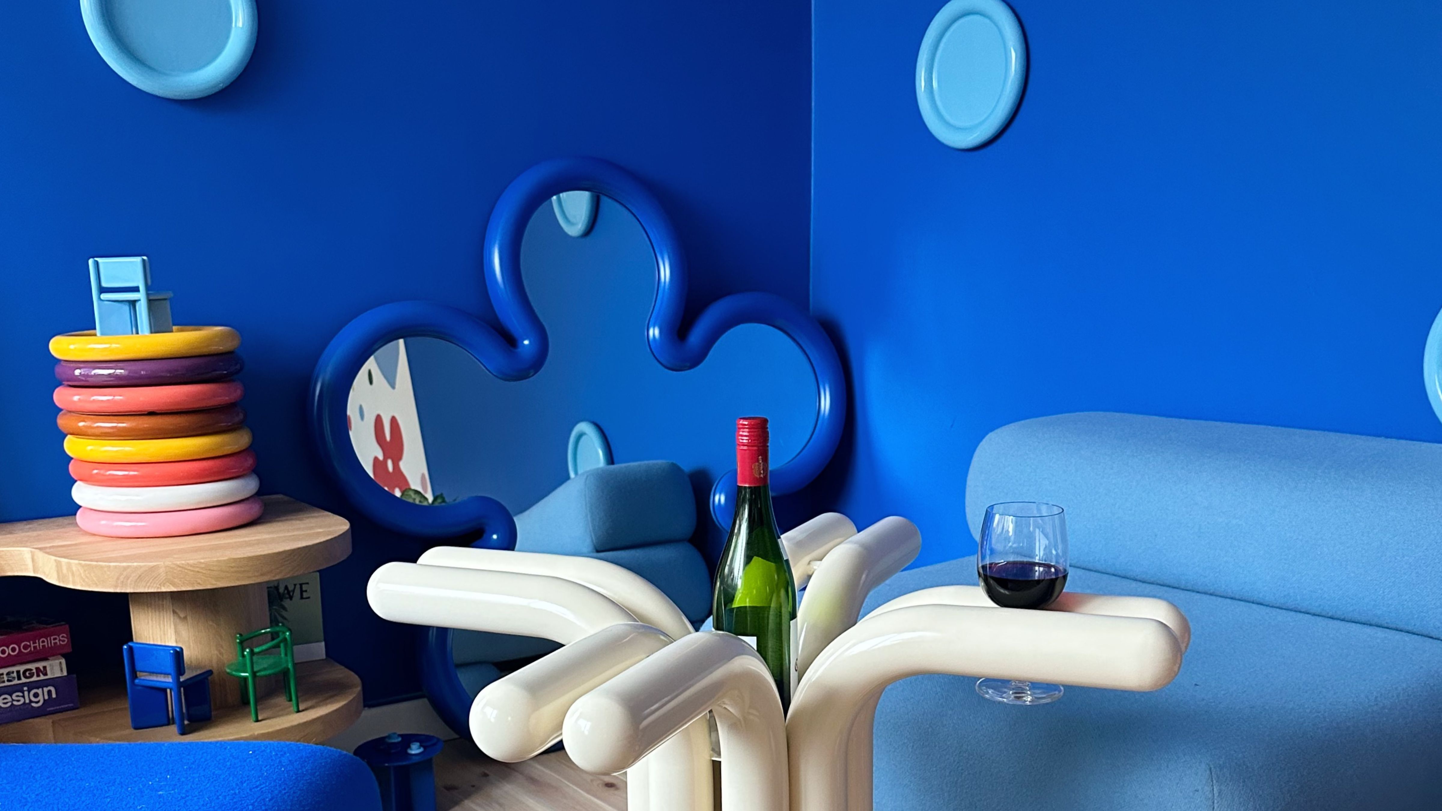
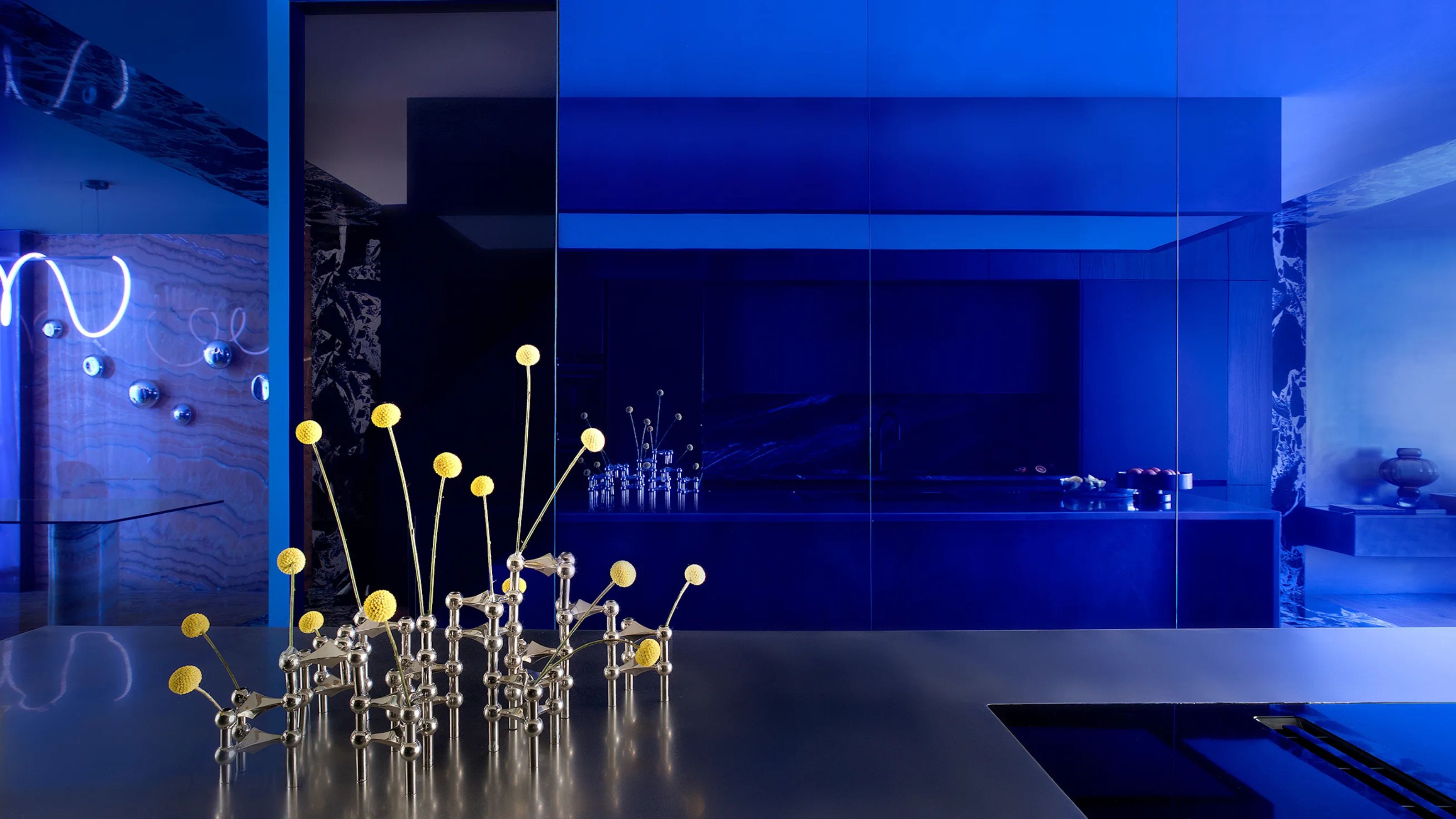
The cobalt blue in this living room creates a striking focal point in the space.
There are so many colors that go with blue, making it a great color to pair with, and in the case of cobalt, there is no mistaking this shade for anything else — which is unusual for a blue. There’s no is-that-teal-or-is-it-turquoise type of messing around — you know when cobalt’s arrived, and you can picture it immediately (you probably already are).
Pure blue with a drop of violet, cobalt is a medium-deep tone that somehow — almost impossibly — is incredibly vibrant without being bright. It holds an elemental quality, feeling as if it’s been mined rather than mixed. Could a human really create something so mesmerizing?
When you think of cobalt, the name Yves Klein often pops into the brain, as the artist not only made the color his signature but also developed his own version of it in the 1950s, which has become the hue’s benchmark. International Klein Blue is pure, infinite, hypnotic, and intentional — designed specifically to preserve the intensity of the pigment. Klein’s work with cobalt cemented its status as more than just something decorative, and it became something comparable to an immersive experience.
"It’s an incredibly impactful and joyful color to use in interiors," says Amanda Lyon, interior designer and founder of All Design Studio. "It has a timeless quality, rooted from a long history of use in art, culture and fashion but seems to always feel so fresh and exciting. Its vibrancy and boldness delivers a big punch of personality."

Creating a positive impact on well-being is at the forefront of Amanda’s approach as the founder of London-based All Design Studio. Her interiors are a thoughtful balance between function, comfort, and beauty and often feature twists of unexpected color.
2. Enrich the Atmosphere

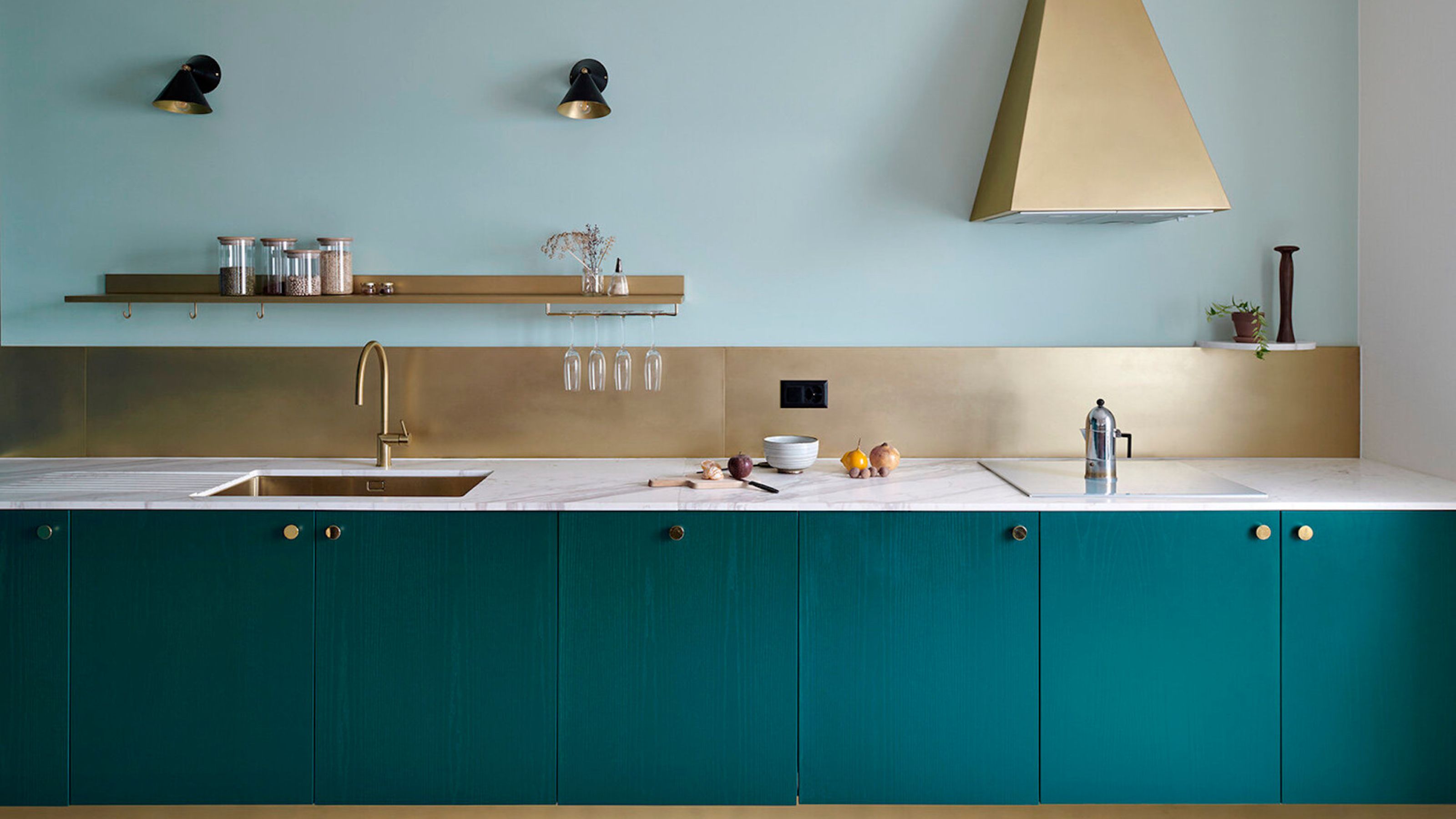
What a way to make your kitchen look more interesting — cobalt blue really sings in this space.
As one of the most expensive-looking shades of blue, Cobalt’s vital, look-at-me-ness makes it impossible to ignore in the home, and whether used in large or small packages, it’ll draw the eye and quicken the heart. "Cobalt is such a great color because it’s bold and full of life," says Simone Gordon, co-counder of Owl Design. "It instantly lifts a space, whether you use it on walls, furniture, or accessories. Plus, it’s got this lovely richness that makes a room feel vibrant but not overwhelming — perfect for adding character."
A glimpse of cobalt is akin to a quick shot of caffeine, the moment a heavy beat finally drops, or the shower turning cold for a moment. It’s a small sudden shock, which just as quickly as it strikes, settles and drifts into equilibrium. In the home, this translates to decorative adventure.
Cobalt is not a shade for the color wary — or is it? Even used in the smallest of portions — a tiny vase in the corner, say, a plant pot or a on a book cover — it can influence the entire room, sending out a pulse of energy that tells the world you’re a maverick, an experimenter, a color alchemist.
Surprisingly, cobalt also has a calm side. Its richness creates a sense of stability, and it can be deeply grounding — because what could possibly move this weighty, monolithic hue? Such self-assurance imbues the color with a sense of serenity — as you float through its immersive world, you innately know that it’s there to support you and that there’s no way of getting lost. Interiors-wise, this creates an atmosphere that’s both cocooning and confident, a space where cobalt’s commanding nature becomes a source of comfort, strength, and tranquillity.
Co-founder of East London-based interior design, styling, and consultancy studio Owl Design, Simone focuses on creating uplifting spaces. She believes that design has the power to transform everyday life and is passionate about joyful and daring aesthetics – which is where tones such as cobalt come in.
3. Curate Cobalt Color Combos

Never has a color combination worked so well. Cobalt blue and bright orange = a marriage of color dreams.
Mixing in other shades alongside cobalt can seem futile — surely the glorious blue will outshine anything it’s placed next to? Au contraire my friend, teaming it up with other hues can both balance out its brazenness as well as emphasize its power — or create an even bigger source of energy. So what colors go with blue in this energetic hue?
"Cobalt is such a dream to pair with other colors!" enthuses Simone. "It works well with both warm and cool colors — it can look striking with earthy tones like terracotta, mustard or burnt orange for a lovely warm contrast, but it also blends beautifully with other blues and greens."
"It pairs well with sandy tones for a Mediterranean-inspired look; with rust or terracotta, it can create an artsy, boho vibe," says Emma Morley, founder and creative director of interior design studio Trifle*. "It’s very gorgeous and quite 'now' to pair it with a burgundy — although not for the fainthearted!"
I do have to say how fantastic a strong, crisp white and cobalt are together. Practically as sharp as each other, the cobalt-and-white team come across as smart, elegant, and considered, lifting each other in a way that’s elegant and understated. Charcoal gray is also pretty fun with it, really upping the contrast and making for a more charged ambiance.
In the more saturated department, there’s also dusty blush or peach for a punch of prettiness that softens the blue, while also keeping things fresh, and rust for some earthy edginess, or the likes of teal or emerald for some intense luxe.

Emma founded London interior design studio Trifle* to create spaces that tell unique stories and to inspire those within them. The firm’s work is fresh and original, each room prompting its inhabitants to be more creative and happier, and bold colors are featured profusely and proudly.
4. Let the Vibrancy Shine

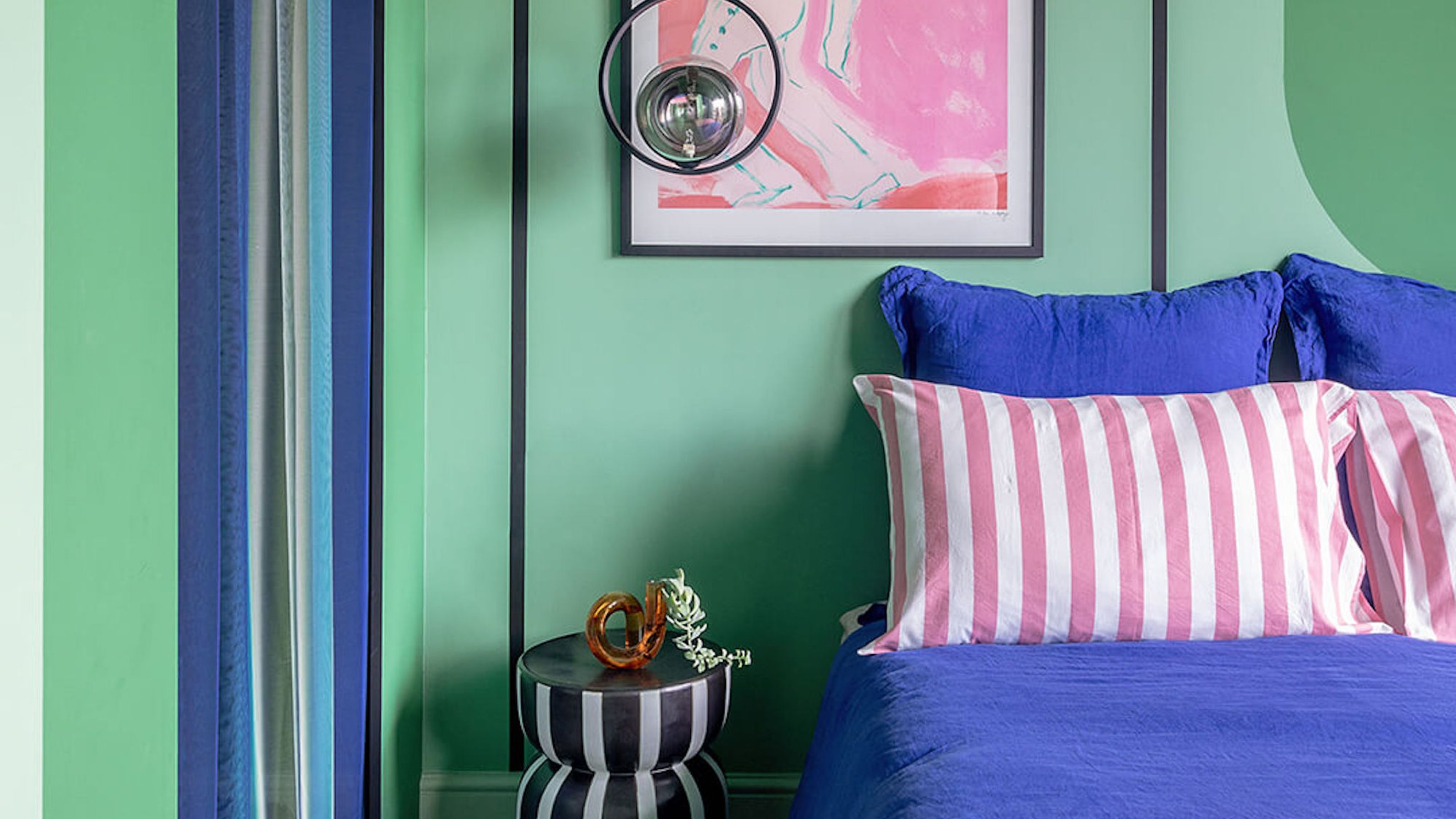
This blue bedroom idea makes the cobalt blue of the headboard really stand out against the other hues in the room.
Okay, so you’re convinced that cobalt’s the one for you — but how to actually integrate it into your pre-existing beautiful home (or your new blank canvas)? Where exactly does it work best, and how exactly should one use it?
Firstly, let’s assess the light. "The golden sunlight of a south-facing room can be a wonderful space for a cobalt blue, which becomes warmer in tone — think Grecian villa in Summer!" explains Emma Morley. And if you're wondering if you should paint a north-facing room blue, it's worth noting that the honeyed southern light makes the shade seem livelier, too, and more theatrical compared to the more muted light of a north-facing setting, which can give cobalt a deeper, moody attitude. "In a north-facing room, it can feel much cooler," Emma continues. "So it’s worth considering pairing it with warmer tones unless you’re aiming for a very clean, fresh, bright look."
Starting with small accent objects is a simple way to ease into cobalt and will help you assess where it fits in your home. This is, after all, a palette power player, and even a small dose of it radiates through a room. "Cobalt is such a strong color that it can dominate a space if you go overboard," agrees Simone Gordon. "If you’re unsure, start with smaller touches such as cushions, artwork, or ceramics. Cobalt glassware can add just the right amount of drama to a space without it feeling overpowering."
If you’re ready to take the plunge, then go big — you’ll reap the rewards. Cobalt walls, rugs, large pieces of furniture, or curtains are transformative elements that turn ordinary spaces into striking, won’t-be-forgetting-this showcases. "As a ‘main character’ cobalt, this is a bold and confident choice and a color that can look amazing when drenched," confirms Emma Morley. "Cobalt looks incredible when used across big areas, through color drenching a room or on a run of joinery," agrees Amanda Lyon. "When using a large amount of it in a room, I always suggest keeping the rest of the aesthetic relatively quiet to avoid overwhelming the space."

Price: £2.45 / sample pot

Price: £5.50 / sample pot

Price: £2 / sample pot
If you're considering decorating with cobalt blue or, indeed, any blue shade, you might be interested in exploring the best Benjamin Moore blues that designers come back to time and time again.

-
 IKEA x Gustaf Westman Is Coming This Autumn — Here’s What You Need to Know About the Brand’s Coolest Collab in Years
IKEA just announced a collab with the creator TikTok's favorite "chunky" plates — and it might just be its buzziest drop since Virgil
-
 5 Patio Mistakes You're Probably Making and What to Do to Avoid Them for a Flawless Outdoor Space
What good is stylish outdoor furniture if your foundations aren't up to scratch? For a patio that lasts, these are the mistakes to avoid.


-
 Our Latest Color Crush Makes for High-Risk, High-Reward Decorating — Meet 'Cosmic Purple'
Our June Color Crush is an entrancing shade that is the secret to creating captivating interiors. Here's how to embrace its boldness
-
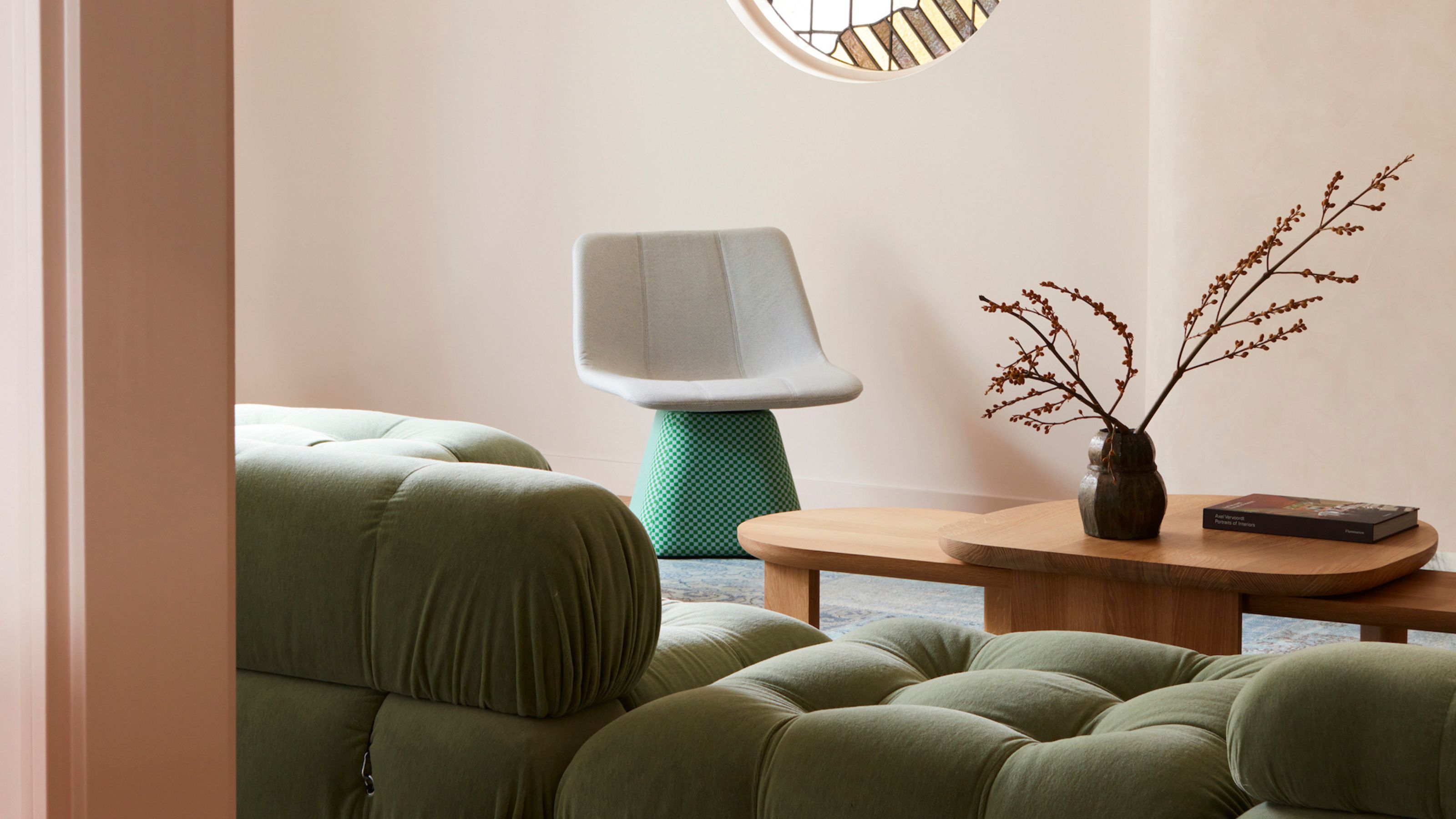
 9 Green and Gray Living Rooms That Feel Modern and Mesmerizing, and Far From 'Millennial'
A favorite color combination among interior designers, green and gray living rooms can be cozy, cool, and full of character
-
 We Already Know the Color That's Going to Have 2027 in a Chokehold — Now's Your Chance to Beat the Trend
This cobalt blue-reminiscent color is set to be the *it* shade of 2027, but we've asked designers how to best bring it into our interiors for right now
-
 I'm a Color Expert, and Here's Why I Think Earthy Color Palettes Always Feel At Home
Whether you live in a period home, a new build, or a cozy flat, these hues create a sense of calm and cohesion
-
 I'd Have Never Considered Teal for My Cabinets Before, but These 7 Kitchens Prove It's a Color With So Much to Offer
If you're looking for a shade to steal the show in your kitchen, you can't go past teal. Here's how to complement it, no matter your interior style
-
 Scientists Have 'Discovered' a Brand New Color — Meet Olo, the Most Unnatural (and Most Saturated) Color in the World
It doesn't exist in nature, and it's not visible with the naked eye, so what *actually* is Olo? And what does it mean for interior design? Let's discuss
-
 10 Pink and Green Living Room Ideas That'll Make You Think Again About This Color Combination
This iconic pairing can be as sophisticated as it is playful — here’s how the experts create contemporary pink and green living rooms
-
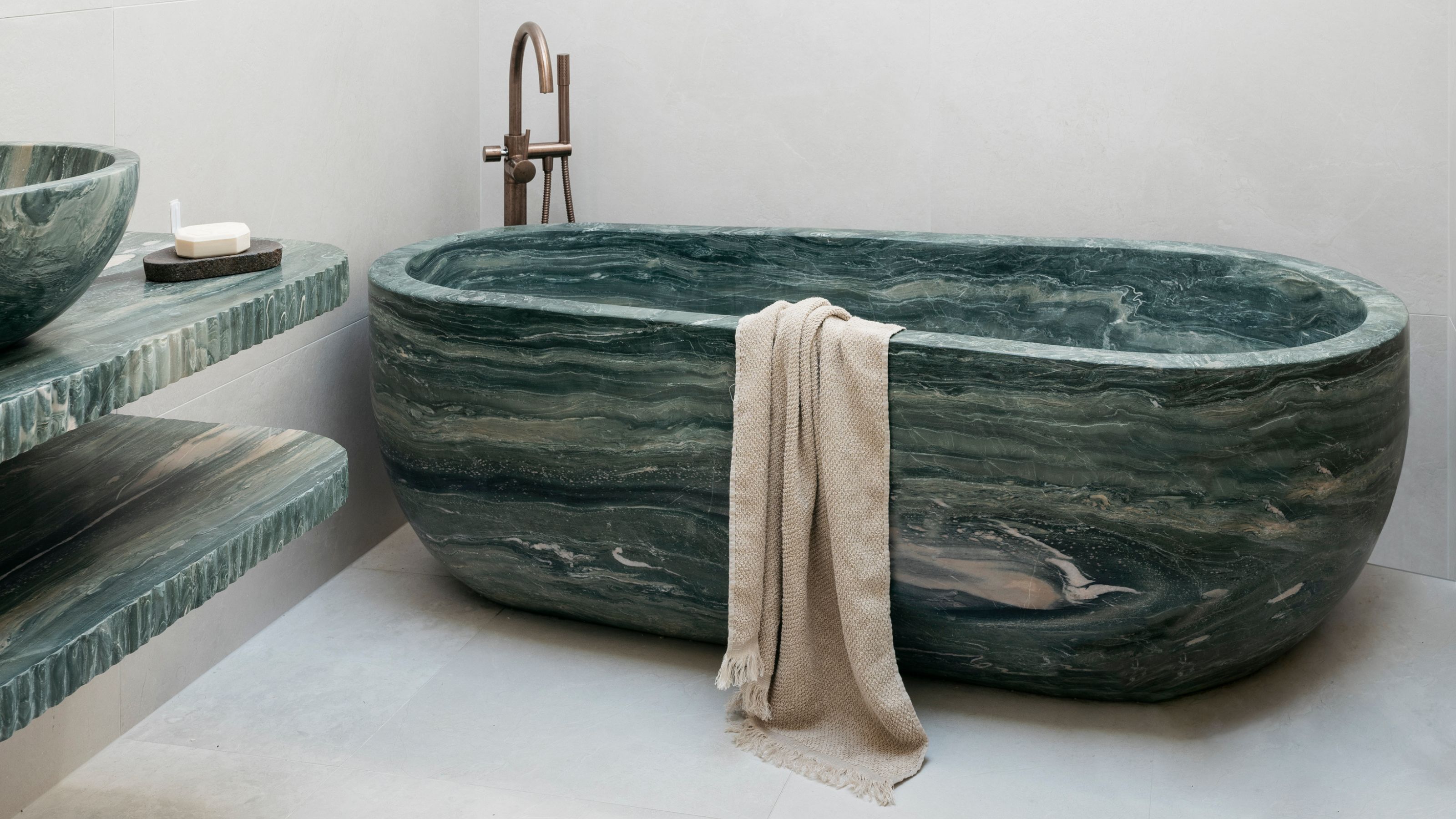 8 Green Marble Bathroom Ideas That Are Bold, Beautiful, and Anything but Basic
Green marble bathroom surfaces create a sense of drama — now is the time to embrace this material for a bold, contemporary look in your space


