"No One Does it Better Than Nature" — Here's Why (and How) You Should be Decorating With Earth Tones
People often use the term 'natural' and 'neutral' interchangeably when it comes to colors, but in truth, there is so much more to decorating with earth tones
The Livingetc newsletters are your inside source for what’s shaping interiors now - and what’s next. Discover trend forecasts, smart style ideas, and curated shopping inspiration that brings design to life. Subscribe today and stay ahead of the curve.
You are now subscribed
Your newsletter sign-up was successful
Mother nature has offered us a wealth of inspiration when it comes to interiors, manifesting in many forms in our homes, from organic materials and textures to captivating color schemes. No one does it better than nature. The options are endless.
But with so many shades to choose from, how do you navigate decorating with earth tones? Which are the easiest earthy paint colors and which can come with challenges? And how do you keep your scheme feeling rooted in nature, but still fresh, different, and inviting?
To answer some of these questions, we've spoken to interior designers across the globe. Each one has provided insight into what makes earthy paint colors so enticing, and how to make the most of them within your home. Here's what they say.
Article continues below1. EVOKE WARMTH WITH YOUR EARTH TONES

This inviting vignette featured in a project by Studio Castille is as rich in character as it is in color. The paneled walls are dressed in a delicious olive green paint that feels modern yet nostalgic, whilst the brown and black accents give the gilded mirror an apparent edge.
The patterned cheetah print rug offers this space another layer of organic connection and fun. This is a perfect example of earthy tones done right, cozy but crisp and cool in its expression.
“Decorating in earth tones evokes a warm, soothing, and natural atmosphere," says Mathilde Abeel and France Lepoutre, founders of the Parisian agency Studio Castille. "Earth tones, such as beige, brown, ochre, terracotta or taupe, are often associated with nature and raw materials like wood, stone or clay. These colors can be incorporated into painted walls, textiles (curtains, cushions, carpets), or even ceramic or distressed wood accessories."
2. EMBRACE THE SOFTNESS OF EARTH TONES
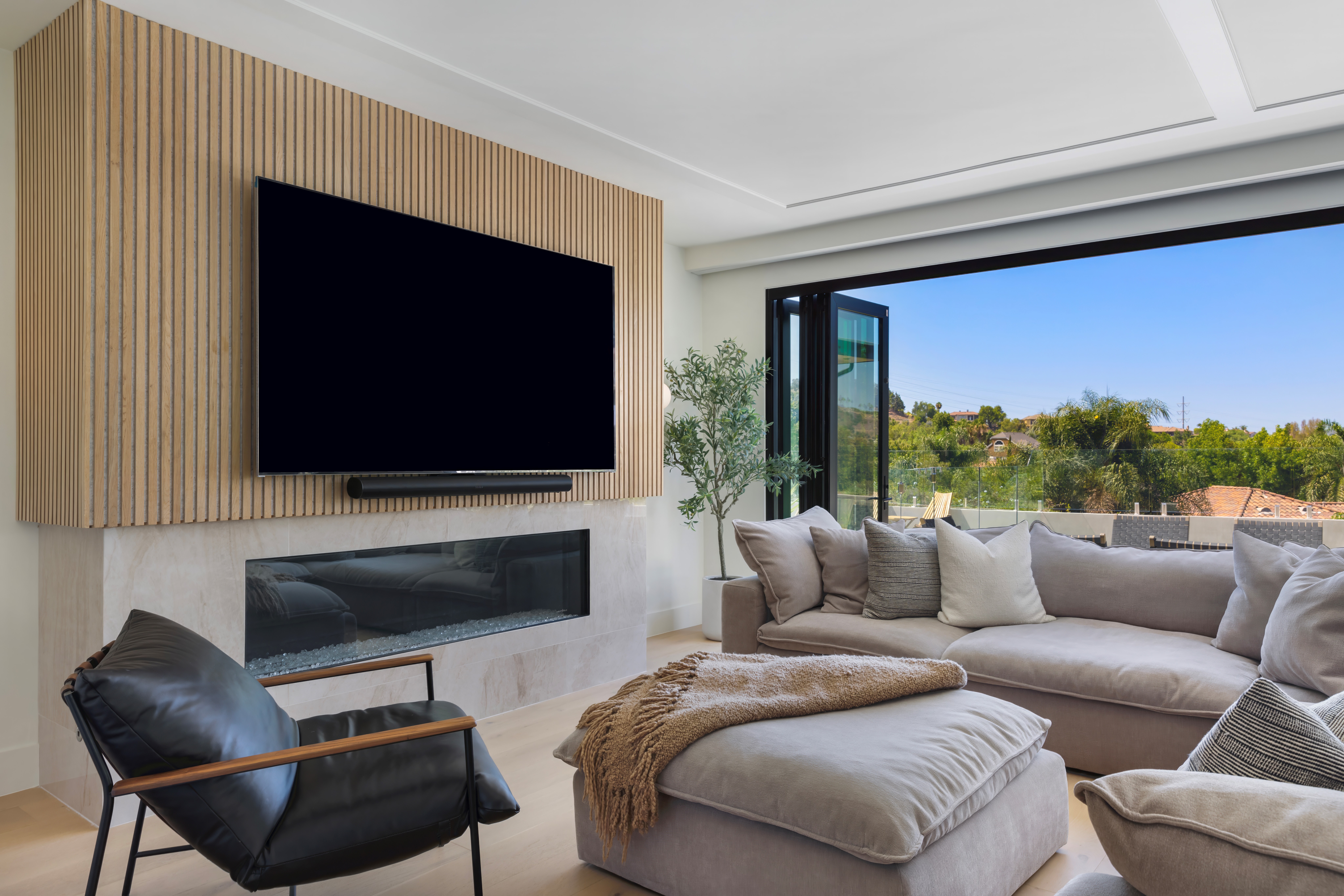
There is a misconception that all earth-centered schemes have to be filled with rich dark tones. This is false, the planet features a library of vast ecosystems and not all are covered in verdant greenery, case in point: the sweeping sand dunes of the Sahara.
The Livingetc newsletters are your inside source for what’s shaping interiors now - and what’s next. Discover trend forecasts, smart style ideas, and curated shopping inspiration that brings design to life. Subscribe today and stay ahead of the curve.
You can embrace the softer side of earth tones and still create an interior that feels organic and welcoming but also reflects plenty of light around the room, much like this earth-toned living room by Market Studio Interiors. The taupe grey and sand tones feel natural but not overwhelming, they are subtle and soothing additions to this space.
“For a gray-dominant palette, I love introducing warm earth-toned textiles that can provide warmth and depth, breaking up the coolness and creating a more inviting atmosphere,” says Vyanca Soto, owner and principal designer at Market Studio Interiors in Fullerton, California.
3. DON’T BE AFRAID TO CREATE CONTRAST WITH YOUR EARTH TONES

“We hear consistently that people want their space to feel calm, comfortable to unwind in," says Jess Nahon, co-principal of design studio, Sugarhouse. "Combining earth tones with punchier colors is the way to go to achieve this."
When decorating with earth tones, it’s also important to remember that interiors are all about balance. This charming living room designed by Sugarhouse is all about layering the almond earth tones found in the upholstery and joinery with contrasting accents like the bold cushions and books that draw the eye in.
The wooden beams and brass lighting fixture add to this contrast too, albeit in a more subtle way. The room brings all of these elements together, big and small, each playing a significant role in the symphony.
4. CONSIDER COOLER EARTH TONES, TOO
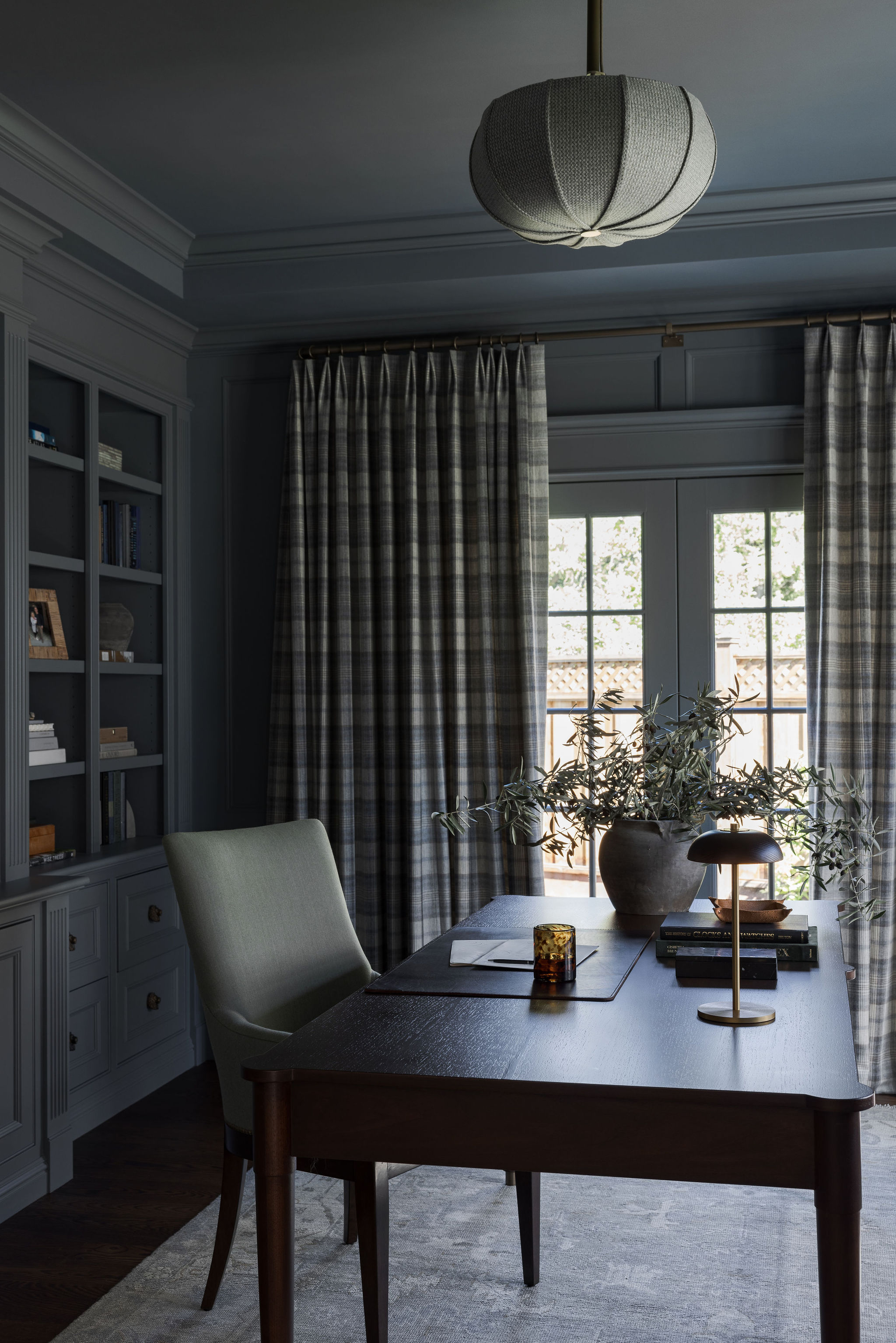
One of the key takeaways from this piece is that yes, earth tones are a great way to warm up a space, but they can also work wonderfully well to do exactly the opposite. Imagine the dewy rain-filled landscapes that dominate the Scottish Highlands — this is a landscape filled with gray, lavender and blue. It celebrates these cooler earth tones rather than running from them.
The striking color scheme for this study by interior designer Marea Clark, founder of Marea Clark Interiors, does exactly the same thing, bringing together soft gray hues and dark walnut tones. The result is a space that feels elegant, cozy, and effortless.
“Earth tones are so versatile and can give a sense of moody warmth to a space," she says. "I really love using them in cozier rooms like offices or earth tone bedrooms (especially boy’s bedroom), where you can go a bit darker and cozier.”
5. INTRODUCE EARTH TONES TO CONTEMPORARY INTERIORS

Some may assume that earth tones only work in more traditional interiors, but New-York based interior designer Ghislaine Viñas proves otherwise in her open-plan living space that blends warm browns and soft beige tones with vibrant bursts of dandelion yellow. Contemporary spaces can be some of the best rooms for earth tones, the shades lending a touch of softness and warmth whilst preserving an ambiance that is firmly rooted in the now.
“Using earthy tones can create a very soothing and pleasing vibe for a room but beware of a snoozy interior," the designer warns. "I recommend considering adding an unexpected color pop even if it's just in the art you select or a fun light fixture.”
6. LOOK TO NATURE FOR INSPIRATION

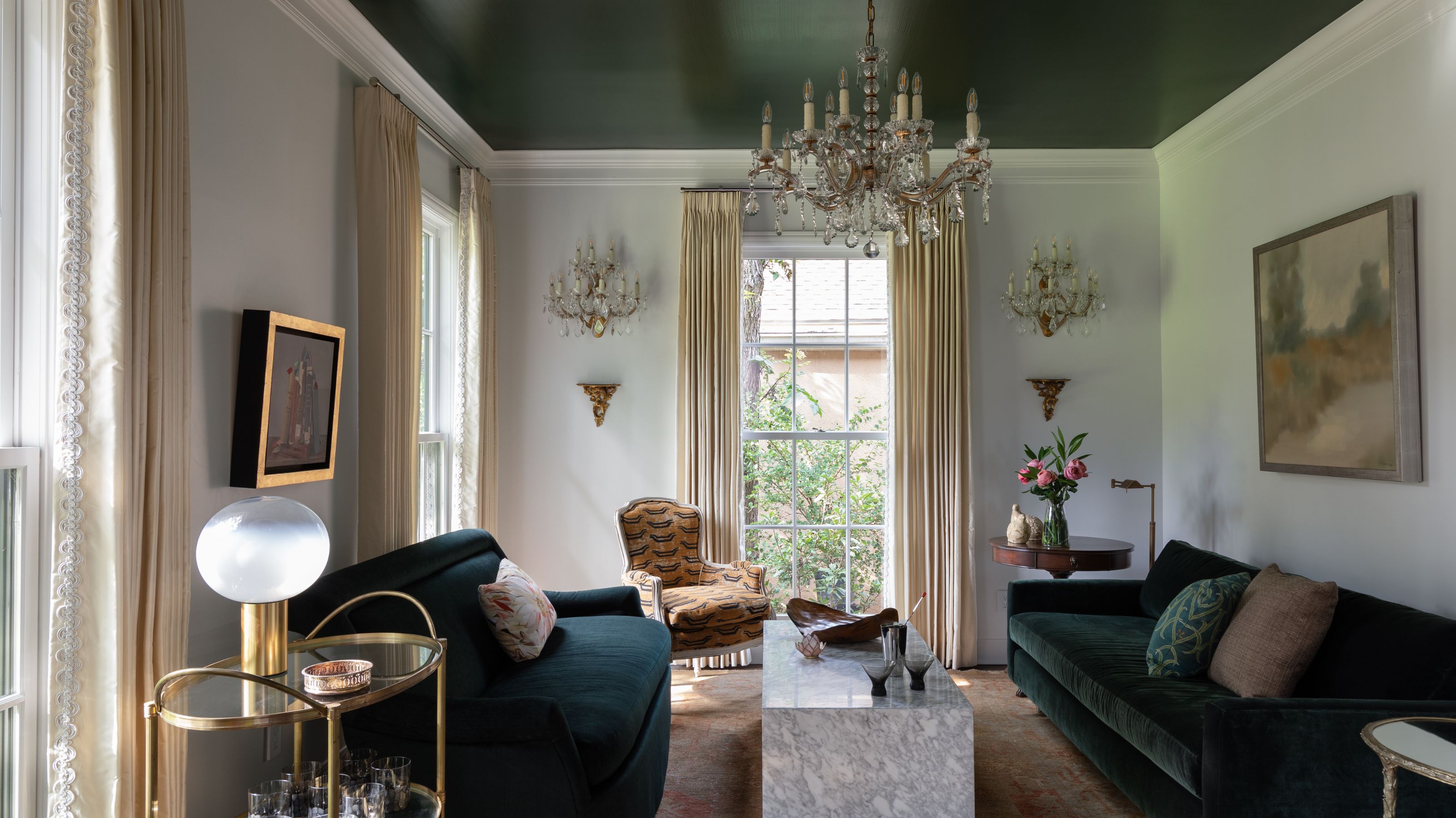
The hunter-green painted ceiling in this decadent living space designed by Austin-based firm Cuppett Kilpatrick is the first sentence in the room’s love letter to earth tones. Accents of gold, taupe, and orange all echo the autumnal tones that feature across the furniture, lighting, and accessories. As the designer suggests, sometimes the answer to mastering decorating with earth tones is found by looking a little closer into the landscapes that surround.
“As in nature, warm and cool colors exist in harmony, balancing each other: green to golds and reds,” explains Tim Cuppett, founding partner at Cuppett Kilpatrick Architecture + Interior Design. Creating a scheme that works to complement the earthy hues found in your own backyard is a great way to ensure your interior works with its surroundings and frames the view just much better.
WHAT ARE EARTH TONES IN COLOR THEORY?
“In color theory, earth tones are revered for their grounding and calming qualities, drawing inspiration from nature’s palette," explains Vyanca Soto, owner and principal designer at Market Studio Interiors. "These colors, such as browns, greens, and grays, help create a sense of balance and harmony in a space, making them a popular choice for both contemporary and traditional designs."
It’s easy to understand why we are all so drawn to these hues, they mirror the biophilic effects that plants and foliage bring to our lives. Instantly you feel closer to the rich landscapes that so many of us seek to escape to.
Writer and design expert Faaizah Shah is the founder of The Interiors Consultancy. She has worked with designers such as Staffan Tollgard and design houses such as Sanderson to help them understand and communicate their narratives. She is known for crafting engaging stories and imaginative content, and understanding great decor from her years alongside some of the best creatives in the industry. She is also a contributor to Livingetc.
