Who Said Decorating With Green Needs to Be Boring? This Bold, Chic, and Gorgeous Hue Is Set to Make a Statement
Designers share their secrets and set to inspire with this stunning tone that you'll soon want in your home
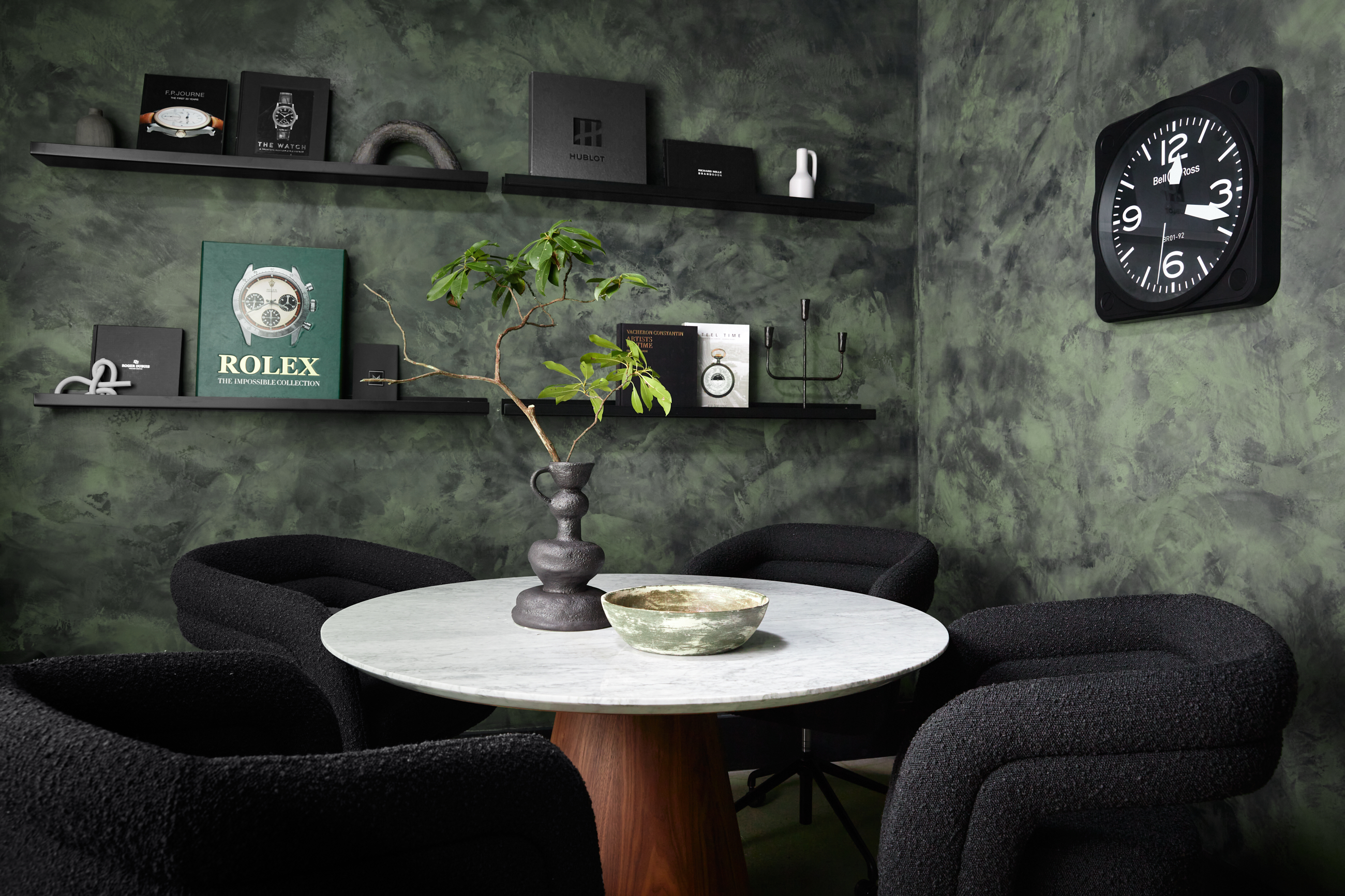
Green is a verdant color rich in character and charm. The biophilic hue is popular thanks to its endless range and versatility; there are so many shades of green to choose from, but therein lies some of the benefits and some of the struggles. How do you know what the rules are when you’re choosing between sage, mint, chartreuse, or emerald?
You might jump to discover what colors go with green once you’ve chosen a favorite but it would be wise to stop and consider what are the secrets to decorating with green in the first place.
We’ve spoken to esteemed interior designers to bring you all the dos and don’ts of decorating with this enticing color. They explore everything from the importance of being brave with your green to factoring in the role texture plays in your shade's final impression. Here's what you need to know.
1. REFLECT THE EXTERIOR WITH YOUR GREEN
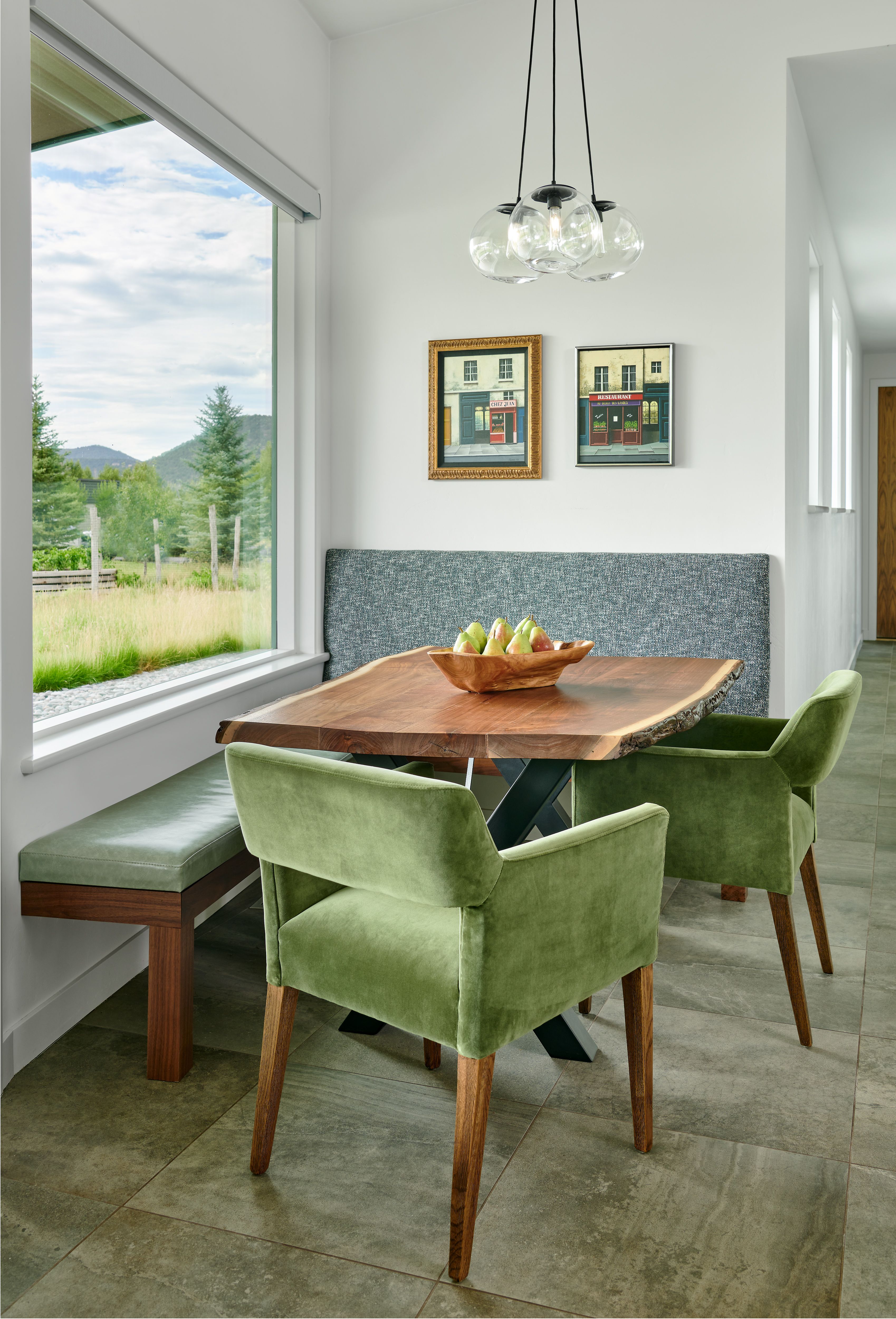
Green is a color synonymous with nature, and to underplay this relationship when decorating with color would be a mistake. So much of why green appeals to us is rooted in its ability to bring the outside in.
For their River Retreat breakfast nook, Aspen Design House brought the richness of the mountain landscapes closer to their clients with the introduction of green upholstered dining chairs and a leather green bench.
The choice of green is just bright enough to feel energizing but natural enough to connect seamlessly with the view outside the window. "If you are selecting a green fabric to upholster a chair in a high-traffic area such as this breakfast nook, we like to use commercially rated fabrics that are up to the wear and tear of regular use and can withstand coffee spills or clean up from marinara pasta sauce if you have grandchildren visiting," says Denise Taylor, founder and design director of Aspen Design House.
Denise also highlights the importance of keeping your greens consistent. "Keeping the fabric selections in the same color tone but with different textures is a lovely way to layer design into a space."
2. CELEBRATE GREEN IN THE SUPPORTING ROLE
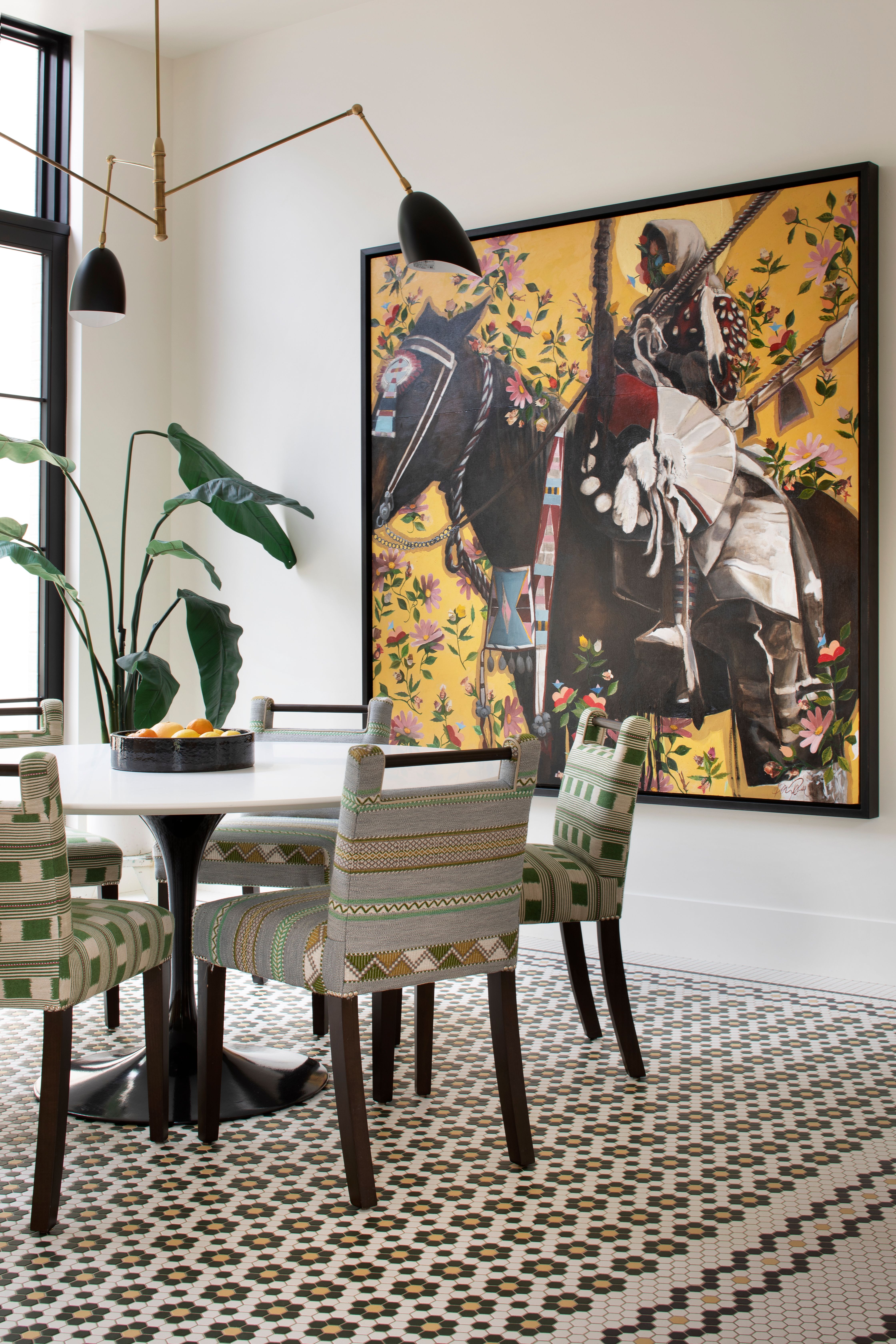
While it might always feel like a bold color can only ever be the star of the show, green is as confident in being the supporting star as it is in taking on the leading role.
This vibrant and colorful breakfast room is the perfect example, the greens are present, but they seek to celebrate the other hues in the room just as much as they give the room a sense of freshness. So if you're wondering what colors go with light green, just embrace the hues welcomed in the design above.
"We’re a fan of complicated color stories in our homes and this one uses black, white, green, and yellow gold as neutrals, but there’s enough green in the mix to create a cast of green in the room to play against the trees outside. We were fairly strict with our color choices to let the accent pinks and reds of the painting shine," explains Jeremiah Young, owner and design director of Montana-based studio, Kibler & Kirch.
3. MARRY YOUR GREENS WITH COMPLEMENTARY TONES

Choosing colors that really bring out the essence of your green is another way to ensure you get the most out of your interior. This moody office space, designed by Philadelphia-based Far Studio, takes the edge of a muted color and dials it up with the addition of charcoal black tones. The result is a room that feels rich and engaging but also effortless in its sense of cohesion and clarity.
"This space was intended to feel warm and inviting and we came up with the idea to do the walls in a custom green Roman clay plaster finish. The vibe was supposed to be masculine but not cold and adding the green textured walls allowed us to really envelope the space in that vibe," says Brittany Wurzak Hakimfar, lead designer of Far Studio.
4. TAKE INSPIRATION FROM THE PAST

"In the retro-inspired kitchen, we were inspired by mid-century Scandinavian kitchens but wanted to play with the palette for these particularly adventurous clients. The split pea soup green was an unexpected choice, but the white cabinet boxes and white walls balance it out," reveals Leah Ring, principal of Another Human Studio.
Take a page out of Ring’s book and explore how green has evolved throughout the decades or even centuries to consider how you might bring it into your interior. This memorable and joy-filled modern kitchen is a poignant reminder that there are no wrong shades of green; rather, beauty is in the eyes of the beholder.
5. USE RICH GREEN TONES TO CELEBRATE SMALLER SPACES
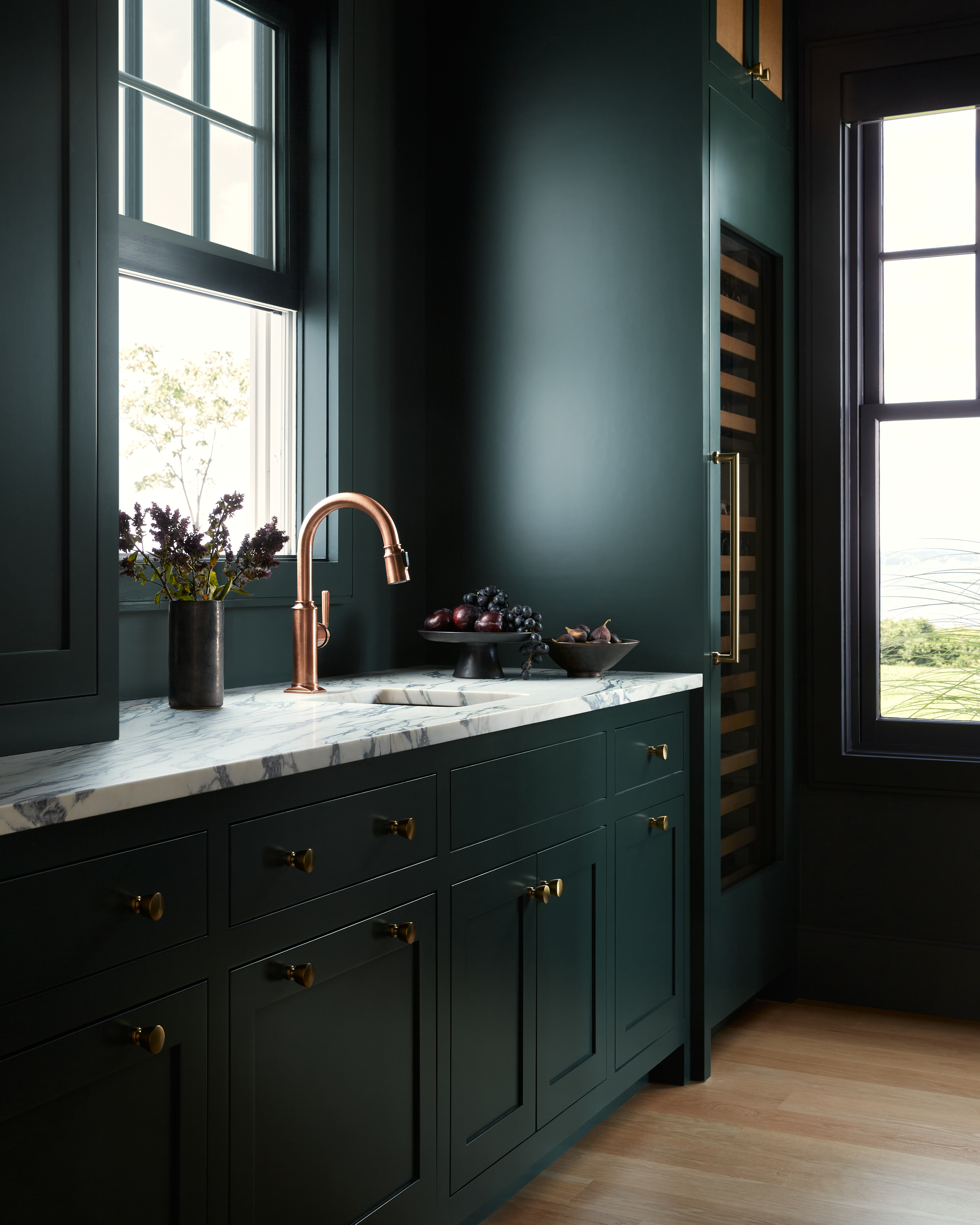
Far Studio’s jewel-toned butler’s pantry highlights the depth and drama that green can bring to spaces, even the smaller ones. Green’s earthy undertones make it a strong neutral, but its vibrance also enables it to captivate the imagination. In a smaller space, this can provide exactly the right balance.
"In this space, we used the veins of the stone to guide us on the green tone. The marble we selected had beautiful emerald green veins running through it which led us to Farrow and Ball's Studio Green. We used antique brass hardware and a copper sink and faucet to complete the look, and it gave the perfect moody vibes without feeling dark," explains Brittany Wurzak Hakimfar, lead designer of Far Studio.
6. DON'T FORGET TO HAVE FUN WITH GREEN

In true brat green fashion, this bold bathroom designed by LA-based studio, Another Human makes the case for more adventurous applications of green. The key here is to experiment with different greens, the neutral and muted sages — similar to this Muted Sage from Behr — and olives have a role to play but so do the effervescent limes and seafoam tones.
"For the kids' bathroom, we wanted to create a sort of retro-inspired underwater world, so we opted for all fairly saturated tones of greens and blues. The aqua blue and lime green tile colors in this bathroom are two of my favorite hues and luckily this client was on board to go with these bold color choices," shares Leah Ring, principal of Another Human.
7. MARRY TEXTURE WITH GREEN FOR MAXIMUM IMPACT
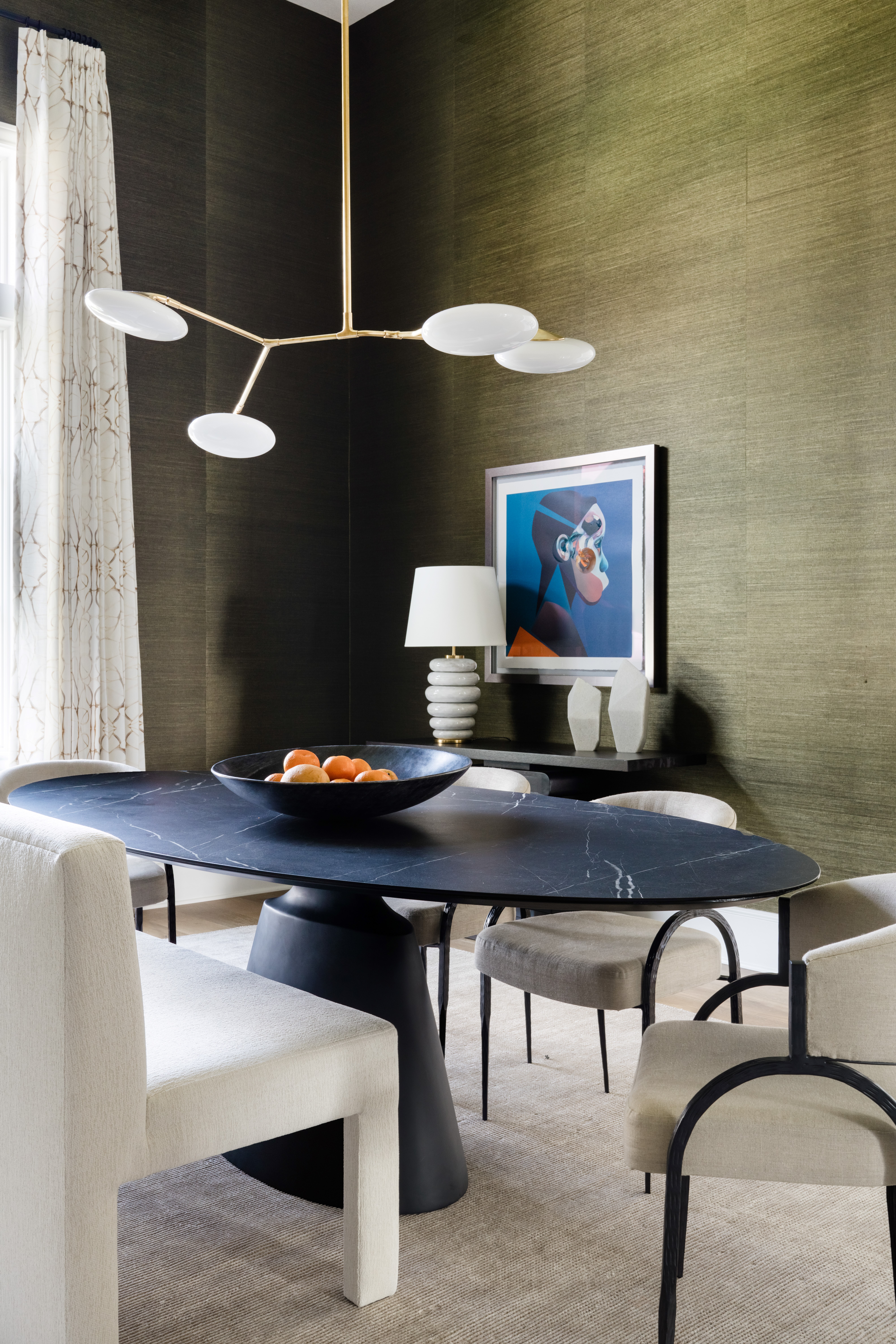
This impressive dining room created by Daley Home highlights the importance that texture plays in your application of green. Whilst the shade itself is important, interiors are by their very nature a tactile experience. In this example, combining a strong olive green (like this Olympic Olive Green from Lowes) with a grass-cloth paper ensures this room presents a sense of movement as well as depth.
"We love using deep greens! In this space, we opted for a beautiful green sisal wallpaper from Thibaut. How you’re bringing in your color makes a huge difference. Paint is a great way to add color to a space but a grass cloth wallpaper will really bring a texture to the walls. It’s important to start with your base and build up from there," explains Shelby Van Daley, founder and principal designer at Daley Home.
Be The First To Know
The Livingetc newsletters are your inside source for what’s shaping interiors now - and what’s next. Discover trend forecasts, smart style ideas, and curated shopping inspiration that brings design to life. Subscribe today and stay ahead of the curve.
Writer and design expert Faaizah Shah is the founder of The Interiors Consultancy. She has worked with designers such as Staffan Tollgard and design houses such as Sanderson to help them understand and communicate their narratives. She is known for crafting engaging stories and imaginative content, and understanding great decor from her years alongside some of the best creatives in the industry. She is also a contributor to Livingetc.
-
 The 'New British' Style? This Victorian London Home Embraces Its Owners' Global Background
Warm timber details, confident color pops, and an uninterrupted connection to the garden are the hallmarks of this relaxed yet design-forward family home
By Emma J Page
-
 Muji Living Room Ideas — 5 Ways to Harness The Calming Qualities of This Japanese Design Style
Inspired by Japanese "zen" principles, Muji living rooms are all about cultivating a calming, tranquil space that nourishes the soul
By Lilith Hudson
-
 This 400-Year-Old Pattern Is the Emerging Trend That Designers Are Using to Bring 'Rhythm' to Their Projects
Whether you'd describe yourself as a maximalist or someone who loves a traditional interior, this centuries-old fabric is making an undeniable style revival
By Olivia Wolfe
-
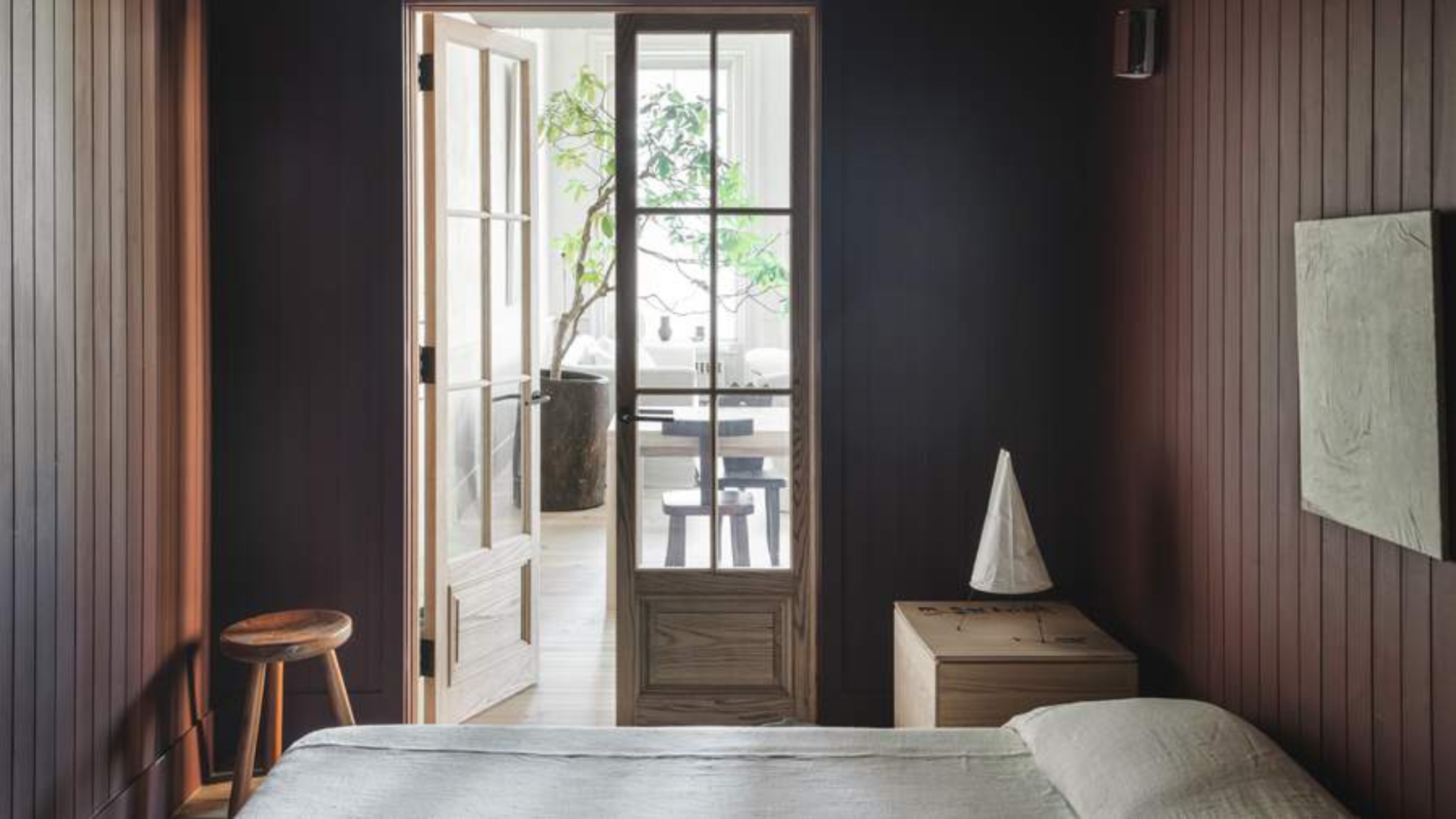 "It's Time to Make Yourself a Bedwomb," a Design Expert Tells Me — Why the Smallest Bedroom Is Best and How It Can Improve Your Sleep
The cozier the space, the better your sleep will be according to this design professional. From canopies to warm colors; here is how to create a bedwomb
By Olivia Wolfe
-
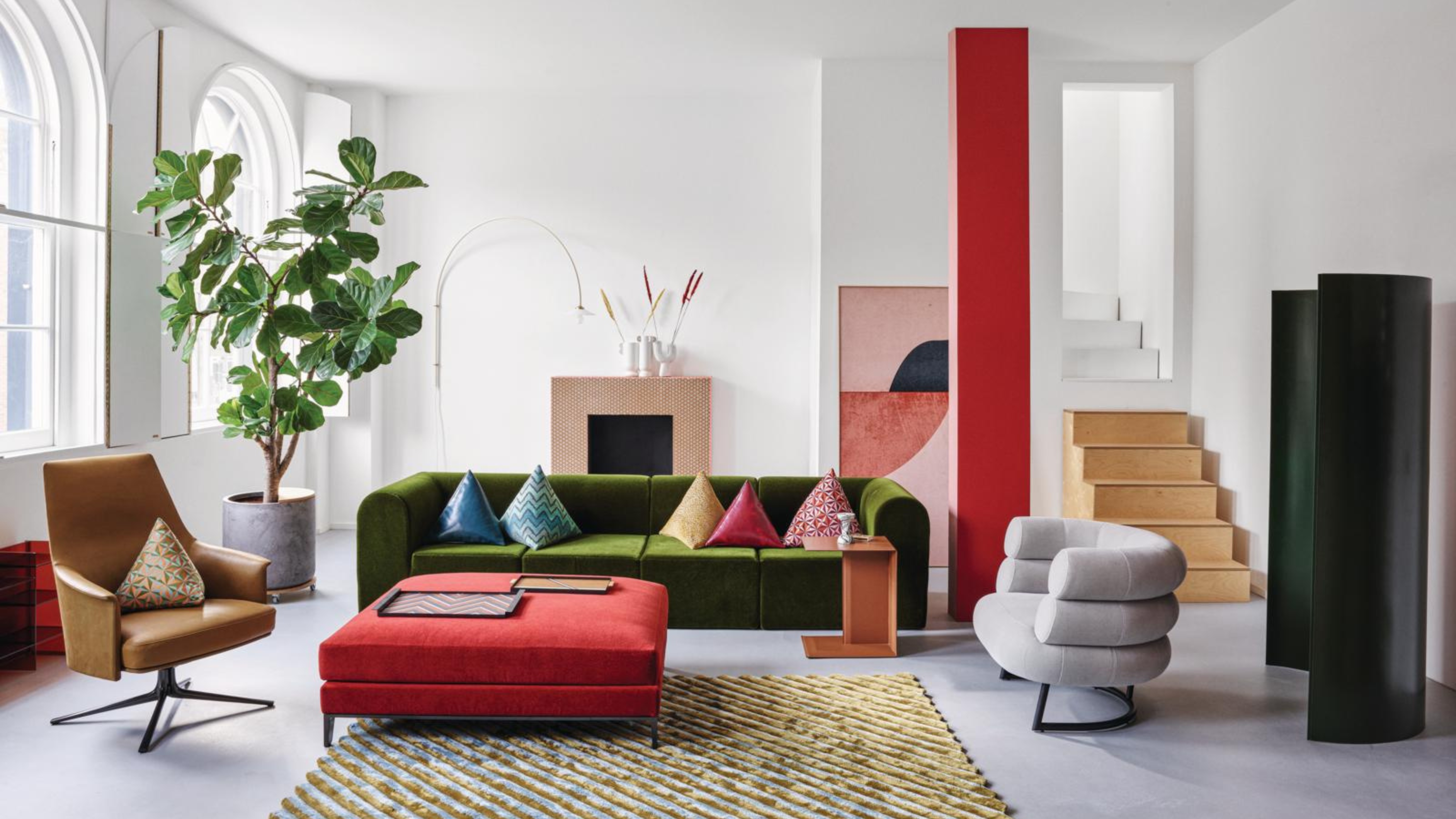 5 Colors Interior Designers Warn Will Date Faster in 2025 Than Paint Can Dry
We're here for the fashionable but not the transient: these are the colors that won't hang around long enough this year for you to invest in them
By Olivia Wolfe
-
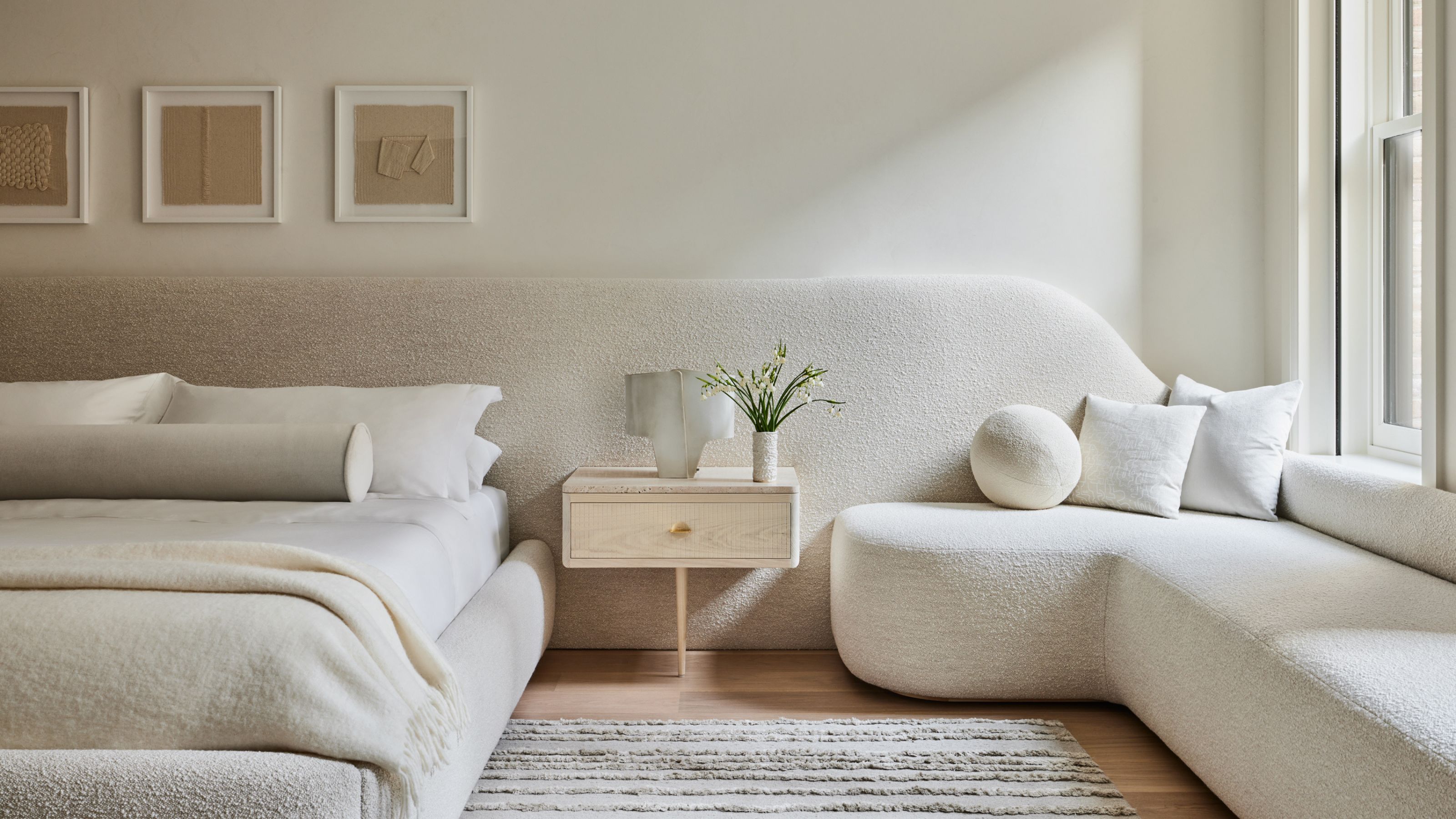 Extended Headboards Are Going to Be Big in 2025 — 5 Reasons Why They Make Every Bedroom Look Bigger, Better and More Expensive
A headboard that stretches beyond just the length of the bed is the little something extra your space needs
By Olivia Wolfe
-
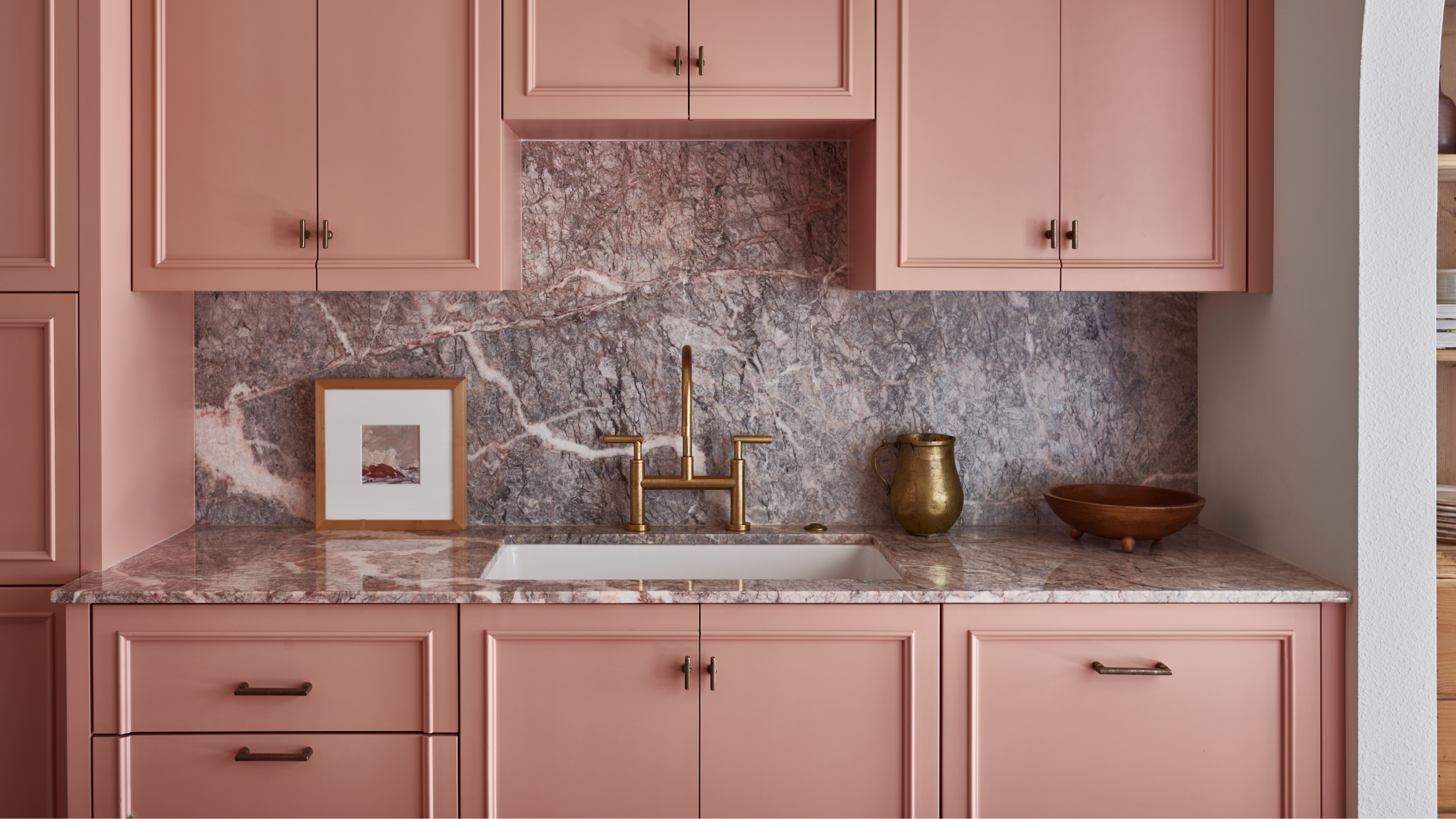 Is 'Dusty Pink' the Most Exciting New Neutral for Kitchen Cabinets? Here's Why Designers Champion This "Warm, and Space-Expanding" Shade
Everything you need to know to give your kitchen cabinets the refresh they deserve
By Olivia Wolfe
-
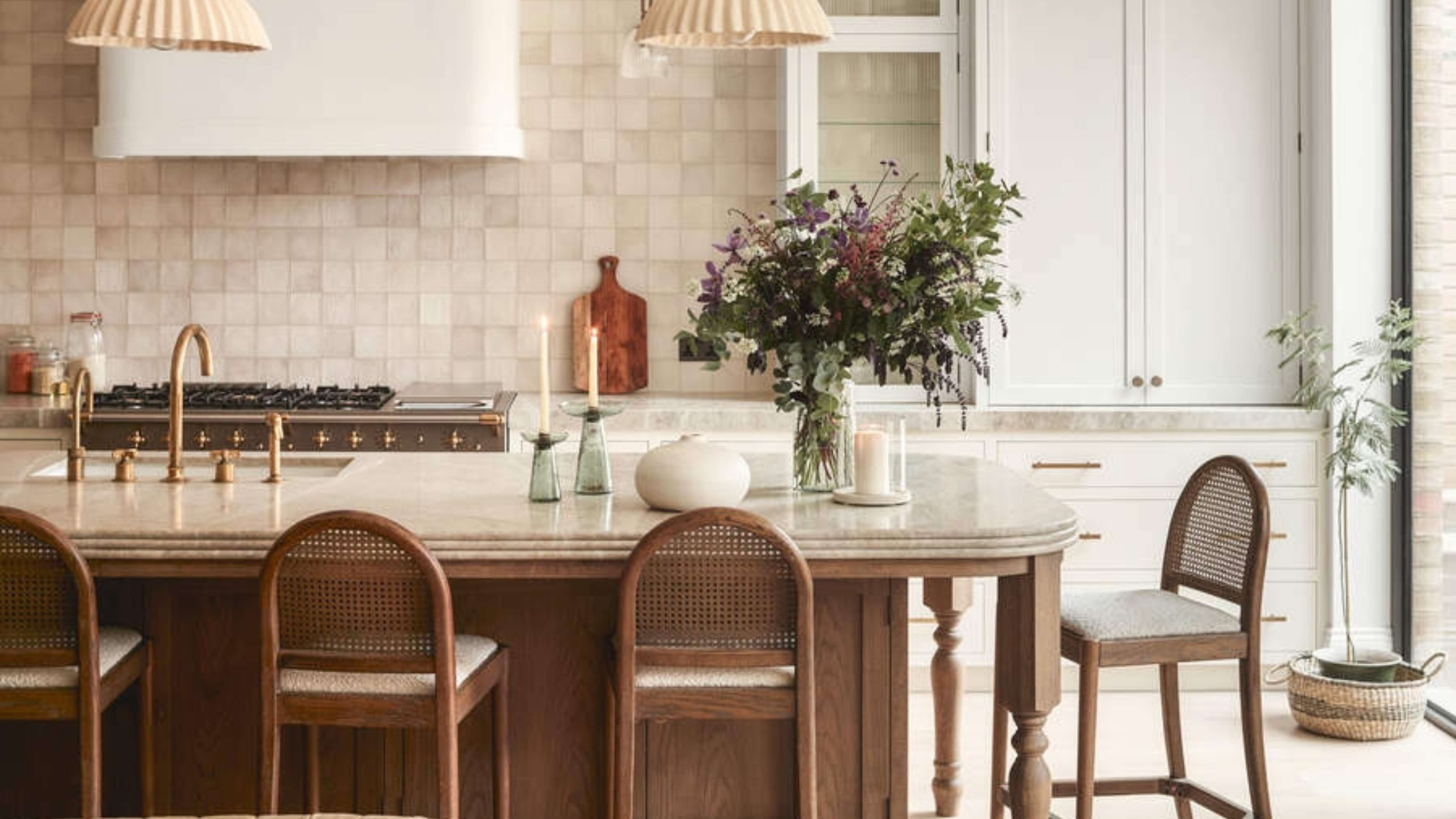 A Designer and Trend Forecaster Shares Her Style Predictions for Kitchens in 2025 — They're Easy Updates to Copy
Some new ideas and some reimagined classics; these unique ideas are perfect for anyone wanting to make a statement in their kitchen
By Olivia Wolfe
-
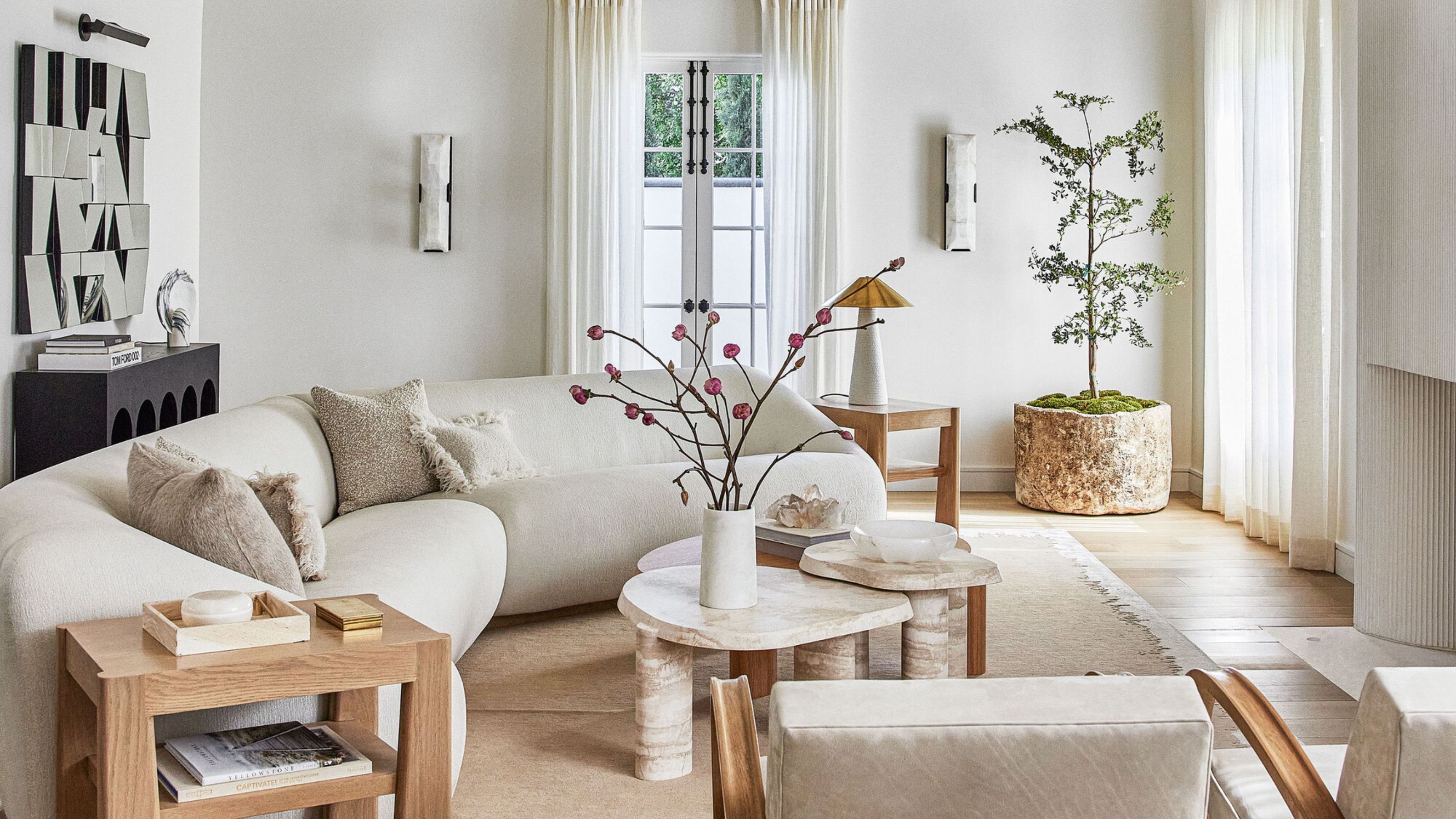 How to Achieve Transitional Style — 14 Designer Tips to Capture the Trend Taking Over Interiors
Transitional design seamlessly blends contemporary and classic interiors through furniture and décor. Experts share key techniques to achieve this balance
By Keith Flanagan
-
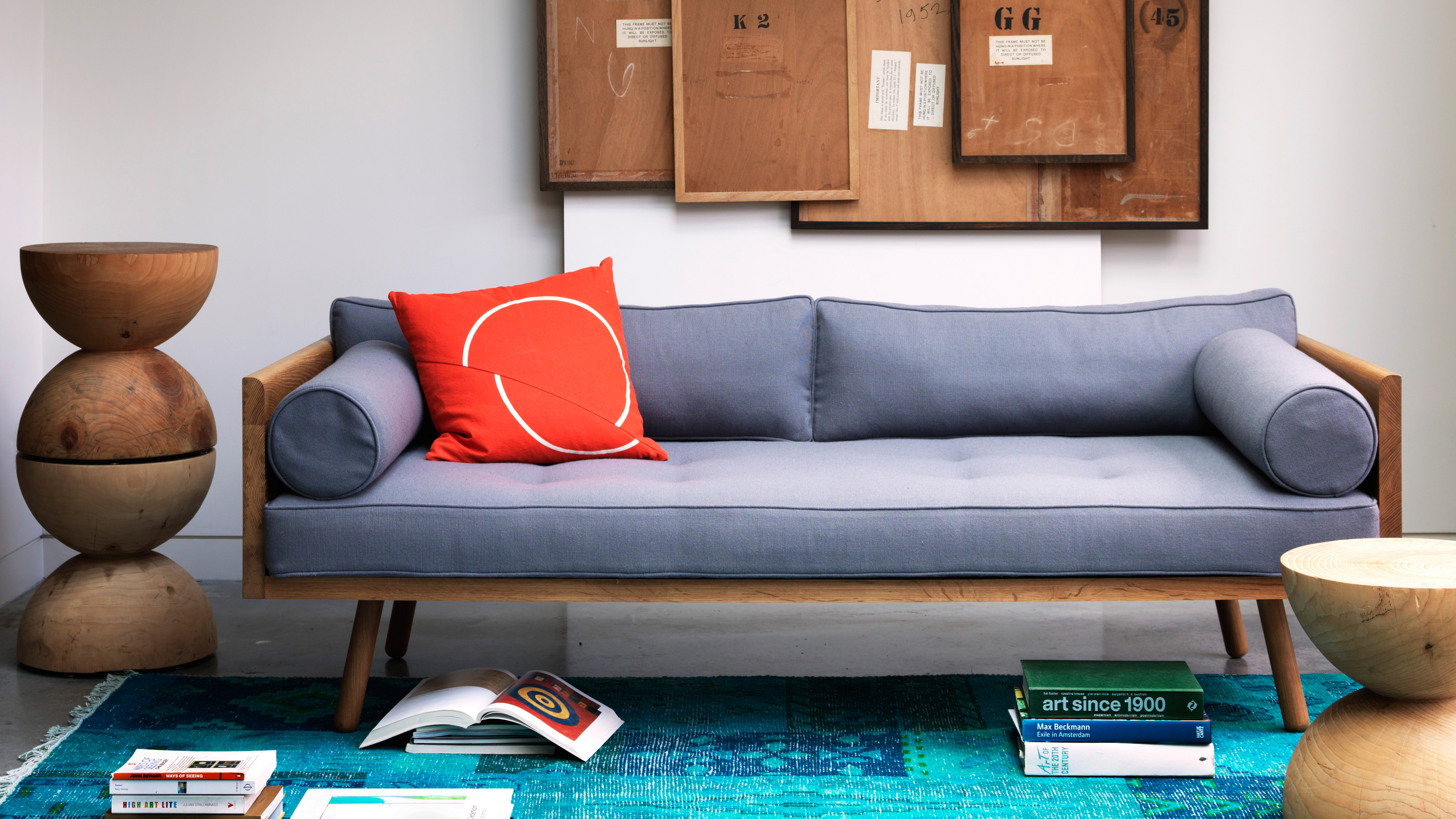 A complete guide to Mid-century modern furniture – how to source the best pieces to nail the trend
Stylish, versatile and adored by many, we take you through everything you need to know about Mid-century modern furniture
By lauriedavidson