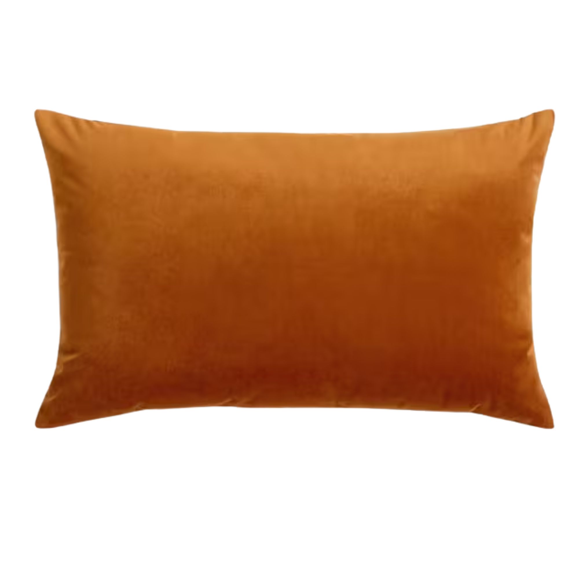
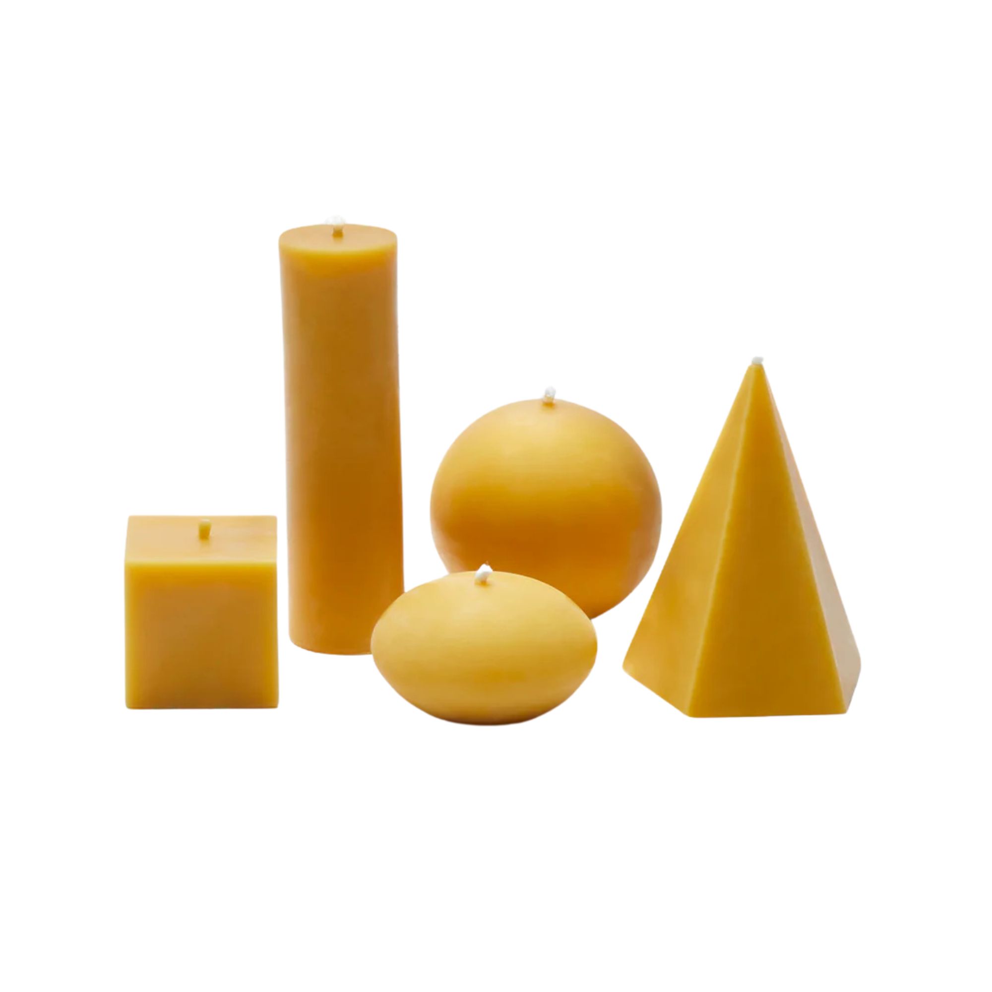
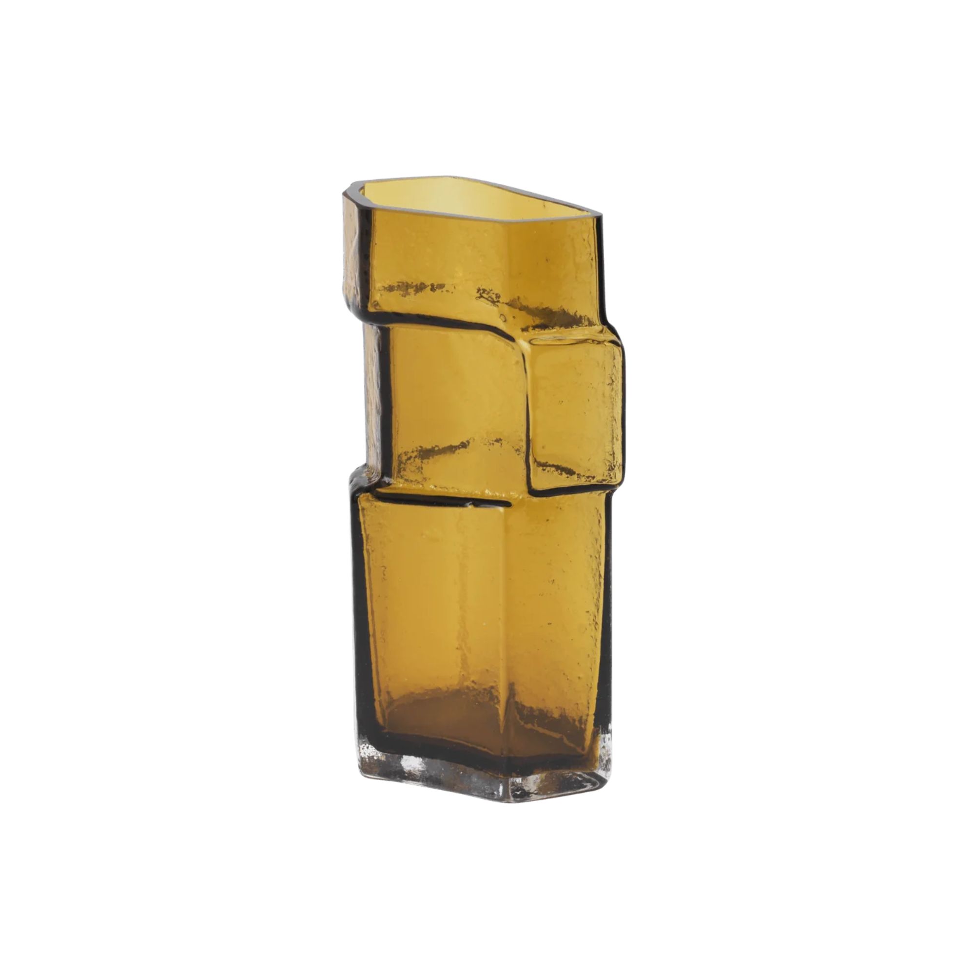
Here's Why Decorating With Mustard Yellow Helps Fill Your Interiors With a Sense of "Confident Calm"
There is so much more to decorating with this turmeric-tinted sauce-wiggled-on-a-hotdog not-quite-yellow shade than meets the eye
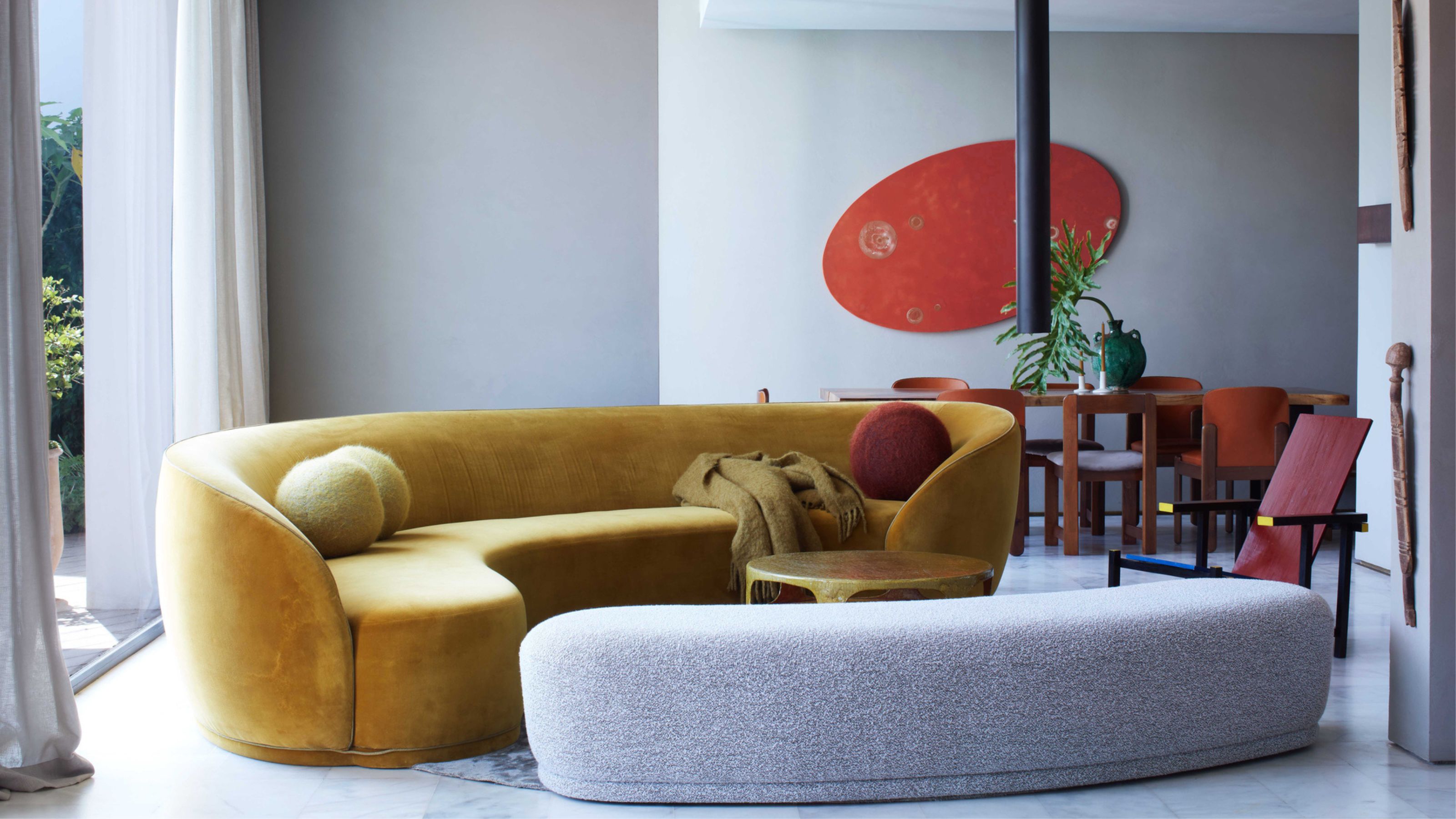

Decorating with mustard yellow had more than a moment over the last decade. For a time, it seemed you couldn't turn without seeing it. But is it still relevant, and does it have staying power? Absolutely — in fact, I think it has what it takes to becomes a real contemporary classic.
Bold, comforting, and warm, mustard yellow is essentially a gold without any of the potential gaudiness. Well, technically it’s yellow — but it really doesn’t feel like it. Rich, but not overly so, and a little bright, decorating with mustard yellow enfolds you into its simmering heat rather than blocking you out with a metallic high shine or the sharp edge of citrus.
It’s energetic and friendly, while retaining a definite aura of calmness and familiarity — close your eyes, and it summons shifting autumnal landscapes. But, we have questions. Does decorating with mustard yellow work in the carefully curated homes of today? How do you do it in a way that’s not been done before? And what are the colors that go with mustard yellow? (They’re not the same as yellow.)
After all, decorating with yellows in this shade isn't about looking back, and please don't confuse it as merely a dulled down yellow, or some kind of compromise for those too afraid to bring lemon-y tones into the home. This is a shade with its own character, and here's what you need to know to decorate with it.
1. Understand the Range of Mustard Yellow
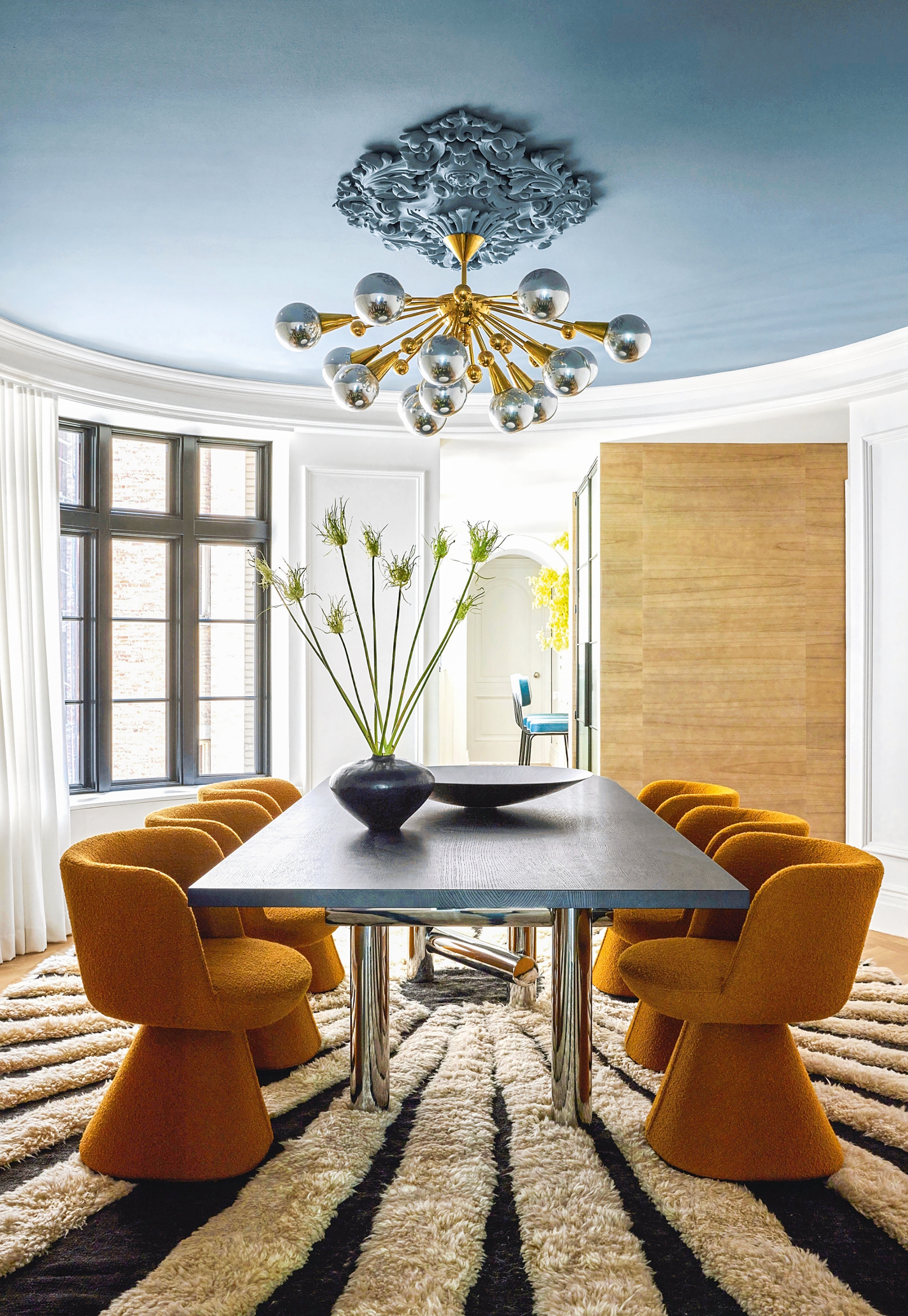
Depending on where you use it, and what undertone it has, decorating with mustard yellow can bring a sense of energy or calmness to a space.
Mustard has range. It can swing from a vivid, turmeric-tinted sauce-wiggled-on-a-hotdog not-quite-yellow shade, to a brighter and more golden hue, to dustier more musted, to something spicy with a hint of orange (along the Dijon lines), to a brown-edged ochre, and finally to a darker shade more influenced by the mustard seed itself.
It’s a color that feels playfully fiery, almost cheeky, like it’s somehow a brown that’s just got a bit carried away. Yet it can — almost — operate as a neutral, or at least, is a color that can be added into a neutral living room without taking up attention, which makes it surprisingly easy to work with.
"I love to tout mustard as the gateway color," says Michelle Fahmy, founder and principal designer of Haus Of Meeshie. "It is a hue that has a lot of depth and pairs well with neutrals (especially those that fall in the gray category). If you're starting to explore bringing more color into your space, it's a great color to consider."
Celebrating ‘off-the-beaten-path colors’ is a central philosophy to Michelle’s Los Angeles-based interior design studio Haus Of Meeshie. As Founder of the brand, she is known for her passion for color, her pattern play, and for her bold and eclectic style.
While yes, the idea of bringing ‘a yellow’ indoors is — let’s admit it — scary, decorating with mustard yellow is a way to nod to that end of the spectrum while keeping things soothing and grounding.
"Most people are nervous about using colors from the yellow family, but get the tone right and they can be joyful without feeling too livid or brash," adds Patrick O'Donnell, international brand ambassador at Farrow & Ball. "The mustard family is a good starting point if you want a more sophisticated feel; slightly dirty and ‘off’, it brings warmth without overpowering."
2. Appreciate Its Essence
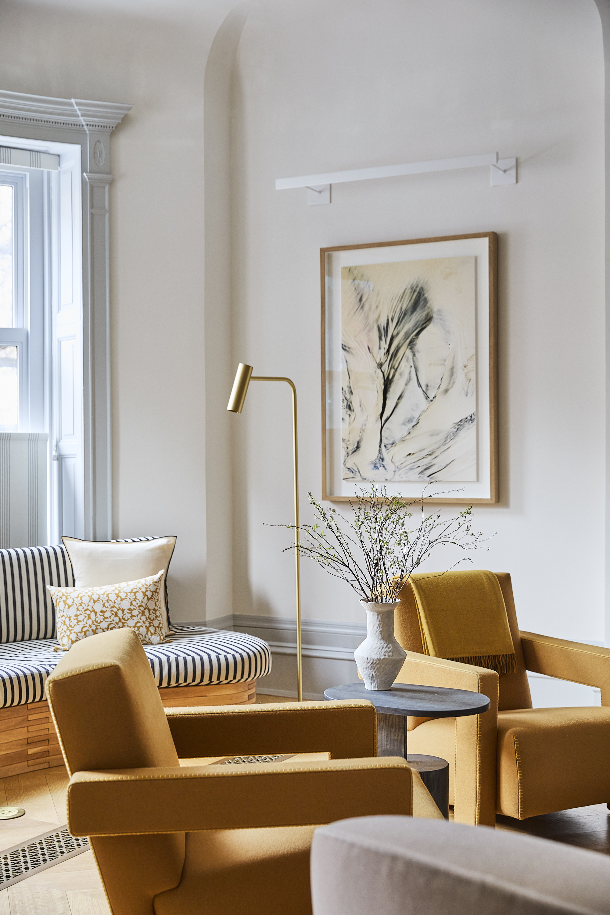
Mustard yellow is a shade that adapts, depending on its surroundings.
The overall mood that decorating with mustard yellow evokes, is one of confident calm. This is a color rich in personality and pigment. It’s a color that adapts, bold when the time is right, more subdued and understated when called upon.
"Mustard shades will bring warmth and intimacy to a room so are perfect for slightly darker spaces in the home, but they will also create an elegant glow in sunlight and give off energy," explains Patrick.
Like its edible namesake, mustard yellow has an innate almost unexpected warmth, infusing spaces with richness and fostering a come-in-and-settle-down welcoming impression. Such natural coziness evokes a lived-in and laid-back aura, while also holding a vitality to pep the space up, keep energy levels strong and stable, and eschew any visual dullness or flatness.
Seeing color as a unifying rather than dominating element of a room, Patrick has represented color authority Farrow & Ball since 2012, consulting on the design of spaces ranging from country cottages to city apartments to create unique, personalized homes full of life and self-expression.
The sun-baked tone toes the line between bold and demure, striking a balance that feels natural and effortless. Hinting at glowing late afternoon sunshine or swaying golden fields of wheat, decorating with mustard yellow radiates a mellow vibrancy and is infused with a dignified positivity.
"This particular hue is a sophisticated approach to warming up a space and summoning feelings of optimism and happiness," adds Michelle. "Mustard is a great way to help a space feel cheerful and comforting." The shade enriches a room’s atmosphere, deftly balancing liveliness with a calm, inviting ambiance.
3. Work Out How to Accent With Mustard Yellow

Mustard yellow translates particularly well to velvets, but complements other natural textures and tones, too.
Mustard yellow is, helpfully, a hue that is as happy as a soothing, enveloping backdrop as it is bringing smaller more attention-grabbing sparks of tangy saturation to a space. Whether you’re after an earthy, rich, and relaxed atmosphere or a brighter burst of vividity, mustard yellow dexterously adapts to multiple moods without overpowering.
"I love suggesting this color if you're itching to jump on the color drenching bus and have a small room you're looking to transform," says Michelle. "If you're not quite ready for a whole room, mustard is particularly great as a pop of color in a space — as artwork, runners, bedding or in tiles. We recently installed a mustard stair runner in a project — it really anchors the space and creates a warm welcome."
It also takes to velvet rather beautifully — bringing forth a soft matte golden quality without the gleam, as well as woven fabrics for the changing depth and tactility. Think cushions, throws, rugs, blankets and upholstery, which can be dotted around a space like friendly, waving texture puppets.
"Try it as a kitchen cabinet color for some welcome sunshine as you sip your morning coffee with warm whites on your wall to counter any vibrancy," tips Patrick. "For full-on drama, a cozy, small bathroom in mustard, lit by candlelight, is a wonderful place to soak away the stresses of the day."
4. Curate the Best Color Pairings
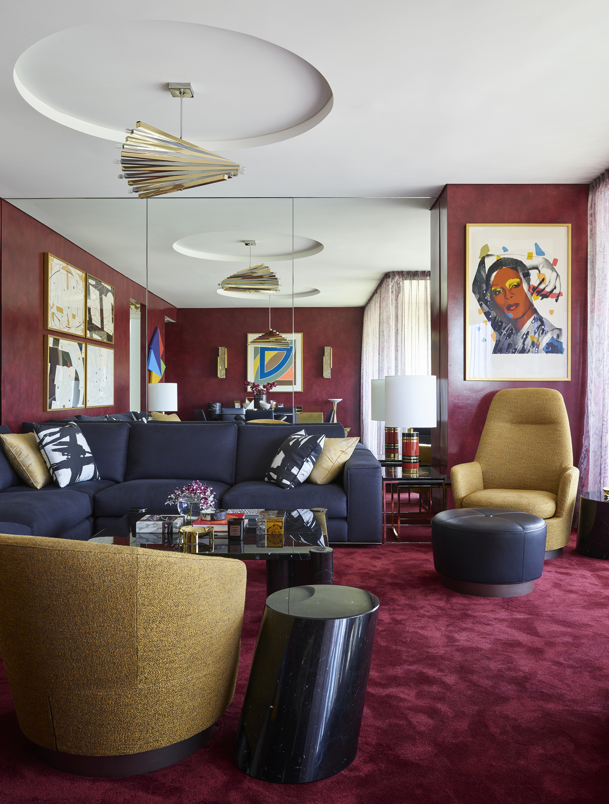
Acting as an almost neutral, there are plenty on complementary pairings to be found with this earthy shade.
With its archetypal shade filled with golden undertones plus a dash of brown, mustard yellow can also lean more towards yellow or orange, which slide it up and down the gentle sunlight/earthy-and-rustic scale, and decide how much vibrancy or warmth it adds to a space.
The secret third undertone option of a muted green-ish mustard gives the color a vintage feel and a more subdued nature. "Mustard with brown or green (particularly olive) undertones making a great color pairing with neutrals," says Michelle. "Are you a plant lover? A mustard drenched room filled with plants would be a fabulous duo."
It also sits beautifully alongside mossy and forest greens as well as dusty mauve or rose, petrol blue or teal, and ochre. And note, thanks to its wide-ranging undertones, the most complementary pairings aren't necessarily the same as the colors that go with yellow.
"Use mustards as a backdrop to brown furniture and pictures, add deep cacao shades for something moodier or pops of olive green for contrast,’ suggests Patrick.
Also, more yellow mustards are a friend of organic reds (for the cohesive warmth), blush (for the delicate balance), and rich blues (for the contrast). A more brown-tinged mustard pairs well with the likes of sage (for the subtle earthiness), softened blue hues such as slate (for a slightly pushed back balance) and burgundy (to emphasize the muted heat).
Bold enough to try decorating with mustard yellow in your own space? Perhaps you'd enjoy a 70s color palette, where this warming shade feels most at home.
The Livingetc newsletters are your inside source for what’s shaping interiors now - and what’s next. Discover trend forecasts, smart style ideas, and curated shopping inspiration that brings design to life. Subscribe today and stay ahead of the curve.
Amy Moorea Wong is a color authority and contemporary interior design writer who has specialized in all things decorating for over a decade. Amy is Livingetc magazine’s Colour Expert, Interiors Editor at The Glossary magazine and a Contributing Editor at Homes & Gardens magazine, and she frequently contributes to an array of global publications to share her insights on interior design zeitgeist. Her book Kaleidoscope: Modern Homes in Every Colour explores a collection of cool colorful homes fizzing with creativity, surprises, and inspiration.
