

Navy blue. It’s been around the home for a while now, adorned every room, every type of surface, and object, but is decorating with navy still relevant? I certainly think so.
Deep, rich, intense, and yet overtly calming, familiar and cozy, navy occupies a unique space in our decorative hearts. Hovering around black, but with a more friendly edge, the hue changes dramatically depending on the light — shadowy and introspective in not-so-bright areas, and more vivid and jovial when it steps into the sun.
Are you looking for ways to decorate with navy that feel modern, exciting, and fresh? The best approach is through the unexpected. That means eyebrow-raising textures, playful color pairings (there are so many colors that go with navy blue to explore), and placing it in spots it's not usually found. Light is also key here, as the tone can feel heavy, so harness the power of daylight, lighting, and mirrors to keep it feeling dynamic and alive, rather than overpowering.
Below, I've shared the things worth thinking about when decorating with navy in your home.

Amy Moorea Wong is well-acquainted with using color in the home. She's been writing about the topic for longer than she cares to admit (as Livingetc's Color Expert, Interiors Editor at The Glossary magazine, and a Contributing Editor at Homes & Gardens magazine. She's even published a book, Kaleidoscope: Modern Homes in Every Colour, which covers the hows, the whys, and the wheres, when it comes to using color in the home.
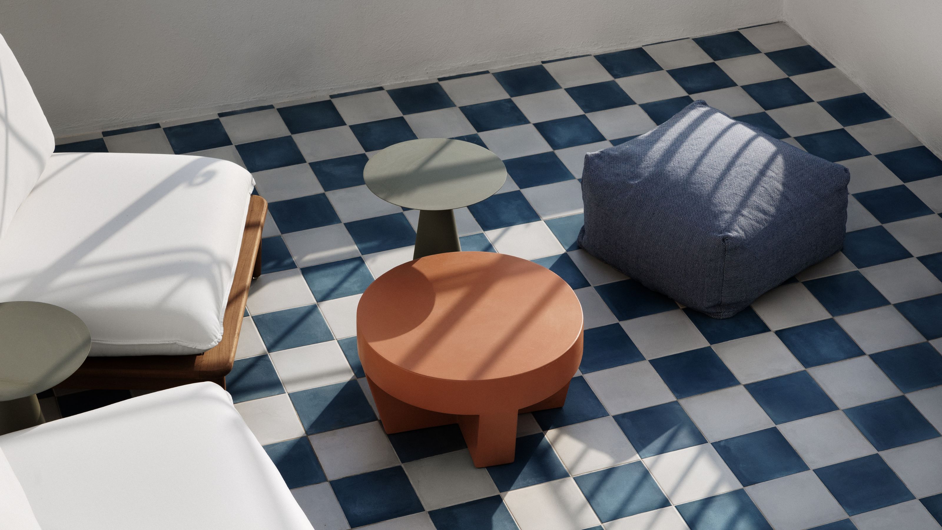
1. Embrace the Darkness of Navy Blue

Navy has a shape-shifting quality that changes depending on the light in the room.
Navy is dark. But it’s important to remember, first and foremost, that it is a color. There’s pigment there. It skirts around the edge of black, almost — but never quite — crossing into the void. Unlike black, which absorbs light entirely, at its core, navy is saturated with blueness which gives it character, dimension, and fills it with life. It talks of midnight skies, the ocean’s vastness, and stormy horizons — the shade is bold yet serene, powerful without overpowering.
Lighting conditions can transform navy completely — in shadow, it can feel mysterious and enveloping, while in brighter spaces its inner blue comes into its own, leaning towards a full-bodied indigo or revealing an inky, velvety complexity.
Some think of navy as a neutral, but it has very much emerged from its time as a much-loved backdrop, and morphed into something more dramatic. It never sat that comfortably in the background anyway, always imbued with presence and personality. Navy might not make the loudest of impacts, but it has always been captivating, drawing the eye with quiet strength. Where true neutrals blend away, navy blue stands firm — rich with pigment, resonance, and a sense of purpose. It’s a color that doesn’t just support a space but defines it, offering a foundation that feels intentional rather than incidental.
2. Get to Know Its Story

There are so many connotations connected to the color navy — all of which make it all the more rich.
The first thing I consider when on the hunt for hues, is how they make me, and the room, feel. With navy, it’s easy — it transports me to gazing up at a starry sky, wrapped in some kind of thick blanket. In other words, it’s a tone that is both familiar and cozy, while having a sense of adventure and mystery imbued within it. And what a mix that is.
If you’re looking for a color that’s a ‘classic’, navy is the one. It’s not a dark blue — it’s the dark blue, a shade that is resolutely timeless and age-proof. It’s an iconic interiors go-to. "Think of classic Ralph Lauren Home where navy is beautifully paired with warm woods for a sophisticated, upstate look, or the king of decorators Roger Banks-Pye of Sibyl Colefax who used it with such deftness and the lightest of touches," says Patrick O'Donnell, a paint specialist and brand ambassador for Farrow & Ball.
From coastal interior design (the name ‘navy’ comes from the blue uniforms of The British Royal Navy in the 1700s) to Parisian chic, the color has pervaded our cultural palette for centuries. Decorating with navy has been a mainstay for generations, proving its ability to transcend trends while remaining relevant thanks to its in-built versatility — it can jump from moody and dramatic in a high gloss, to crisp and smart when paired with white, or rich and enveloping with alluring textures. This is a classic that never feels predictable.
3. Use Navy as a Gateway to Color

As an almost neutral, navy is a good place to start when it comes to introducing color in the home.
For the color-wary out there — navy is here to hold your hand and guide you, gently, into the land of pigment. It’s approachable, a universally familiar shade that is a tempting stepping stone into a bolder and brighter palette. Easy to use as an alternative to gray, black, beige, or other neutrals, navy is both colorful and subtle, expanding decorative comfort zones and quietly whispering that bold tones aren’t as scary as you perhaps once thought.
Navy’s grounding, timeless nature provides both a sense of stability — it’ll never go out of style — as well as easy going sophistication that makes the idea of bolder or brighter colors less intimidating. "Classic dark almost-black navy blue is a wonderful foundation color," agrees Ansley Majit, design principal at Californian-based studio, Lark + Palm.
The hue is a great backdrop to layer other colors against, and a springboard into other jewel tones. Start with a brain full of navy living room ideas, and before you know it, you’re surrounded by a home brimming with joy (or perhaps one room is all you need).
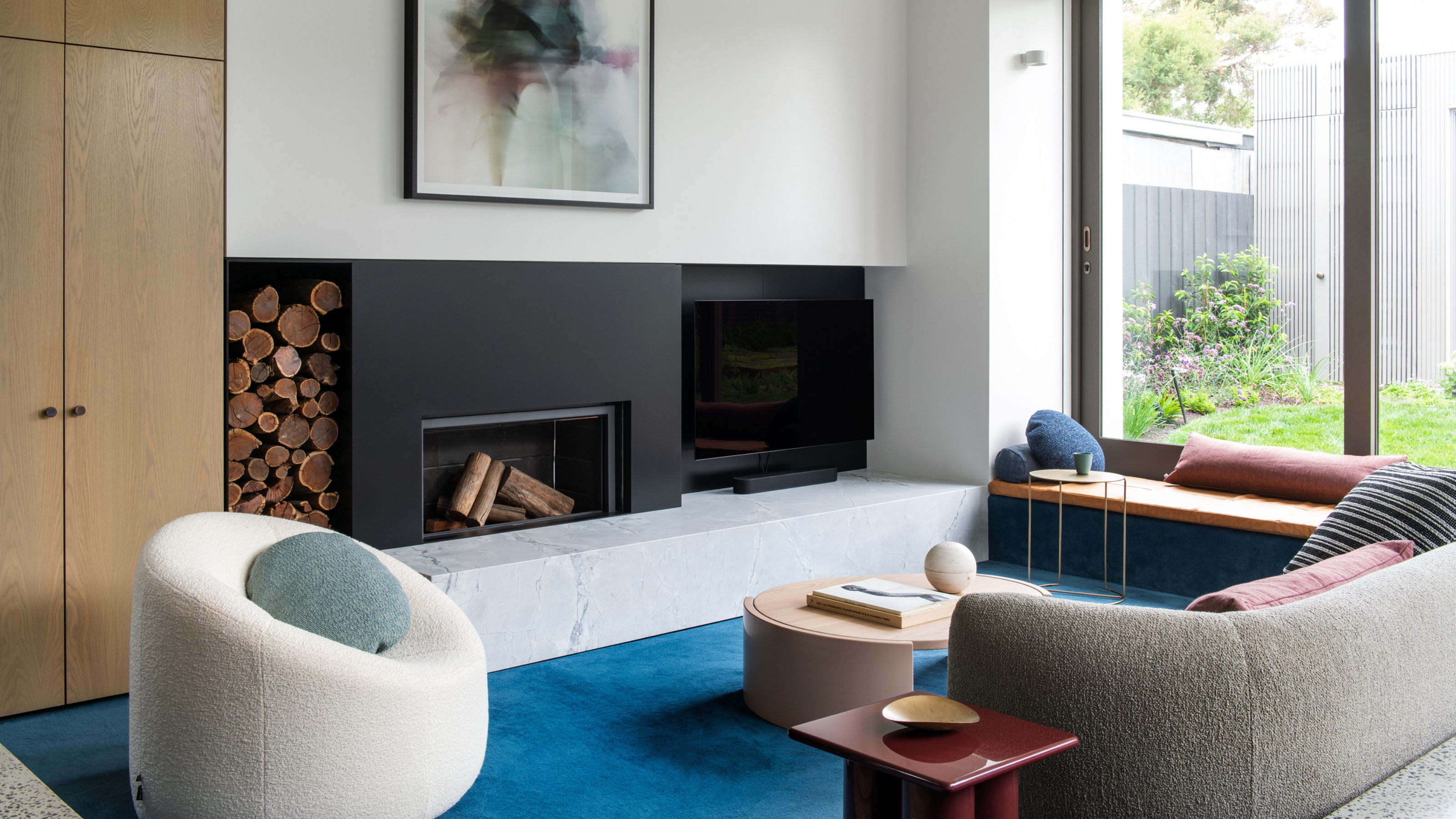
4. Consider Complementary Colors

Considering it's almost a neutral color, it layers well with so many shades — including oranges, yellows, and pinks.
As a color that's often used like a neutral, decorating with navy works well alongside a huge range of other shades. "Navy is such a wonderful color because it really does go beautifully with almost every color — pinks and reds, greens, and yellow…" says Ansley Majit. Be it a coordinating rich shade or something zingy and contrasting, navy’s chameleon-like ability to adapt to and enhance so many hues means it can smoothly anchor a scheme, or balance unexpected vibrancy in a home.
You can look at color theory as a guide. "On the color wheel, navy is complementary to orange but it’s split complementary colors of yellow-orange and red-orange work a treat with it too," says Ansely. "But above all experiment with it — I always love a little addition of citrus lime or a bounce of grayish pink, even though we are often told to question blue and green should never be seen. A splash of emerald green on upholstery or your accessories will sit very happily with navy too (but steer away from bright reds, they can feel a little municipal)."
Due to its cool, dark undertones, decorating with navy works best when you let bright colors pop against it, creating a strong balance. "I love navy with any variation of pink, brighter greens, and a whole range of yellows from bright sunny yellow to dark ochre," says Ansley. "I also love a dustier iteration of a navy blue like Soot by Benjamin Moore, which has a lot of dimension, ranging from blue to black to deep charcoal depending on the time of day."

Price: £5.95/color sample
You can also try pairing navy with teal, turquoise, or peacock blue for a sophisticated and layered look, or sky blue for a breezy, tonal effect. For greens, softer shades like eucalyptus, celadon, or pistachio bring an organic, calming touch, while a lush jade adds bold elegance.
For cool pastels, powder blue, lavender, and seafoam work for a delicate hit of contrast, and if you're feeling adventurous, a splash of tangerine or magenta can create a high-impact statement.
And don’t forget the understated tones; "Navy is absolutely one of those colors that loves being paired with crisp white trim to lighten the effect (not brilliant white, but the purest form of soft white)," says Patrick O'Donnell. While Ansley says she thinks navy and black make for "a really sophisticated combination."
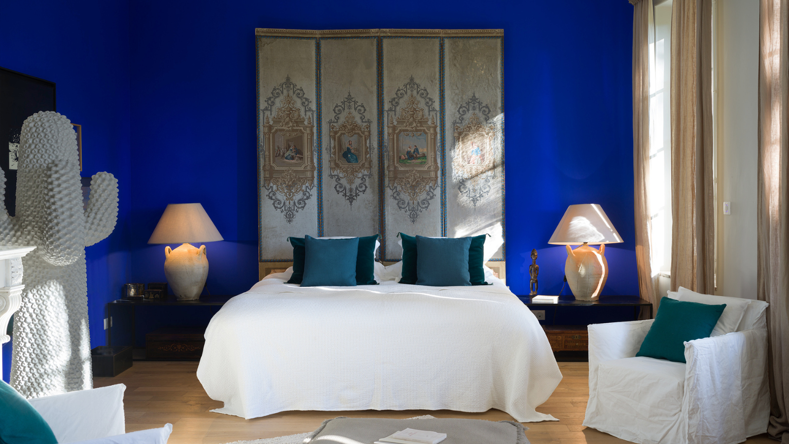
5. Tune Into the Undertones

Is it light and bright, or bold and dramatic? Depending on its undertones, navy can be both.
Navy’s power lies in its in-between-ness, how it floats in that space between black and blue, carrying black’s grounding quality as well as the heady allure of blue. Sometimes it’s more of one, sometimes more of the other — and the most subtle shift in tone can dramatically alter its effect, meaning it flits between being a bold and a neutral.
A shadowy, inky navy that leans into the black is here for the drama. It’s black — with a softer, more nuanced edge, creating a moody yet inviting ambiance. Try darker navy for living room walls or in bedrooms to create cozy spaces that feel like comforting cocoons.
A brighter navy with a purer blue undertone brings a refined yet uplifting energy to a space that feels classic and crisp. It’s bold — but with a fresh, tailored feel, creating a polished yet energizing ambiance. This type of navy works well in more formal spaces — navy blue kitchen cabinets, dining rooms, foyers, offices — for a refined, tailored quality.
There’s also a surprise entry for the lesser-known navy with a gray undertone. These muted, softer shades are understated, creating an under-the-radar elegance that offers depth without overpowering. Try them in transitional areas like stairwells and landings, their soft, refined quality enhancing architectural details and adding a touch of definition.
There are ample ways (and reasons!) to decorate with navy in your home, but if you're still not sure where to start, adding navy décor feels like an easy way in.

-
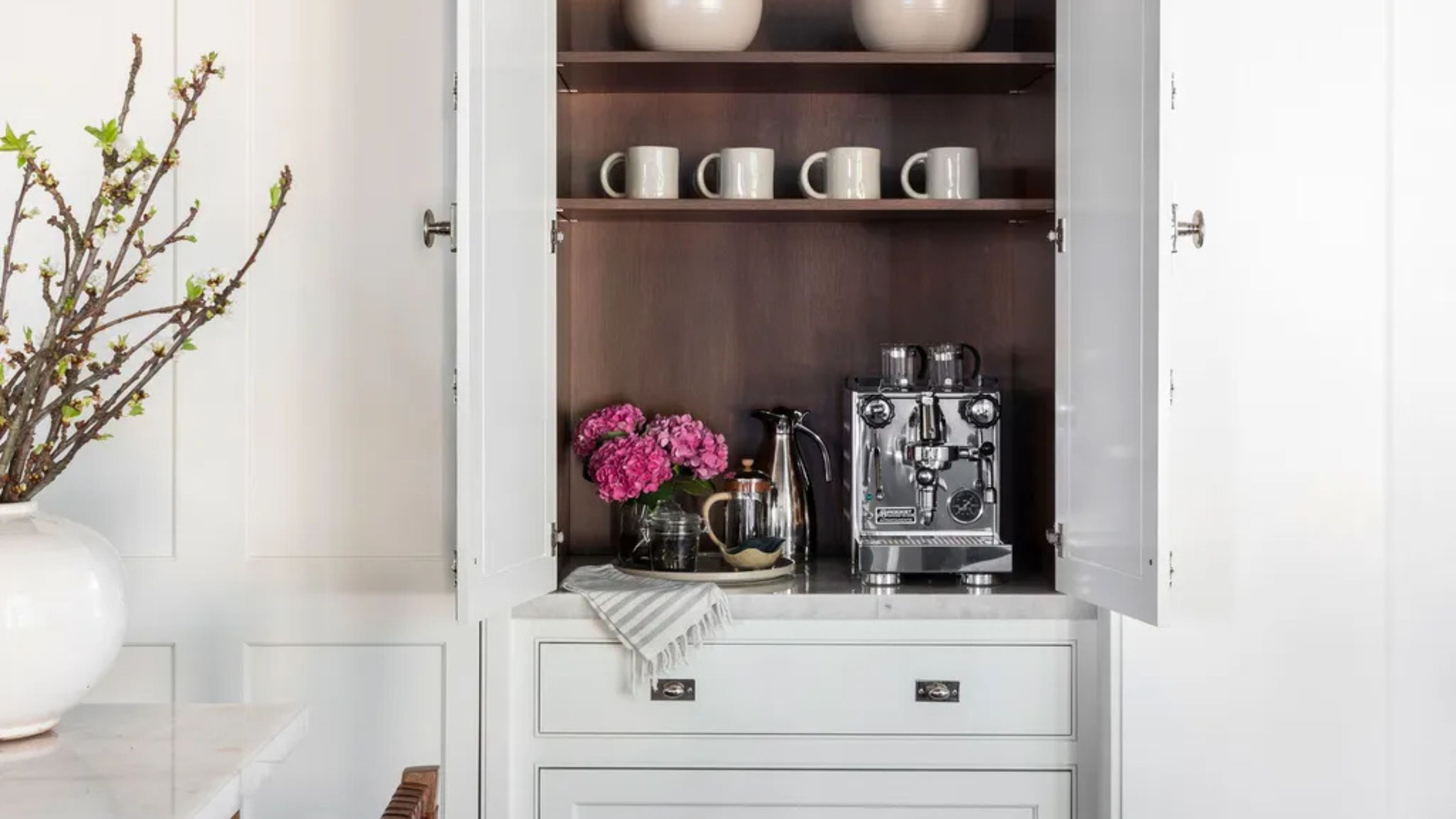 Turns Out the Coolest New Café is Actually In Your Kitchen — Here's How to Steal the Style of TikTok's Latest Trend
Goodbye, over-priced lattes. Hello, home-brewed coffee with friends. TikTok's 'Home Cafe' trend brings stylish cafe culture into the comfort of your own home
-
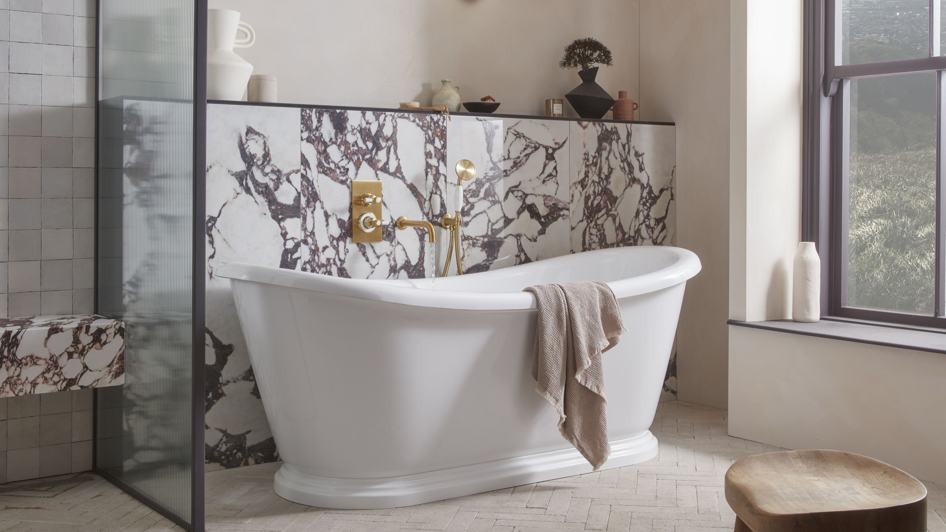 5 Bathroom Layouts That Look Dated in 2025 — Plus the Alternatives Designers Use Instead for a More Contemporary Space
For a bathroom that feels in line with the times, avoid these layouts and be more intentional with the placement and positioning of your features and fixtures


-
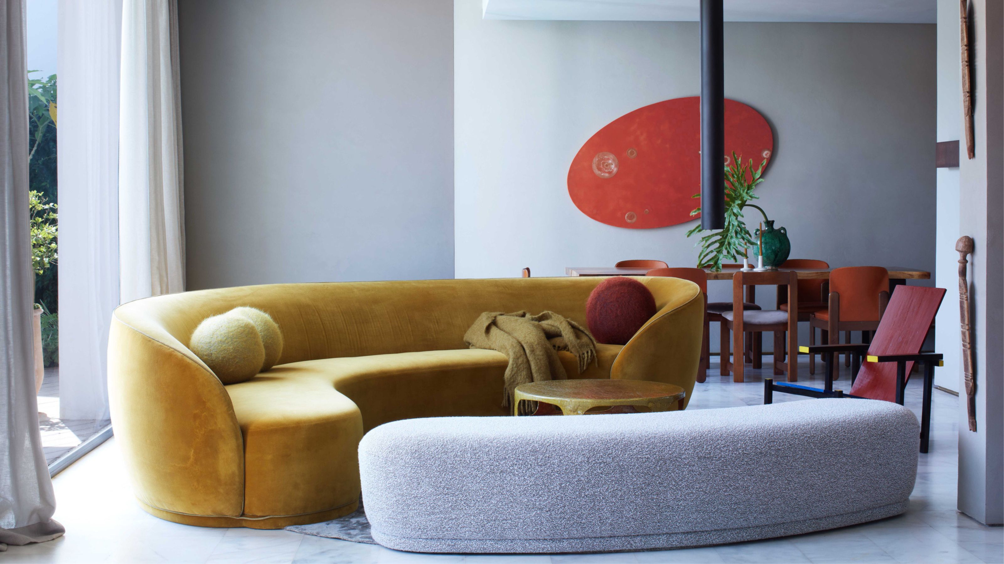 Here's Why Decorating With Mustard Yellow Helps Fill Your Interiors With a Sense of "Confident Calm"
There is so much more to decorating with this turmeric-tinted sauce-wiggled-on-a-hotdog not-quite-yellow shade than meets the eye
-
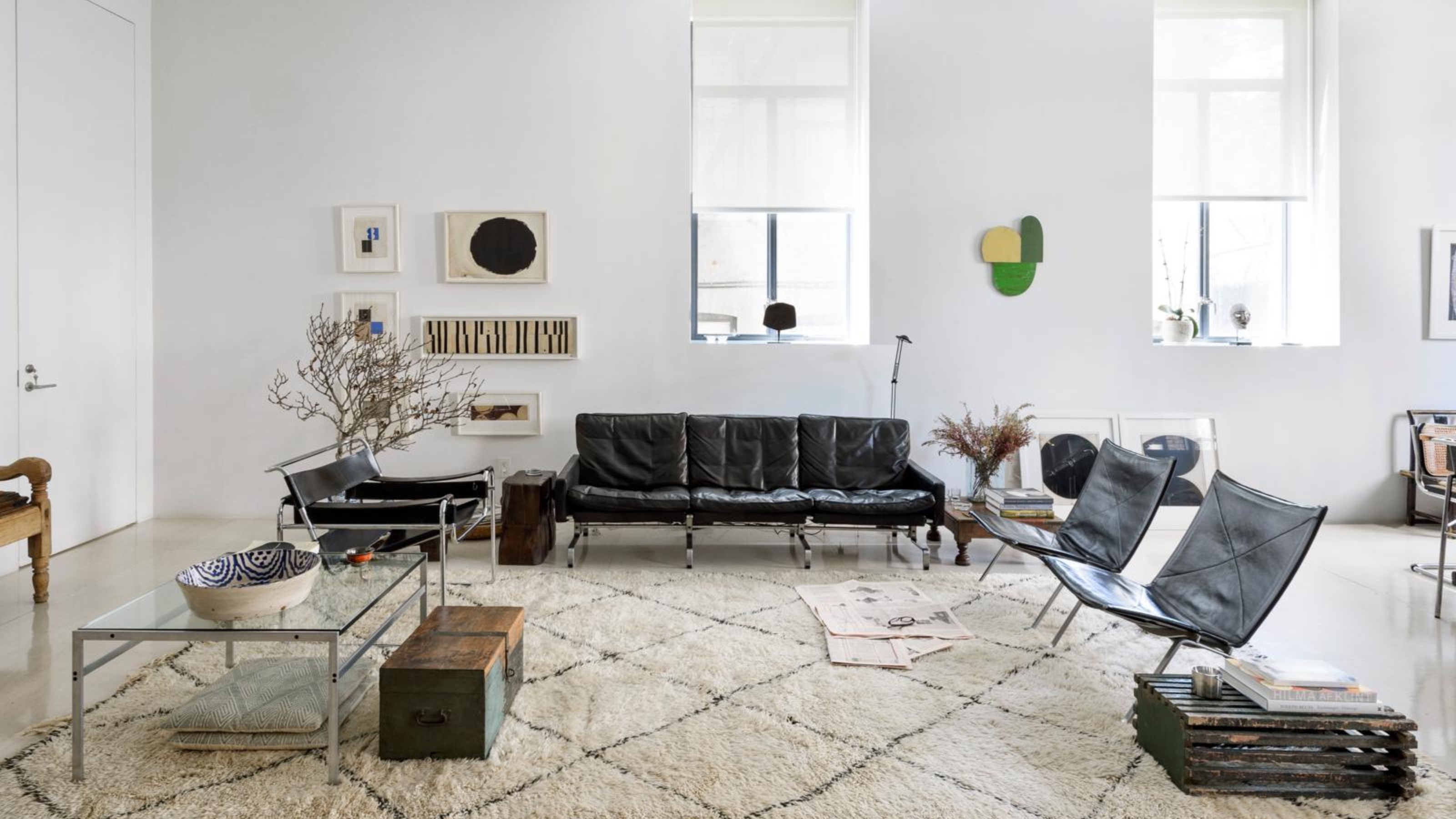 5 Problems With Painting Your Walls White That No-One Ever Talks About (Until Now)
White is the easiest neutral to work with...right? Interior designers explain why this shade is actually more complex than it may seem
-
 5 Mistakes That Are Making the Blue Details in Your Room Feel Old-Fashioned — And How to Rectify Them
Blue is a timeless shade, no doubt, but use it in the wrong space or in the wrong way, and it can make a space feel, well... a bit blue
-
 5 of the Best Navy Blue Paint Colors That Designers Love — And How to Use Them
Navy blue has timeless appeal and can feel both modern yet classic, but what are the designers' favorite paints?
-
 Should Your Carpet Be A Darker Color Than Your Walls? How to Make This Bold Look Work
Not every room can get away with a carpet that is darker than the walls; Designers share when and where this combination works best
-
 What Actually Is Yves Klein Blue? A Short History of This Iconic Color, and How to Decorate With It
Explore “the most perfect expression of blue” and how to free this pigment in your home
-
 Do Pink and Green Go Together in Interiors? A Professional Color Consultant's Verdict
How to make pink and green color combinations work for more contemporary interior schemes
-
 The 'Grown-Up' Way to Decorate With Light Blue — This Shade Shouldn't Just "Be Resigned to the Baby's Room"
We explore how to bring the lighter intonations of blue into your home in a contemporary and thoughtful way


