Decorating with neutrals – 5 tricks that are brilliant not boring
Decorating with neutrals is a go-to for so many of us. So chic, so simple and so easy to adapt. But it can risk looking a bit...blah, so we asked the experts how to keep neutrals exciting

Decorating with neutrals has always been popular, whether that's been by choice or accidental. It's easy to choose white, beige, or grey paint tones, soft furnishings, and accessories because they're easy to live with and go with pretty much everything. But the downside is a neutral scheme can end up looking a bit drab and uninspired.
But a neutral scheme can look absolutely stunning and be a statement in itself if done correctly. Fred Rigby, of Fred Rigby Studio – a London-based furniture and interior design practice – predominantly uses organic shapes, natural symbolism, and earthy materials to provide a strong connection to nature indoors.
The designer likes to stick to pared-back earthy tones and highly textured materials to make spaces sing. ‘When designing in general I like to think about how someone will use and travel around a space, creating key vignettes and touchpoints to enhance them and the space and providing moments to wow guests or customers,’ says Fred. Here he shares his expertise for ways to bring interest and drama to a classic and comforting scheme, whether that be a neutral living room or a neutral kitchen.
How to make a neutral decorating scheme interesting
1. Make the most of natural light
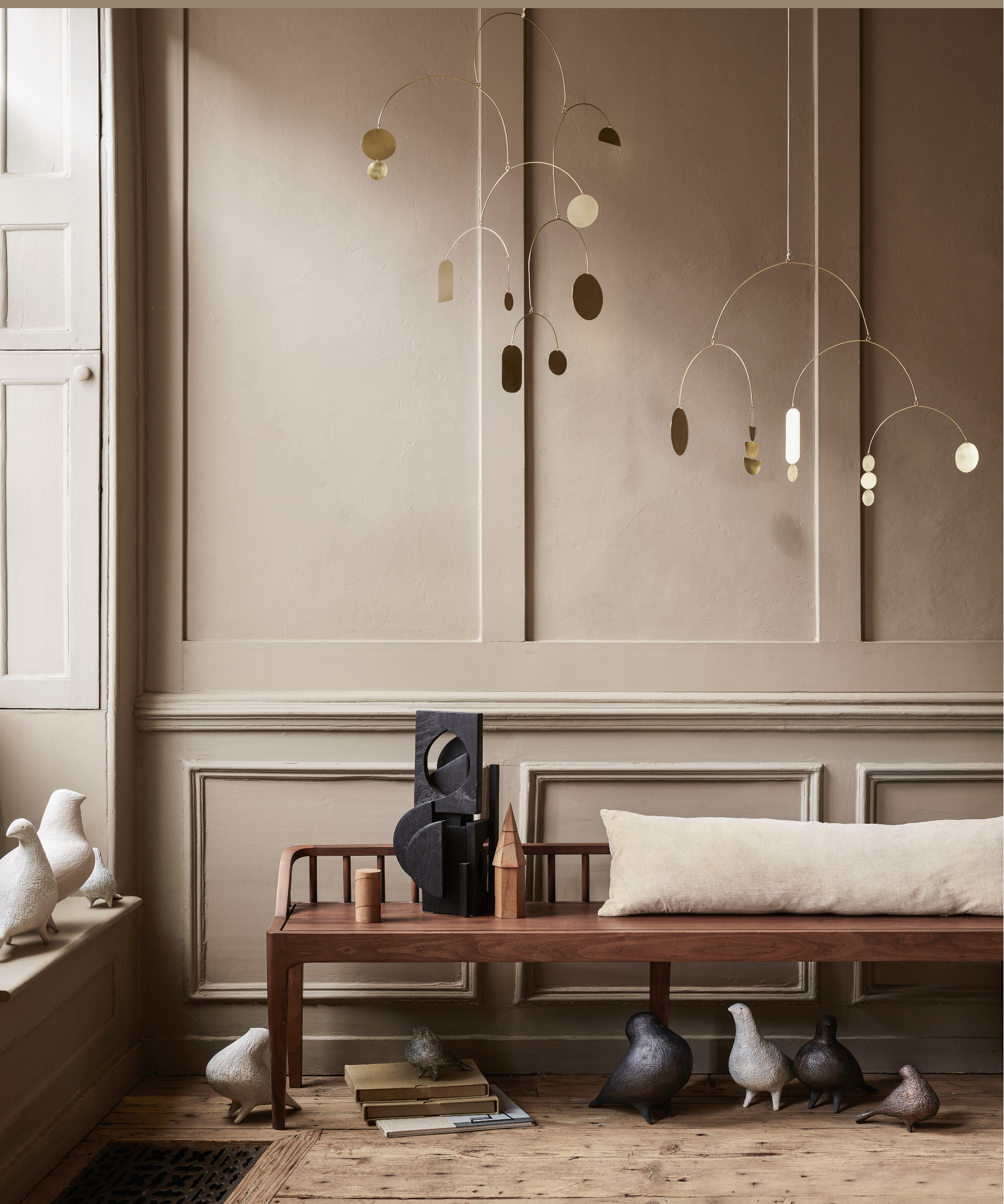
Using natural daylight as part of an interior scheme is important, so if there's any way to make a bigger deal out of it, then it's worth doing.
'I like to open up the space to catch as much light as possible,' says Fred. When designing Rosh Mahtani's Clerkenwell home (founder of jewelry brand Alighieri) the living space was on the ground floor and bedrooms and bathroom were in the basement.
'I removed everything that obstructed light, such as changing all the basement and garden doors to glass, removing the balustrade, and opening up nonstructural sections of walls. We created a semi-circle glassless window between the stairs and the kitchen and it creates a wonderful theatrical opening, allowing more light into the space and provides an unexpected greeting as you enter,' he adds. 'All of these adjustments can add interest, shape, and surprise to an otherwise neutral space, without the need for loud paint and pattern.'
Removing balustrades completely might be a bit impractical for everyone, especially with young children about, but swapping out an old balustraded or spindles for alternative staircase railing ideas could be a fantastic way to make an old space feel new.
2. Use one paint tone throughout
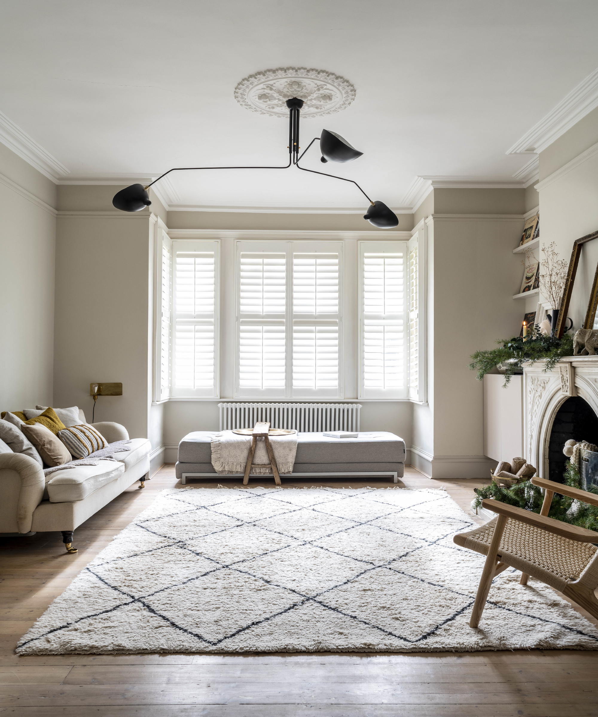
One house in one color? Seems like a bit of a boring paint idea but actually picking just one carefully considered hue and splashing it everywhere can create a real statement while leaving space for treasured items to shine. If you're after an almost gallery-like space then this is the look for you, as this monochrome living room idea proves.
'Painting a property all in one tone – which could be considered boring or unadventurous to some – however, I’d argue that the walls create a backdrop for objects and art and the continuity allows the eye to become more focused and less distracted by the changes in wall color as you move through a home,' explains Fred.
'Light in different rooms can affect the shade of a paint color, especially through the changing seasons and as the sun rises or sets, so a paint color – although the same in two rooms – can seem completely different. In Rosh Mahtani's home, we intentionally made the material palette muted so Rosh’s collection of objects, collected on her travels, would be the heroes,' he adds.
3. Create interest with a mix of textures
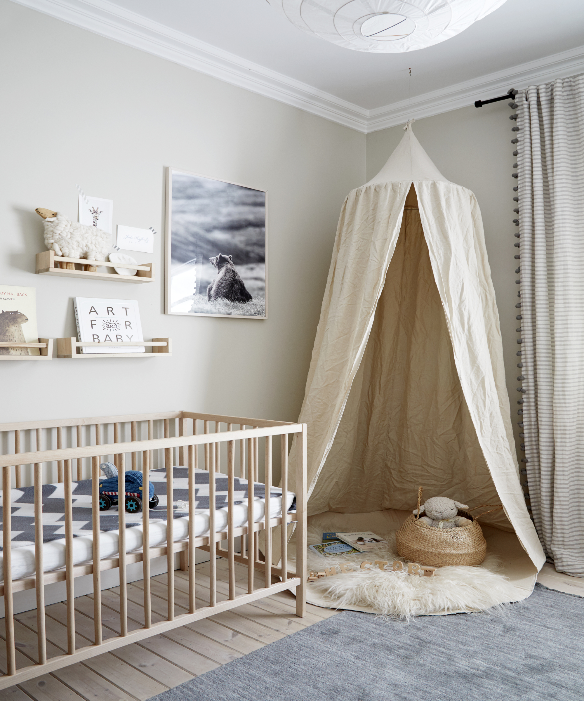
Texture is vitally important when it comes to interior design and making a scheme feel complete. Even a scheme based on a restrained palette of colors and materials, like neutrals, can be brought to life through textural variety. Whether a surface is smooth, soft, rough, or ridged, light will bounce off the bumps and curves creating highlights and shadows.
Use texture in the form of tactile fabrics, woods, and stone to add physical comfort and visual interest to a space. Layering texture helps bring organic life and visual interest to a design, keeping a space from feeling flat or one-dimensional.
'Working with a muted color palette means using textures to enhance the furniture and space instead, such as a boucle wool fabric on sofas and linen curtains to add softness and MicroCrete on fireplaces or bathroom walls and floors - the material is very similar to plaster; it's an amazing texture and very practical,' explains Fred.
4. Use clever and unexpected design pieces
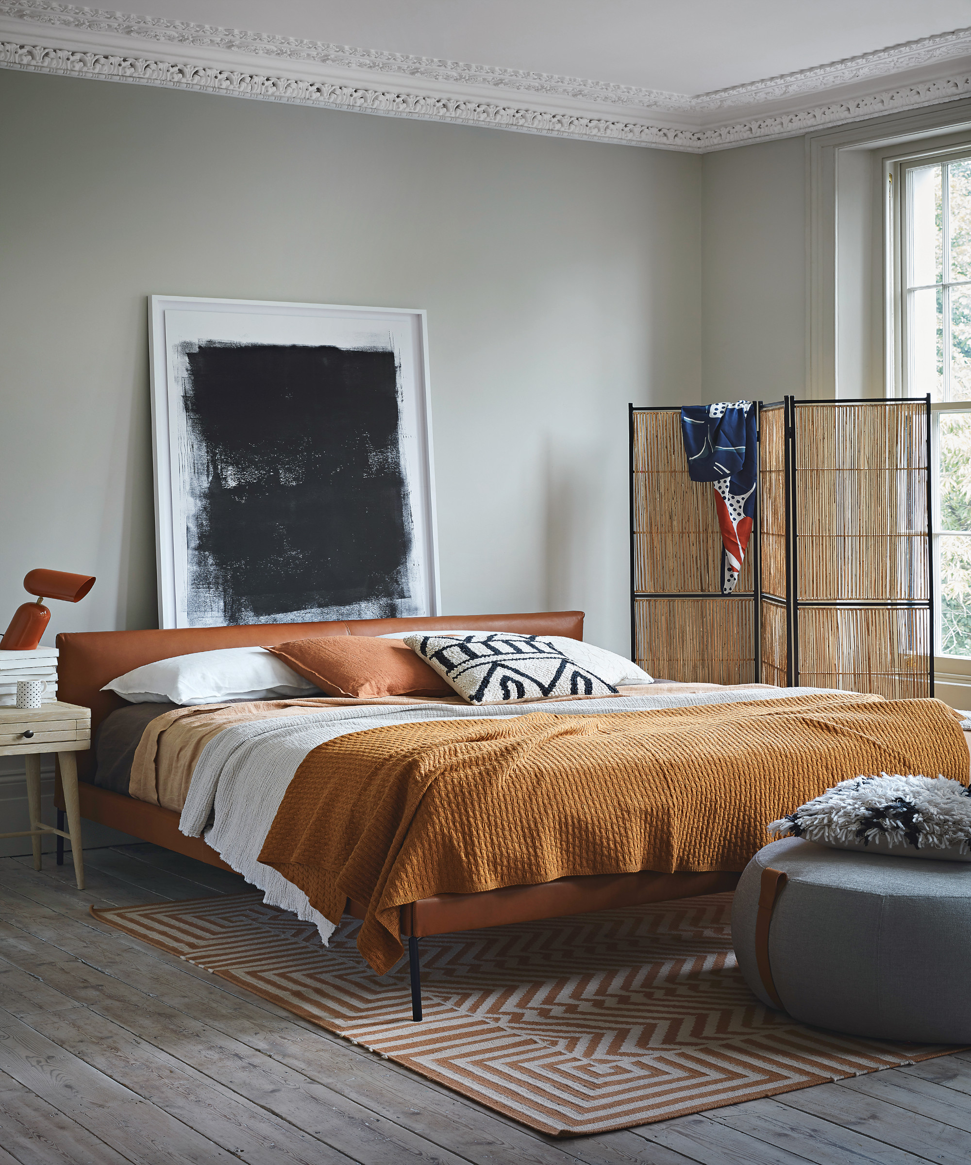
Pale and interesting interiors can be boosted by beautiful and practical design ideas. Whether that's wooden screens to divide rooms, marble coffee tables, or statement oversized lighting in natural tones. Character can be created via more than just the color of walls and original features of a house.
'We used a wooden divide, a classic piece by Alvaro Aalto, that we added to the neutral bedroom in Rosh Mahtani's apartment to create a more secluded space for the bath and break the room up, while also playing with the idea of curves, which are dotted throughout the house,' says Fred. 'The shape and tone of wood turns a simple, pared-back bedroom into an interesting space that you want to explore.'
5. Bring in natural finishes to add depth to a neutral color scheme
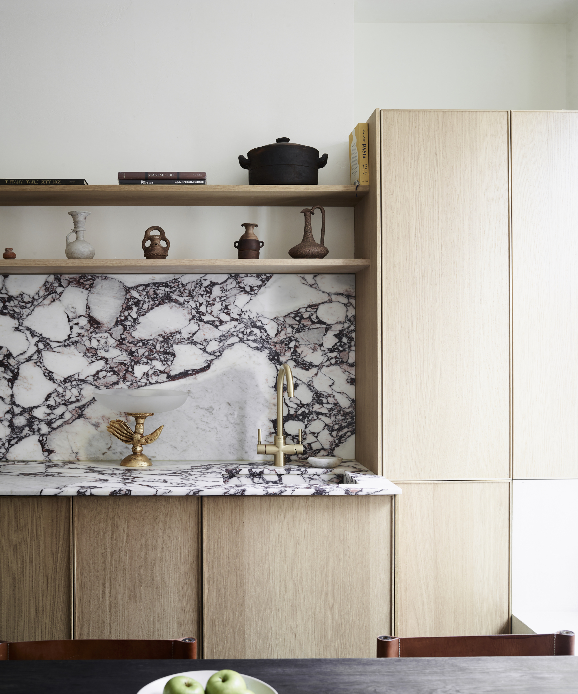
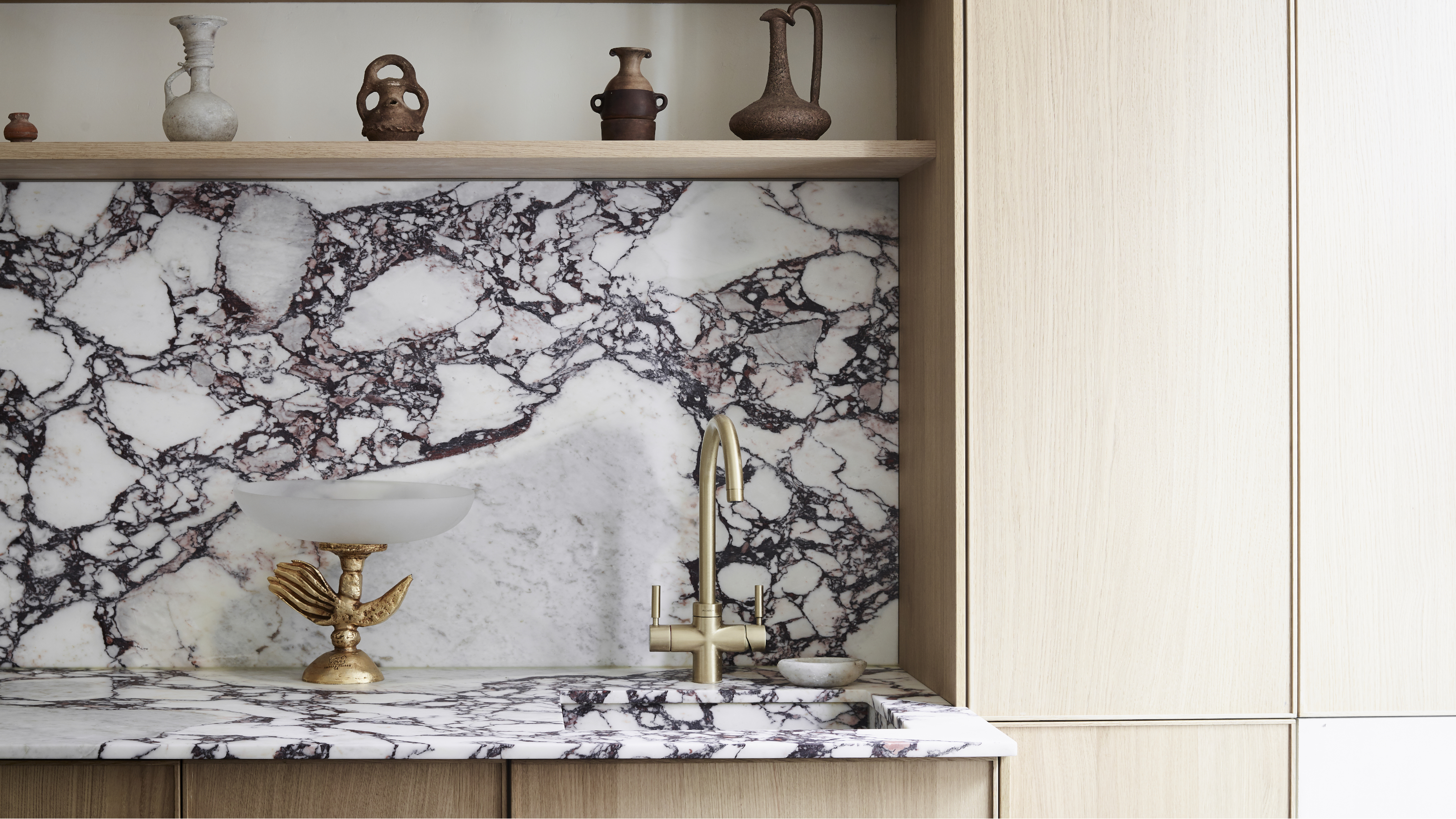
Natural stones like marble are certainly having a moment at the minute and it's so easy to see why; they're visually stunning, add tons of texture, can go with a variety of interior schemes, whether modern or traditional, and they feel completely luxurious. Marble kitchen ideas are timeless and beautiful. Plus, as a natural material, it only gets better looking with age.
'Calacatta Viola marble was chosen for the kitchen countertop and it has the most incredible colored veins. Marble and other natural stones are perfect for bringing a neutral scheme to life,' mentions Fred.
'The natural stone – although heavily veined and deep in color – still feels elegant and calm combined with wooden kitchen cabinetry and neutral walls. The slab was cut and honed which creates a matt finish to the marble, rather than gloss, which I prefer as it absorbs light rather than reflect it and it is also more resilient to staining. I loved it so much I used a hob which blended into the countertop and I used the same marble to create the sink,' he adds.
What is a neutral color scheme?
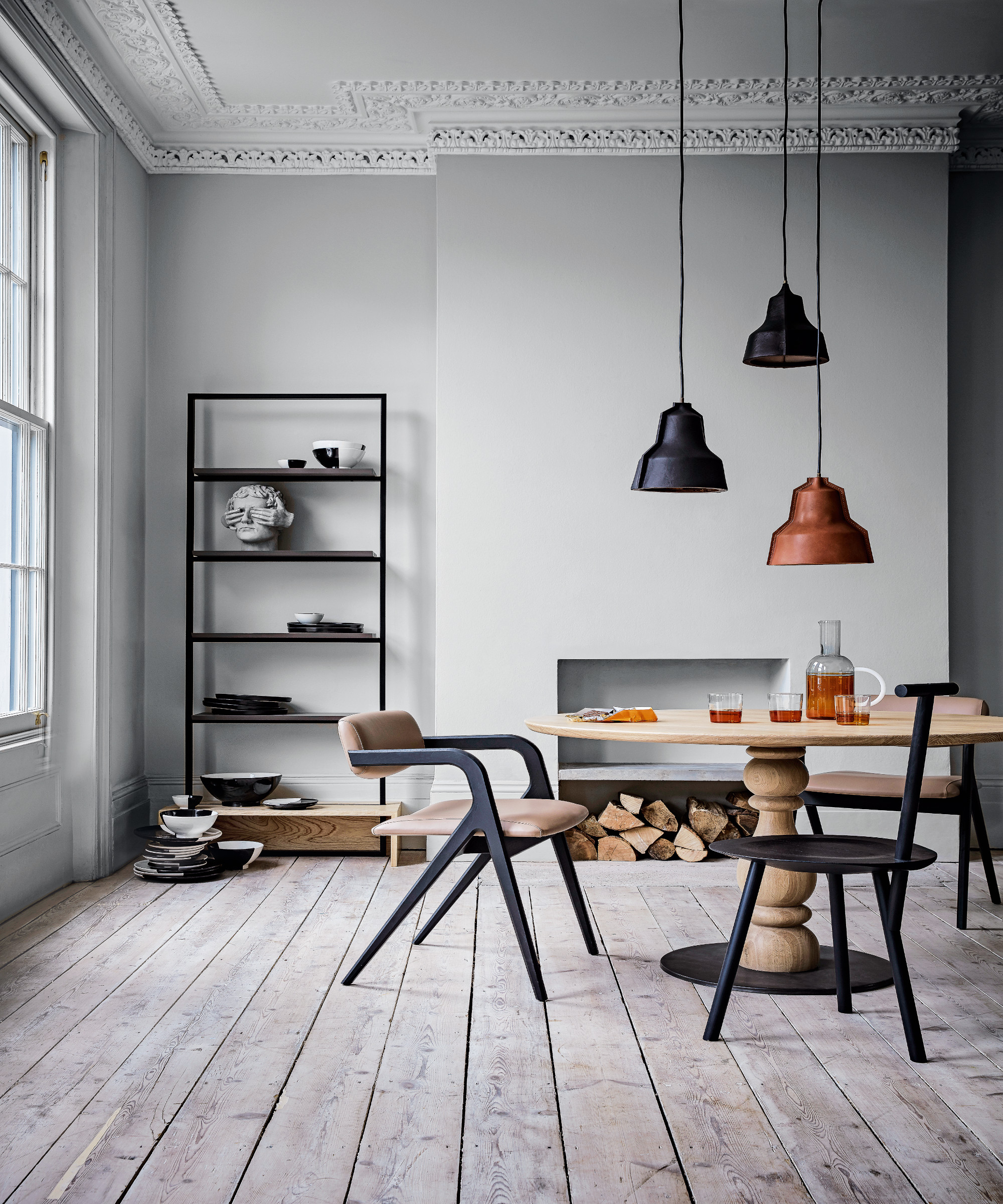
Neutral colors are muted shades that lack color and these can be anything from whites and blacks to greys and beiges they can provide a fantastic blank canvas, giving artwork and architectural features a chance to stand out.
Forget the magnolia trend of the 1990s and intense grays of the 2010s, nowadays there are so many wonderful, elegant paint shades to choose from, including light neutrals, such as warm creams and whites to darker shades, such as charcoal and black. Think about your space and the way the light falls and pick a hue to suit your space rather than one that's seen as fashionable.
A warm or cool neutral will look better or worse depending on whether you have a north or south-facing room. If you're decorating a dark, north-facing room or a room that doesn't get much natural light, go for warmer tones when picking your neutral. If you've got a light-filled, south-facing room you can opt for just about any color you like, but consider cooler colors as they balance out the sun's natural warm light.
What are the four neutrals?
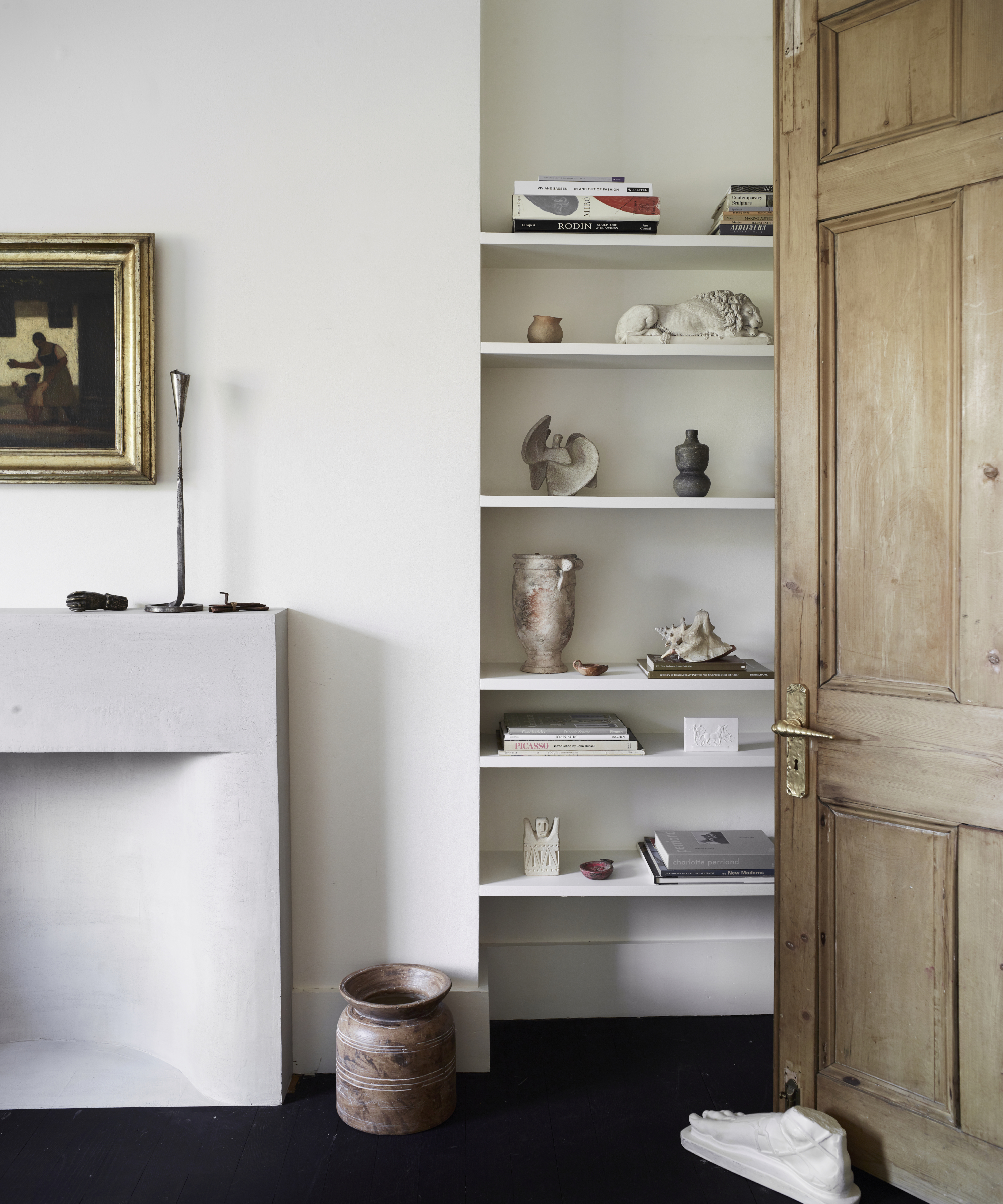
The four neutrals are usually considered to be white, grey, black, and brown, but there are probably more like eight neutrals, including beige, ivory, taupe, gray, cream, brown, black, and white. While neutral colors are not on the color wheel, they complement both primary and secondary colors.
What colors work with grey? Grey is a fantastic color to work with and goes particularly well with blush pinks, mustard yellows, and burnt oranges.
If you're working with white, then by its very nature, white goes with any color you pair with it, so take your pick! For a neutral look, white works well with other neutrals like creams, beige and gray. If you want a bolder look, white is perfect for contrasting with dark or bright colors. Deep navy is a stylish choice.
Decorating with brown has seen a surge very recently and it seeping into the interior design trends of 2022, so if you're hopping on this trend, consider pairing with navy blue or lighter beige and cream tones. And finally, if you're feeling brave and fancy a black interior scheme, pair with earthy hues to create a dramatic but cozy design or mix with white for a high contrast aesthetic.
Be The First To Know
The Livingetc newsletters are your inside source for what’s shaping interiors now - and what’s next. Discover trend forecasts, smart style ideas, and curated shopping inspiration that brings design to life. Subscribe today and stay ahead of the curve.

As the Houses Editor on Livingetc, Rachel has been obsessed with property ever since she was a kid. With a diploma in interior design and more than a decade working on interior magazines under her belt, she feels very at home sourcing the best contemporary houses the world has to offer for Livingetc. It's not just the day job either, she admits she's spent a scary amount of her own time researching schemes for her own renovations - scrolling Instagram, stalking Rightmove and Modern House, flicking through magazines and snooping in other peoples' windows - so she really does live and breathe houses on a daily, if not hourly, basis. Before Livingetc, Rachel had a stint finding homes for Ikea Family magazine where she was lucky enough to gallivant around the world on shoots meeting and interviewing interesting people, all with a very keen eye for blending high-end design with everyday items from Ikea. It inspired her to not be afraid of mixing new and old, expensive and affordable, vintage and modern and so Rachel's current Victorian terrace in north London is very much an updated, contemporary take on a period property; think open-plan modern kitchen with concrete floors, feature fireplaces and her grandmother’s paintings on the walls. Rachel is currently crushing on reeded glass, large gingham prints, squishy curved furniture; like Buchanan Studio’s Studio chair, and vintage wall sconces; she especially adores Retrouvius for sourcing antique finds and feels inspired by Lonika Chande, Beata Heuman and Matilda Goad and already can’t wait to start planning her next home, wherever that might be.
-
 Straight from Salone: Five Emerging Trends I Found That'll Shape Interiors For the Year Ahead
From reflective silver to fluidity, here's my perspective on the key themes and new moods coming through from Milan Design Week
By Sarah Spiteri Published
-
 9 Bathroom Storage Mistakes You're Probably Making That Make Using This Space Much Harder — And What to Do Instead
Discover which mistakes are to blame for your overcrowded and cluttered bathroom
By Seraphina Kyprios Published