Amethyst, Heather, Pansy, Plum — Turns Out Decorating With Purple Opens You Up to a World of Possibilities
Purple certainly isn't a color for the faint hearted, it's a shade that can smell your fear. Here's how to conquer it through your interiors
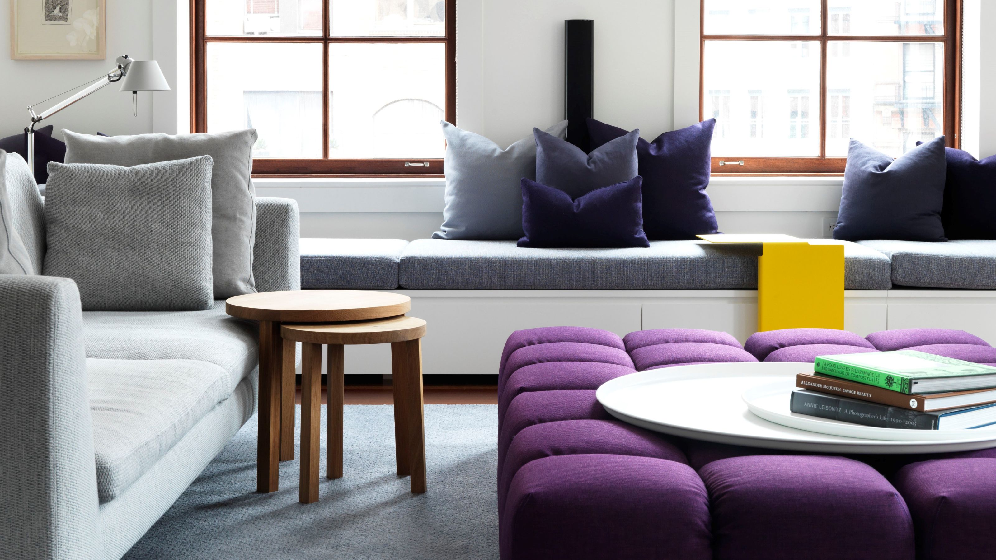
Purple is the color of dreams, of floating on an ethereal lavender-y lilac-y smoke into worlds unknown. It’s also the color of shadows, darkness, of sinking into aubergine-y blackberry depths unknown. Decorating with purple is something many aren't easily convinced on — until recently, it seems.
Regal, intriguing, and ever so slightly elusive, purple is a color that refuses to be easily defined. It carries the depth and drama of blue with the warmth of red. At its darkest, it feels sumptuous and brooding, rich with the weight of history and luxury — think heavy velvet curtains, deep damsons, or the inkiness of twilight.
Move towards the lighter end of the spectrum, and it softens into something more delicate and wistful, evoking wisteria-laden gardens, fading dusk, and antique silks. It’s a hue that’s somehow expressive yet composed, bold yet comforting, mysterious yet familiar, radiating a quiet air of sophistication wrapped in an aura of enigma.
Bringing it indoors — perhaps through purple living rooms, bathrooms, or bedrooms — and somehow capturing and containing its magic, can seem daunting. But it’s more than doable, and absolutely worth it. It’s easy to associate it with the dusty royal robes and ornate tapestries of days gone by or the fleeting futuristic flashes of 80s neon and Ultra Violet 2018s, but decorating with purple still holds its place as a dynamic and beguiling choice for the home. Here's how to do it.
1. Discover the Depth of Purple
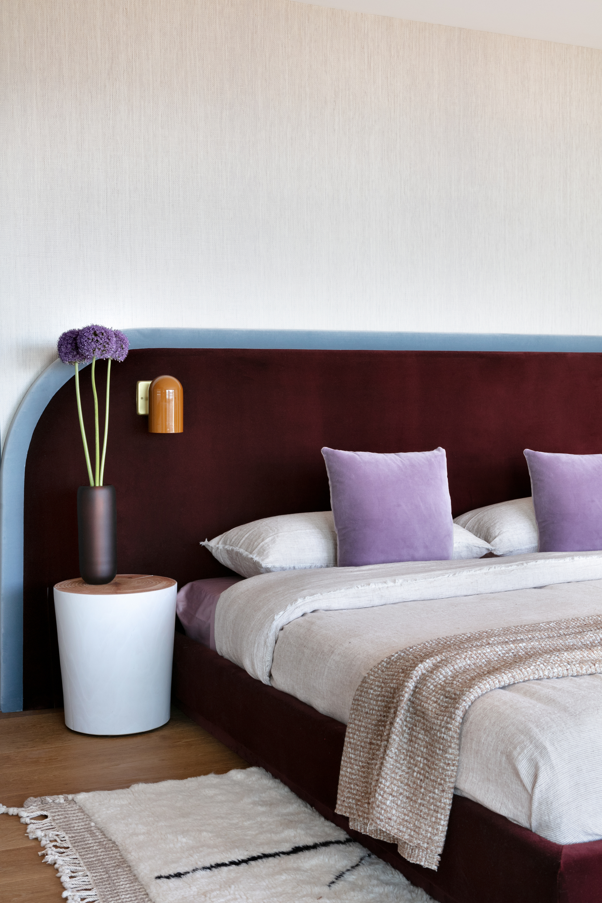
There are so many different shades of purple to decorate with, which gives the shade versatility and depth.
Picture purple. You could be drifting into the haze of twilight mist. Biting into a ripened plum. Running through French fields lined with lavender. Marveling at the brilliance of an electric storm. Sinking into an oily darkness. Gazing at an iris as it comes into bloom. Luxuriating in the plushness of imperial treasures. Clinging onto those last remnants of a dream as it slips away.
The purple-sphere is intricate, ranging from intense to intriguing and illusory. It’s a color of many guises and moods, ranging from the tranquil and calm color palettes all the way to regal opulence.
"Known for its ability to inspire creativity while evoking calm and contemplation, purple has long been associated with royalty and authority," says Kit Kemp, creative director Kit Kemp Design Studio. "It’s rarity in nature made it one of the most expensive dyes to produce, adding to its historical significance. Such a rich legacy infuses the color with an inherent sense of sophistication and prestige."
Dedicated to designing exciting and unique interiors, Kit Kemp MBE is Creative Director of celebrated London-based interior design firm Kit Kemp Design Studio, as well as Founder and Creative Director of the famously visually adventurous Firmdale Hotels. Kit has a love of color, craft and storytelling, creating rooms filled with narrative, originality and bold palettes.
"Treat it with respect," warns Jennifer Hamilton, interior designer and director at The Vawdrey House. "It’s not a color to be taken lightly and the choice of tone is so important — just painting a ‘feature wall’ or having one colorful sofa is not enough for purple, you need to go for gentle accents tying together across the room, or all in with full color drenching."
In other words, decorating with purple isn’t something to be scared of — this is a shade that can smell your fear. To conquer it, you need to throw yourself into it, give in to its hypnotic pull really allow it to come inside.
2. Sink into Purple's Mood
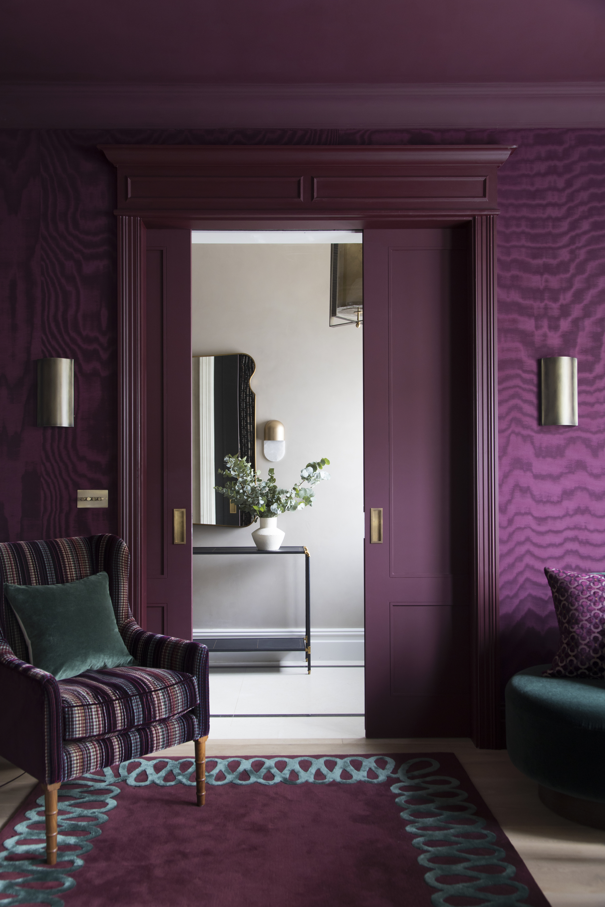
Purple can be rich and regal, or soft and soothing — it just depends what shade you choose.
Decorating with purple is a real mood-setter. It has the power to set the tone, be it a bright and spritely violet, a bold and confident amethyst, a wistful and whimsical heliotrope, a hushed and reflective heather, a moody, subdued mauve, a vivid, pensive pansy, a sultry and smouldering mulberry, or a brooding and intense blackcurrant.
So, while purple may not be a pigment to just lightly dip into — there’s a lot to choose from. Purple demands attention but rewards those of us willing to embrace its full spectrum of personalities, and harnessing its potential in the home starts with understanding how the different shades of this emerging color trend interact with space.
"Purple is a powerful color, so it’s important to consider the size of and natural light in the room before introducing it," explains Caroline Milns, head of interior design at Zulufish. "Lighter shades, such as lilac and lavender, bring a sense of openness and reflect light, making them ideal for a calming, restful bedroom. On the other hand, deeper purples, such as plum or aubergine, create a rich, cocooning atmosphere, perfect for dramatic dining rooms or cozy snugs where you might want to deliver a sense of intimacy and warmth."
Caroline developed her deep understanding of color and texture as a textile design specialist. As Head of Interior Design at London-based interior design consultancy and architectural practice Zulufish, she crafts distinctive, cutting-edge spaces, based around the belief that beautiful design should both look and feel fantastic.
Whether you crave a blissful retreat or a bold, immersive statement, there’s a tone to match every intention when decorating with purple, from drifting-away-on-a-cloud peaceful elegance to wham-in-your-face theatrical impact.
Purple can be as inviting and airy or as decadent and dominant as you desire — it’s all about handling it with confidence.
3. Embrace the Adaptability of Purple
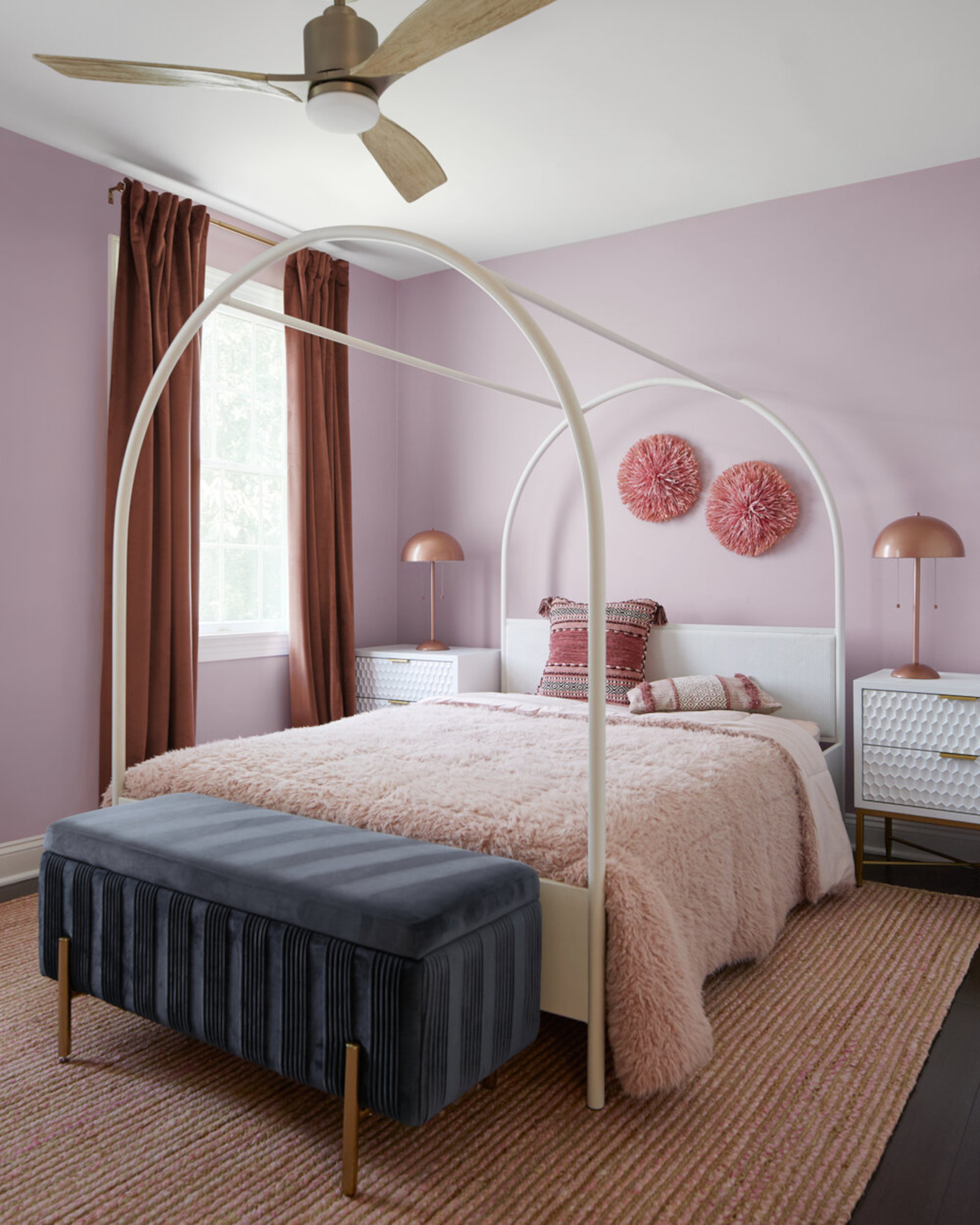
Every shade of purple has its own personality when it comes to decorating — some are pretty, while others are punchy.
Versatile and full of personality, decorating with purple can be both soothing and striking. It has a unique ability to shift effortlessly between a whole melee of moods, adapting to its surroundings and morphing almost unrecognizably from dark to light to bright, while always retaining its distinct sense of intrigue.
"Purple offers a beautiful range of tones, each with its own unique character," agrees Kit Kemp. "The cooler shades, such as lavender, bring a sense of calm and tranquility, perfect for a restful bedroom where serenity is key. On the other hand, the warmer purples — magenta and aubergine — are rich and energetic, adding a dramatic flair to living or dining spaces. Deeper purples, such as plum or wine, have an elegance and depth that make them ideal for creating those cozy, intimate corners in a room."
The possibilities are endless, each tone a chance to tell a new story — from the dusky, to the dark, the dazzling, and the daring. Each should be approached differently, as every variation brings a new perspective to the purple palette party.
"A fresh pale lilac can be light and delicate and will need florals and patterns to tie it in, which can work well in a breakfast room or bedroom, where you want it to feel like a spring morning," advises Jennifer Hamilton.
Director of design studio The Vawdrey House in West Sussex, Jennifer has a love of creative design and architecture, creating exciting and unusual spaces that range from listed heritage buildings to the brand new. Her elegant use of color infuses every room with a contemporary vibrancy, adding a fresh and dynamic energy and enhancing the intrinsic character of each property.
"A dark, rich, enveloping plum or indigo can be perfect for bars and cinema rooms, where you want to feel relaxed and decanted at the other end of the day," Jennifer continues.
Whether you opt for a soft orchid or a reddish amaranth, purple can be tailored to your space to strike the perfect balance between serenity and sophistication, all while adding a playful twist and an air of enchantment.
4. Balance Your Palettes
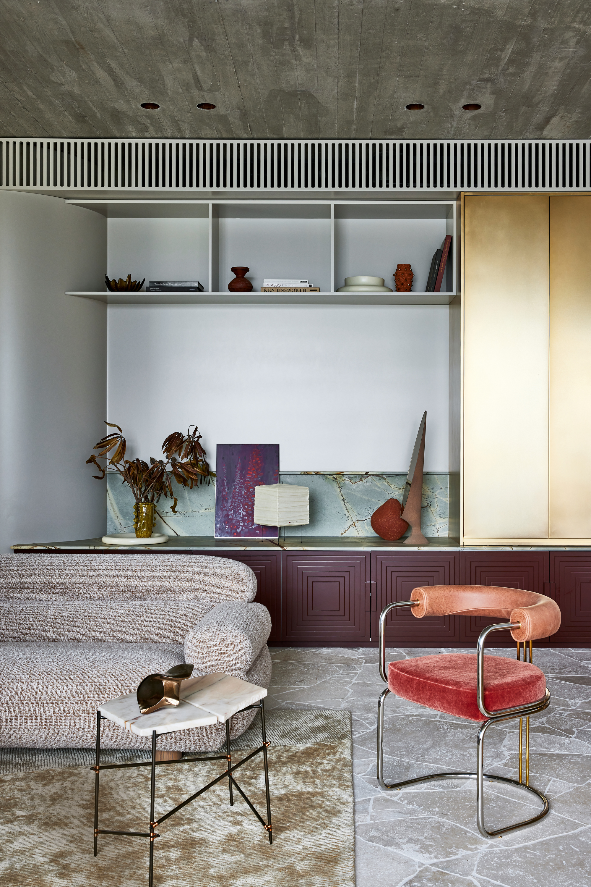
This purple, red, and blue room demonstrates just how easy it is to complement.
Ready to embark on the decorating with purple path? First stop is understanding the undertones of paint colors, wallpaper samples, and fabric swatches that you’re drawn to, which will point your color compass in the right direction.
White-tinted purples such as lavender and wisteria are soft, airy, and delicate, creating a fresh, uplifting, and ethereal quality. Red-tinged purples, your plums, aubergines and magentas, are warm, rich and energetic, feeling vibrant, impactful and luxurious.
Blue-undertoned shades, the likes of indigo, amethyst, and periwinkle, have a more reserved and sophisticated elegance about them, while pink-tinted hues — lilac, mauve, orchid — are romantic and soft, inducing a nostalgic and lighthearted ambiance.
Then things turn quieter with the gray-purples, such as heather or thistle, which create a cocooning, understated atmosphere. We go earthy with the brown-edged prune and blackberry hues and their grounded, vintage charms, and things get intense as we step into the black-undertoned purples — blackberry, deep damson, obsidian — which are bold, and immersive.
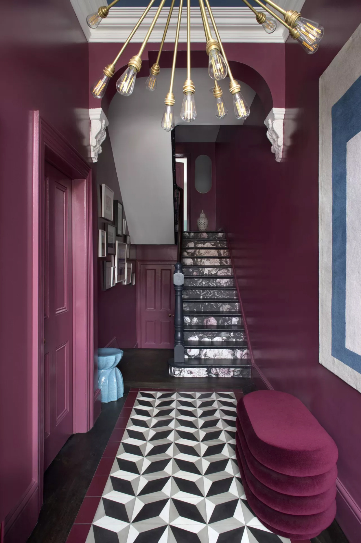
Thinking of color-drenching a space? Be bold and pick purple.
While such variation may seem overwhelming, it means there’s a lot of choice, and plenty of colors that go with purple that will help enhance its nuanced personality.
"Purple is a very rich and strong color and can therefore be rather overpowering within an interior," says Kit Kemp. "To maintain balance, pair it with a broader color scheme or soften its impact by combining it with calming neutrals and soft, chalky whites to help temper its intensity."
"It also complements fresh, light hues such as coral, cool blues, leafy greens, and neutrals, which allow the vibrancy of purple to introduce depth and interest," adds Kit.
"I absolutely love pairing purple with a serene mix of soft grays, charcoal, and touches of white," says Caroline Milns. "The cooler tones complement the dramatic depth of purple so beautifully, creating a refined and harmonious balance."
"Ochre and mustard tones work very well with purples and plums to balance out the bluey tones," says Jennifer Hamilton. "You can also mix pink and purple if you have the right tone of purple, which can work well with some greens alongside. Plummy/burgundy tones especially mix well with olive green and auburn/brown tones to make a rich autumnal palette."
You can also try warm tones including cinnamon, copper, or amber for a refined, intimate vibe, seafoam green or mint for a dash of freshness and serene-yet-statement contrast, pastels for a soft, lingering sense of stillness, or cobalt blue for an energetic wildcard that gives off intensity as well as a sense of cohesion.
The Livingetc newsletters are your inside source for what’s shaping interiors now - and what’s next. Discover trend forecasts, smart style ideas, and curated shopping inspiration that brings design to life. Subscribe today and stay ahead of the curve.
Amy Moorea Wong is a color authority and contemporary interior design writer who has specialized in all things decorating for over a decade. Amy is Livingetc magazine’s Colour Expert, Interiors Editor at The Glossary magazine and a Contributing Editor at Homes & Gardens magazine, and she frequently contributes to an array of global publications to share her insights on interior design zeitgeist. Her book Kaleidoscope: Modern Homes in Every Colour explores a collection of cool colorful homes fizzing with creativity, surprises, and inspiration.
