
Seeing red isn’t always a bad thing. The fiery and enigmatic tone has become a staple in designer schemes as more of us lean into expressive accents in our homes. Following the widespread celebration of the unexpected red theory earlier this year, many of us are asking the question — can decorating with red actually look stylish?
It can be a daunting prospect. Whilst red can be an energizing and joyful addition to interiors, it is also a color that attracts attention and has a lifelong association with danger (just think of a stop sign). Our journey into exploring the hue has seen us look at colors that go with red, but now we're considering more closely how the experts make the most of this primary shade.
Below, interior designers and color experts have weighed in on how to achieve visual balance with red whilst elevating schemes with this colorful and exciting addition. Their advice is accompanied by inspiring examples to help you paint the town red (or at least your living room to start with). Here's how to do it.
1. SMALL BUT MIGHTY — CHOOSE RED ACCESSORIES

San Franciscan designer Heather Hilliard takes an exacting approach to red, harnessing its striking impact in her contemporary bedroom design. Red accents give the soothing and natural textures in this space a touch of refreshment — the warmth in the brown and ecru tones is also accentuated by these touches too. It’s a subtle approach to the color that yields impressive results.
“Pillows, lighting, and other small decorative items and accessories are a good way to incorporate red," she says. "It's low commitment, as you can always swap them out later on if you tire of the color."
But she stresses that the placement and way you mix red items with other pieces in the room is important. “It depends on how much of it you're applying to a space, but I tend to lean towards rusty, deep reds if we're painting a room, and slightly lighter, brighter reds if it's one or two accessories or an accent piece,” she adds.

Price: $14.99
Size: 16" x 24"
2. CONSIDER THE CONTRAST THAT RED CAN CREATE

“We wanted the interiors of the Arc show home to be playful and engaging, and using different tones of red, from deep to lighter rusty tones against a soft blue backdrop creates an element of surprise — something that feels intentional yet delightfully unanticipated," explains Owl Design founders Sophie van Winden and Simone Gordon. "This pop of color not only complements the surrounding design but also creates a sense of rhythm and balance in the room.”
The contrast that your preferred shade of red will create with the other colors within the room is a defining factor in the success of your scheme. In this example, the red takes a joyful stance of opposition against the blue and pastel tones, connected by their playful connotations but visually balancing one another. When designing, ask yourself how even in contrast, your shade of red brings cohesion to the room.
3. MIX AND MATCH YOUR SHADES OF RED

Taking a more nuanced approach, this red bathroom layers jubilant red tones to create a visually stunning moment. Ghislaine Viñas, the interior designer behind this memorable space, plays with form, color, and narrative. The other elements play on the same level as the red-striped wallpaper, from the crisp edges of the architectural vanity to the gallery-like arrangement of portraits on the wall. This is a space that isn’t afraid to channel the stark and bold presence of the hue that dominates it.
“I’m all for mixing non-matching reds — it’s such an interesting way to layer a space and create depth," she says. "Playing with different tones of the same color can give you a really unique look. For instance, putting a lipstick red next to a deep burgundy can be stunning, and then adding a pop of raspberry red takes it even further. It creates a rich, dynamic palette.”

Price: $5.99/sample pot; $2.50 color swatch

Price: $5.99/sample pot; $2.50 color swatch

Price: $5.99/sample pot; $2.50 color swatch
4. BLEND YOUR RED WITH WARMER NEUTRAL TONES

Part of what makes red so appealing is the intense warmth that the color is very much identified by. Award-winning Australian interior designer Greg Natale’s Toorak Penthouse project is a testament to the versatility of red when it’s married with warming shades that soften its impact and simultaneously bring cohesion to the room.
“Opt for rich, warm reds like maroon or burgundy," he says. "These shades will still make a statement but won’t be as overpowering as brighter reds tend to be and are more timeless. They also pair better with other colors, such as gold, beige, pink, and brown, as demonstrated in this seating room. Amongst the warm neutrals, the maroon wall is blended in with the rest of the design, rather than fighting against it.”

Price: $245
Size: 610g
5. CREATE UNDERSTATED ELEGANCE WITH DARKER SHADES OF RED

Thea Bloch-Neal, Durham-based founder and lead designer of Curated by Thea believes in the elegance and drama of darker red tones. The walls of her red living room are painted in rich brick-like red that instantly makes this space feel like a cozy cocoon, accentuated wonderfully by the buttery, espresso-colored leather sofa and warm wooden accents.
“I love incorporating dark reds or pops of bright red — they bring so much depth and elegance to a room," she says. "I like to pair reds with warm tones to avoid any unintended "sports team" vibes. You definitely don’t want your space to feel like a locker room!”
For those who are still finding their feet decorating with red, going for darker iterations of the color can be a great way to still enjoy all of the adventure and warmth this shade has to offer.
What is the unexpected red theory?
At the beginning of 2024, TikToker Taylor Simon coined the now viral ‘unexpected red theory’, setting the spotlight on red in the months to follow. Its secret lies in its selective approach, applying just the right amount of red to intrigue and excite.
“The ‘unexpected red theory’ is all about using red as a striking element that energizes a space without overwhelming it," says Sophie van Winden. "Red has a powerful presence, and when used thoughtfully, it draws the eye and creates a dynamic focal point.”
The bravery of the theory also lends to its success, it revels in the unexpected. “Adding a pop of red can always make a room look interesting and create a sense of uniqueness. It can defy a general theme or look and that can be daring and fun,” explains interior designer, Ghislaine Viñas.
-
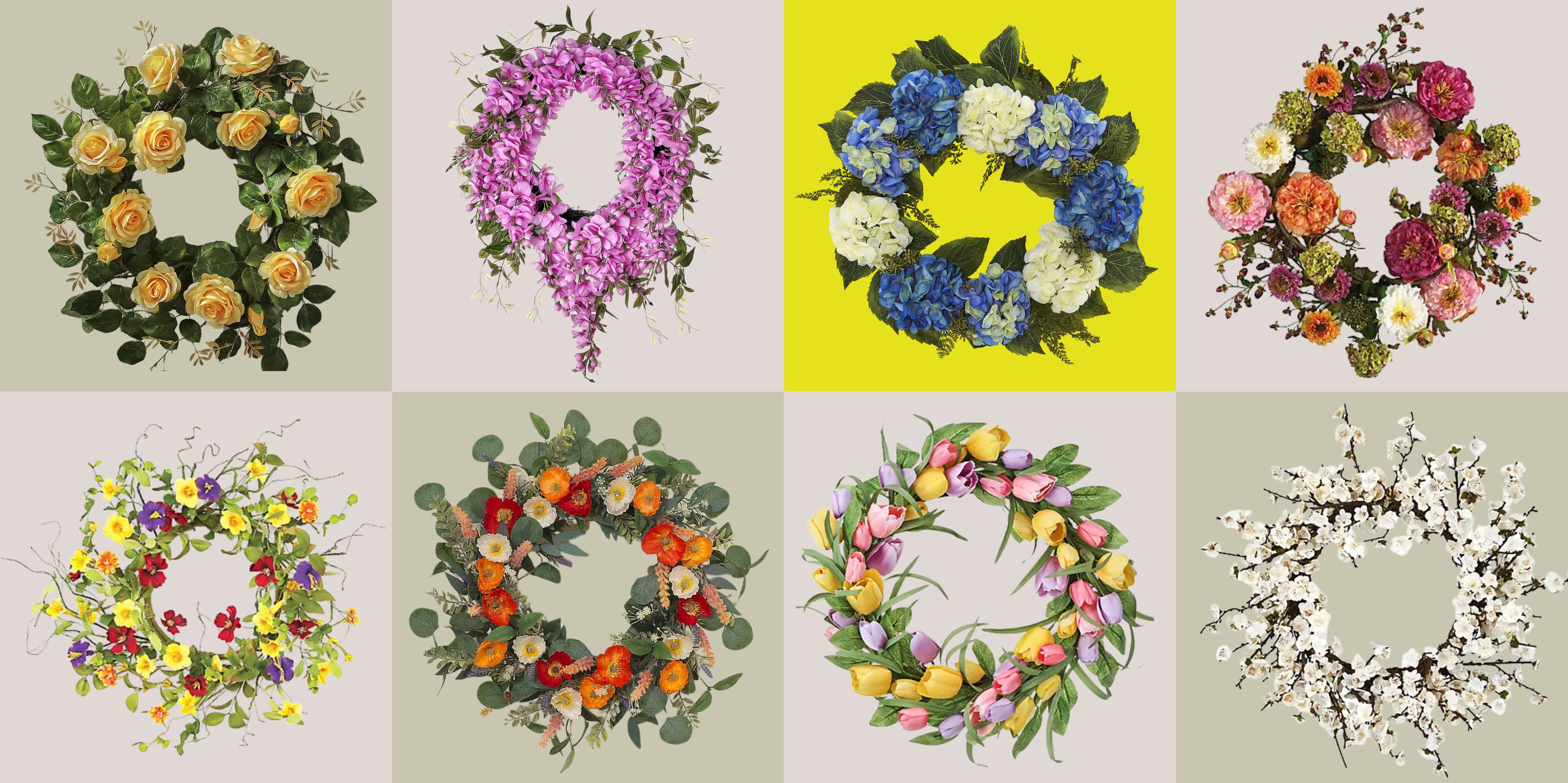 These Are the Flower Crowns I’m Wearing This Spring (Spoiler: They’re Actually for My Door)
Coachella confirmed the comeback of flower crowns. At home, they just go by another name: the spring wreath
-
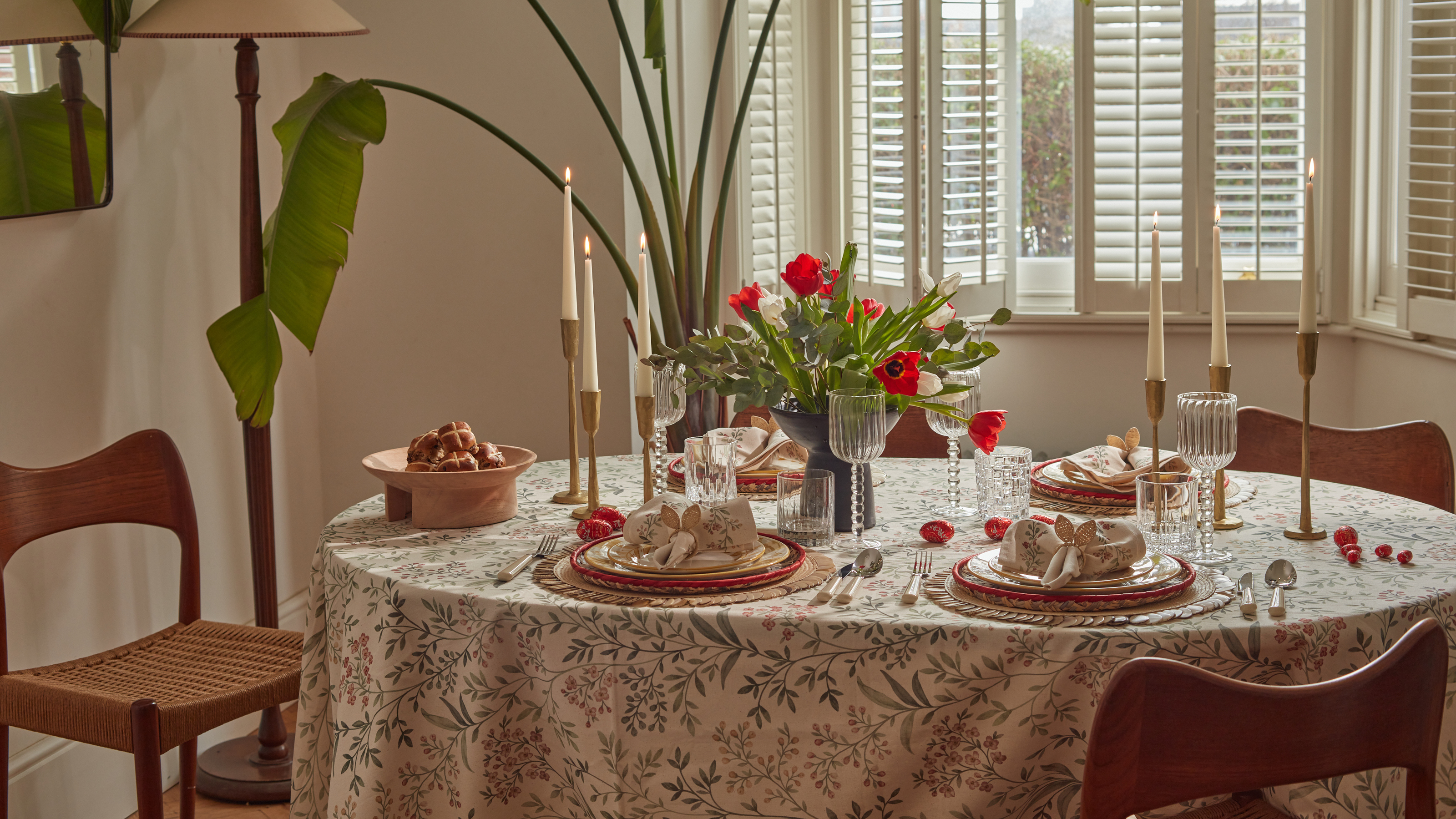 Bunny Ears, Be Gone — 7 Easter Table Styling Mistakes That Will Take Your Setting from Tawdry to Tasteful
From fussy floral displays that disrupt conversation to over-relying on tacky tropes, don't fall victim to these errors when decorating your Easter table

