How Designers Are Decorating With Sage Green to Create Schemes That Are Unexpected, Fresh, and Timeless
There's a lot to love about sage green thanks to its soothing temperament, but to get it right, you need to understand its subtle intricacies
There is no denying that sage is a celebrated hue by interior designers and home enthusiasts alike. When it comes to decorating with sage green, the muted tone has much to offer us thanks to its soothing temperament that works equally well in warmer iterations as it does in cooler, gray-soaked shades.
To add it its accolades, sage is also praised for being a team player as its proximity to neutral hues means that there are several shades it works well with when it comes to sage green room ideas. But before you start, it's important to understand the intricacies of this charming shade.
To help, we’ve put together our key pieces of advice when working with the color, after consulting the experts. From considering the light and scale of your room to understanding the atmospheric impact of your chosen shade of sage, these are the things to keep in mind when decorating with sage green.
1. UNDERSTAND HOW SAGE CREATES AN ATMOSPHERE
Sage can work with a variety of different interior styles, be that farmhouse, cottage, modern, or bohemian. It's important, therefore, to consider the atmosphere you want to create, and the style of furniture and accessories you have, to ensure it's a color that will complement the overall aesthetic.
"Sage's soothing and earthy qualities may work well if you're seeking a tranquil environment, especially for bedrooms or living rooms," says Ann Lane, founder of Ann Lane Home Design. "If you are decorating for a specific mood, think about how sage makes you feel in that particular room. By thoughtfully balancing sage with other colors and textures, you can create a space that feels both serene and stylish."
2. CONSIDER THE NATURAL LIGHT AND SCALE OF YOUR SPACE

As with any color, it’s important to factor in how light affects green paint, particularly the way it will look in the space. The darker the sage tone is, the less light is reflected, and thus the atmosphere of the room changes. Scale is a factor that connects to this, as lighter often means the illusion of a larger room.
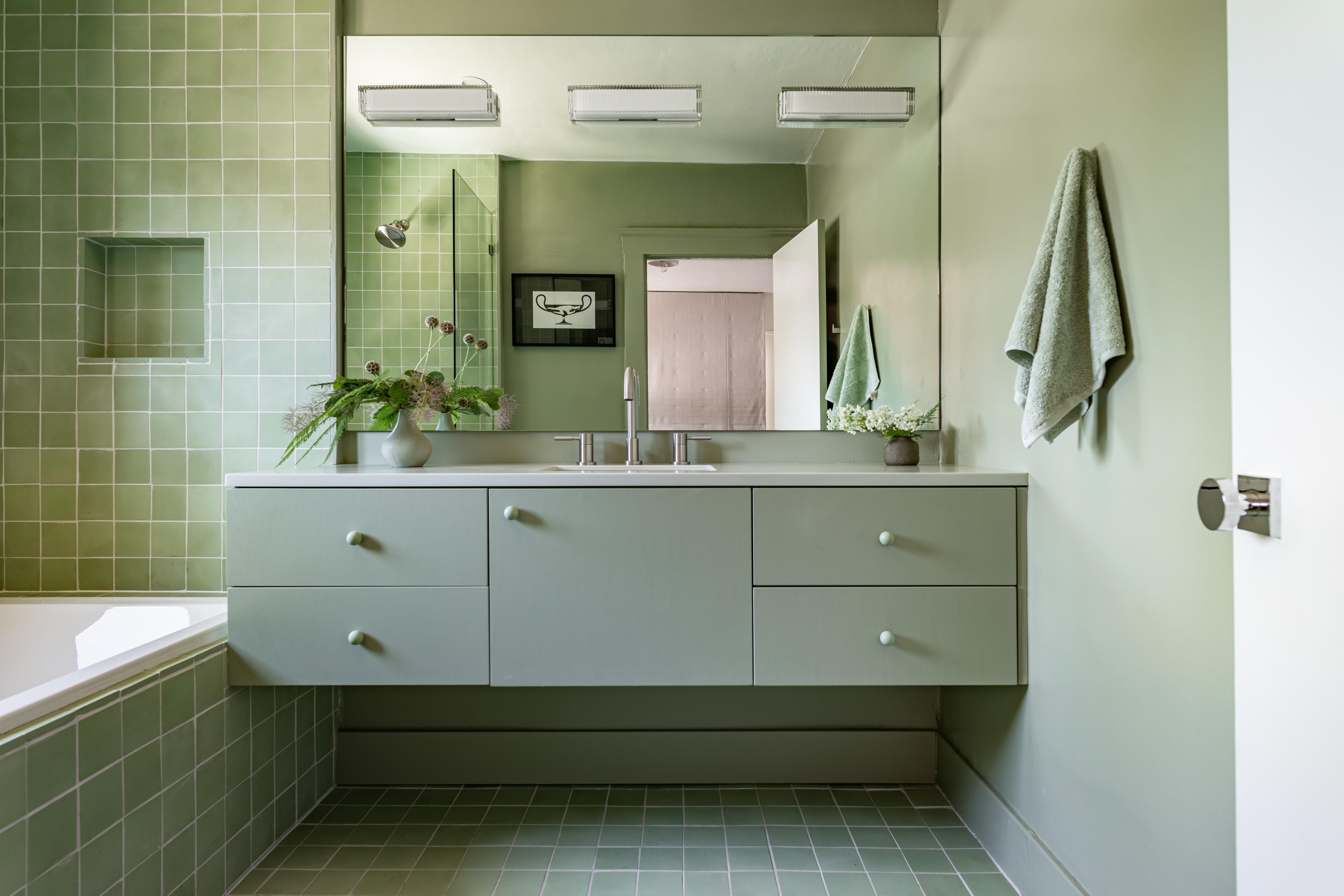
This sage-filled contemporary bathroom design highlights how the right shade can echo feelings of space, comfort, and serenity. “The brief for this guest bathroom was to create a spa-like vibe, so my mind instantly went to sage green," says Leah Ring, principal at LA-based studio, Another Human. "The color is soft enough that we could apply it to all surfaces in the room and create a calm, monochromatic space. If the color were more saturated it might be overwhelming, but this sage green was a perfect hue given the natural light and the scale of the room.”
3. TAKE ADVANTAGE OF THE CALM SAGE BRINGS
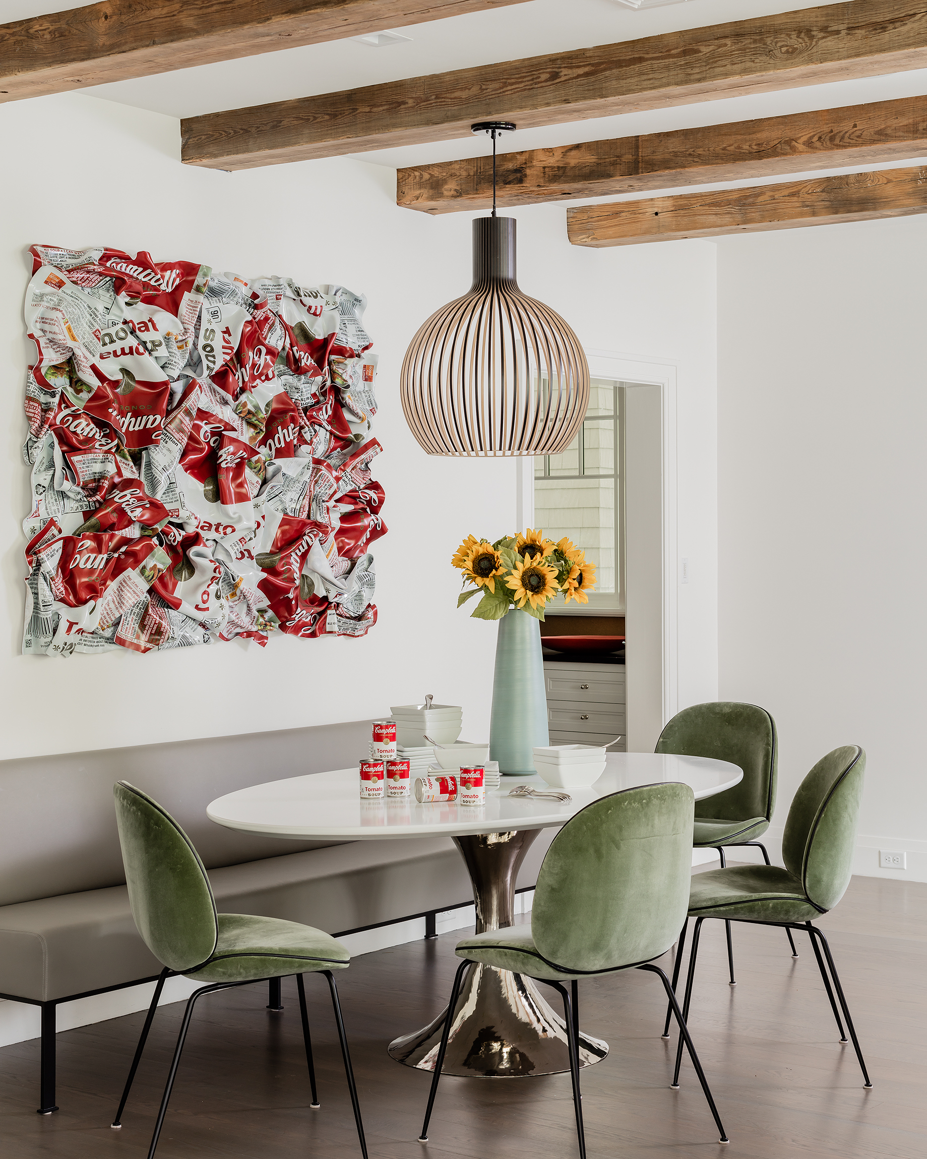
Balance in interior design is an essential tenet, and sage elements can often soften more expressive artwork or furnishings. This is in part due to the gray that forms the foundation of the color, it gives the green a much more muted and calming flavor whilst retaining its freshness.
"Sage green color always creates a calming and sophisticated atmosphere, especially when it is used with a neutral background, it adds depth," shares Boston-based interior designer, Atsu Gunther. "In this kitchen, we used Gubi Beetle chairs in a light green velvet. Velvet also adds a luxurious touch so that it feels rich and not too casual in the modern farmhouse setting."
The effect is a kitchen seating area that feels cool and contemporary but also warm and inviting. If you’re considering how you might use sage in your home, introducing this method by reupholstering existing furniture or opting for green accent chairs might be a great place to start.
4. DON'T BE AFRAID TO GO BIG WITH SAGE
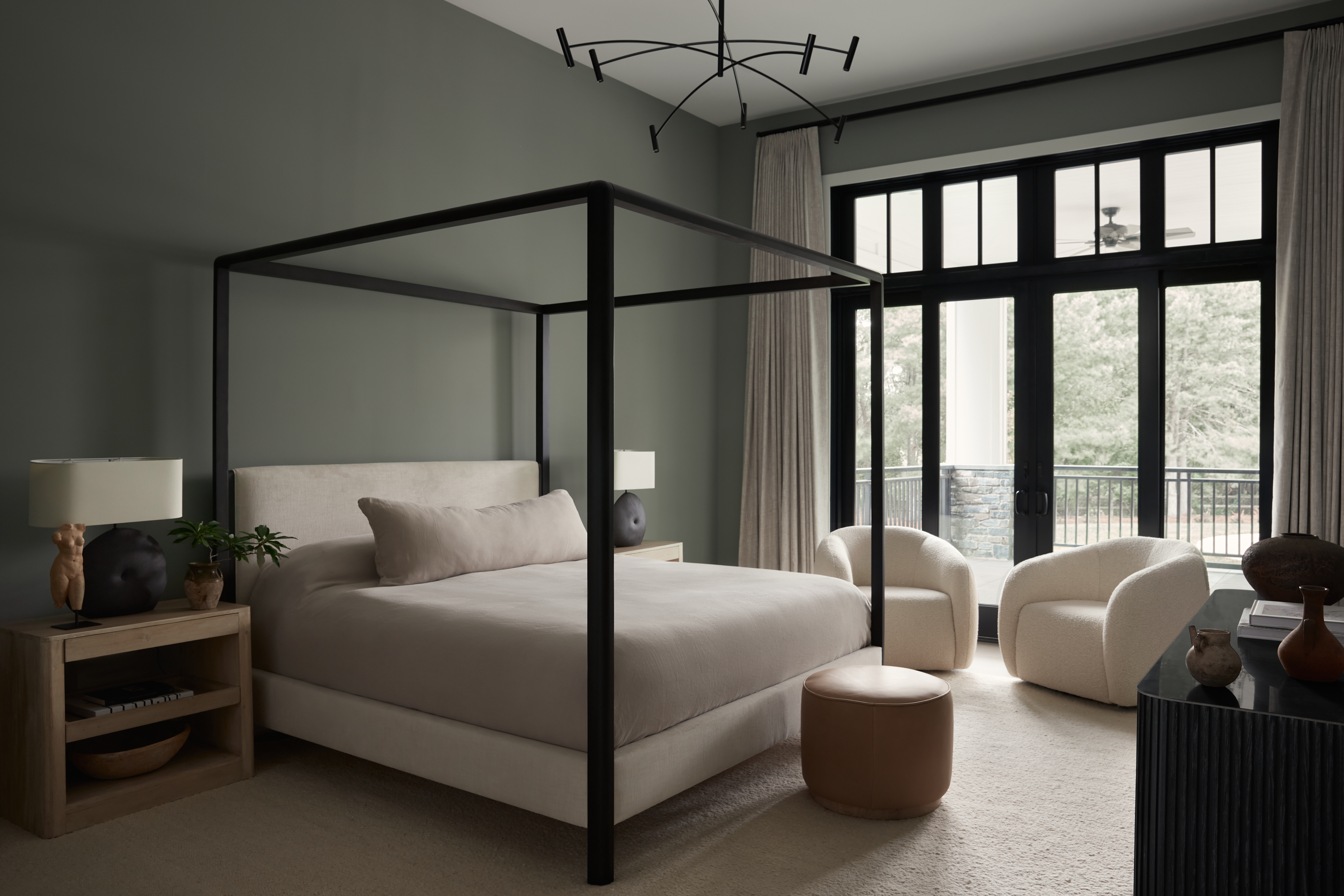
Sage is a wonderful color to use across larger surfaces where you want to add character but not overwhelm the space, as shown in this beautiful sage green bedroom design by Philadelphia-based Far Studio.
“In this bedroom, the clients wanted to infuse color, but I really wanted to be sure it was something calming and subtle," says Brittany Wurzak Hakimfar, lead designer at Far Studio. "I did not want it to be something they would tire of in a few years. To achieve this we found the perfect tone of a very subtle and soft sage green (Sherwin Williams Western Reserve) which covered all of the walls.”
Experiment with your favorite shade of sage by color drenching your room, as you cover the floor and ceiling — you’ll find yourself enveloped by warmth.
5. CONSIDER THE ROLE TEXTURE PLAYS
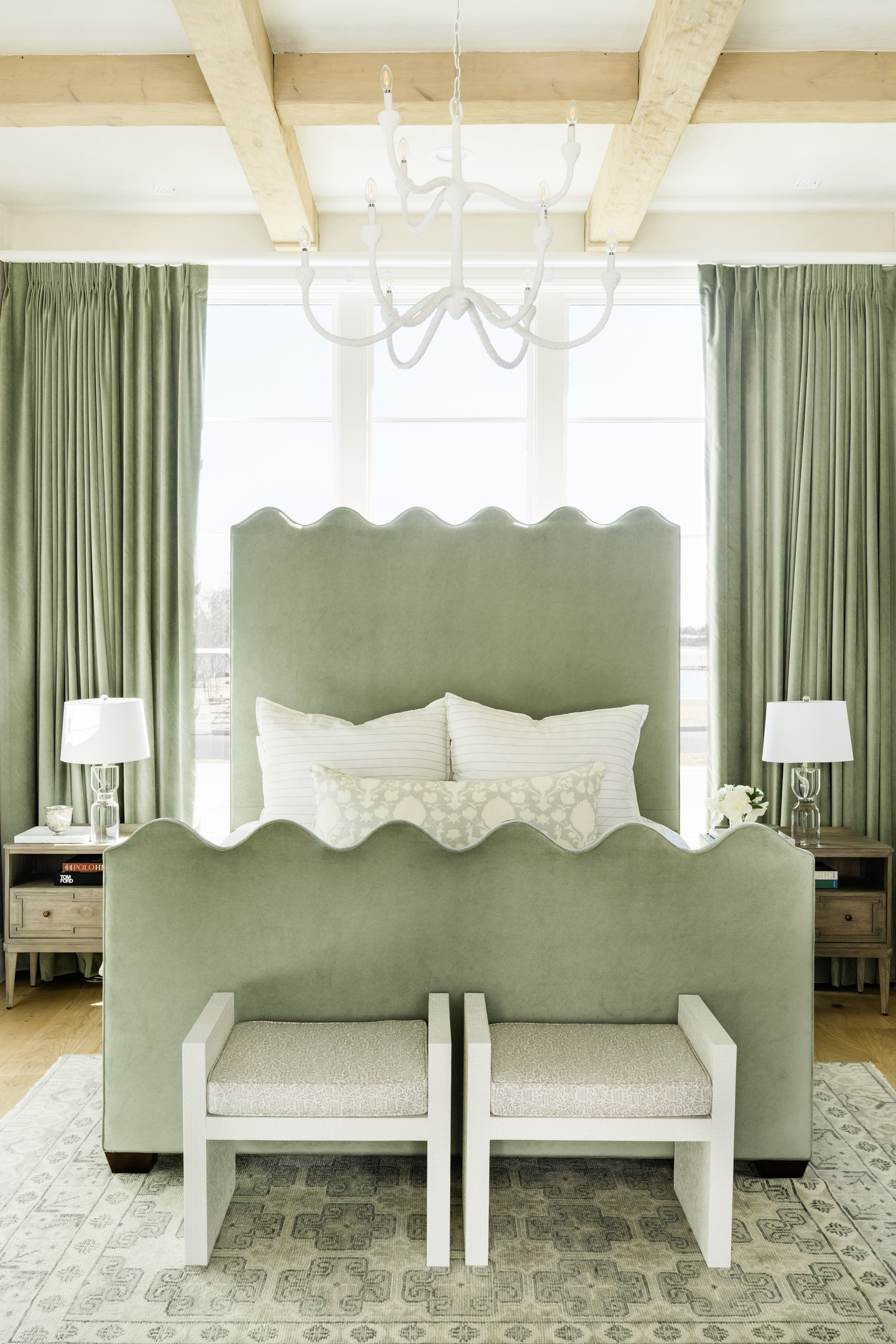
It’s easy to get lost in the visual elements of your design journey but it’s important to consider the role texture and form plays in how you experience your sage furnishings.
Order samples and visit showrooms to understand how that sage green sofa or drapes feel in real life. This is an approach that interior designer, Shelby Van Daley, founder and principal designer of Austin-based studio, Daley Home, emphasizes as she details the journey of putting this enticing sage bedroom together.
“When going for a look of over-saturation of color, it’s important to mix in textures and applications," she says. "In this room, we have the boldness in the bed and drapes but soften it with the handwoven wool rug that has more movement and pattern. Also, by adding scallops to the bed, we created a differentiation between the bed and the drapes in order to draw your eye in. This room has a lot of natural light, so we opted for plaster walls in a soft beige to add more intrigue to the space.”
6. OPT FOR THE UNEXPECTED
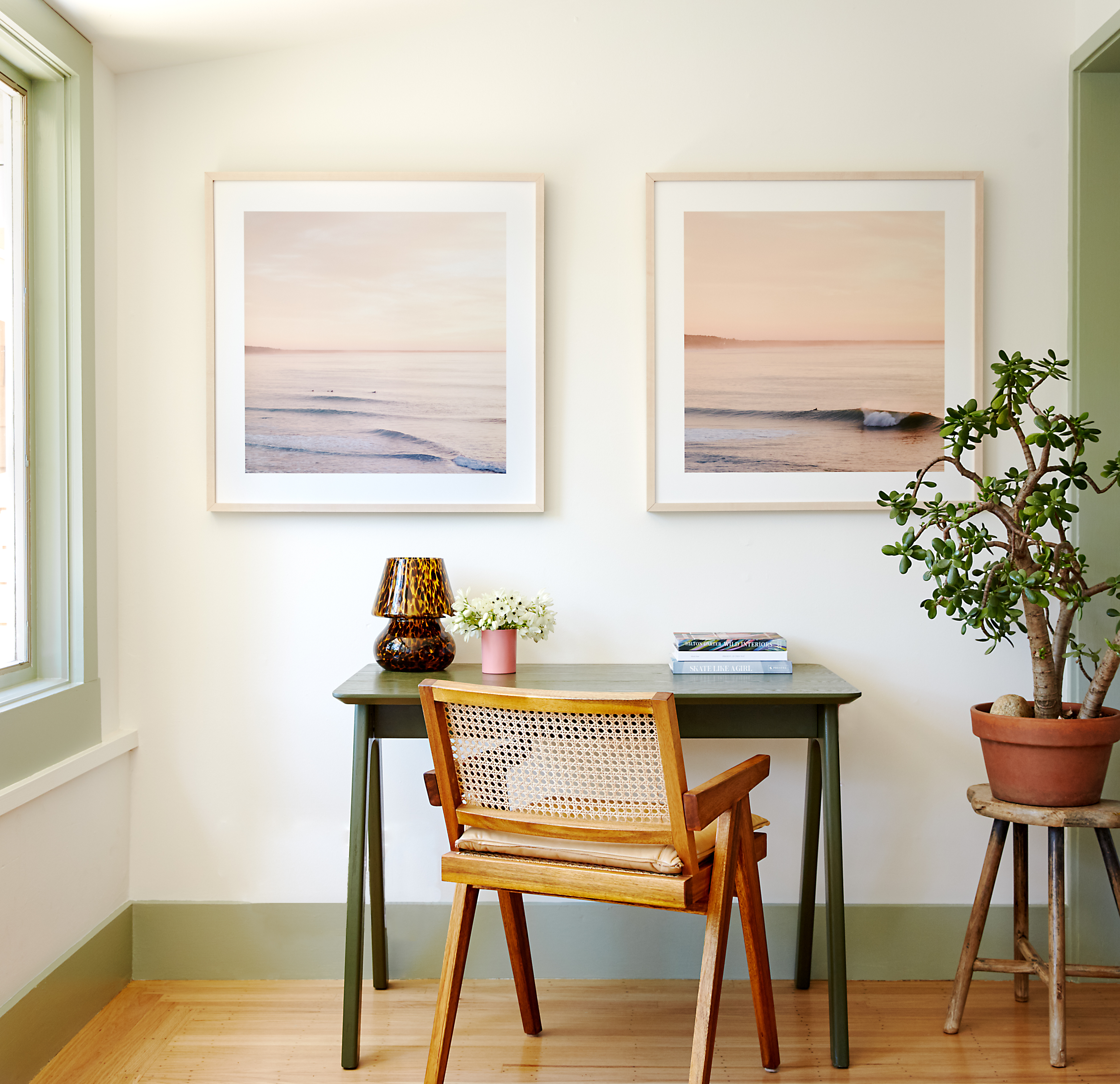
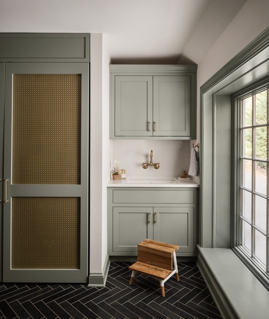
Although sage is celebrated for its versatility, it’s also important to be careful to not play it too safe with your application of the color. In order to create an interior that truly captivates, question the placement of your sage finishes or furnishings. This home office designed by Californian designer, Sheila Kramer, founder of Sheila Kramer Interiors, takes this staple color and creatively uses it to frame the space as a window and trim color.
"We moved this family of five into their home with the ultimate goal of gut-renovating it within the next couple of years," explains Shelia. "In the meantime, we wanted to bring charm and harmony to the first floor. To that end, we painted all the trim throughout the first floor a soothing sage green. This made the spaces feel cohesive and brought the stunning views of Mt. Tam to life!"
Be The First To Know
The Livingetc newsletters are your inside source for what’s shaping interiors now - and what’s next. Discover trend forecasts, smart style ideas, and curated shopping inspiration that brings design to life. Subscribe today and stay ahead of the curve.
Writer and design expert Faaizah Shah is the founder of The Interiors Consultancy. She has worked with designers such as Staffan Tollgard and design houses such as Sanderson to help them understand and communicate their narratives. She is known for crafting engaging stories and imaginative content, and understanding great decor from her years alongside some of the best creatives in the industry. She is also a contributor to Livingetc.
-
 7 Sustainable Product Designs That Are Setting the Agenda for Environmentally-Conscious Homes in 2025
From pillows made from textile waste to sanitaryware made in the world's first electric kiln, these brands are revolutionizing sustainable design — for the better
By Devin Toolen
-
 NYC's New Rules Forced Me to Find a Chic Compost Bin — Here's 7 Options Significantly Cheaper Than the $300 Fine
Composting is now mandatory in NYC. Here’s how to do it stylishly
By Julia Demer
-
 Should a Living Room Be Painted Dark or Light? We Asked Design Experts to Settle The Age-Old Debate
The color of your living room can completely shift the mood of your entire home, so the question remains: should you go light or dark...?
By Devin Toolen
-
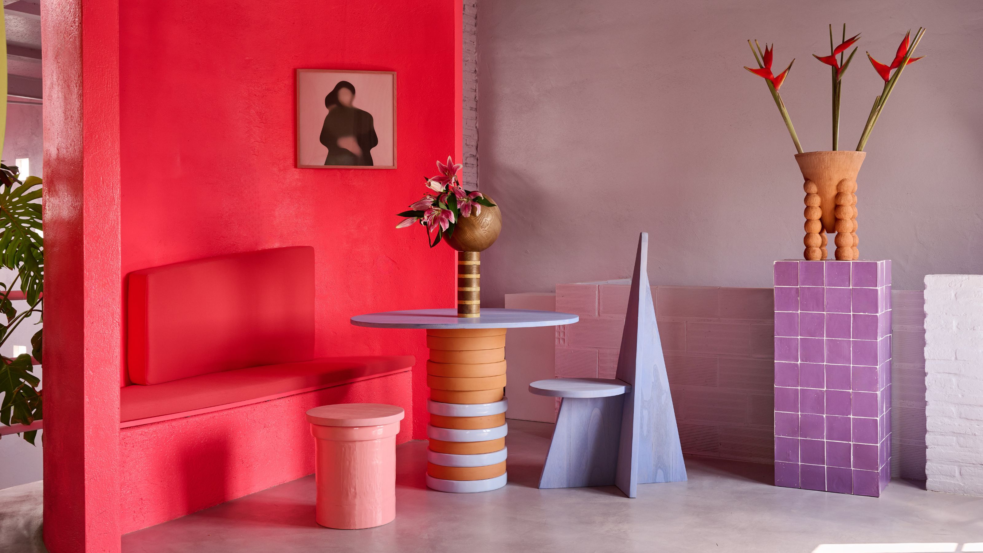 I'm Sorry, But You Need to Know About 'Advancing and Receding Colors' If You Want to Get Your Home's Decorating Scheme Right
While some colors tend to pop and reach forward in a room, others draw back. Here, a color expert helps define these palettes and how to use them
By Olivia Wolfe
-
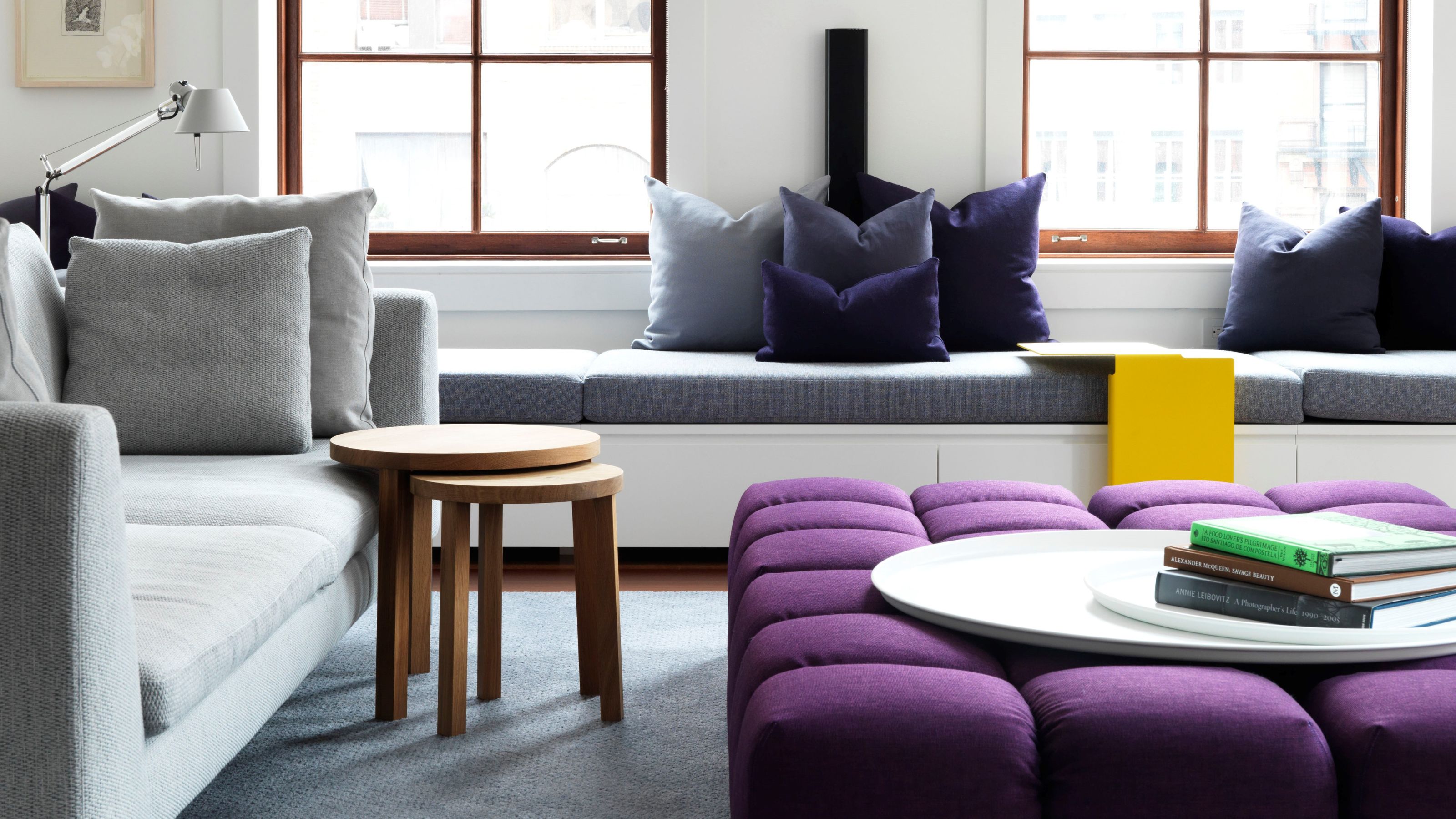 Amethyst, Heather, Pansy, Plum — Turns Out Decorating With Purple Opens You Up to a World of Possibilities
Purple certainly isn't a color for the faint hearted, it's a shade that can smell your fear. Here's how to conquer it through your interiors
By Amy Moorea Wong
-
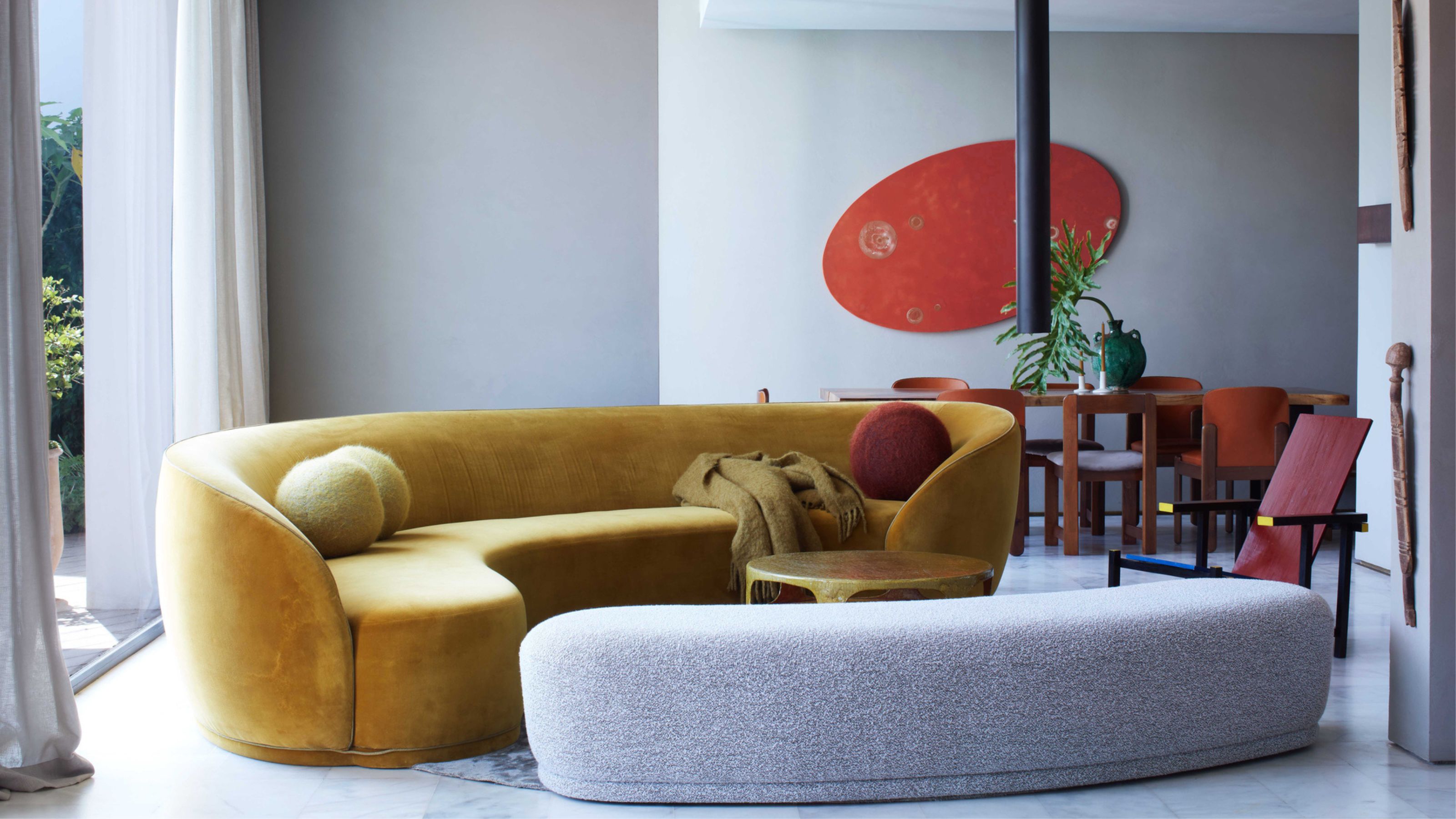 Here's Why Decorating With Mustard Yellow Helps Fill Your Interiors With a Sense of "Confident Calm"
There is so much more to decorating with this turmeric-tinted sauce-wiggled-on-a-hotdog not-quite-yellow shade than meets the eye
By Amy Moorea Wong
-
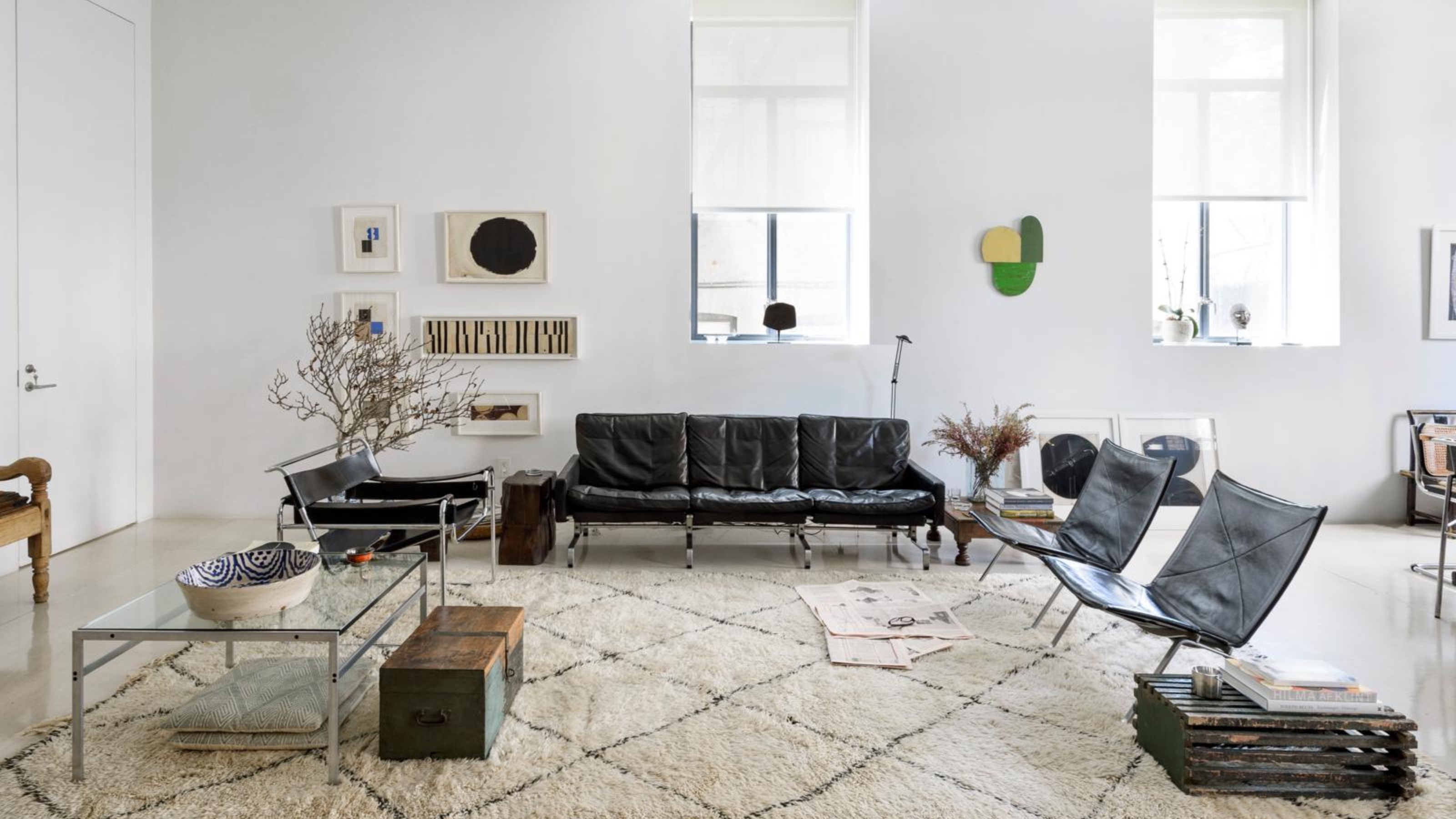 5 Problems With Painting Your Walls White That No-One Ever Talks About (Until Now)
White is the easiest neutral to work with...right? Interior designers explain why this shade is actually more complex than it may seem
By Olivia Wolfe
-
 5 Mistakes That Are Making the Blue Details in Your Room Feel Old-Fashioned — And How to Rectify Them
Blue is a timeless shade, no doubt, but use it in the wrong space or in the wrong way, and it can make a space feel, well... a bit blue
By Kelly Hushin
-
 5 of the Best Navy Blue Paint Colors That Designers Love — And How to Use Them
Navy blue has timeless appeal and can feel both modern yet classic, but what are the designers' favorite paints?
By Oonagh Turner
-
 Should Your Carpet Be A Darker Color Than Your Walls? How to Make This Bold Look Work
Not every room can get away with a carpet that is darker than the walls; Designers share when and where this combination works best
By Olivia Wolfe