Do red and green go together? Why I'm convinced this color scheme should go beyond your Christmas decor
Red and green might be the colors of Christmas, but used in the right combinations, it can be a stylish, non-festive choice for your home, too
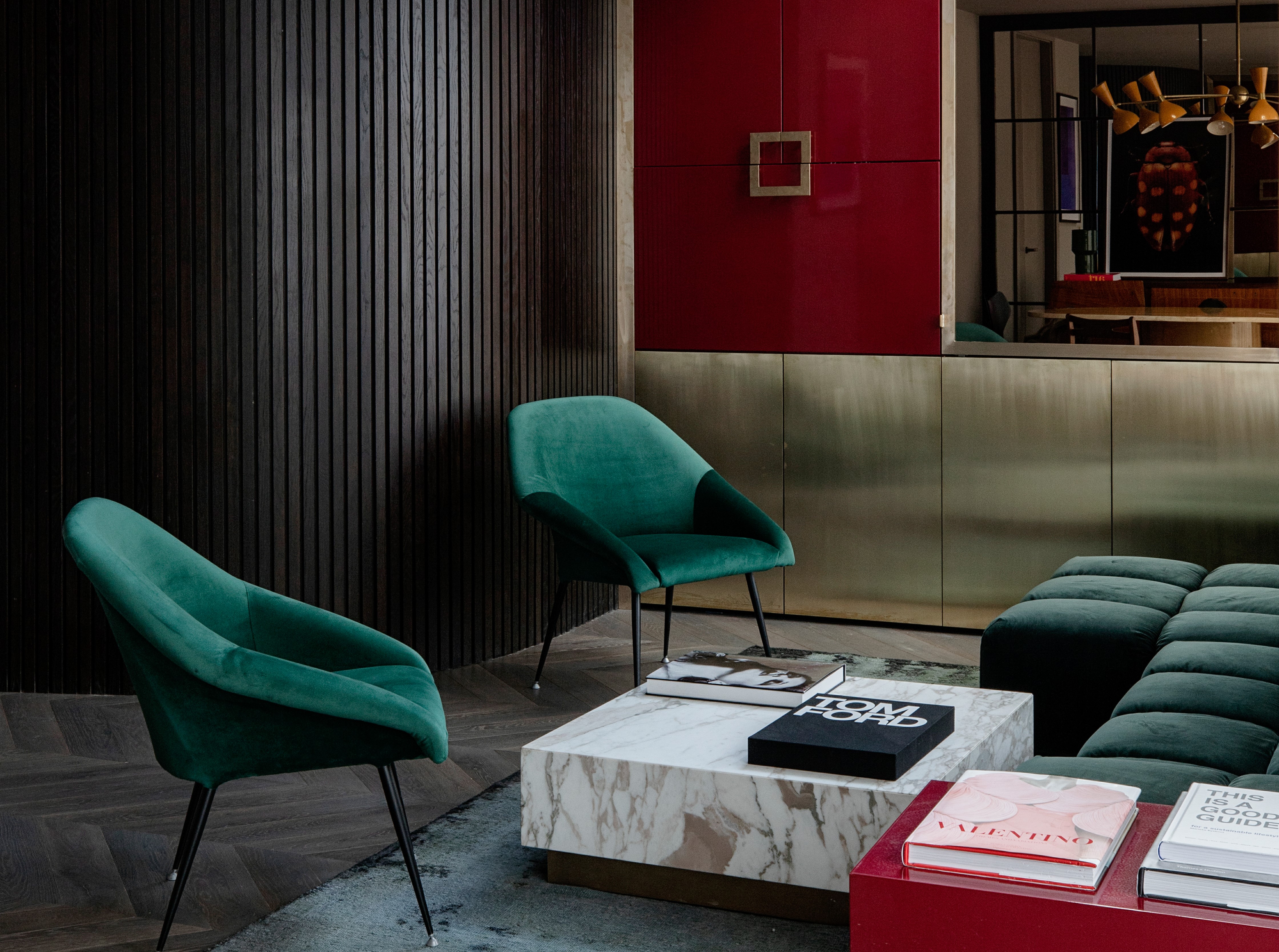

At this time of year, you see red and green everywhere. It's a color combination that is, of course, synonymous with Christmas. It obviously makes for a winning color scheme, but can this palette shake free of its festive connotations to be a part of our home the rest of the year?
It only takes a few good examples to showcase that shades of red and green can help create a wonderful modern interior. The key to getting it right? It all depends on the intensity of shades you choose, and how you plan to incorporate them in your home.
These shades are naturally complementary, as per color theory, and the combination has the power to create a perfectly balanced color palette for a warm and sumptuous design.
I'm convinced it's a color palette we're not using enough, so I spoke to designers to help find out how to make this combination work every time, without invoking the spirit of Christmas.

Aditi is a homes writer and editor with several years of experience. Her articles, backed by expert insights, offer suggestions aimed at helping readers make the best home design choices. For this article, she spoke to several designers to understand how to use green and red in interiors, much beyond Christmas.
Do red and green go together?
The straight answer to that question is: yes. While green and red are opposite each other on the color wheel, they're considered completely complementary, the two tones can still have a wonderful partnership.
Usually, this palette is seen abundantly during Christmas, but when it comes to designing with these tones all year round, this combo doesn't have to look too much like an explosion at Santa's workshop. When it comes to colors that go with green, red is easier to work with than you might think. Using them in textures, furniture, wallpapers to even cushions or curios can keep your space from looking too seasonal, but cheery all year round. But most of all, choosing the right tones of red and green matters.
There are many colors that go with red and green, allowing a third shade to be introduced that can further uplift the scheme.
'Contrasting and complementary colors sit opposite each other on the color wheel,' says Justyna Korczynska, senior designer at paint brand Crown. 'The received wisdom is that the most striking color combinations are achieved when you use colors, such as yellow and blue or red and green. These are called complimentary colors. As the name suggests this creates interesting color schemes that are both harmonious and opposite.'
For a more sophisticated setting, choose deeper tones
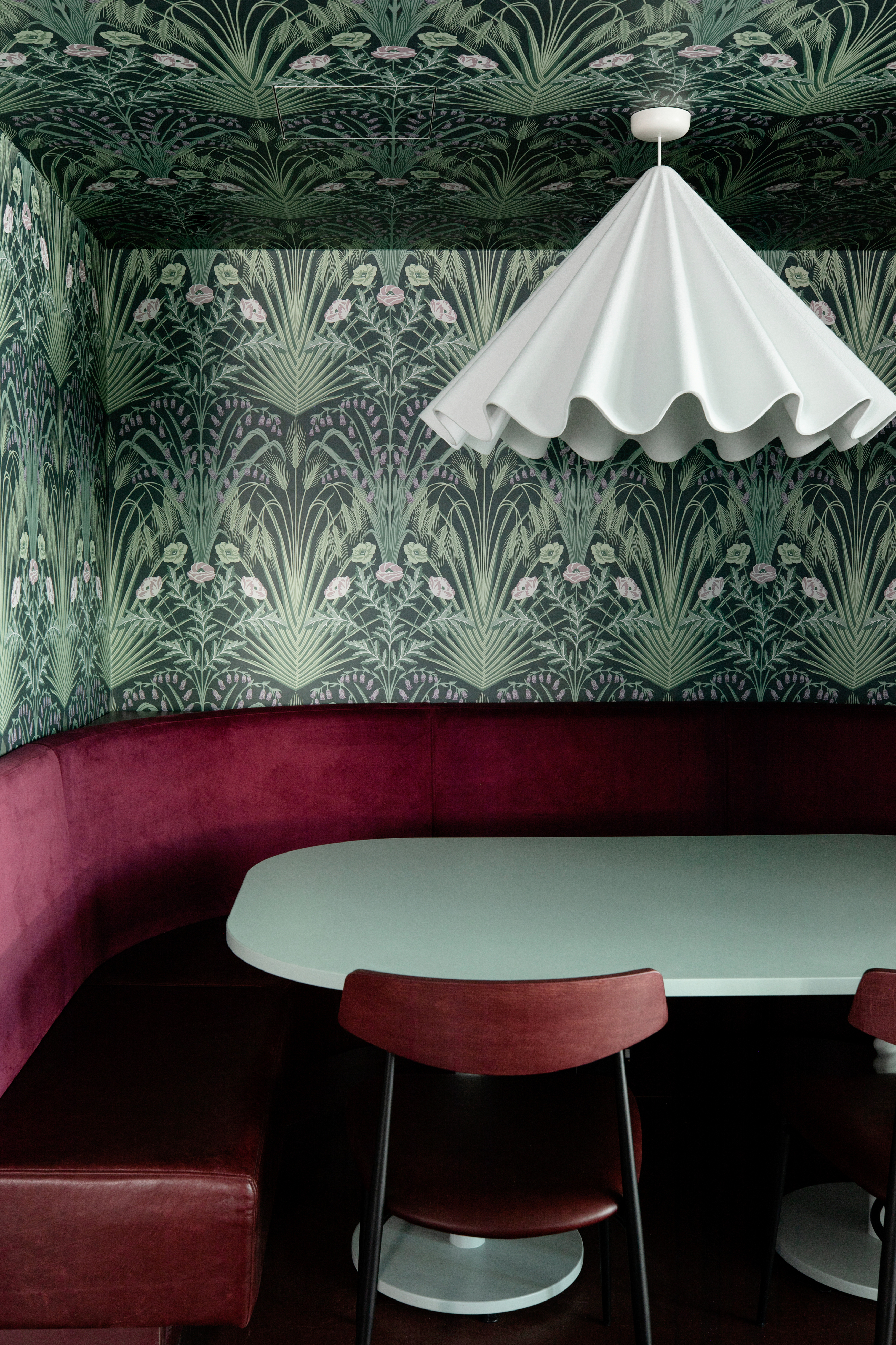
Dark tones are a great way to ground a red and green room and avoid that Christmassy feel. Warm tones have an inherent cocooning feel and can create a cozy environment, especially helpful in spaces like the dining room or banquette seating, which are intimate areas.
If the deep palette feels too one-dimensional, introduce patterns to break up the solid tones, and give the design some movement.
'When red and green are paired together, Christmas often comes to mind,' says Helen Shaw, UK Director of Benjamin Moore, 'yet, the results can be surprisingly sophisticated with the correct styling and shades. Richer hues of these colors such as burgundy and forest green complement each other well and jewel tones add a luxurious feel to the home, especially when styled with gold accessories.'
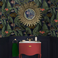
Aquarium Deep Sea Wallpaper, Graham & Brown
This under-sea-inspired wallpaper with deep greens and tiny touches of reds is ideal for a cozy, convivial space like the dining room or a banquette seating area.

'When using colors like red and green, you're approaching the design with the intent to make a statement,' says Katie Paulsen, interior designer at Maestri Studio. 'In this case, the space needed to be exciting but also needed to have a soothing quality that the family could always enjoy.'
'We did this by softening the brighter values of the red and green by pulling in wood tones and by adding warmth to the metal finishes,' she adds. 'We knew that our best approach to using these bold colors was in knowing they will stand out but also keeping in mind that they need to feel like they belong.'
Avoid primary colors and choose tonal shades
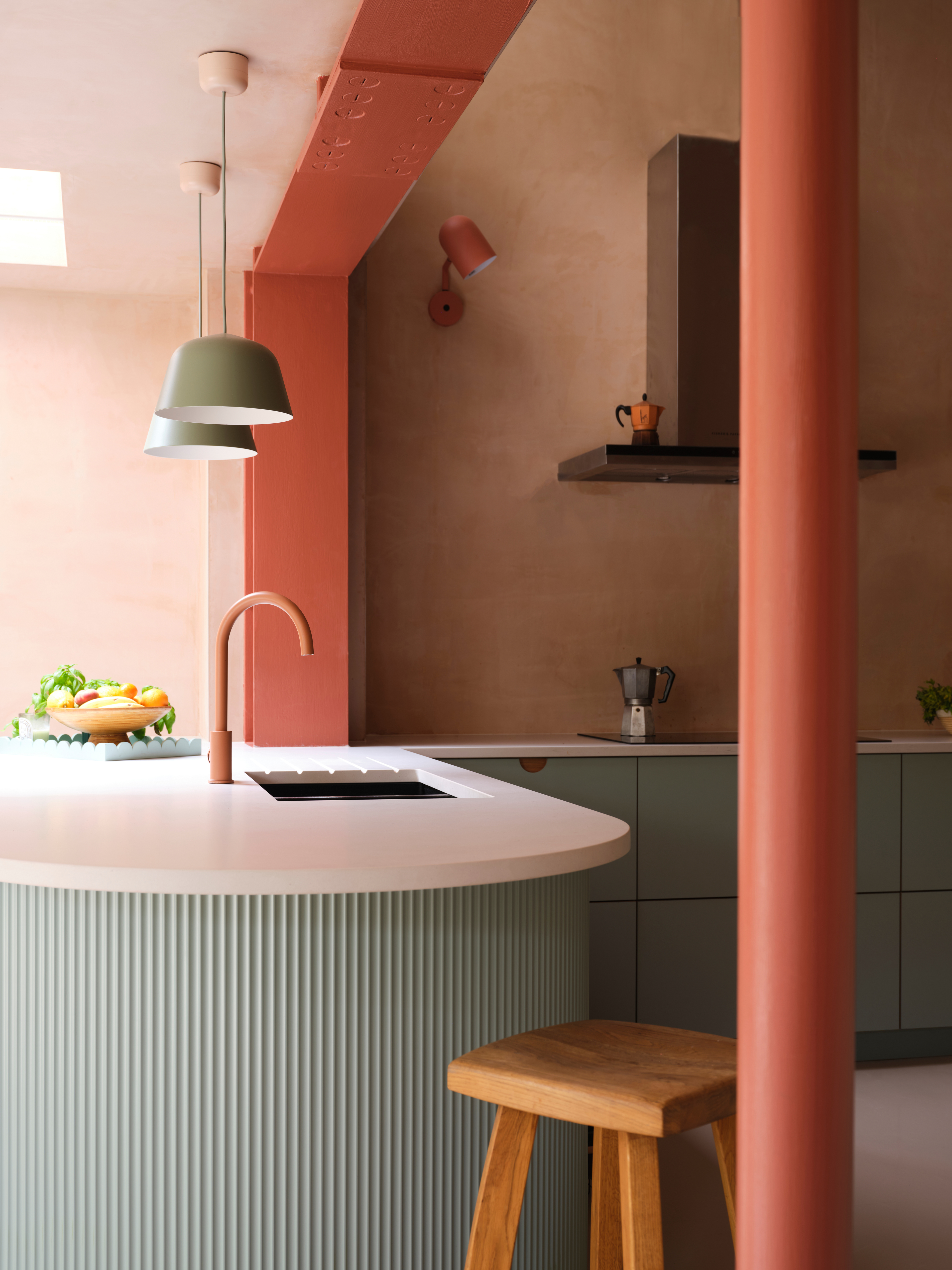
Thankfully, red and green are available in several interesting undertones and shades. From mint, sage, and forest to teal and moss green, and terracotta, rust, scarlet, to poppy red and more, there's a whole gamut of hues you can use to create this palette. Whether you're looking for bedroom color ideas, living room, or kitchen, this offers a much less stark color combination than pure tones of red and green.
'There are many shades of red and green that go together beautifully such as soft green with a rusty red that looks incredible,' say interior designers Jenna Choate-James and Mariana Ugarte of UK-based Interior Fox. 'It's all about avoiding the primary colors and playing the shades in between if you want to avoid a festive feel.'
Scatter the palette around the room for a more subtle look
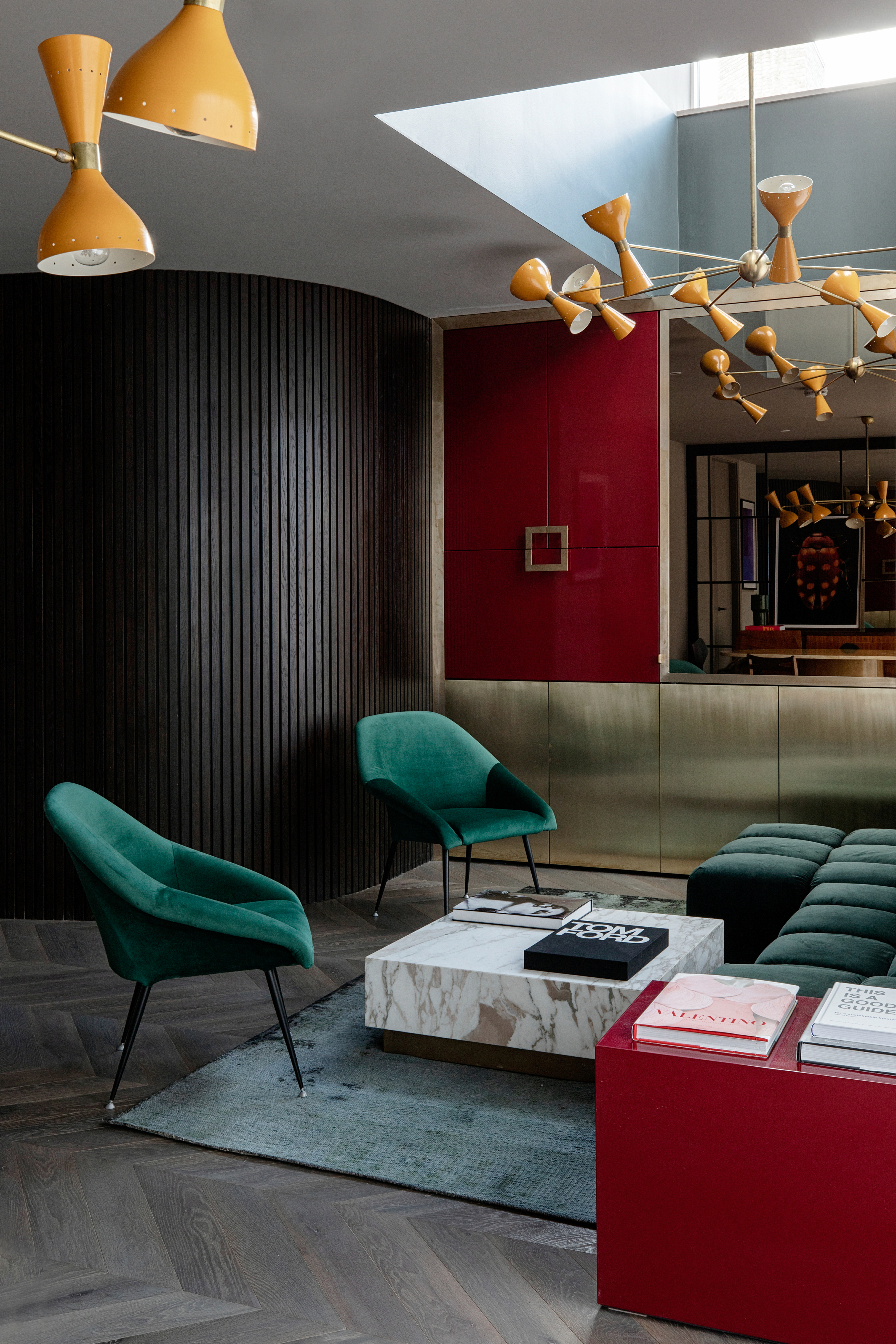
Another way to work with this palette is by scattering it around the room, or by concentrating it in one corner of a room. Consider bringing in more tones such as black, gold or beige to ground a scheme that may seem too OTT with just green and red. A living room or bedroom accent wall with red and green, with the rest of the room drenched in neutrals, could do the trick too.
'Use red and green together for much stronger and powerful decorative schemes that stay relevant and interesting over time,' says Justyna. 'Today we are far more creative, schemes such as feature walls can take many forms, shapes, textures, and materials that stand the test of time.'
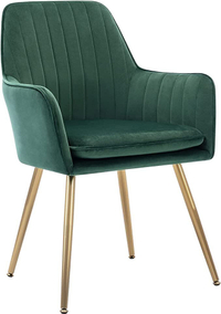
Golden Beach Velvet Chair from Amazon
This plush, emerald green accent chair is the perfect addition to any social space, be it the living room or dining.
Mix red and green with other complementary hues
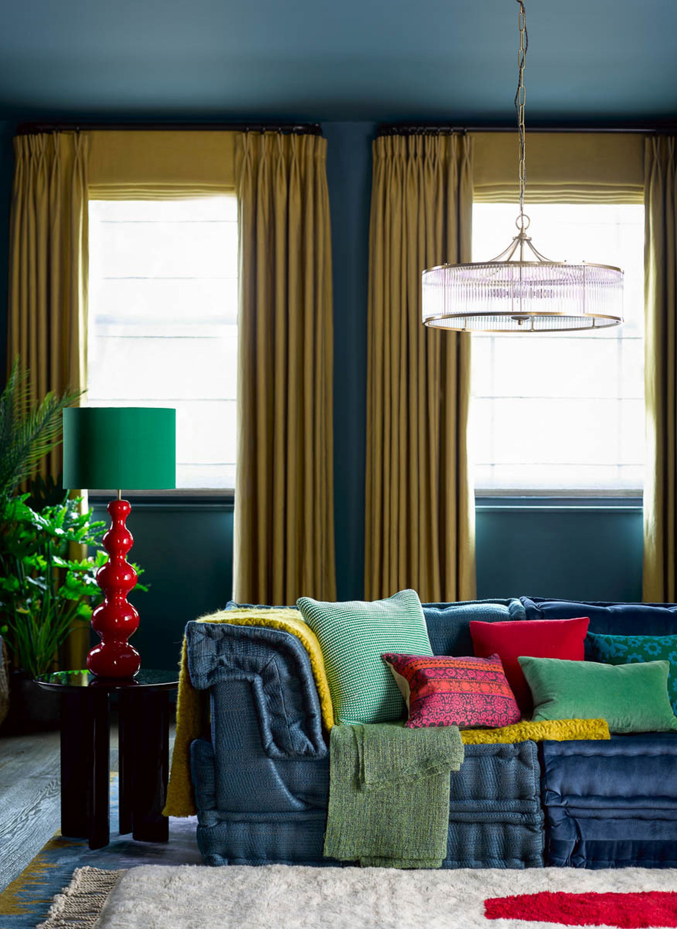
Keep in mind that you don't need red and green to dominate your space. With your red and green color scheme, consider weaving in a masterful job with multiple colors. The trick is to use pieces of decor that combine all of the hues in your palette, instead of trying to use individual pieces in each color.
A nice, vibrant combination of red, green, yellow, blue, and pink can look stunning, all against the backdrop of crisp white walls and ceiling. Don't forget to bring in loads of natural light to help balance the electrifying scheme.
If you want the presence of red and green but want to keep it restrained, consider adding these as smaller elements to a larger color scheme of, say all blue or dark grey rooms. Several colors go with blue or grey, and red and green can do the job of lifting a moody scheme like this.
Be The First To Know
The Livingetc newsletters are your inside source for what’s shaping interiors now - and what’s next. Discover trend forecasts, smart style ideas, and curated shopping inspiration that brings design to life. Subscribe today and stay ahead of the curve.

Aditi Sharma Maheshwari started her career at The Address (The Times of India), a tabloid on interiors and art. She wrote profiles of Indian artists, designers, and architects, and covered inspiring houses and commercial properties. After four years, she moved to ELLE DECOR as a senior features writer, where she contributed to the magazine and website, and also worked alongside the events team on India Design ID — the brand’s 10-day, annual design show. She wrote across topics: from designer interviews, and house tours, to new product launches, shopping pages, and reviews. After three years, she was hired as the senior editor at Houzz. The website content focused on practical advice on decorating the home and making design feel more approachable. She created fresh series on budget buys, design hacks, and DIYs, all backed with expert advice. Equipped with sizable knowledge of the industry and with a good network, she moved to Architectural Digest (Conde Nast) as the digital editor. The publication's focus was on high-end design, and her content highlighted A-listers, starchitects, and high-concept products, all customized for an audience that loves and invests in luxury. After a two-year stint, she moved to the UK and was hired at Livingetc as a design editor. She now freelances for a variety of interiors publications.
-
 Turns Out the Coolest New Café is Actually In Your Kitchen — Here's How to Steal the Style of TikTok's Latest Trend
Goodbye, over-priced lattes. Hello, home-brewed coffee with friends. TikTok's 'Home Cafe' trend brings stylish cafe culture into the comfort of your own home
By Devin Toolen Published
-
 5 Bathroom Layouts That Look Dated in 2025 — Plus the Alternatives Designers Use Instead for a More Contemporary Space
For a bathroom that feels in line with the times, avoid these layouts and be more intentional with the placement and positioning of your features and fixtures
By Lilith Hudson Published
