

Red and yellow are two colors that have been in our vocabulary since we were in school, and learned of the color wheel — but how does the duo translate to interiors? Do red and yellow go together?
While it might seem like a jarring pairing at first, when the right variation of each color is selected, red and yellow can become quite a nuanced dichotomy. The pairing is playful, pleasant, and you guessed it: perfect for your home.
"People tend to shy away from red and yellow because they’re bold, high-impact colors," says Washington, D.C.-based interior designer Zoë Feldman. "But when used thoughtfully and in the right context, they can bring a beautiful layer of complexity to a room."
Think of bright red poppies next to bold, yellow tulips, or the red-to-yellow ombre that sets in an evening sky. Yellow is one of the great colors to pair with red — though both bold and striking colors, there's something inherently soothing about them as a pair. So, how should we combine them in our interiors? Below, designers reveal all.


Firstly, what makes red and yellow such a visually pleasing combination? According to color theory, red and yellow are both primary colors, meaning they're foundational colors of all other colors. Importantly, this means they’re inherently easy for the eye to digest.
"As an interior designer, I don’t see red and yellow as simply 'primary,'" says interior designer Rachel Blindauer, founder of Rachel Blindauer Interiors. Color psychology explains how they can become rich with story and emotion.
"Red brings grounding and passion, while yellow offers light and levity," says Rachel. "And when layered thoughtfully, they can balance each other beautifully."
The best way to do that? Rachel recommends starting with hues that are softened or complex, but nothing too saccharine or sharp.
Rachel Blindauer has been an interior designer for over 15 years, and her designs have been widely published. She attended the School of the Art Institute in Chicago, earned a five-year bachelor’s degree in Interior Architecture and Product Design from Kansas State University, and continued her studies at Academy of Art University and the Architectural Association School of Architecture in London. Rachel is currently based out of St Louis, MO, but continues to take on projects in various locations, from Nantucket, Massachusetts, to Sarasota, Florida.

Price: £5.50/sample pot
India Yellow from Farrow & Ball is a mustard-meets-earth tone that feels sophisticated, not sunny. "It's especially striking in dining rooms or on cabinetry where natural light warms it throughout the day," says Rachel.

Price: £5.50/sample pot
Rachel describes Arras from Little Greene as, "a deep, historic red with a weathered elegance. It reads luxurious without screaming for attention."

Price: £5.75/sample pot
If you are looking for a rich red that reads as subtle and sophisticated, Rachel says this one is, "a russet-meets-brick red that adds depth to cozy spaces like studies or libraries."
How to Style Red and Yellow Together in Interiors

Yellow takes center stage in this powder room, with a few red accent pieces to tie the space together. The primary palette looks particularly lovely when blue is also introduced — another great color to pair with yellow.
When decorating with primary colors like red and yellow, Zoë Feldman says, "It’s important to pick one star." In the powder room above, that star is the yellow floor. "We brought in red in smaller pockets through the shelf and the faucet," says Zoë.
Because these are high-impact colors, you need to define what you want your moment to be so they don’t compete with each other, but rather complement the space’s overall composition.

Zoë is a Washington D.C.-based interior designer who studied at Parsons School of Design in New York. She's wored under AD100 designer Alexa Hampton, and set up her practice in 2004. Her work has been featured in many major publications and can be described as modernized classicism.

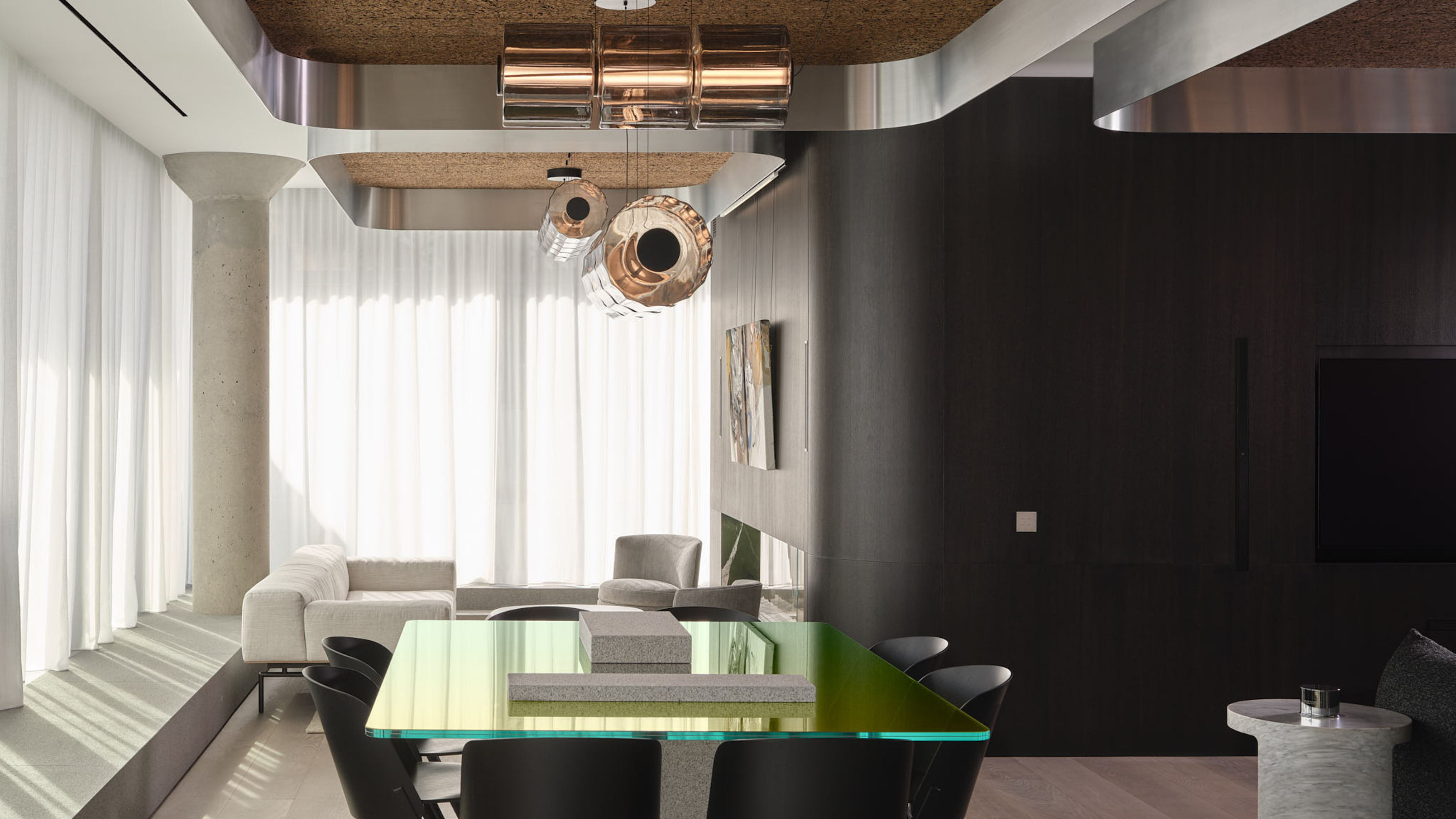
Sometimes, just a dash of red provides just the right amount of visual interest.
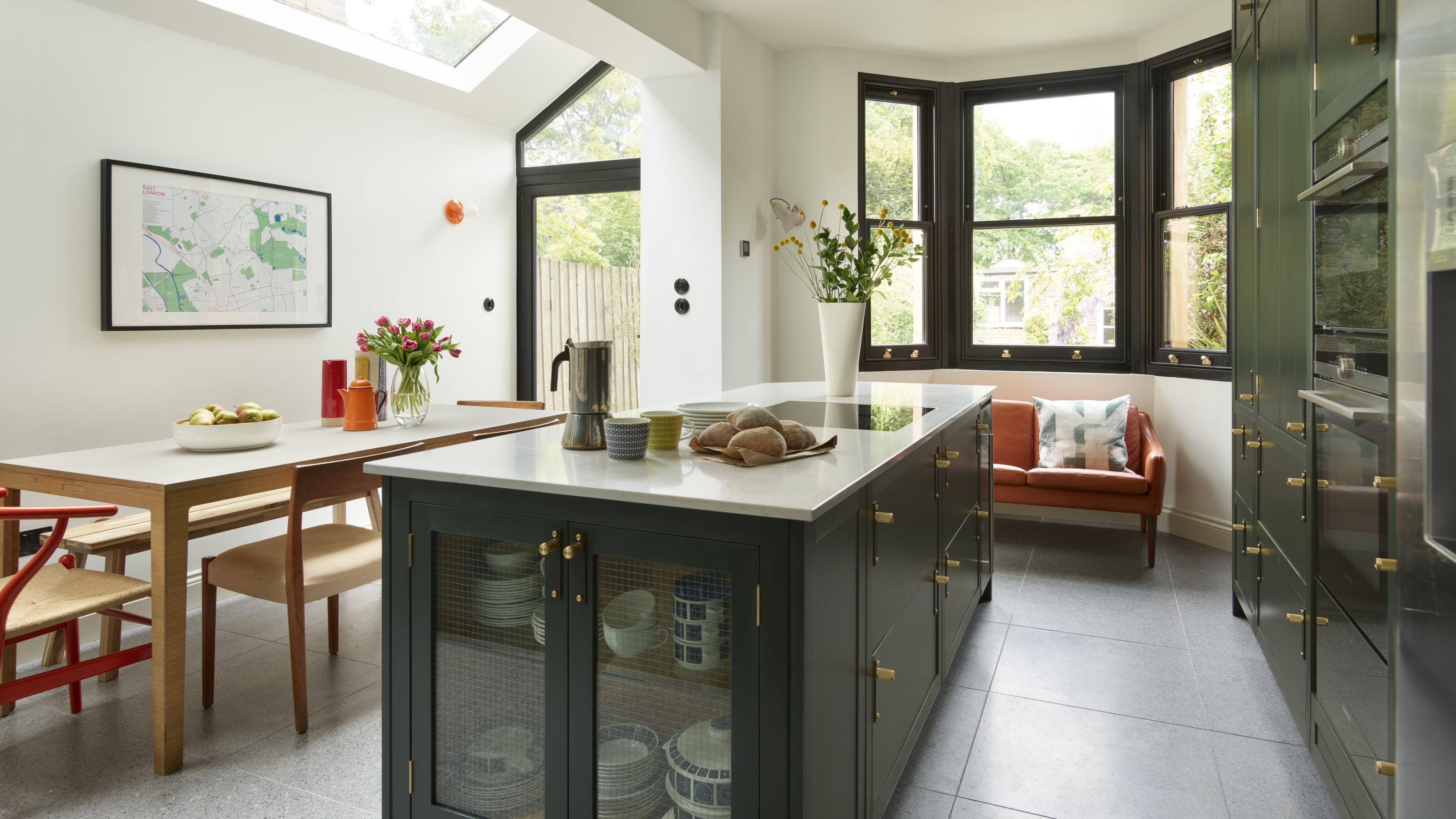
For a yellow kitchen idea, like the space shown above, "a gloss-finish yellow base paired with aged brass feels both daring and timeless," says Rachel. Then, red can be added sparingly — perhaps as a lacquered trim, a velvet occasional chair, or even an oversized abstract painting — to punctuate without overwhelming.
"They’re warm and versatile, able to lean muddy and earthy or go bright and saturated, depending on the palette," says Zoë of the shades. That range makes them a classic pairing with a lot of flexibility.
As for other decorative details to add to red and yellow spaces, aged leathers, warm woods, and softened whites (like Benjamin Moore's Swiss Coffee) will help create contrast in your interior design. Imagine a soft butter yellow sofa with rich brick red throw pillows and a burl wood coffee table or side table to ground the tones.
"Don’t underestimate the power of texture; a velvet in yellow is entirely different from a ceramic tile in the same hue," adds Rachel.

Neither red nor yellow dominates this stunning bedroom design. Instead, a harmonious balance is struck between the two colors.
Together, red and yellow conjure warmth, energy, and a touch of nostalgia. These energetic colors make a bold duo, yes, but also a timeless one.
"It's the kind of pairing that reminds me of European cafés, terracotta-tiled courtyards in Provence, or a lacquered chinoiserie cabinet quietly glowing in the corner of an otherwise neutral room," says Rachel.
It's safe to say red and yellow can be left off the list of colors that don't go together, but like all great pairings, it relies on nuance. "When curated with care, they’re less 'primary color playroom' and more 'elevated European atelier,'" says Rachel.

-
 This Sleek Toronto Penthouse Hits Just the Right Note for Its Record Producer Owner
Music plays a key role in the home, manifesting through the design in both in symbolic and practical ways
-
 5 Kitchen Cabinet Details That Will Make Your Space Look More Expensive
From luxury hardware to textured cabinet fronts, don't overlook these finer details if you want your kitchen to look more high-end


-
 5 Butter Yellow Paints That Designers Swear By — So You Can Get This Trending Color on Your Walls With Confidence
Butter yellow is everywhere, but picking a paint shade can be a big commitment. To help, we asked designers to share their favorite shades
-
 What Does the Color Yellow Mean in Interior Design? A Color and Design Psychology Expert Explains
Whether you love or hate it, yellow always seems to elicit a strong reaction from people — here, we explain why
-
 Should a Living Room Be Painted Dark or Light? We Asked Design Experts to Settle The Age-Old Debate
The color of your living room can completely shift the mood of your entire home, so the question remains: should you go light or dark...?
-
 I'm Sorry, But You Need to Know About 'Advancing and Receding Colors' If You Want to Get Your Home's Decorating Scheme Right
While some colors tend to pop and reach forward in a room, others draw back. Here, a color expert helps define these palettes and how to use them
-
 Amethyst, Heather, Pansy, Plum — Turns Out Decorating With Purple Opens You Up to a World of Possibilities
Purple certainly isn't a color for the faint hearted, it's a shade that can smell your fear. Here's how to conquer it through your interiors
-
 Here's Why Decorating With Mustard Yellow Helps Fill Your Interiors With a Sense of "Confident Calm"
There is so much more to decorating with this turmeric-tinted sauce-wiggled-on-a-hotdog not-quite-yellow shade than meets the eye
-
 5 Problems With Painting Your Walls White That No-One Ever Talks About (Until Now)
White is the easiest neutral to work with...right? Interior designers explain why this shade is actually more complex than it may seem
-
 5 Mistakes That Are Making the Blue Details in Your Room Feel Old-Fashioned — And How to Rectify Them
Blue is a timeless shade, no doubt, but use it in the wrong space or in the wrong way, and it can make a space feel, well... a bit blue


