I'm an Interior Designer Who Thinks White Walls Feel Unfinished — Here's What You Should Do Instead
When it comes to painting our walls, many default to white, but you could be doing yourself and your home a huge disservice
The Livingetc newsletters are your inside source for what’s shaping interiors now - and what’s next. Discover trend forecasts, smart style ideas, and curated shopping inspiration that brings design to life. Subscribe today and stay ahead of the curve.
You are now subscribed
Your newsletter sign-up was successful
Over the last 20 years I’ve redecorated well over 1,000 properties as the founder of Staged To Sell Home, a home staging company based in New York City that specializes in dramatic property transformations. This past year alone, me and my team have repainted the walls of over 2000 rooms — and wherever possible, not in white.
I'm a firm believer that we should live colorfully and in color at home, and that's why when it comes to choosing paint color ideas, I'm reluctant to stick to a boring, all-white palette for the walls. Yes, painting with color can be risky, but more often than not, it's worth taking calculated risks in order to receive the ultimate reward.
Below, I've broken down five convincing reasons why I'd never decorate with white, and what I, as a design professional, would recommend doing instead (as well as some tips and tricks on being brave enough to take risks when it comes to using color in your home).
Article continues below1. Create depth by drenching the space in one color
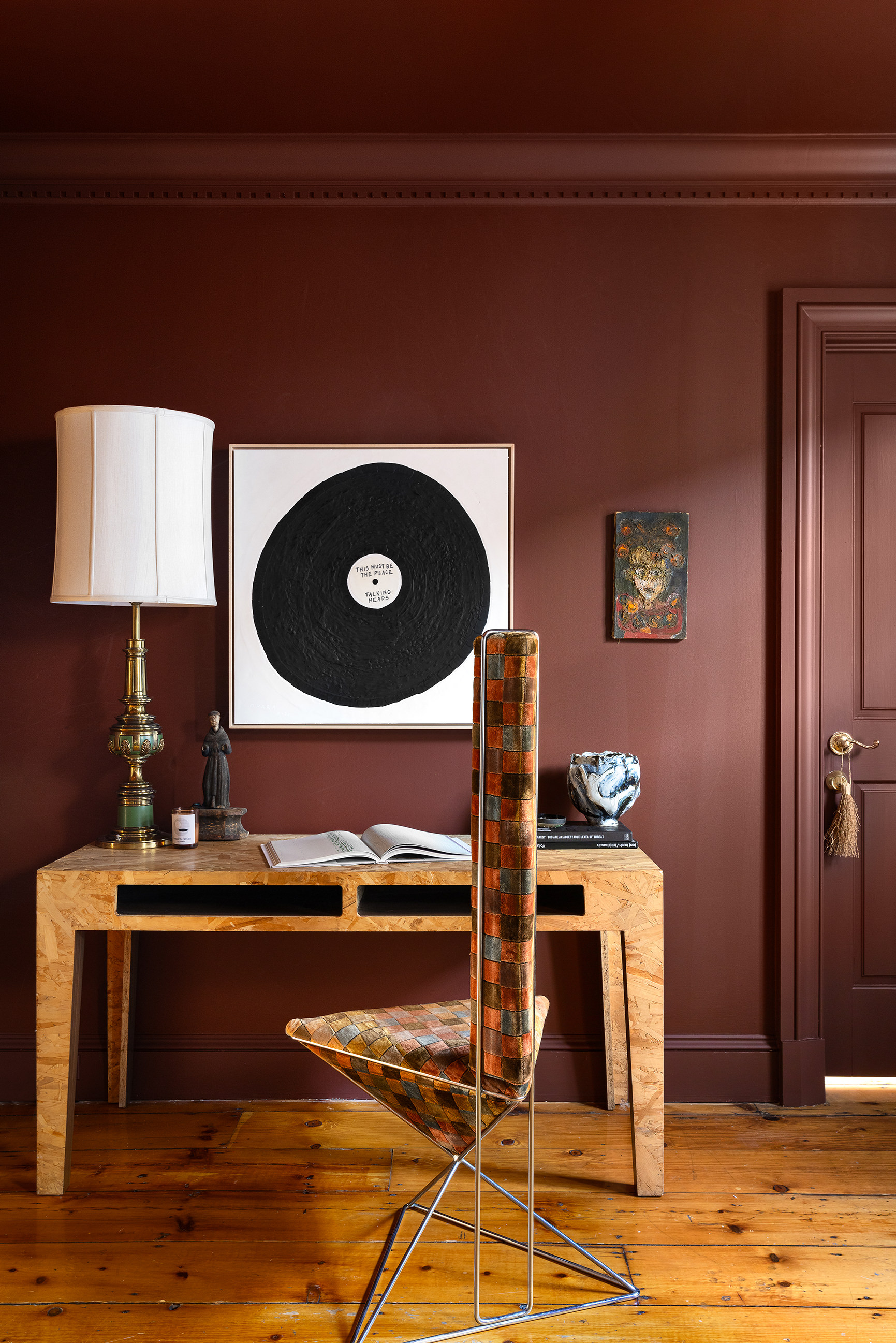
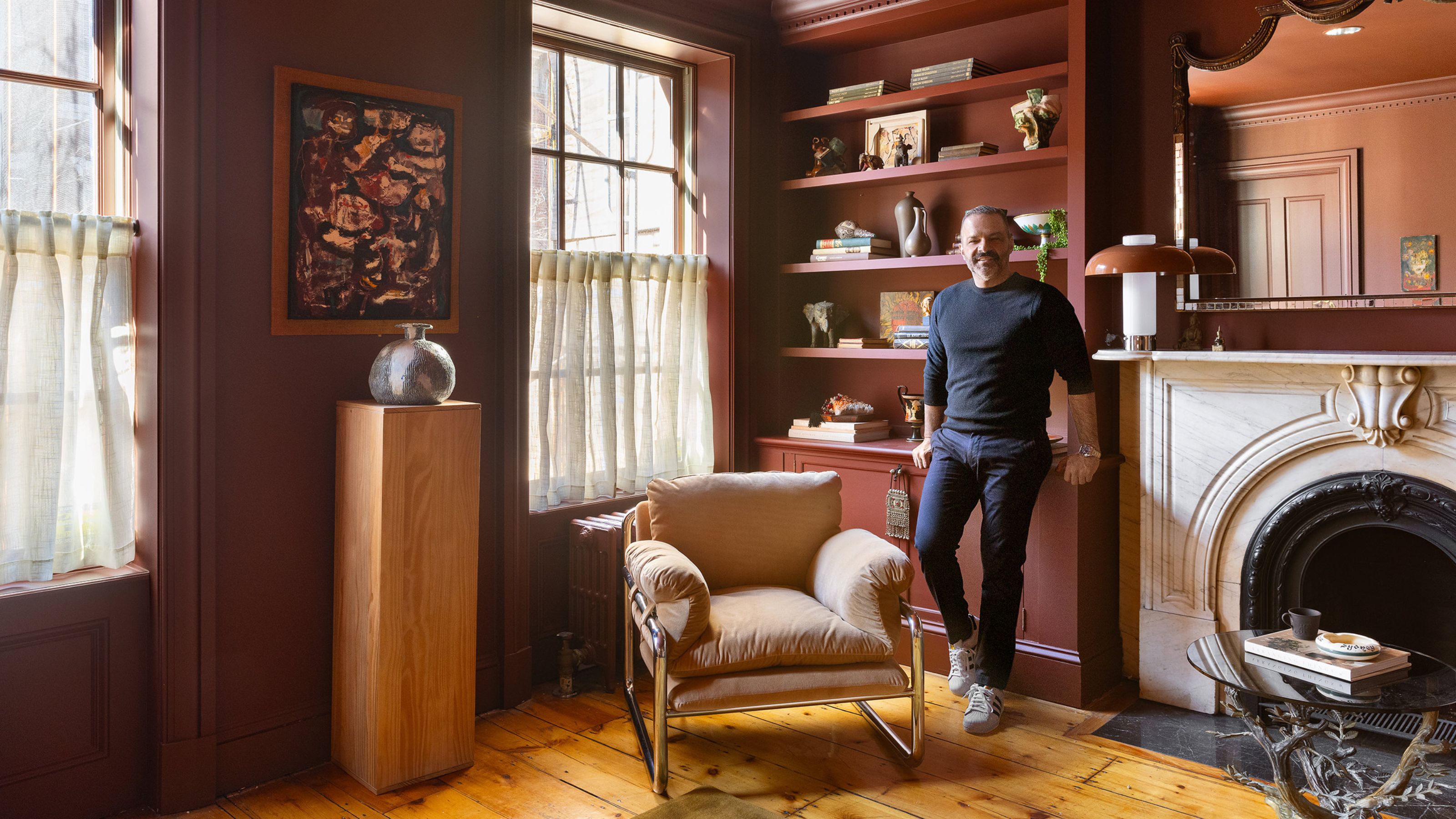
I love a warm and rich paint color that creates a soothing feeling, and a dark color instantly transforms a room from clinical to soulful. Every home needs a moody space to drift away once you enter the room, and sticking to a simple white palette will often leave the space feeling flat and lacking in depth.
For this study I painted the room with Farrow & Ball's Deep Reddish Brown. To achieve a cocoon-like effect, I color-drenched the space, painting the walls, moulding, doors, and trim all the same color.
This helps to keep the room soothing and adds a nice modern touch to what could have been just a standard paint job.
2. Add drama and impact to a space with bold colors
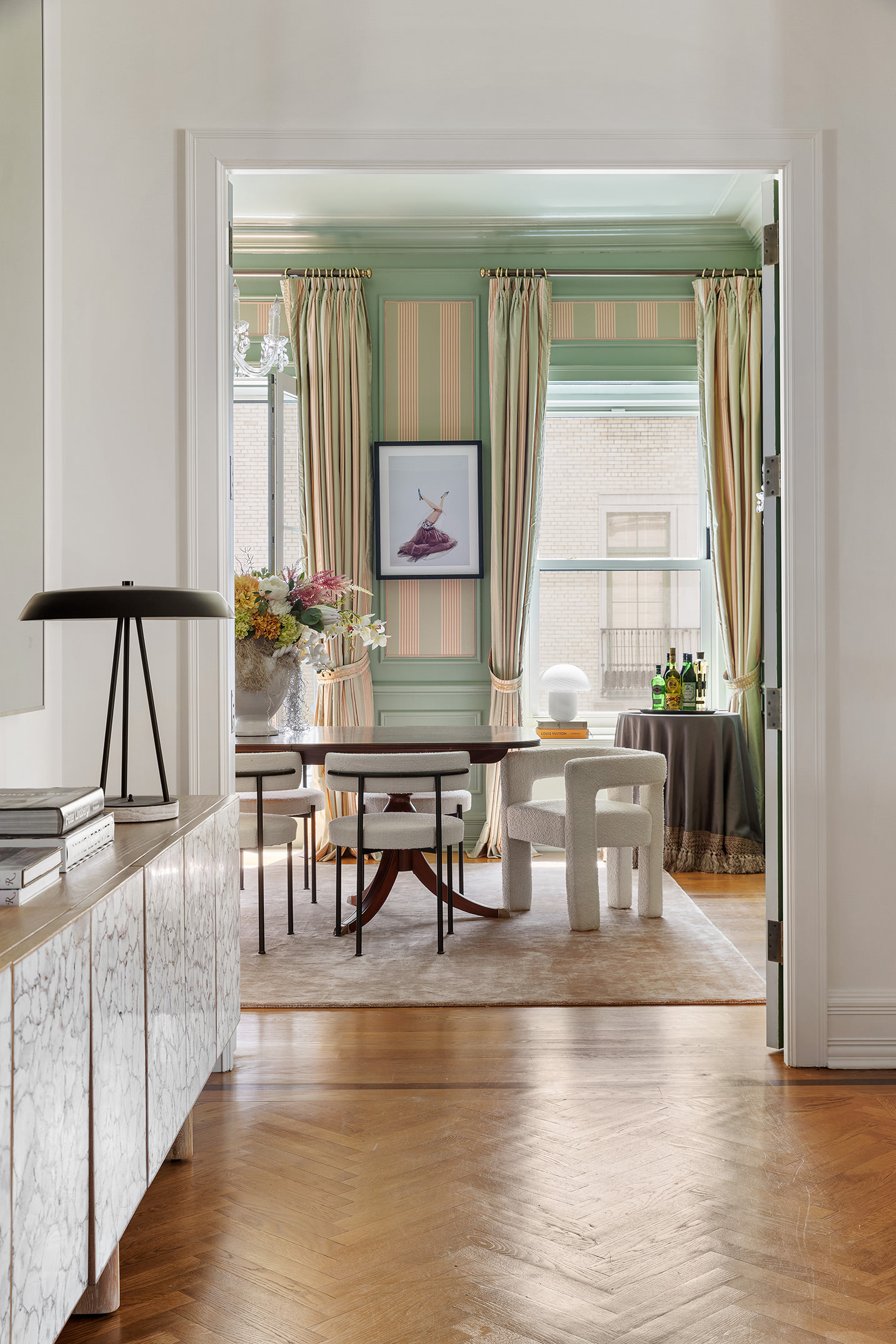
A playful color, especially one in a high gloss finish, creates a jewel box-like effect that adds just the right amount of drama to a space. I like to use bright colors in rooms that are often used during the day time, or where dynamic events often occur, as they help to curate an extraordinary impact that an all-white space simply wouldn't be able to do.
The Livingetc newsletters are your inside source for what’s shaping interiors now - and what’s next. Discover trend forecasts, smart style ideas, and curated shopping inspiration that brings design to life. Subscribe today and stay ahead of the curve.
When remaking this formal dining room at the famed Plaza Hotel, I imagined raucous dinner parties. I pulled the green from the original iron work in the building and used it as the color palette to complement the fabric walls.
3. Color lifts the energy of a room, making it feel more vibrant
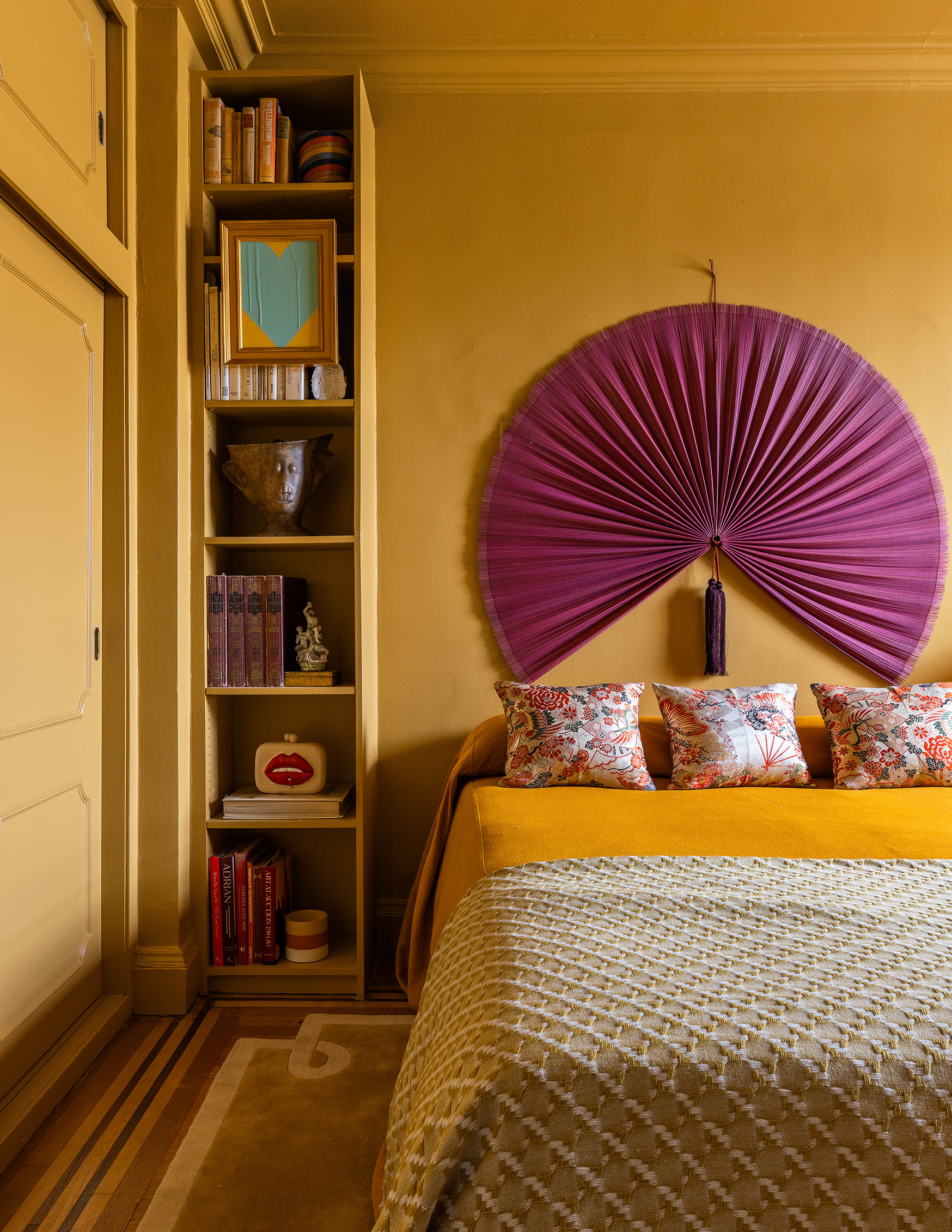
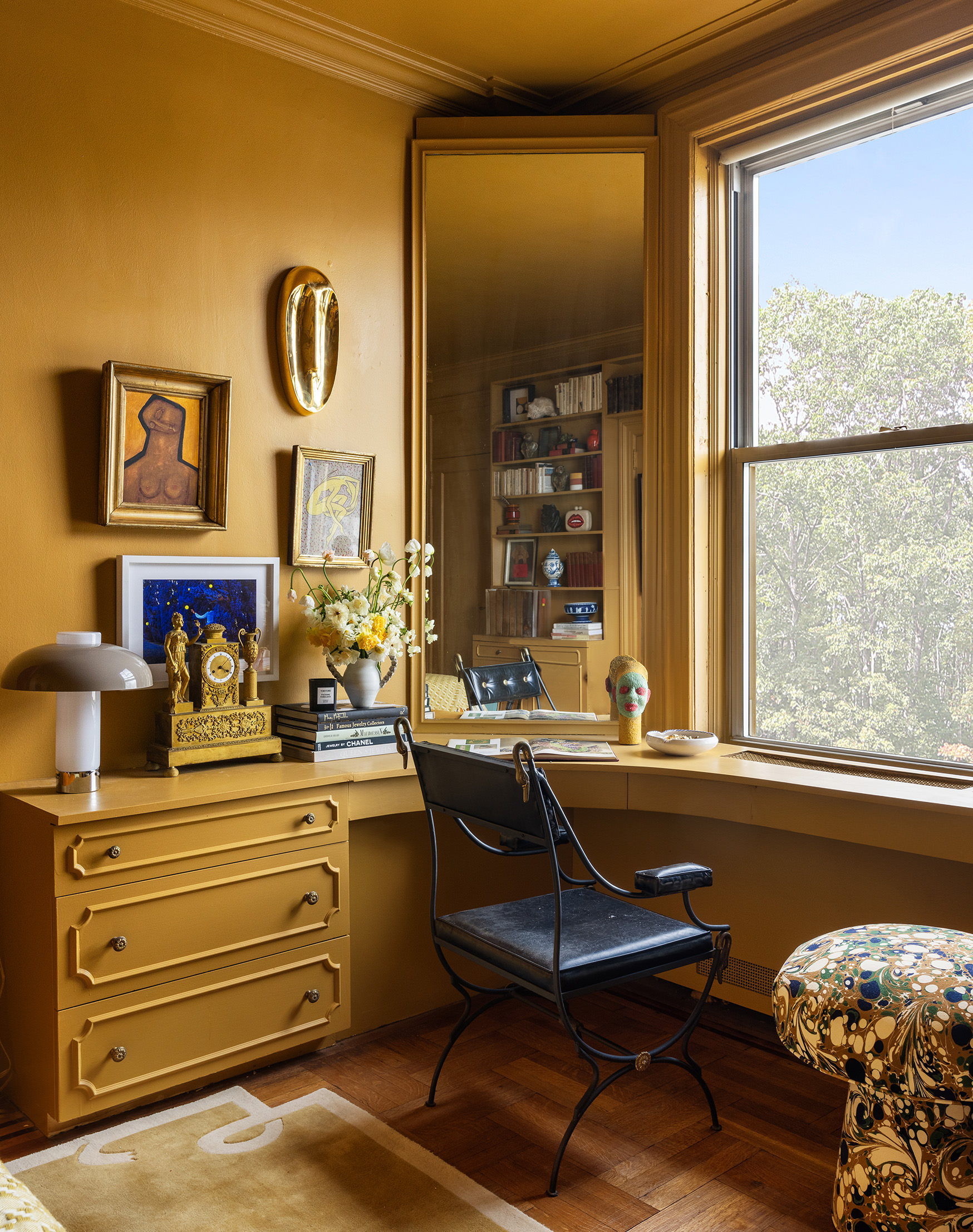
I love using a bold and refreshing color, like India Yellow by Farrow & Ball, to give a room an energetic jolt that I truly believe transfers to its inhabitants. Some rooms need an energetic lift — perhaps it’s a yoga room, wellness room, or a guest bedroom — and white is designed to disappear, not amplify a space.
This vibrant color saturates the room above with a super sunny-like feeling, which boosts serotonin level. We worked on this room in the winter and everyone loved walking back into this space, joking that it felt like a getaway. And who wouldn't want their home to feel like that?
4. Clever color blocking can make a space feel bigger
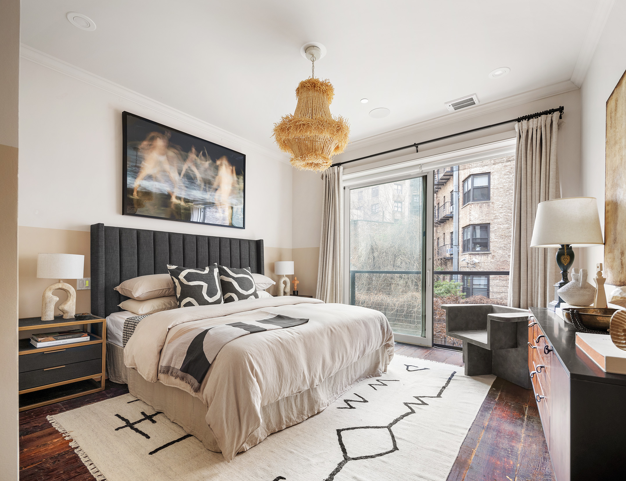
If you have lower ceilings, consider painting part of the room in a different color to make the room feel larger. Be creating this layering effect — also known as color blocking — you trick the eyes into thinking the ceiling height is actually higher than it is.
I like to paint one portion of the wall, about ⅓ of the way up, in one color and ⅔ the other. I think having it be slightly off balance and not perfectly in half is another way to elongate the space.
In this two tone primary bedroom, I used Farrow and Ball's Skimming Stone and Oxford Stone to achieve this look, and I think it works wonderfully.
5. Having all-white walls is boring
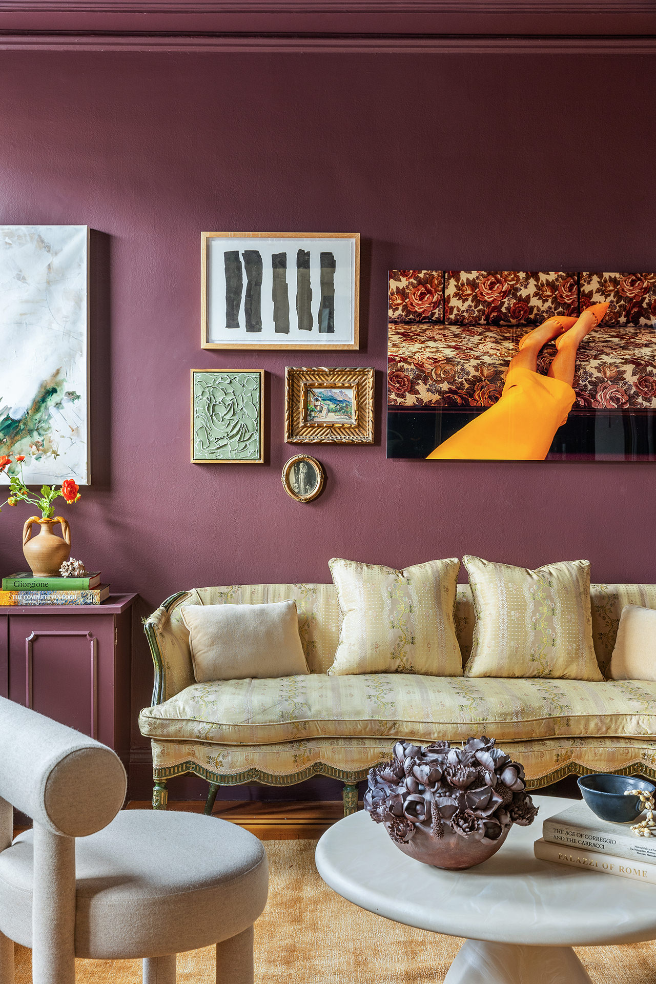
And lastly, all white walls are boring. There, I said it. To me, an all-white home never feels truly finished. The rooms begin to blend into each other, and there is no vibrancy or energy in the space. It feels flat.
I'd always recommend trying to create a sense of separation and purpose in your home by utilizing color to create a more customized space. Put simply, if you want to have a memorable home, you need to inject a dose of color in it.
How to take a risk when it comes to choosing a wall color
If this is your first time designing a home, and you want to find ways to experiment with color, start with a small space as a way to test it out. Instead of picking a color at random, start with your favorite color — yes, it can be that simple.
If you don't have one particular color you know you'll never get sick of, take a look in your closet and pull out the clothes you gravitate towards the most. That will help you to truly see what color you naturally gravitate towards and that makes you feel good.
Next, choose a small space or feature in your home to test the results. Think about a room that may be under utilized, like a powder room or walk-in closet. Those are two great places to begin experimenting with in living with color. And once you move away from putting white on the walls, I wouldn't be surprised if you never go back...
You can see more of Jason's work at Staged to Sell Home.
Jason Saft is an interior designer and founder of New York City-based Staged To Sell Home, a specialized home staging company. Over his 20 year career in design and real estate, his work has been recognized with numerous awards from The Real Estate Stager Association, including Best Luxury Home Staging, Best Luxury Vacant Staging, and Best Vacant Staging.