16 Entryway Decorating Mistakes — Designers Share Common Errors and Simple Fixes
Transform your entryway from a common problem area to a welcoming gateway with these simple design hacks for a beautiful, functional space
- 1. Not factoring in functional storage space
- 2. Over-decorating
- 3. Forgetting soft finishes
- 4. Using bulky furniture in small entryways
- 5. Not using the space to inject some personality
- 6. Not maximizing light in smart ways
- 7. Not getting clever with paint
- 8. Or being inventive with color
- 9. Neglecting to add seating space
- 10. A carpeted floor
- 11. Making it too rectangular
- 12. Messy shoe storage
- 13. Using colors that don’t connect to the rest of the house
- 14. Not considering the lighting
- 15. Laying white runners
- 16. Unnecessary clutter

Lola Houlton
Get your entryway decor wrong and this key space, which often gets overlooked anyway during the home reno process, can end up as a characterless dumping ground instead of a stylish, welcoming room in its own right. And if it is on the small side and lacks natural light, too, it will feel anything but inviting and stylish.
If your entryway ideas haven’t quite turned out how you thought they would, it might be due to some common design mistakes. However, with a few thoughtful changes, you can create a space that is just right.
“An entryway isn't just a home's first impression; it's a taste, a teaser, of the narrative that unfolds within its walls,” Founder and Principal Designer at Arsight, Artem Kropovinsky tells us. These are the 16 entryway mistakes to avoid during the design process, according to Artem and his fellow designers.
1. Not factoring in functional storage space
Entryways should be designed with high traffic and organization in mind. Overlooking functional decor can lead to clutter that disrupts the aesthetic. Thinking practically, your entryway is a space that leads to the outside world, it's where you need to transition from slippers and loungewear into appropriate attire for the great outdoors. Think functional and design the space to match this need.
Homeowners often fall into the trap of prioritizing style over practicality, for example choosing a console table and, as a result, allowing clutter to accumulate. Choosing furniture with built-in storage, such as a bench with drawers or a console with cubbies can help you organize an entryway, enhance your daily routines, and keep the area tidy and welcoming.
You can achieve the best of both worlds by finding chic or discreet entryway storage ideas that blend seamlessly with your decor. For example, in minimalist entryways consider discreetly installed wall hooks hidden behind a decorative panel, providing storage without disrupting the minimalist aesthetic.
Additionally, while open storage can look stylish, it may not be practical in a busy entryway where many items come and go. Instead, closed storage options like drawers and cabinets are ideal for stowing away everyday essentials, preventing clutter on surfaces and creating a more polished appearance.
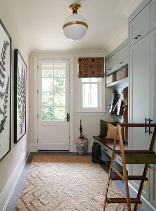
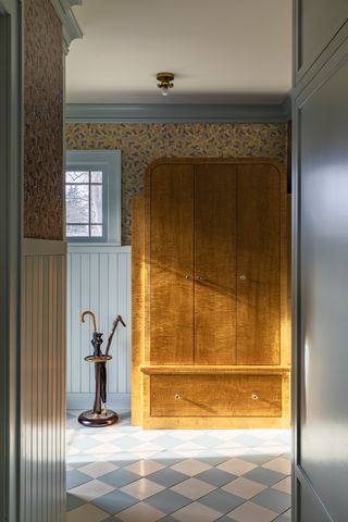
This entryway mudroom has put spare space to clever use by creating a smart storage solution for all those coats, hats and shoes. Toronto-based Hali Interiors kept the space from feeling cluttered with a beautiful calming color scheme featuring dusky light blue, a verdant green, creams and browns. The palette hints at the countryside to give a cozy look, but underneath the aesthetic the design really shines. It's a practical space, with drawers, wardrobe room, a space for wicker baskets, shoes, and a handy pot that has been used here as an umbrella stand. There is also a ladder to help get to those hard-to-reach areas.
2. Over-decorating
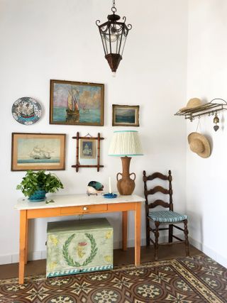
"One of the most common errors I see is the tendency to over-decorate, which can make even the largest entryways feel cramped," warns Elissa Hall, founder of EDH Interiors. While entryways naturally accommodate outdoor essentials like coats, shoes, keys, and letters, they also serve as an opportunity to infuse your personal style, reflecting the character of the rest of your home. However, overloading the space with both decorative and functional items can quickly create an overwhelming, cluttered space.
There are three essential strategies to remember while decorating that will help you avoid this.
First, embrace negative space. Intentionally leaving some areas — walls, surfaces, and corners — bare will create a clean aesthetic and sense of openness.
Second, prioritize functional decor. Opt for stylish yet practical pieces, such as a decorative bowl or tray for keys, or a beautiful entryway bench or console that includes storage for shoes and letters.
Finally, curate deliberate decorative vignettes by selecting a few standout items to display, ensuring balance and preventing clutter from accumulating. Ellissa Hall advises: "Focus on a select few high-impact pieces — a standout console or an eye-catching mirror, for example — that make the space feel intentional and open."
3. Forgetting soft finishes
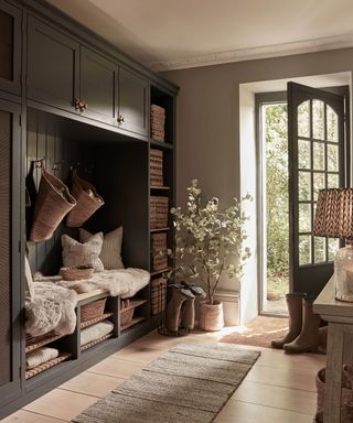
The entrance to your home is the first port of call for your guests, but just because it is a space where people pass through, don't forget those all-important soft furnishings. You want to reassure whoever is entering your home that they are being welcomed into a warming, cozy space. Emphasize this point with soft furnishings underfoot that make an entryway feel cozy, instantly.
"Floors typically tend to get a lot of wear and a hard floor will always meet the demands of busy life much better than a carpet, however acoustics play a large part in an entryway as they can also act as an amphitheater helping noise to travel very easily around the entire home," explains interior designer, Rachel Usher. "Applying carpet runners is a great way to soften the acoustics and also gives an element of protection to a timber floor and a way to apply an interesting texture such as sisal."
When considering entryway flooring ideas, think practicality: don't go for too high a pile entryway rug because this is a high-traffic area, and it may get worn in quickly/ However, if you have cold flooring, like stone or wood, a long, low-pile rug can really add character and warmth to the space.
"We love to use rugs in the entryway to ground the entire space," says Lauren Lerner, founder and principal designer of Living with Lolo, who designed the above entryway. "It's one of our favorite ways to incorporate color and pattern into entryways. It's always important that you select a rug that is durable, like jute or a high-performance fabric that can hold up to traffic. Wool is also a good idea as it can be cleaned easily."
Also, think carefully when it comes to measuring the size of your rug for your entryway, and don't forget to take into account any furniture that might be near it, so you leave space on all ends. "Generally, we like at least 12in of space on every side of the rug," says Lauren.
Be sure to carefully consider rug placement. Move your rug away from the door mat area, and give slightly more space on this side, or one end of your rug might become tattered and dirtied by muddy shoes.
4. Using bulky furniture in small entryways
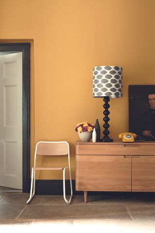
Flow is very important in any entryway: from the movement of light and air to the smooth passage of foot traffic. A well-designed entryway should allow for smooth transitions in and out of the space, keeping it unobstructed and open. The primary culprit that usually obstructs flow, making entryways feel cramped, stuffy, and somewhat like an obstacle course, is bulky furniture.
To maintain a sense of openness, select furniture and storage solutions that are proportionate to the space and thoughtfully placed, ensuring that there is ample room for movement, as well as natural light and airflow.
Ruben Gutierrez, interior designer and founder of Errez Design advises: "If you have height in your entryway, use it. Wall-mounted hooks, shelves, and even a tall mirror will draw the eye upward. In tight spaces, height is your friend. It’s the difference between feeling boxed in and feeling like the place has a bit of breathing room."
5. Not using the space to inject some personality
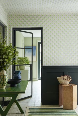
"Entryways are thresholds; they are the first space to welcome you home," say Tal Schori and Rustam Mehta of GRT Architects. "They should reflect something of the character of the home and people that lie beyond."
Ruben Gutierrez agrees, adding "Without a focal point, your entryway’s just a hallway. Give it something to say — a mirror that catches the light, a piece of art that stops people in their tracks, a vignette on a console that tells a story. This is where you set the mood. Make it count." In this way, harness this space, even if it is a small entryway, and create a visual moment in your home that shows off who you are.
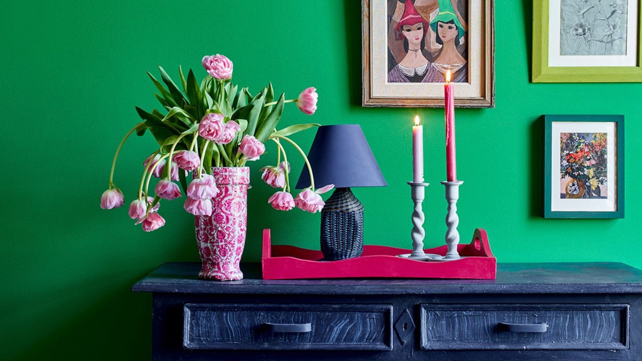
In this example from Little Greene, the entryway is a moment to embrace color and pattern and the owner's personality, with small trinkets on the console table and a dash of vibrant color.
"As a design vignette in your home, an entry table provides an opportunity to maybe have a little fun with design and not worry so much if the favorite table you found goes with the rest of the house," adds Shauna.
6. Not maximizing light in smart ways
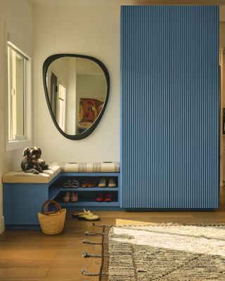
This is often part of the home that can be dark, so don't forget to make the most of natural light and clever reflective techniques with the addition of a mirror to the space, helping you borrow light from where it springs, not to mention giving you the option of a last-minute inspection before you leave the home.
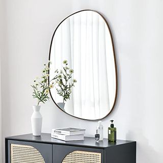
"Maximize the wall space by adding in an oversized mirror that will bounce around the light and make a narrow hallway appear much larger," say Jen and Mar of interior design company Interior Fox, who designed this scheme with a large round piece. Alternatively, go for something curvy and statement, a popular look in mirror trends at the moment.
"By positioning on the opposing wall above a console table a focal point is instantly created, drawing your eye into the home from the entrance."
7. Not getting clever with paint
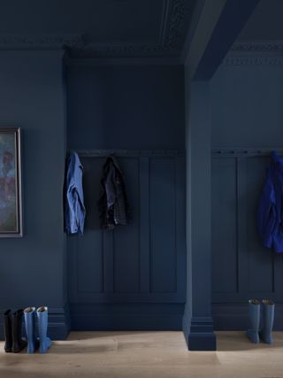
Think carefully about not just the color scheme of your entryway, but the quality of the paint. "This is a high-traffic area," points out Emma Bestley, co-founder and creative director of YesColours, so your choice of hallway paint matters.
"The quality and finish of the paint must be a careful consideration and low-quality paint will not stand the test of time. Make sure to use a wipeable high-quality matt finish paint," advises Emma.
Using a durable eggshell paint on wooden staircases and baseboards will help keep these frequently used surfaces smarter for longer, and if the paint has a sheen to it, this will add interest to the space and enable natural light to reflect, creating a bright and airy entryway to your home.
For example, a hard-wearing, soft-sheen paint doesn't need the application of wax or lacquer to protect and finish after painting.
8. Or being inventive with color
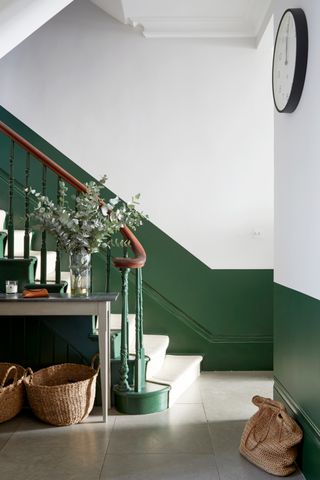
Many homes have quite muted or pared back color schemes in the entryway, but there is no reason you can't get experimental with color in this part of the home, with either bold paint colors or interesting paint ideas, like this example from Indie & Co, which paints the lower half of the wall in a deep forest green.
"Working closely with our clients, we began with creating a color scheme throughout that would bring a sense of fun and vibrancy in each room," explains Celine Erlam of Indie & Co. "Using strong color on the ceilings gave the rooms an unexpected feel, and creating half-painted walls gave the illusion of paneling that was a nod to what might have been in the building's previous life."
"The halfway-up color used to be done in older buildings to hide scuffs and scratches, and to protect the walls, so in houses with small children we tend to do the same. That way we can use a more matte finish above," adds Celine.
9. Neglecting to add seating space
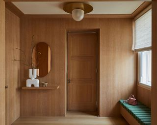
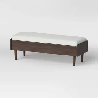
A storage bench is a simple addition to an entryway space that can go a long way for a touch of comfort. Your entryway might not normally be a sitting area, but it's a nice piece of furniture that can encourage you to take a seat and regroup before going out into the world each morning. In this example by Indie & Co, the bench doubles up as a seating area and space-saving storage. Above the bench is the perfect place to hang a work of art or mirror.
"Depending on the layout of your entryway a dedicated seating area is a great place to start when designing the space," say Jen and Mar of Interior Fox. "Awkward corners, that are often found in entryways, provide the perfect spot for a comfy seat or a hardwearing bench — a place to sit and pop your shoes on is always helpful. It can also double up as a cozy nook, to decompress, make notes or read a book. You’ll be surprised how often an entryway seat is needed and used."
10. A carpeted floor
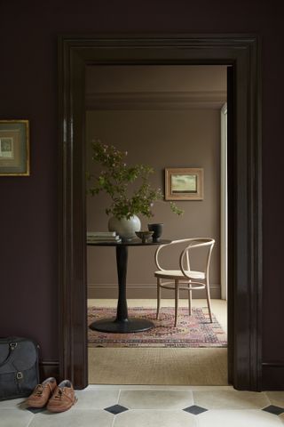
A mistake catching Kathy Corbet of Kathy Corbet Interior’s eye is underfoot. That’s right, carpet in your entryway is a major no-no. Although carpet is known to make a space feel cozier and less clinical, in an entryway, it’s a material to steer clear of.
“An entryway is a high-touch home area, so it is crucial to utilize durable elements such as tile floors that will withstand shoes, pets, and heavy traffic,” Corbet says. “I often see entry spaces that are designed for aesthetics and no function.”
This is particularly true of homes with children where lots of wiping of shoes can’t be guaranteed before entering the space. Peter Dunham highlights this very issue for homes without a mudroom. It is wise to opt for laminate or tiled floors — such as this example by Little Greene — in this area and use a welcome mat to wipe feet and add some texture back into the floors.
11. Making it too rectangular
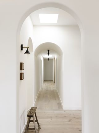
Your entryway is so often a long, rectangular shape that can feel like an unwelcoming tunnel made up of harsh lines, so lean into the architectural features and embrace the trend for sweeping curves. A curved archway is soft and adds a welcoming element to the design, like in this home in Madrid designed by Sierra + de la Higuera.
12. Messy shoe storage
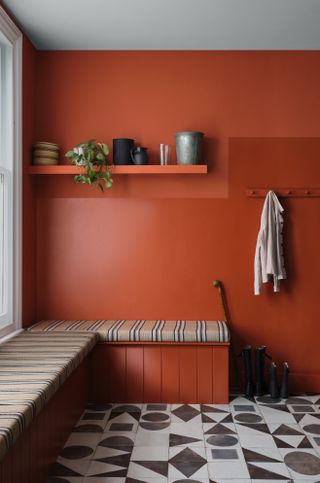
There’s one mistake often made when decorating and, subsequently using an entryway day-to-day which makes designers twitch, and that’s messy shoe storage. Although, practically speaking, yes, you will want your shoes close to the door of your home, filling your entryway with open shelving full of muddy sneakers is going to quickly make the space look untidy, no matter how polished the rest of the space is. It’s a mistake Los Angeles-based designer Peter Dunham has seen in many homes. He says: “Any kind of storage for shoes seems like a good idea, but never looks tidy.”
Instead, opt for a doored unit where a few of your most used pairs of shoes can be stored, and keep the rest of your shoes in the base of your closet.
13. Using colors that don’t connect to the rest of the house
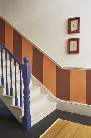
Although you can make a feature of your entryway, Atlanta-based designer Catherine Wilson of CCW Interiors warns against using colors that don’t connect to the rest of your house, or at least to the adjoining room. “When you don’t study your paint transitions before you paint, you could either end up with a choppy paint connection from one wall to the next, a deep color over-extending its welcome in stairwells and hallways that often don’t have natural light, or light colors extending into stairwells and hallways creating a very sterile and uninviting look,” the designer explains. “Depending on the color you select for your foyer, you must plan on the fact that it needs to purposefully and smoothly connect to other rooms.”
Wilson’s advice on how to avoid this misstep is easily followed: “The best way to avoid design mistakes like these is to design with the end in mind,” she says. “If you don’t know where you are going, you might be unable to tell if you have arrived. Specifically, you may not like the look of what you have created because you started buying for your entryway or any part of your home, for that matter, without fully knowing what you want throughout your entire home. So, you must create a comprehensive design plan before you hire your first sub-contractor or make a purchase.”
14. Not considering the lighting
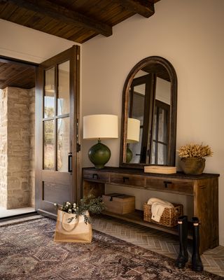
Creating light in an entryway is often a must — many homes lack natural light in these spaces, as they are often tight with little to no windows. This will help the area feel welcoming and warm.
"Generally low-level ambient lighting such as table lamps or wall lights that can be operated independently of brighter architectural lighting will allow you to establish welcoming light settings that create a sense of home," says interior designer, Rachel Usher. Automatic lighting schemes are a must for dark winter nights and can be easy and cost-effective to install with smart bulbs that can operate on a schedule or via an app.
The entryway is also a space where you might want to fit a statement entryway lighting idea, pendant, or chandelier, creating a statement for guests as they walk into the home.
15. Laying white runners
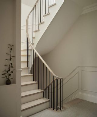
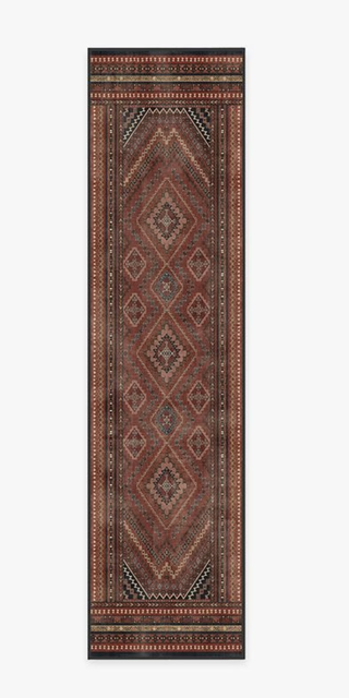
Brooke Speckman of Californian brand Design Hutch says she notices white runners in entryways and not for the right reasons. Although you may have taken Corbet’s advice and moved away from carpeting your entryway, laying a white runner to add dimension back into the space isn’t necessarily the way to go. “Ideally, avoid colors like white in an entry runner, as that will show the most amount of wear and tear, and dirt immediately,” Speckman explains.
You could look for a patterned runner that won’t show up dirt or even a tougher material like a jute rug which is easier to maintain and won’t go out of style. We also recommend the runners at Ruggable, which are all washable (ideal for coping with muddy shoes).
16. Unnecessary clutter
Madison Popper thinks general clutter in other areas of an entryway can be a significant eyesore. “Everyone loves a showroom vibe but it still needs to feel like a home,” Popper says. “We are all stimulated by constant distractions every day. The last thing you want to feel is overwhelmed when you return to your space.”
To rectify this issue, he says: “An eye-catching console with storage can create a huge difference, and having a coat/storage closet, in addition, guarantees it to be clutter-free.” Or if working to a tighter budget, the designer says: “There are great versatile seating benches with storage under. It tends to be this or that, which is why utilizing the space and maximizing its perception is imperative.”
Clutter can range from the obvious — opened letters, old parcel boxes — to the more obscure forms of clutter that you may not be able to pin down but you know the space is looking chaotic. Isfira Jensen of Nufacet Interiors says the less obvious sinners could be furniture that may fit the aesthetic of the space, but may be the wrong scale. “
Overcrowding with too many items makes this area feel too chaotic with less than optimal room for movement,” Jensen says. “Choosing furniture that is either too large or too small for the space will throw off the visual balance and flow of the area. It’s the first thing that gives off the vibe that the area is not well designed.”
Avoiding entryway decor mistakes isn’t about following some strict design rulebook; it’s about finding the balance between beauty and functionality and making sure the space works for how you live. Start by assessing what you already have — size, lighting, the way you use the space — and then make intentional choices that reflect your needs and style. It’s not about being perfect; it’s about setting the right tone so every time you walk through the door, it feels like home.
Be The First To Know
The Livingetc newsletter is your shortcut to the now and the next in home design. Subscribe today to receive a stunning free 200-page book of the best homes from around the world.

Former content editor at Livingetc.com, Oonagh is an expert at spotting the interior trends that are making waves in the design world. She has written a mix of everything from home tours to news, long-form features to design idea pieces, as well as having frequently been featured in the monthly print magazine. She is the go-to for design advice in the home. Previously, she worked on a London property title, producing long-read interiors features, style pages and conducting interviews with a range of famous faces from the UK interiors scene, from Kit Kemp to Robert Kime. In doing so, she has developed a keen interest in London's historical architecture and the city's distinct tastemakers paving the way in the world of interiors.
- Lola HoultonNews writer
-
 Is This Shocking Purple the New Shade of Spring? Aimee Song Seems to Think So
Her new Lulu and Georgia collection captures the eye of a front-row fashion fixture — and makes a compelling case for coloring outside the lines
By Julia Demer Published
-
 This Storage Coffee Table Has Drew Barrymore's Stamp of Approval — And It Brings Secret Storage to Your Living Room
This is certainly not your average coffee table. With a removable lid that reveals a storage pit, this coffee table can store living room clutter in the most stylish way
By Devin Toolen Published
