

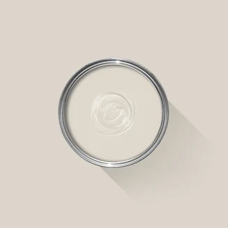
2025 is the year of the neutral. And if there was one shade that could completely convince me of this fact, it’s greige. Now, I know what you’re thinking, but despite its unappealing name, the versatile hue has the power to unite people at all ends of the style spectrum. Not too warm, not too cool, it's the perfect in-between color to bring balance into your home. And there's none that do it quite like Farrow & Ball's Skimming Stone paint shade.
Described by the brand as "a warm, light gray", Skimming Stone derives its name from a 19th-century plaster color — a texture reminiscent of the limewash walls we've been seeing everywhere as of late. Now one of Farrow & Ball's best paint colors, it has a nostalgic quality, and for many, stirs up memories of afternoons spent skimming stones across the water.
Farrow & Ball's Skimming Stone sits somewhere between the brand's cool-toned Strong White and warm mid-gray, Elephant's Breath. All part of the Contemporary Neutrals collection, they're characterized by their lilac undertones, which, although not immediately perceptible in Skimming Stone, helps create that soothing quality that has earned the shade its cult status today.
As one of the best greige paints, it's the perfect canvas, working alongside pretty much any color scheme, without any risk of your space looking soulless or sterile. And it's a certified favorite for interior designers and home renovators alike. Feeling convinced? We spoke with those in the know to discover everything you need to know about Farrow & Ball's Skimming Stone — where, how, and when to use it — so you can feel confident in your design choice.
Samples: £5.50
What Makes Farrow & Ball's Skimming Stone So Popular?

With its soft warmth, Farrow & Ball's Skimming Stone is the type of color that could work all throughout the home. While it may appear similar to other neutral shades in their collection, it's the undertone that matters.
"Each of our whites has a certain nuance, be it undertones of gray, green, red, or yellow etc." explains paint expert and brand ambassador Patrick O'Donnell. "Skimming Stone reads as a warm gray-white with a tiny dose of red which gives it a pleasing softness without feeling too pretty."
It's a super versatile and adaptable shade, even more so when you consider the eleven different paint finishes you can pick from — which range from 2% to 95% sheen, which can completely change its look.

Patrick O'Donnell is a paint and color expert, and has been a brand ambassador for Farrow & Ball since 2012. He provides color consultations with renovators and interior designers, and holds a ISVA Fine Art & Chattels qualification after studying specialist paint decoration at the prestigious Leonard Pardon School.
Designers love it for its “pleasant" gray-beige tone, which makes it the ideal complement to a whole range of color and design schemes — particularly more maximalist designs that require some kind of reprieve. Elissa Hall, head designer at Awning, describes it as “neither too frigid nor too earthy,” and says that this sweet-spot means it “harmonizes and subtly neutralizes rooms.”
Anna Tatsioni, lead interior designer and architect at Decorilla, also notes its ability to balance, adding: “The moment I painted a sample on the wall, I was captivated by its warmth and subtlety. It strikes that perfect balance between gray and beige, creating an inviting atmosphere that feels both modern and timeless.”
It can be difficult to find a shade quite as adaptable as Skimming Stone. Not too harsh nor too subtle, it cloaks a space in a unique, welcoming warmth. Interior designer Jen Stevens, founder of Texas-based studio Fonde Interiors, adds that, “It's a neutral that actually feels inviting — something that's not always easy to find. I love how it creates this soft, welcoming atmosphere that makes a room feel instantly more comfortable.”
What Room Is Best for Farrow & Ball's Skimming Stone?

Skimming Stone is a shade that could easily work in a whole range of rooms, though its calming nature does make it particularly well suited bedrooms, or as a relaxing living room color.
“Skimming Stone shines in living rooms and bedrooms — anywhere you wish to have a sense of serenity that still seems rich — because it lies in that optimum zone between mild warm gray and subdued taupe,” explains Elissa.
Beyond these rooms, there are plenty of other spaces in which Skimming Stone would make a welcome addition, such as in “transitional spaces,” says interior designer Jen Stevens. “It's a chameleon color that adapts to different color palettes throughout the home. In one room it might feel warm and cozy, and in another, it takes on a completely different mood, which is why I love using it to create a cohesive flow.”
The neutral tone also pairs seamlessly with natural materials like marble and wood, making it a great option for kitchen cabinet colors or in bathrooms, where it can “enhance natural light”, Anna Tatsioni adds.
What Colors Pair Well With Farrow & Ball's Skimming Stone?

The colors you pair with Skimming Stone can completely transform its look. “Skimming Stone comes alive when paired with warmer dark browns, rich dark terracottas, and natural materials like French limestone,” explains Jen. “These tones create this incredible, sophisticated palette that feels both grounded and elegant. The paint essentially becomes a beautiful neutral backdrop that lets those warmer, deeper colors sing.”
Patrick O'Donnell agrees, adding: "It loves being paired with our magenta lick brown London Clay, but will also respond well when teamed with plum and wine reds such as Brinjal."
And Skimming Stone looks just as stylish when complemented with rich jewel tones. “I remember one project where we combined it with navy accents in the furniture and décor, it added such depth and sophistication to the room,” says Anna.
While Skimming Stone can provide a welcome contrast for these deep, vibrant colors, the shade is equally suited to a softer, more layered palette. “Gentle blues, delicate blush pinks, and crisp whites fit very nicely next to Skimming Stone; or consider watery teals for subdued contrasts or mild buttery creams for tonal layering," recommends Elissa.
For something more dramatic: “We combined Skimming Stone with a strong accent of Farrow & Ball's Hague Blue on built-in bookshelves, which gave an otherwise muted living room editorial impact,” she adds.
How to Style Farrow & Ball's Skimming Stone

“Designing around Skimming Stone is all about layering textures and creating warmth,” explains Anna. The neutral backdrop can stand up against rich and heavy materials, so lean in to that by building up dimension with different fabrics and finishes. You could even try to incorporate contrasting prints in your soft furnishings. Against such a soothing backdrop, this will come across as cozy and eclectic, rather than messy or cluttered.
Another way of styling Skimming Stone is by combining newer features with vintage designs. “I love mixing vintage pieces with modern elements — think antique French chairs, worn leather, heavyweight linens, and burnished brass details," says Jen. "The color becomes this beautiful, warm backdrop that ties together pieces that feel like they've been gathered from different eras and places.”
“In one of my favorite projects, we incorporated soft textiles like velvet cushions and linen drapes to complement the color," adds Anna. "We also added natural elements like wooden furniture and greenery to bring the space to life.”
Skimming Stone looks beautiful alongside earthy, natural materials. In particular, Elissa recommends, “Combining natural wood flooring, stone accents, and soft textiles to accentuate Skimming Stone on the walls,” and then balancing the look with “metallic fixtures or bold furniture in darker tones.”
What's the Best Application for Farrow & Ball's Skimming Stone?

Color drenching has been a predominant interior design trend over the last few years, and Farrow & Ball's Skimming Stone is the perfect way to embrace it, subtly. “As it’s an off-white, it's best to commit to all over as it would be lost in translation on a feature wall (unless teamed with the softest white — but what would be the point!)," says Patrick.
Jen is also an advocate for going all-in on Skimming Stone. “I've really moved away from accent walls and love the impact of color drenching instead," she says. "With Skimming Stone, painting the entire room creates this beautiful, immersive environment. It transforms the space, making it feel cohesive and intentional. When you commit to the full color, you get a much more sophisticated and considered design.”

If we've managed to convince you that it's time to wave goodbye to your white walls, it's worth scrubbing up on the most common painting mistakes people make, before giving your home the gorgeous greige update it's been waiting for.

-
 7 Sustainable Product Designs That Are Setting the Agenda for Environmentally-Conscious Homes in 2025
From pillows made from textile waste to sanitaryware made in the world's first electric kiln, these brands are revolutionizing sustainable design — for the better
-
 NYC's New Rules Forced Me to Find a Chic Compost Bin — Here's 7 Options Significantly Cheaper Than the $300 Fine
Composting is now mandatory in NYC. Here’s how to do it stylishly


-
 10 Yellow Bathroom Ideas That Vitalize Your Mornings and Look Unexpectedly Sophisticated While Doing So
Yellow is a color that by its very nature is energetic and full of life, and these designers have proved it's ideal for a bathroom
-
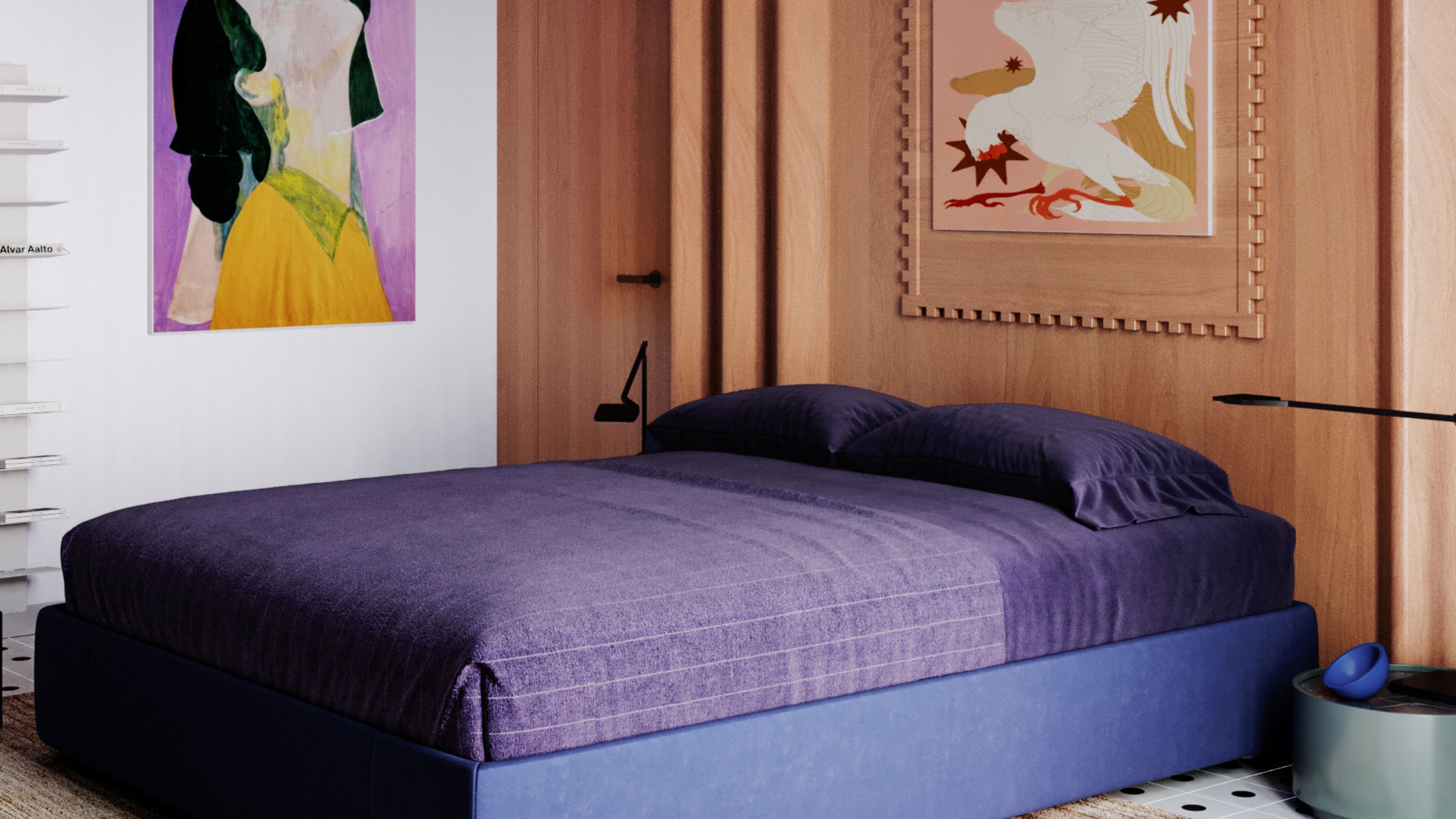 It's a Color Symbolic of Dreams, so These Purple Bedroom Ideas Almost Guarantee a Good Night's Sleep, Right?
Not always an obvious choice for the bedroom, these designs prove that purple has restful and calming qualities, making it perfect for the bedroom
-
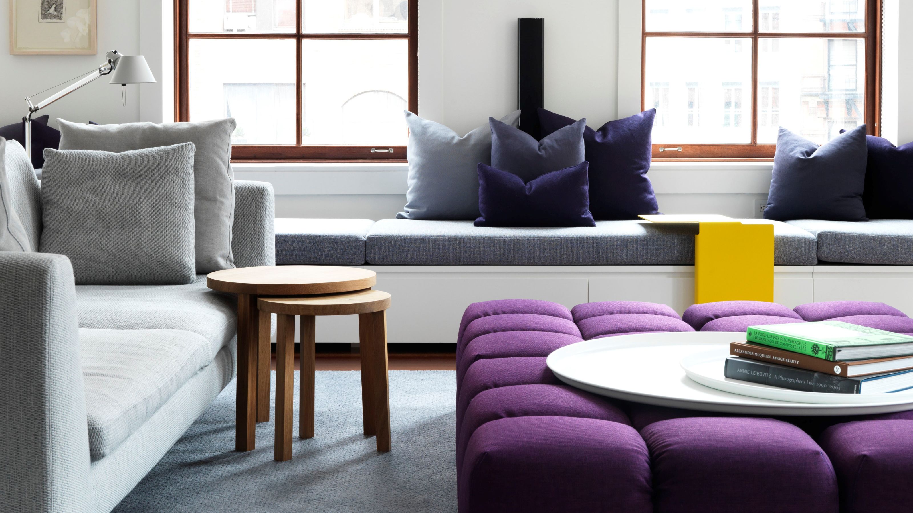 Amethyst, Heather, Pansy, Plum — Turns Out Decorating With Purple Opens You Up to a World of Possibilities
Purple certainly isn't a color for the faint hearted, it's a shade that can smell your fear. Here's how to conquer it through your interiors
-
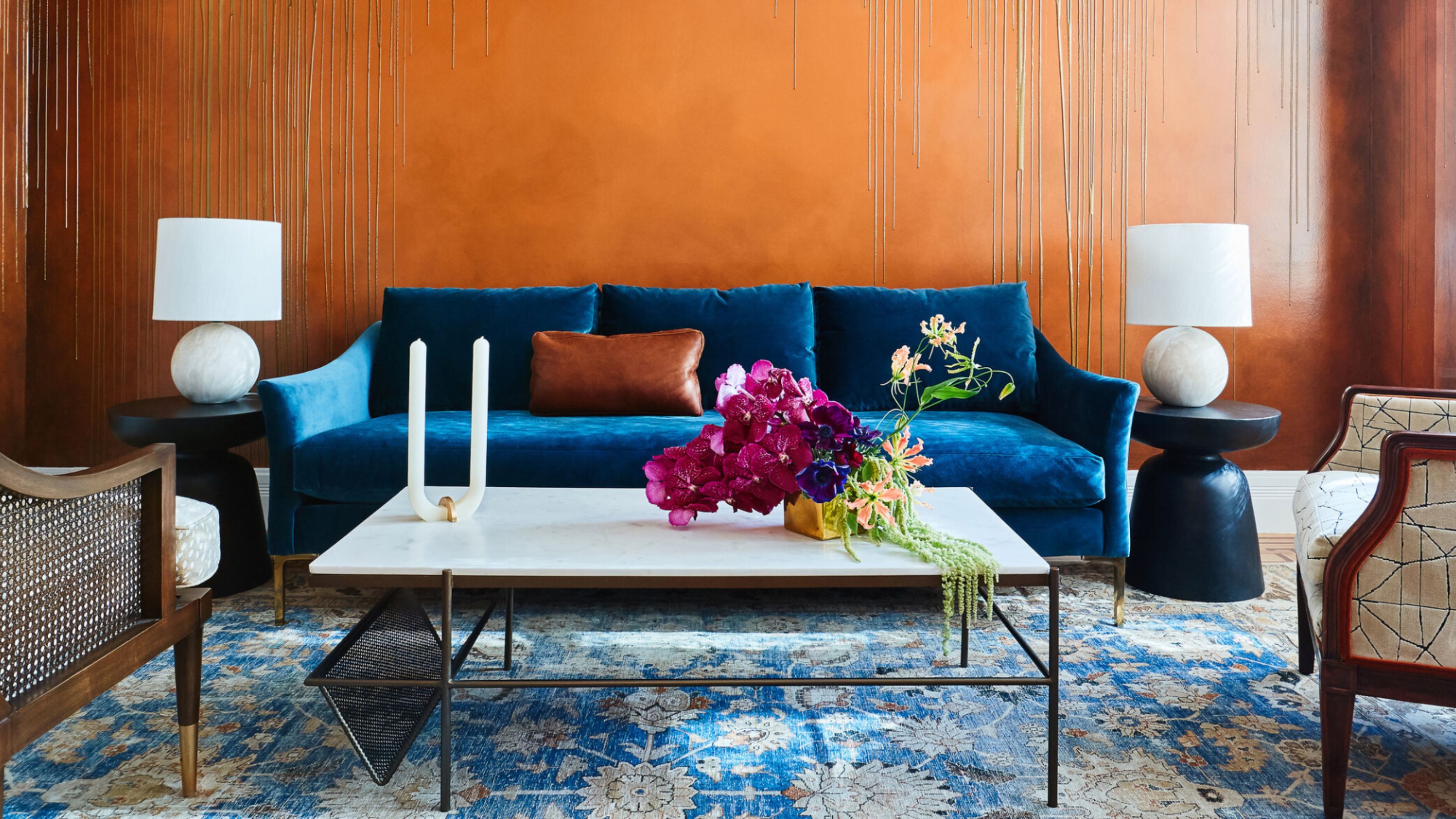 The Combination You Weren't Expecting to Love — 8 Blue And Orange Living Room Ideas That Feel Surprisingly Elevated
A blue and orange scheme for living rooms may sound jarring, but these spaces prove they're striking, vibrant, and certainly unforgettable
-
 Smeg Says Teal, and We’re Listening — The Kitchen Shade of the Year Is Here
Designers are already using the soft, sea-glass green everywhere from cabinetry to countertops
-
 Do Yellow and Purple Go Together? Designers Reveal How to Make This Unexpected Pairing Feel "Totally Intentional"
In an era where unexpected combinations have become cool, we've done a deep-dive to discover how to pair yellow and purple in a space
-
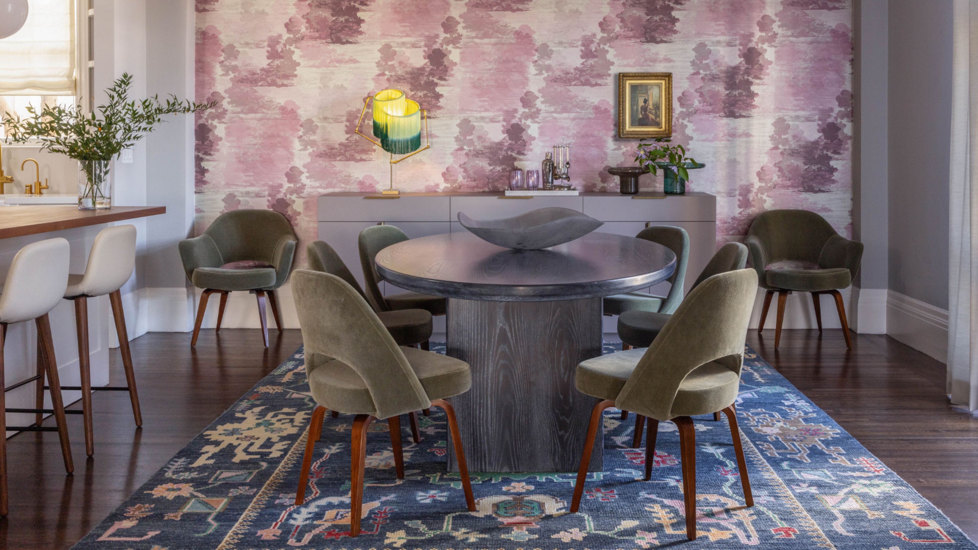
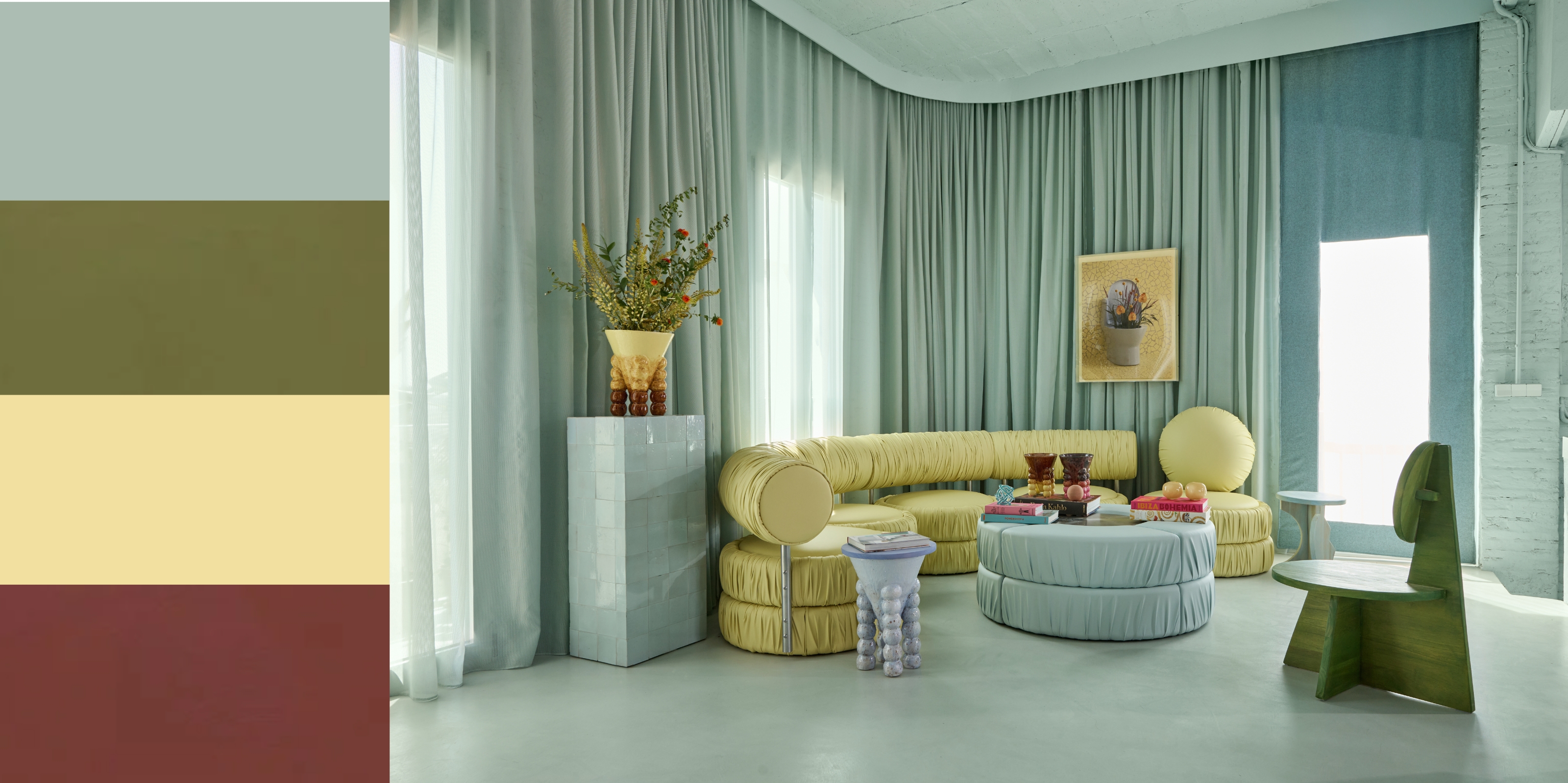 5 Unexpected but Seriously Stylish Spring Color Palettes to Shake Up the Season — "It's Pastel, but Punchy"
Spring color palettes are notorious for their use of pretty pastels, but that doesn't mean they have to lack variation
-
 The 'Red Table Trick' Is the Easiest and Most Expensive-Looking Trend to Hit 2025 So Far
A red dining table makes a seriously stylish statement; the beloved pop of red trend just got an bold and expensive-looking upgrade


