Green Bedroom Ideas — 15 Restful Designs That Showcase the Best of This Elegant Color
Whether you are looking for a deep, dramatic shade, a zingy apple tone, or a soft powdery pastel, these green bedrooms will offer inspiration
Aditi Sharma
- 1. Create a peaceful haven with sage green
- 2. Highlight a contemporary feature with acid green
- 3. Color drench with two shades of cool green
- 4. Opt for darker greens to create an earthy interior
- 5. Inject green into a neutral room with bedding
- 6. Choose a deep, dramatic tone
- 7. Layer green tones in prints and plains
- 8. Combine green with eco-friendly materials
- 9. Ensure your greens work in all lights
- 10. Pick out the millwork in green
- 11. Paint sloping walls the same green
- 12. Get creative with natural motifs
- 13. Pair pink and green
- 14. Use upholstery or accessories for a gentler approach
- 15. Choose a statement-making wallpaper
- Shop our green bedroom edit
The Livingetc newsletters are your inside source for what’s shaping interiors now - and what’s next. Discover trend forecasts, smart style ideas, and curated shopping inspiration that brings design to life. Subscribe today and stay ahead of the curve.
You are now subscribed
Your newsletter sign-up was successful
Green is a top choice for bedrooms amongst interior designers because, whether dark or light, it's an inherently relaxing and serene color that's incredibly versatile and easy to work with.
Its wide variety of shades means that green in a bedroom can range from dark and contemporary, yet still warm — think: a deep green under lamplight, to cool and calming, yet still inviting — a pale, powdery green matched with rich woody tones is a wonderful combination. Brave enough for brat green in a bedroom, anyone?
Of course, green, whatever its tone, needn't just grace your walls. It can also be used as an accent shade — whether expressed on furnishings or furniture, on an area rug or just as a border on drapes. Whatever way you use it, a room awash in green can create a tranquil mood that should put it at the top of your list of bedroom color ideas. These are our favorite green bedroom ideas.
Article continues below1. Create a peaceful haven with sage green

Green room ideas, particularly when in pale or muted tones, are amongst the most calming bedroom paint colors. A favorite for Livingetc? Sage green bedroom ideas — which, color experts say, can help lower blood pressure. We don't know about the science, but if you want to design a bedroom for sleep, then this is the color to go for in our book.
"The most soothing shade of green for bedrooms is often considered to be soft, muted tones like sage green or pastel mint," adds Paula Taylor, head stylist & trend specialist at Graham & Brown. "You could try Graham & Brown’s Palm House, Panache, or Viridis as these shades are calming and can create a serene atmosphere, promoting relaxation and restful sleep.”
“In this bedroom (above), we chose Plantation by Porter’s Paints which has a gentle subtlety to its tone, perfect for rest and relaxation,” shares interior designer Sally Taylor. We think Star Gazer by Graham and Brown is a good match for it, or you can check our list of the best sage green paints for more ideas.
To create a modernist look, combine with more saturated than crisp colors that go with green. So consider cream over a white, or teal over blue.
The Livingetc newsletters are your inside source for what’s shaping interiors now - and what’s next. Discover trend forecasts, smart style ideas, and curated shopping inspiration that brings design to life. Subscribe today and stay ahead of the curve.
2. Highlight a contemporary feature with acid green
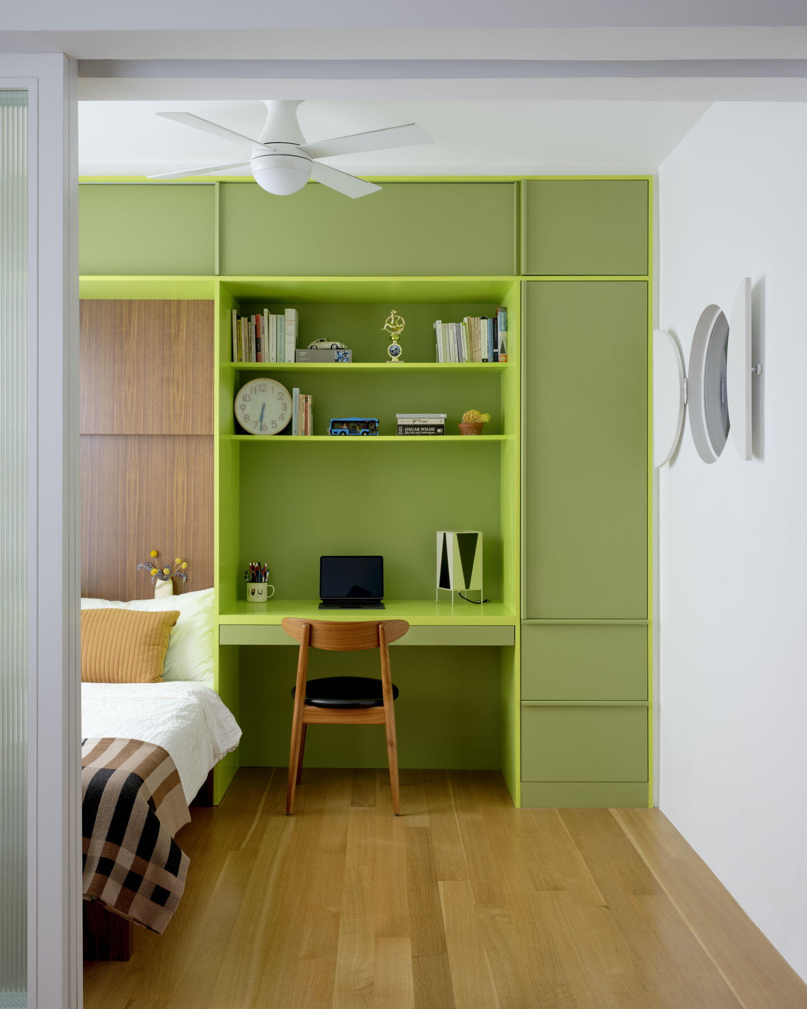
Accent walls and furnishings aside, you can also use a bright and upbeat green to highlight an architectural feature or even a small bedroom storage idea, where a bold shade would be overpowering on every wall. This is especially a great trick for a small bedroom, where color can be used to distract from the room's compact dimensions.
“The hues of green are meant to soothe and excite simultaneously,” say Jacob Esocoff and Henry Ng of Ideas of Order. “The green of the cabinet fronts (above) has a lot of gray in it while the green of the cabinet structure pops because it has so much yellow.”
3. Color drench with two shades of cool green
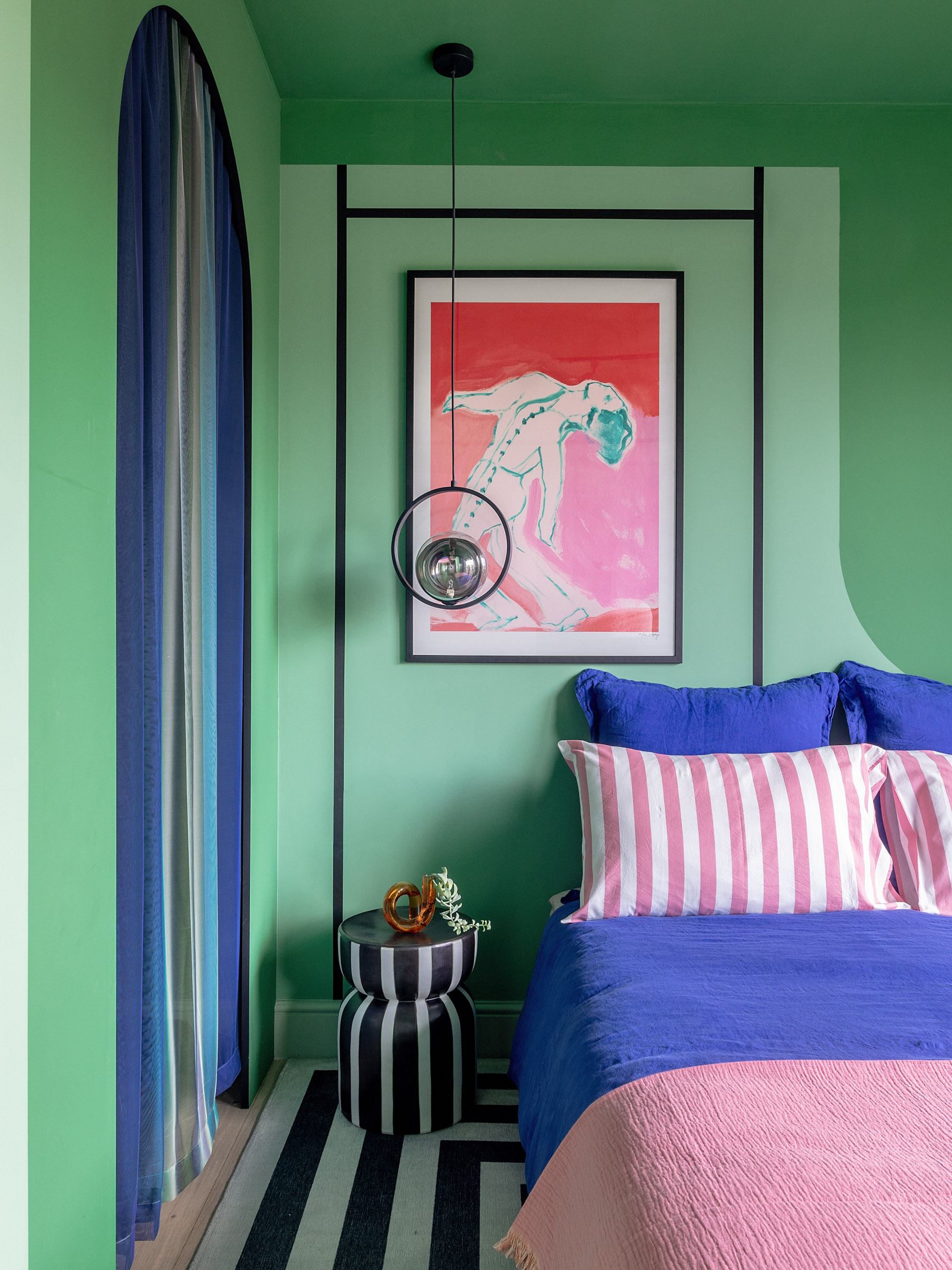
If you're looking to create drama in a modern bedroom, there's no better way than color blocking with green. This idea shouts confidence and style and will make your room always feel on-trend. A great way to choose tones is going for those that complement each other, located either near or opposite each other on the color wheel.
Green and blue are a harmonious color combination. Green is also a color that goes with pink really beautifully, and the two together can create quite an arresting visual. Usually, it's best to limit color blocking to three colors, lest the bedroom feels too busy.
To mimic the scheme above, start with Troop Beverly Hills by Backdrop Home and Emerald Green by Farrow & Ball.
4. Opt for darker greens to create an earthy interior
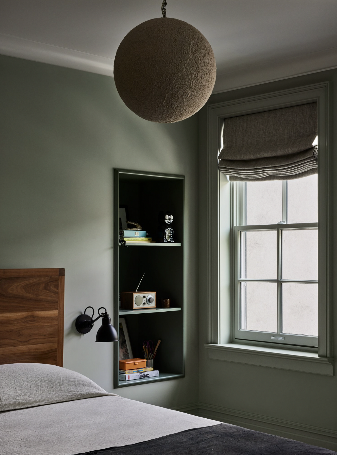
Many parents wonder how to design a bedroom for a growing child. This boy's bedroom is a great example of the best (read: calming) tones to use, which are both personality-filled yet mature and timeless.
“This is a bedroom for a teenage boy, and so we wanted a color palette that felt gently masculine but still approachable,” explains Kevin Greenberg, founder of Space Exploration. “The rest of the house is rendered in a palette of similarly muted tones chosen for their classic, timeless warmth, and inviting character. We wanted to create a bedroom for this young man that he could enjoy in his waning childhood years and as he matures into adulthood and returns home to visit his mother.”
5. Inject green into a neutral room with bedding
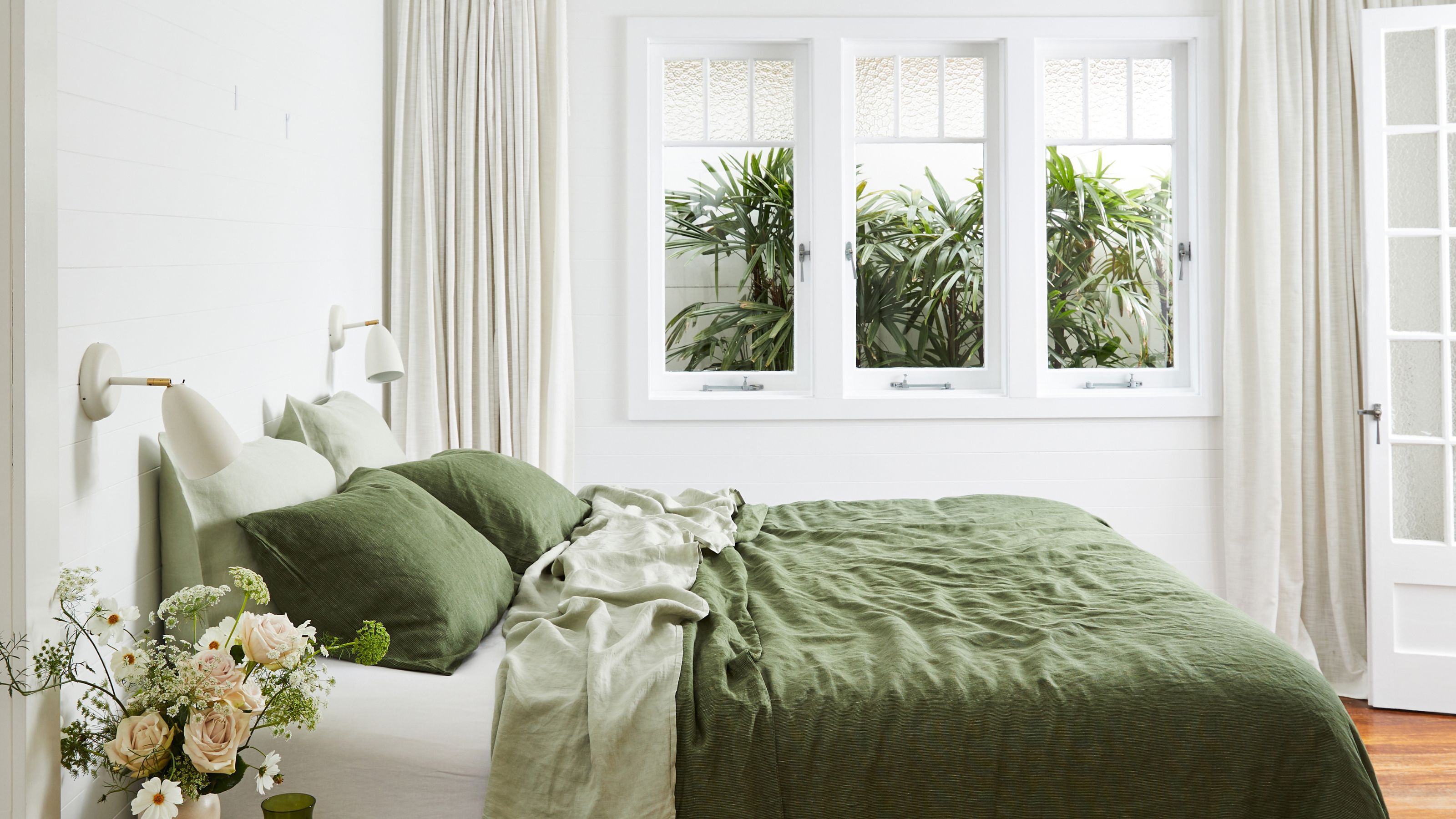
The ease of this idea is that you can make a bedroom feel like it's dominated by green with the simple introduction of strong-toned bedding. The foliage adds more depth, too.
If you wish to add further dimension to a scheme like this, consider adding a second color that goes with forest green, such as yellow, orange, or even peach.
The Olive Stripe Flat Sheet from Bed Threads will help you achieve the bedding look above.
6. Choose a deep, dramatic tone

Design by Studio Kaya
Dive straight into the deep end with abundant forest hues. Deniz Bayern, founder of Studio Kaya felt drawn to dark and moody hues for this bedroom scheme.
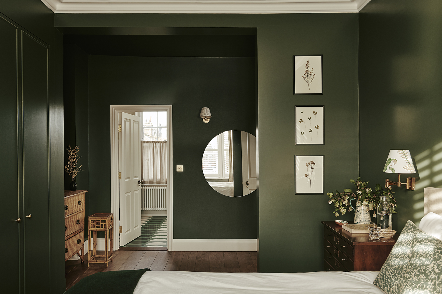
"I feel that a room painted in a rich color gives the feeling of being warmly embraced," she says, and the theory here is the same as that which goes with gray bedroom ideas. "This particular shade of green injects drama into the bedroom while also providing a deep sense of tranquility through its direct connection to nature."
As with anything that is so richly decadent, a delicate touch and moderation is key. "Dark walls can sometimes feel overwhelming, so I pared back for the rest of the room, using neutral tones and natural textures across both furniture and accessories," Deniz says. "The prevalent use of white helps highlight the deep green even more while keeping the overall scheme fresh and calming."
Sherwin Williams' Forestwood is a good match for this, or, if your room is north-facing with a cool light, the warmer Mediterranean Olive by Benjamin Moore is a good pick.
7. Layer green tones in prints and plains
Bedroom design by Studio Ashby
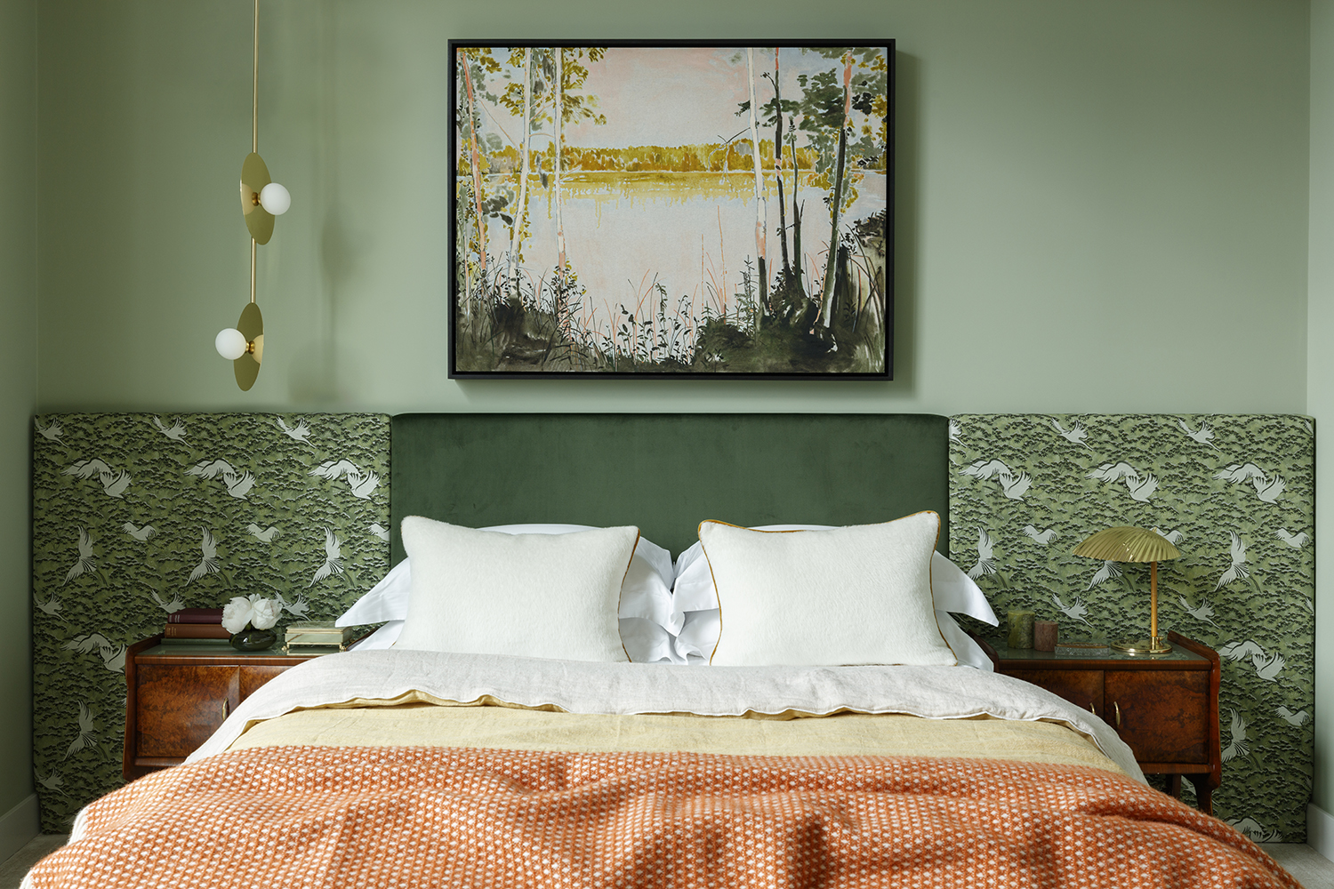
Don’t feel you have to choose just one hue for your green bedroom; consider exploring the full tonal spectrum. Fiona Blanchot, director at design studio, Studio Ashby, explains the process behind expertly combining different shades.
"Green is one of our favorite colors; it has the power to completely transform the mood of a bedroom," Fiona says. "For the main backdrop of this scheme, we wanted something soft and chose this chalky grey-green for its almost meditative and calming quality. This calm backdrop set the scene for introducing something a little bolder.
"As a Studio, we’re drawn to patterns referencing the wild and this feels especially apt in a palette of natural greens. We chose a densely patterned nature-inspired fabric for the headboard, and balanced its busyness with a rich green velvet."
"Splashes of ochre, brass, and orange help to soften the contrasts between the green tones to build an enticing oasis away from everyday stresses," adds Fiona.
8. Combine green with eco-friendly materials
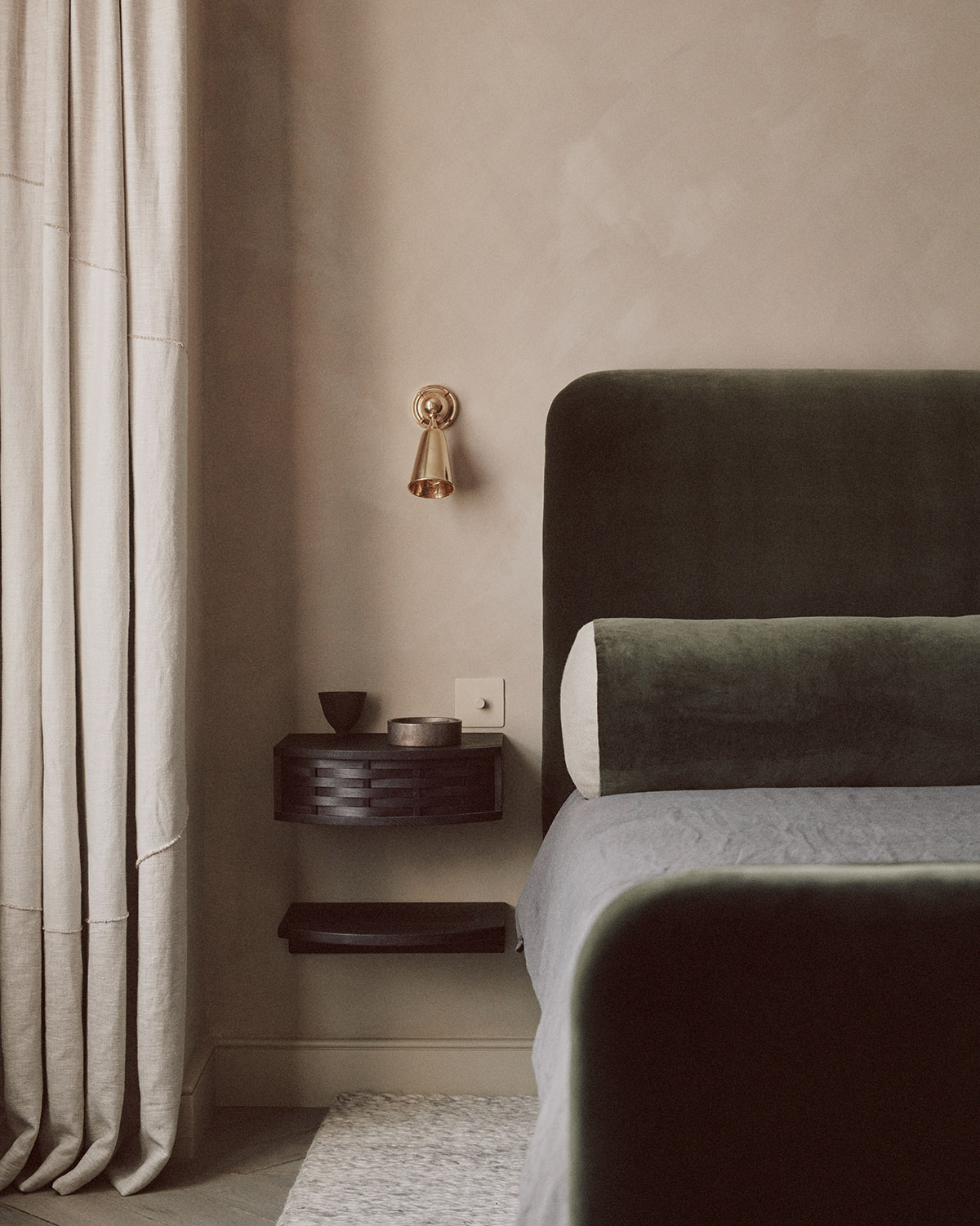
Design by House of Grey
"As consumers and designers, we have the choice to use natural materials and live in synergy with our surroundings," says Louisa Grey, founder of design studio, House of Grey. Committed to detoxing rooms from chemicals and toxins, House of Grey creates serene spaces both in aesthetics and concept that have zero impact on the earth and conjure a feeling of grounding to their inhabitants.
This earth tone bedroom is an example. "With our design principles in mind, we often find ourselves utilizing a variety of green in our interior design schemes for its instant evocation of, and deep connection to, nature," Louisa says. "In this particular project, the use of a forest green tone on the upholstery felt like a natural choice, designed in collaboration with Sebastian Cox. The bed is handmade and has been upholstered using a combination of rubberized animal hair, natural latex, and 100% wool wadding. The mattress and bedding are made entirely from biodegradable resources so they can return to the Earth as nature intended."
9. Ensure your greens work in all lights
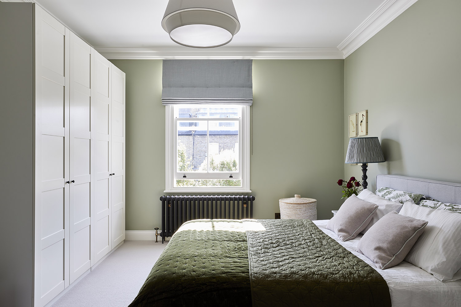
Design by Imperfect Interiors
Every paint color has a range of subtle undertones at work. These will inform the appearance of the color when seen in different light conditions, as well as how it will look when combined with other colors in the room. For a cohesive look, be sure to first consider the aspect of your bedroom and how your choice of green will fare in its light levels. Next, observe the undertones within the paint and choose complementary tones to accessorize accordingly. Beth Dadswell, founder of Imperfect Interiors, applies this logic masterfully for this cozy bedroom scheme.
"We choose a paint color with lots of grayish blue undertones, and let this guide us towards window treatments and soft furnishings in pale misty blues and grey-toned pinks," Beth says. "The overall effect is tranquil, elegant, and contemporary."
"For a bolder look, a more vibrant shade of green on the walls could be matched with bold patterns on pillows and blinds in cohesive tones," Beth adds.
10. Pick out the millwork in green
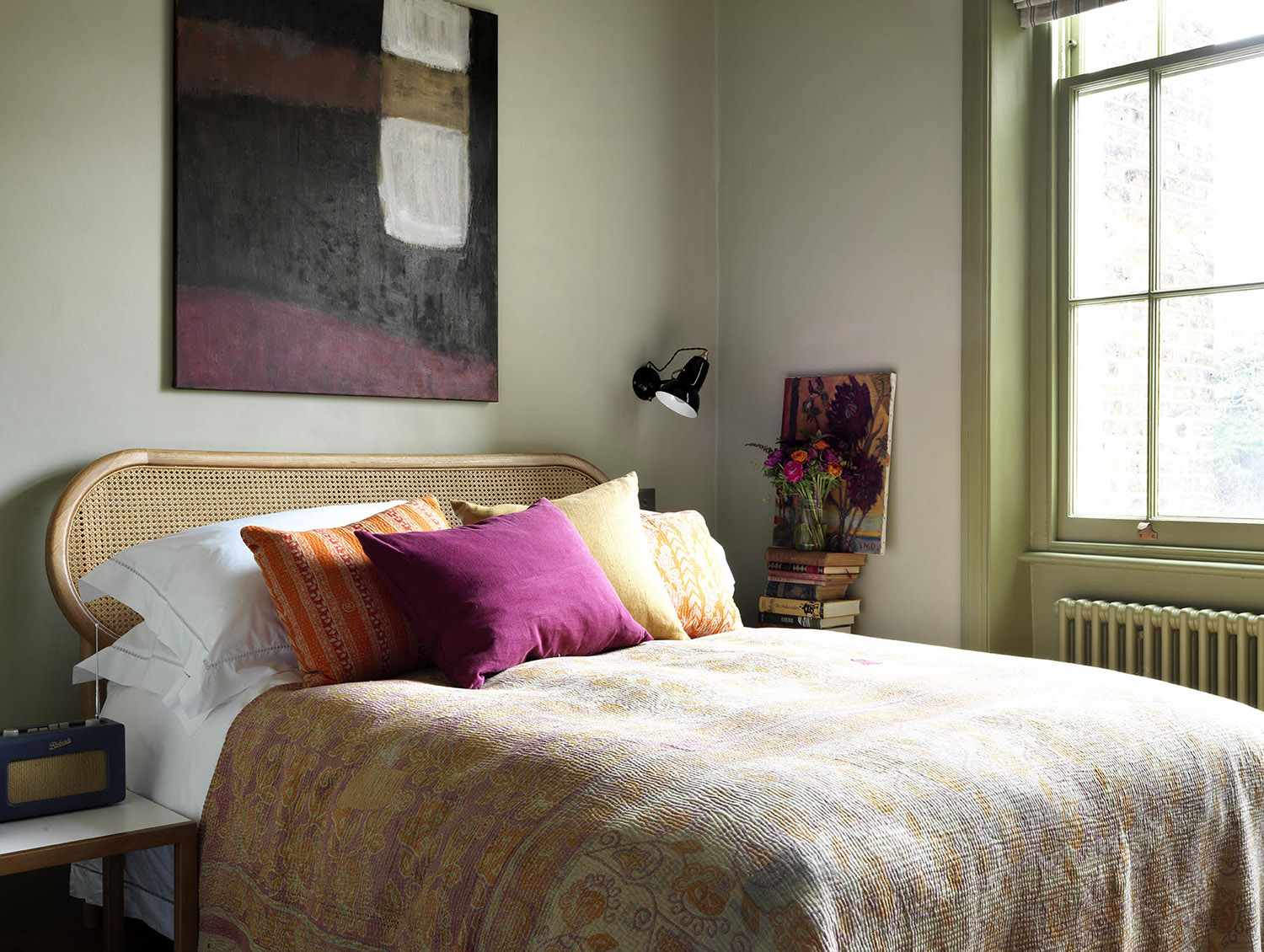
Design by Lonika Chande
Often overlooked, the millwork can be a wonderful canvas for bringing another element of color into a green bedroom scheme, and it's an easy way to introduce a more layered approach. In this bedroom, Lonika Chande spotted an opportunity to create a connection to the rooms beyond, one of those great master bedroom ideas that work if you're trying to create the feeling of being in a suite.
"We used Botanist by Paint & Paper Library on the walls in the hallway just off the bedroom, so it gave a sense of natural continuity and flow to carry this through onto the woodwork in the bedroom across the window frame and baseboards," explains Lonika.
Going just a couple of shades lighter on the walls creates a soothing contrast. "Green is such a restful and calm color, so it works well in a bedroom," adds Lonika. "Using Wattle V, also by Paint and Paper Library, on the walls works in harmony with the green tones of Botanist while offering a comforting overall atmosphere to the room."
11. Paint sloping walls the same green
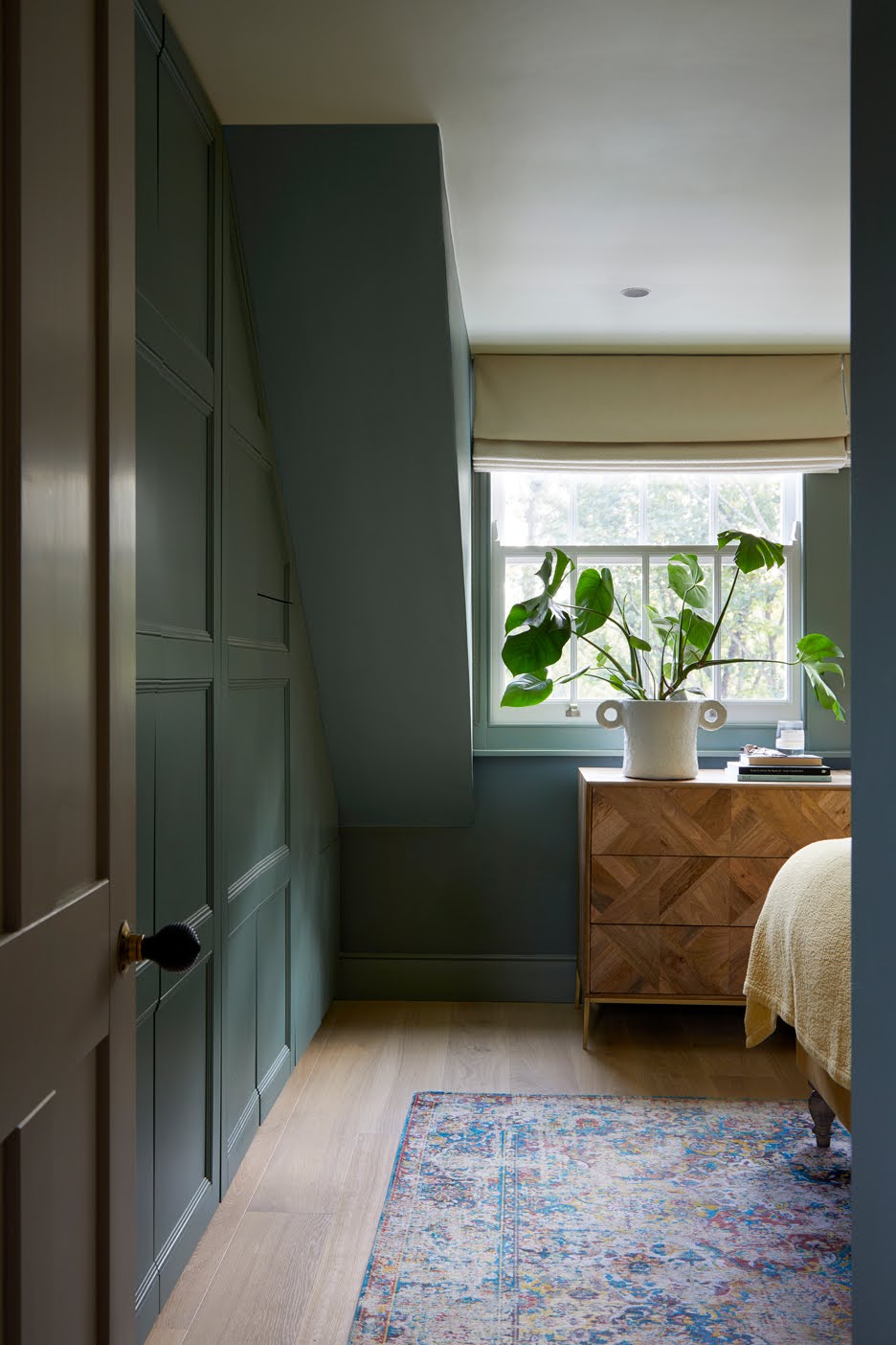
Design by A New Day
The effect of a floor-to-ceiling green treatment is deeply reassuring and cocoons you within the delicious depths of this emotive hue, it's why, as a side note, it's also a great color to consider when thinking about bedroom wallpaper ideas. Andrew Griffiths, founder of A New Day explains how it’s particularly effective in a room that looks out to nature, or one with difficult proportions, such as with a bedroom built into the eaves.
"Green can be a beautifully serene color, particularly in an earthy mid-tone like Green Smoke by Farrow & Ball that's used here," says Andrew. "The color connects with the view of the treetops from the window for a bedroom that feels calm and relaxing."
It’s a good idea to create some delicate variation in tone across the different elements of architecture. Andrew says, "In this room, we used a subtle tonal look to highlight details without shouting about it — the walls are Farrow & Ball Green Smoke with Card Room Green on the woodwork. For a softer transition, the ceiling is then painted in an off-white with a green undertone."
12. Get creative with natural motifs
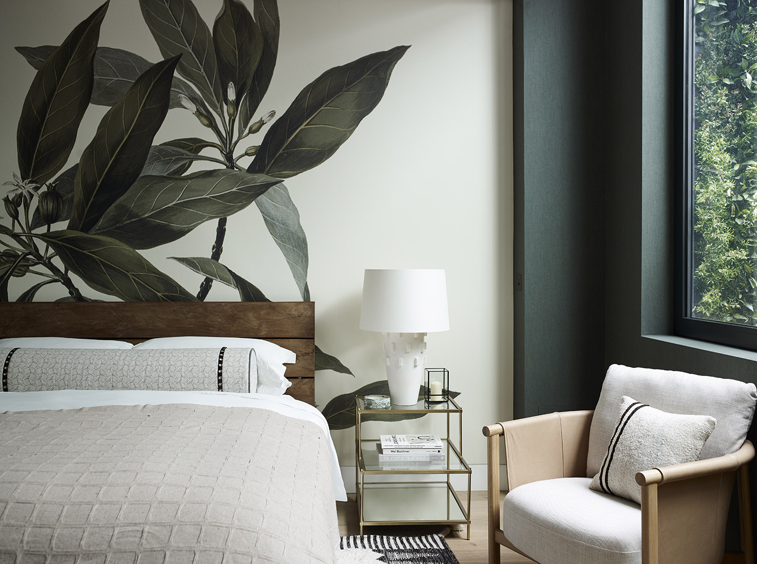
Design by Gunter and Co
Combining green with visual references to bedroom plants and greenery is a match made in heaven, and it can create a beautiful synergy with the great outdoors. Irene Gunter, founder of design studio, Gunter & Co, says, "We decided to opt for a botanical scheme in this room early on as we felt it would tie in very well with the abundance of greenery in the adjacent lightwell, which features a living green wall and lots of stunning potted plants."
When building a scheme around bold motifs, achieving balance is key, and considering the light levels your room receives will help inform you on which way to go. Irene explains, "The botanical mural came first, so the next decision was what to pair it with. The room is naturally dark, so we knew that the pale walls surrounding it wouldn’t work. Instead, we leaned into the moodiness and found a beautiful Belgian wallpaper in a deep green to surround the window and wrap around the rest of the room for an all-encompassing feel."
13. Pair pink and green
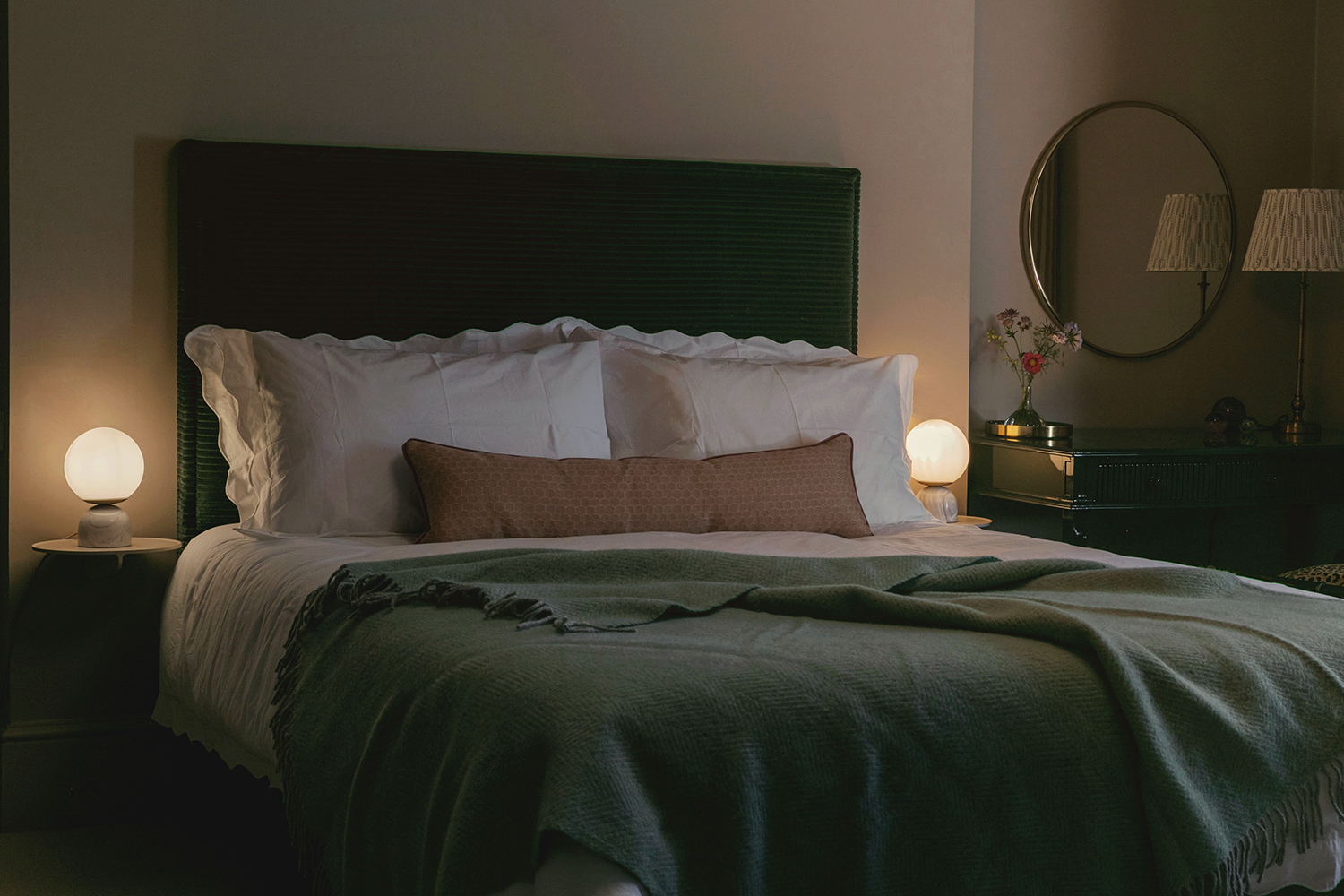
Design by Studio Duggan
Despite popular belief, the combination of a pink color palette with green is a surefire winner in a bedroom. Go bold and bright with zesty tones, or take Studio Duggan’s route into a more muted territory for a contemporary bedroom look.
Tiffany Duggan, founder of Studio Duggan says, "The color green is having a real moment in interiors. It is so easy to use and a great gateway color for people more comfortable with neutrals. Pink works as the perfect partner because it sits opposite green on the color wheel, creating a dynamic and aesthetically pleasing contrast."
14. Use upholstery or accessories for a gentler approach
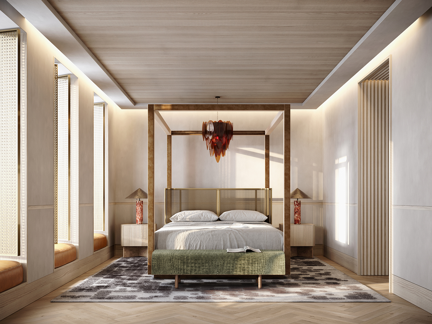
Design by Noa Santos, founder of Nainoa Studio
You needn’t redecorate to incorporate green into your bedroom. In fact, even the subtlest hint is enough to reap its feel-good benefits. Try adding some natural bedding like linen pillows in olive green, or an armchair in emerald velvet — this will work particularly well if your existing scheme is neutral or monochrome in tone.
Noa Santos, founder of Nainoa Studio, understands how a splash of green can uplift any bedroom, "Whenever we get the chance to bring the outdoors into a space, we take it," he says. "The moss green of the bench in this opulent bedroom draws the eye to the foot of the bed then out to the adjacent window and into the green trees — and in doing so, pushes the boundaries of the room outward making the space feel larger."
15. Choose a statement-making wallpaper
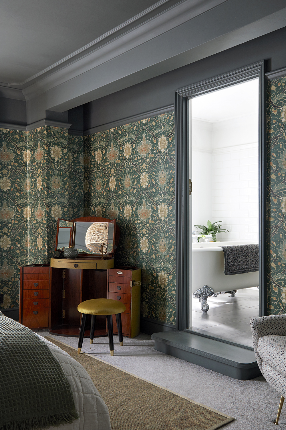
Fiona Duke Interiors
If you’re struggling with where to begin your green bedroom scheme, a wow-factor wallpaper is a great place. In fact, a big wallpaper trend at the moment is using bold tones, large prints, and even interesting, textured finishes that give a room depth.
Fiona Duke, of Fiona Duke Interiors, was instantly drawn to this William Morris print and situates it clearly within a palette of cool grey.
"The whole room started with this inspiring and decorative wallpaper," Fiona says. "We didn’t hold back and wanted to wrap the whole room in this iconic design which makes the room sing. To embrace its bold pattern, we painted the ceiling and top part of the wall in a dark grey tone to match and stand up to the drama of the print, which pulls the whole concept together."
Shop our green bedroom edit
Is green a good color for the bedroom?
As per design experts and color psychologists, green is a great color for the bedroom as it has an inherent calmness and tranquility to it. The nature's tone stands for well-being and peace. It helps the dweller to wind down, relax, and even sleep well.
What color goes well with green in a bedroom?
While the tone of green you choose for the bedroom will help dictate the combos you can create, largely, tones such as brown, gray, yellow, pink, blue or beige can go with green in the bedroom. Green is a versatile hue and lends itself to easy pairings. For a more relaxing, and on-trend scheme, consider using green as the primary color in the room, and accenting it with other cooler tones. The contrast will be eye-catching.
Interiors stylist and journalist Amy Neason was the Deputy Style and Interiors editor at House Beautiful for years. She is now a freelance props and set stylist, creating work for a range of national publications and brands such as Imogen Heath. She has previously worked at Established & Sons, and her skills include styling still life and interiors shots for editorial features and sourcing unique products to create inspirational imagery.
She is particularly respected for interpreting seasonal trends into feature ideas and style stories.
- Aditi SharmaFormer Design Editor
